스크롤 앱의 일반적인 레이아웃
컬렉션을 사용해 정리하기
내 환경설정을 기준으로 콘텐츠를 저장하고 분류하세요.
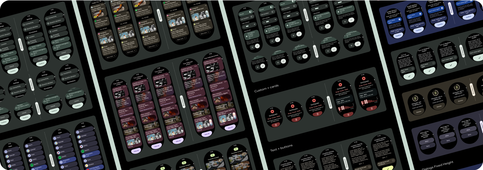
스크롤 앱 뷰 레이아웃에는 목록 (TransformingLazyColumn
)과 대화상자가 포함됩니다.
이러한 레이아웃은 앱 화면의 대부분을 구성하며 더 큰 화면 크기에 맞게 조정해야 하는 구성요소 모음을 나타냅니다. 구성요소가 반응형인지 확인합니다. 즉, 사용 가능한 너비를 채우고 화면 높이를 더 사용할 수 있을 때 TransformingLazyColumn
조정을 채택하는지 확인합니다. 이러한 레이아웃은 이미 반응형으로 빌드되어 있으며, 확장된 리얼 에스테이트를 더욱 활용하기 위한 몇 가지 추가 권장사항이 있습니다.

반응형 및 최적화된 디자인 빌드
디자인 레이아웃이 더 큰 화면 크기에 맞게 조정될 수 있도록 레이아웃과 구성요소의 동작이 업데이트되어 비율 기반 여백과 패딩을 비롯한 반응형 동작이 내장되었습니다. 이 문제를 해결하기 위해 Android UI 라이브러리 레이아웃과 구성요소를 비율 기반 여백 및 패딩을 비롯한 내장 반응형 동작으로 업데이트했습니다. Compose 구성요소를 활용하는 경우 이 반응성을 자동으로 상속할 수 있습니다.
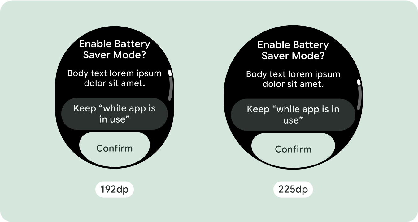
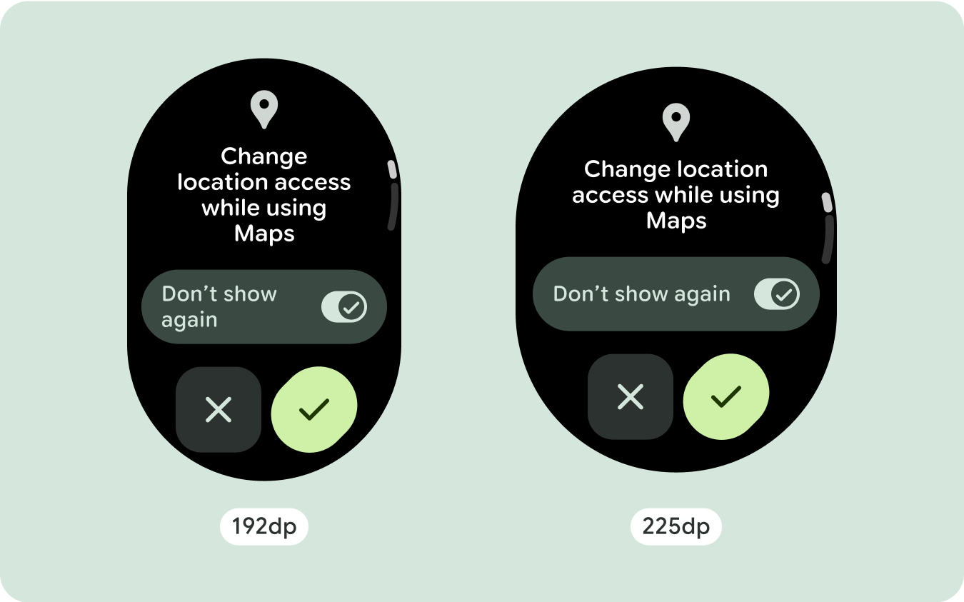
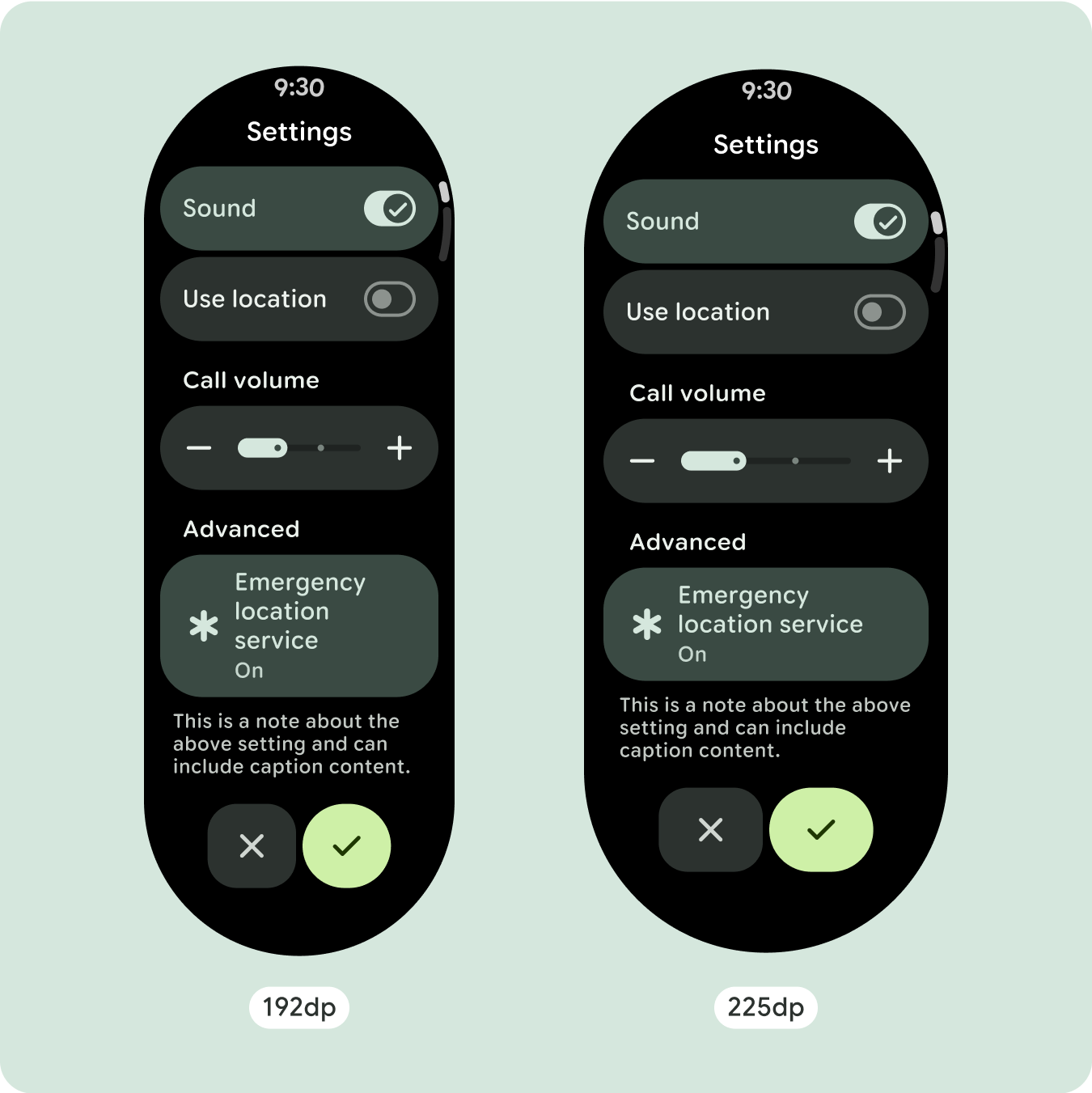
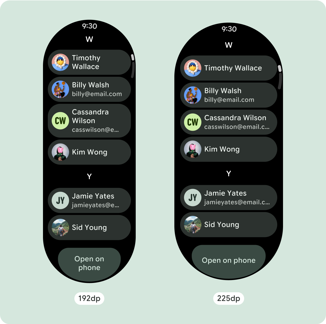
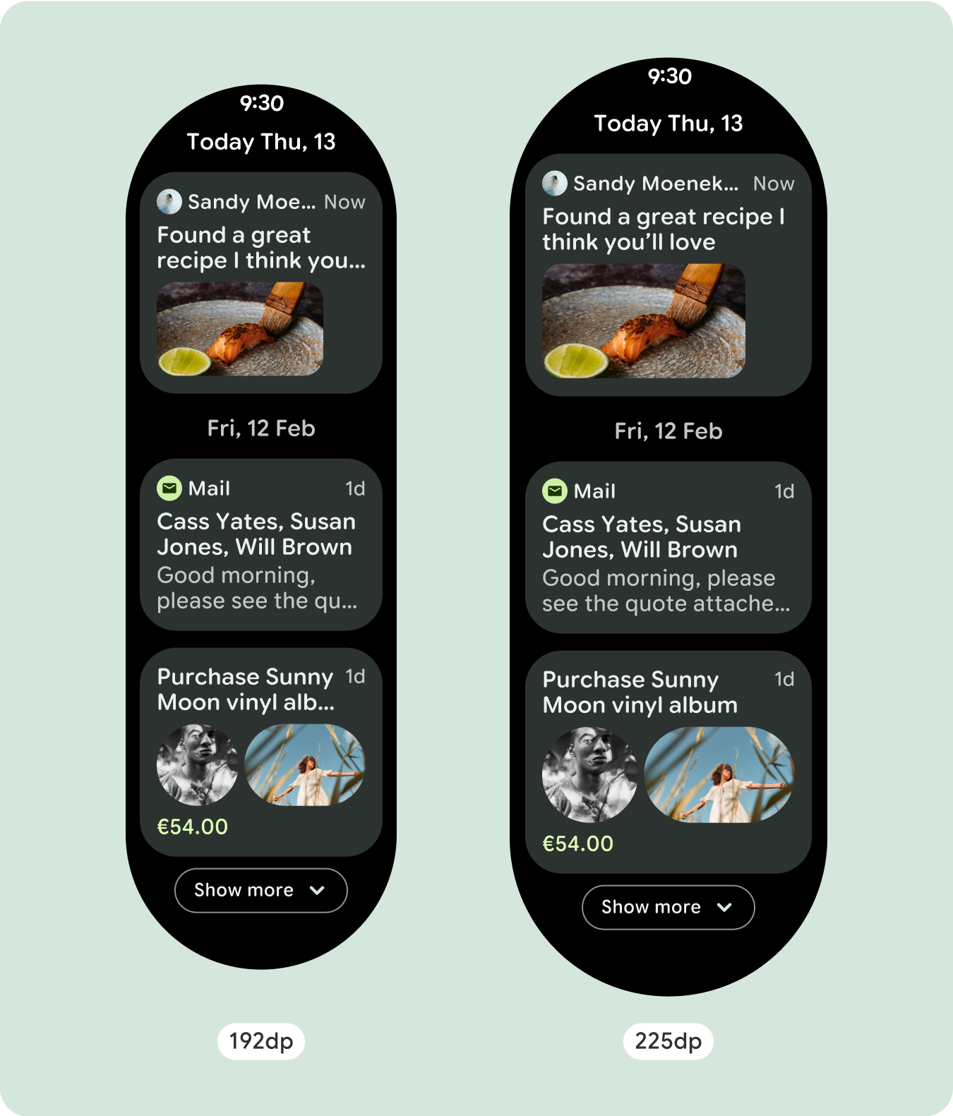
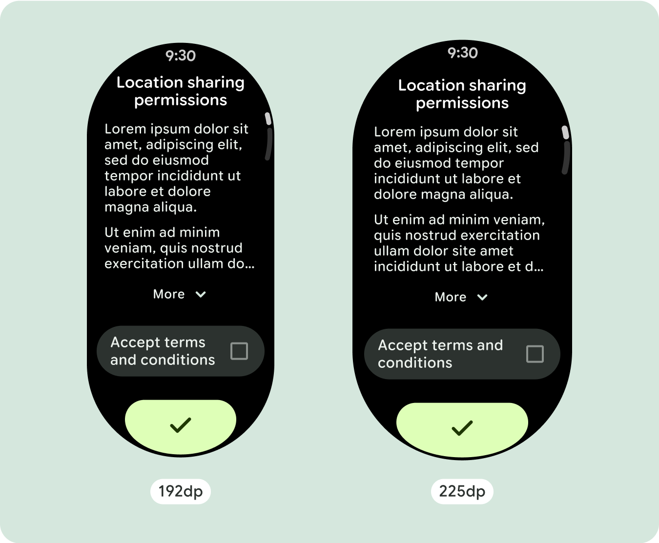
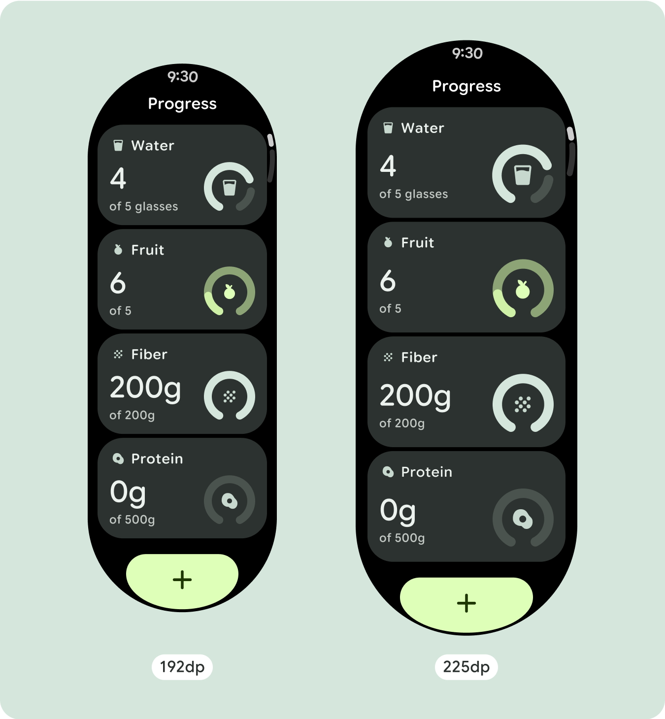
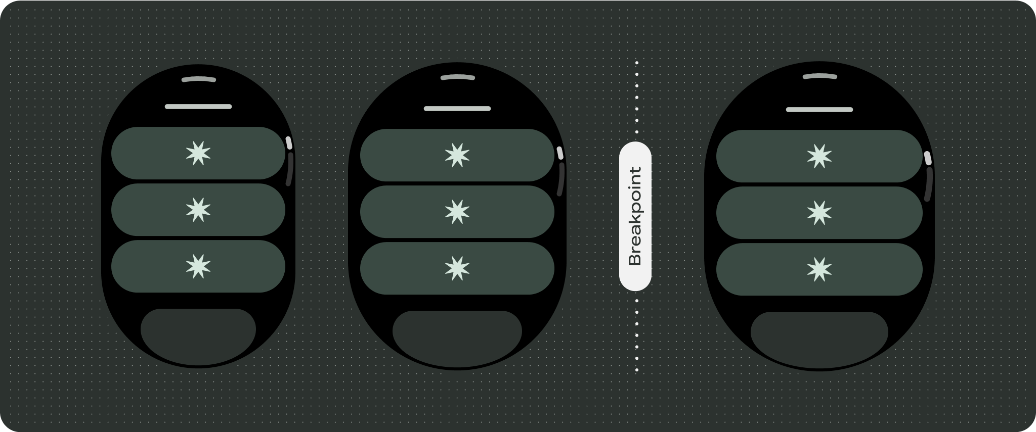
고유한 화면 디자인의 경우 다양한 화면 크기에서 철저히 테스트하여 구성요소와 요소가 원활하게 조정되고 콘텐츠가 잘리지 않도록 합니다. 비율 여백은 스페이서를 효과적으로 조정하는 데 도움이 되며, 225dp의 브레이크포인트를 사용하여 더 큰 시계 화면에 추가 정보와 향상된 기능을 도입하는 것이 좋습니다.
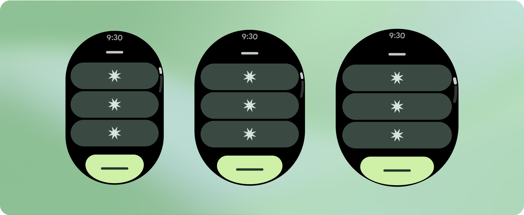
구성요소가 사용 가능한 너비를 채우는지 확인
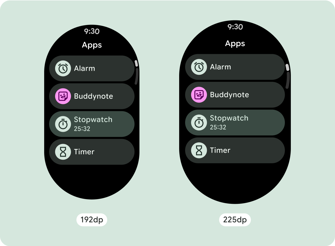
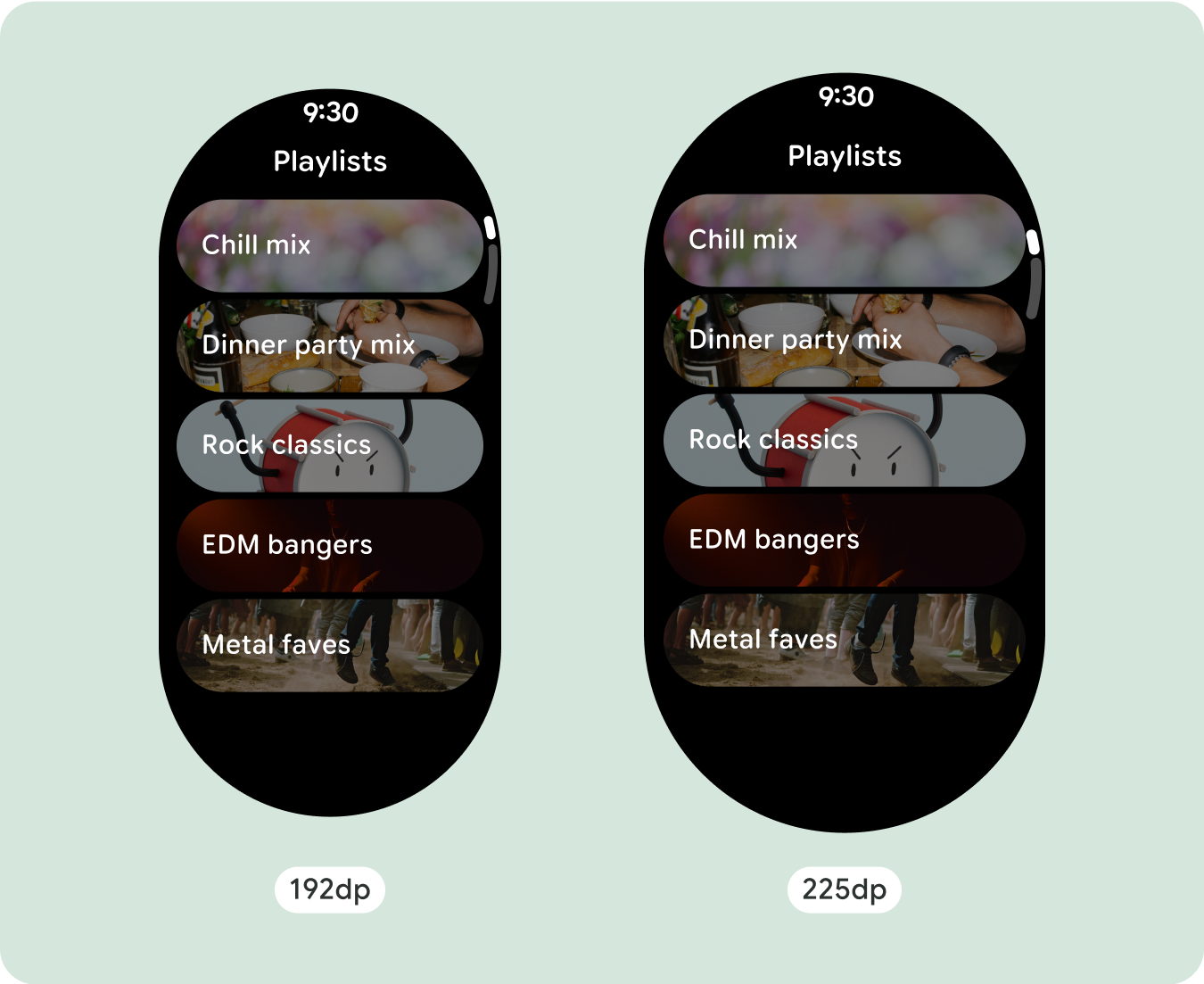
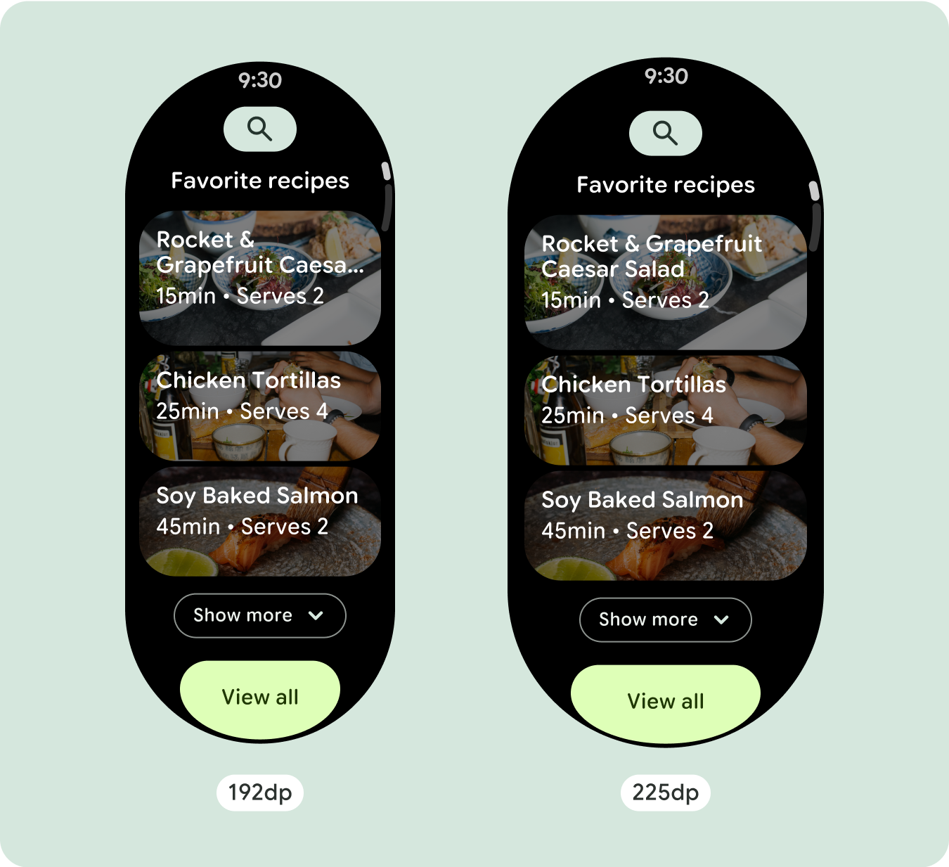
모든 구성요소는 반응형으로 빌드되므로 사용 가능한 너비와 높이를 채웁니다. 콘텐츠가 둥근 화면으로 잘리지 않도록 필요한 여백이 있는지 확인합니다.
추가 텍스트 문자 표시
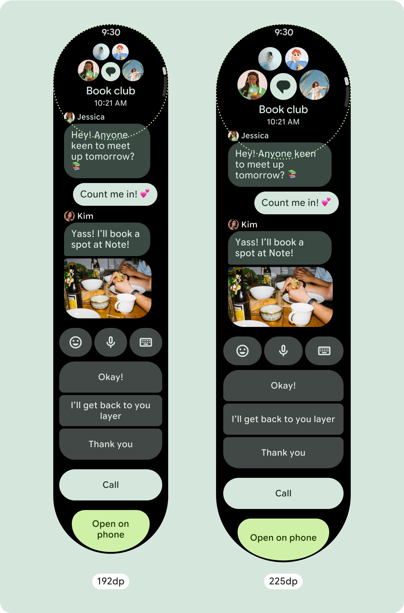
대부분의 구성요소에는 사용 가능한 너비를 채우는 텍스트 상자가 있습니다. 즉, 화면 너비가 넓어질수록 자동으로 글자 수가 늘어납니다.
적응형 및 차별화된 디자인 빌드
스크롤 레이아웃은 이전에 화면 접힌 부분 아래에 숨겨져 있던 항목을 더 많이 자동으로 표시하므로 가치를 높이기 위해 별도로 취해야 할 조치는 많지 않습니다. 각 구성요소는 사용 가능한 너비를 채우며, 경우에 따라 구성요소에 텍스트 행이 추가되거나 (예: 카드) 구성요소가 늘어나 사용 가능한 너비를 채울 수 있습니다 (예: 아이콘 버튼).
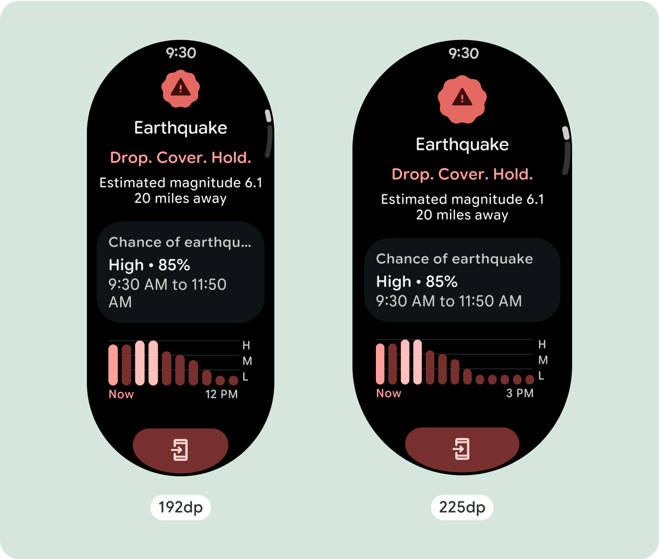
더 큰 화면 크기에서 추가 공간을 최대한 활용하려면 225dp에 크기 중단점을 추가합니다. 이 브레이크포인트를 사용하면 추가 콘텐츠를 표시하거나, 더 많은 버튼이나 데이터를 포함하거나, 더 큰 화면에 더 적합하도록 레이아웃을 변경할 수 있습니다. 이를 위해서는 각 중단점마다 다른 디자인이 필요합니다. 더 큰 화면 디자인 (225인치 이상)에는 다음과 같은 추가 요소가 포함될 수 있습니다.
기존 구성요소의 크기를 늘리거나 상태를 변경합니다.
이렇게 하면 더 많은 세부정보를 표시하거나 콘텐츠를 한눈에 볼 수 있습니다.
최적화되고 차별화된 레이아웃
레이아웃은 225dp 브레이크포인트 이후에 약간 변경될 수 있으므로 기본 뷰의 접히는 부분 위의 콘텐츠가 최적화되지만 접히는 부분 아래의 동일한 콘텐츠는 화면 크기와 관계없이 계속 사용할 수 있습니다.
반응형 및 적응형 동작
Compose 라이브러리의 모든 구성요소가 더 넓은 화면 크기에 자동으로 적응하고 너비와 높이를 얻습니다. 반응형 디자인 관행을 사용하는 스크롤 뷰는 일반적으로 다양한 화면 크기에 맞게 조정됩니다. 그러나 경우에 따라 브레이크포인트를 사용하여 크기를 재정의하고 레이아웃을 보강하여 기능을 확장하거나, 한눈에 볼 수 있도록 개선하거나, 콘텐츠를 화면에 더 잘 맞게 할 수 있습니다.
모든 상단, 하단, 측면 여백은 클리핑을 방지하고 요소의 비례 크기 조정을 제공하기 위해 백분율로 정의해야 합니다. PositionIndicator
는 사용자가 스크롤할 때 표시되며 크기와 관계없이 화면의 베젤을 자동으로 감쌉니다.
체크리스트
- 권장되는 상단, 하단, 측면 여백을 적용합니다.
- 스크롤 가능한 컨테이너의 시작과 끝에서 클리핑이 발생하지 않도록 외부 여백을 백분율 값으로 정의합니다.
- UI 요소 간에 고정된 DP 값으로 여백을 적용합니다.
- 225dp에 브레이크포인트를 적용하여 추가 콘텐츠를 표시하거나 더 큰 화면 크기에서 기존 콘텐츠를 한눈에 볼 수 있도록 하는 것이 좋습니다.

차별화된 환경 만들기
스크롤 뷰는 구성요소를 원하는 순서로 조합하여 추가할 수 있는 등 고도로 맞춤설정할 수 있습니다. 상단 및 하단 여백은 상단과 하단에 있는 구성요소에 따라 달라질 수 있습니다. 이는 화면의 커브가 커져 콘텐츠가 잘리는 것을 방지하기 위한 것입니다.

이 페이지에 나와 있는 콘텐츠와 코드 샘플에는 콘텐츠 라이선스에서 설명하는 라이선스가 적용됩니다. 자바 및 OpenJDK는 Oracle 및 Oracle 계열사의 상표 또는 등록 상표입니다.
최종 업데이트: 2025-07-27(UTC)
[[["이해하기 쉬움","easyToUnderstand","thumb-up"],["문제가 해결됨","solvedMyProblem","thumb-up"],["기타","otherUp","thumb-up"]],[["필요한 정보가 없음","missingTheInformationINeed","thumb-down"],["너무 복잡함/단계 수가 너무 많음","tooComplicatedTooManySteps","thumb-down"],["오래됨","outOfDate","thumb-down"],["번역 문제","translationIssue","thumb-down"],["샘플/코드 문제","samplesCodeIssue","thumb-down"],["기타","otherDown","thumb-down"]],["최종 업데이트: 2025-07-27(UTC)"],[],[],null,["# Common layouts for scrolling apps\n\nScrolling app view layouts include lists (`TransformingLazyColumn`) and dialogs.\nThese layouts make up the majority of app screens, and they represent a\ncollection of components which need to adapt to larger screen sizes. Check that\nthe components are responsive---that is, that they fill the available width and\nadopt the `TransformingLazyColumn` adjustments when more of the screen's height\nis available. These layouts are built responsively already, and we have some\nadditional recommendations to take further advantage of the expanded real\nestate.\n\nBuild responsive and optimized designs\n--------------------------------------\n\nTo help your design layouts adapt to larger screen sizes, we have updated the\nbehavior of our layouts and components to have built-in responsive behavior,\nincluding percentage-based margins and padding. To address this, we have updated\nour Android UI library layouts and components with built-in responsive behavior,\nincluding percentage-based margins and padding. If you're utilizing our Compose\ncomponents, you can automatically inherit this responsiveness.\n\nFor unique screen designs, thoroughly test across a variety of screen sizes,\nensuring components and elements adapt smoothly and avoid content clipping. Our\npercentage margins help spacers scale effectively, and we recommend using a\nbreakpoint at 225dp to introduce additional information and enhanced\nfunctionality on larger watch screens.\n\n### Check that components fill the available width\n\n\nAll components are built responsively, meaning they fill the available width and\nheight. Make sure you have the necessary margins to ensure content doesn't get\nclipped by the rounding screen. \n\n\n\u003cbr /\u003e\n\n### Show additional text characters\n\n\nMost components have text boxes which fill the available width. This means that\nthey automatically gain character counts as the screen width increases. \n\n\n\u003cbr /\u003e\n\nBuild adaptive and differentiated designs\n-----------------------------------------\n\nAs scrolling layouts will automatically show more of what was previously hidden\nbelow the screen fold, there isn't much you need to do to add value. Each\ncomponent fills the available width, and in some cases, a component might gain\nadditional rows of text (such as cards), or components stretch to fill the\navailable width (such as icon buttons).\n\nTo best use the additional space on larger screen sizes, add a size breakpoint\nat 225dp. This breakpoint makes it possible to reveal additional content,\ninclude more buttons or data, or change the layout to better suit the larger\nscreen. This requires a different design for each breakpoint. The larger screen\ndesign (225+) could include the following additional elements:\n\n### Increase the size or change the state of the existing components\n\n\nThis could be done in order to show more detail or make the content more\nglanceable. \n\n\u003cbr /\u003e\n\n### Optimized and differentiated layouts\n\n\nThe layout can alter slightly after the 225dp breakpoint, so that the content\nabove the fold in the default view is optimized, however all of the same content\nbelow the fold should still be available regardless of screen size. \n\n\u003cbr /\u003e\n\nResponsive and adaptive behavior\n--------------------------------\n\nAll components in the Compose library will automatically adapt to the wider\nscreen size, and gain width and height. Scroll views that use responsive design\npractices usually adapt to a range of screen sizes. However, in some special\ncases, you can use a breakpoint to override dimensions and augment layouts which\nexpand functionality, improve glanceability, or make content fit better on\nscreen.\n\nAll top, bottom, and side margins should be defined in percentages to avoid\nclipping and provide proportional scaling of elements. Consider that the\n`PositionIndicator` appears when the user scrolls, and it automatically hugs the\nscreen's bezel no matter its size.\n\n### Checklist\n\n- Apply the recommended top, bottom, and side margins.\n- Define outer margins in percentage values to prevent clipping at the beginning and end of the scrollable container.\n- Apply margins in fixed DP values between UI elements.\n- Consider applying a breakpoint at 225dp to introduce additional content or make existing content more glanceable when on bigger screen sizes.\n\nCreate differentiated experiences\n---------------------------------\n\nScrolling views are highly customizable, with the ability to add any combination\nof components in any order. The top and bottom margins can change depending on\nwhich components sit at the top and bottom. This is to prevent content from\nbeing clipped by the growing curve of the screen."]]