
Android 15 이상을 실행하는 기기에서 SDK 35 이상을 타겟팅하면 앱이 더 넓은 화면으로 표시됩니다. 창은 시스템 표시줄 뒤에 그려져 디스플레이의 전체 너비와 높이에 걸쳐 있습니다. 시스템 표시줄에는 상태 표시줄, 자막 표시줄, 탐색 메뉴가 포함됩니다.
많은 앱에 상단 앱 바가 있습니다. 상단 앱 바는 화면의 상단 가장자리까지 늘어나 상태 표시줄 뒤에 표시되어야 합니다. 선택적으로 콘텐츠가 스크롤될 때 상단 앱 바가 상태 표시줄 높이로 축소될 수 있습니다.
많은 앱에는 하단 앱 바 또는 하단 탐색 메뉴도 있습니다. 이러한 막대는 화면 하단까지 늘어나 탐색 메뉴 뒤에 표시되어야 합니다. 그렇지 않으면 앱은 탐색 메뉴 뒤에 스크롤 콘텐츠를 표시해야 합니다.
앱에서 더 넓은 화면 레이아웃을 구현할 때는 다음 사항에 유의하세요.
- 더 넓은 화면 표시 사용 설정
- 적응형 레이아웃을 구현하여 다양한 폼 팩터에서 사용자 환경 최적화
- 시각적 중복 처리
- 시스템 표시줄 뒤에 스크림 표시 고려
더 넓은 화면 표시 사용 설정
앱이 SDK 35 이상을 타겟팅하는 경우 Android 15 이상 기기에서 더 넓은 화면이 자동으로 사용 설정됩니다.
이전 Android 버전에서 더 넓은 화면을 사용 설정하려면 Activity의 onCreate에서 enableEdgeToEdge를 수동으로 호출하세요.
Kotlin
 override fun onCreate(savedInstanceState: Bundle?) {
         super.onCreate(savedInstanceState)
         WindowCompat.enableEdgeToEdge(window)
        ...
      }
자바
 @Override
      protected void onCreate(@Nullable Bundle savedInstanceState) {
        super.onCreate(savedInstanceState);
        WindowCompat.enableEdgeToEdge(getWindow());
        ...
      }
기본적으로 enableEdgeToEdge()는 시스템 표시줄을 투명하게 만듭니다. 단, 탐색 메뉴가 반투명 스크림을 갖는 3버튼 탐색 모드에서는 예외입니다. 시스템 아이콘과 스크림의 색상은 시스템 밝은 테마 또는 어두운 테마에 따라 조정됩니다.
enableEdgeToEdge() 함수를 사용하지 않고 앱에서 더 넓은 화면 표시를 사용 설정하려면 더 넓은 화면 표시 수동 설정을 참고하세요.
인셋을 사용하여 중복 처리
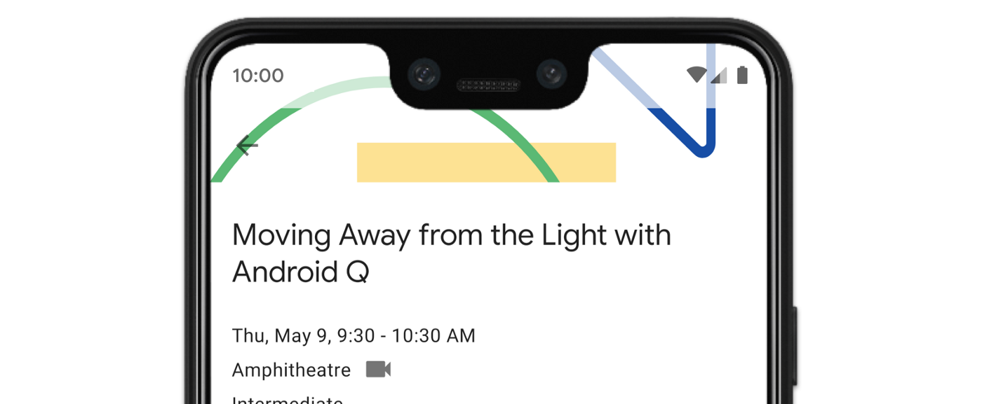
앱의 일부 뷰는 그림 3과 같이 시스템 표시줄 뒤에 그려질 수 있습니다.
인셋에 반응하여 오버랩을 해결할 수 있습니다. 인셋은 화면의 어느 부분이 탐색 메뉴나 상태 표시줄과 같은 시스템 UI와 교차하는지 지정합니다. 교차는 콘텐츠 위에 표시되는 것을 의미할 수 있지만 시스템 동작에 관해 앱에 알릴 수도 있습니다.
앱을 더 넓은 화면으로 표시하는 데 적용되는 인셋 유형은 다음과 같습니다.
시스템 표시줄 인셋: 탭할 수 있고 시스템 표시줄에 의해 시각적으로 가려서는 안 되는 뷰에 가장 적합합니다.
디스플레이 컷아웃 인셋: 기기 모양으로 인해 화면 컷아웃이 있을 수 있는 영역
시스템 동작 인셋: 앱보다 우선순위가 높은 시스템에서 사용하는 동작 탐색 영역입니다.
시스템 표시줄 인셋
시스템 표시줄 인셋은 가장 흔히 사용되는 인셋 유형입니다. 시스템 UI가 앱 위의 Z축에 표시되는 영역을 나타냅니다. 탭할 수 있고 시스템 표시줄에 의해 시각적으로 가려서는 안 되는 앱의 뷰를 이동하거나 패딩하는 데 가장 적합합니다.
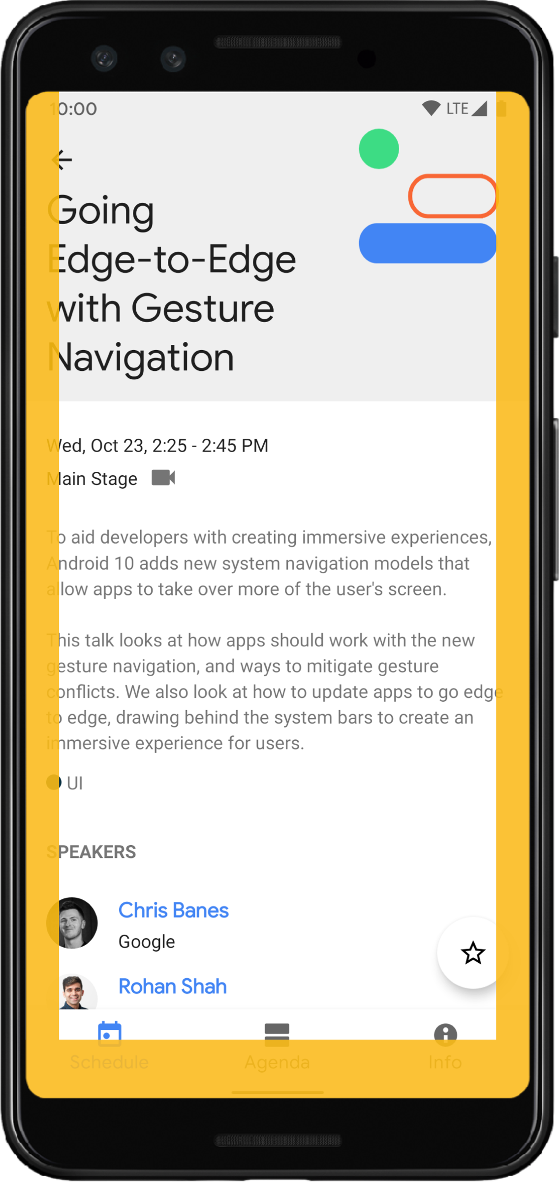
예를 들어 그림 3의 플로팅 작업 버튼 (FAB)은 탐색 메뉴에 의해 부분적으로 가려집니다.
동작 모드 또는 버튼 모드에서 이러한 시각적 중복을 방지하려면 WindowInsetsCompat.Type.systemBars()와 함께 getInsets(int)를 사용하여 뷰의 여백을 늘리면 됩니다.
다음 코드 예는 시스템 표시줄 인셋을 구현하는 방법을 보여줍니다.
Kotlin
ViewCompat.setOnApplyWindowInsetsListener(fab) { v, windowInsets ->
  val insets = windowInsets.getInsets(WindowInsetsCompat.Type.systemBars())
  // Apply the insets as a margin to the view. This solution sets
  // only the bottom, left, and right dimensions, but you can apply whichever
  // insets are appropriate to your layout. You can also update the view padding
  // if that's more appropriate.
  v.updateLayoutParams<MarginLayoutParams> {
      leftMargin = insets.left
      bottomMargin = insets.bottom
      rightMargin = insets.right
  }

  // Return CONSUMED if you don't want the window insets to keep passing
  // down to descendant views.
  WindowInsetsCompat.CONSUMED
}
자바
ViewCompat.setOnApplyWindowInsetsListener(fab, (v, windowInsets) -> {
  Insets insets = windowInsets.getInsets(WindowInsetsCompat.Type.systemBars());
  // Apply the insets as a margin to the view. This solution sets only the
  // bottom, left, and right dimensions, but you can apply whichever insets are
  // appropriate to your layout. You can also update the view padding if that's
  // more appropriate.
  MarginLayoutParams mlp = (MarginLayoutParams) v.getLayoutParams();
  mlp.leftMargin = insets.left;
  mlp.bottomMargin = insets.bottom;
  mlp.rightMargin = insets.right;
  v.setLayoutParams(mlp);

  // Return CONSUMED if you don't want the window insets to keep passing
  // down to descendant views.
    return WindowInsetsCompat.CONSUMED;
});
그림 3에 표시된 예에 이 솔루션을 적용하면 그림 4와 같이 버튼 모드에서 시각적 중복이 발생하지 않습니다.
동작 탐색 모드에도 동일하게 적용됩니다(그림 5 참고).
디스플레이 컷아웃 인셋
일부 기기에는 디스플레이 컷아웃이 있습니다. 일반적으로 컷아웃은 화면 상단에 있으며 상태 표시줄에 포함됩니다. 기기 화면이 가로 모드인 경우 컷아웃이 세로 가장자리에 있을 수 있습니다. 앱이 화면에 표시하는 콘텐츠에 따라 디스플레이 컷아웃을 피하기 위해 패딩을 구현해야 합니다. 기본적으로 앱은 디스플레이 컷아웃에 그려지기 때문입니다.
예를 들어 많은 앱 화면에 항목 목록이 표시됩니다. 디스플레이 컷아웃이나 시스템 표시줄로 목록 항목을 가리지 마세요.
Kotlin
ViewCompat.setOnApplyWindowInsetsListener(binding.recyclerView) { v, insets ->
  val bars = insets.getInsets(
    WindowInsetsCompat.Type.systemBars()
      or WindowInsetsCompat.Type.displayCutout()
  )
  v.updatePadding(
    left = bars.left,
    top = bars.top,
    right = bars.right,
    bottom = bars.bottom,
  )
  WindowInsetsCompat.CONSUMED
}
자바
ViewCompat.setOnApplyWindowInsetsListener(mBinding.recyclerView, (v, insets) -> {
  Insets bars = insets.getInsets(
    WindowInsetsCompat.Type.systemBars()
    | WindowInsetsCompat.Type.displayCutout()
  );
  v.setPadding(bars.left, bars.top, bars.right, bars.bottom);
  return WindowInsetsCompat.CONSUMED;
});
시스템 표시줄과 디스플레이 컷아웃 유형의 논리적 or를 취하여 WindowInsetsCompat 값을 결정합니다.
clipToPadding을 RecyclerView로 설정하여 패딩이 목록 항목과 함께 스크롤되도록 합니다. 이렇게 하면 사용자가 스크롤할 때 항목이 시스템 표시줄 뒤로 이동할 수 있습니다(다음 예 참고).
<androidx.recyclerview.widget.RecyclerView
    android:id="@+id/recycler_view"
    android:layout_width="match_parent"
    android:layout_height="match_parent"
    android:clipToPadding="false"
    app:layoutManager="androidx.recyclerview.widget.LinearLayoutManager" />
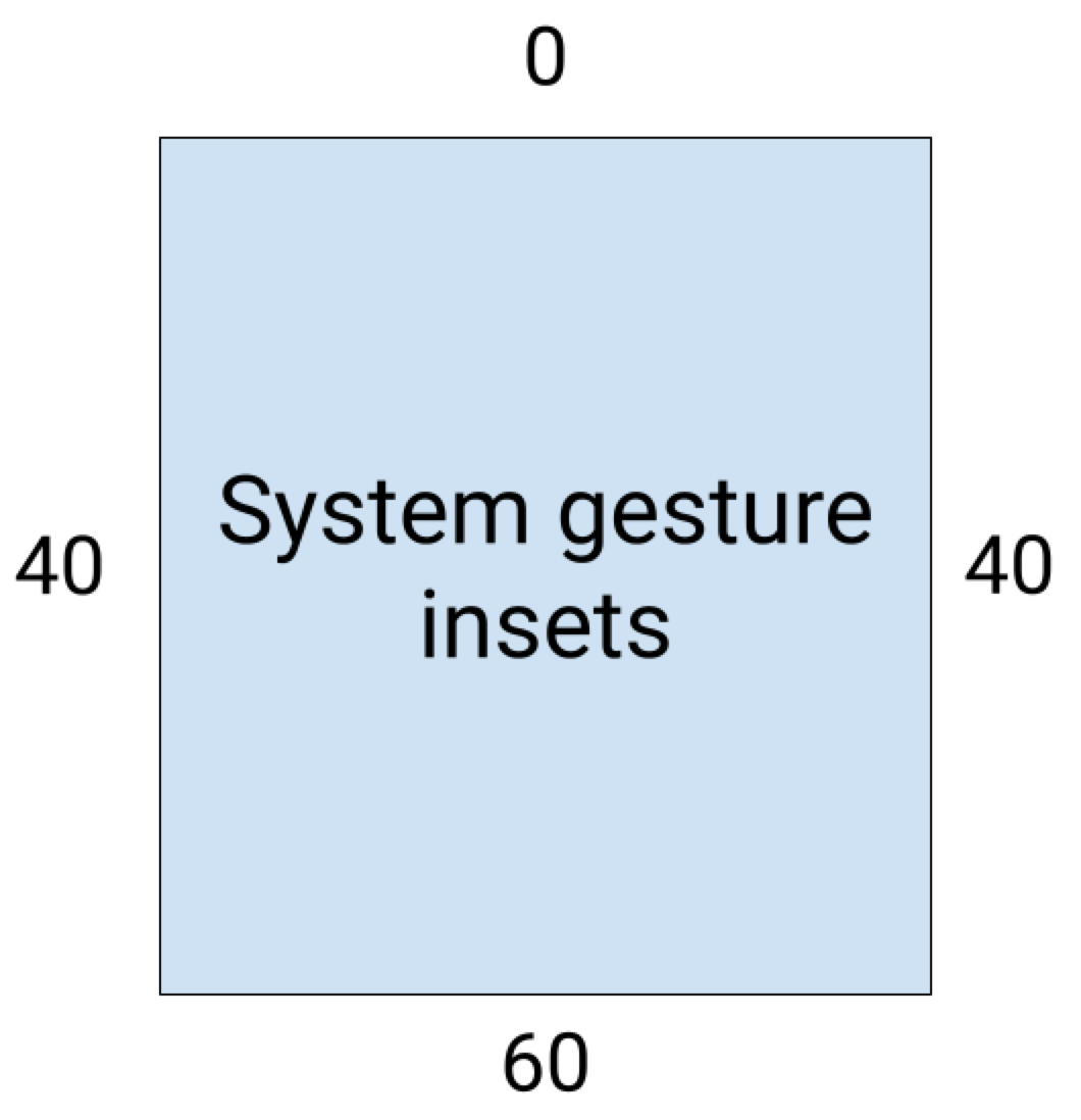
시스템 동작 인셋
시스템 동작 인셋은 시스템 동작이 앱보다 우선하는 창 영역을 나타냅니다. 이러한 영역은 그림 6에 주황색으로 표시되어 있습니다.
시스템 표시줄 인셋과 마찬가지로 WindowInsetsCompat.Type.systemGestures()와 함께 getInsets(int)를 사용하여 시스템 동작 인셋이 겹치지 않도록 할 수 있습니다.
이러한 인셋을 사용하여 스와이프 가능한 뷰를 가장자리에서 멀리 이동하거나 패딩합니다. 일반적인 사용 사례로는 하단 시트, 게임에서의 스와이프, ViewPager2를 사용하여 구현된 캐러셀이 있습니다.
Android 10 이상에서 시스템 동작 인셋에는 홈 동작의 하단 인셋과 뒤로 동작의 왼쪽 및 오른쪽 인셋이 포함됩니다.
다음 코드 예에서는 시스템 동작 인셋을 구현하는 방법을 보여줍니다.
Kotlin
ViewCompat.setOnApplyWindowInsetsListener(view) { view, windowInsets ->
    val insets = windowInsets.getInsets(WindowInsetsCompat.Type.systemGestures())
    // Apply the insets as padding to the view. Here, set all the dimensions
    // as appropriate to your layout. You can also update the view's margin if
    // more appropriate.
    view.updatePadding(insets.left, insets.top, insets.right, insets.bottom)

    // Return CONSUMED if you don't want the window insets to keep passing down
    // to descendant views.
    WindowInsetsCompat.CONSUMED
}
자바
ViewCompat.setOnApplyWindowInsetsListener(view, (v, windowInsets) -> {
    Insets insets = windowInsets.getInsets(WindowInsetsCompat.Type.systemGestures());
    // Apply the insets as padding to the view. Here, set all the dimensions
    // as appropriate to your layout. You can also update the view's margin if
    // more appropriate.
    view.setPadding(insets.left, insets.top, insets.right, insets.bottom);

    // Return CONSUMED if you don't want the window insets to keep passing down
    // to descendant views.
    return WindowInsetsCompat.CONSUMED;
});
Material 구성요소
많은 뷰 기반 Android Material 구성요소(com.google.android.material)는 BottomAppBar, BottomNavigationView, NavigationRailView, NavigationView를 비롯한 인셋을 자동으로 처리합니다.
하지만 AppBarLayout은 인셋을 자동으로 처리하지 않습니다. android:fitsSystemWindows="true"을 추가하여 상단 인셋을 처리하세요.
Compose의 Material 구성요소로 인셋을 처리하는 방법을 읽어보세요.
하위 호환 인셋 디스패치
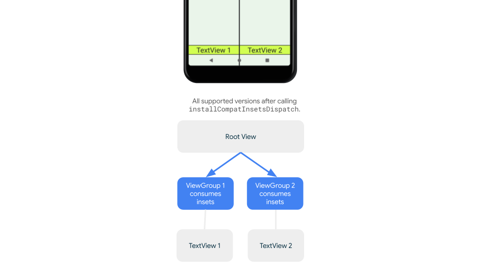
인셋이 하위 뷰로 디스패치되는 것을 중지하고 과도한 패딩을 방지하려면 WindowInsetsCompat.CONSUMED 상수를 사용하여 인셋을 사용하면 됩니다. 하지만 Android 10 (API 수준 29 이하)을 실행하는 기기에서는 WindowInsetsCompat.CONSUMED를 호출한 후 인셋이 형제 요소에 디스패치되지 않아 의도하지 않은 시각적 중복이 발생할 수 있습니다.
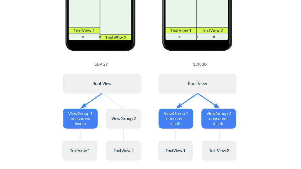
지원되는 모든 Android 버전에서 인셋이 형제 요소에 디스패치되는지 확인하려면 AndroidX Core 및 Core-ktx 1.16.0-alpha01 이상에서 사용할 수 있는 인셋을 사용하기 전에 ViewGroupCompat#installCompatInsetsDispatch를 사용하세요.
Kotlin
// Use the i.d. assigned to your layout's root view, e.g. R.id.main
val rootView = findViewById(R.id.main)
// Call before consuming insets
ViewGroupCompat.installCompatInsetsDispatch(rootView)
자바
// Use the i.d. assigned to your layout's root view, e.g. R.id.main
LinearLayout rootView = findViewById(R.id.main);
// Call before consuming insets
ViewGroupCompat.installCompatInsetsDispatch(rootView);
몰입형 모드
일부 콘텐츠는 전체 화면으로 표시하여 사용자에게 몰입감 있는 환경을 제공하는 것이 좋습니다. WindowInsetsController 및 WindowInsetsControllerCompat 라이브러리를 사용하여 몰입형 모드의 시스템 표시줄을 숨길 수 있습니다.
Kotlin
val windowInsetsController =
      WindowCompat.getInsetsController(window, window.decorView)

// Hide the system bars.
windowInsetsController.hide(Type.systemBars())

// Show the system bars.
windowInsetsController.show(Type.systemBars())
자바
Window window = getWindow();
WindowInsetsControllerCompat windowInsetsController =
      WindowCompat.getInsetsController(window, window.getDecorView());
if (windowInsetsController == null) {
    return;
  }
// Hide the system bars.
windowInsetsController.hide(WindowInsetsCompat.Type.systemBars());

// Show the system bars.
windowInsetsController.show(WindowInsetsCompat.Type.systemBars());
이 기능을 구현하는 방법에 관한 자세한 내용은 몰입형 모드의 시스템 표시줄 숨기기를 참고하세요.
시스템 표시줄 아이콘
enableEdgeToEdge를 호출하면 기기 테마가 변경될 때 시스템 표시줄 아이콘 색상이 업데이트됩니다.
더 넓은 화면으로 전환하는 동안 앱의 배경과 대비되도록 시스템 표시줄 아이콘 색상을 수동으로 업데이트해야 할 수 있습니다. 예를 들어 밝은 상태 표시줄 아이콘을 만들려면 다음을 실행합니다.
Kotlin
WindowCompat.getInsetsController(window, window.decorView)
    .isAppearanceLightStatusBars = false
자바
WindowCompat.getInsetsController(window, window.getDecorView())
    .setAppearanceLightStatusBars(false);
시스템 표시줄 보호
앱이 SDK 35 이상을 타겟팅하면 더 넓은 화면이 적용됩니다.
시스템 상태 표시줄과 동작 탐색 메뉴는 투명하지만 3버튼 탐색 메뉴는 반투명합니다. enableEdgeToEdge를 호출하여 이전 버전과 호환되도록 합니다.
하지만 시스템 기본값이 모든 사용 사례에 적합하지 않을 수 있습니다. 투명 또는 반투명 시스템 표시줄을 사용할지 결정하려면 Android 시스템 표시줄 디자인 안내 및 더 넓은 디자인을 참고하세요.
투명한 시스템 표시줄 만들기
Android 15 (SDK 35) 이상을 타겟팅하거나 이전 버전의 기본 인수로 enableEdgeToEdge()를 호출하여 투명한 상태 표시줄을 만듭니다.
Android 15 이상을 타겟팅하거나 이전 버전의 기본 인수로 enableEdgeToEdge()를 호출하여 투명한 동작 탐색 메뉴를 만듭니다. 3버튼 탐색 메뉴의 경우 Window.setNavigationBarContrastEnforced를 false로 설정합니다. 그렇지 않으면 반투명 스크림이 적용됩니다.
반투명 시스템 표시줄 만들기
반투명 상태 표시줄을 만들려면 다음을 실행하세요.
androidx-core종속 항목을 1.16.0-beta01 이상으로 업데이트합니다.- XML 레이아웃을
androidx.core.view.insets.ProtectionLayout로 래핑하고 ID를 할당합니다. - 프로그래매틱 방식으로
ProtectionLayout에 액세스하여 보호를 설정하고 상태 표시줄의 측면과GradientProtection을 지정합니다.
<androidx.core.view.insets.ProtectionLayout xmlns:android="http://schemas.android.com/apk/res/android" android:id="@+id/list_protection" android:layout_width="match_parent" android:layout_height="match_parent"> <ScrollView android:id="@+id/item_list" android:clipToPadding="false" android:layout_width="match_parent" android:layout_height="match_parent"> <!--items--> </ScrollView> </androidx.core.view.insets.ProtectionLayout>
findViewById<ProtectionLayout>(R.id.list_protection) .setProtections( listOf( GradientProtection( WindowInsetsCompat.Side.TOP, // Ideally, this is the pane's background color paneBackgroundColor ) ) )
GradientProtection에 전달된 ColorInt이 콘텐츠 배경과 일치하는지 확인합니다. 예를 들어 폴더블에 표시된 목록 세부정보 레이아웃에는 목록 패널과 세부정보 패널에 서로 다른 색상의 GradientProtections이 있을 수 있습니다.
반투명 동작 탐색 메뉴를 만들지 마세요. 반투명 3버튼 탐색 메뉴를 만들려면 다음 중 하나를 실행합니다.
ProtectionView로 래핑된 레이아웃이 이미 있는 경우setProtections메서드에 추가ColorProtection또는GradientProtection를 전달할 수 있습니다. 그 전에window.isNavigationBarContrastEnforced = false을 확인하세요.- 그렇지 않으면
window.isNavigationBarContrastEnforced = true로 설정합니다.
기타 팁
인셋을 처리할 때 추가 팁
스크롤 콘텐츠를 더 넓은 화면에 표시
인셋을 처리하고 clipToPadding를 false로 설정하여 마지막 목록 항목이 RecyclerView 또는 NestedScrollView의 시스템 표시줄에 가려지지 않는지 확인합니다.
다음 동영상은 가장자리 대 가장자리 디스플레이가 사용 중지(왼쪽) 및 사용 설정 (오른쪽)된 RecyclerView를 보여줍니다.
코드 샘플은 RecyclerView로 동적 목록 만들기 섹션의 코드 스니펫을 참고하세요.
전체 화면 대화상자를 더 넓은 화면으로 만들기
전체 화면 대화상자를 더 넓게 만들려면 대화상자에서 enableEdgeToEdge를 호출하세요.
Kotlin
class MyAlertDialogFragment : DialogFragment() {
    override fun onStart(){
        super.onStart()
        dialog?.window?.let { WindowCompat.enableEdgeToEdge(it) }
    }
    ...
}
Java
public class MyAlertDialogFragment extends DialogFragment {
    @Override
    public void onStart() {
        super.onStart();
        Dialog dialog = getDialog();
        if (dialog != null) {
            Window window = dialog.getWindow();
            if (window != null) {
                WindowCompat.enableEdgeToEdge(window);
            }
        }
    }
    ...
}
추가 리소스
더 넓은 화면에 관한 자세한 내용은 다음 참고 자료를 참고하세요.
블로그
디자인
기타 문서
동영상