LinearLayout
is a view group that aligns all children in a single direction, vertically or
horizontally. You can specify the layout direction with the
android:orientation
attribute.

LinearLayout with three horizontally
oriented children.
All children of a LinearLayout are stacked one after the other,
so a vertical list only has one child per row, no matter how wide they are. A
horizontal list is only one row high, and it's the height of the tallest child,
plus padding. A LinearLayout respects margins between
children, and the gravity—right, center, or left
alignment—of each child.
Layout weight
LinearLayout also supports assigning a weight to
individual children with the
android:layout_weight
attribute. This attribute assigns an "importance" value to a view in terms of
how much space it occupies on the screen. A larger weight value lets it expand
to fill the remaining space in the parent view. Child views can specify a weight
value, and any remaining space in the view group is assigned to children
proportionately, based on their declared weight. The default weight is zero.
Equal distribution
To create a linear layout in which each child uses the same amount of space
on the screen, set the
android:layout_height
of each view to "0dp" for a vertical layout, or the
android:layout_width
of each view to "0dp" for a horizontal layout. Then set the
android:layout_weight of each view to "1".
Unequal distribution
You can also create linear layouts where the child elements use different amounts of space on the screen. Consider the following examples:
- Suppose you have three text fields: two with a weight value of 1, and a third with the default weight value of 0. The third text field, with the weight value of 0, occupies only the area required by its content. The other two text fields, with the weight value of 1, expand equally to fill the space that remains after the contents of all three fields are measured.
- If instead you have three text fields where two have a weight value of 1 and the third has a weight of 2, then the space that remains after the contents of all three fields are measured is allocated as follows: half to the field with the weight value of 2, and half divided equally between the fields with the weight value of 1.
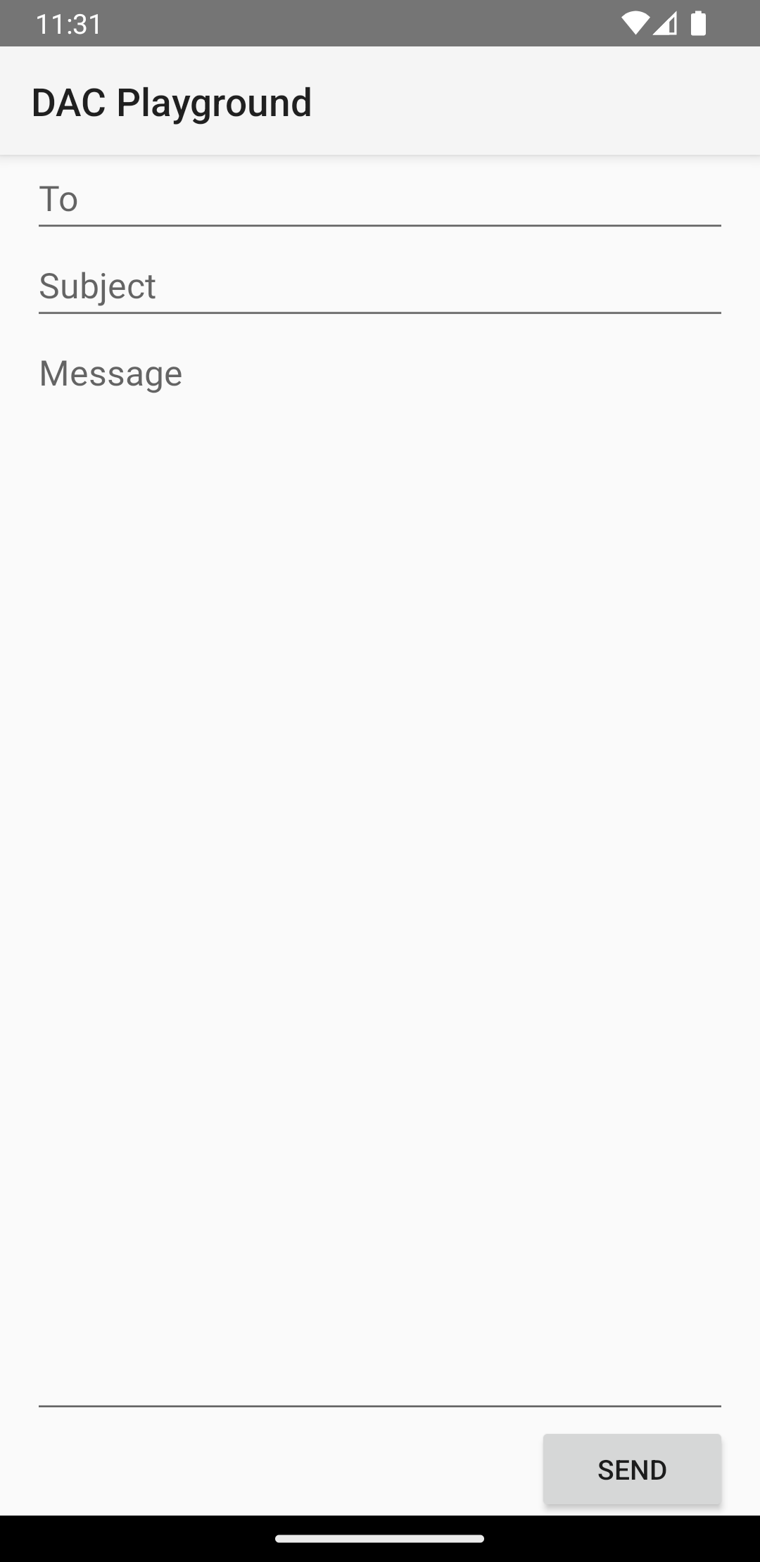
The following figure and code snippet show how layout weights might work in a "send message" activity. The To field, Subject line, and Send button each take up only the height they need. The message area takes up the rest of the activity's height.

LinearLayout.
<?xml version="1.0" encoding="utf-8"?>
<LinearLayout xmlns:android="http://schemas.android.com/apk/res/android"
    android:layout_width="match_parent"
    android:layout_height="match_parent"
    android:paddingLeft="16dp"
    android:paddingRight="16dp"
    android:orientation="vertical" >
    <EditText
        android:layout_width="match_parent"
        android:layout_height="wrap_content"
        android:hint="@string/to" />
    <EditText
        android:layout_width="match_parent"
        android:layout_height="wrap_content"
        android:hint="@string/subject" />
    <EditText
        android:layout_width="match_parent"
        android:layout_height="0dp"
        android:layout_weight="1"
        android:gravity="top"
        android:hint="@string/message" />
    <Button
        android:layout_width="100dp"
        android:layout_height="wrap_content"
        android:layout_gravity="end"
        android:text="@string/send" />
</LinearLayout>
For details about the attributes available to each child view of a
LinearLayout, see
LinearLayout.LayoutParams.

