
לעתים קרובות אפליקציות צריכות להציג נתונים במאגרי מידע עם סגנון דומה, כמו מאגרי מידע שמכילים מידע על הפריטים ברשימה. המערכת מספקת את CardView API כדי להציג מידע בכרטיסים עם מראה עקבי בכל הפלטפורמה. לדוגמה, לכרטיסים יש גובה ברירת מחדל מעל קבוצת התצוגה שמכילה אותם, ולכן המערכת מציירת צללים מתחתיהם. הכרטיסים מאפשרים לכם להכיל קבוצה של תצוגות, תוך שמירה על סגנון עקבי של המאגר.
הוספת יחסי התלות
הווידג'ט CardView הוא חלק מ-AndroidX. כדי להשתמש בו בפרויקט, מוסיפים את התלות הבאה לקובץ build.gradle של מודול האפליקציה:
מגניב
dependencies {
    implementation "androidx.cardview:cardview:1.0.0"
}
Kotlin
dependencies {
    implementation("androidx.cardview:cardview:1.0.0")
}
יצירת כרטיסים
כדי להשתמש ב-CardView, מוסיפים אותו לקובץ הפריסה. אפשר להשתמש בו כקבוצת תצוגות כדי להכיל תצוגות אחרות. בדוגמה הבאה, התג CardView מכיל את התג ImageView וכמה תגי TextViews כדי להציג למשתמש מידע מסוים:
<?xml version="1.0" encoding="utf-8"?>
<androidx.constraintlayout.widget.ConstraintLayout
    xmlns:android="http://schemas.android.com/apk/res/android"
    xmlns:app="http://schemas.android.com/apk/res-auto"
    android:padding="16dp"
    android:background="#E0F7FA"
    android:layout_width="match_parent"
    android:layout_height="match_parent">

    <androidx.cardview.widget.CardView
        android:layout_width="match_parent"
        android:layout_height="wrap_content"
        app:layout_constraintBottom_toBottomOf="parent"
        app:layout_constraintEnd_toEndOf="parent"
        app:layout_constraintStart_toStartOf="parent"
        app:layout_constraintTop_toTopOf="parent">

        <androidx.constraintlayout.widget.ConstraintLayout
            android:padding="4dp"
            android:layout_width="match_parent"
            android:layout_height="match_parent">

            <ImageView
                android:id="@+id/header_image"
                android:layout_width="match_parent"
                android:layout_height="200dp"
                android:src="@drawable/logo"
                app:layout_constraintEnd_toEndOf="parent"
                app:layout_constraintStart_toStartOf="parent"
                app:layout_constraintTop_toTopOf="parent" />

            <TextView
                android:id="@+id/title"
                style="@style/TextAppearance.MaterialComponents.Headline3"
                android:layout_width="match_parent"
                android:layout_height="wrap_content"
                android:layout_marginTop="4dp"
                android:text="I'm a title"
                app:layout_constraintEnd_toEndOf="parent"
                app:layout_constraintStart_toStartOf="parent"
                app:layout_constraintTop_toBottomOf="@id/header_image" />

            <TextView
                android:id="@+id/subhead"
                style="@style/TextAppearance.MaterialComponents.Subtitle2"
                android:layout_width="match_parent"
                android:layout_height="wrap_content"
                android:layout_marginTop="4dp"
                android:text="I'm a subhead"
                app:layout_constraintEnd_toEndOf="parent"
                app:layout_constraintStart_toStartOf="parent"
                app:layout_constraintTop_toBottomOf="@id/title" />

            <TextView
                android:id="@+id/body"
                style="@style/TextAppearance.MaterialComponents.Body1"
                android:layout_width="match_parent"
                android:layout_height="wrap_content"
                android:layout_marginTop="4dp"
                android:text="I'm a supporting text. Very Lorem ipsum dolor sit amet, consectetur adipiscing elit, sed do eiusmod tempor incididunt ut labore et dolore magna aliqua. Ut enim ad minim veniam, quis nostrud exercitation ullamco laboris nisi ut aliquip ex ea commodo consequat. Duis aute irure dolor in reprehenderit in voluptate velit esse cillum dolore eu fugiat nulla pariatur. Excepteur sint occaecat cupidatat non proident, sunt in culpa qui officia deserunt mollit anim id est laborum."
                app:layout_constraintEnd_toEndOf="parent"
                app:layout_constraintStart_toStartOf="parent"
                app:layout_constraintTop_toBottomOf="@id/subhead" />
        </androidx.constraintlayout.widget.ConstraintLayout>
    </androidx.cardview.widget.CardView>
</androidx.constraintlayout.widget.ConstraintLayout>
קטע הקוד הקודם יוצר פלט שדומה לזה שמוצג בהמשך, בהנחה שמשתמשים באותה תמונה של הלוגו של Android:
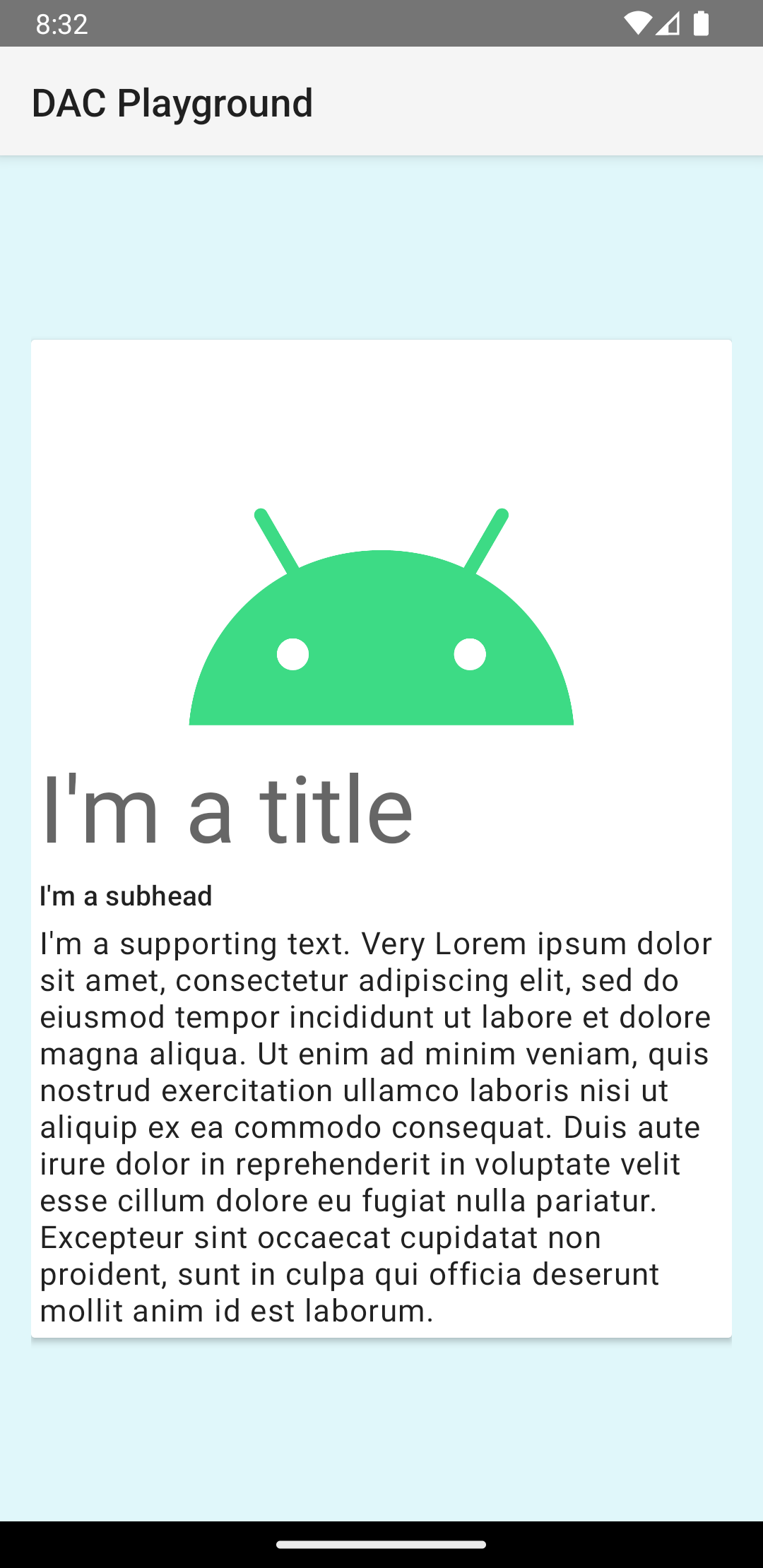
הכרטיס בדוגמה הזו מצויר על המסך עם גובה ברירת מחדל, ולכן המערכת מציירת צל מתחתיו. אפשר לציין גובה מותאם אישית לכרטיס באמצעות המאפיין card_view:cardElevation. לכרטיס בגובה רב יותר יש צל בולט יותר, ולכרטיס בגובה נמוך יותר יש צל בהיר יותר. CardView משתמשת בהגבהה אמיתית ובצללים דינמיים ב-Android מגרסה 5.0 (רמת API 21) ומעלה.
אפשר להשתמש במאפיינים האלה כדי להתאים אישית את המראה של הווידג'ט CardView:
- כדי להגדיר את רדיוס הפינות בפריסות, משתמשים במאפיין
card_view:cardCornerRadius. - כדי להגדיר את רדיוס הפינה בקוד, משתמשים בשיטה
CardView.setRadius. - כדי להגדיר את צבע הרקע של כרטיס, משתמשים במאפיין
card_view:cardBackgroundColor.