تنظيم صفحاتك في مجموعات
يمكنك حفظ المحتوى وتصنيفه حسب إعداداتك المفضّلة.
يمكن أن يظهر الرمز التكيُّفي، أو
AdaptiveIconDrawable،
بشكل مختلف حسب إمكانات الجهاز الفردية وسمات المستخدم. يستخدم مشغّل التطبيقات الرموز التكيّفية بشكل أساسي على الشاشة الرئيسية، ولكن يمكن أيضًا استخدامها في الاختصارات وتطبيق "الإعدادات" ومربّعات حوار المشاركة وشاشة "نظرة عامة". تُستخدَم الرموز التكيُّفية على جميع أشكال أجهزة Android.
وعلى عكس صور
النقاط النقطية، يمكن أن تتكيّف الرموز التكيّفية مع حالات الاستخدام المختلفة، وذلك على النحو التالي:
أشكال مختلفة: يمكن أن يعرض الرمز التكيّفي مجموعة متنوعة من الأشكال
على طُرز الأجهزة المختلفة. على سبيل المثال، يمكن أن يعرض شكلًا دائريًا على جهاز أحد المصنّعين الأصليين، ويعرض شكلًا بيضويًا (شكل بين المربع والدائرة) على جهاز آخر. يجب أن يوفّر كل مصنّع معدّات أصلية للأجهزة قناعًا يستخدمه النظام لعرض جميع الرموز التكيّفية بالشكل نفسه.
الشكل 1. تتيح الرموز التكيّفية استخدام مجموعة متنوعة من الأقنعة التي تختلف من جهاز إلى آخر.
التأثيرات المرئية: يتيح الرمز التكيُّفي مجموعة متنوعة من التأثيرات المرئية الجذابة التي تظهر عندما يضع المستخدمون الرمز أو ينقلونه على الشاشة الرئيسية.
الشكل 2. أمثلة على المؤثرات البصرية التي يعرضها رمز متكيّف
تغيير المظهر من قِبل المستخدم: بدءًا من Android 13 (المستوى 33 لواجهة برمجة التطبيقات)، يمكن للمستخدمين تغيير مظهر الرموز التكيّفية. إذا فعّل المستخدم رموز التطبيقات المتوافقة مع المظهر في إعدادات النظام وكان مشغّل التطبيقات يتيح هذه الميزة، سيستخدم النظام ألوان الخلفية والمظهر اللذين اختارهما المستخدم لتحديد لون التظليل لرموز التطبيقات التي تتضمّن طبقة monochrome في الرمز التكيّفي. اعتبارًا من الإصدار الثاني من Android 16 QPR، يطبّق Android تلقائيًا سمات على رموز التطبيقات التي لا توفّر رموزًا خاصة بها.
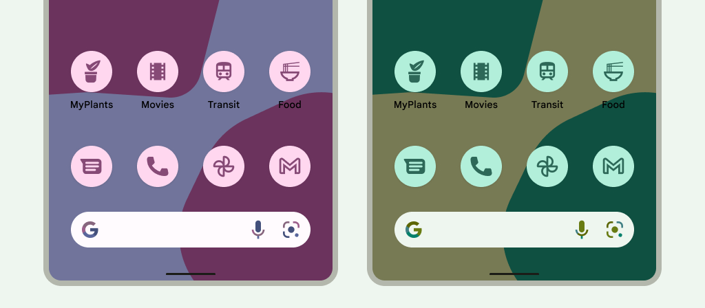
الشكل 3. رموز تكيّفية مستوحاة من خلفية الشاشة والمظاهر التي يختارها المستخدم
في الحالات التالية، لا تعرض الشاشة الرئيسية رمز التطبيق المتوافق مع المظهر، بل تعرض رمز التطبيق التكيّفي أو العادي:
إذا لم يفعّل المستخدم رموز التطبيقات المستوحاة من موضوع معيّن
إذا كان تطبيقك لا يوفّر رمزًا أحادي اللون للتطبيق وكان جهاز المستخدم يعمل بإصدار أقدم من Android 16 QPR 2
إذا كان المشغّل لا يتيح رموز التطبيقات المستوحاة من موضوع معيّن
تصميم رموز تكيّفية
لضمان أنّ الرمز التكيُّفي يتوافق مع الأشكال والتأثيرات المرئية المختلفة وسمات المستخدم، يجب أن يستوفي التصميم المتطلبات التالية:
يجب توفير طبقتَين لنسخة الرمز الملوّنة: طبقة للخلفية وطبقة أخرى للعناصر في المقدّمة. يمكن أن تكون الطبقات متجهات أو صور نقطية، ولكن يُفضّل استخدام المتجهات.
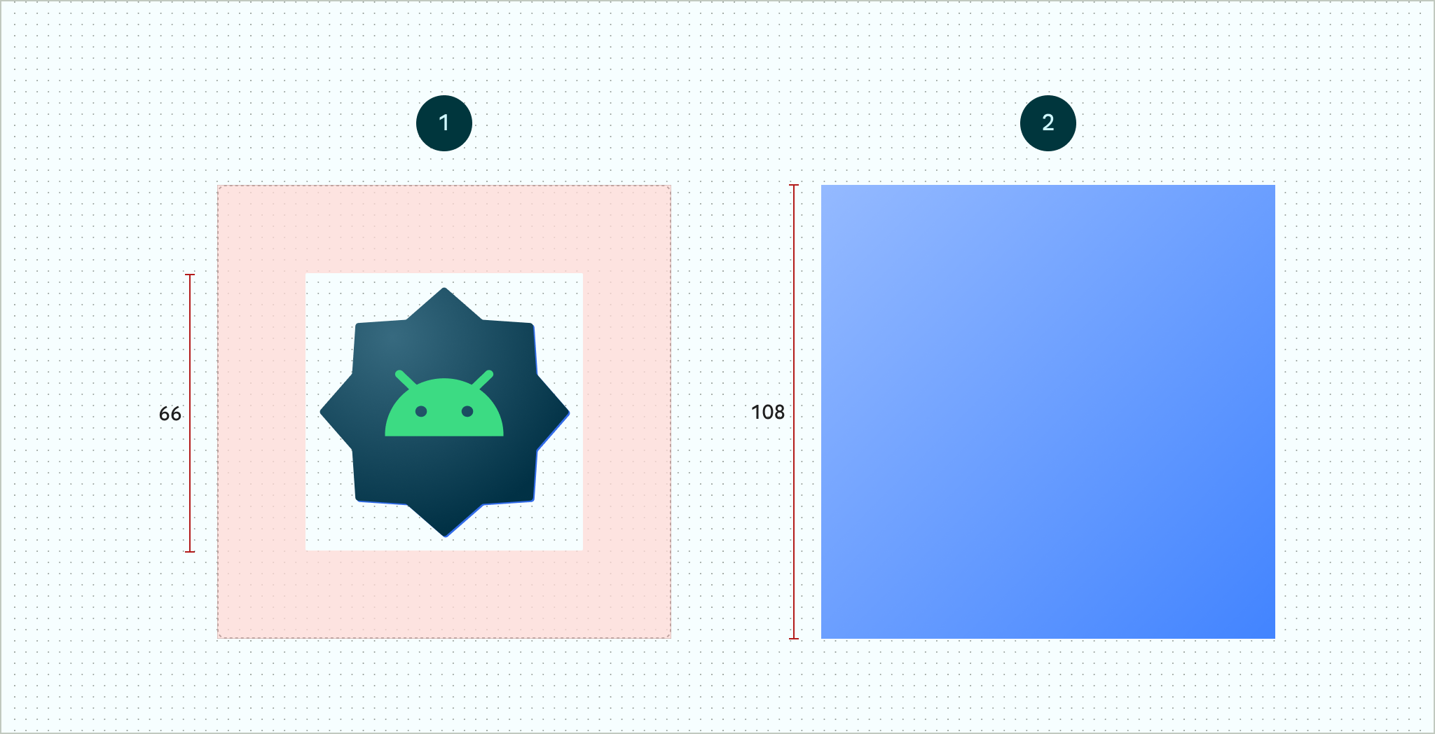
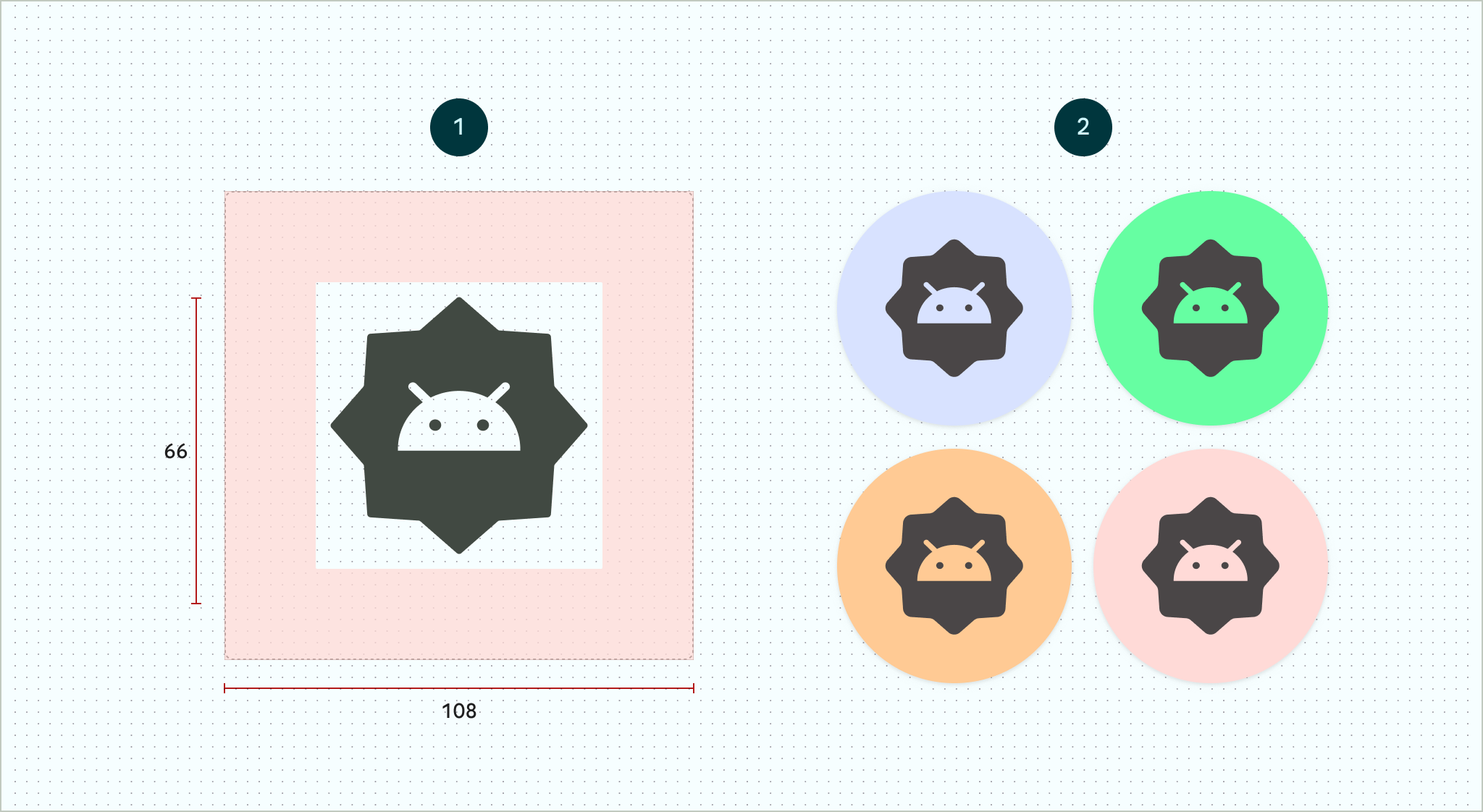
الشكل 4. رموز متكيّفة محدّدة باستخدام طبقات المقدّمة والخلفية المنطقة الآمنة التي تبلغ مساحتها 66 × 66 هي المساحة التي لا يتم اقتصاصها أبدًا بواسطة قناع محدّد الشكل يحدّده المصنّع الأصلي للجهاز.
الشكل 5. مثال على كيفية ظهور الطبقتَين الأمامية والخلفية معًا بعد تطبيق قناع دائري
إذا أردت السماح للمستخدمين بتخصيص رموز التطبيقات، عليك توفير طبقة واحدة لإصدار الرمز أحادي اللون.
الشكل 6. طبقة رمز أحادية اللون (على اليمين) مع أمثلة على معاينات الألوان (على اليسار)
اضبط حجم جميع الطبقات على 108×108 بكسل مستقل الكثافة.
استخدِم رموزًا ذات حواف واضحة. يجب ألا تحتوي الطبقات على أقنعة أو ظلال خلفية حول المخطط التفصيلي للرمز.
استخدِم شعارًا لا يقلّ حجمه عن 48x48 dp. يجب ألا يتجاوز حجمه 66x66 dp،
لأنّ الجزء الداخلي من الرمز بحجم 66x66 dp يظهر ضمن مساحة العرض المقنّعة.
يتم حجز مساحة 18 dp الخارجية على كل جانب من الجوانب الأربعة للطبقات من أجل
إخفاء الأجزاء غير المرئية وإنشاء تأثيرات مرئية، مثل المنظر المجسم أو النبض.
تُستخدَم السمة الاختيارية android:roundIcon من قِبل مشغّلات التطبيقات التي تعرض التطبيقات برموز دائرية، وقد تكون مفيدة إذا كان رمز تطبيقك يتضمّن خلفية دائرية كجزء أساسي من تصميمه. يجب أن تنشئ هذه المشغّلات رموز التطبيقات من خلال تطبيق قناع دائري على android:roundIcon، وقد يتيح لك هذا الضمان تحسين مظهر رمز تطبيقك، مثلاً من خلال تكبير الشعار قليلاً والتأكّد من أنّ الخلفية الدائرية تكون كاملة عند الاقتصاص.
يوضّح مقتطف الرمز التالي كلتا السمتَين، ولكن معظم التطبيقات تحدّد السمة android:icon فقط:
بعد ذلك، احفظ الرمز التكيّفي في res/mipmap-anydpi-v26/ic_launcher.xml. استخدِم العنصر <adaptive-icon> لتحديد موارد الطبقة الأمامية والخلفية والأحادية اللون للرموز. تتوافق العناصر الداخلية <foreground> و<background> و<monochrome> مع صور الرسومات المتجهة والصور النقطية.
يوضّح المثال التالي كيفية تحديد عناصر <foreground> و<background> و<monochrome> داخل <adaptive-icon>:
تستخدم طبقتَا المقدمة والأحادية اللون العنصر القابل للرسم نفسه. ومع ذلك، يمكنك إنشاء عناصر قابلة للرسم منفصلة لكل طبقة إذا لزم الأمر.
يمكنك أيضًا تحديد العناصر القابلة للرسم كعناصر من خلال تضمينها في العناصر
<foreground> و<background> و<monochrome>. تعرض القصاصة التالية مثالاً على كيفية إجراء ذلك باستخدام العنصر القابل للرسم في المقدّمة.
يخضع كل من المحتوى وعيّنات التعليمات البرمجية في هذه الصفحة للتراخيص الموضحّة في ترخيص استخدام المحتوى. إنّ Java وOpenJDK هما علامتان تجاريتان مسجَّلتان لشركة Oracle و/أو الشركات التابعة لها.
تاريخ التعديل الأخير: 2025-08-22 (حسب التوقيت العالمي المتفَّق عليه)
[[["يسهُل فهم المحتوى.","easyToUnderstand","thumb-up"],["ساعَدني المحتوى في حلّ مشكلتي.","solvedMyProblem","thumb-up"],["غير ذلك","otherUp","thumb-up"]],[["لا يحتوي على المعلومات التي أحتاج إليها.","missingTheInformationINeed","thumb-down"],["الخطوات معقدة للغاية / كثيرة جدًا.","tooComplicatedTooManySteps","thumb-down"],["المحتوى قديم.","outOfDate","thumb-down"],["ثمة مشكلة في الترجمة.","translationIssue","thumb-down"],["مشكلة في العيّنات / التعليمات البرمجية","samplesCodeIssue","thumb-down"],["غير ذلك","otherDown","thumb-down"]],["تاريخ التعديل الأخير: 2025-08-22 (حسب التوقيت العالمي المتفَّق عليه)"],[],[],null,["# Adaptive icons\n\nAn adaptive icon, or\n[`AdaptiveIconDrawable`](/reference/android/graphics/drawable/AdaptiveIconDrawable),\ncan display differently depending on individual device capabilities and user\ntheming. Adaptive icons are primarily used by the launcher on the home screen,\nbut they can also be used in shortcuts, the Settings app, sharing dialogs, and\nthe overview screen. Adaptive icons are used across all Android form factors.\n\nIn contrast to [bitmap\nimages](/guide/topics/resources/drawable-resource#Bitmap), adaptive icons can\nadapt to different use cases:\n\n- **Different shapes:** an adaptive icon can display a variety of shapes\n across different device models. For example, it can display a circular shape\n on one OEM device, and display a squircle (a shape between a square and a\n circle) on another device. Each device OEM must provide a mask, which the\n system uses to render all adaptive icons with the same shape.\n\n **Figure 1.** Adaptive icons support a variety of masks, which vary from one device to another.\n- **Visual effects:** an adaptive icon supports a variety of engaging visual\n effects, which display when users place or move the icon around the home\n screen.\n\n **Figure 2.** Examples of visual effects displayed by an adaptive icon. **Note:** Animated visual effects are generated by supported launchers. Visual effects might vary from one launcher to another.\n- **User theming:** starting with Android 13 (API level 33), users can theme\n their adaptive icons. If a user enables themed app icons in their system\n settings, and the launcher supports this feature, the system uses the\n coloring of the user's chosen wallpaper and theme to determine the tint\n color of the app icons for apps that have a `monochrome` layer in their\n adaptive icon. Starting with Android 16 QPR 2, Android automatically themes\n app icons for apps that don't provide their own.\n\n **Figure 3.** Adaptive icons inheriting from the user's wallpaper and themes.\n\n In the following scenarios, the home screen doesn't display the themed\n app icon, and instead displays the adaptive or standard app icon:\n - If the user doesn't enable themed app icons.\n - If your app doesn't provide a monochromatic app icon and the users device runs on an earlier version of Android than Android 16 QPR 2.\n - If the launcher doesn't support themed app icons.\n\nDesign adaptive icons\n---------------------\n\nTo ensure that your adaptive icon supports different shapes, visual effects, and\nuser theming, the design must meet the following requirements:\n\n- You must provide two layers for the color version of the icon: one for the\n foreground, and one for the background. The layers can be either vectors or\n bitmaps, though vectors are preferred.\n\n **Figure 4.** Adaptive icons defined using foreground and background layers. The 66x66 *safe zone* depicted is the area that is never clipped by a shaped mask defined by an OEM. **Figure 5.** An example of how foreground and background layers look together with a circular mask applied.\n- If you want to support user theming of app icons, provide a single layer for\n the monochrome version of the icon.\n\n **Figure 6.** A monochromatic icon layer (left) with examples of color previews (right).\n- Size all layers to 108x108 dp.\n\n- Use icons with clean edges. The layers must not have masks or background\n shadows around the outline of the icon.\n\n- Use a logo that's at least 48x48 dp. It must not exceed 66x66 dp,\n because the inner 66x66 dp of the icon appears within the masked\n viewport.\n\nThe outer 18 dp on each of the four sides of the layers is reserved for\nmasking and to create visual effects such as parallax or pulsing.\n| **Caution:** If you don't update your launcher icon with the necessary layers, the icon neither looks consistent with other icons displayed by the system nor supports visual effects.\n\nTo learn how to create adaptive icons using Android Studio, see our [Android App\nicon Figma\ntemplate](https://www.figma.com/community/file/1131374111452281708)\nor [Android Studio documentation for creating launcher\nicons](/studio/write/image-asset-studio#create-adaptive). Also,\ncheck out the blog post [Designing Adaptive\nIcons](https://medium.com/google-design/designing-adaptive-icons-515af294c783)\n.\n\nAdd your adaptive icon to your app\n----------------------------------\n\nAdaptive icons, just like non-adaptive icons, are specified [using the\n`android:icon` attribute in the app\nmanifest](/guide/topics/manifest/manifest-intro#iconlabel).\n\nAn optional attribute, `android:roundIcon`, is used by launchers that represent\napps with circular icons, and may be useful if your app's icon includes a\ncircular background as a core part of its design. Such launchers are required to\ngenerate app icons by applying a circular mask to `android:roundIcon`, and this\nguarantee may enable you to optimize the appearance of your app icon by, for\nexample, slightly enlarging the logo and ensuring that when cropped, the\ncircular background is full bleed.\n\nThe following code snippet illustrates both of these attributes, but most apps\nonly specify `android:icon`: \n\n```xml\n\u003capplication\n ...\n android:icon=\"@mipmap/ic_launcher\"\n android:roundIcon=\"@mipmap/ic_launcher_round\"\n ...\u003e\n\u003c/application\u003e\n```\n\nNext, save your adaptive icon to `res/mipmap-anydpi-v26/ic_launcher.xml`. Use\nthe `\u003cadaptive-icon\u003e` element to define the foreground, background, and\nmonochromatic layer resources for your icons. The `\u003cforeground\u003e`,\n`\u003cbackground\u003e`, and `\u003cmonochrome\u003e` inner elements support both\nvector and bitmap images.\n\nThe following example shows how to define `\u003cforeground\u003e`, `\u003cbackground\u003e`, and\n`\u003cmonochrome\u003e` elements inside `\u003cadaptive-icon\u003e`: \n\n```xml\n\u003c?xml version=\"1.0\" encoding=\"utf-8\"?\u003e\n...\n\u003cadaptive-icon xmlns:android=\"http://schemas.android.com/apk/res/android\"\u003e\n \u003cbackground android:drawable=\"@drawable/ic_launcher_background\" /\u003e\n \u003cforeground android:drawable=\"@drawable/ic_launcher_foreground\" /\u003e\n \u003cmonochrome android:drawable=\"@drawable/ic_launcher_foreground\" /\u003e\n\u003c/adaptive-icon\u003e\n...\n```\n\nThe foreground and monochrome layers are using the same\ndrawable. However, you can create separate drawables for each layer if needed.\n\nYou can also define drawables as elements by *inlining* them into the\n`\u003cforeground\u003e`, `\u003cbackground\u003e`, and `\u003cmonochrome\u003e` elements. The following\nsnippet shows an example of doing this with the foreground drawable. \n\n```xml\n\u003c?xml version=\"1.0\" encoding=\"utf-8\"?\u003e\n...\n\u003cforeground\u003e\n \u003cinset\n android:insetBottom=\"18dp\"\n android:insetLeft=\"18dp\"\n android:insetRight=\"18dp\"\n android:insetTop=\"18dp\"\u003e\n \u003cshape android:shape=\"oval\"\u003e\n \u003csolid android:color=\"#0000FF\" /\u003e\n \u003c/shape\u003e\n \u003c/inset\u003e\n\u003c/foreground\u003e\n...\n```\n\nIf you want to apply the same mask and visual effect to your shortcuts as\nregular adaptive icons, use one of the following techniques:\n\n- For static shortcuts, use the `\u003cadaptive-icon\u003e` element.\n- For dynamic shortcuts, call the [`createWithAdaptiveBitmap()`](/reference/android/graphics/drawable/Icon#createWithAdaptiveBitmap(android.graphics.Bitmap)) method when you create them.\n\nFor more information about implementing adaptive icons, see [Implementing\nAdaptive\nIcons](https://medium.com/google-developers/implementing-adaptive-icons-1e4d1795470e).\nFor more information about shortcuts, see [App shortcuts\noverview](/guide/topics/ui/shortcuts).\n\nAdditional resources\n--------------------\n\nSee the following resources for additional information about designing and\nimplementing adaptive icons.\n\n- [Figma community page template](https://www.figma.com/community/file/1131374111452281708)\n- [Understanding Android Adaptive Icons](https://medium.com/google-design/understanding-android-adaptive-icons-cee8a9de93e2)\n- [Designing Adaptive Icons](https://medium.com/google-design/designing-adaptive-icons-515af294c783)\n- [Implementing Adaptive Icons](https://medium.com/google-developers/implementing-adaptive-icons-1e4d1795470e)\n- [Create app icons in Android Studio](/studio/write/create-app-icons#create-adaptive)\n- [Google Play icon design specifications](/google-play/resources/icon-design-specifications)"]]