
আপনি যদি View -ভিত্তিক লেআউট ব্যবহার করেন, তাহলে টগল প্রয়োগ করার জন্য তিনটি প্রধান উপায় রয়েছে। আমরা ম্যাটেরিয়াল কম্পোনেন্টস লাইব্রেরি থেকে SwitchMaterial কম্পোনেন্টটি ব্যবহার করার পরামর্শ দিই:
<androidx.constraintlayout.widget.ConstraintLayout xmlns:android="http://schemas.android.com/apk/res/android"
    xmlns:app="http://schemas.android.com/apk/res-auto"
    android:layout_width="match_parent"
    android:layout_height="match_parent"
    android:padding="16dp">

    <com.google.android.material.switchmaterial.SwitchMaterial
        android:id="@+id/material_switch"
        android:layout_width="wrap_content"
        android:layout_height="wrap_content"
        android:text="@string/material_switch"
        app:layout_constraintEnd_toEndOf="parent"
        app:layout_constraintStart_toStartOf="parent"
        app:layout_constraintTop_toTopOf="parent" />

</androidx.constraintlayout.widget.ConstraintLayout>
লিগ্যাসি অ্যাপগুলি এখনও পুরানো SwitchCompat AppCompat কম্পোনেন্ট ব্যবহার করতে পারে, যেমনটি নিম্নলিখিত উদাহরণে দেখানো হয়েছে:
<androidx.constraintlayout.widget.ConstraintLayout xmlns:android="http://schemas.android.com/apk/res/android"
    xmlns:app="http://schemas.android.com/apk/res-auto"
    android:layout_width="match_parent"
    android:layout_height="match_parent"
    android:padding="16dp">

    <androidx.appcompat.widget.SwitchCompat
        android:id="@+id/switchcompat"
        android:layout_width="wrap_content"
        android:layout_height="wrap_content"
        android:text="@string/switchcompat"
        app:layout_constraintEnd_toEndOf="parent"
        app:layout_constraintStart_toStartOf="parent"
        app:layout_constraintTop_toTopOf="parent" />

</androidx.constraintlayout.widget.ConstraintLayout>
নিম্নলিখিত উদাহরণটি AppCompatToggleButton দেখাচ্ছে, যেটি আরেকটি লিগ্যাসি কম্পোনেন্ট এবং যার UI লক্ষণীয়ভাবে ভিন্ন:
<androidx.constraintlayout.widget.ConstraintLayout xmlns:android="http://schemas.android.com/apk/res/android"
    xmlns:app="http://schemas.android.com/apk/res-auto"
    android:layout_width="match_parent"
    android:layout_height="match_parent"
    android:padding="16dp">

    <TextView
        android:id="@+id/toggle_button_label"
        android:layout_width="wrap_content"
        android:layout_height="wrap_content"
        app:layout_constraintStart_toStartOf="parent"
        app:layout_constraintEnd_toStartOf="@id/toggle"
        app:layout_constraintHorizontal_chainStyle="packed"
        app:layout_constraintBaseline_toBaselineOf="@id/toggle"
        android:text="@string/toggle_button" />

    <androidx.appcompat.widget.AppCompatToggleButton
        android:id="@+id/toggle"
        android:layout_width="wrap_content"
        android:layout_height="wrap_content"
        app:layout_constraintEnd_toEndOf="parent"
        app:layout_constraintStart_toEndOf="@id/toggle_button_label"
        app:layout_constraintTop_toTopOf="parent"
        app:layout_constraintBottom_toBottomOf="parent"/>

</androidx.constraintlayout.widget.ConstraintLayout>
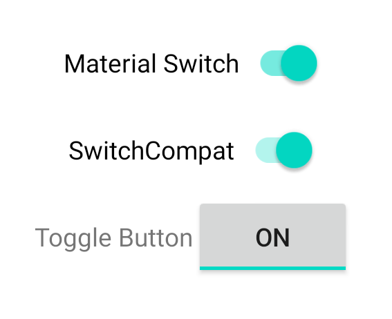
এই তিনটি কম্পোনেন্ট একই আচরণ প্রদান করে কিন্তু দেখতে ভিন্ন। SwitchMaterial এবং SwitchCompat মধ্যে পার্থক্য সূক্ষ্ম, কিন্তু AppCompatToggleButton লক্ষণীয়ভাবে আলাদা:
অবস্থার পরিবর্তন পরিচালনা করুন
SwitchMaterial , SwitchCompat , এবং AppCompatToggleButton সবগুলোই CompoundButton এর সাবক্লাস, যা এদেরকে চেক্ট অবস্থার পরিবর্তন হ্যান্ডেল করার জন্য একটি সাধারণ মেকানিজম প্রদান করে। আপনি CompoundButton.OnCheckedChangeListener এর একটি ইনস্ট্যান্স ইমপ্লিমেন্ট করে সেটিকে বাটনে যুক্ত করবেন, যেমনটি নিচের উদাহরণে দেখানো হয়েছে:
কোটলিন
class MainActivity : AppCompatActivity() {
    override fun onCreate(savedInstanceState: Bundle?) {
        super.onCreate(savedInstanceState)

        val binding: SwitchLayoutBinding = SwitchLayoutBinding.inflate(layoutInflater)
        setContentView(binding.root)

        binding.materialSwitch.setOnCheckedChangeListener { _, isChecked ->
            if (isChecked) {
                // The switch is checked.
            } else {
                // The switch isn't checked.
            }
        }
    }
}
জাভা
public class MainActivity extends AppCompatActivity {

    @Override
    protected void onCreate(Bundle savedInstanceState) {
        super.onCreate(savedInstanceState);

        SwitchLayoutBinding binding = SwitchLayoutBinding.inflate(getLayoutInflater());
        setContentView(binding.getRoot());

        binding.materialSwitch.setOnCheckedChangeListener((buttonView, isChecked) -> {
            if (isChecked) {
                // The switch is checked.
            } else {
                // The switch isn't checked.
            }
        });
    }
}
CompoundButton.OnCheckedChangeListener হলো একটি একক অ্যাবস্ট্রাক্ট মেথড ইন্টারফেস (বা SAM ইন্টারফেস ), তাই আপনি এটিকে একটি ল্যাম্বডা হিসেবে ইমপ্লিমেন্ট করতে পারেন। যখনই চেক্ট অবস্থা পরিবর্তিত হয়, তখনই ল্যাম্বডাটি কল করা হয় এবং ল্যাম্বডাতে পাস করা isChecked বুলিয়ানের মানটি নতুন চেক্ট অবস্থা নির্দেশ করে।