
زر الإجراء الرئيسي (FAB) هو زر دائري يؤدي إلى تنفيذ الإجراء الأساسي في واجهة مستخدِم تطبيقك. يوضّح هذا المستند كيفية إضافة زر الإجراء الرئيسي (FAB) إلى تنسيقك، وتخصيص بعض مظهره، والاستجابة للنقرات على الزر.
لمزيد من المعلومات حول كيفية تصميم زر الإجراء الرئيسي (FAB) لتطبيقك وفقًا لإرشادات التصميم المتعدد الأبعاد، يُرجى الاطّلاع على مستند زر الإجراء الرئيسي (FAB) في التصميم المتعدد الأبعاد.
إضافة زر الإجراء الرئيسي إلى التصميم
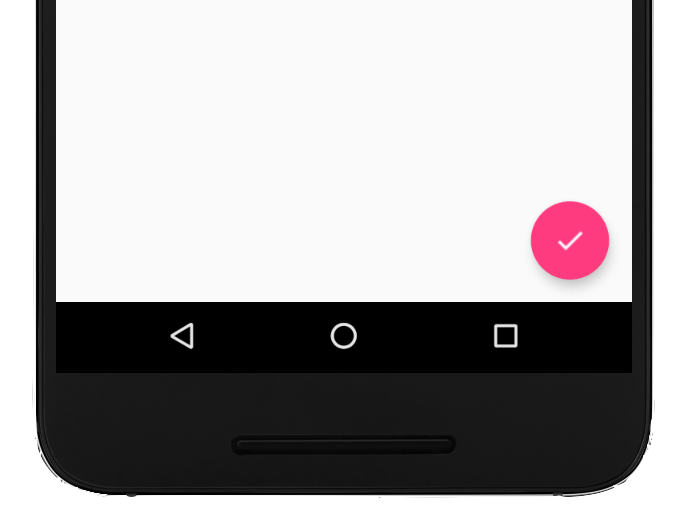
يوضّح الرمز التالي كيفية ظهور
FloatingActionButton
في ملف التنسيق:
<com.google.android.material.floatingactionbutton.FloatingActionButton
        android:id="@+id/fab"
        android:layout_width="wrap_content"
        android:layout_height="wrap_content"
        android:layout_gravity="end|bottom"
        android:src="@drawable/ic_my_icon"
        android:contentDescription="@string/submit"
        android:layout_margin="16dp" />
يتم تلقائيًا تلوين زر الإجراء الرئيسي (FAB) باستخدام السمة colorAccent، التي يمكنك
تخصيصها باستخدام لوحة ألوان المظهر.
يمكنك ضبط خصائص أخرى لزر الإجراء الرئيسي (FAB) باستخدام سمات تنسيق XML أو الطرق المقابلة، مثل ما يلي:
- حجم زر الإجراء الرئيسي (FAB)، باستخدام السمة
app:fabSizeأو الطريقةsetSize() - لون تأثير التموج في زر الإجراء الرئيسي (FAB)، باستخدام السمة
app:rippleColorأو الطريقةsetRippleColor() - رمز زر الإجراء الرئيسي (FAB)، باستخدام السمة
android:srcأو الطريقةsetImageDrawable()
الاستجابة للنقرات على الزر
يمكنك بعد ذلك تطبيق
View.OnClickListener للتعامل مع النقرات على زر الإجراء الرئيسي. على سبيل المثال، يعرض الرمز التالي
Snackbar عندما
ينقر المستخدِم على زر الإجراء الرئيسي (FAB):
Kotlin
val fab: View = findViewById(R.id.fab)
fab.setOnClickListener { view ->
    Snackbar.make(view, "Here's a Snackbar", Snackbar.LENGTH_LONG)
            .setAction("Action", null)
            .show()
}
Java
FloatingActionButton fab = findViewById(R.id.fab);
fab.setOnClickListener(new View.OnClickListener() {
    @Override
    public void onClick(View view) {
        Snackbar.make(view, "Here's a Snackbar", Snackbar.LENGTH_LONG)
                .setAction("Action", null).show();
    }
});
لمزيد من المعلومات حول إمكانات زر الإجراء الرئيسي (FAB)، يُرجى الاطّلاع على مرجع واجهة برمجة التطبيقات
لـ
FloatingActionButton.