

使用者介面元件可透過回應使用者互動的方式,向裝置使用者提供回饋。每個元件都有專屬的互動回應方式,可協助使用者瞭解互動情形。舉例來說,如果使用者在裝置的觸控螢幕上輕觸某個按鈕,該按鈕可能會以某種方式改變,例如加上醒目顯示顏色。這項變化可讓使用者知道自己已輕觸該按鈕。如果使用者不想輕觸按鈕,就可以先將手指移到旁邊再放開,以免觸發按鈕事件。
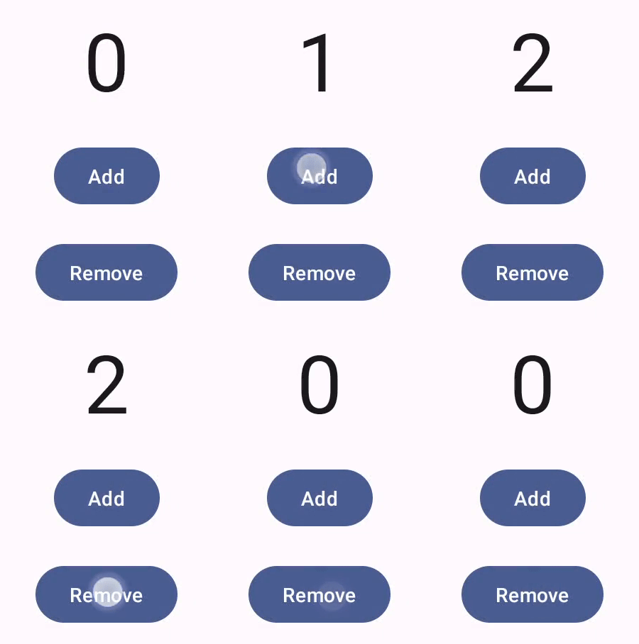

Compose 手勢說明文件講解了 Compose 元件處理低層級指標事件的方式,例如指標移動和點選事件。Compose 預設會將這些低層級事件化用為較高層級的操作,比如一連串指標事件累加起來,可能會產生點選再放開按鈕的效果。瞭解這些較高層級的簡化作業後,您就可以自訂使用者介面回應使用者的方式。例如,您可以自訂使用者與元件互動時的元件外觀變化,或者保留使用者動作記錄。本文件將提供所需資訊,協助您修改標準 UI 元素或自行設計 UI 元素。
互動
在許多情況下,您不必瞭解 Compose 元件對使用者互動的解讀結果。舉例來說,Button 要使用 Modifier.clickable 才能判斷使用者是否點選了按鈕。如要在應用程式中加入一般按鈕,您可以定義按鈕的 onClick 程式碼,而 Modifier.clickable 會視情況執行該程式碼。也就是說,您不必瞭解使用者是否輕觸螢幕或透過鍵盤選取按鈕。Modifier.clickable 會知道使用者執行了點選動作,並執行 onClick 程式碼以做出回應。
不過,如果您要自訂使用者介面元件對使用者行為的回應方式,可能得進一步瞭解背後的運作原理。本節將提供這方面的說明。
當使用者與 UI 元件互動時,系統會產生多個 Interaction 事件來表示其行為。舉例來說,如果使用者輕觸某個按鈕,該按鈕就會產生 PressInteraction.Press。如果使用者在按鈕範圍內放開手指,系統就會產生 PressInteraction.Release,讓按鈕知道點選動作已完成。另一方面,如果使用者將手指拖曳到按鈕範圍外才放開手指,按鈕就會產生 PressInteraction.Cancel,表示按下按鈕的動作已取消而並未完成。
這類互動無預設立場。也就是說,這些低層級互動事件不會解讀使用者動作的意義或順序,也不會解讀這類動作的優先順序。
這類互動通常成對,分別為起始互動和結尾互動。第二個互動包含第一個互動的參照。舉例來說,假如使用者輕觸按鈕後放開手指,輕觸動作會產生 PressInteraction.Press 互動,而放開動作會產生 PressInteraction.Release。Release 具有用於識別初始 PressInteraction.Press 的 press 屬性。
您可以觀察特定元件的 InteractionSource 以瞭解其互動。InteractionSource 是根據 Kotlin 流程建構而成,因此您可以像使用任何其他流程一樣,透過 Kotlin 流程收集互動。如要進一步瞭解這項設計決策,請參閱「照亮互動」網誌文章。
互動狀態
您也可以自行追蹤互動,藉此擴充元件的內建功能,比如讓按鈕在受到點選時變色。如要追蹤互動,最簡單的方法就是觀察相應的互動「狀態」。InteractionSource 提供多種顯示各種互動狀態的方法。舉例來說,如要瞭解使用者是否按下了特定按鈕,您可以呼叫其 InteractionSource.collectIsPressedAsState() 方法:
val interactionSource = remember { MutableInteractionSource() } val isPressed by interactionSource.collectIsPressedAsState() Button( onClick = { /* do something */ }, interactionSource = interactionSource ) { Text(if (isPressed) "Pressed!" else "Not pressed") }
除了 collectIsPressedAsState() 以外,Compose 還提供 collectIsFocusedAsState()、collectIsDraggedAsState() 和 collectIsHoveredAsState()。這些方法實際上是根據較低層級 InteractionSource API 建構而成的簡便方法。在某些情況下,建議您直接使用這些較低層級的函式。
舉例來說,假設您必須瞭解使用者是否按下了按鈕,以及是否「也」拖曳了手指。如果您同時使用 collectIsPressedAsState() 和 collectIsDraggedAsState(),Compose 會執行許多重複的工作,而且您接收到的互動順序不一定正確。在這類情況下,建議您直接使用 InteractionSource。如要進一步瞭解如何使用 InteractionSource 自行追蹤互動,請參閱「使用 InteractionSource」。
下節將說明如何分別透過 InteractionSource 和 MutableInteractionSource 消耗及發出互動。
取用及發出 Interaction
InteractionSource 代表 Interactions 的唯讀串流,無法將 Interaction 發送至 InteractionSource。如要發出 Interaction,您需要使用 MutableInteractionSource,後者會從 InteractionSource 擴充。
修飾符和元件可以取用、發出或取用並發出 Interactions。
以下章節說明如何從修飾符和元件取用及發出互動。
消耗修飾符範例
如要使用修飾符繪製焦點狀態的邊框,您只需要觀察 Interactions,因此可以接受 InteractionSource:
fun Modifier.focusBorder(interactionSource: InteractionSource): Modifier { // ... }
從函式簽章可以看出,這個修飾符是「消費者」,可以消耗 Interactions,但無法發出。
產生修飾符範例
如要使用處理懸停事件的修飾符 (例如 Modifier.hoverable),您需要發出 Interactions,並接受 MutableInteractionSource 做為參數:
fun Modifier.hover(interactionSource: MutableInteractionSource, enabled: Boolean): Modifier { // ... }
這個修飾符是「產生器」,可使用提供的 MutableInteractionSource 在指標懸停或取消懸停時發出 HoverInteractions。
建構可取用及產生內容的元件
Material Button 等高階元件同時扮演生產者和消費者。這些事件會處理輸入和焦點事件,也會因應這些事件變更外觀,例如顯示漣漪或為高度設定動畫。因此,這些函式會直接將 MutableInteractionSource 做為參數公開,方便您提供自己的記憶體執行個體:
@Composable fun Button( onClick: () -> Unit, modifier: Modifier = Modifier, enabled: Boolean = true, // exposes MutableInteractionSource as a parameter interactionSource: MutableInteractionSource? = null, elevation: ButtonElevation? = ButtonDefaults.elevatedButtonElevation(), shape: Shape = MaterialTheme.shapes.small, border: BorderStroke? = null, colors: ButtonColors = ButtonDefaults.buttonColors(), contentPadding: PaddingValues = ButtonDefaults.ContentPadding, content: @Composable RowScope.() -> Unit ) { /* content() */ }
這樣一來,您就能將 MutableInteractionSource「提升」至元件外,並觀察元件產生的所有 Interaction。您可以藉此控制該元件或 UI 中任何其他元件的外觀。
如果您要建構自己的互動式高階元件,建議您以這種方式將 MutableInteractionSource 做為參數公開。除了遵循狀態提升最佳做法,這也有助於讀取及控制元件的視覺狀態,方式與讀取及控制任何其他類型的狀態 (例如啟用狀態) 相同。
Compose 採用分層架構方法,因此高階 Material 元件是建構在基礎建構區塊之上,這些區塊會產生控制波紋和其他視覺效果所需的 Interaction。基礎程式庫提供高階互動修飾符,例如 Modifier.hoverable、Modifier.focusable 和 Modifier.draggable。
如要建構可回應懸停事件的元件,只要使用 Modifier.hoverable 並傳遞 MutableInteractionSource 做為參數即可。只要懸停在元件上,就會發出 HoverInteraction,您可以利用這個方式變更元件的顯示方式。
// This InteractionSource will emit hover interactions val interactionSource = remember { MutableInteractionSource() } Box( Modifier .size(100.dp) .hoverable(interactionSource = interactionSource), contentAlignment = Alignment.Center ) { Text("Hello!") }
如要讓這個元件也能成為焦點,可以新增 Modifier.focusable,並傳遞相同的 MutableInteractionSource 做為參數。現在,HoverInteraction.Enter/Exit 和 FocusInteraction.Focus/Unfocus 都會透過相同的 MutableInteractionSource 發出,您可以在同一個位置自訂這兩種類型互動的外觀:
// This InteractionSource will emit hover and focus interactions val interactionSource = remember { MutableInteractionSource() } Box( Modifier .size(100.dp) .hoverable(interactionSource = interactionSource) .focusable(interactionSource = interactionSource), contentAlignment = Alignment.Center ) { Text("Hello!") }
Modifier.clickable 是比 hoverable 和 focusable 更高層級的抽象概念,因為元件可點選就表示可懸停,而可點選的元件也應可聚焦。您可以使用 Modifier.clickable 建立可處理懸停、焦點和按壓互動的元件,不必組合較低層級的 API。如要讓元件也可供點選,可以將 hoverable 和 focusable 替換為 clickable:
// This InteractionSource will emit hover, focus, and press interactions val interactionSource = remember { MutableInteractionSource() } Box( Modifier .size(100.dp) .clickable( onClick = {}, interactionSource = interactionSource, // Also show a ripple effect indication = ripple() ), contentAlignment = Alignment.Center ) { Text("Hello!") }
與 InteractionSource 合作
如需元件互動的低層級資訊,可以為該元件的 InteractionSource 使用標準流程 API。舉例來說,假設您要保有 InteractionSource 的按下和拖曳互動清單。以下程式碼會執行一半的工作,在發生新的按下互動時立即將其加入清單中:
val interactionSource = remember { MutableInteractionSource() } val interactions = remember { mutableStateListOf<Interaction>() } LaunchedEffect(interactionSource) { interactionSource.interactions.collect { interaction -> when (interaction) { is PressInteraction.Press -> { interactions.add(interaction) } is DragInteraction.Start -> { interactions.add(interaction) } } } }
不過,除了新增互動以外,您也必須在互動結束後移除互動,例如在使用者將手指從元件上放開後。這很簡單,因為結尾互動一律包含相關聯起始互動的參照。以下程式碼顯示如何移除已結束的互動:
val interactionSource = remember { MutableInteractionSource() } val interactions = remember { mutableStateListOf<Interaction>() } LaunchedEffect(interactionSource) { interactionSource.interactions.collect { interaction -> when (interaction) { is PressInteraction.Press -> { interactions.add(interaction) } is PressInteraction.Release -> { interactions.remove(interaction.press) } is PressInteraction.Cancel -> { interactions.remove(interaction.press) } is DragInteraction.Start -> { interactions.add(interaction) } is DragInteraction.Stop -> { interactions.remove(interaction.start) } is DragInteraction.Cancel -> { interactions.remove(interaction.start) } } } }
現在,如要瞭解元件目前是否處於按下或拖曳狀態,只要查看 interactions 是否為空白即可:
val isPressedOrDragged = interactions.isNotEmpty()
如要瞭解最近一次的互動為何,只要查看清單中的最後一個項目即可。舉例來說,以下程式碼顯示 Compose 漣漪實作項目如何瞭解要用於最近互動的適當狀態重疊:
val lastInteraction = when (interactions.lastOrNull()) { is DragInteraction.Start -> "Dragged" is PressInteraction.Press -> "Pressed" else -> "No state" }
由於所有 Interaction 都遵循相同結構,因此處理不同類型的使用者互動時,程式碼差異不大,整體模式相同。
請注意,本節中的先前範例代表使用 State 的互動 Flow,因此方便觀察更新的值,因為讀取狀態值會自動導致重組。不過,組合會在每個影格前批次處理。也就是說,如果狀態在同一影格內先變更,然後又變回原狀,觀察狀態的元件就不會看到變更。
這對互動來說很重要,因為互動通常會在同一個影格內開始和結束。舉例來說,使用先前的 Button 範例:
val interactionSource = remember { MutableInteractionSource() } val isPressed by interactionSource.collectIsPressedAsState() Button(onClick = { /* do something */ }, interactionSource = interactionSource) { Text(if (isPressed) "Pressed!" else "Not pressed") }
如果按壓動作在同一影格內開始和結束,文字就不會顯示為「Pressed!」。在大多數情況下,這並非問題,因為顯示這麼短時間的視覺效果會導致閃爍,使用者也不太會注意到。在某些情況下 (例如顯示漣漪效果或類似動畫),您可能希望效果至少顯示一段時間,而不是在按鈕不再按下時立即停止。如要這麼做,您可以直接在 collect lambda 內啟動及停止動畫,不必寫入狀態。「使用動畫邊框建構進階 Indication」一節中提供這個模式的範例。
範例:使用自訂互動處理方式建構元件
想瞭解如何建構包含自訂輸入回應的元件,請參考以下這個修改過的按鈕範例。在本範例中,假設您想在使用者按下按鈕時變更按鈕外觀:

為此,請根據 Button 建構自訂可組合項,並讓該可組合項利用額外的 icon 參數繪製圖示 (在這個範例中為購物車圖示)。您要呼叫 collectIsPressedAsState() 追蹤使用者是否將滑鼠游標懸停在按鈕上。如果是的話,就加入圖示。程式碼如下所示:
@Composable fun PressIconButton( onClick: () -> Unit, icon: @Composable () -> Unit, text: @Composable () -> Unit, modifier: Modifier = Modifier, interactionSource: MutableInteractionSource? = null ) { val isPressed = interactionSource?.collectIsPressedAsState()?.value ?: false Button( onClick = onClick, modifier = modifier, interactionSource = interactionSource ) { AnimatedVisibility(visible = isPressed) { if (isPressed) { Row { icon() Spacer(Modifier.size(ButtonDefaults.IconSpacing)) } } } text() } }
使用上述新可組合項後,程式碼將如下所示:
PressIconButton( onClick = {}, icon = { Icon(Icons.Filled.ShoppingCart, contentDescription = null) }, text = { Text("Add to cart") } )
這個新的 PressIconButton 是以現有 Material Button 為基礎,因此會照常回應使用者互動。使用者按下按鈕後,按鈕的不透明度會稍微改變,就像一般的 Material Button 一樣。
使用 Indication 建立及套用可重複使用的自訂效果
在先前的章節中,您已瞭解如何因應不同的 Interaction 變更元件的一部分,例如在按下時顯示圖示。您也可以使用相同方法,變更提供給元件的參數值,或變更元件內顯示的內容,但這只適用於個別元件。應用程式或設計系統通常會提供有狀態視覺效果的通用系統,以便對所有元件套用一致的效果。
如果您要建構這類設計系統,可能會因為下列原因,難以自訂一個元件,然後將自訂項目重複用於其他元件:
- 設計系統中的每個元件都需要相同的樣板
- 很容易忘記將這項效果套用至新建立的元件和自訂可點選元件
- 自訂效果可能難以與其他效果合併使用
如要避免這些問題,並在系統中輕鬆調整自訂元件的大小,可以使用 Indication。Indication 代表可重複使用的視覺效果,可套用至應用程式或設計系統中的元件。Indication 分成兩部分:
IndicationNodeFactory:工廠,用於建立Modifier.Node例項,為元件算繪視覺效果。如果實作方式較簡單,且不會在元件之間變更,則這可以是單例模式 (物件),並在整個應用程式中重複使用。這些執行個體可以是有狀態或無狀態。由於這些屬性是依元件建立,因此可以從
CompositionLocal擷取值,以變更特定元件內的外觀或行為,就像任何其他Modifier.Node一樣。Modifier.indication: 為元件繪製Indication的修飾符。Modifier.clickable和其他高階互動修飾符會直接接受指標參數,因此不僅會發出Interaction,還能為發出的Interaction繪製視覺效果。因此,在簡單的情況下,您只要使用Modifier.clickable,不需要Modifier.indication。
以 Indication 取代效果
本節說明如何將套用至特定按鈕的手動縮放效果,替換為可在多個元件中重複使用的等效指標。
下列程式碼會建立按鈕,按下時會向下縮放:
val interactionSource = remember { MutableInteractionSource() } val isPressed by interactionSource.collectIsPressedAsState() val scale by animateFloatAsState(targetValue = if (isPressed) 0.9f else 1f, label = "scale") Button( modifier = Modifier.scale(scale), onClick = { }, interactionSource = interactionSource ) { Text(if (isPressed) "Pressed!" else "Not pressed") }
如要將上述程式碼片段中的縮放效果轉換為 Indication,請按照下列步驟操作:
建立負責套用縮放效果的
Modifier.Node。 附加節點後,節點會觀察互動來源,與先前的範例類似。這裡唯一的差別在於,它會直接啟動動畫,而不是將傳入的互動轉換為狀態。節點需要實作
DrawModifierNode,才能覆寫ContentDrawScope#draw(),並使用與 Compose 中任何其他 Graphics API 相同的繪圖指令,算繪縮放效果。從
ContentDrawScope接收器呼叫drawContent()可用的項目,即可繪製Indication應套用的實際元件,因此您只需要在縮放轉換中呼叫這個函式即可。請確保Indication實作項目一律會在某個時間點呼叫drawContent(),否則您套用Indication的元件不會繪製。private class ScaleNode(private val interactionSource: InteractionSource) : Modifier.Node(), DrawModifierNode { var currentPressPosition: Offset = Offset.Zero val animatedScalePercent = Animatable(1f) private suspend fun animateToPressed(pressPosition: Offset) { currentPressPosition = pressPosition animatedScalePercent.animateTo(0.9f, spring()) } private suspend fun animateToResting() { animatedScalePercent.animateTo(1f, spring()) } override fun onAttach() { coroutineScope.launch { interactionSource.interactions.collectLatest { interaction -> when (interaction) { is PressInteraction.Press -> animateToPressed(interaction.pressPosition) is PressInteraction.Release -> animateToResting() is PressInteraction.Cancel -> animateToResting() } } } } override fun ContentDrawScope.draw() { scale( scale = animatedScalePercent.value, pivot = currentPressPosition ) { this@draw.drawContent() } } }
建立
IndicationNodeFactory。其唯一責任是為提供的互動來源建立新的節點執行個體。由於沒有任何參數可設定指標,因此工廠可以是物件:object ScaleIndication : IndicationNodeFactory { override fun create(interactionSource: InteractionSource): DelegatableNode { return ScaleNode(interactionSource) } override fun equals(other: Any?): Boolean = other === ScaleIndication override fun hashCode() = 100 }
Modifier.clickable會在內部使用Modifier.indication,因此如要使用ScaleIndication建立可點選的元件,只要將Indication做為參數提供給clickable即可:Box( modifier = Modifier .size(100.dp) .clickable( onClick = {}, indication = ScaleIndication, interactionSource = null ) .background(Color.Blue), contentAlignment = Alignment.Center ) { Text("Hello!", color = Color.White) }
這也方便使用自訂
Indication建構可重複使用的高階元件,例如按鈕可能如下所示:@Composable fun ScaleButton( onClick: () -> Unit, modifier: Modifier = Modifier, enabled: Boolean = true, interactionSource: MutableInteractionSource? = null, shape: Shape = CircleShape, content: @Composable RowScope.() -> Unit ) { Row( modifier = modifier .defaultMinSize(minWidth = 76.dp, minHeight = 48.dp) .clickable( enabled = enabled, indication = ScaleIndication, interactionSource = interactionSource, onClick = onClick ) .border(width = 2.dp, color = Color.Blue, shape = shape) .padding(horizontal = 16.dp, vertical = 8.dp), horizontalArrangement = Arrangement.Center, verticalAlignment = Alignment.CenterVertically, content = content ) }
接著,您可以透過下列方式使用按鈕:
ScaleButton(onClick = {}) { Icon(Icons.Filled.ShoppingCart, "") Spacer(Modifier.padding(10.dp)) Text(text = "Add to cart!") }
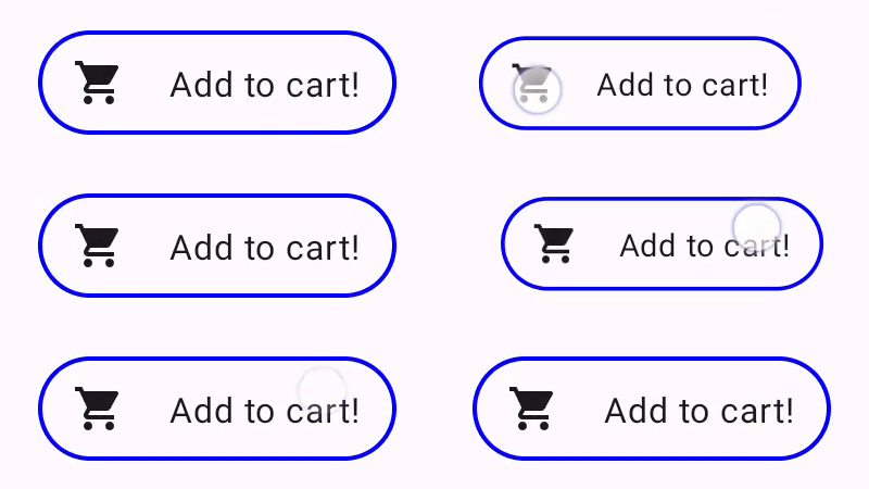
Indication 建構的按鈕。建構具有動畫邊框的進階 Indication
Indication 不僅限於轉換效果,例如縮放元件。由於 IndicationNodeFactory 會傳回 Modifier.Node,因此您可以像使用其他繪圖 API 一樣,在內容上方或下方繪製任何效果。舉例來說,您可以繪製元件周圍的動畫邊框,並在按下元件時,在元件頂端疊加內容:
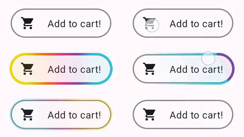
Indication 繪製的動畫邊框效果。這裡的 Indication 實作方式與先前的範例非常相似,只是建立含有某些參數的節點。由於動畫邊框取決於元件的形狀和邊框,因此 Indication 實作也需要提供形狀和邊框寬度做為參數:Indication
data class NeonIndication(private val shape: Shape, private val borderWidth: Dp) : IndicationNodeFactory { override fun create(interactionSource: InteractionSource): DelegatableNode { return NeonNode( shape, // Double the border size for a stronger press effect borderWidth * 2, interactionSource ) } }
即使繪圖程式碼較為複雜,Modifier.Node 的實作概念也相同。與先前一樣,這個函式會在附加時觀察 InteractionSource,啟動動畫,並實作 DrawModifierNode,在內容頂端繪製效果:
private class NeonNode( private val shape: Shape, private val borderWidth: Dp, private val interactionSource: InteractionSource ) : Modifier.Node(), DrawModifierNode { var currentPressPosition: Offset = Offset.Zero val animatedProgress = Animatable(0f) val animatedPressAlpha = Animatable(1f) var pressedAnimation: Job? = null var restingAnimation: Job? = null private suspend fun animateToPressed(pressPosition: Offset) { // Finish any existing animations, in case of a new press while we are still showing // an animation for a previous one restingAnimation?.cancel() pressedAnimation?.cancel() pressedAnimation = coroutineScope.launch { currentPressPosition = pressPosition animatedPressAlpha.snapTo(1f) animatedProgress.snapTo(0f) animatedProgress.animateTo(1f, tween(450)) } } private fun animateToResting() { restingAnimation = coroutineScope.launch { // Wait for the existing press animation to finish if it is still ongoing pressedAnimation?.join() animatedPressAlpha.animateTo(0f, tween(250)) animatedProgress.snapTo(0f) } } override fun onAttach() { coroutineScope.launch { interactionSource.interactions.collect { interaction -> when (interaction) { is PressInteraction.Press -> animateToPressed(interaction.pressPosition) is PressInteraction.Release -> animateToResting() is PressInteraction.Cancel -> animateToResting() } } } } override fun ContentDrawScope.draw() { val (startPosition, endPosition) = calculateGradientStartAndEndFromPressPosition( currentPressPosition, size ) val brush = animateBrush( startPosition = startPosition, endPosition = endPosition, progress = animatedProgress.value ) val alpha = animatedPressAlpha.value drawContent() val outline = shape.createOutline(size, layoutDirection, this) // Draw overlay on top of content drawOutline( outline = outline, brush = brush, alpha = alpha * 0.1f ) // Draw border on top of overlay drawOutline( outline = outline, brush = brush, alpha = alpha, style = Stroke(width = borderWidth.toPx()) ) } /** * Calculates a gradient start / end where start is the point on the bounding rectangle of * size [size] that intercepts with the line drawn from the center to [pressPosition], * and end is the intercept on the opposite end of that line. */ private fun calculateGradientStartAndEndFromPressPosition( pressPosition: Offset, size: Size ): Pair<Offset, Offset> { // Convert to offset from the center val offset = pressPosition - size.center // y = mx + c, c is 0, so just test for x and y to see where the intercept is val gradient = offset.y / offset.x // We are starting from the center, so halve the width and height - convert the sign // to match the offset val width = (size.width / 2f) * sign(offset.x) val height = (size.height / 2f) * sign(offset.y) val x = height / gradient val y = gradient * width // Figure out which intercept lies within bounds val intercept = if (abs(y) <= abs(height)) { Offset(width, y) } else { Offset(x, height) } // Convert back to offsets from 0,0 val start = intercept + size.center val end = Offset(size.width - start.x, size.height - start.y) return start to end } private fun animateBrush( startPosition: Offset, endPosition: Offset, progress: Float ): Brush { if (progress == 0f) return TransparentBrush // This is *expensive* - we are doing a lot of allocations on each animation frame. To // recreate a similar effect in a performant way, it would be better to create one large // gradient and translate it on each frame, instead of creating a whole new gradient // and shader. The current approach will be janky! val colorStops = buildList { when { progress < 1 / 6f -> { val adjustedProgress = progress * 6f add(0f to Blue) add(adjustedProgress to Color.Transparent) } progress < 2 / 6f -> { val adjustedProgress = (progress - 1 / 6f) * 6f add(0f to Purple) add(adjustedProgress * MaxBlueStop to Blue) add(adjustedProgress to Blue) add(1f to Color.Transparent) } progress < 3 / 6f -> { val adjustedProgress = (progress - 2 / 6f) * 6f add(0f to Pink) add(adjustedProgress * MaxPurpleStop to Purple) add(MaxBlueStop to Blue) add(1f to Blue) } progress < 4 / 6f -> { val adjustedProgress = (progress - 3 / 6f) * 6f add(0f to Orange) add(adjustedProgress * MaxPinkStop to Pink) add(MaxPurpleStop to Purple) add(MaxBlueStop to Blue) add(1f to Blue) } progress < 5 / 6f -> { val adjustedProgress = (progress - 4 / 6f) * 6f add(0f to Yellow) add(adjustedProgress * MaxOrangeStop to Orange) add(MaxPinkStop to Pink) add(MaxPurpleStop to Purple) add(MaxBlueStop to Blue) add(1f to Blue) } else -> { val adjustedProgress = (progress - 5 / 6f) * 6f add(0f to Yellow) add(adjustedProgress * MaxYellowStop to Yellow) add(MaxOrangeStop to Orange) add(MaxPinkStop to Pink) add(MaxPurpleStop to Purple) add(MaxBlueStop to Blue) add(1f to Blue) } } } return linearGradient( colorStops = colorStops.toTypedArray(), start = startPosition, end = endPosition ) } companion object { val TransparentBrush = SolidColor(Color.Transparent) val Blue = Color(0xFF30C0D8) val Purple = Color(0xFF7848A8) val Pink = Color(0xFFF03078) val Orange = Color(0xFFF07800) val Yellow = Color(0xFFF0D800) const val MaxYellowStop = 0.16f const val MaxOrangeStop = 0.33f const val MaxPinkStop = 0.5f const val MaxPurpleStop = 0.67f const val MaxBlueStop = 0.83f } }
主要差異在於,現在使用 animateToResting() 函式時,動畫有最短時間限制,因此即使立即放開按鈕,按鈕動畫仍會繼續播放。此外,系統也會處理 animateToPressed 開始時的多次快速按壓。如果在現有按壓或靜止動畫期間發生按壓,系統會取消先前的動畫,並從頭開始按壓動畫。如要支援多個並行效果 (例如漣漪,新的漣漪動畫會繪製在其他漣漪上方),您可以追蹤清單中的動畫,而不是取消現有動畫並啟動新動畫。
為您推薦
- 注意:系統會在 JavaScript 關閉時顯示連結文字
- 瞭解手勢
- 適用於 Jetpack Compose 的 Kotlin
- Material Design 元件和版面配置