
以降のセクションでは、Glance を使用して基本的なアプリ ウィジェットを作成する方法について説明します。
マニフェストで AppWidget を宣言する
設定手順を完了したら、アプリで AppWidget とその
メタデータを宣言します。
GlanceAppWidgetReceiverからAppWidgetレシーバを拡張します。class MyAppWidgetReceiver : GlanceAppWidgetReceiver() { override val glanceAppWidget: GlanceAppWidget = TODO("Create GlanceAppWidget") }
AndroidManifest.xmlファイルと関連するメタデータ ファイルで、アプリ ウィジェットのプロバイダを登録します。<receiver android:name=".glance.MyReceiver" android:exported="true"> <intent-filter> <action android:name="android.appwidget.action.APPWIDGET_UPDATE" /> </intent-filter> <meta-data android:name="android.appwidget.provider" android:resource="@xml/my_app_widget_info" /> </receiver>
AppWidgetProviderInfo メタデータを追加する
次に、ウィジェットを作成するガイドに沿って、@xml/my_app_widget_info ファイルでアプリ
ウィジェット情報を定義します。
Glance の唯一の違いは、initialLayout XML がないことですが、定義する必要があります。ライブラリで提供されている事前定義済みの読み込みレイアウトを使用できます。
<appwidget-provider xmlns:android="http://schemas.android.com/apk/res/android"
android:initialLayout="@layout/glance_default_loading_layout">
</appwidget-provider>
AppWidgetProviderInfo XML を宣言する
AppWidgetProviderInfo オブジェクトは、ウィジェットの重要な特性を定義します。<appwidget-provider> 要素内の XML メタデータ リソース ファイル
(res/xml/my_app_widget_info.xml)で AppWidgetProviderInfo を定義します。
<appwidget-provider xmlns:android="http://schemas.android.com/apk/res/android"
    android:minWidth="40dp"
    android:minHeight="40dp"
    android:targetCellWidth="1"
    android:targetCellHeight="1"
    android:maxResizeWidth="250dp"
    android:maxResizeHeight="120dp"
    android:updatePeriodMillis="86400000"
    android:description="@string/example_appwidget_description"
    android:previewLayout="@layout/example_appwidget_preview"
    android:initialLayout="@layout/glance_default_loading_layout"
    android:configure="com.example.android.ExampleAppWidgetConfigurationActivity"
    android:resizeMode="horizontal|vertical"
    android:widgetCategory="home_screen"
    android:widgetFeatures="reconfigurable|configuration_optional">
</appwidget-provider>
ウィジェットのサイズ設定属性
デフォルトのホーム画面では、アプリ ウィジェットは高さと幅が定義されたセルのグリッドに基づいてウィンドウ内に配置されます。ほとんどのホーム画面では、ウィジェットのサイズはグリッドセルの整数倍にしかできません(たとえば、横 2 セル、縦 3 セルなど)。
ウィジェットのサイズ設定属性を使用すると、ウィジェットのデフォルト サイズを指定し、ウィジェットのサイズの下限と上限を設定できます。このコンテキストでは、ウィジェットのデフォルト サイズとは、ウィジェットがホーム画面に最初に追加されたときのサイズを指します。
次の表に、ウィジェットのサイズ設定に関連する <appwidget-provider> 属性を示します。
| 属性と説明 | |
|---|---|
targetCellWidth と
targetCellHeight(Android 12)、
minWidth と minHeight |
targetCellWidthと
targetCellHeightをサポートしていない場合にアプリが
minWidthとminHeightを使用するように、targetCellWidthと
targetCellHeight、minWidthと
minHeightの両方の属性を指定することをおすすめします。サポートされている場合、
targetCellWidth 属性と targetCellHeight 属性は、minWidth 属性と minHeight
属性よりも優先されます。
|
minResizeWidth と
minResizeHeight |
ウィジェットの絶対最小サイズを指定します。これらの値は、
ウィジェットが読みにくい、または使用できないサイズを指定します。これらの属性を使用すると、ユーザーはウィジェットのサイズをデフォルトのウィジェット サイズよりも小さいサイズに変更できます。minResizeWidth 属性は minWidth より大きい場合、または水平方向のサイズ変更が有効になっていない場合は無視されます。
をご覧ください。resizeMode同様に、
minResizeHeight 属性が
minHeight より大きい場合、または垂直方向のサイズ変更が有効になっていない場合は無視されます。 |
maxResizeWidth と
maxResizeHeight |
ウィジェットの推奨最大サイズを指定します。値がグリッドセルのサイズの倍数でない場合は、最も近いセルサイズに切り上げられます。maxResizeWidth 属性が minWidth より小さい場合、または水平方向のサイズ変更が有効になっていない場合は無視されます。resizeMode をご覧ください。同様に、
maxResizeHeight 属性が minHeight より小さい場合、または垂直方向のサイズ変更が有効になっていない場合は無視されます。
Android 12 で導入されました。 |
resizeMode |
ウィジェットのサイズを変更できるルールを指定します。この属性を使用すると、ホーム画面のウィジェットのサイズを水平方向、垂直方向、
または両方の軸で変更できます。ユーザーがウィジェットを長押しするとサイズ変更ハンドルが表示され、
縦または横のハンドルをドラッグして
レイアウト グリッド上でサイズを変更できるようになります。`resizeMode` 属性の値には、`horizontal`、`vertical`、`none` があります。ウィジェットを水平方向と垂直方向にサイズ変更可能として宣言するには、horizontal|vertical を使用します。 |
例
前の表の属性がウィジェットのサイズ設定にどのように影響するかを示すために、次の仕様を想定します。
- グリッドセルの幅は 30 dp、高さは 50 dp です。
- 次の属性仕様が提供されています。
<appwidget-provider xmlns:android="http://schemas.android.com/apk/res/android"
    android:minWidth="80dp"
    android:minHeight="80dp"
    android:targetCellWidth="2"
    android:targetCellHeight="2"
    android:minResizeWidth="40dp"
    android:minResizeHeight="40dp"
    android:maxResizeWidth="120dp"
    android:maxResizeHeight="120dp"
    android:resizeMode="horizontal|vertical" />
Android 12 以降:
targetCellWidth 属性と targetCellHeight 属性をウィジェットのデフォルト サイズとして使用します。
ウィジェットのサイズはデフォルトで 2x2 です。ウィジェットのサイズは 2x1 から 4x3 まで変更できます。
Android 11 以前:
minWidth 属性と minHeight 属性を使用して、ウィジェットのデフォルト サイズを計算します。
デフォルトの幅 = Math.ceil(80 / 30) = 3
デフォルトの高さ = Math.ceil(80 / 50) = 2
ウィジェットのサイズはデフォルトで 3x2 です。ウィジェットのサイズは 2x1 から全画面表示まで変更できます。
その他のウィジェット属性
次の表に、ウィジェットのサイズ設定以外の特性に関連する <appwidget-provider> 属性を示します。
| 属性と説明 | |
|---|---|
updatePeriodMillis |
ウィジェット フレームワークが
GlanceAppWidgetReceiver に更新をリクエストする頻度を、onUpdate()
コールバック メソッドを呼び出して定義します。バッテリーを節約するため、更新はできるだけ頻繁に行わないことをおすすめします(1 時間に 1 回以下)。
詳細については、Glance の状態管理のウィジェットを更新するタイミングをご覧ください。 |
initialLayout |
Glance UI コンポジションがレンダリングされる前に、ウィジェットの読み込みレイアウトを定義するレイアウト リソースを指定します。ライブラリで提供されている事前定義済みの読み込みレイアウト(@layout/glance_default_loading_layout)を使用できます。 |
configure |
ユーザーがウィジェットを追加したときに起動する構成アクティビティを定義します。このページのウィジェット構成アクティビティを実装するをご覧ください。 |
description |
ウィジェット選択ツールに表示されるウィジェットの説明を指定します。Android 12 で導入されました。 |
previewLayout(Android 12)と previewImage(Android 11 以前) |
|
autoAdvanceViewId |
ウィジェットのホストによって自動進行されるウィジェット サブビューのビュー ID を指定します。 |
widgetCategory |
ウィジェットをホーム画面
(home_screen)、ロック画面(keyguard)、またはその両方に表示できるかどうかを宣言します。Android 5.0 以降では、home_screen のみが有効です。 |
widgetFeatures |
ウィジェットでサポートされている機能を宣言します。たとえば、ウィジェットの構成が省略可能な場合は、configuration_optional と reconfigurable の両方を指定します。 |
GlanceAppWidget を定義する
GlanceAppWidgetから拡張し、provideGlanceメソッドをオーバーライドする新しいクラスを作成します。これは、ウィジェットのレンダリングに必要なデータを読み込むメソッドです。class MyAppWidget : GlanceAppWidget() { override suspend fun provideGlance(context: Context, id: GlanceId) { // In this method, load data needed to render the AppWidget. // Use `withContext` to switch to another thread for long running // operations. provideContent { // create your AppWidget here Text("Hello World") } } }
GlanceAppWidgetReceiverのglanceAppWidgetでインスタンス化します。class MyAppWidgetReceiver : GlanceAppWidgetReceiver() { // Let MyAppWidgetReceiver know which GlanceAppWidget to use override val glanceAppWidget: GlanceAppWidget = MyAppWidget() }
これで、Glance を使用して AppWidget を構成しました。
GlanceAppWidgetReceiver クラスを使用してウィジェットのブロードキャストを処理する
GlanceAppWidgetReceiver は、基盤となる AppWidgetProvider を拡張することで、ウィジェットのブロードキャストとプラットフォームの状態
の更新を調整します。ウィジェットが更新、削除、有効化、無効化されると、プラットフォーム イベントを受信し、Compose ライフサイクル リクエストに変換します。
マニフェストでウィジェットを宣言する
AndroidManifest.xml ファイルで、GlanceAppWidgetReceiver クラスのサブクラスをブロードキャスト レシーバとして宣言します。
<receiver android:name="ExampleAppWidgetReceiver"
          android:exported="false">
    <intent-filter>
        <action android:name="android.appwidget.action.APPWIDGET_UPDATE" />
    </intent-filter>
    <meta-data android:name="android.appwidget.provider"
               android:resource="@xml/my_app_widget_info" />
</receiver>
<receiver> 要素には、レシーバ クラスを指定する
android:name 属性が必要です。レシーバは、<intent-filter> 内で ACTION_APPWIDGET_UPDATE
ブロードキャスト アクションを受け入れる必要があります。
<meta-data> 要素の名前は
android.appwidget.provider である必要があり、android:resource 属性は
AppWidgetProviderInfo XML メタデータ リソース(@xml/my_app_widget_info)を指している必要があります。
GlanceAppWidgetReceiver クラスを実装する
Glance では、AppWidgetProvider を直接拡張するのではなく、GlanceAppWidgetReceiver
を拡張します。レシーバを GlanceAppWidget インスタンスにリンクして実装します。GlanceAppWidgetReceiver で使用できる主なコールバックは次のように動作します。
onUpdate(): Glance によって自動的にオーバーライドされ、コンポジションの更新を実行します。`onUpdate` を手動でオーバーライドする場合は、Glance がコンポジション スレッドを正常に起動できるように、**`super.onUpdate` を呼び出す必要があります**super.onUpdate。onAppWidgetOptionsChanged(): ウィジェットが最初に配置されたとき、またはサイズ変更されたときに呼び出されます。Glance はオプション バンドル アイテムを内部で読み取るため、レイアウトは実行時のサイズに基づいてシームレスに調整されます。onDeleted(Context, IntArray): ユーザーが特定のウィジェット インスタンスを削除するたびに呼び出されます。onEnabled(Context): ウィジェットの最初のインスタンスが正常に作成されたときにトリガーされます。グローバル移行の実行に最適です。onDisabled(Context): プロバイダの最後のアクティブなインスタンスが削除されたときに呼び出されます。onReceive(Context, Intent): 特定のコールバック メソッドの前にすべてのプラットフォーム ブロードキャストをインターセプトします。作成するカスタム レシーバ ロジック がsuper.onReceive(context, intent)を呼び出すようにする必要があります。Glance は自動的に非同期で処理をルーティングするため、自分でgoAsync呼び出すことはできません。
ウィジェットのブロードキャスト インテントを受け取る
内部的には、GlanceAppWidgetReceiver は次の基本的なプラットフォーム ウィジェット ブロードキャスト インテントをフィルタして処理します。
ACTION_APPWIDGET_UPDATEACTION_APPWIDGET_DELETEDACTION_APPWIDGET_ENABLEDACTION_APPWIDGET_DISABLEDACTION_APPWIDGET_OPTIONS_CHANGED
UI を作成する
次のスニペットは、UI を作成する方法を示しています。
/* Import Glance Composables In the event there is a name clash with the Compose classes of the same name, you may rename the imports per https://kotlinlang.org/docs/packages.html#imports using the `as` keyword. import androidx.glance.Button import androidx.glance.layout.Column import androidx.glance.layout.Row import androidx.glance.text.Text */ class MyAppWidget : GlanceAppWidget() { override suspend fun provideGlance(context: Context, id: GlanceId) { // Load data needed to render the AppWidget. // Use `withContext` to switch to another thread for long running // operations. provideContent { // create your AppWidget here MyContent() } } @Composable private fun MyContent() { Column( modifier = GlanceModifier.fillMaxSize(), verticalAlignment = Alignment.Top, horizontalAlignment = Alignment.CenterHorizontally ) { Text(text = "Where to?", modifier = GlanceModifier.padding(12.dp)) Row(horizontalAlignment = Alignment.CenterHorizontally) { Button( text = "Home", onClick = actionStartActivity<MyActivity>() ) Button( text = "Work", onClick = actionStartActivity<MyActivity>() ) } } } }
上記のコードサンプルは次の処理を行います。
- 最上位の
Columnでは、アイテムが縦に配置されます。 Columnは、使用可能なスペースに合わせてサイズを拡大し(GlanceModifierを使用)、コンテンツを上部 (verticalAlignment)に揃え、水平方向の中央(horizontalAlignment)に配置します。Columnのコンテンツは、ラムダを使用して定義されます。順序が重要です。
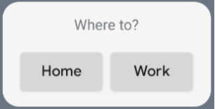
配置の値を変更したり、別の修飾子値(パディングなど)を適用して、コンポーネントの配置とサイズを変更できます。各クラスのコンポーネント、パラメータ、使用可能な 修飾子の完全なリストについては、リファレンス ドキュメントをご覧ください。
角の丸みを実装する
Android 12 では、システム パラメータが導入され、アプリ ウィジェットの角の丸みを動的にカスタマイズできるようになりました。
system_app_widget_background_radius: ウィジェットの背景コンテナの角の丸みを指定します(28 dp を超えることはありません)。- 内側の半径: コンテンツのクリッピングを防ぐため、システム背景のアウトラインに基づいて内側のコンテンツの比例半径を計算します。
systemRadiusValue - widgetPadding
Glance では、GlanceModifier.cornerRadius(android.R.dimen.system_app_widget_background_radius) を使用して、コンポジションで角の丸みのサイズ設定プロパティを動的に適用できます。
Android 11(API レベル 30)以前を搭載しているデバイスとの下位互換性を確保するため、カスタム属性とカスタム テーマ リソースのフォールバックを実装します。
/values/attrs.xml<resources> <attr name="backgroundRadius" format="dimension" /> </resources>/values/styles.xml<resources> <style name="MyWidgetTheme"> <item name="backgroundRadius">@dimen/my_background_radius_dimen</item> </style> </resources>/values-31/styles.xml<resources> <style name="MyWidgetTheme" parent="@android:style/Theme.DeviceDefault.DayNight"> <item name="backgroundRadius">@android:dimen/system_app_widget_background_radius</item> </style> </resources>/drawable/my_widget_background.xml<shape xmlns:android="http://schemas.android.com/apk/res/android" android:shape="rectangle"> <corners android:radius="?attr/backgroundRadius" /> </shape>