

Compose에는 많은 애니메이션 메커니즘이 내장되어 있으며 어떤 것을 선택해야 할지 알기 어려울 수 있습니다. 다음은 일반적인 애니메이션 사용 사례 목록입니다. 사용 가능한 다양한 API 옵션 전체에 관한 자세한 내용은 전체 Compose 애니메이션 문서를 참고하세요.
일반적인 컴포저블 속성에 애니메이션 적용
Compose는 많은 일반적인 애니메이션 사용 사례를 해결할 수 있는 편리한 API를 제공합니다. 이 섹션에서는 컴포저블의 일반적인 속성에 애니메이션을 적용하는 방법을 보여줍니다.
나타남 / 사라짐 애니메이션 처리

AnimatedVisibility를 사용하여 컴포저블을 숨기거나 표시합니다. AnimatedVisibility 내의 하위 요소는 자체 시작 또는 종료 전환에 Modifier.animateEnterExit()를 사용할 수 있습니다.
var visible by remember { mutableStateOf(true) } // Animated visibility will eventually remove the item from the composition once the animation has finished. AnimatedVisibility(visible) { // your composable here // ... }
AnimatedVisibility의 enter 및 exit 매개변수를 사용하면 컴포저블이 표시되고 사라질 때의 동작을 구성할 수 있습니다. 자세한 내용은 전체 문서를 참고하세요.
컴포저블의 가시성을 애니메이션화하는 또 다른 옵션은 animateFloatAsState를 사용하여 시간 경과에 따라 알파를 애니메이션화하는 것입니다.
var visible by remember { mutableStateOf(true) } val animatedAlpha by animateFloatAsState( targetValue = if (visible) 1.0f else 0f, label = "alpha" ) Box( modifier = Modifier .size(200.dp) .graphicsLayer { alpha = animatedAlpha } .clip(RoundedCornerShape(8.dp)) .background(colorGreen) .align(Alignment.TopCenter) ) { }
그러나 알파를 변경하면 컴포저블이 컴포지션에 남아 배치된 공간을 계속 차지한다는 점에 유의해야 합니다. 이로 인해 스크린 리더 및 기타 접근성 메커니즘이 화면의 항목을 계속 고려할 수 있습니다. 반면 AnimatedVisibility는 결국 컴포지션에서 항목을 삭제합니다.

배경 색상 애니메이션 처리

val animatedColor by animateColorAsState( if (animateBackgroundColor) colorGreen else colorBlue, label = "color" ) Column( modifier = Modifier.drawBehind { drawRect(animatedColor) } ) { // your composable here }
이 옵션은 Modifier.background()를 사용하는 것보다 성능이 더 좋습니다.
Modifier.background()는 일회성 색상 설정에 적합하지만, 시간에 따라 색상에 애니메이션을 적용할 때는 필요 이상으로 많은 재구성이 발생할 수 있습니다.
배경 색상에 무한 애니메이션을 적용하려면 애니메이션 반복 섹션을 참고하세요.
컴포저블 크기 애니메이션 처리

Compose를 사용하면 몇 가지 방법으로 컴포저블 크기에 애니메이션을 적용할 수 있습니다. 컴포저블 크기 변경 간 애니메이션에는 animateContentSize()를 사용합니다.
예를 들어 한 줄에서 여러 줄로 확장할 수 있는 텍스트가 포함된 상자가 있는 경우 Modifier.animateContentSize()를 사용하여 더 부드러운 전환을 구현할 수 있습니다.
var expanded by remember { mutableStateOf(false) } Box( modifier = Modifier .background(colorBlue) .animateContentSize() .height(if (expanded) 400.dp else 200.dp) .fillMaxWidth() .clickable( interactionSource = remember { MutableInteractionSource() }, indication = null ) { expanded = !expanded } ) { }
AnimatedContent를 SizeTransform와 함께 사용하여 크기 변경이 어떻게 이루어져야 하는지 설명할 수도 있습니다.
컴포저블 위치 애니메이션 처리

컴포저블의 위치에 애니메이션을 적용하려면 Modifier.offset{ }를 animateIntOffsetAsState()와 함께 사용합니다.
var moved by remember { mutableStateOf(false) } val pxToMove = with(LocalDensity.current) { 100.dp.toPx().roundToInt() } val offset by animateIntOffsetAsState( targetValue = if (moved) { IntOffset(pxToMove, pxToMove) } else { IntOffset.Zero }, label = "offset" ) Box( modifier = Modifier .offset { offset } .background(colorBlue) .size(100.dp) .clickable( interactionSource = remember { MutableInteractionSource() }, indication = null ) { moved = !moved } )
위치나 크기에 애니메이션을 적용할 때 컴포저블이 다른 컴포저블 위나 아래에 그려지지 않도록 하려면 Modifier.layout{ }를 사용합니다. 이 수정자는 크기 및 위치 변경사항을 상위 요소에 전파하고, 이는 다른 하위 요소에 영향을 미칩니다.
예를 들어 Column 내에서 Box를 이동하고 Box가 이동할 때 다른 하위 요소도 이동해야 하는 경우 다음과 같이 Modifier.layout{ }를 사용하여 오프셋 정보를 포함합니다.
var toggled by remember { mutableStateOf(false) } val interactionSource = remember { MutableInteractionSource() } Column( modifier = Modifier .padding(16.dp) .fillMaxSize() .clickable(indication = null, interactionSource = interactionSource) { toggled = !toggled } ) { val offsetTarget = if (toggled) { IntOffset(150, 150) } else { IntOffset.Zero } val offset = animateIntOffsetAsState( targetValue = offsetTarget, label = "offset" ) Box( modifier = Modifier .size(100.dp) .background(colorBlue) ) Box( modifier = Modifier .layout { measurable, constraints -> val offsetValue = if (isLookingAhead) offsetTarget else offset.value val placeable = measurable.measure(constraints) layout(placeable.width + offsetValue.x, placeable.height + offsetValue.y) { placeable.placeRelative(offsetValue) } } .size(100.dp) .background(colorGreen) ) Box( modifier = Modifier .size(100.dp) .background(colorBlue) ) }

Modifier.layout{ }컴포저블의 패딩 애니메이션 처리

컴포저블의 패딩에 애니메이션을 적용하려면 animateDpAsState를 Modifier.padding()와 함께 사용합니다.
var toggled by remember { mutableStateOf(false) } val animatedPadding by animateDpAsState( if (toggled) { 0.dp } else { 20.dp }, label = "padding" ) Box( modifier = Modifier .aspectRatio(1f) .fillMaxSize() .padding(animatedPadding) .background(Color(0xff53D9A1)) .clickable( interactionSource = remember { MutableInteractionSource() }, indication = null ) { toggled = !toggled } )
컴포저블의 고도 애니메이션 처리
컴포저블의 고도를 애니메이션화하려면 animateDpAsState를 Modifier.graphicsLayer{ }와 함께 사용합니다. 일회성 권한 상향의 경우 Modifier.shadow()를 사용합니다. 그림자에 애니메이션을 적용하는 경우 Modifier.graphicsLayer{ } 수정자를 사용하는 것이 더 효율적인 옵션입니다.
val mutableInteractionSource = remember { MutableInteractionSource() } val pressed = mutableInteractionSource.collectIsPressedAsState() val elevation = animateDpAsState( targetValue = if (pressed.value) { 32.dp } else { 8.dp }, label = "elevation" ) Box( modifier = Modifier .size(100.dp) .align(Alignment.Center) .graphicsLayer { this.shadowElevation = elevation.value.toPx() } .clickable(interactionSource = mutableInteractionSource, indication = null) { } .background(colorGreen) ) { }
또는 Card 컴포저블을 사용하고 상태별로 고도 속성을 다른 값으로 설정합니다.
텍스트 크기 조정, 변환 또는 회전 애니메이션 처리

텍스트의 크기, 변환 또는 회전에 애니메이션을 적용할 때는 TextStyle의 textMotion 매개변수를 TextMotion.Animated로 설정합니다. 이렇게 하면 텍스트 애니메이션 간의 전환이 더 원활해집니다. Modifier.graphicsLayer{ }를 사용하여 텍스트를 변환, 회전 또는 확장합니다.
val infiniteTransition = rememberInfiniteTransition(label = "infinite transition") val scale by infiniteTransition.animateFloat( initialValue = 1f, targetValue = 8f, animationSpec = infiniteRepeatable(tween(1000), RepeatMode.Reverse), label = "scale" ) Box(modifier = Modifier.fillMaxSize()) { Text( text = "Hello", modifier = Modifier .graphicsLayer { scaleX = scale scaleY = scale transformOrigin = TransformOrigin.Center } .align(Alignment.Center), // Text composable does not take TextMotion as a parameter. // Provide it via style argument but make sure that we are copying from current theme style = LocalTextStyle.current.copy(textMotion = TextMotion.Animated) ) }
텍스트 색상 애니메이션

텍스트 색상에 애니메이션을 적용하려면 BasicText 컴포저블에서 color 람다를 사용합니다.
val infiniteTransition = rememberInfiniteTransition(label = "infinite transition") val animatedColor by infiniteTransition.animateColor( initialValue = Color(0xFF60DDAD), targetValue = Color(0xFF4285F4), animationSpec = infiniteRepeatable(tween(1000), RepeatMode.Reverse), label = "color" ) BasicText( text = "Hello Compose", color = { animatedColor }, // ... )
다양한 유형의 콘텐츠 간에 전환하기

AnimatedContent를 사용하여 여러 컴포저블 간에 애니메이션을 적용합니다. 컴포저블 간에 표준 페이드만 적용하려면 Crossfade를 사용합니다.
var state by remember { mutableStateOf(UiState.Loading) } AnimatedContent( state, transitionSpec = { fadeIn( animationSpec = tween(3000) ) togetherWith fadeOut(animationSpec = tween(3000)) }, modifier = Modifier.clickable( interactionSource = remember { MutableInteractionSource() }, indication = null ) { state = when (state) { UiState.Loading -> UiState.Loaded UiState.Loaded -> UiState.Error UiState.Error -> UiState.Loading } }, label = "Animated Content" ) { targetState -> when (targetState) { UiState.Loading -> { LoadingScreen() } UiState.Loaded -> { LoadedScreen() } UiState.Error -> { ErrorScreen() } } }
AnimatedContent를 맞춤설정하여 다양한 종류의 들어가기 및 나가기 전환을 표시할 수 있습니다. 자세한 내용은 AnimatedContent 문서를 참조하거나 AnimatedContent에 관한 이 블로그 게시물을 참조하세요.
다른 대상으로 이동하는 동안 애니메이션 처리

navigation-compose 아티팩트를 사용할 때 컴포저블 간 전환을 애니메이션 처리하려면 컴포저블에서 enterTransition 및 exitTransition를 지정합니다. 최상위 수준 NavHost에서 모든 대상에 사용할 기본 애니메이션을 설정할 수도 있습니다.
val navController = rememberNavController() NavHost( navController = navController, startDestination = "landing", enterTransition = { EnterTransition.None }, exitTransition = { ExitTransition.None } ) { composable("landing") { ScreenLanding( // ... ) } composable( "detail/{photoUrl}", arguments = listOf(navArgument("photoUrl") { type = NavType.StringType }), enterTransition = { fadeIn( animationSpec = tween( 300, easing = LinearEasing ) ) + slideIntoContainer( animationSpec = tween(300, easing = EaseIn), towards = AnimatedContentTransitionScope.SlideDirection.Start ) }, exitTransition = { fadeOut( animationSpec = tween( 300, easing = LinearEasing ) ) + slideOutOfContainer( animationSpec = tween(300, easing = EaseOut), towards = AnimatedContentTransitionScope.SlideDirection.End ) } ) { backStackEntry -> ScreenDetails( // ... ) } }
들어오는 콘텐츠와 나가는 콘텐츠에 다양한 효과를 적용하는 다양한 종류의 시작 및 종료 전환이 있습니다. 자세한 내용은 문서를 참고하세요.
애니메이션 반복
infiniteRepeatable
animationSpec와 함께 rememberInfiniteTransition를 사용하여 애니메이션을 계속 반복합니다. RepeatModes를 변경하여 앞뒤로 이동하는 방식을 지정합니다.
repeatable를 사용하여 정해진 횟수만큼 반복합니다.
val infiniteTransition = rememberInfiniteTransition(label = "infinite") val color by infiniteTransition.animateColor( initialValue = Color.Green, targetValue = Color.Blue, animationSpec = infiniteRepeatable( animation = tween(1000, easing = LinearEasing), repeatMode = RepeatMode.Reverse ), label = "color" ) Column( modifier = Modifier.drawBehind { drawRect(color) } ) { // your composable here }
컴포저블 실행 시 애니메이션 시작
LaunchedEffect는 컴포저블이 컴포지션에 들어갈 때 실행됩니다. 컴포저블 실행 시 애니메이션을 시작하며, 이를 사용하여 애니메이션 상태 변경을 유도할 수 있습니다. animateTo 메서드와 함께 Animatable를 사용하여 실행 시 애니메이션을 시작합니다.
val alphaAnimation = remember { Animatable(0f) } LaunchedEffect(Unit) { alphaAnimation.animateTo(1f) } Box( modifier = Modifier.graphicsLayer { alpha = alphaAnimation.value } )
순차 애니메이션 만들기
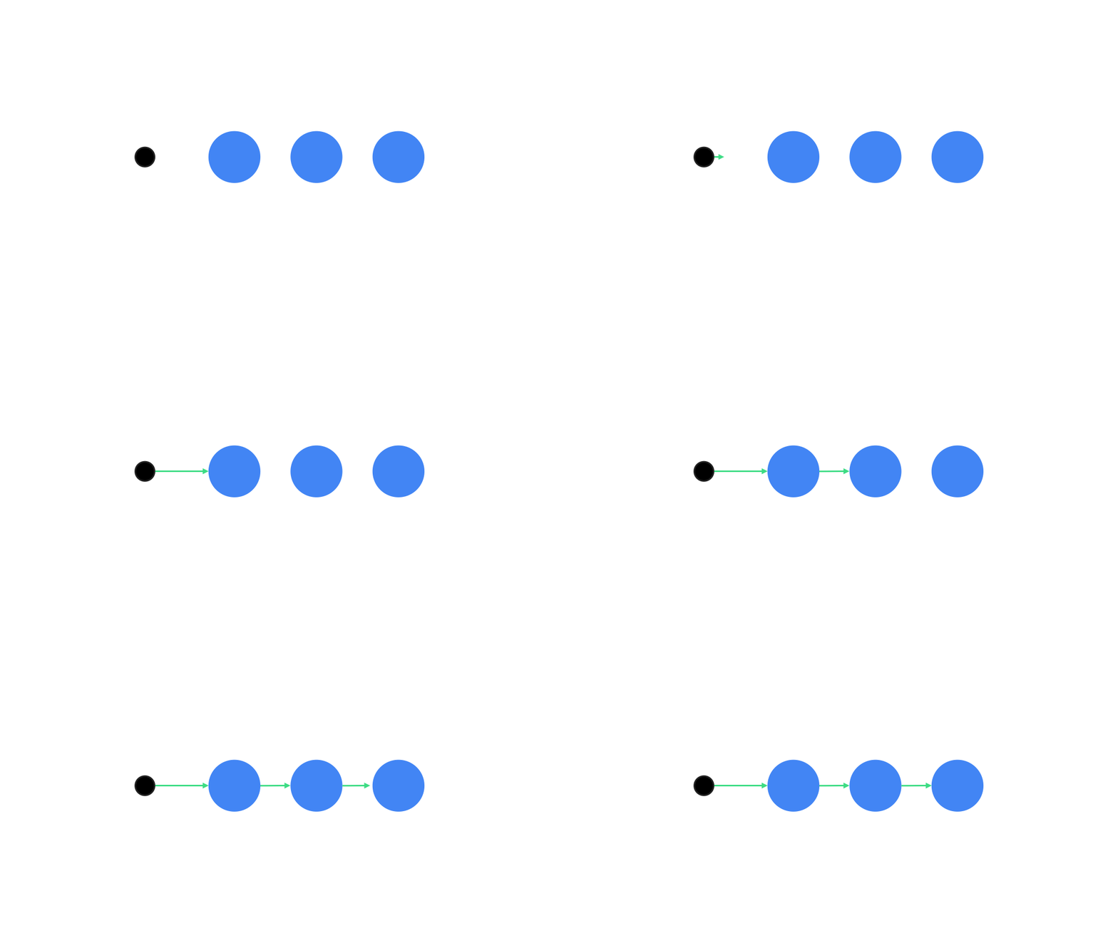
Animatable 코루틴 API를 사용하여 순차적 또는 동시 애니메이션을 실행합니다. Animatable에서 animateTo를 차례로 호출하면 각 애니메이션이 이전 애니메이션이 완료될 때까지 기다린 후 진행됩니다.
정지 함수이기 때문입니다.
val alphaAnimation = remember { Animatable(0f) } val yAnimation = remember { Animatable(0f) } LaunchedEffect("animationKey") { alphaAnimation.animateTo(1f) yAnimation.animateTo(100f) yAnimation.animateTo(500f, animationSpec = tween(100)) }
동시 애니메이션 만들기

코루틴 API (Animatable#animateTo() 또는 animate) 또는 Transition API를 사용하여 동시 애니메이션을 구현합니다. 코루틴 컨텍스트에서 여러 실행 함수를 사용하면 애니메이션이 동시에 실행됩니다.
val alphaAnimation = remember { Animatable(0f) } val yAnimation = remember { Animatable(0f) } LaunchedEffect("animationKey") { launch { alphaAnimation.animateTo(1f) } launch { yAnimation.animateTo(100f) } }
updateTransition API를 사용하면 동일한 상태를 사용하여 여러 속성 애니메이션을 동시에 구동할 수 있습니다. 다음 예에서는 상태 변경으로 제어되는 두 속성 rect 및 borderWidth에 애니메이션을 적용합니다.
var currentState by remember { mutableStateOf(BoxState.Collapsed) } val transition = updateTransition(currentState, label = "transition") val rect by transition.animateRect(label = "rect") { state -> when (state) { BoxState.Collapsed -> Rect(0f, 0f, 100f, 100f) BoxState.Expanded -> Rect(100f, 100f, 300f, 300f) } } val borderWidth by transition.animateDp(label = "borderWidth") { state -> when (state) { BoxState.Collapsed -> 1.dp BoxState.Expanded -> 0.dp } }
애니메이션 성능 최적화
Compose의 애니메이션으로 인해 성능 문제가 발생할 수 있습니다. 이는 애니메이션의 특성 때문입니다. 애니메이션은 화면에서 픽셀을 프레임별로 빠르게 이동하거나 변경하여 움직이는 듯한 착각을 일으킵니다.
Compose의 다양한 단계(컴포지션, 레이아웃, 그리기)를 고려합니다. 애니메이션이 레이아웃 단계를 변경하는 경우 영향을 받는 모든 컴포저블을 다시 배치하고 다시 그려야 합니다. 그리기 단계에서 애니메이션이 발생하면 레이아웃 단계에서 애니메이션을 실행하는 경우보다 기본적으로 성능이 더 좋습니다. 전반적으로 해야 할 작업이 더 적기 때문입니다.
애니메이션을 적용하는 동안 앱이 가능한 한 적은 작업을 하도록 하려면 가능하면 Modifier의 람다 버전을 선택하세요. 이렇게 하면 재구성을 건너뛰고 컴포지션 단계 외부에서 애니메이션을 실행합니다. 그렇지 않으면 Modifier.graphicsLayer{ }를 사용합니다. 이 수정자는 항상 그리기 단계에서 실행되기 때문입니다. 자세한 내용은 성능 문서의 읽기 지연 섹션을 참고하세요.
애니메이션 시간 변경하기
Compose는 기본적으로 대부분의 애니메이션에 스프링 애니메이션을 사용합니다. 스프링 또는 물리학 기반 애니메이션은 더 자연스럽게 느껴집니다. 또한 고정된 시간이 아닌 객체의 현재 속도를 고려하므로 중단할 수 있습니다.
기본값을 재정의하려면 이전에 시연된 모든 Animation API에서 animationSpec를 설정하여 애니메이션 실행 방식을 맞춤설정할 수 있습니다. 특정 기간에 실행할지 아니면 더 탄력적으로 실행할지 여부를 지정할 수 있습니다.
다음은 다양한 animationSpec 옵션에 대한 요약입니다.
spring: 물리 기반 애니메이션으로, 모든 애니메이션의 기본값입니다. stiffness 또는 dampingRatio를 변경하여 다른 애니메이션 디자인과 분위기를 구현할 수 있습니다.tween(between의 약어): 기간 기반 애니메이션으로,Easing함수를 사용하여 두 값 사이에서 애니메이션을 적용합니다.keyframes: 애니메이션의 특정 키 포인트에서 값을 지정하는 사양입니다.repeatable:RepeatMode로 지정된 특정 횟수만큼 실행되는 기간 기반 사양입니다.infiniteRepeatable: 영구적으로 실행되는 기간 기반 사양입니다.snap: 애니메이션 없이 최종 값으로 즉시 이동합니다.

animationSpecs에 관한 자세한 내용은 전체 문서를 참고하세요.
추가 리소스
Compose의 재미있는 애니메이션에 관한 더 많은 예는 다음을 참고하세요.