앱 디자인 원칙
컬렉션을 사용해 정리하기
내 환경설정을 기준으로 콘텐츠를 저장하고 분류하세요.
앱은 Wear OS의 기본 영역 중 하나입니다. 앱은 앱 콘텐츠를 한눈에 확인할 수 있는 표현인 정보 표시나 카드와는 다릅니다.
앱은 더 많은 정보를 표시하고 더욱 풍부한 상호작용을 지원합니다. 사용자는 알림, 정보 표시, 카드 또는 음성 작업과 같은 다른 영역을 통해 앱을 시작하는 경우가 많습니다.
원칙
앱을 디자인할 때는 다음 원칙을 염두에 두세요.
중요: 사용자가 몇 초 이내에 작업을 완료할 수 있도록 중요한 작업에 집중하세요.
얕고 선형: 2단계보다 더 깊은 계층 구조를 만들지 마세요.
가능하다면 콘텐츠와 탐색을 인라인으로 표시하는 것을 목표로 합니다.
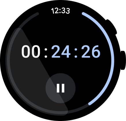
스크롤: 앱에서 스크롤할 수 있습니다. 이는 사용자가 시계에서 더 많은 콘텐츠를 볼 수 있는 자연스러운 동작입니다.
가이드라인
앱을 디자인할 때 다음 가이드라인을 따르세요.
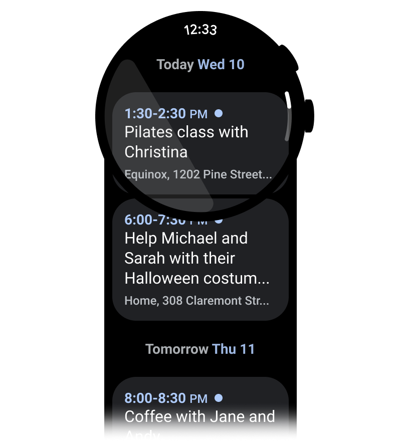
세로 레이아웃에 최적화
사용자가 한 방향으로 스크롤하여 콘텐츠를 탐색할 수 있는 세로 레이아웃을 사용하여 앱 디자인을 단순화합니다.
check_circle
권장사항
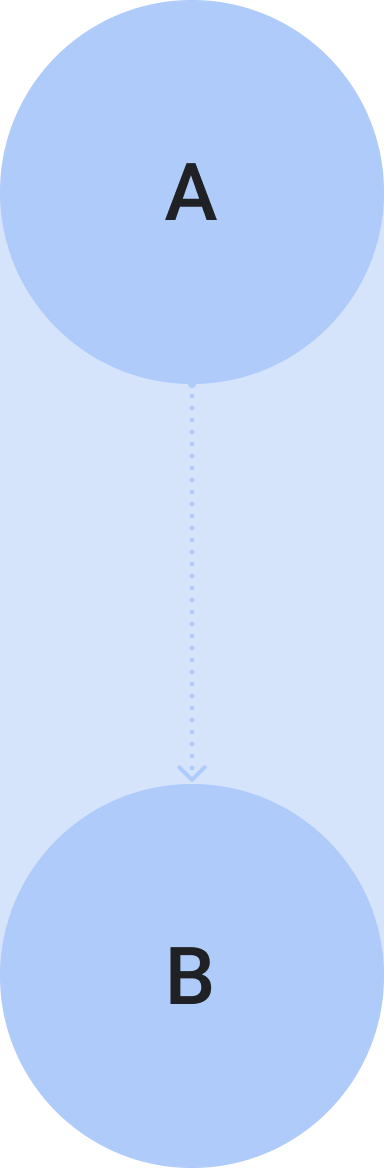
이 앱의 목표는 사용자를 A 지점에서 B 지점으로 안내하는 것입니다.
cancel
금지사항
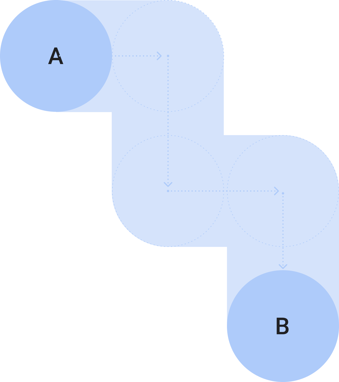
세로 스크롤과 가로 스크롤을 모두 사용하지 마세요. 앱 환경이 혼란스러워질 수 있습니다. 단, 세로 스크롤과 가로 스크롤을 모두 지원할 수 있는 미디어 재생을 비롯한 일부 특정 사용 사례는 예외입니다.
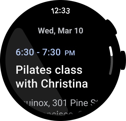
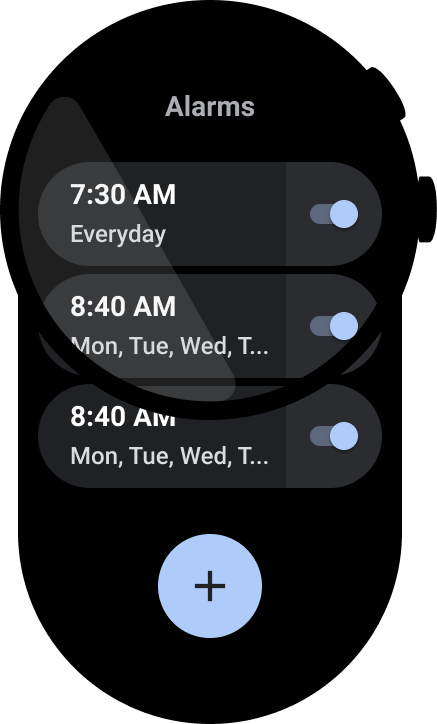
시간 표시
사용자는 앱에서 더 많은 시간을 보내는 경향이 있으므로 시간에 빠르게 액세스할 수 있도록 하는 것이 중요합니다.
check_circle
권장사항
앱 상단에 시간을 표시합니다. 사용자가 시간을 보는 일관된 위치를 제공하기 때문입니다.
cancel
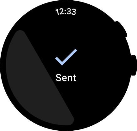
금지사항
대화상자나 확인 화면, 선택 도구에 시간을 표시합니다. 사용자가 이러한 화면에 소비하는 시간은 몇 초밖에 되지 않을 수 있기 때문입니다.
접근성을 위해 명확한 아이콘과 라벨을 사용하여 모든 작업을 인라인으로 표시해야 합니다. 설정 및 환경설정의 진입점이 포함됩니다.
check_circle
권장사항
가능하면 아이콘과 라벨을 모두 사용하세요.
cancel
금지사항
아이콘만 사용하여 사용자에게 작업을 실행하도록 합니다.
기본 작업 올리기
기본 작업을 앱 상단으로 가져와 사용자가 앱에서 작업을 실행할 수 있도록 지원합니다. 명확한 기본 작업을 앱 상단으로 올립니다.
라벨을 사용하여 사용자 안내
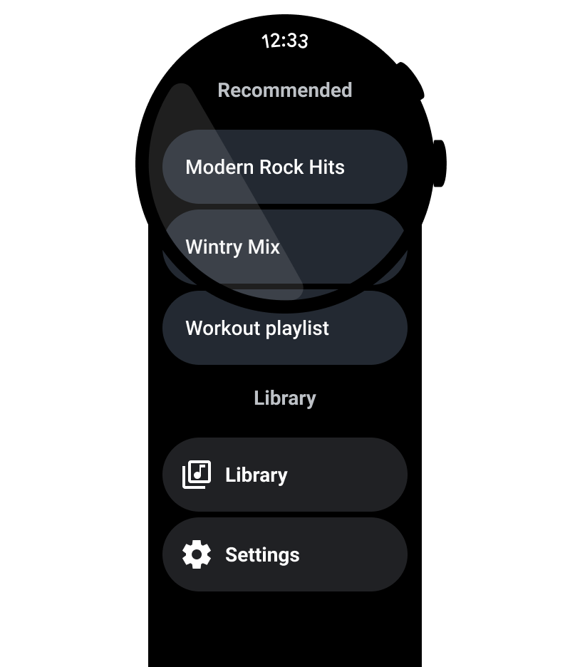
긴 앱의 경우 콘텐츠를 스크롤할 때 라벨을 사용하여 사용자가 방향을 파악할 수 있도록 합니다.
check_circle
권장사항
페이지 나누기, 라벨, 기타 신호를 사용하여 콘텐츠를 정리하고, 사용자가 혼합 콘텐츠가 있는 더 긴 뷰를 스크롤할 때 방향을 파악할 수 있도록 합니다.
cancel
금지사항
단일 콘텐츠 유형이 포함된 앱의 라벨을 추가합니다.
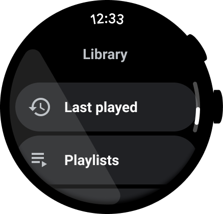
스크롤바 표시
다음 이미지와 같이 전체 뷰가 스크롤되면 스크롤바를 표시합니다.
자세한 내용은 위치 표시기를 참고하세요.
콘텐츠 컨테이너
다음 콘텐츠 컨테이너 예를 참고하세요.
그림 1. 고정된 높이의 컨테이너
그림 2. 가변 높이의 컨테이너
그림 3. 표시 영역보다 높이와 너비가 큰 컨테이너
그림 4. 페이지로 나눈 컨테이너
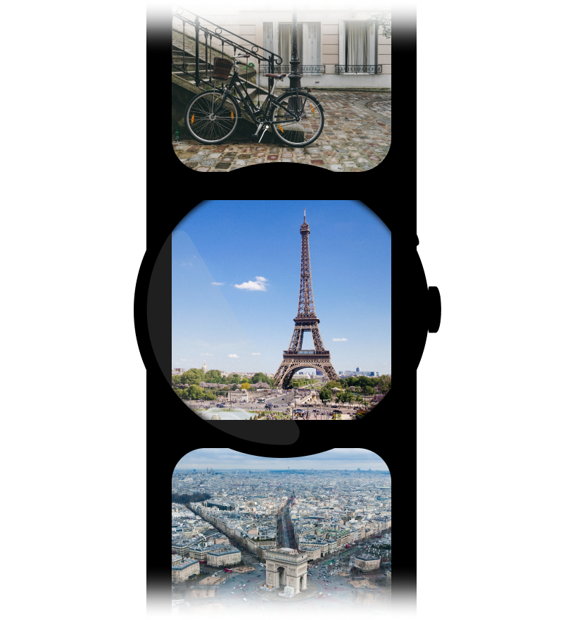
그림 5a. 화면 전체 크기를 차지하며 세로로 페이지를 나눈 콘텐츠 페이지
이 페이지에 나와 있는 콘텐츠와 코드 샘플에는 콘텐츠 라이선스에서 설명하는 라이선스가 적용됩니다. 자바 및 OpenJDK는 Oracle 및 Oracle 계열사의 상표 또는 등록 상표입니다.
최종 업데이트: 2025-07-27(UTC)
[[["이해하기 쉬움","easyToUnderstand","thumb-up"],["문제가 해결됨","solvedMyProblem","thumb-up"],["기타","otherUp","thumb-up"]],[["필요한 정보가 없음","missingTheInformationINeed","thumb-down"],["너무 복잡함/단계 수가 너무 많음","tooComplicatedTooManySteps","thumb-down"],["오래됨","outOfDate","thumb-down"],["번역 문제","translationIssue","thumb-down"],["샘플/코드 문제","samplesCodeIssue","thumb-down"],["기타","otherDown","thumb-down"]],["최종 업데이트: 2025-07-27(UTC)"],[],[]]
