 Google uses AI technology to translate content into your preferred language. AI translations can contain errors.
滑桿
透過集合功能整理內容
你可以依據偏好儲存及分類內容。
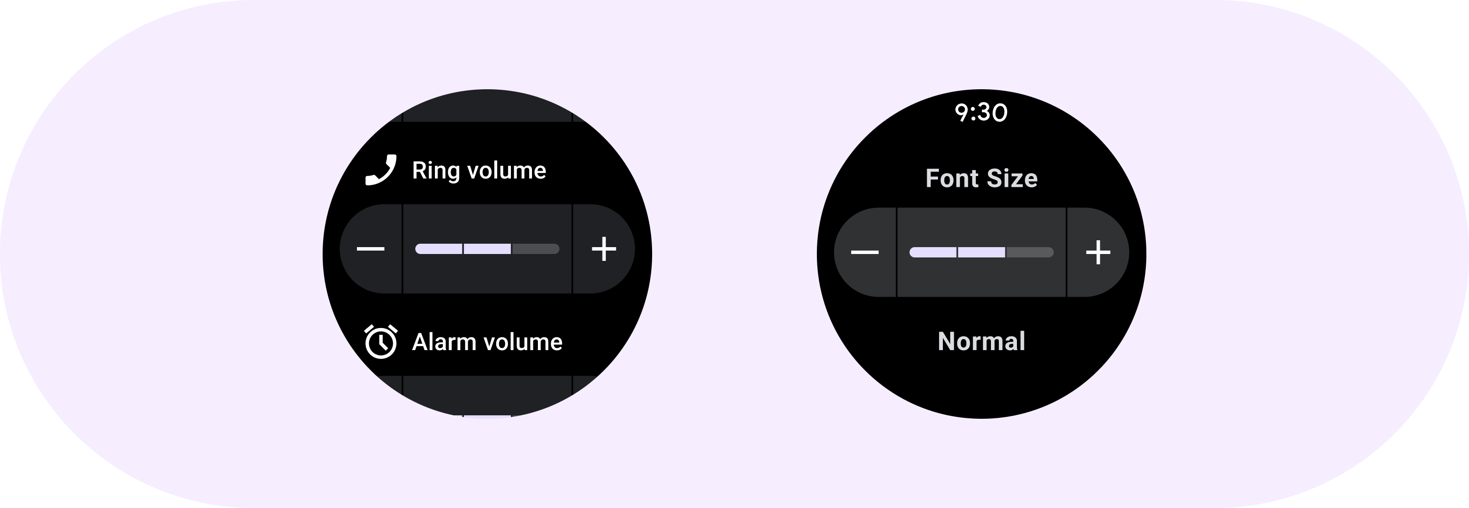
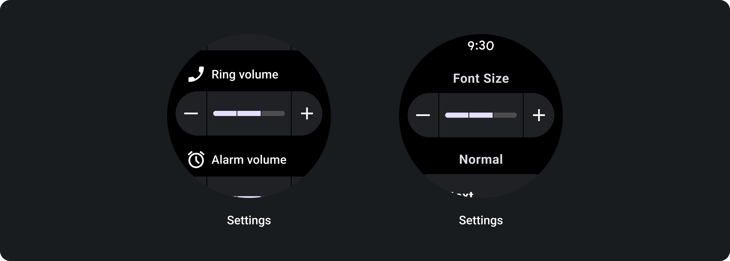
內嵌滑桿可讓使用者從多種值中選擇。

使用內嵌滑桿選取範圍中的值,例如設定螢幕亮度或字型大小。使用滑桿進行的變更會立即生效,可以繼續調整,直到滿意為止。如果不需要立即調整,請勿使用滑桿。
圖解
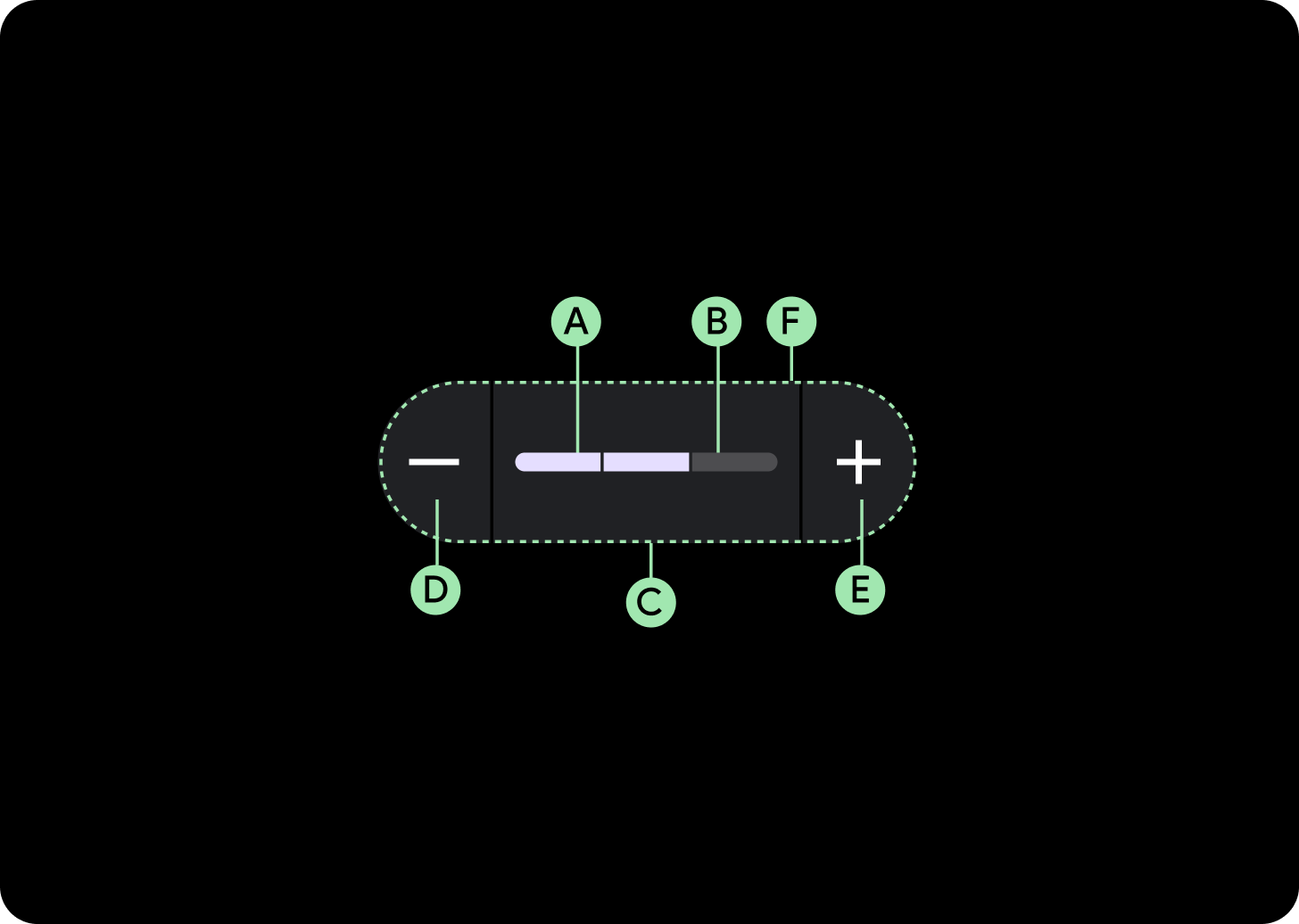
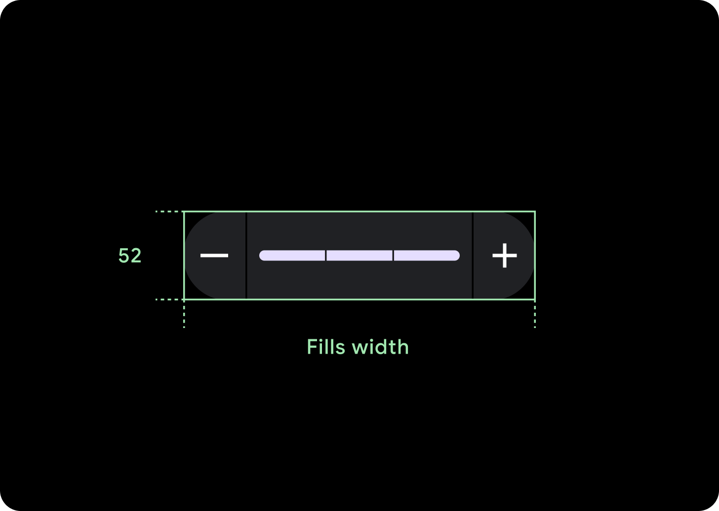
A. 進度列
B. 進度追蹤
C. 容器
D. 調低圖示
E. 調高圖示
F. 空格字元
設計建議
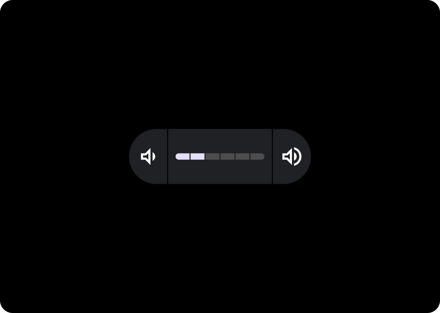
區隔滑桿
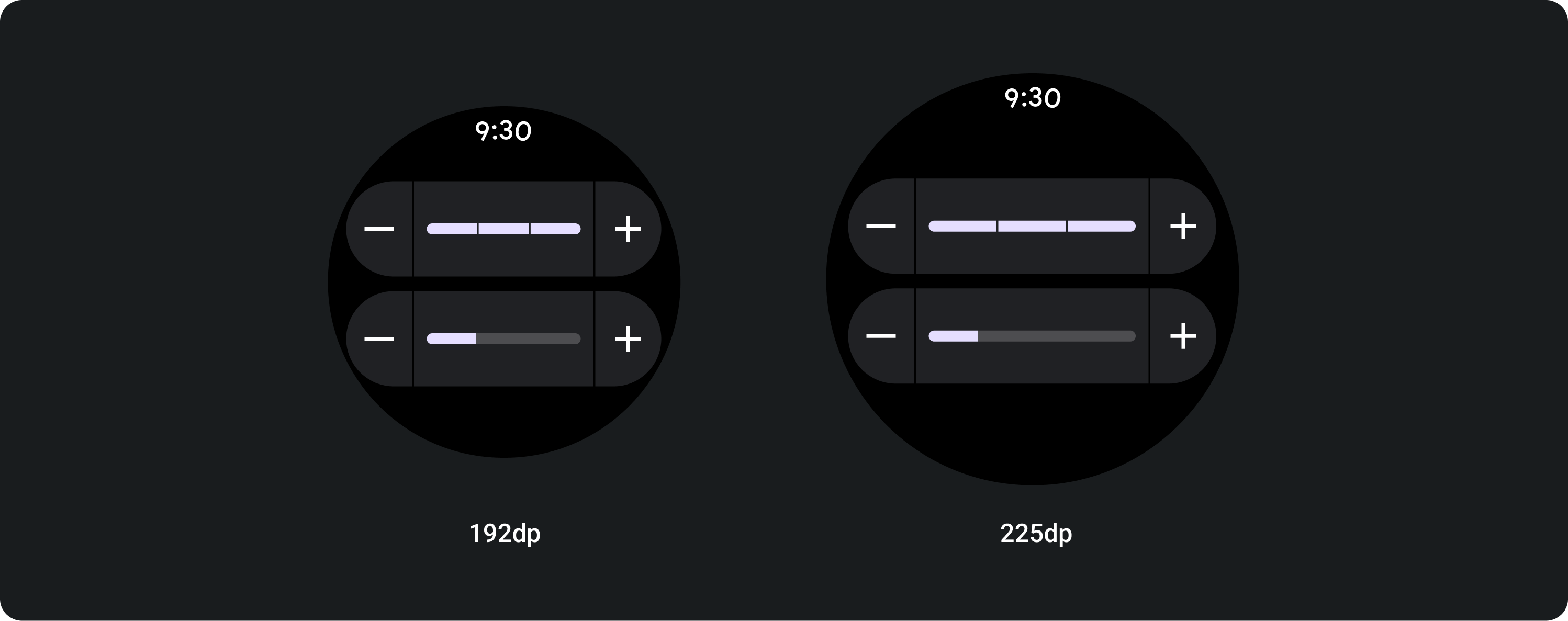
如果值的範圍介於 3 到 9 之間,請考慮使用區隔滑桿。如果範圍大於八,表示區隔太小,將無法顯示。
使用方式
自動調整式版面配置
步驟區段會填滿可用寬度,因此視螢幕大小而定,路段會較長。
填入可用寬度
在大螢幕上,滑桿會延展至填滿可用寬度。
圖示 (24 x 24 dp)
容器 (52 x XX dp)
這個頁面中的內容和程式碼範例均受《內容授權》中的授權所規範。Java 與 OpenJDK 是 Oracle 和/或其關係企業的商標或註冊商標。
上次更新時間:2025-07-27 (世界標準時間)。
[[["容易理解","easyToUnderstand","thumb-up"],["確實解決了我的問題","solvedMyProblem","thumb-up"],["其他","otherUp","thumb-up"]],[["缺少我需要的資訊","missingTheInformationINeed","thumb-down"],["過於複雜/步驟過多","tooComplicatedTooManySteps","thumb-down"],["過時","outOfDate","thumb-down"],["翻譯問題","translationIssue","thumb-down"],["示例/程式碼問題","samplesCodeIssue","thumb-down"],["其他","otherDown","thumb-down"]],["上次更新時間:2025-07-27 (世界標準時間)。"],[],[]]
