
Material 3 Expressive (M3) was built to meet user demand for experiences that are modern, relevant, and distinct. Expressive also allows designers to mirror specific emotions and feelings in the layout and presentation of the interface.
Color and typography
The color system is expanding to adopt M3's deeper tonal palettes and a wider token set and the simpler typography scale is utilizing variable font axes for more expression, making interactions more expressive and delightful.
Color theming
The new tokens allow for more color to be applied across different themes and in context of the design system as a whole.
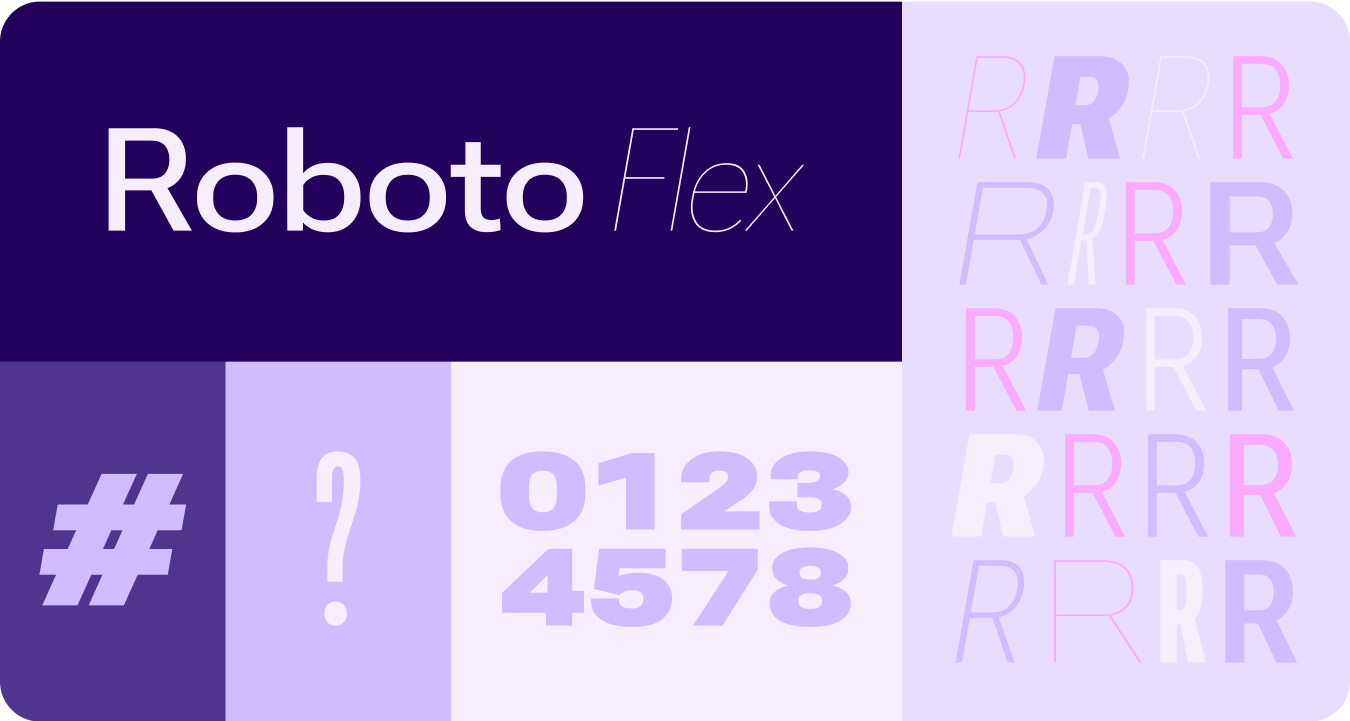
Variable fonts
The updated considerations for variable fonts and their customizable axis, extend beyond 1P to also serve 3P use cases such as Roboto Flex, which has a similar set of variable axis.
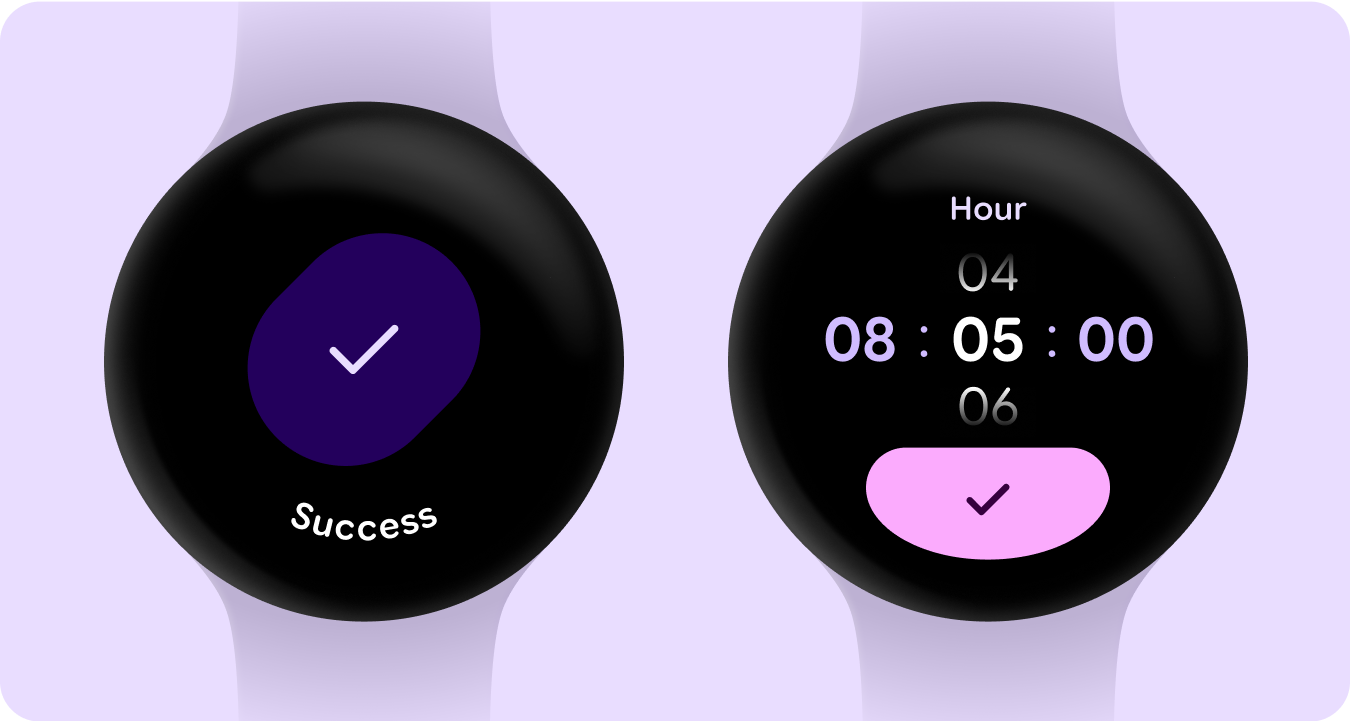
Variable font axis in motion
Utilizing variable font axis to signal expressive motion feedback and making interactions more expressive and delightful to use.
Example use-cases:
- Dynamic font weight
- Dynamic font width
- Dynamic font weight and width
Type roles
Along with an updated and optimized type scale, we are also introducing new type roles that specifically serve notable patterns on Wear.
These new type roles support several use cases—including Arc Text for surface titles, proactive content with live space, and a type role specifically for Numerals—that allow for bigger and more styled text sizes for strings that don't need to be localized.
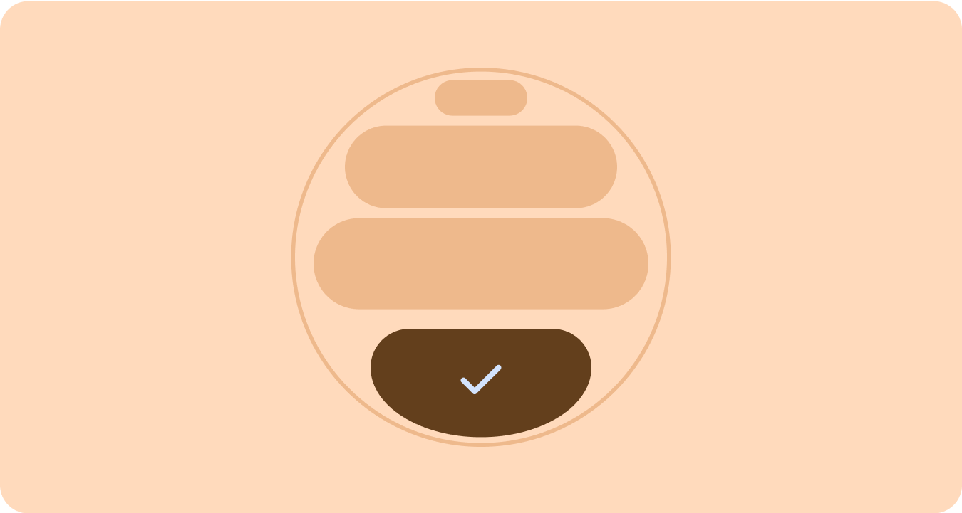
Shape and motion
We are also leaning into shape language in a much more expansive and meaningful way by utilizing flexible container shapes to apply rounding and sharpening of corner radius to support shape morphing lists and button states. We're introducing edge-hugging buttons as a new ownable and iconic design pattern for round devices on Wear.
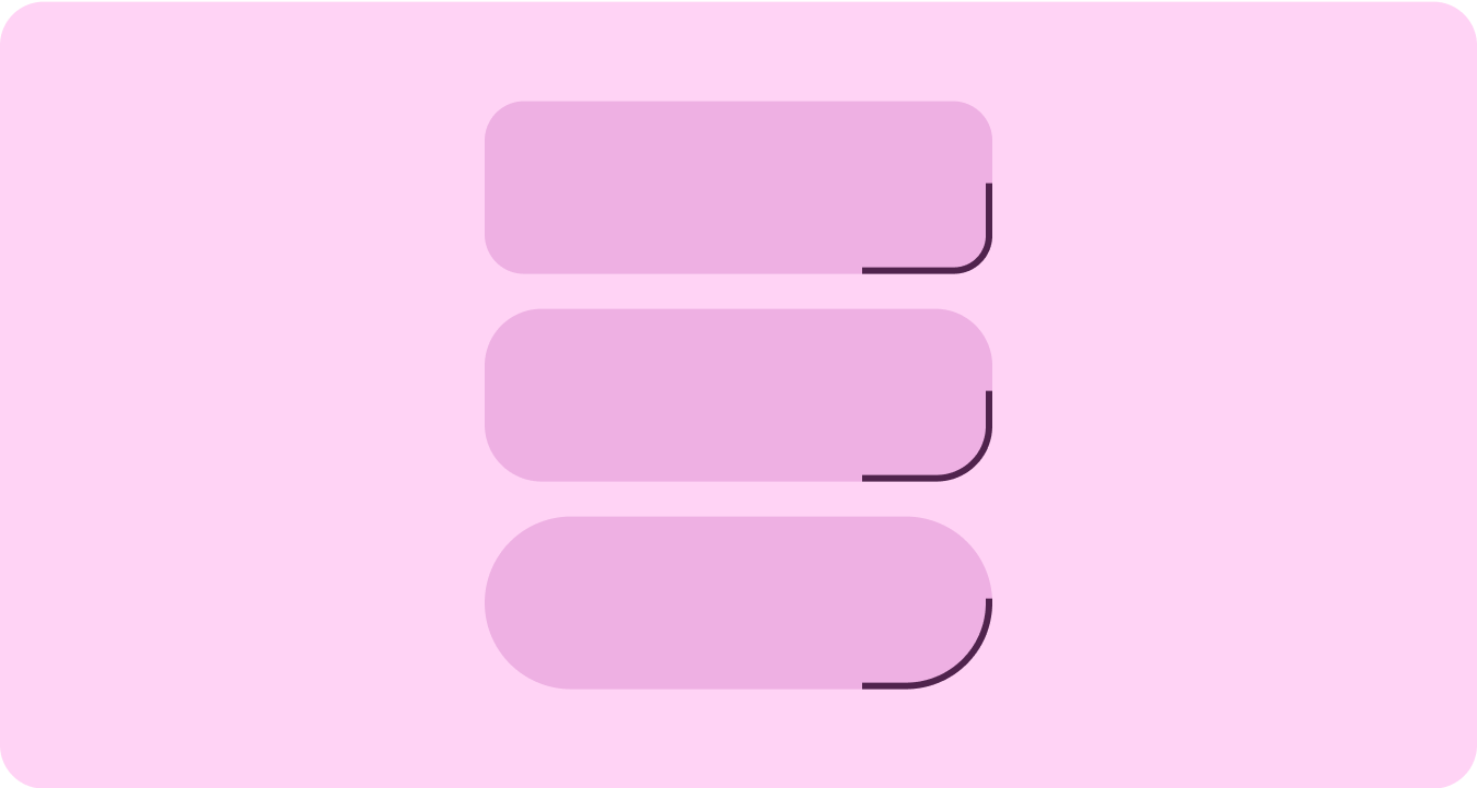
Edge-hugging containers
Introducing shape containers that embrace round and maximize the space within the circular form factor.
Shape applied
Using corner radius and unique shapes as containers to embrace expressive design —extending to delightful loading animations, interesting layouts, shape-morphing buttons and adaptive button groups.
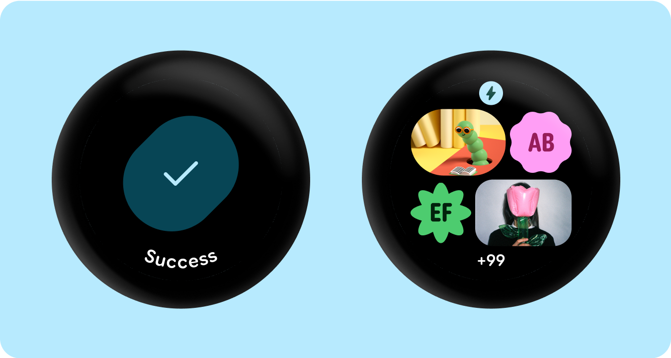
Corner radius
Utilizing Material 3 corner shapes to enable variety, distinction, and relationship between container shapes.
Grouped containers
Component containers use flexible layout techniques to dynamically adapt to available space. They can distribute this space evenly for symmetry, or strategically arrange elements to establish visual hierarchy, emphasize important content, and guide user interaction through expressive and motion-lead visual cues.