با مجموعهها، منظم بمانید
ذخیره و طبقهبندی محتوا براساس اولویتهای شما.
کاشیها دسترسی سریع به اطلاعات و اقداماتی را که کاربران برای انجام کارها نیاز دارند، فراهم میکنند. با کشیدن انگشت از صفحه ساعت، کاربر میتواند ببیند که چگونه به سمت اهداف تناسب اندام خود پیش میرود، آب و هوا را بررسی کند و موارد دیگر. یک برنامه را راه اندازی کنید یا کارهای ضروری را به سرعت از کاشی ها انجام دهید.
طراحی های پاسخگو و بهینه بسازید
برای اینکه به شما کمک کنیم طرحبندیهای طراحی خود را با اندازههای صفحه بزرگتر تطبیق دهید، ما رفتار طرحبندیها و اجزای خود را بهروزرسانی کردهایم تا رفتار پاسخگوی داخلی، از جمله حاشیهها و لایههای مبتنی بر درصد داشته باشیم.
اگر از الگوهای ProtoLayout ما استفاده میکنید، میتوانید این بهروزرسانیها را بهطور خودکار از طریق آخرین نسخه بتا کتابخانه Wear ProtoLayout Jetpack به ارث ببرید. همچنین، فقط باید طرحبندیهایی را تهیه کنید که در آن محتوا یا اجزای اضافی پس از نقطه شکست اندازه صفحه نمایش اضافه کردهاید. برای راهنمایی کامل و توصیههایی درباره نحوه استفاده از اندازه صفحه نمایش بزرگتر، [راهنمای کاشیها][2] ما را مشاهده کنید. کاشیها ارتفاع صفحه ثابتی دارند، بنابراین ما بالشتک را تنظیم کردهایم تا فضای محدود صفحه نمایش را بدون ایجاد برش ناخواسته به حداکثر برسانیم.
بررسی کنید که اجزای عرض موجود را پر کنند
همه اجزا باید به صورت پاسخگو ساخته شوند. با تنظیم ارتفاع و عرض روی «بسط»، فضای موجود را پر می کنند. برای جلوگیری از بریده شدن محتوا توسط صفحه گرد، حاشیه های لازم را لحاظ کنید.
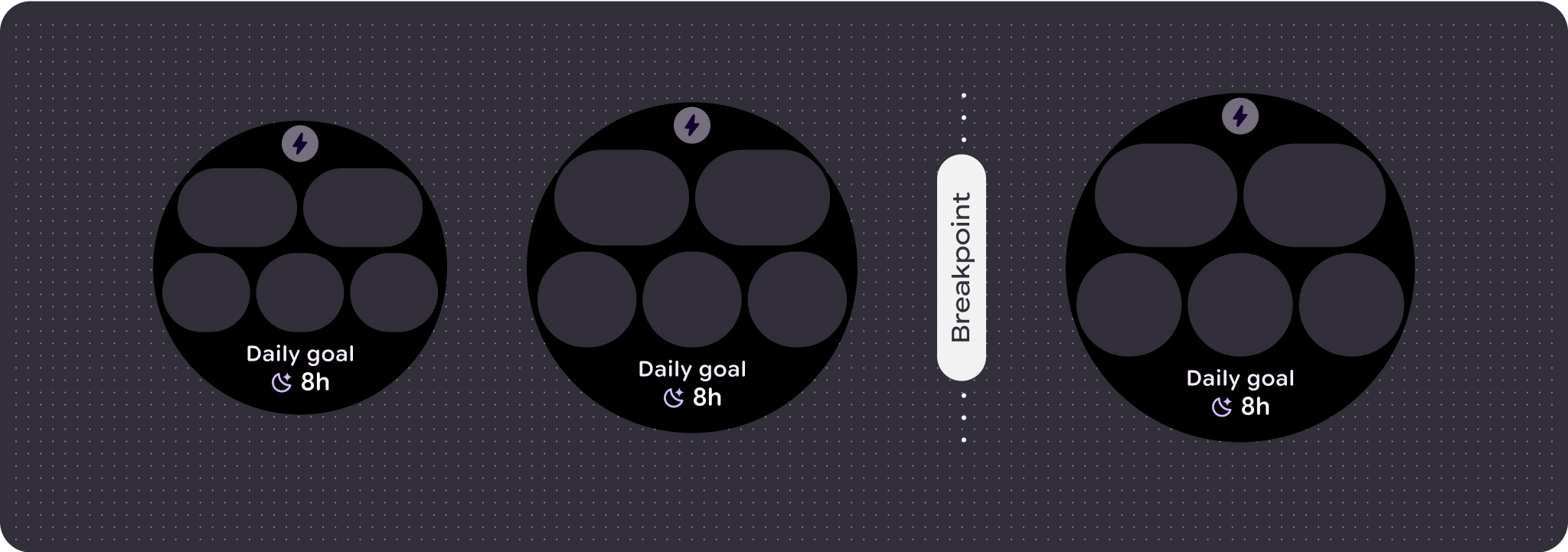
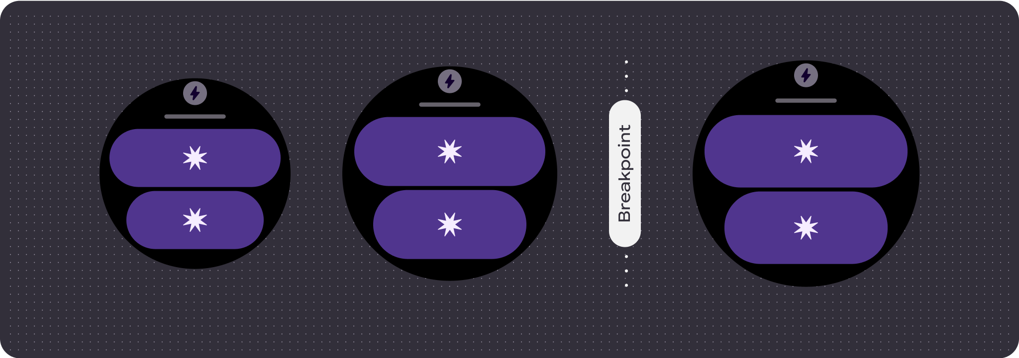
طراحی های تطبیقی و متمایز بسازید
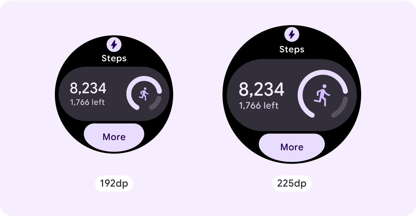
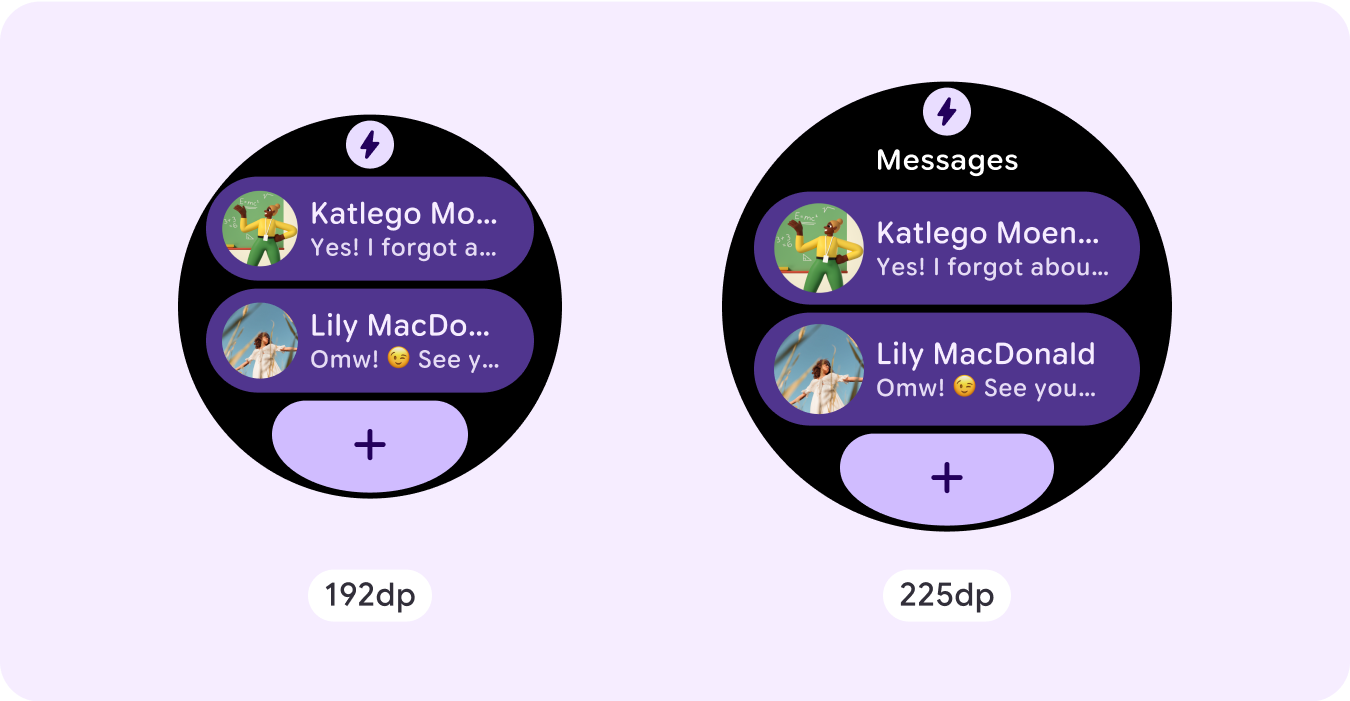
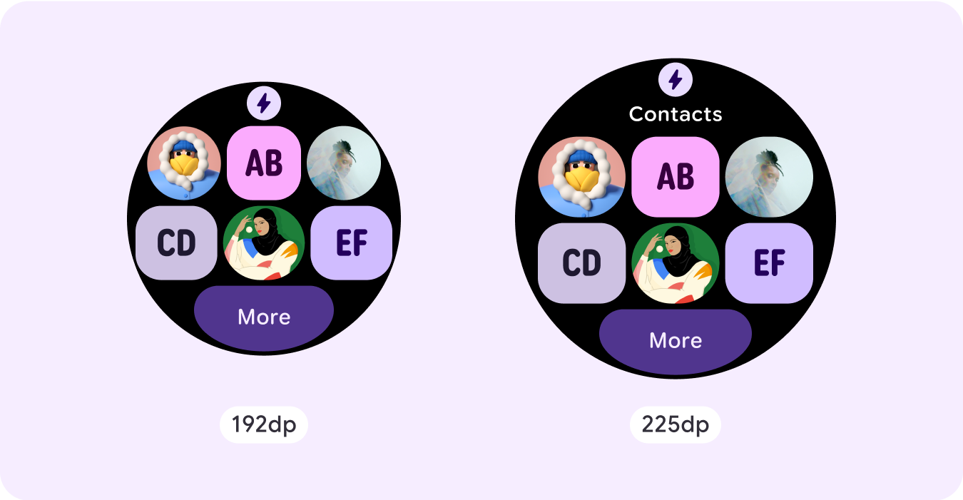
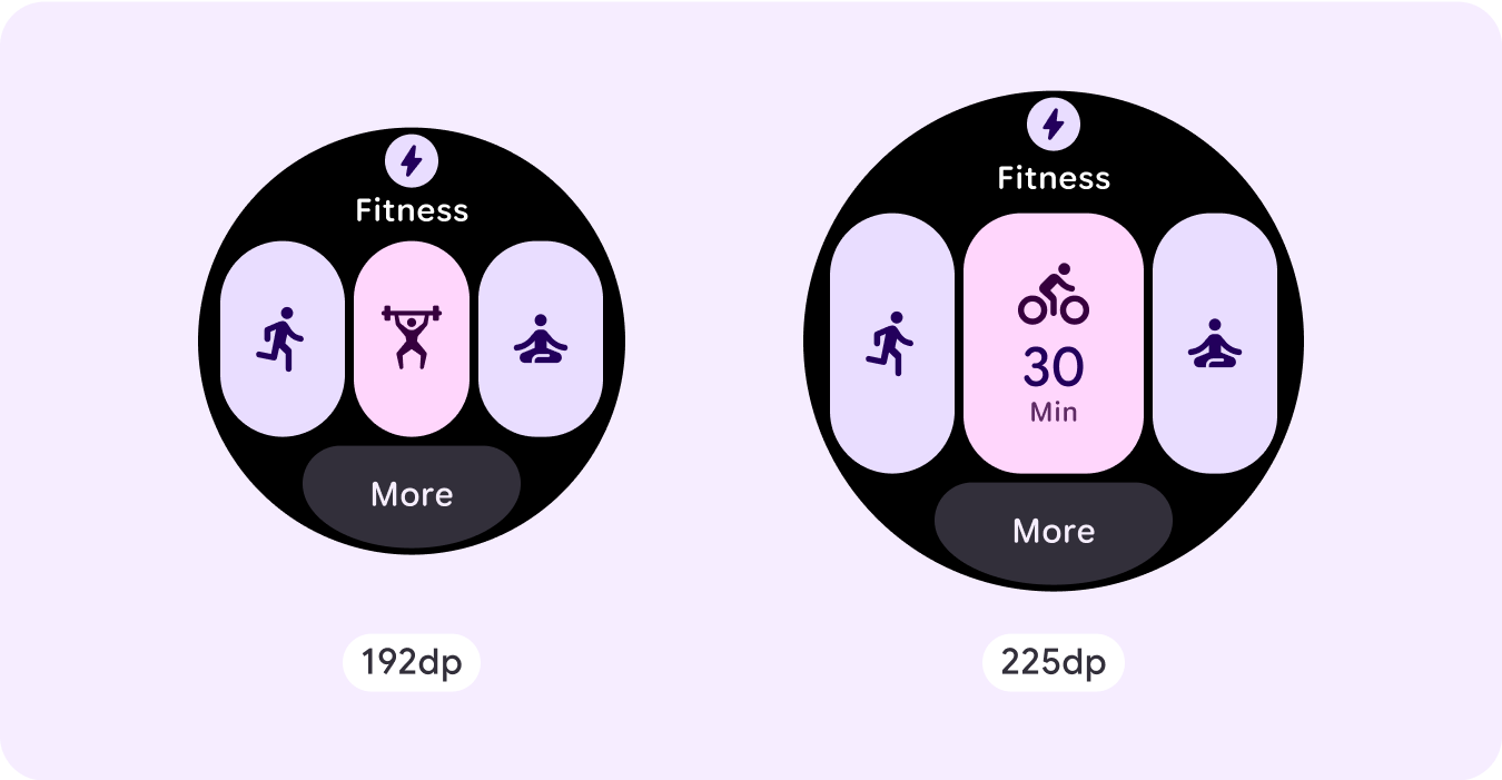
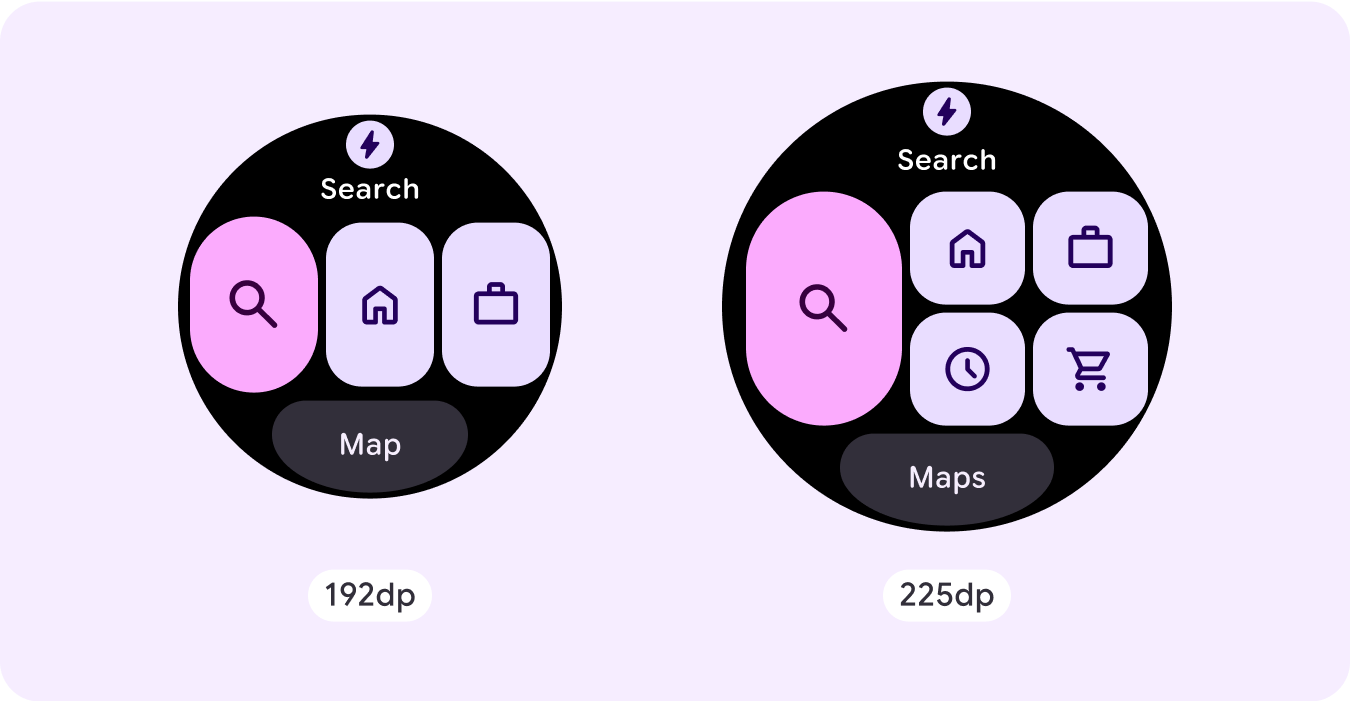
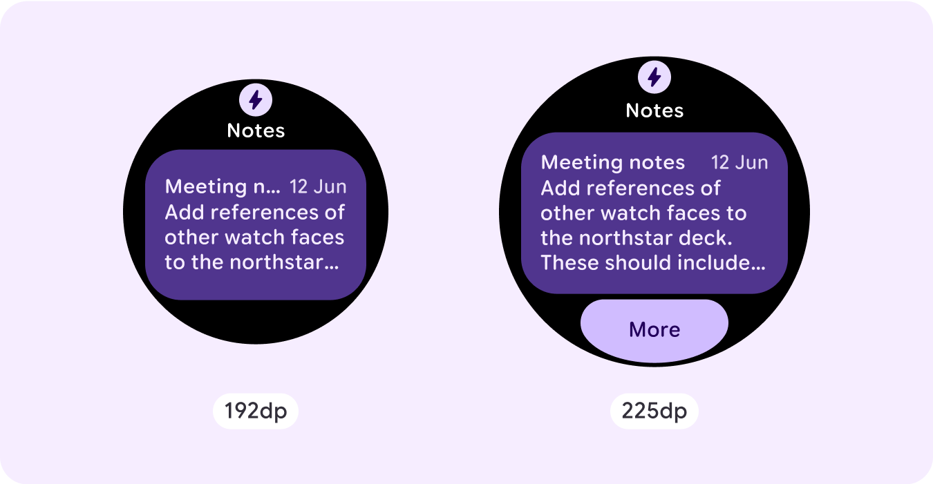
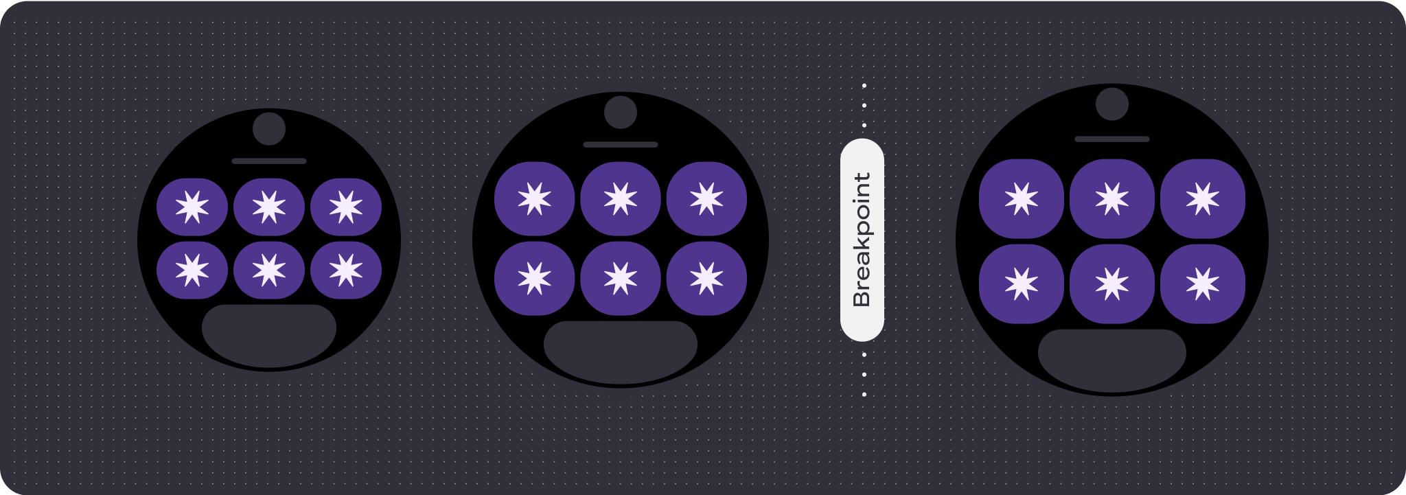
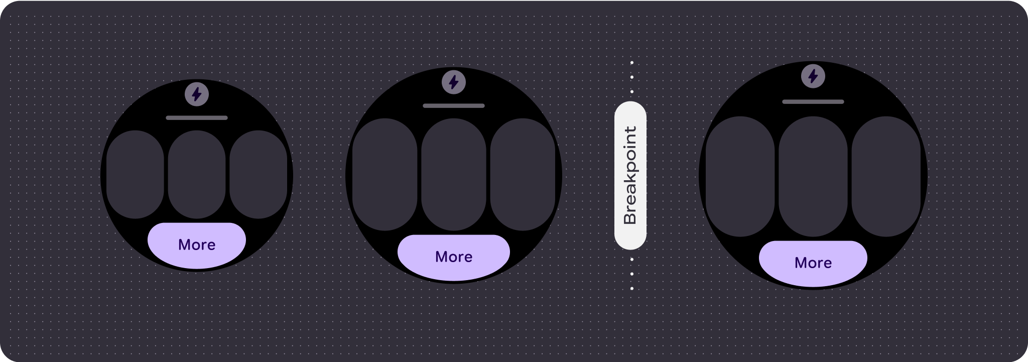
برای استفاده حداکثری از فضای اضافی در اندازه های بزرگتر، یک نقطه شکست اندازه با 225dp اضافه کنید. این نقطه انفصال به شما امکان میدهد محتوای اضافی را نشان دهید، دکمهها یا دادههای بیشتری را اضافه کنید یا طرحبندی را تغییر دهید تا مناسبتر با صفحه نمایش بزرگتر باشد.
این نیاز به طراحی متفاوتی برای هر نقطه شکست دارد. طراحی صفحه نمایش بزرگتر (225+ dp) می تواند شامل عناصر اضافی زیر باشد:
شکاف عنوان پنهان قبلی را نشان دهید
این در مورد طرحبندیهایی با دو ردیف قبل از نقطه شکست توصیه میشود، جایی که برای اطمینان از حداقل ضربه زدن به هدف 48dp، باید شکاف عنوان حذف شود.
اندازه را افزایش دهید یا وضعیت اجزای موجود را تغییر دهید
این می تواند به منظور نشان دادن جزئیات بیشتر یا قابل مشاهده تر کردن محتوا انجام شود.
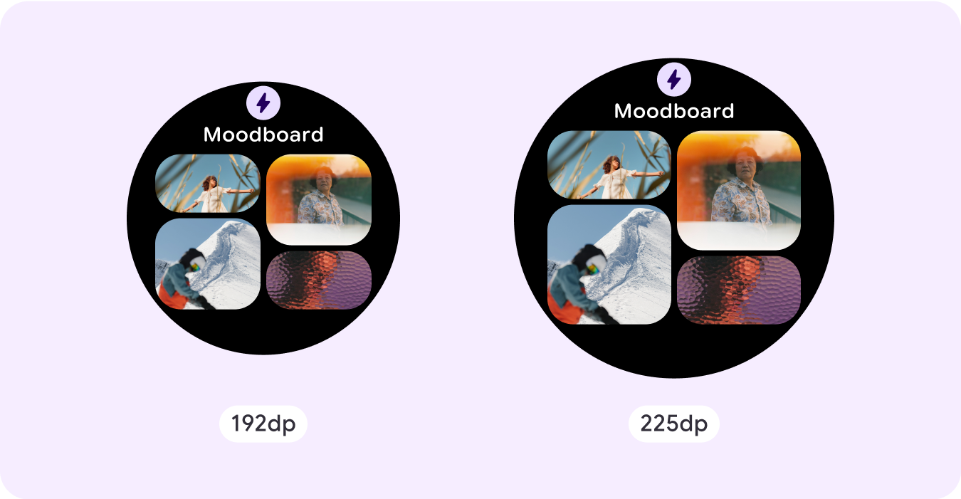
اسلات اجزا را در طرح فعلی اضافه کنید
با افزودن مؤلفهها، طرحبندی گزینههای بیشتر یا جزئیات بیشتری را ارائه میدهد. با این حال، مطمئن شوید که محتوا قابل مشاهده است.
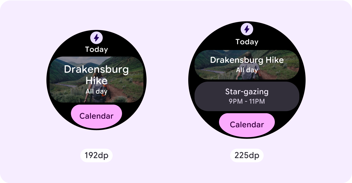
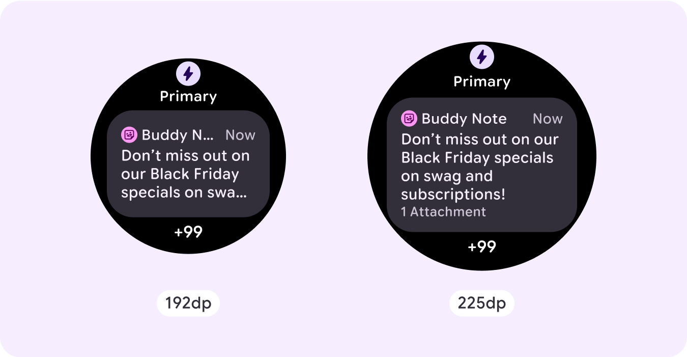
محتوای بیشتری را در پایین اضافه کنید
در برخی موارد، به جای افزودن مؤلفهها در اسلات اصلی، افزودن دکمههای عمل یا محتوا در بخش پایین منطقیتر است.
احتیاط: اندازه نمایشگر بزرگتر هرگز نباید اطلاعات کمتری نسبت به نمایشگرهایی که کوچکتر از آن هستند نمایش دهد. این به ویژه برای رفتارهای سفارشی اضافه شده در نقطه شکست مرتبط است.
یک مثال رایج در این مورد زمانی است که اجزا یا اندازه متن از نقطه شکست گذشته است و در نهایت در صفحه های بزرگتر کمتر نشان داده می شود. صفحه نمایش ها همیشه باید با افزایش اندازه ارزش بیشتری نشان دهند.
رفتار پاسخگو و سازگار
رفتار پاسخگو و تطبیقی به سه شکاف (بخش) طرح بستگی دارد.
نماد برنامه و اسلات عنوان
هیچ تغییر رفتاری در نماد برنامه ارائه شده توسط سیستم وجود ندارد. اسلات عنوان به طور خودکار با اندازه بزرگتر صفحه سازگار می شود و کاراکترهای اضافی را نمایش می دهد. حاشیههای داخلی متناسب (درصد) در قسمت بالایی وجود دارد تا در هنگام افزایش اندازه صفحه، از هرگونه بریده شدن جلوگیری شود.
اسلات اصلی (قطعات)
همه اجزای درون شکاف اصلی باید عرض و ارتفاع خود را روی "بسط" تنظیم کنند تا به طور خودکار با اندازه بزرگتر صفحه سازگار شوند. حاشیههای داخلی متناسب (درصد) در بخش شکاف اصلی وجود دارد - و در برخی موارد هر ردیف در این شکاف - برای جلوگیری از هرگونه بریدگی در هنگام افزایش اندازه صفحه نمایش. اگر از ترکیبی از شعاع گوشه و چیدمان استفاده میکنید، ممکن است شکاف اصلی شما به حاشیههای بزرگتری نیاز داشته باشد.
شکاف پایین
هیچ تغییر رفتاری در دکمه یا متن پایین وجود ندارد، اما عرض دکمه و کادرهای متنی به طور خودکار با اندازه بزرگتر صفحه تطبیق داده می شود و کاراکترها را به دست می آورند. حاشیههای داخلی متناسبی (درصد) در شکاف پایینی وجود دارد تا هنگام افزایش اندازه صفحه، از هرگونه بریدگی جلوگیری شود. هنگامی که هیچ شکاف پایینی وجود ندارد، یک حاشیه پیش فرض به طور خودکار اضافه می شود.
کاشی هایی که شامل یک دکمه در شکاف پایین هستند کاشی هایی که شامل متن در شکاف پایین هستند کاشی بدون شکاف پایین
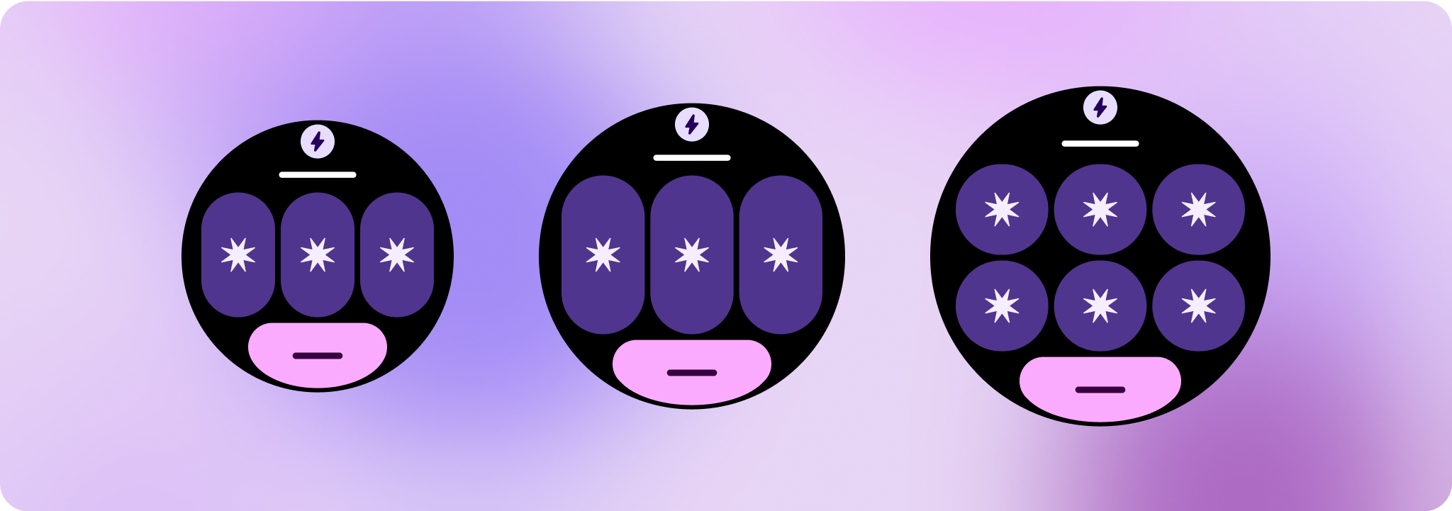
تجربیات متمایز ایجاد کنید
یک طرح کاملاً قابل تنظیم، با 60 یا بیشتر جایگشت تعبیه شده در آن، امکان سفارشی سازی عملاً بی حد و حصر را فراهم می کند. کاشیها بر اساس یک سیستم مبتنی بر شکاف ساخته شدهاند، بنابراین میتوانید یک شکاف از طرحبندی متعارف را با هر محتوا یا جزء جایگزین کنید و جزء را روی یکی از انواع مختلف و ترکیبهای رنگی تنظیم کنید. در این مورد، رفتار پاسخگو را حفظ کنید و توصیه های طراحی ما را دنبال کنید.
این سفارشیسازیها باید محدود باشند و نباید از قالب کاشی منحرف شوند. این برای حفظ ثبات زمانی است که کاربران در چرخ و فلک کاشیهای دستگاههای Wear OS خود حرکت میکنند.
محتوا و نمونه کدها در این صفحه مشمول پروانههای توصیفشده در پروانه محتوا هستند. جاوا و OpenJDK علامتهای تجاری یا علامتهای تجاری ثبتشده Oracle و/یا وابستههای آن هستند.
تاریخ آخرین بهروزرسانی 2025-07-29 بهوقت ساعت هماهنگ جهانی.
[[["درک آسان","easyToUnderstand","thumb-up"],["مشکلم را برطرف کرد","solvedMyProblem","thumb-up"],["غیره","otherUp","thumb-up"]],[["اطلاعاتی که نیاز دارم وجود ندارد","missingTheInformationINeed","thumb-down"],["بیشازحد پیچیده/ مراحل بسیار زیاد","tooComplicatedTooManySteps","thumb-down"],["قدیمی","outOfDate","thumb-down"],["مشکل ترجمه","translationIssue","thumb-down"],["مشکل کد / نمونهها","samplesCodeIssue","thumb-down"],["غیره","otherDown","thumb-down"]],["تاریخ آخرین بهروزرسانی 2025-07-29 بهوقت ساعت هماهنگ جهانی."],[],[],null,["# Common layouts for tiles\n\nTiles provide quick access to information and actions users need to get things\ndone. With a swipe from the watch face, a user can see how they are progressing\ntowards their fitness goals, check the weather, and more. Launch an app or get\nessential tasks done quickly from tiles.\n\nBuild responsive and optimized designs\n--------------------------------------\n\nTo help you adapt your design layouts to larger screen sizes, we have updated\nthe behavior of our layouts and components to have built-in responsive behavior,\nincluding percentage-based margins and padding.\n\nIf you are using our ProtoLayout templates, you can inherit these updates\nautomatically through the latest beta release of the [Wear ProtoLayout](/jetpack/androidx/releases/wear-protolayout)\nJetpack library. Also, you only need to supply layouts where you have added\nadditional content or components after a screen size breakpoint. For full\nguidance and recommendations on how to take advantage of a larger screen size,\nview our \\[tiles guidance\\]\\[2\\]. Tiles have a fixed screen height, so we've\nadjusted the padding to maximize the limited screen real estate without creating\nunwanted clipping.\n\nCheck that components fill the available width\n----------------------------------------------\n\n\nAll components should be built responsively. By setting the height and width to\n\"expand,\" they fill the available space. Include the necessary margins to\nprevent content from being clipped by the rounded screen. \n\n\n\u003cbr /\u003e\n\nBuild adaptive and differentiated designs\n-----------------------------------------\n\nTo make the most of the additional space on larger screen sizes, add a size\nbreakpoint at 225dp. This breakpoint lets you reveal additional content, include\nmore buttons or data, or change the layout to better suit the larger screen.\n\nThis requires a different design for each breakpoint. The larger screen design\n(225+ dp) could include the following additional elements:\n\n### Show the previously hidden title slot\n\n\nThis is advised on layouts with two rows before the breakpoint, where the title\nslot needs to be removed in order to ensure the min tap target of 48dp. \n\n\u003cbr /\u003e\n\n### Increase the size or change the state of the existing components\n\n\nThis could be done in order to show more detail or make the content more\nglanceable.\n**Note:** Don't just scale up the design. Instead, use components that respond and adapt to the available width and height. You could also use a different or larger component style, or graphic content with additional details. \n\n\u003cbr /\u003e\n\n### Add component slots within the current layout\n\n\nBy adding components, the layout provides more options or additional details.\nMake sure the content remains glanceable, though. \n\n\n\u003cbr /\u003e\n\n### Add more content at the bottom\n\n\nIn some cases, it makes more sense to add action buttons or content in the\nbottom section, rather than adding components within the main slot. \n\n\u003cbr /\u003e\n\n**Caution:** A larger display size should\n*never* display less information than ones that are smaller than it.\nThis is especially relevant for custom behaviors added in at the\nbreakpoint.\n\nA common example of this is when components or text sizes are increased\npast the breakpoint and end up showing less are the larger screens. Screens\nshould *always* show more value with increasing size.\n\nResponsive and adaptive behavior\n--------------------------------\n\nThe responsive and adaptive behavior depends on the three slots (sections) of\nthe layout.\n\n### App icon and title slot\n\nThere is no behavior change on the app icon that the system provides. The title\nslot automatically adapts to the wider screen size, displaying additional\ncharacters. There are proportional (percentage) internal margins on the top\nsection to avoid any clipping when the screen size increases.\n| **Note:** The title slot is optional and should be hidden before the 225dp breakpoint when using a layout with two rows in the main content section. This lets the tap targets in the main content area remain large enough on the smallest screens.\n\n### Main slot (components)\n\nAll components within the main slot should set their width and height to\n\"expand\" so that they automatically adapt to the wider screen size. There are\nproportional (percentage) internal margins on the main slot section---and each row\nwithin this slot in some instances---to avoid any clipping when the screen size\nincreases. If you use a combination of corner radius and layout, your main slot\nmight require larger margins.\n\n### Bottom slot\n\nThere is no behavior change in the bottom button or text, but the width of the\nbutton and text boxes automatically adapt to the wider screen size, and gain\ncharacters. There are proportional (percentage) internal margins on the bottom\nslot to avoid any clipping when the screen size increases. When no bottom slot\nis present, a default margin is added automatically.\nTiles that include a button in the bottom slot\n\n\u003cbr /\u003e\n\nTiles that include text in the bottom slot\n\n\u003cbr /\u003e\n\nTiles with no bottom slot\n\nCreate differentiated experiences\n---------------------------------\n\nOne fully customizable layout, with 60 or more permutations built into it,\nallows for practically limitless customization. Tiles are built on a slot-based\nsystem, so you can replace a slot from the canonical layout with any content or\ncomponent, and set the component to one of the many variants and color\ncombinations. In this case, maintain responsive behavior and follow our design\nrecommendations.\n\nThese customizations should be limited, and shouldn't deviate from the tile\ntemplate. This is to maintain consistency when users scroll through the tiles\ncarousel on their Wear OS devices."]]