طرحبندیهای رایج برای برنامههای پیمایش
با مجموعهها، منظم بمانید
ذخیره و طبقهبندی محتوا براساس اولویتهای شما.
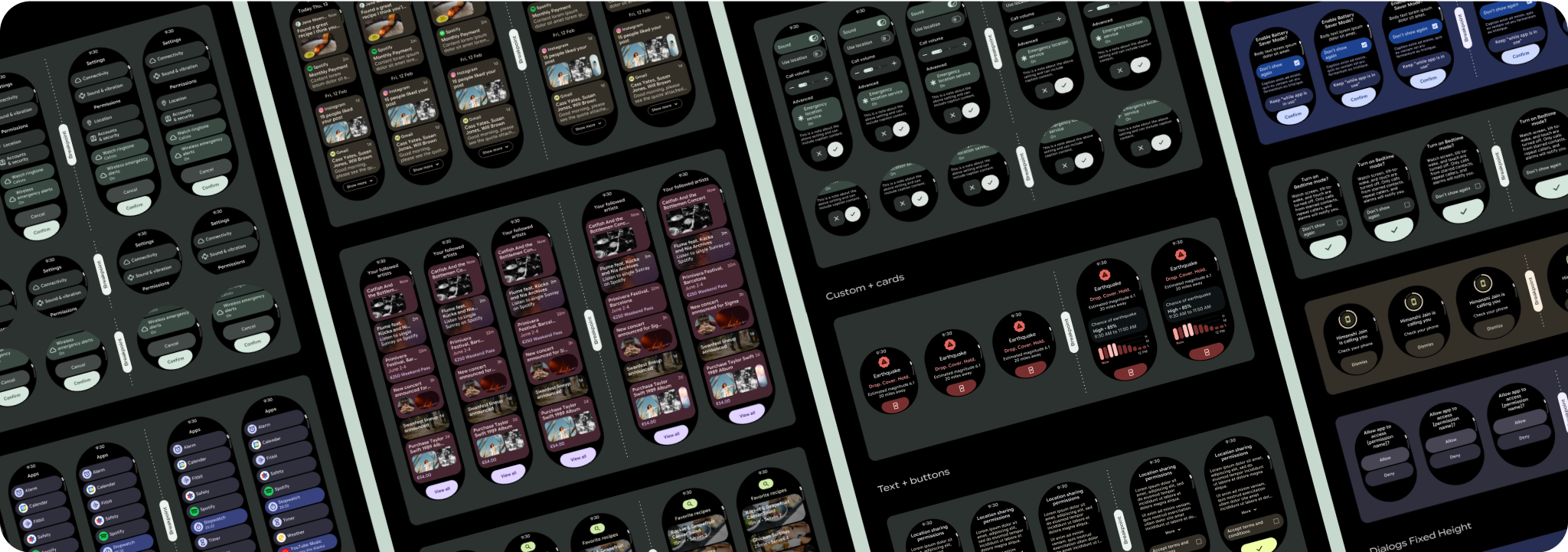
طرحبندیهای نمایش برنامه پیمایش شامل لیستها ( TransformingLazyColumn
) و دیالوگها است. این طرحبندیها اکثر صفحهنمایش برنامهها را تشکیل میدهند و مجموعهای از مؤلفهها را نشان میدهند که باید با اندازههای صفحه نمایش بزرگتر سازگار شوند. بررسی کنید که مؤلفهها پاسخگو باشند—یعنی عرض موجود را پر کنند و هنگامی که ارتفاع بیشتری از صفحه در دسترس است، تنظیمات TransformingLazyColumn
انجام دهند. این طرحبندیها قبلاً بهصورت پاسخگو ساخته شدهاند، و ما توصیههای دیگری برای استفاده بیشتر از املاک و مستغلات داریم.

طراحی های پاسخگو و بهینه بسازید
برای کمک به انطباق طرحبندیهای طراحی شما با اندازههای صفحهنمایش بزرگتر، ما رفتار طرحبندیها و اجزای خود را بهروزرسانی کردهایم تا رفتار پاسخگوی داخلی، از جمله حاشیهها و بالشتکهای مبتنی بر درصد داشته باشیم. برای رسیدگی به این موضوع، طرحبندیها و مؤلفههای کتابخانه رابط کاربری Android خود را با رفتار پاسخگوی داخلی، از جمله حاشیهها و بالشتکهای مبتنی بر درصد بهروزرسانی کردهایم. اگر از مؤلفه های Compose ما استفاده می کنید، می توانید به طور خودکار این پاسخگویی را به ارث ببرید.
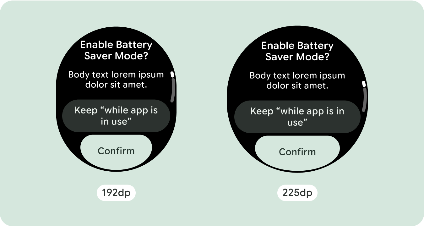
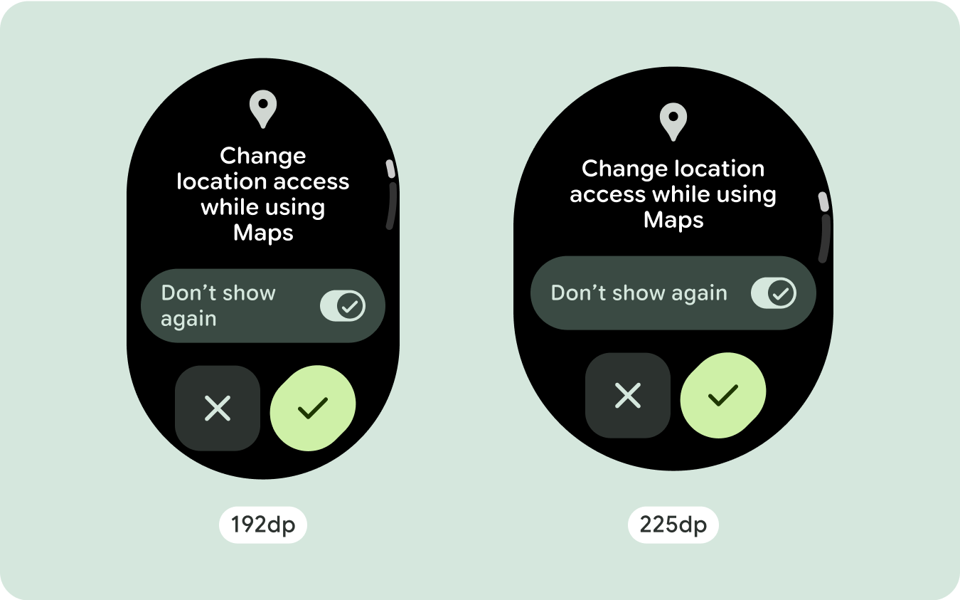
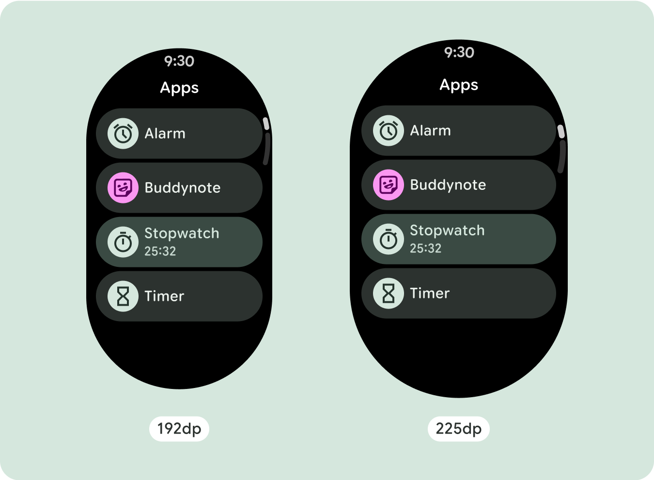
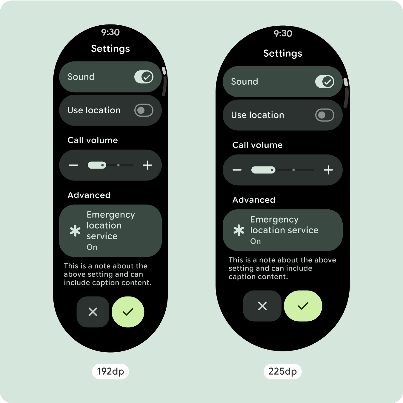
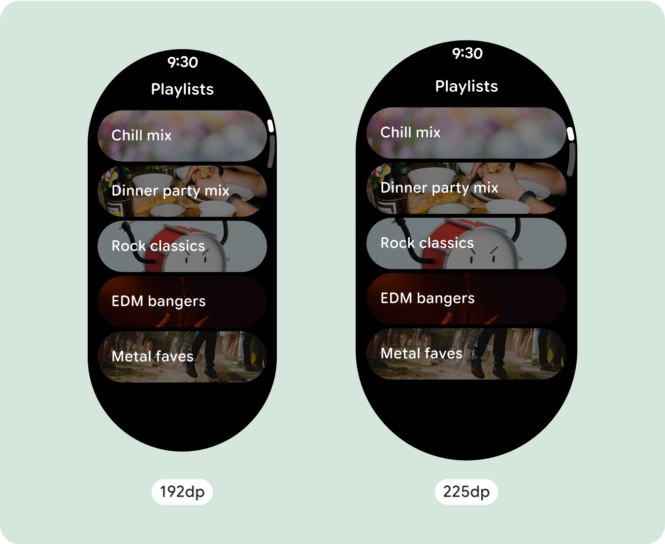
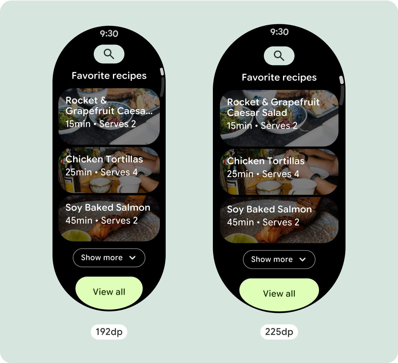
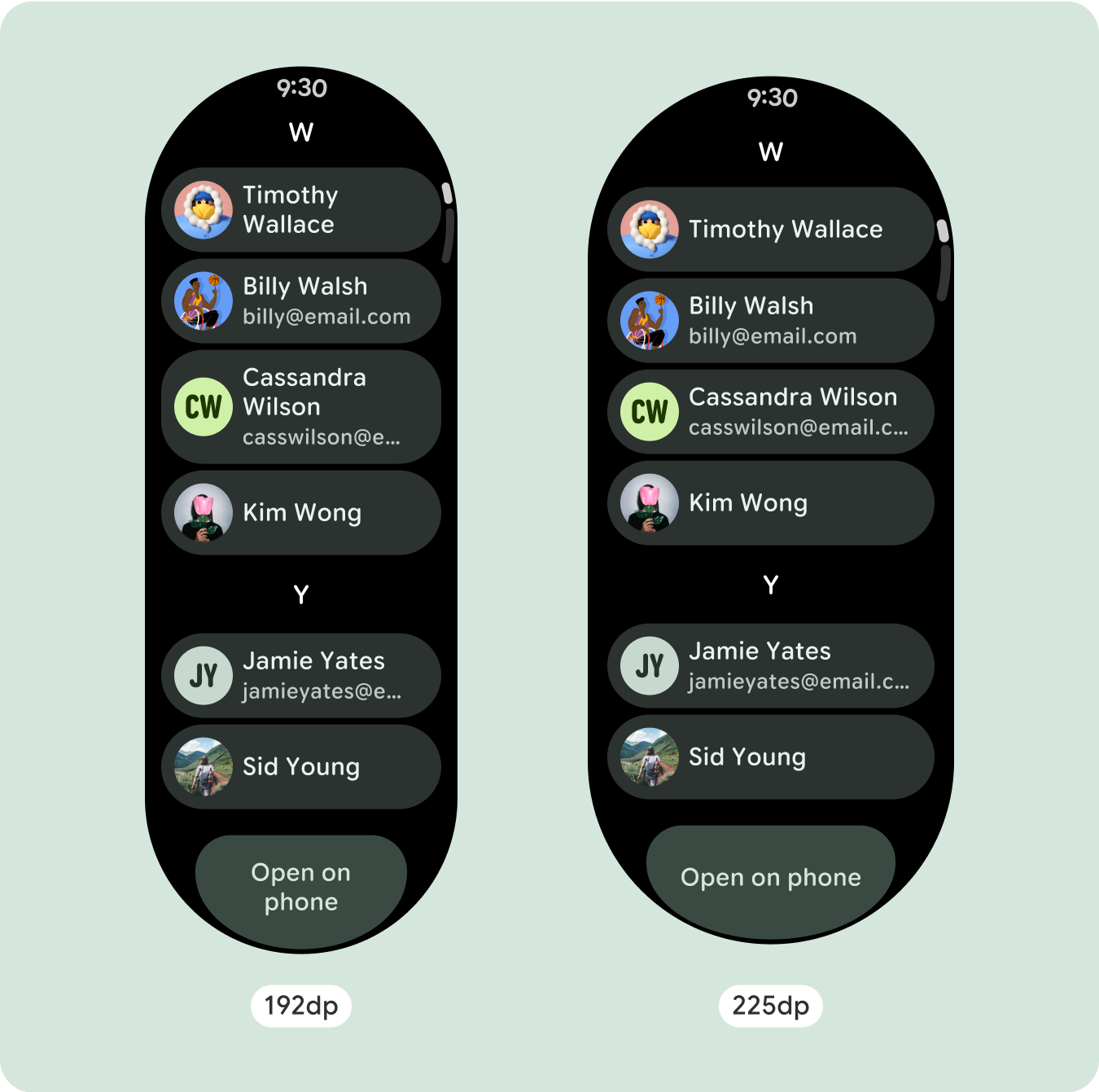
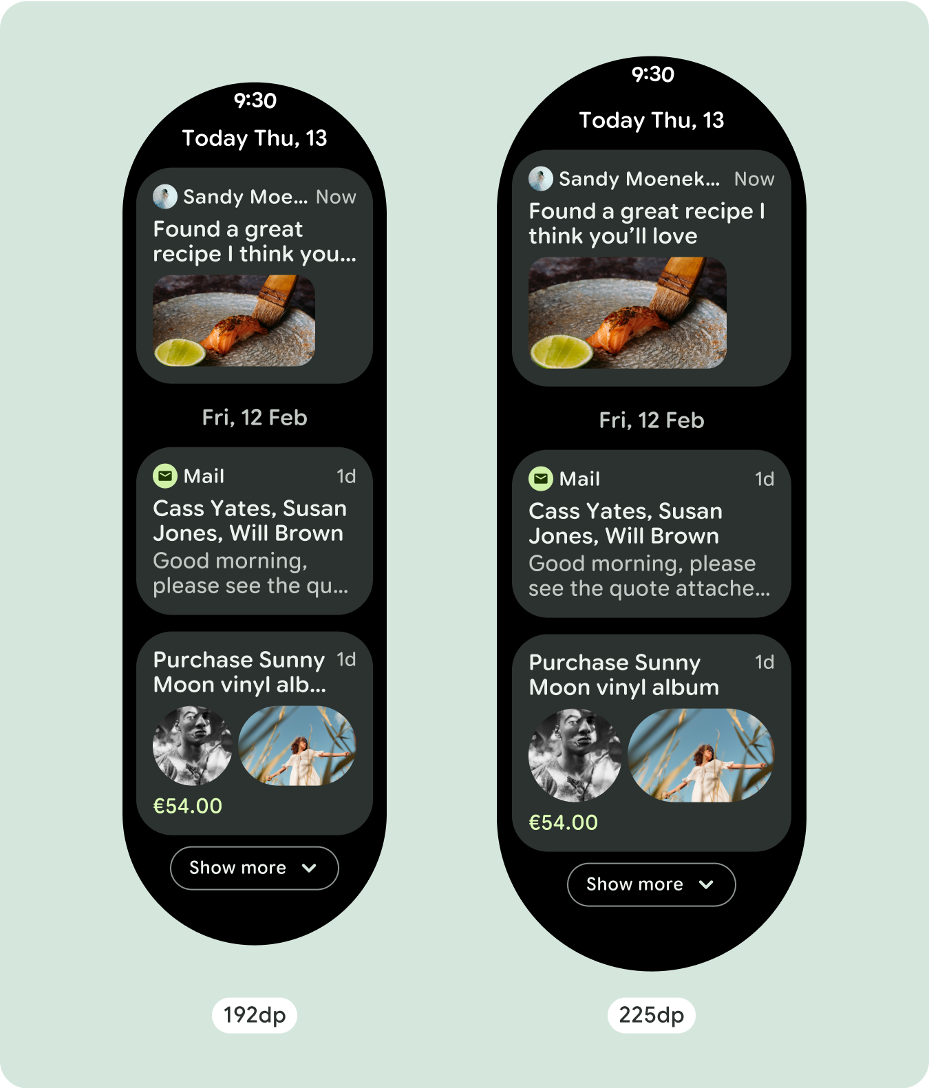
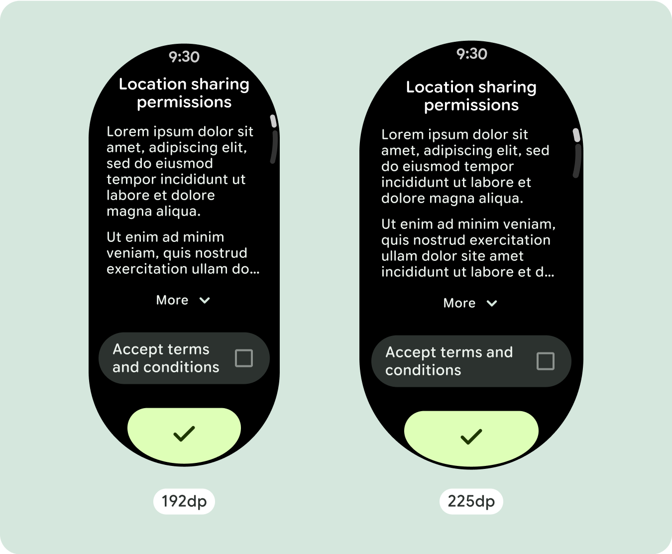
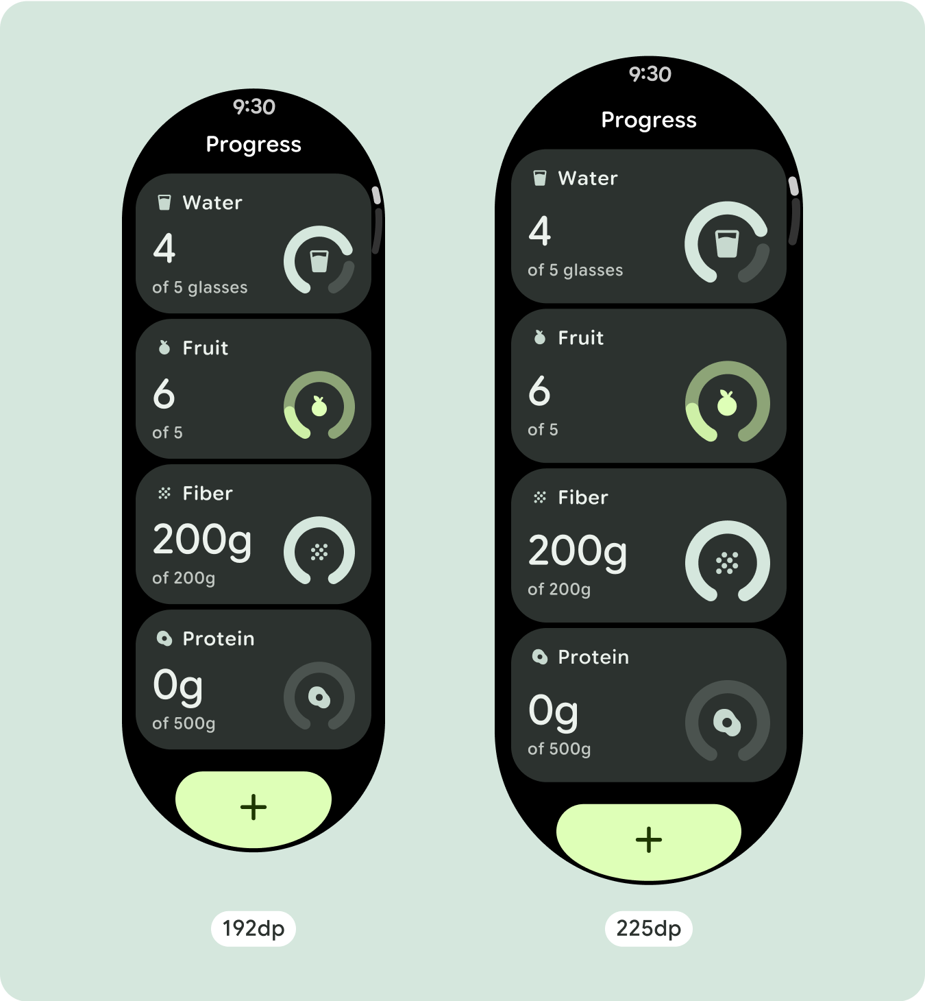
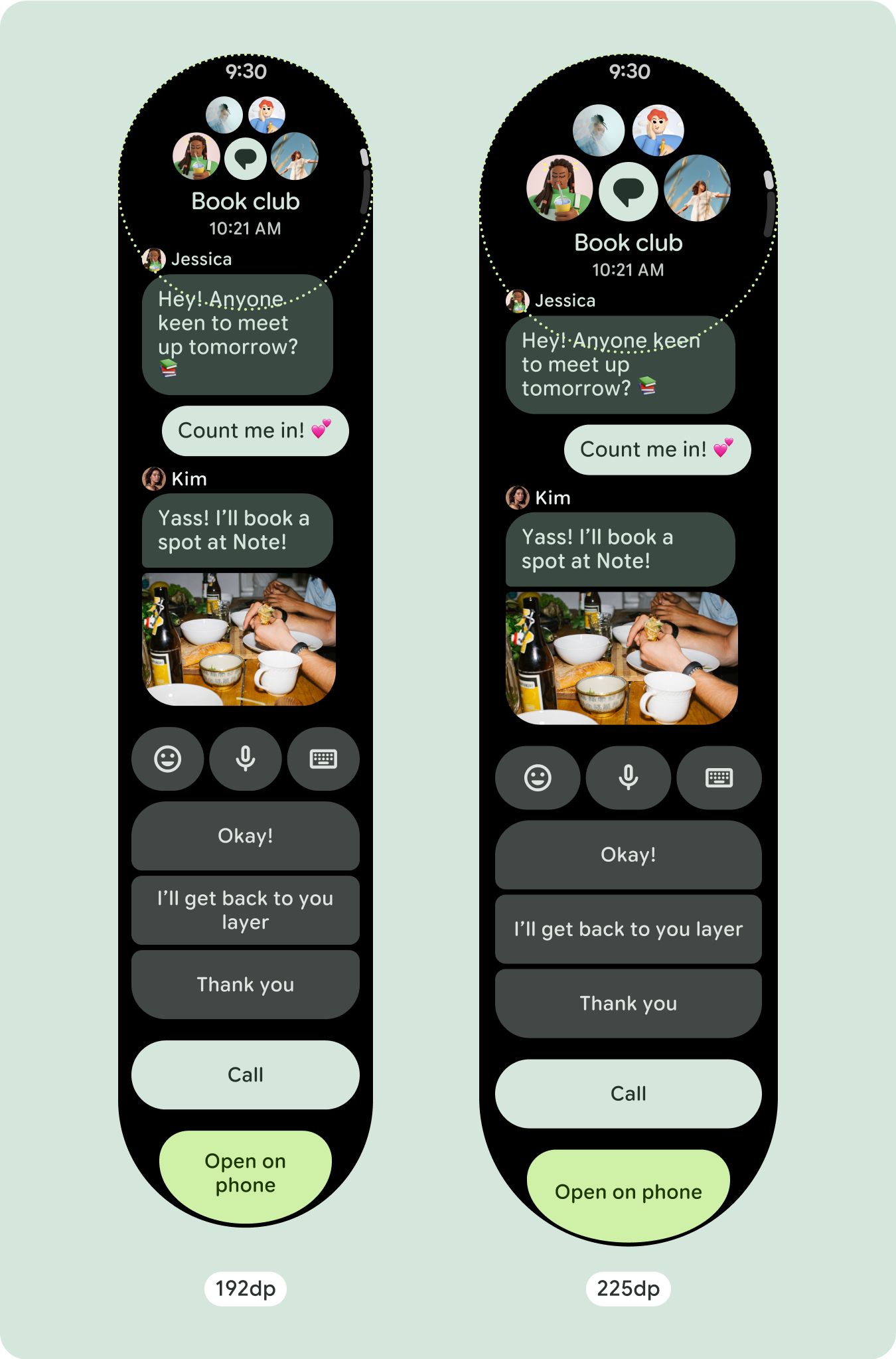
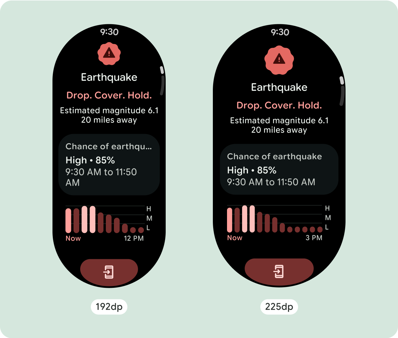
برای طراحیهای منحصربهفرد صفحهنمایش، اندازههای مختلف صفحهنمایش را بهطور کامل تست کنید، اطمینان حاصل کنید که اجزا و عناصر بهخوبی منطبق میشوند و از بریده شدن محتوا جلوگیری میکنند. حاشیههای درصدی ما به مقیاسبندی مؤثر فاصلهدهندهها کمک میکند، و توصیه میکنیم از نقطه شکست 225dp برای معرفی اطلاعات بیشتر و عملکرد بهبودیافته در صفحههای ساعت بزرگتر استفاده کنید.
بررسی کنید که اجزای عرض موجود را پر کنند
همه اجزا به صورت پاسخگو ساخته می شوند، به این معنی که عرض و ارتفاع موجود را پر می کنند. مطمئن شوید که حاشیههای لازم را دارید تا مطمئن شوید که محتوا توسط صفحه گرد بریده نمیشود.
نمایش کاراکترهای متنی اضافی
اکثر اجزا دارای کادرهای متنی هستند که عرض موجود را پر می کنند. این بدان معنی است که با افزایش عرض صفحه نمایش، آنها به طور خودکار تعداد کاراکترها را به دست می آورند.
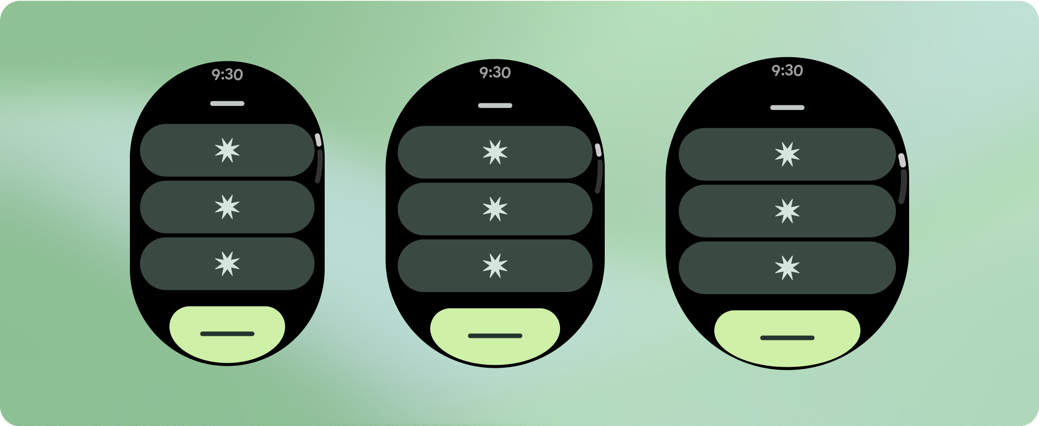
طراحی های تطبیقی و متمایز بسازید
از آنجایی که طرحبندیهای پیمایش بهطور خودکار موارد بیشتری را که قبلاً در زیر صفحه پنهان شده بود نشان میدهند، برای افزودن ارزش نیازی به انجام کار زیادی نیست. هر مؤلفه پهنای موجود را پر میکند، و در برخی موارد، ممکن است یک مؤلفه ردیفهای اضافی متن (مانند کارتها) به دست آورد یا مؤلفهها برای پر کردن عرض موجود (مانند دکمههای نماد) کشیده شوند.
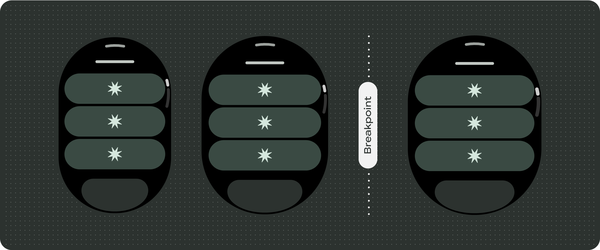
برای استفاده بهینه از فضای اضافی در اندازه های بزرگتر صفحه نمایش، یک نقطه شکست اندازه در 225dp اضافه کنید. این نقطه شکست امکان نمایش محتوای اضافی، اضافه کردن دکمهها یا دادههای بیشتر، یا تغییر طرحبندی را برای مطابقت بهتر با صفحه نمایش بزرگتر ممکن میسازد. این نیاز به طراحی متفاوتی برای هر نقطه شکست دارد. طراحی صفحه نمایش بزرگتر (225+) می تواند شامل عناصر اضافی زیر باشد:
اندازه را افزایش دهید یا وضعیت اجزای موجود را تغییر دهید
این می تواند به منظور نشان دادن جزئیات بیشتر یا قابل مشاهده تر کردن محتوا انجام شود.
چیدمان های بهینه شده و متفاوت
چیدمان میتواند پس از نقطه شکست 225dp کمی تغییر کند، به طوری که محتوای بالای صفحه در نمای پیشفرض بهینهسازی میشود، با این حال، تمام محتوای یکسان زیر تاشو باید بدون توجه به اندازه صفحه همچنان در دسترس باشند.
رفتار پاسخگو و سازگار
همه مؤلفههای موجود در کتابخانه Compose بهطور خودکار با اندازه گستردهتر صفحه سازگار میشوند و عرض و ارتفاع را افزایش میدهند. نماهای اسکرول که از شیوههای طراحی واکنشگرا استفاده میکنند، معمولاً با طیف وسیعی از اندازههای صفحه سازگار میشوند. با این حال، در برخی موارد خاص، میتوانید از یک نقطه شکست برای نادیده گرفتن ابعاد و تقویت طرحبندیها استفاده کنید که عملکرد را افزایش میدهد، قابلیت نگاه را بهبود میبخشد یا محتوا را بهتر روی صفحه نمایش میدهد.
تمام حاشیههای بالا، پایین و کناری باید بر حسب درصد تعریف شوند تا از بریده شدن و ایجاد مقیاسبندی متناسب عناصر جلوگیری شود. در نظر بگیرید که PositionIndicator
زمانی که کاربر پیمایش می کند ظاهر می شود و بدون توجه به اندازه آن، به طور خودکار قاب صفحه را در آغوش می گیرد.
چک لیست
- حاشیه های بالا، پایین و کناری توصیه شده را اعمال کنید.
- حاشیه های بیرونی را در مقادیر درصد تعریف کنید تا از برش در ابتدا و انتهای ظرف قابل پیمایش جلوگیری کنید.
- حاشیه ها را در مقادیر ثابت DP بین عناصر UI اعمال کنید.
- استفاده از نقطه شکست در 225dp را در نظر بگیرید تا محتوای اضافی را معرفی کنید یا محتوای موجود را در اندازههای صفحه بزرگتر قابل مشاهدهتر کنید.

تجربیات متمایز ایجاد کنید
نماهای اسکرول بسیار قابل تنظیم هستند، با قابلیت افزودن هر ترکیبی از اجزا به هر ترتیب. حاشیه های بالا و پایین بسته به اینکه کدام اجزا در بالا و پایین قرار می گیرند می توانند تغییر کنند. این برای جلوگیری از بریده شدن محتوا توسط منحنی رو به رشد صفحه است.

محتوا و نمونه کدها در این صفحه مشمول پروانههای توصیفشده در پروانه محتوا هستند. جاوا و OpenJDK علامتهای تجاری یا علامتهای تجاری ثبتشده Oracle و/یا وابستههای آن هستند.
تاریخ آخرین بهروزرسانی 2025-07-29 بهوقت ساعت هماهنگ جهانی.
[[["درک آسان","easyToUnderstand","thumb-up"],["مشکلم را برطرف کرد","solvedMyProblem","thumb-up"],["غیره","otherUp","thumb-up"]],[["اطلاعاتی که نیاز دارم وجود ندارد","missingTheInformationINeed","thumb-down"],["بیشازحد پیچیده/ مراحل بسیار زیاد","tooComplicatedTooManySteps","thumb-down"],["قدیمی","outOfDate","thumb-down"],["مشکل ترجمه","translationIssue","thumb-down"],["مشکل کد / نمونهها","samplesCodeIssue","thumb-down"],["غیره","otherDown","thumb-down"]],["تاریخ آخرین بهروزرسانی 2025-07-29 بهوقت ساعت هماهنگ جهانی."],[],[],null,["# Common layouts for scrolling apps\n\nScrolling app view layouts include lists (`TransformingLazyColumn`) and dialogs.\nThese layouts make up the majority of app screens, and they represent a\ncollection of components which need to adapt to larger screen sizes. Check that\nthe components are responsive---that is, that they fill the available width and\nadopt the `TransformingLazyColumn` adjustments when more of the screen's height\nis available. These layouts are built responsively already, and we have some\nadditional recommendations to take further advantage of the expanded real\nestate.\n\nBuild responsive and optimized designs\n--------------------------------------\n\nTo help your design layouts adapt to larger screen sizes, we have updated the\nbehavior of our layouts and components to have built-in responsive behavior,\nincluding percentage-based margins and padding. To address this, we have updated\nour Android UI library layouts and components with built-in responsive behavior,\nincluding percentage-based margins and padding. If you're utilizing our Compose\ncomponents, you can automatically inherit this responsiveness.\n\nFor unique screen designs, thoroughly test across a variety of screen sizes,\nensuring components and elements adapt smoothly and avoid content clipping. Our\npercentage margins help spacers scale effectively, and we recommend using a\nbreakpoint at 225dp to introduce additional information and enhanced\nfunctionality on larger watch screens.\n\n### Check that components fill the available width\n\n\nAll components are built responsively, meaning they fill the available width and\nheight. Make sure you have the necessary margins to ensure content doesn't get\nclipped by the rounding screen. \n\n\n\u003cbr /\u003e\n\n### Show additional text characters\n\n\nMost components have text boxes which fill the available width. This means that\nthey automatically gain character counts as the screen width increases. \n\n\n\u003cbr /\u003e\n\nBuild adaptive and differentiated designs\n-----------------------------------------\n\nAs scrolling layouts will automatically show more of what was previously hidden\nbelow the screen fold, there isn't much you need to do to add value. Each\ncomponent fills the available width, and in some cases, a component might gain\nadditional rows of text (such as cards), or components stretch to fill the\navailable width (such as icon buttons).\n\nTo best use the additional space on larger screen sizes, add a size breakpoint\nat 225dp. This breakpoint makes it possible to reveal additional content,\ninclude more buttons or data, or change the layout to better suit the larger\nscreen. This requires a different design for each breakpoint. The larger screen\ndesign (225+) could include the following additional elements:\n\n### Increase the size or change the state of the existing components\n\n\nThis could be done in order to show more detail or make the content more\nglanceable. \n\n\u003cbr /\u003e\n\n### Optimized and differentiated layouts\n\n\nThe layout can alter slightly after the 225dp breakpoint, so that the content\nabove the fold in the default view is optimized, however all of the same content\nbelow the fold should still be available regardless of screen size. \n\n\u003cbr /\u003e\n\nResponsive and adaptive behavior\n--------------------------------\n\nAll components in the Compose library will automatically adapt to the wider\nscreen size, and gain width and height. Scroll views that use responsive design\npractices usually adapt to a range of screen sizes. However, in some special\ncases, you can use a breakpoint to override dimensions and augment layouts which\nexpand functionality, improve glanceability, or make content fit better on\nscreen.\n\nAll top, bottom, and side margins should be defined in percentages to avoid\nclipping and provide proportional scaling of elements. Consider that the\n`PositionIndicator` appears when the user scrolls, and it automatically hugs the\nscreen's bezel no matter its size.\n\n### Checklist\n\n- Apply the recommended top, bottom, and side margins.\n- Define outer margins in percentage values to prevent clipping at the beginning and end of the scrollable container.\n- Apply margins in fixed DP values between UI elements.\n- Consider applying a breakpoint at 225dp to introduce additional content or make existing content more glanceable when on bigger screen sizes.\n\nCreate differentiated experiences\n---------------------------------\n\nScrolling views are highly customizable, with the ability to add any combination\nof components in any order. The top and bottom margins can change depending on\nwhich components sit at the top and bottom. This is to prevent content from\nbeing clipped by the growing curve of the screen."]]