
基本通知には通常、1 つのタイトル、1 行のテキスト、レスポンスとしてユーザーが実行可能なアクションが表示されます。詳細な情報を提供したい場合は、このドキュメントで説明している通知テンプレートのいずれかを適用して、大型の展開可能型通知を作成してください。
まず、通知を作成するで説明しているように、基本的なコンテンツをすべて含めた通知を作成します。次に、以下の例に示すように、スタイル オブジェクトを指定して setStyle() を呼び出し、各テンプレートに対応する情報を指定します。
大きな画像を追加する
通知に画像を追加するには、NotificationCompat.BigPictureStyle のインスタンスを setStyle() に渡します。
var notification = NotificationCompat.Builder(context, CHANNEL_ID) .setSmallIcon(com.example.compose.snippets.R.drawable.ic_logo) .setContentTitle("Title") .setContentText("Content text") .setStyle( NotificationCompat.BigPictureStyle() .bigPicture(bitmapImage) ) .build()
次の図に示すように、通知が折りたたまれているときはサムネイルだけを表示するには、setLargeIcon() を呼び出して画像を渡します。さらに、BigPictureStyle.bigLargeIcon() を呼び出して null を渡し、通知が展開されたときに大きなアイコンが表示されないようにします。
notification = NotificationCompat.Builder(context, CHANNEL_ID) .setSmallIcon(R.drawable.ic_logo) .setContentTitle("Title") .setContentText("Content text") .setLargeIcon(Icon.createWithResource(context, R.drawable.dog)) .setStyle( NotificationCompat.BigPictureStyle() .bigPicture(bitmapImage) .bigLargeIcon(null as Bitmap?) ) .build()
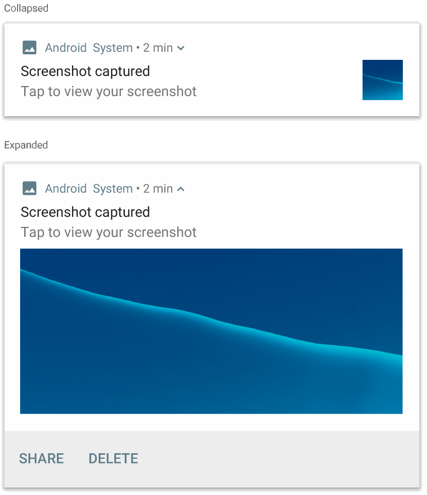
NotificationCompat.BigPictureStyle を使用した通知。
大きなテキスト ブロックを追加する
NotificationCompat.BigTextStyle を適用すると、通知の展開コンテンツ領域にテキストを表示できます。
notification = NotificationCompat.Builder(context, CHANNEL_ID) .setSmallIcon(R.drawable.ic_logo) .setContentTitle("Sender name") .setContentText("Email subject") .setLargeIcon(Icon.createWithResource(context, R.drawable.dog)) .setStyle( NotificationCompat.BigTextStyle() .bigText(someVeryLongMessage) ) .build()
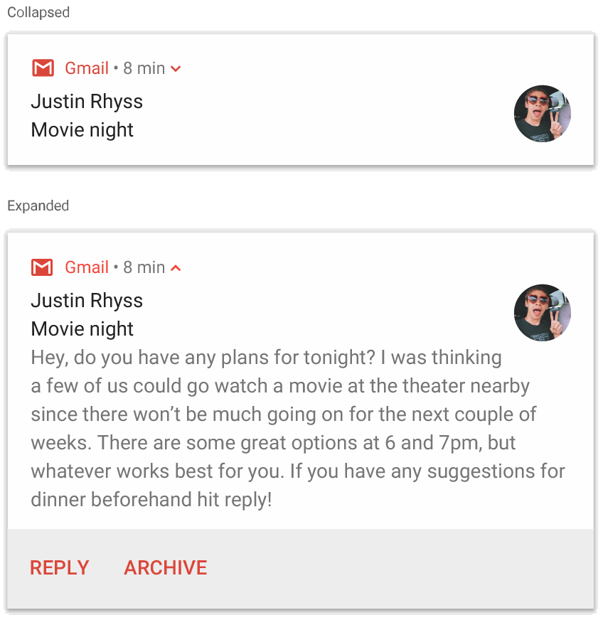
NotificationCompat.BigTextStyle を使用した通知。
受信トレイスタイルの通知を作成する
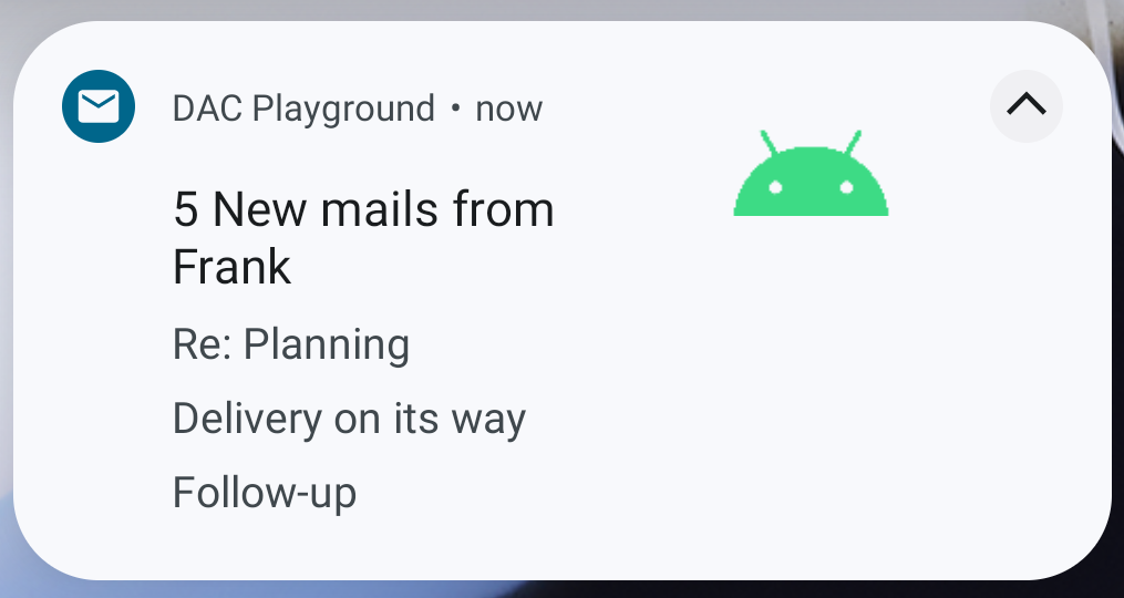
NotificationCompat.InboxStyle を通知に適用すると、受信メールの抜粋など、数行の簡潔な概要を追加することができます。これにより、NotificationCompat.BigTextStyle が提供する連続テキスト行ではなく、複数のコンテンツ テキストからそれぞれ 1 行だけの抜粋を表示することができます。
新しい行を追加するには、次の例に示すように、addLine() を最大 6 回呼び出します。6 行を超える行を追加しても、最初の 6 行しか表示されません。
notification = NotificationCompat.Builder(context, CHANNEL_ID) .setSmallIcon(R.drawable.mail) .setContentTitle("5 New mails from Frank") .setContentText("Check them out") .setLargeIcon(bitmapImage) .setStyle( NotificationCompat.InboxStyle() .addLine("Re: Planning") .addLine("Delivery on its way") .addLine("Follow-up") ) .build()
結果は次の図のようになります。
通知に会話を表示する
NotificationCompat.MessagingStyle を適用すると、さまざまな人との間でメッセージを順次表示できます。一貫したレイアウトで各メッセージを表示できるため、メッセージ アプリに最適です。この場合、送信者の名前とメッセージ テキストを別々に扱い、各メッセージを複数行に渡って表示することができます。
新しいメッセージを追加するには、addMessage() を呼び出して、メッセージ テキスト、受信日時、送信者の名前を渡します。次の例に示すように、この情報を NotificationCompat.MessagingStyle.Message オブジェクトとして渡すこともできます。
val message1 = NotificationCompat.MessagingStyle.Message( messages[0].text, messages[0].time, messages[0].sender ) val message2 = NotificationCompat.MessagingStyle.Message( messages[1].text, messages[1].time, messages[1].sender ) notification = NotificationCompat.Builder(context, CHANNEL_ID) .setSmallIcon(R.drawable.ic_logo) .setStyle( NotificationCompat.MessagingStyle(Person.Builder().setName("Me").build()) .addMessage(message1) .addMessage(message2) ) .build()
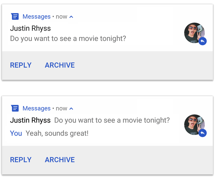
NotificationCompat.MessagingStyle を使用した通知。
NotificationCompat.MessagingStyle を使用する場合、setContentTitle() と setContentText() に渡した値は無視されます。
setConversationTitle() を呼び出すことで、会話の上部に表示するタイトルを追加できます。タイトルには、ユーザーが作成したグループ名を指定できます。また、特に名前を付けない場合は、会話の参加者のリストなどをタイトルにすることもできます。1 対 1 のチャットの場合は、会話タイトルを設定しないでください。このフィールドは、会話がグループかどうかを判断するヒントとして使用されます。
このスタイルが適用されるのは、Android 7.0(API レベル 24)以降を搭載しているデバイスに限られます。前述のように互換性ライブラリ(NotificationCompat)を使用する場合、MessagingStyle を指定した通知には、サポートされている展開通知スタイルが代替的に自動適用されます。
チャットの会話を対象としてこのような通知を作成する場合は、ダイレクト返信アクションを追加します。
メディア コントロールを備えた通知を作成する
MediaStyleNotificationHelper.MediaStyle を適用すると、メディア再生コントロールとトラック情報を表示できます。
関連付けられた MediaSession をコンストラクタで指定します。これにより、Android でメディアに関する正しい情報を表示できます。
addAction() を最大 5 回呼び出すことで、最大 5 つのアイコンボタンを表示できます。アルバムのアートワークを設定するには、setLargeIcon() を呼び出します。
他の通知スタイルとは異なり、MediaStyle を使用すると、折りたたみサイズ コンテンツ ビューも編集可能になり、3 つの操作ボタンも表示するように指定できます(このボタンは、折りたたみビューにも表示できます)。そのためには、操作ボタンのインデックスを setShowActionsInCompactView() に指定します。
次の例は、メディア コントロールを含む通知を作成する方法を示しています。
notification = NotificationCompat.Builder(context, CHANNEL_ID) // Show controls on lock screen even when user hides sensitive content. .setVisibility(NotificationCompat.VISIBILITY_PUBLIC) .setSmallIcon(com.example.compose.snippets.R.drawable.play) // Add media control buttons that invoke intents in your media service .addAction(R.drawable.previous, "Previous", null /* Add valid intent */) // #0 .addAction(R.drawable.pause, "Pause", null /* Add valid intent */) // #1 .addAction(R.drawable.next, "Next", null /* Add valid intent */) // #2 // Apply the media style template. .setStyle(MediaStyleNotificationHelper.MediaStyle(mediaSession) .setShowActionsInCompactView(1 /* #1: pause button */)) .setContentTitle("Wonderful music") .setContentText("My Awesome Band") .setLargeIcon(bitmapImage) .build()
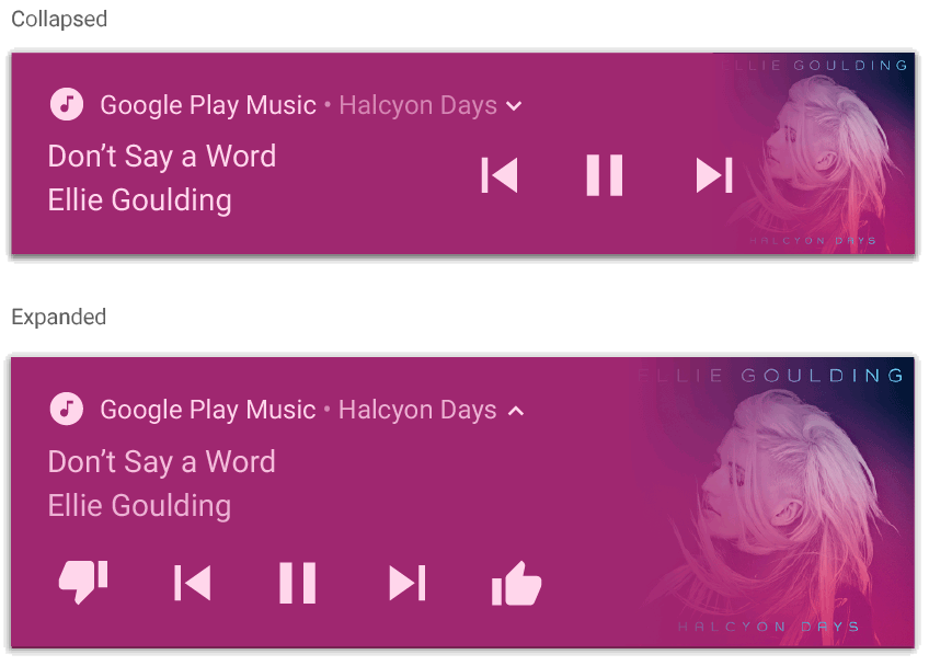
MediaStyleNotificationHelper.MediaStyle を使用した通知。
参考情報
MediaStyle と展開可能な通知の詳細については、次のリファレンスをご覧ください。