
التصميم المتعدد الأبعاد هو دليل شامل لتصميم المرئيات والحركة والتفاعل على جميع المنصات والأجهزة. لاستخدام التصميم المتعدد الأبعاد في تطبيقات Android، اتّبِع الإرشادات المحدّدة في مواصفات التصميم المتعدد الأبعاد. إذا كان تطبيقك يستخدم Jetpack Compose، يمكنك استخدام الـ Compose Material 3 library. إذا كان تطبيقك يستخدم طرق العرض، يمكنك استخدام مكتبة Android Material Components.
يوفّر Android الميزات التالية لمساعدتك في إنشاء تطبيقات تستخدم التصميم المتعدد الأبعاد:
- مظهر تطبيق يستند إلى التصميم المتعدد الأبعاد لتنسيق جميع عناصر واجهة المستخدِم
- عناصر لواجهات العرض المعقّدة، مثل القوائم والبطاقات
- واجهات برمجة تطبيقات للظلال والصور المتحركة المخصّصة
المظهر والعناصر المستندة إلى التصميم المتعدد الأبعاد
للاستفادة من ميزات التصميم المتعدد الأبعاد، مثل تنسيق عناصر واجهة المستخدِم العادية، ولتبسيط تعريف نمط تطبيقك، طبِّق مظهرًا يستند إلى التصميم المتعدد الأبعاد على تطبيقك.
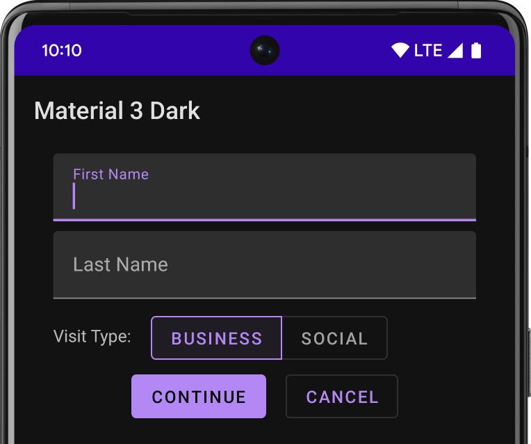
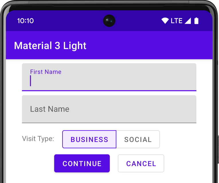
إذا كنت تستخدم استوديو Android لإنشاء مشروع Android، يتم تطبيق مظهر يستند إلى التصميم المتعدد الأبعاد تلقائيًا. للتعرّف على كيفية تعديل مظهر مشروعك، اطّلِع على المقالة الأنماط والمظاهر.
لتوفير تجربة مألوفة للمستخدمين، استخدِم أنماط تجربة المستخدم الأكثر شيوعًا في التصميم المتعدد الأبعاد:
- روِّج للإجراء الرئيسي في واجهة المستخدِم باستخدام زرّ الإجراء الرئيسي (FAB).
- اعرض علامتك التجارية والتنقّل والبحث والإجراءات الأخرى باستخدام الـ شريط التطبيق.
- اعرض تنقّل تطبيقك وأخفِه باستخدام لائحة التنقّل.
- اختَر من بين العديد من عناصر التصميم المتعدد الأبعاد الأخرى لتخطيط تطبيقك والتنقل فيه، مثل أشرطة الأدوات القابلة للطي وعلامات التبويب وشريط التنقل السفلي وغير ذلك. للاطّلاع عليها جميعًا، راجِع الـ كتالوج Material Components for Android.
استخدِم Material Icons المحدّدة مسبقًا كلّما أمكن ذلك. على سبيل المثال، بالنسبة إلى زر "القائمة" في لائحة التنقّل، استخدِم رمز "الهمبرغر" العادي. راجِع التصميم المتعدد الأبعاد Icons للاطّلاع على قائمة بالرموز المتاحة. يمكنك أيضًا استيراد رموز رسومات موجّهة يمكن تغيير حجمها (SVG) من مكتبة رمز متوافق مع إرشادات التصميم المتعدّد الأبعاد باستخدام استوديو مواد العرض الخاصة بالمتّجهات في استوديو Android .
الظلال والبطاقات المستندة إلى الارتفاع
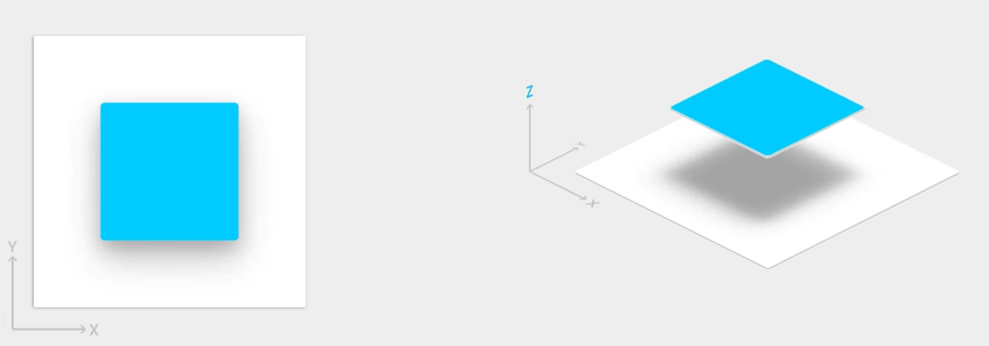
بالإضافة إلى سمتَي X و Y، تتضمّن طرق العرض في Android سمة Z. تمثّل هذه السمة ارتفاع طريقة العرض، ما يحدّد ما يلي:
- حجم الظل: تُنشئ طرق العرض التي تتضمّن قيم Z أعلى ظلالاً أكبر.
- ترتيب الرسم: تظهر طرق العرض التي تتضمّن قيم Z أعلى فوق طرق العرض الأخرى.
يمكنك تطبيق الارتفاع على تخطيط يستند إلى البطاقات، ما يساعدك في عرض معلومات مهمة داخل بطاقات توفّر مظهرًا مستندًا إلى التصميم المتعدد الأبعاد. يمكنك استخدام عنصر CardView لإنشاء بطاقات ذات ارتفاع تلقائي. لمزيد من المعلومات، اطّلِع على المقالة
إنشاء تخطيط يستند إلى البطاقات.
لمعلومات عن إضافة الارتفاع إلى طرق العرض الأخرى، اطّلِع على المقالة إنشاء الظلال واقتصاص طرق العرض.
الصور المتحركة
تتيح لك واجهات برمجة التطبيقات للصور المتحركة إنشاء صور متحركة مخصّصة للاهتزاز عند لمس الشاشة في عناصر التحكّم في واجهة المستخدِم، والتغييرات في حالة طريقة العرض، والانتقالات بين الأنشطة.
تتيح لك واجهات برمجة التطبيقات هذه ما يلي:
- الردّ على أحداث اللمس في طرق العرض باستخدام صور متحركة للاهتزاز عند لمس الشاشة
- إخفاء طرق العرض وإظهارها باستخدام صور متحركة للكشف الدائري
- التبديل بين الأنشطة باستخدام صور متحركة مخصّصة للانتقال بين الأنشطة
- إنشاء صور متحركة أكثر طبيعية باستخدام الحركة المنحنية
- تحريك التغييرات في سمة واحدة أو أكثر من سمات طريقة العرض باستخدام صور متحركة لتغيير حالة طريقة العرض
- عرض صور متحركة في رسومات الحالة القابلة للرسم بين تغييرات حالة طريقة العرض
تكون الصور المتحركة للاهتزاز عند لمس الشاشة مضمّنة في العديد من طرق العرض العادية، مثل الأزرار. تتيح لك واجهات برمجة التطبيقات للصور المتحركة تخصيص هذه الصور المتحركة وإضافتها إلى طرق العرض المخصّصة.
لمزيد من المعلومات، اطّلِع على المقالة مقدّمة عن الصور المتحركة.
الرسومات القابلة للرسم
تساعدك الإمكانات التالية للرسومات القابلة للرسم في تنفيذ تطبيقات تستخدم التصميم المتعدد الأبعاد:
- الرسومات المتجهة القابلة للرسم قابلة للتوسيع بدون فقدان الوضوح ومثالية للرموز داخل التطبيق ذات اللون الواحد. مزيد من المعلومات عن الرسومات المتجهة القابلة للرسم.
- تتيح لك ميزة تلوين الرسومات القابلة للرسم تحديد الصور النقطية كقناع ألفا وتلوينها بلون في وقت التشغيل. كيفية إضافة لون إلى الرسومات القابلة للرسم إضافة لون إلى الرسومات القابلة للرسم.
- تتيح لك ميزة استخراج الألوان استخراج الألوان البارزة تلقائيًا من صورة نقطية. كيفية اختيار الألوان باستخدام Palette API