
Once you target SDK 35 or higher on a device running Android 15 or higher, your app is displayed edge-to-edge. The window spans the entire width and height of the display by drawing behind the system bars. System bars include the status bar, caption bar, and navigation bar.
Many apps have a top app bar. The top app bar should stretch to the top edge of the screen and display behind the status bar. Optionally, the top app bar can shrink to the height of the status bar when the content scrolls.
Many apps also have a bottom app bar or bottom navigation bar. These bars should also stretch to the bottom edge of the screen and display behind the navigation bar. Otherwise, apps should show scrolling content behind the navigation bar.
When implementing an edge-to-edge layout in your app, keep the following in mind:
- Enable an edge-to-edge display
- Implement adaptive layouts to optimize the user experience on different form factors
- Handle any visual overlaps
- Consider showing scrims behind the system bars
Enable edge-to-edge display
If your app targets SDK 35 or later, edge-to-edge is automatically enabled for Android 15 devices or later.
To enable edge-to-edge on previous Android versions, manually call
enableEdgeToEdge in onCreate of your Activity.
Kotlin
 override fun onCreate(savedInstanceState: Bundle?) {
         super.onCreate(savedInstanceState)
         WindowCompat.enableEdgeToEdge(window)
        ...
      }
Java
 @Override
      protected void onCreate(@Nullable Bundle savedInstanceState) {
        super.onCreate(savedInstanceState);
        WindowCompat.enableEdgeToEdge(getWindow());
        ...
      }
By default, enableEdgeToEdge() makes the system bars transparent, except on
3-button navigation mode where the navigation bar gets a translucent scrim. The
colors of the system icons and the scrim are adjusted based on the system
light or dark theme.
To enable edge-to-edge display in your app without using the
enableEdgeToEdge() function, see
Manually set up the edge-to-edge display.
Handle overlaps using insets
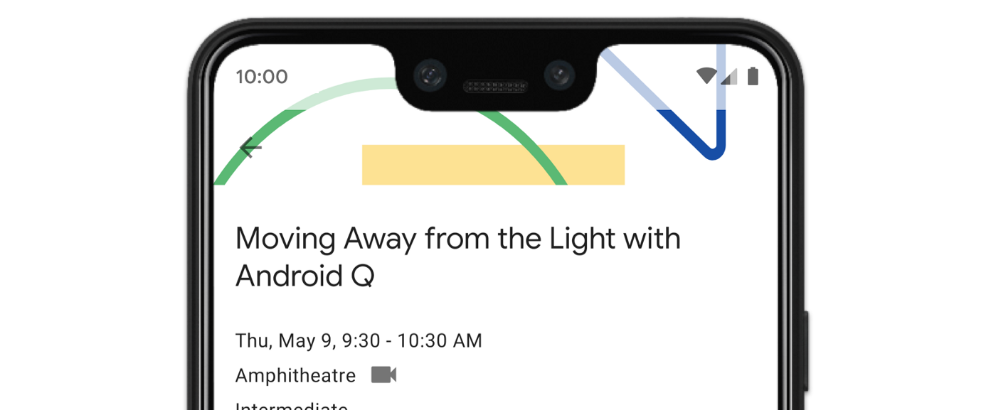
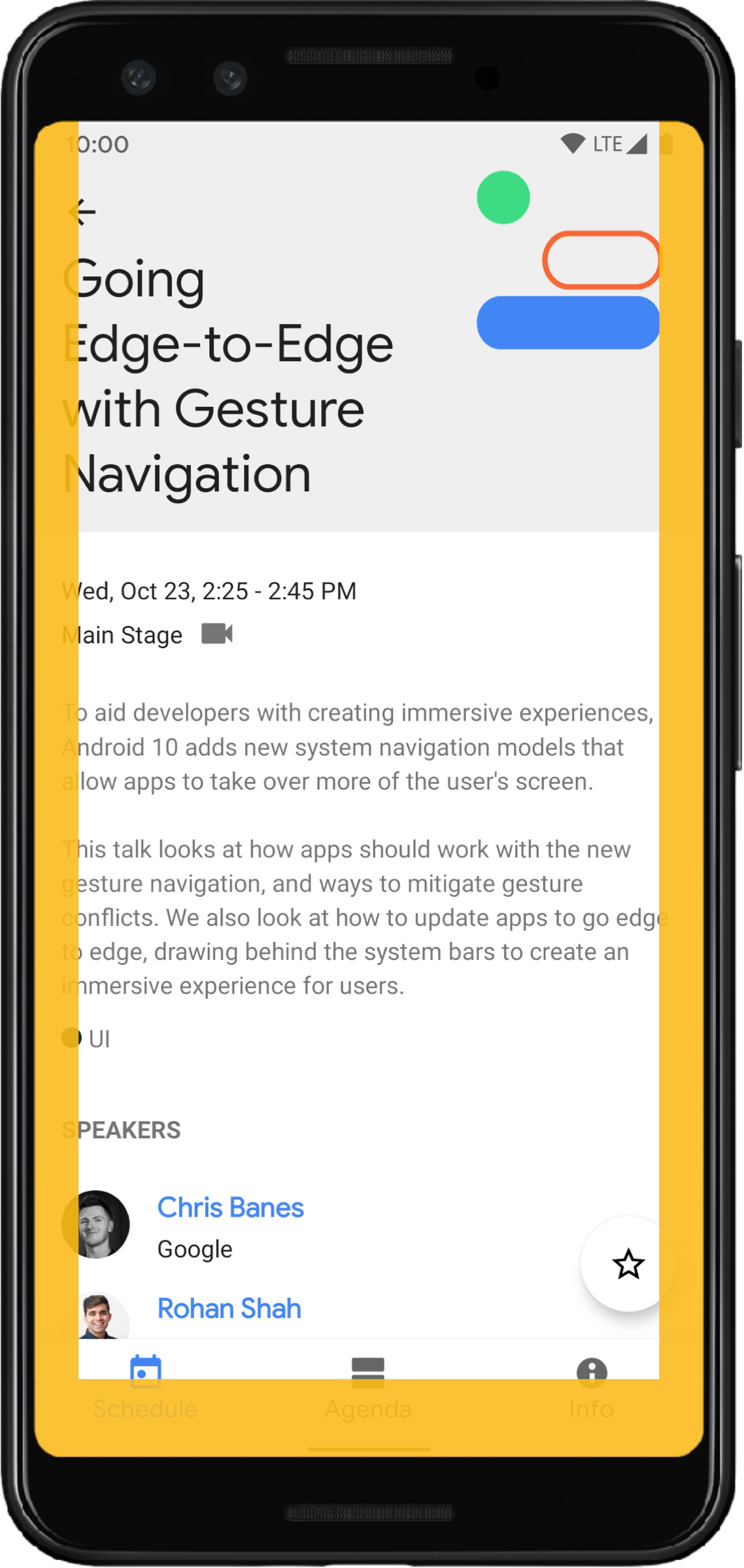
Some of your app's views might draw behind the system bars, as shown in figure 3.
You can address overlaps by reacting to insets, which specify which parts of the screen intersect with system UI such as the navigation bar or the status bar. Intersecting can mean displaying above the content, but it can also inform your app about system gestures.
The types of insets that apply to displaying your app edge-to-edge are:
System bars insets: best for views that are tappable and that must not be visually obscured by the system bars.
Display cutout insets: for areas where there may be a screen cutout due to the shape of the device.
System gesture insets: for gesture-navigational areas used by the system that take priority over your app.
System bars insets
System bar insets are the most commonly used type of insets. They represent the area where the system UI displays in the Z-axis above your app. They are best used to move or pad views in your app that are tappable and that must not be visually obscured by the system bars.
For example, the floating action button (FAB) in figure 3 is partially obscured by the navigation bar:
To avoid this kind of visual overlap in either gesture mode or button mode, you
can increase the view's margins using
getInsets(int)
with
WindowInsetsCompat.Type.systemBars().
The following code example shows how to implement system bar insets:
Kotlin
ViewCompat.setOnApplyWindowInsetsListener(fab) { v, windowInsets ->
  val insets = windowInsets.getInsets(WindowInsetsCompat.Type.systemBars())
  // Apply the insets as a margin to the view. This solution sets
  // only the bottom, left, and right dimensions, but you can apply whichever
  // insets are appropriate to your layout. You can also update the view padding
  // if that's more appropriate.
  v.updateLayoutParams<MarginLayoutParams> {
      leftMargin = insets.left
      bottomMargin = insets.bottom
      rightMargin = insets.right
  }

  // Return CONSUMED if you don't want the window insets to keep passing
  // down to descendant views.
  WindowInsetsCompat.CONSUMED
}
Java
ViewCompat.setOnApplyWindowInsetsListener(fab, (v, windowInsets) -> {
  Insets insets = windowInsets.getInsets(WindowInsetsCompat.Type.systemBars());
  // Apply the insets as a margin to the view. This solution sets only the
  // bottom, left, and right dimensions, but you can apply whichever insets are
  // appropriate to your layout. You can also update the view padding if that's
  // more appropriate.
  MarginLayoutParams mlp = (MarginLayoutParams) v.getLayoutParams();
  mlp.leftMargin = insets.left;
  mlp.bottomMargin = insets.bottom;
  mlp.rightMargin = insets.right;
  v.setLayoutParams(mlp);

  // Return CONSUMED if you don't want the window insets to keep passing
  // down to descendant views.
    return WindowInsetsCompat.CONSUMED;
});
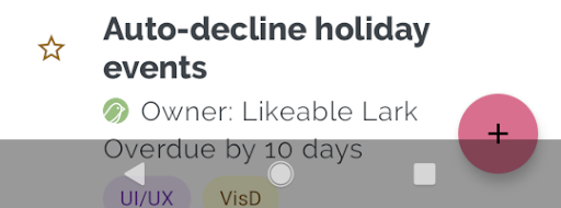
If you apply this solution to the example shown in figure 3, it results in no visual overlap in button mode, as shown in figure 4:
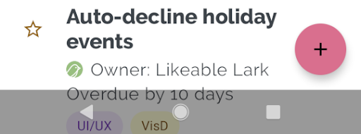
The same applies to gesture navigation mode, as shown in figure 5:
Display cutout insets
Some devices have display cutouts. Typically, the cutout is at the top of the screen and included in the status bar. When the device screen is in landscape mode, the cutout may be on the vertical edge. Depending on the content your app shows on the screen, you should implement padding to avoid display cutouts, as by default, apps will draw in the display cutout.
For example, many app screens show a list of items. Don't obscure list items with the display cutout or the system bars.
Kotlin
ViewCompat.setOnApplyWindowInsetsListener(binding.recyclerView) { v, insets ->
  val bars = insets.getInsets(
    WindowInsetsCompat.Type.systemBars()
      or WindowInsetsCompat.Type.displayCutout()
  )
  v.updatePadding(
    left = bars.left,
    top = bars.top,
    right = bars.right,
    bottom = bars.bottom,
  )
  WindowInsetsCompat.CONSUMED
}
Java
ViewCompat.setOnApplyWindowInsetsListener(mBinding.recyclerView, (v, insets) -> {
  Insets bars = insets.getInsets(
    WindowInsetsCompat.Type.systemBars()
    | WindowInsetsCompat.Type.displayCutout()
  );
  v.setPadding(bars.left, bars.top, bars.right, bars.bottom);
  return WindowInsetsCompat.CONSUMED;
});
Determine the value of WindowInsetsCompat by taking the logical or of the
system bars and the display cutout types.
Set clipToPadding to the RecyclerView so that the padding scrolls with the
list items. This allows the items to go behind the system bars when the user
scrolls, as shown in the following example.
<androidx.recyclerview.widget.RecyclerView
    android:id="@+id/recycler_view"
    android:layout_width="match_parent"
    android:layout_height="match_parent"
    android:clipToPadding="false"
    app:layoutManager="androidx.recyclerview.widget.LinearLayoutManager" />
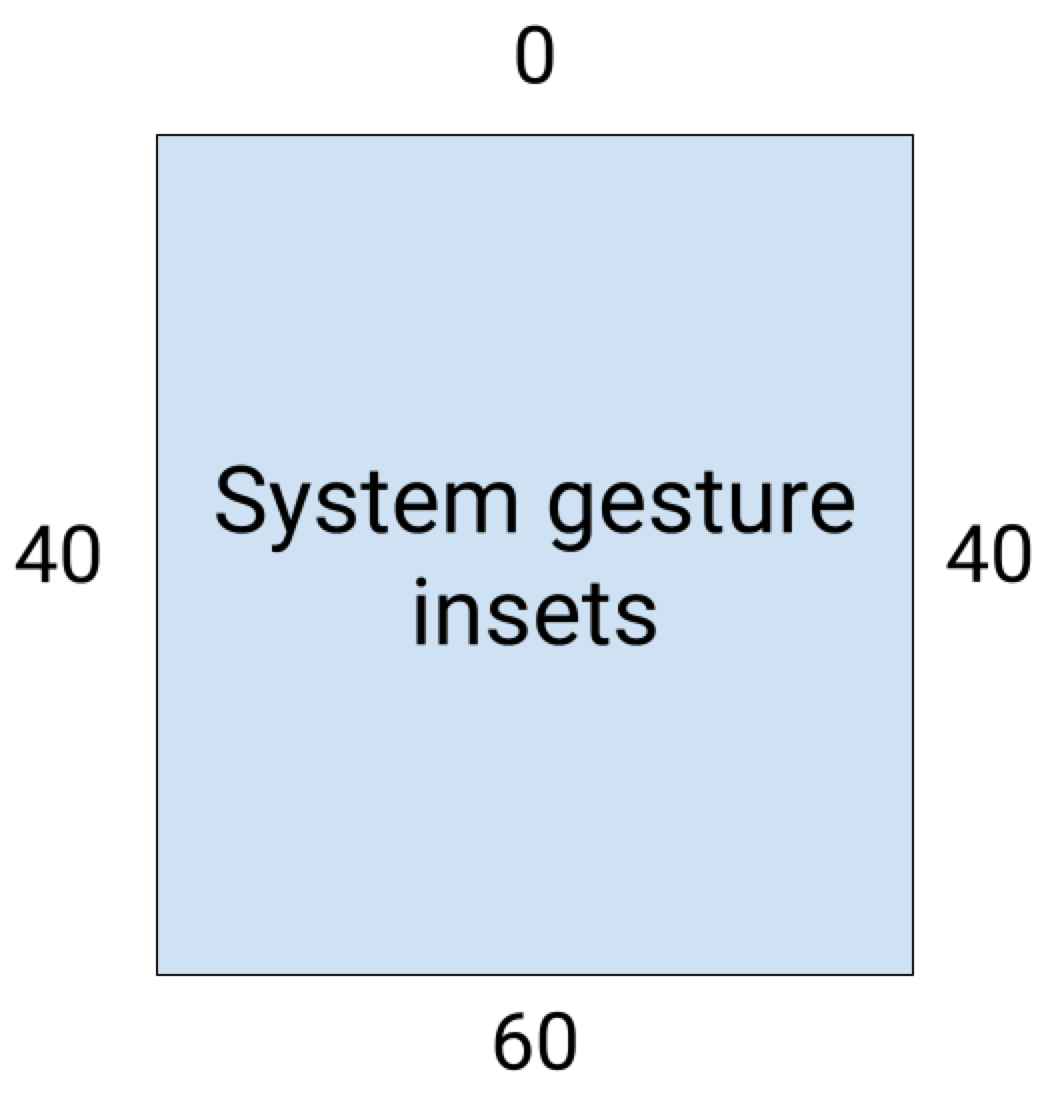
System gesture insets
System gesture insets represent the areas of the window where system gestures take priority over your app. These areas are shown in orange in figure 6:
Like the system bar insets, you can avoid overlapping the system gesture insets
using
getInsets(int)
with
WindowInsetsCompat.Type.systemGestures().
Use these insets to move or pad swipeable views away from the edges. Common use
cases include bottom sheets,
swiping in games, and carousels implemented using
ViewPager2.
On Android 10 or later, system gesture insets contain a bottom inset for the home gesture, and a left and right inset for the back gestures:
The following code example shows how to implement system gesture insets:
Kotlin
ViewCompat.setOnApplyWindowInsetsListener(view) { view, windowInsets ->
    val insets = windowInsets.getInsets(WindowInsetsCompat.Type.systemGestures())
    // Apply the insets as padding to the view. Here, set all the dimensions
    // as appropriate to your layout. You can also update the view's margin if
    // more appropriate.
    view.updatePadding(insets.left, insets.top, insets.right, insets.bottom)

    // Return CONSUMED if you don't want the window insets to keep passing down
    // to descendant views.
    WindowInsetsCompat.CONSUMED
}
Java
ViewCompat.setOnApplyWindowInsetsListener(view, (v, windowInsets) -> {
    Insets insets = windowInsets.getInsets(WindowInsetsCompat.Type.systemGestures());
    // Apply the insets as padding to the view. Here, set all the dimensions
    // as appropriate to your layout. You can also update the view's margin if
    // more appropriate.
    view.setPadding(insets.left, insets.top, insets.right, insets.bottom);

    // Return CONSUMED if you don't want the window insets to keep passing down
    // to descendant views.
    return WindowInsetsCompat.CONSUMED;
});
Material components
Many views-based
Android Material Components
(com.google.android.material) automatically handle insets, including
BottomAppBar,
BottomNavigationView,
NavigationRailView
and NavigationView
However, AppBarLayout
doesn't automatically handle insets. Add
android:fitsSystemWindows="true"
to handle top insets.
Read how to handle insets with Material Components in Compose.
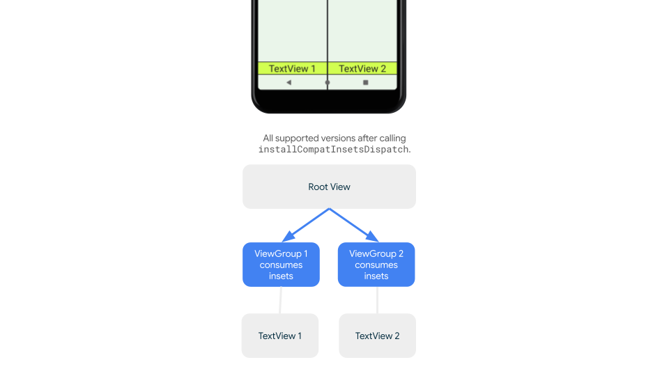
Backward compatible inset dispatching
To stop insets dispatching to children views and avoid over-padding, you can
consume insets using the
WindowInsetsCompat.CONSUMED
constant. However, on devices that run Android 10 (API level 29 and earlier),
insets aren't dispatched to siblings after calling
WindowInsetsCompat.CONSUMED, which can cause unintended visual overlap.
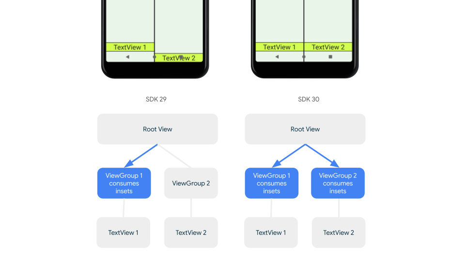
To confirm that insets are dispatched to siblings for all supported Android
versions, use ViewGroupCompat#installCompatInsetsDispatch before consuming
insets, available on
AndroidX Core and Core-ktx 1.16.0-alpha01
and higher.
Kotlin
// Use the i.d. assigned to your layout's root view, e.g. R.id.main
val rootView = findViewById(R.id.main)
// Call before consuming insets
ViewGroupCompat.installCompatInsetsDispatch(rootView)
Java
// Use the i.d. assigned to your layout's root view, e.g. R.id.main
LinearLayout rootView = findViewById(R.id.main);
// Call before consuming insets
ViewGroupCompat.installCompatInsetsDispatch(rootView);
Immersive mode
Some content is best experienced in full screen, giving the user a more
immersive experience. You can hide the system bars an for immersive mode using
the WindowInsetsController
and
WindowInsetsControllerCompat
libraries:
Kotlin
val windowInsetsController =
      WindowCompat.getInsetsController(window, window.decorView)

// Hide the system bars.
windowInsetsController.hide(Type.systemBars())

// Show the system bars.
windowInsetsController.show(Type.systemBars())
Java
Window window = getWindow();
WindowInsetsControllerCompat windowInsetsController =
      WindowCompat.getInsetsController(window, window.getDecorView());
if (windowInsetsController == null) {
    return;
  }
// Hide the system bars.
windowInsetsController.hide(WindowInsetsCompat.Type.systemBars());

// Show the system bars.
windowInsetsController.show(WindowInsetsCompat.Type.systemBars());
Refer to Hide system bars for immersive mode for more information about implementing this feature.
System bar icons
Calling enableEdgeToEdge ensures system bar icon colors update when the device
theme changes.
While going edge-to-edge, you might need to manually update the system bar icon colors so they contrast with your app's background. For example, to create light status bar icons:
Kotlin
WindowCompat.getInsetsController(window, window.decorView)
    .isAppearanceLightStatusBars = false
Java
WindowCompat.getInsetsController(window, window.getDecorView())
    .setAppearanceLightStatusBars(false);
System bar protection
Once your app targets SDK 35 or higher, edge-to-edge is enforced.
The system status bar and gesture navigation bars are transparent, but the
three-button navigation bar is translucent. Call enableEdgeToEdge to make this
backward compatible.
However, the system defaults might not work for all use cases. Consult the Android system bars design guidance and Edge-to-edge design to determine whether to use transparent or translucent system bars.
Create transparent system bars
Create a transparent status bar by targeting Android 15 (SDK 35) or higher or by
calling enableEdgeToEdge() with default arguments for earlier versions.
Create a transparent gesture navigation bar by targeting Android 15 or higher or
by calling enableEdgeToEdge() with default arguments for earlier versions. For
three-button navigation bar, set Window.setNavigationBarContrastEnforced
to false otherwise there will be a translucent scrim applied.
Create translucent system bars
To create a translucent status bar, do the following:
- Update your
androidx-coredependency to 1.16.0-beta01 or higher - Wrap your XML layout in
androidx.core.view.insets.ProtectionLayoutand assign an ID. - Programmatically access the
ProtectionLayoutto set protections, specifying the side and aGradientProtectionfor the status bar.
<androidx.core.view.insets.ProtectionLayout xmlns:android="http://schemas.android.com/apk/res/android" android:id="@+id/list_protection" android:layout_width="match_parent" android:layout_height="match_parent"> <ScrollView android:id="@+id/item_list" android:clipToPadding="false" android:layout_width="match_parent" android:layout_height="match_parent"> <!--items--> </ScrollView> </androidx.core.view.insets.ProtectionLayout>
findViewById<ProtectionLayout>(R.id.list_protection) .setProtections( listOf( GradientProtection( WindowInsetsCompat.Side.TOP, // Ideally, this is the pane's background color paneBackgroundColor ) ) )
Ensure the ColorInt passed into GradientProtection matches the content
background. For example, a list-detail layout displayed on a foldable might have
different GradientProtections of different colors for the list panel and the
detail panel.
Don't create a translucent gesture navigation bar. To create a translucent three-button navigation bar do one of the following:
- If you already have your layout wrapped in a
ProtectionView, you can pass an additionalColorProtectionorGradientProtectionto thesetProtectionsmethod. Before doing so, ensurewindow.isNavigationBarContrastEnforced = false. - Otherwise, set
window.isNavigationBarContrastEnforced = true.
Other tips
Additional tips when handling insets.
Make scrolling content edge-to-edge
Check that the last list item isn't obscured by the system bars in your
RecyclerView or NestedScrollView by handling insets and setting
clipToPadding to false.
The following video shows a RecyclerView with edge-to-edge display disabled
(left) and enabled (right):
See the code snippets in the Create dynamic lists with RecyclerView section for a code sample.
Make full-screen dialogs edge-to-edge
To make full-screen dialog's edge-to-edge, call enableEdgeToEdge on the Dialog.
Kotlin
class MyAlertDialogFragment : DialogFragment() {
    override fun onStart(){
        super.onStart()
        dialog?.window?.let { WindowCompat.enableEdgeToEdge(it) }
    }
    ...
}
Java
public class MyAlertDialogFragment extends DialogFragment {
    @Override
    public void onStart() {
        super.onStart();
        Dialog dialog = getDialog();
        if (dialog != null) {
            Window window = dialog.getWindow();
            if (window != null) {
                WindowCompat.enableEdgeToEdge(window);
            }
        }
    }
    ...
}
Additional resources
See the following references for more information on going edge-to-edge.
Blogs
Design
Other documentation
Videos