
The design of your app’s UI isn't tied to a particular device form factor. Android applications need to adapt to a number of different types of devices, from 4-inch handsets to 50-inch TVs to ChromeOS devices with resizable windows.
Your app’s user interface is drawn inside of a window, the size of which can change at will. You use resource qualifiers to provide different layouts for varying window sizes. These differences can be due to constraints in the size of the device’s screen, or they can be driven by the user using multi-window mode to change the window size.
Designing responsive content
You should provide a rich experience for all of your users, so you should have each screen in your app take full advantage of the window real estate available to you.
For example, an app running in a window taking up the full width of a phone screen could perhaps hide details for a piece of content when entering multi-window mode, and it could expand its user interface to provide more content when running in a window taking up the full width of a ChromeOS device’s screen.
In addition to addressing these user expectations, it's often necessary to provide more content on larger devices to avoid leaving too much whitespace or unwittingly introducing awkward interactions. In the following figure, you can see some of the problems that can arise when adapting a user interface design for a larger window:
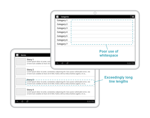
Figure 1. Not enough content on large-width windows leads to awkward whitespace and exceedingly long line lengths.
To learn more about designing responsive navigation experiences, see Navigation for responsive UIs.
Providing tailored user experiences
It’s important to provide unique experiences that go beyond expanding your content views to fill available space. You can tailor user interfaces to provide the ideal user experience for given window sizes, even using entirely different layouts and widgets.
In figure 2, a
BottomNavigationView
is used as top-level navigation when there is adequate vertical space to do so.
When the size of the window is reduced, as shown on the right side of the
figure, top-level navigation is instead implemented using a
DrawerLayout.
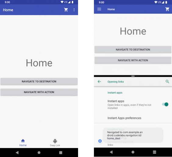
Figure 2. The bottom nav bar is replaced with a nav drawer when vertical space is limited.
Here are some other examples:
- A
Toolbarcan show or hide action menu items given the amount of available space. - A
RecyclerView.LayoutManagercould change its span count to take full advantage of the size of a window - You can increase the amount of detail you show for custom views as you have more space to do so.
These are all great ways to make sure that your users have great experiences wherever they’re running your app.
You can find more examples of responsive design patterns and ideas for adaptive layouts on material.io.