
Compose レイアウト モデルでは、AlignmentLine を使用してカスタム アライメント ラインを作成できます。これにより、親レイアウトで子の整列と配置を行うことができます。たとえば、Row では、その子のカスタム アライメント ラインを使用して子を整列できます。
レイアウトで特定の AlignmentLine に値を指定する場合、レイアウトの親は対応する Placeable インスタンスに Placeable.get 演算子を使用し、この値を測定した後に読み取ることができます。親は、AlignmentLine の位置に基づいて子の配置を決定できます。
Compose の一部のコンポーザブルには、すでにアライメント ラインが搭載されています。たとえば、BasicText コンポーザブルは、FirstBaseline と LastBaseline のアライメント ラインを公開します。
下の例では、firstBaselineToTop というカスタム LayoutModifier が FirstBaseline を読み取り、その最初のベースラインから Text にパディングを追加しています
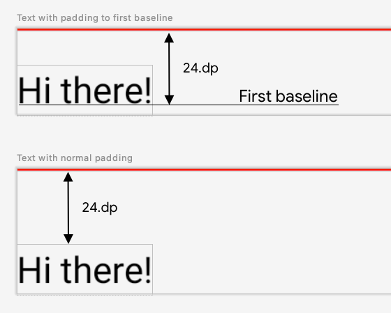
図 1. 特定の要素に通常のパディングを追加することと、テキスト要素のベースラインにパディングを適用することの違い。
fun Modifier.firstBaselineToTop( firstBaselineToTop: Dp, ) = layout { measurable, constraints -> // Measure the composable val placeable = measurable.measure(constraints) // Check the composable has a first baseline check(placeable[FirstBaseline] != AlignmentLine.Unspecified) val firstBaseline = placeable[FirstBaseline] // Height of the composable with padding - first baseline val placeableY = firstBaselineToTop.roundToPx() - firstBaseline val height = placeable.height + placeableY layout(placeable.width, height) { // Where the composable gets placed placeable.placeRelative(0, placeableY) } } @Preview @Composable private fun TextWithPaddingToBaseline() { MaterialTheme { Text("Hi there!", Modifier.firstBaselineToTop(32.dp)) } }
この例では、FirstBaseline を読み取るため、測定フェーズで placeable [FirstBaseline] を使用します。
カスタムのアライメント ラインを作成する
カスタム Layout コンポーザブルまたはカスタム LayoutModifier を作成するときに、カスタムのアライメント ラインを指定できます。これにより、他の親のコンポーザブルがそれらを使用して子を適切に整列させ、配置することが可能になります。
次の例は、他のコンポーザブルがグラフデータの最大値と最小値に整列できるように 2 つのアライメント ライン、MaxChartValue と MinChartValue を公開するカスタム BarChart コンポーザブルを示しています。2 つのテキスト要素、Max と Min がカスタム アライメント ラインの中心に整列しています。
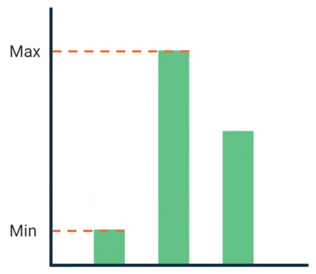
図 2. Text がデータの最大値と最小値に整列している BarChart コンポーザブル。
カスタム アライメント ラインは、プロジェクトの最上位の変数として定義されます。
/** * AlignmentLine defined by the maximum data value in a [BarChart] */ private val MaxChartValue = HorizontalAlignmentLine(merger = { old, new -> min(old, new) }) /** * AlignmentLine defined by the minimum data value in a [BarChart] */ private val MinChartValue = HorizontalAlignmentLine(merger = { old, new -> max(old, new) })
サンプルを作成するためのカスタムのアライメント ラインは HorizontalAlignmentLine 型です。これは、子を垂直方向に配置するために使用されます。複数のレイアウトでこれらのアライメント ラインの値が提供される場合、マージポリシーがパラメータとして渡されます。Compose レイアウト システムの座標と Canvas 座標は [0, 0] を表しているため、左上隅と、x 軸、y 軸の正の方向はすべて下向きであり、MaxChartValue 値は常に MinChartValue より小さくなります。したがって、マージポリシーは、グラフデータの最大値のベースラインでは min、グラフデータの最小値のベースラインでは max になります。
カスタムの Layout または LayoutModifier を作成する場合は、MeasureScope.layout メソッド(alignmentLines: Map<AlignmentLine, Int> パラメータを受け取ります)でカスタムのアライメント ラインを指定します。
@Composable private fun BarChart( dataPoints: List<Int>, modifier: Modifier = Modifier, ) { val maxValue: Float = remember(dataPoints) { dataPoints.maxOrNull()!! * 1.2f } BoxWithConstraints(modifier = modifier) { val density = LocalDensity.current with(density) { // ... // Calculate baselines val maxYBaseline = // ... val minYBaseline = // ... Layout( content = {}, modifier = Modifier.drawBehind { // ... } ) { _, constraints -> with(constraints) { layout( width = if (hasBoundedWidth) maxWidth else minWidth, height = if (hasBoundedHeight) maxHeight else minHeight, // Custom AlignmentLines are set here. These are propagated // to direct and indirect parent composables. alignmentLines = mapOf( MinChartValue to minYBaseline.roundToInt(), MaxChartValue to maxYBaseline.roundToInt() ) ) {} } } } } }
このコンポーザブルの直接的および間接的な親は、アライメント ラインを使用できます。次のコンポーザブルは、カスタム レイアウトを作成し、2 つの Text スロットとデータポイントをパラメータとして受け取り、2 つのテキストをグラフデータの最大値と最小値に整列させます。このコンポーザブルのプレビューを図 2 に示します。
@Composable private fun BarChartMinMax( dataPoints: List<Int>, maxText: @Composable () -> Unit, minText: @Composable () -> Unit, modifier: Modifier = Modifier, ) { Layout( content = { maxText() minText() // Set a fixed size to make the example easier to follow BarChart(dataPoints, Modifier.size(200.dp)) }, modifier = modifier ) { measurables, constraints -> check(measurables.size == 3) val placeables = measurables.map { it.measure(constraints.copy(minWidth = 0, minHeight = 0)) } val maxTextPlaceable = placeables[0] val minTextPlaceable = placeables[1] val barChartPlaceable = placeables[2] // Obtain the alignment lines from BarChart to position the Text val minValueBaseline = barChartPlaceable[MinChartValue] val maxValueBaseline = barChartPlaceable[MaxChartValue] layout(constraints.maxWidth, constraints.maxHeight) { maxTextPlaceable.placeRelative( x = 0, y = maxValueBaseline - (maxTextPlaceable.height / 2) ) minTextPlaceable.placeRelative( x = 0, y = minValueBaseline - (minTextPlaceable.height / 2) ) barChartPlaceable.placeRelative( x = max(maxTextPlaceable.width, minTextPlaceable.width) + 20, y = 0 ) } } } @Preview @Composable private fun ChartDataPreview() { MaterialTheme { BarChartMinMax( dataPoints = listOf(4, 24, 15), maxText = { Text("Max") }, minText = { Text("Min") }, modifier = Modifier.padding(24.dp) ) } }
あなたへのおすすめ
- 注: JavaScript がオフになっている場合はリンクテキストが表示されます
- Compose のグラフィック
- カスタム レイアウト {:#custom-layouts }
- Compose レイアウトの固有の測定値