
برنامهها اغلب نیاز دارند دادهها را در کانتینرهایی با سبک مشابه نمایش دهند، مانند کانتینرهایی که اطلاعات مربوط به موارد موجود در یک لیست را در خود نگه میدارند. سیستم، API CardView را برای شما فراهم میکند تا اطلاعات را در کارتهایی نمایش دهید که ظاهری ثابت در سراسر پلتفرم دارند. به عنوان مثال، کارتها دارای ارتفاع پیشفرض بالاتر از گروه نمای حاوی خود هستند، بنابراین سیستم سایههایی را در زیر آنها ترسیم میکند. کارتها راهی برای در بر گرفتن گروهی از نماها در عین ارائه سبکی ثابت برای کانتینر فراهم میکنند.
وابستگیها را اضافه کنید
ویجت CardView بخشی از AndroidX است. برای استفاده از آن در پروژه خود، وابستگی زیر را به فایل build.gradle ماژول برنامه خود اضافه کنید:
شیار
dependencies {
    implementation "androidx.cardview:cardview:1.0.0"
}
کاتلین
dependencies {
    implementation("androidx.cardview:cardview:1.0.0")
}
ایجاد کارتها
برای استفاده از CardView ، آن را به فایل layout خود اضافه کنید. از آن به عنوان یک گروه view برای قرار دادن viewهای دیگر استفاده کنید. در مثال زیر، CardView شامل یک ImageView و چند TextViews برای نمایش برخی اطلاعات به کاربر است:
<?xml version="1.0" encoding="utf-8"?>
<androidx.constraintlayout.widget.ConstraintLayout
    xmlns:android="http://schemas.android.com/apk/res/android"
    xmlns:app="http://schemas.android.com/apk/res-auto"
    android:padding="16dp"
    android:background="#E0F7FA"
    android:layout_width="match_parent"
    android:layout_height="match_parent">

    <androidx.cardview.widget.CardView
        android:layout_width="match_parent"
        android:layout_height="wrap_content"
        app:layout_constraintBottom_toBottomOf="parent"
        app:layout_constraintEnd_toEndOf="parent"
        app:layout_constraintStart_toStartOf="parent"
        app:layout_constraintTop_toTopOf="parent">

        <androidx.constraintlayout.widget.ConstraintLayout
            android:padding="4dp"
            android:layout_width="match_parent"
            android:layout_height="match_parent">

            <ImageView
                android:id="@+id/header_image"
                android:layout_width="match_parent"
                android:layout_height="200dp"
                android:src="@drawable/logo"
                app:layout_constraintEnd_toEndOf="parent"
                app:layout_constraintStart_toStartOf="parent"
                app:layout_constraintTop_toTopOf="parent" />

            <TextView
                android:id="@+id/title"
                style="@style/TextAppearance.MaterialComponents.Headline3"
                android:layout_width="match_parent"
                android:layout_height="wrap_content"
                android:layout_marginTop="4dp"
                android:text="I'm a title"
                app:layout_constraintEnd_toEndOf="parent"
                app:layout_constraintStart_toStartOf="parent"
                app:layout_constraintTop_toBottomOf="@id/header_image" />

            <TextView
                android:id="@+id/subhead"
                style="@style/TextAppearance.MaterialComponents.Subtitle2"
                android:layout_width="match_parent"
                android:layout_height="wrap_content"
                android:layout_marginTop="4dp"
                android:text="I'm a subhead"
                app:layout_constraintEnd_toEndOf="parent"
                app:layout_constraintStart_toStartOf="parent"
                app:layout_constraintTop_toBottomOf="@id/title" />

            <TextView
                android:id="@+id/body"
                style="@style/TextAppearance.MaterialComponents.Body1"
                android:layout_width="match_parent"
                android:layout_height="wrap_content"
                android:layout_marginTop="4dp"
                android:text="I'm a supporting text. Very Lorem ipsum dolor sit amet, consectetur adipiscing elit, sed do eiusmod tempor incididunt ut labore et dolore magna aliqua. Ut enim ad minim veniam, quis nostrud exercitation ullamco laboris nisi ut aliquip ex ea commodo consequat. Duis aute irure dolor in reprehenderit in voluptate velit esse cillum dolore eu fugiat nulla pariatur. Excepteur sint occaecat cupidatat non proident, sunt in culpa qui officia deserunt mollit anim id est laborum."
                app:layout_constraintEnd_toEndOf="parent"
                app:layout_constraintStart_toStartOf="parent"
                app:layout_constraintTop_toBottomOf="@id/subhead" />
        </androidx.constraintlayout.widget.ConstraintLayout>
    </androidx.cardview.widget.CardView>
</androidx.constraintlayout.widget.ConstraintLayout>
قطعه کد قبلی چیزی شبیه به کد زیر تولید میکند، با فرض اینکه از همان تصویر لوگوی اندروید استفاده میکنید:
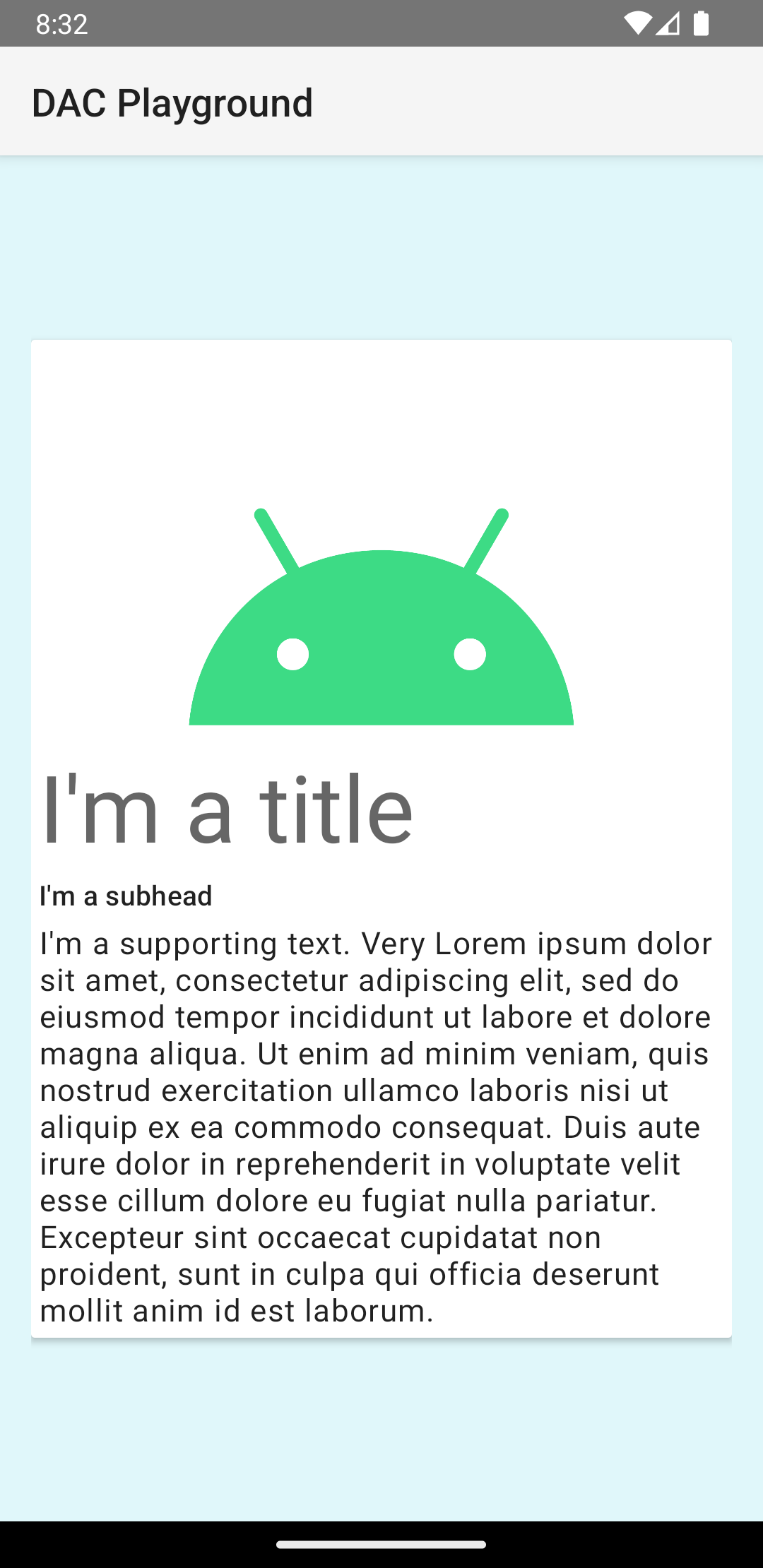
کارت در این مثال با ارتفاع پیشفرض روی صفحه نمایش داده میشود که باعث میشود سیستم زیر آن سایه بکشد. میتوانید با استفاده از ویژگی card_view:cardElevation ، ارتفاع سفارشی برای یک کارت ایجاد کنید. کارتی که در ارتفاع بالاتر قرار دارد، سایه برجستهتری دارد و کارتی که در ارتفاع پایینتر قرار دارد، سایه روشنتری دارد. CardView از ارتفاع واقعی و سایههای پویا در اندروید ۵.۰ (سطح API ۲۱) و بالاتر استفاده میکند.
از این ویژگیها برای سفارشیسازی ظاهر ویجت CardView استفاده کنید:
- برای تنظیم شعاع گوشه در طرحبندیهای خود، از ویژگی
card_view:cardCornerRadiusاستفاده کنید. - برای تنظیم شعاع گوشه در کد خود، از متد
CardView.setRadiusاستفاده کنید. - برای تنظیم رنگ پسزمینه یک کارت، از ویژگی
card_view:cardBackgroundColorاستفاده کنید.