
Приложениям часто необходимо отображать данные в контейнерах, имеющих схожий стиль, например, в контейнерах, содержащих информацию об элементах списка. Система предоставляет API CardView , позволяющий отображать информацию в карточках , имеющих единый внешний вид на всей платформе. Например, карточки по умолчанию имеют отступ над содержащей их группой представлений, поэтому система отображает тени под ними. Карточки позволяют разместить группу представлений, обеспечивая при этом единый стиль для контейнера.
Добавьте зависимости
Виджет CardView является частью AndroidX . Чтобы использовать его в своем проекте, добавьте следующую зависимость в файл build.gradle вашего модуля приложения:
классный
dependencies {
    implementation "androidx.cardview:cardview:1.0.0"
}
Котлин
dependencies {
    implementation("androidx.cardview:cardview:1.0.0")
}
Создать карточки
Чтобы использовать CardView , добавьте его в файл разметки. Используйте его как группу представлений для размещения других представлений. В следующем примере CardView содержит ImageView и несколько TextViews для отображения информации пользователю:
<?xml version="1.0" encoding="utf-8"?>
<androidx.constraintlayout.widget.ConstraintLayout
    xmlns:android="http://schemas.android.com/apk/res/android"
    xmlns:app="http://schemas.android.com/apk/res-auto"
    android:padding="16dp"
    android:background="#E0F7FA"
    android:layout_width="match_parent"
    android:layout_height="match_parent">

    <androidx.cardview.widget.CardView
        android:layout_width="match_parent"
        android:layout_height="wrap_content"
        app:layout_constraintBottom_toBottomOf="parent"
        app:layout_constraintEnd_toEndOf="parent"
        app:layout_constraintStart_toStartOf="parent"
        app:layout_constraintTop_toTopOf="parent">

        <androidx.constraintlayout.widget.ConstraintLayout
            android:padding="4dp"
            android:layout_width="match_parent"
            android:layout_height="match_parent">

            <ImageView
                android:id="@+id/header_image"
                android:layout_width="match_parent"
                android:layout_height="200dp"
                android:src="@drawable/logo"
                app:layout_constraintEnd_toEndOf="parent"
                app:layout_constraintStart_toStartOf="parent"
                app:layout_constraintTop_toTopOf="parent" />

            <TextView
                android:id="@+id/title"
                style="@style/TextAppearance.MaterialComponents.Headline3"
                android:layout_width="match_parent"
                android:layout_height="wrap_content"
                android:layout_marginTop="4dp"
                android:text="I'm a title"
                app:layout_constraintEnd_toEndOf="parent"
                app:layout_constraintStart_toStartOf="parent"
                app:layout_constraintTop_toBottomOf="@id/header_image" />

            <TextView
                android:id="@+id/subhead"
                style="@style/TextAppearance.MaterialComponents.Subtitle2"
                android:layout_width="match_parent"
                android:layout_height="wrap_content"
                android:layout_marginTop="4dp"
                android:text="I'm a subhead"
                app:layout_constraintEnd_toEndOf="parent"
                app:layout_constraintStart_toStartOf="parent"
                app:layout_constraintTop_toBottomOf="@id/title" />

            <TextView
                android:id="@+id/body"
                style="@style/TextAppearance.MaterialComponents.Body1"
                android:layout_width="match_parent"
                android:layout_height="wrap_content"
                android:layout_marginTop="4dp"
                android:text="I'm a supporting text. Very Lorem ipsum dolor sit amet, consectetur adipiscing elit, sed do eiusmod tempor incididunt ut labore et dolore magna aliqua. Ut enim ad minim veniam, quis nostrud exercitation ullamco laboris nisi ut aliquip ex ea commodo consequat. Duis aute irure dolor in reprehenderit in voluptate velit esse cillum dolore eu fugiat nulla pariatur. Excepteur sint occaecat cupidatat non proident, sunt in culpa qui officia deserunt mollit anim id est laborum."
                app:layout_constraintEnd_toEndOf="parent"
                app:layout_constraintStart_toStartOf="parent"
                app:layout_constraintTop_toBottomOf="@id/subhead" />
        </androidx.constraintlayout.widget.ConstraintLayout>
    </androidx.cardview.widget.CardView>
</androidx.constraintlayout.widget.ConstraintLayout>
Приведенный выше фрагмент кода выдает результат, похожий на следующий, при условии использования того же изображения логотипа Android:
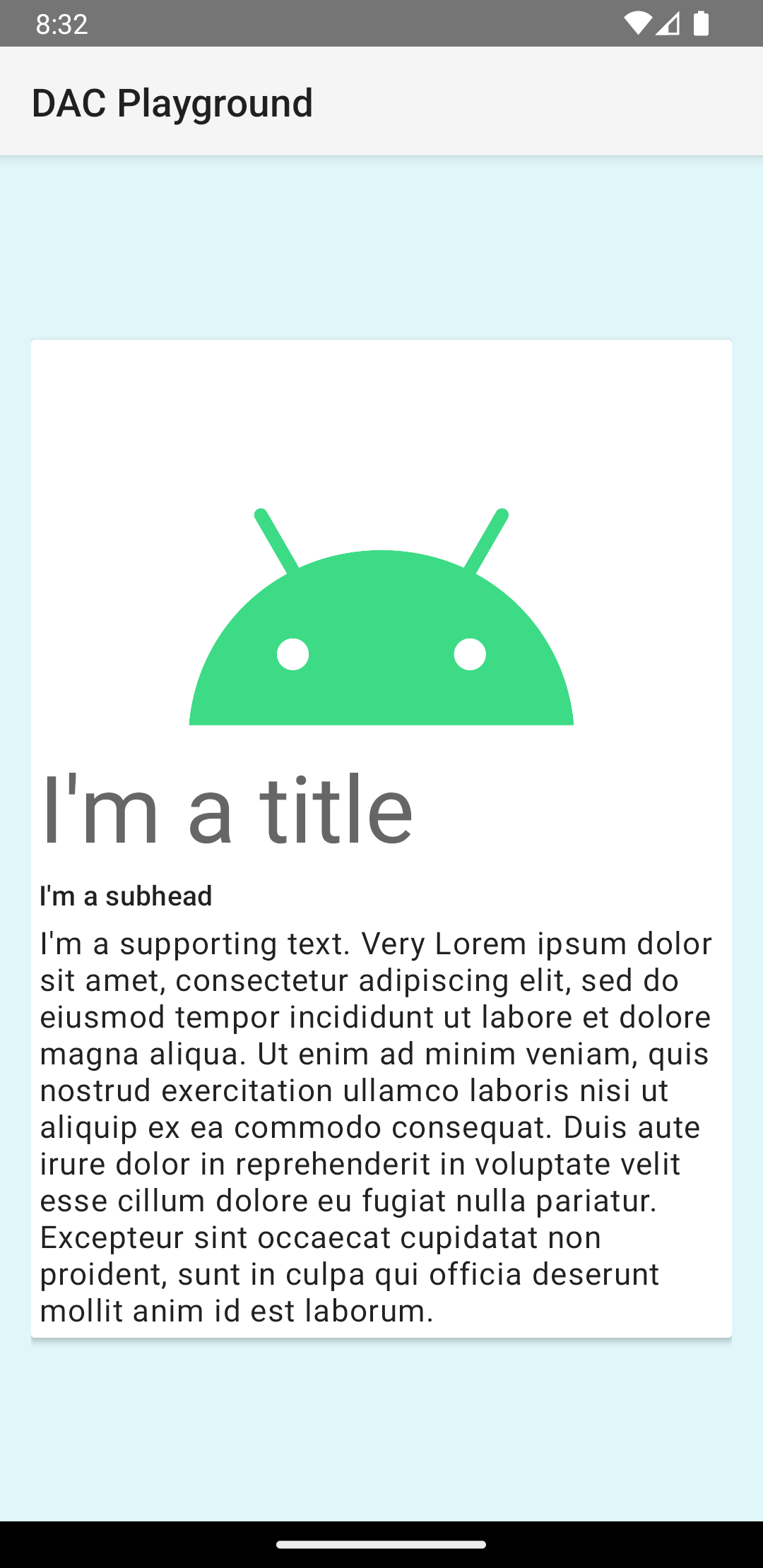
В этом примере карточка отображается на экране с заданным по умолчанию уровнем возвышения, из-за чего система рисует тень под ней. Вы можете задать пользовательский уровень возвышения для карточки с помощью атрибута card_view:cardElevation . Карточка с более высоким уровнем возвышения будет иметь более выраженную тень, а карточка с более низким уровнем возвышения — более светлую тень. CardView использует реальное возвышение и динамические тени на Android 5.0 (уровень API 21) и выше.
Используйте эти свойства для настройки внешнего вида виджета CardView :
- Чтобы задать радиус скругления углов в ваших макетах, используйте атрибут
card_view:cardCornerRadius. - Чтобы задать радиус скругления углов в коде, используйте метод
CardView.setRadius. - Чтобы задать цвет фона карточки, используйте атрибут
card_view:cardBackgroundColor.