
Les applications doivent souvent afficher des données dans des conteneurs de style similaire, par exemple des conteneurs contenant des informations sur les éléments d'une liste. Le système fournit
l'CardView API pour afficher des informations dans des cartes dont l'apparence est cohérente sur l'ensemble de la plate-forme. Par exemple, les cartes ont une élévation par défaut au-dessus de leur groupe de vues conteneur, de sorte que le système dessine des ombres en dessous. Les cartes permettent de contenir un groupe de vues tout en offrant un style cohérent pour le conteneur.
Ajouter les dépendances
Le widget CardView fait partie d'AndroidX. Pour l'utiliser dans votre projet, ajoutez la dépendance suivante au fichier build.gradle du module de votre application :
Groovy
dependencies {
    implementation "androidx.cardview:cardview:1.0.0"
}
Kotlin
dependencies {
    implementation("androidx.cardview:cardview:1.0.0")
}
Créer des cartes
Pour utiliser un CardView, ajoutez-le à votre fichier de mise en page. Utilisez-le comme groupe de vues pour contenir d'autres vues. Dans l'exemple suivant, le CardView contient un ImageView et quelques TextViews pour afficher des informations à l'utilisateur :
<?xml version="1.0" encoding="utf-8"?>
<androidx.constraintlayout.widget.ConstraintLayout
    xmlns:android="http://schemas.android.com/apk/res/android"
    xmlns:app="http://schemas.android.com/apk/res-auto"
    android:padding="16dp"
    android:background="#E0F7FA"
    android:layout_width="match_parent"
    android:layout_height="match_parent">

    <androidx.cardview.widget.CardView
        android:layout_width="match_parent"
        android:layout_height="wrap_content"
        app:layout_constraintBottom_toBottomOf="parent"
        app:layout_constraintEnd_toEndOf="parent"
        app:layout_constraintStart_toStartOf="parent"
        app:layout_constraintTop_toTopOf="parent">

        <androidx.constraintlayout.widget.ConstraintLayout
            android:padding="4dp"
            android:layout_width="match_parent"
            android:layout_height="match_parent">

            <ImageView
                android:id="@+id/header_image"
                android:layout_width="match_parent"
                android:layout_height="200dp"
                android:src="@drawable/logo"
                app:layout_constraintEnd_toEndOf="parent"
                app:layout_constraintStart_toStartOf="parent"
                app:layout_constraintTop_toTopOf="parent" />

            <TextView
                android:id="@+id/title"
                style="@style/TextAppearance.MaterialComponents.Headline3"
                android:layout_width="match_parent"
                android:layout_height="wrap_content"
                android:layout_marginTop="4dp"
                android:text="I'm a title"
                app:layout_constraintEnd_toEndOf="parent"
                app:layout_constraintStart_toStartOf="parent"
                app:layout_constraintTop_toBottomOf="@id/header_image" />

            <TextView
                android:id="@+id/subhead"
                style="@style/TextAppearance.MaterialComponents.Subtitle2"
                android:layout_width="match_parent"
                android:layout_height="wrap_content"
                android:layout_marginTop="4dp"
                android:text="I'm a subhead"
                app:layout_constraintEnd_toEndOf="parent"
                app:layout_constraintStart_toStartOf="parent"
                app:layout_constraintTop_toBottomOf="@id/title" />

            <TextView
                android:id="@+id/body"
                style="@style/TextAppearance.MaterialComponents.Body1"
                android:layout_width="match_parent"
                android:layout_height="wrap_content"
                android:layout_marginTop="4dp"
                android:text="I'm a supporting text. Very Lorem ipsum dolor sit amet, consectetur adipiscing elit, sed do eiusmod tempor incididunt ut labore et dolore magna aliqua. Ut enim ad minim veniam, quis nostrud exercitation ullamco laboris nisi ut aliquip ex ea commodo consequat. Duis aute irure dolor in reprehenderit in voluptate velit esse cillum dolore eu fugiat nulla pariatur. Excepteur sint occaecat cupidatat non proident, sunt in culpa qui officia deserunt mollit anim id est laborum."
                app:layout_constraintEnd_toEndOf="parent"
                app:layout_constraintStart_toStartOf="parent"
                app:layout_constraintTop_toBottomOf="@id/subhead" />
        </androidx.constraintlayout.widget.ConstraintLayout>
    </androidx.cardview.widget.CardView>
</androidx.constraintlayout.widget.ConstraintLayout>
L'extrait de code précédent produit un résultat semblable à celui-ci, en supposant que vous utilisez la même image de logo Android :
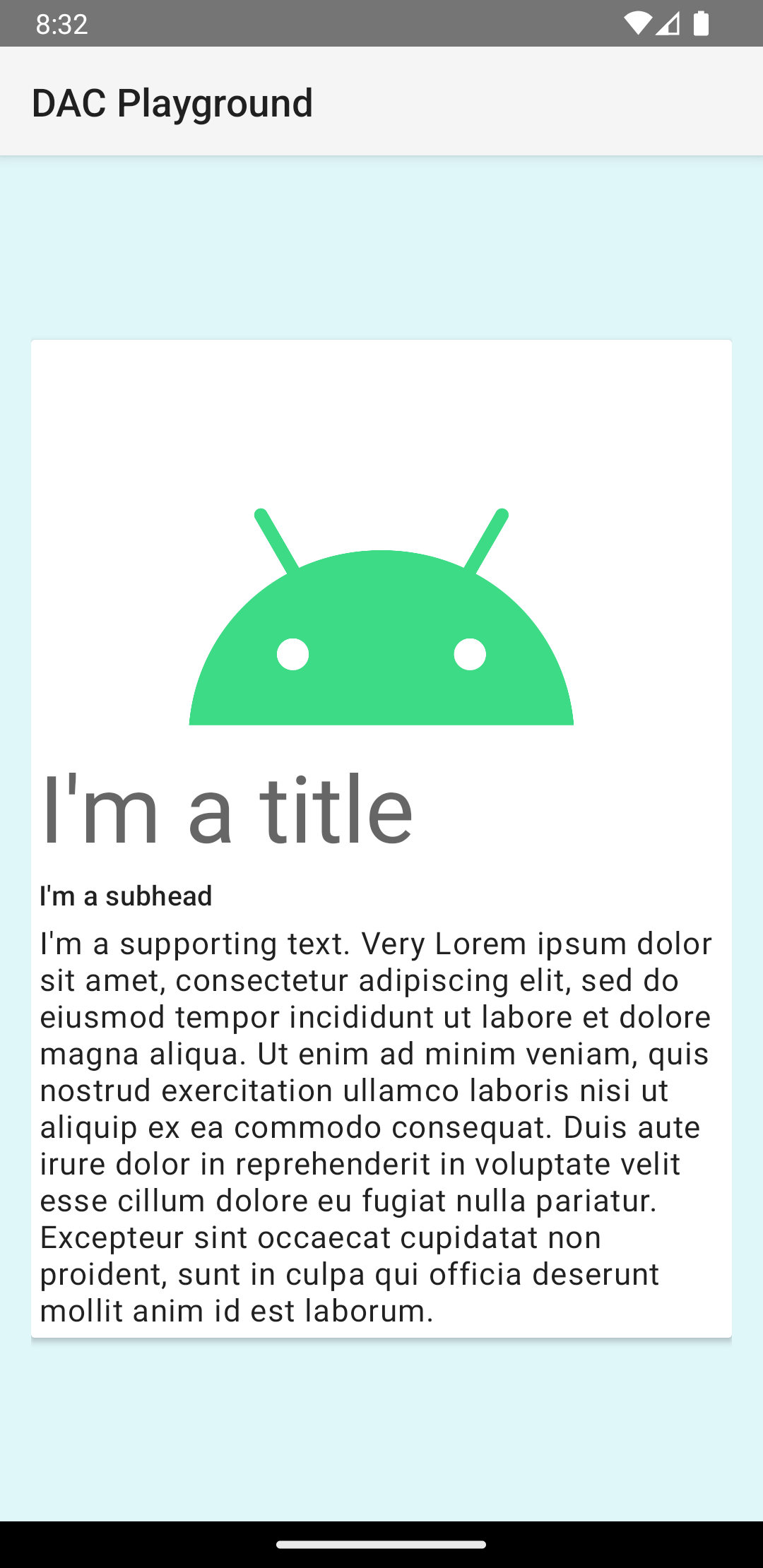
La carte de cet exemple est dessinée à l'écran avec une élévation par défaut, ce qui amène le système à dessiner une ombre en dessous. Vous pouvez fournir une élévation personnalisée pour une carte avec l'attribut card_view:cardElevation. Une carte à une élévation plus élevée a une ombre plus prononcée, tandis qu'une carte à une élévation plus faible a une ombre plus légère. CardView utilise une élévation réelle et des ombres dynamiques sur Android 5.0 (niveau d'API 21) et versions ultérieures.
Utilisez ces propriétés pour personnaliser l'apparence du widget CardView :
- Pour définir le rayon des angles dans vos mises en page, utilisez l'attribut
card_view:cardCornerRadius. - Pour définir le rayon des angles dans votre code, utilisez la méthode
CardView.setRadius. - Pour définir la couleur d'arrière-plan d'une carte, utilisez l'attribut
card_view:cardBackgroundColor.