
Thường thì ứng dụng phải cho thấy dữ liệu trong các vùng chứa được định kiểu như nhau, chẳng hạn như các vùng chứa chứa thông tin về các mục trong danh sách. Hệ thống cung cấp API CardView để bạn cho thấy thông tin trong thẻ có giao diện nhất quán trên nền tảng. Ví dụ: các thẻ có độ cao mặc định lớn hơn nhóm view chứa chúng, vì vậy, hệ thống sẽ vẽ bóng đổ bên dưới. Thẻ cung cấp một cách để chứa một nhóm khung hiển thị trong khi vẫn cung cấp một kiểu nhất quán cho vùng chứa đó.
Thêm phần phụ thuộc
Tiện ích CardView là một phần của AndroidX. Để sử dụng thành phần này trong dự án, hãy thêm phần phụ thuộc sau đây vào tệp build.gradle của mô-đun ứng dụng:
Groovy
dependencies {
    implementation "androidx.cardview:cardview:1.0.0"
}
Kotlin
dependencies {
    implementation("androidx.cardview:cardview:1.0.0")
}
Tạo thẻ
Để sử dụng CardView, hãy thêm thẻ này vào tệp bố cục. Sử dụng thẻ này làm nhóm view chứa cả các thành phần hiển thị khác. Trong ví dụ sau, CardView chứa một ImageView và một vài TextViews để hiển thị một số thông tin cho người dùng:
<?xml version="1.0" encoding="utf-8"?>
<androidx.constraintlayout.widget.ConstraintLayout
    xmlns:android="http://schemas.android.com/apk/res/android"
    xmlns:app="http://schemas.android.com/apk/res-auto"
    android:padding="16dp"
    android:background="#E0F7FA"
    android:layout_width="match_parent"
    android:layout_height="match_parent">

    <androidx.cardview.widget.CardView
        android:layout_width="match_parent"
        android:layout_height="wrap_content"
        app:layout_constraintBottom_toBottomOf="parent"
        app:layout_constraintEnd_toEndOf="parent"
        app:layout_constraintStart_toStartOf="parent"
        app:layout_constraintTop_toTopOf="parent">

        <androidx.constraintlayout.widget.ConstraintLayout
            android:padding="4dp"
            android:layout_width="match_parent"
            android:layout_height="match_parent">

            <ImageView
                android:id="@+id/header_image"
                android:layout_width="match_parent"
                android:layout_height="200dp"
                android:src="@drawable/logo"
                app:layout_constraintEnd_toEndOf="parent"
                app:layout_constraintStart_toStartOf="parent"
                app:layout_constraintTop_toTopOf="parent" />

            <TextView
                android:id="@+id/title"
                style="@style/TextAppearance.MaterialComponents.Headline3"
                android:layout_width="match_parent"
                android:layout_height="wrap_content"
                android:layout_marginTop="4dp"
                android:text="I'm a title"
                app:layout_constraintEnd_toEndOf="parent"
                app:layout_constraintStart_toStartOf="parent"
                app:layout_constraintTop_toBottomOf="@id/header_image" />

            <TextView
                android:id="@+id/subhead"
                style="@style/TextAppearance.MaterialComponents.Subtitle2"
                android:layout_width="match_parent"
                android:layout_height="wrap_content"
                android:layout_marginTop="4dp"
                android:text="I'm a subhead"
                app:layout_constraintEnd_toEndOf="parent"
                app:layout_constraintStart_toStartOf="parent"
                app:layout_constraintTop_toBottomOf="@id/title" />

            <TextView
                android:id="@+id/body"
                style="@style/TextAppearance.MaterialComponents.Body1"
                android:layout_width="match_parent"
                android:layout_height="wrap_content"
                android:layout_marginTop="4dp"
                android:text="I'm a supporting text. Very Lorem ipsum dolor sit amet, consectetur adipiscing elit, sed do eiusmod tempor incididunt ut labore et dolore magna aliqua. Ut enim ad minim veniam, quis nostrud exercitation ullamco laboris nisi ut aliquip ex ea commodo consequat. Duis aute irure dolor in reprehenderit in voluptate velit esse cillum dolore eu fugiat nulla pariatur. Excepteur sint occaecat cupidatat non proident, sunt in culpa qui officia deserunt mollit anim id est laborum."
                app:layout_constraintEnd_toEndOf="parent"
                app:layout_constraintStart_toStartOf="parent"
                app:layout_constraintTop_toBottomOf="@id/subhead" />
        </androidx.constraintlayout.widget.ConstraintLayout>
    </androidx.cardview.widget.CardView>
</androidx.constraintlayout.widget.ConstraintLayout>
Đoạn mã trước đó tạo ra kết quả tương tự như sau, giả sử bạn sử dụng cùng một hình ảnh biểu trưng Android:
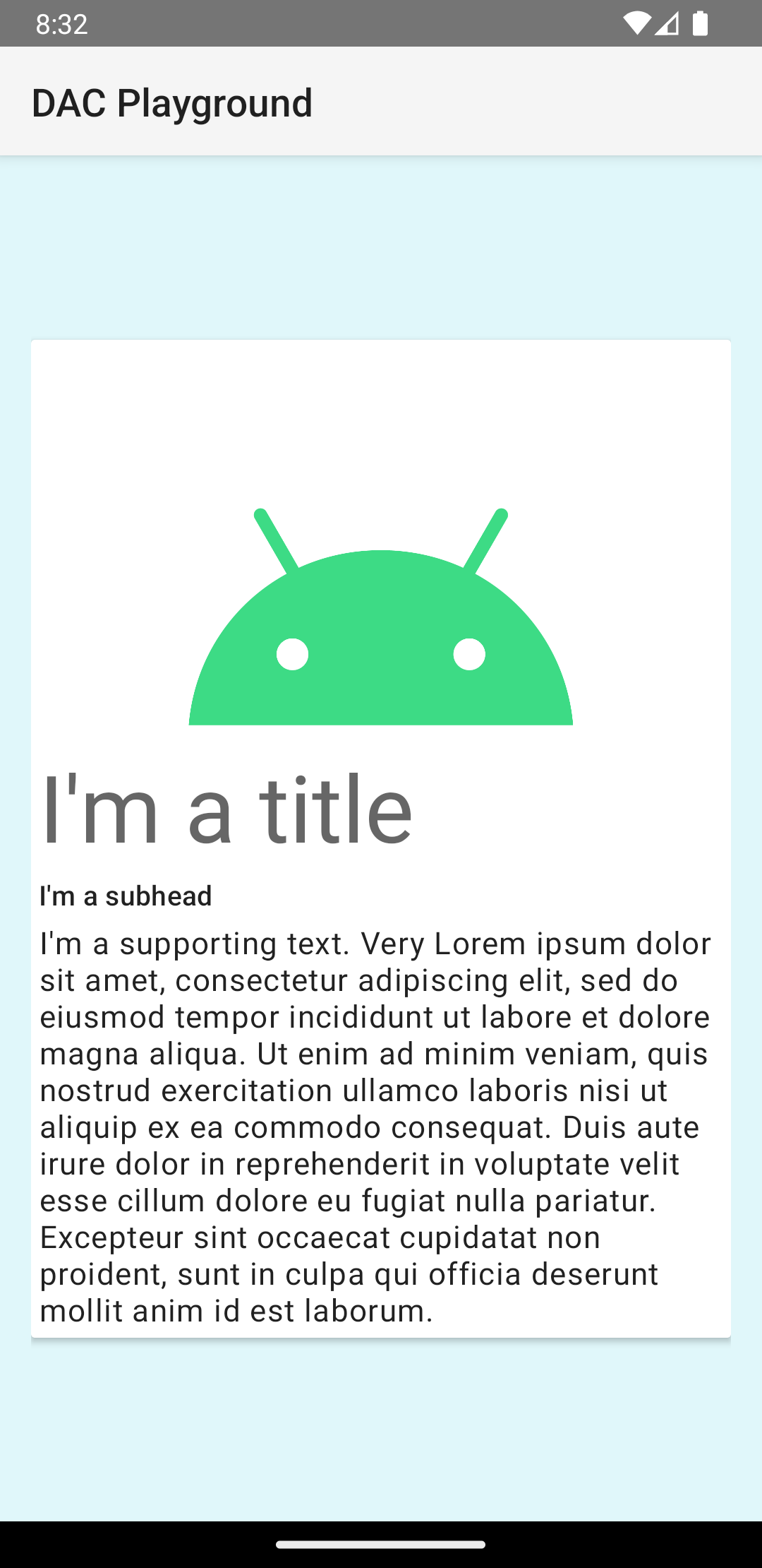
Thẻ trong ví dụ này được vẽ lên màn hình với độ cao mặc định, khiến hệ thống vẽ bóng đổ bên dưới. Bạn có thể cung cấp độ cao tuỳ chỉnh cho thẻ bằng thuộc tính card_view:cardElevation. Thẻ ở độ cao lớn hơn có bóng đổ rõ ràng hơn, còn thẻ ở độ cao thấp hơn có bóng đổ nhạt hơn. CardView sử dụng độ cao thực và bóng đổ động trên Android 5.0 (cấp độ API 21) trở lên.
Sử dụng các thuộc tính sau đây để tuỳ chỉnh giao diện của tiện ích CardView:
- Để đặt bán kính góc trong bố cục, hãy sử dụng thuộc tính
card_view:cardCornerRadius. - Để đặt bán kính góc trong mã, hãy sử dụng phương thức
CardView.setRadius. - Để đặt màu nền của thẻ, hãy sử dụng thuộc tính
card_view:cardBackgroundColor.