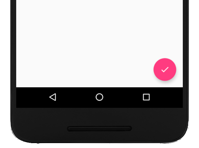
Eine unverankerte Aktionsschaltfläche (UAS) ist eine runde Schaltfläche, mit der die primäre Aktion in der Benutzeroberfläche Ihrer App ausgelöst wird. In diesem Dokument wird beschrieben, wie Sie Ihrem Layout eine FAB hinzufügen, ihr Aussehen anpassen und auf Schaltflächen-Taps reagieren.
Sie können andere FAB-Attribute mit XML-Attributen oder entsprechenden Methoden konfigurieren, z. B.:
Die Größe des schwebenden Aktionsschaltfläche (FAB) mit dem Attribut app:fabSize oder der Methode setSize()
Die Farbe des Ripples des schwebenden Aktionsschaltfläche (FAB) mit dem Attribut app:rippleColor oder der Methode setRippleColor()
Das Symbol für die Schaltfläche „Aktion“ mit dem Attribut android:src oder der Methode setImageDrawable()
Auf Schaltflächen-Taps reagieren
Anschließend können Sie ein View.OnClickListener anwenden, um Tippen auf das FAB zu verarbeiten. Im folgenden Code wird beispielsweise ein Snackbar angezeigt, wenn der Nutzer auf das FAB tippt:
Kotlin
valfab:View=findViewById(R.id.fab)fab.setOnClickListener{view->Snackbar.make(view,"Here's a Snackbar",Snackbar.LENGTH_LONG).setAction("Action",null).show()}
Java
FloatingActionButtonfab=findViewById(R.id.fab);fab.setOnClickListener(newView.OnClickListener(){@OverridepublicvoidonClick(Viewview){Snackbar.make(view,"Here's a Snackbar",Snackbar.LENGTH_LONG).setAction("Action",null).show();}});
Weitere Informationen zu den Funktionen des FAB finden Sie in der API-Referenz für FloatingActionButton.
Alle Inhalte und Codebeispiele auf dieser Seite unterliegen den Lizenzen wie im Abschnitt Inhaltslizenz beschrieben. Java und OpenJDK sind Marken oder eingetragene Marken von Oracle und/oder seinen Tochtergesellschaften.
Zuletzt aktualisiert: 2025-08-27 (UTC).
[[["Leicht verständlich","easyToUnderstand","thumb-up"],["Mein Problem wurde gelöst","solvedMyProblem","thumb-up"],["Sonstiges","otherUp","thumb-up"]],[["Benötigte Informationen nicht gefunden","missingTheInformationINeed","thumb-down"],["Zu umständlich/zu viele Schritte","tooComplicatedTooManySteps","thumb-down"],["Nicht mehr aktuell","outOfDate","thumb-down"],["Problem mit der Übersetzung","translationIssue","thumb-down"],["Problem mit Beispielen/Code","samplesCodeIssue","thumb-down"],["Sonstiges","otherDown","thumb-down"]],["Zuletzt aktualisiert: 2025-08-27 (UTC)."],[],[],null,["Try the Compose way \nJetpack Compose is the recommended UI toolkit for Android. Learn how to add components in Compose. \n[Floating Action Button →](/develop/ui/compose/components/fab) \n\n\u003cbr /\u003e\n\nA floating action button (FAB) is a circular button that triggers the primary\naction in your app's UI. This document shows how to add a FAB to your layout,\ncustomize some of its appearance, and respond to button taps.\n\nTo learn more about how to design a FAB for your app according to the Material\nDesign Guidelines, see [Material Design\nFAB](https://m3.material.io/components/floating-action-button/overview)\n.\n**Figure 1.** A floating action button (FAB).\n\nAdd the floating action button to your layout\n\nThe following code shows how the\n[`FloatingActionButton`](/reference/com/google/android/material/floatingactionbutton/FloatingActionButton)\nappears in your layout file: \n\n```xml\n\u003ccom.google.android.material.floatingactionbutton.FloatingActionButton\n android:id=\"@+id/fab\"\n android:layout_width=\"wrap_content\"\n android:layout_height=\"wrap_content\"\n android:layout_gravity=\"end|bottom\"\n android:src=\"@drawable/ic_my_icon\"\n android:contentDescription=\"@string/submit\"\n android:layout_margin=\"16dp\" /\u003e\n```\n\nBy default, a FAB is colored by the `colorAccent` attribute, which you can\n[customize with the theme's color\npalette](/guide/topics/ui/look-and-feel/themes#ColorPalette).\n\nYou can configure other FAB properties using XML attributes or corresponding\nmethods, such as the following:\n\n- The size of the FAB, using the `app:fabSize` attribute or the [`setSize()`](/reference/com/google/android/material/floatingactionbutton/FloatingActionButton#setSize(int)) method\n- The ripple color of the FAB, using the `app:rippleColor` attribute or the [`setRippleColor()`](/reference/com/google/android/material/floatingactionbutton/FloatingActionButton#setRippleColor(int)) method\n- The FAB icon, using the `android:src` attribute or the [`setImageDrawable()`](/reference/android/widget/ImageView#setImageDrawable(android.graphics.drawable.Drawable)) method\n\nRespond to button taps\n\nYou can then apply an\n[`View.OnClickListener`](/reference/android/view/View.OnClickListener) to\nhandle FAB taps. For example, the following code displays a\n[`Snackbar`](/reference/com/google/android/material/snackbar/Snackbar) when\nthe user taps the FAB: \n\nKotlin \n\n```kotlin\nval fab: View = findViewById(R.id.fab)\nfab.setOnClickListener { view -\u003e\n Snackbar.make(view, \"Here's a Snackbar\", Snackbar.LENGTH_LONG)\n .setAction(\"Action\", null)\n .show()\n}\n```\n\nJava \n\n```java\nFloatingActionButton fab = findViewById(R.id.fab);\nfab.setOnClickListener(new View.OnClickListener() {\n @Override\n public void onClick(View view) {\n Snackbar.make(view, \"Here's a Snackbar\", Snackbar.LENGTH_LONG)\n .setAction(\"Action\", null).show();\n }\n});\n```\n\nFor more information about the capabilities of the FAB, see the API reference\nfor the\n[`FloatingActionButton`](/reference/com/google/android/material/floatingactionbutton/FloatingActionButton)."]]