Un botón de acción flotante (BAF) es un botón circular que activa la acción principal en la IU de tu app. En este documento, se muestra cómo agregar un BAF a tu diseño, personalizar parte de su apariencia y responder cuando se presionan los botones.
Para obtener más información sobre cómo diseñar un FAB para tu app según los lineamientos de Material Design, consulta FAB de Material Design.
Figura 1: Un botón de acción flotante (BAF).
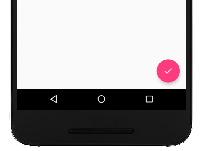
Cómo agregar el botón de acción flotante a tu diseño
En el siguiente código, se muestra cómo aparece FloatingActionButton en tu archivo de diseño:
Puedes configurar otras propiedades del BAF con atributos XML o métodos correspondientes, como los siguientes:
El tamaño del FAB, con el atributo app:fabSize o el método setSize()
El color de ondas del BAF, utilizando el atributo app:rippleColor o el método setRippleColor()
El ícono del BAF, con el atributo android:src o el método setImageDrawable()
Cómo responder a presiones de botones
Luego, puedes aplicar un View.OnClickListener para controlar los toques del BAF. Por ejemplo, el siguiente código muestra un Snackbar cuando el usuario presiona el FAB:
Kotlin
valfab:View=findViewById(R.id.fab)fab.setOnClickListener{view->Snackbar.make(view,"Here's a Snackbar",Snackbar.LENGTH_LONG).setAction("Action",null).show()}
Java
FloatingActionButtonfab=findViewById(R.id.fab);fab.setOnClickListener(newView.OnClickListener(){@OverridepublicvoidonClick(Viewview){Snackbar.make(view,"Here's a Snackbar",Snackbar.LENGTH_LONG).setAction("Action",null).show();}});
Para obtener más información sobre las capacidades del BAF, consulta la referencia de la API de FloatingActionButton.
El contenido y las muestras de código que aparecen en esta página están sujetas a las licencias que se describen en la Licencia de Contenido. Java y OpenJDK son marcas registradas de Oracle o sus afiliados.
Última actualización: 2025-08-27 (UTC)
[[["Fácil de comprender","easyToUnderstand","thumb-up"],["Resolvió mi problema","solvedMyProblem","thumb-up"],["Otro","otherUp","thumb-up"]],[["Falta la información que necesito","missingTheInformationINeed","thumb-down"],["Muy complicado o demasiados pasos","tooComplicatedTooManySteps","thumb-down"],["Desactualizado","outOfDate","thumb-down"],["Problema de traducción","translationIssue","thumb-down"],["Problema con las muestras o los códigos","samplesCodeIssue","thumb-down"],["Otro","otherDown","thumb-down"]],["Última actualización: 2025-08-27 (UTC)"],[],[],null,["Try the Compose way \nJetpack Compose is the recommended UI toolkit for Android. Learn how to add components in Compose. \n[Floating Action Button →](/develop/ui/compose/components/fab) \n\n\u003cbr /\u003e\n\nA floating action button (FAB) is a circular button that triggers the primary\naction in your app's UI. This document shows how to add a FAB to your layout,\ncustomize some of its appearance, and respond to button taps.\n\nTo learn more about how to design a FAB for your app according to the Material\nDesign Guidelines, see [Material Design\nFAB](https://m3.material.io/components/floating-action-button/overview)\n.\n**Figure 1.** A floating action button (FAB).\n\nAdd the floating action button to your layout\n\nThe following code shows how the\n[`FloatingActionButton`](/reference/com/google/android/material/floatingactionbutton/FloatingActionButton)\nappears in your layout file: \n\n```xml\n\u003ccom.google.android.material.floatingactionbutton.FloatingActionButton\n android:id=\"@+id/fab\"\n android:layout_width=\"wrap_content\"\n android:layout_height=\"wrap_content\"\n android:layout_gravity=\"end|bottom\"\n android:src=\"@drawable/ic_my_icon\"\n android:contentDescription=\"@string/submit\"\n android:layout_margin=\"16dp\" /\u003e\n```\n\nBy default, a FAB is colored by the `colorAccent` attribute, which you can\n[customize with the theme's color\npalette](/guide/topics/ui/look-and-feel/themes#ColorPalette).\n\nYou can configure other FAB properties using XML attributes or corresponding\nmethods, such as the following:\n\n- The size of the FAB, using the `app:fabSize` attribute or the [`setSize()`](/reference/com/google/android/material/floatingactionbutton/FloatingActionButton#setSize(int)) method\n- The ripple color of the FAB, using the `app:rippleColor` attribute or the [`setRippleColor()`](/reference/com/google/android/material/floatingactionbutton/FloatingActionButton#setRippleColor(int)) method\n- The FAB icon, using the `android:src` attribute or the [`setImageDrawable()`](/reference/android/widget/ImageView#setImageDrawable(android.graphics.drawable.Drawable)) method\n\nRespond to button taps\n\nYou can then apply an\n[`View.OnClickListener`](/reference/android/view/View.OnClickListener) to\nhandle FAB taps. For example, the following code displays a\n[`Snackbar`](/reference/com/google/android/material/snackbar/Snackbar) when\nthe user taps the FAB: \n\nKotlin \n\n```kotlin\nval fab: View = findViewById(R.id.fab)\nfab.setOnClickListener { view -\u003e\n Snackbar.make(view, \"Here's a Snackbar\", Snackbar.LENGTH_LONG)\n .setAction(\"Action\", null)\n .show()\n}\n```\n\nJava \n\n```java\nFloatingActionButton fab = findViewById(R.id.fab);\nfab.setOnClickListener(new View.OnClickListener() {\n @Override\n public void onClick(View view) {\n Snackbar.make(view, \"Here's a Snackbar\", Snackbar.LENGTH_LONG)\n .setAction(\"Action\", null).show();\n }\n});\n```\n\nFor more information about the capabilities of the FAB, see the API reference\nfor the\n[`FloatingActionButton`](/reference/com/google/android/material/floatingactionbutton/FloatingActionButton)."]]