
本頁說明 Android 12 (API 級別 31) 以上版本提供的選用小工具強化功能。這些功能為選用功能,但實作方式簡單明瞭,可提升使用者的動態小工具體驗。
使用動態色彩
從 Android 12 開始,小工具可以針對按鈕、背景和其他元件使用裝置主題顏色。這樣一來,不同小工具之間的轉場效果會更流暢,且整體風格一致。
動態色彩的實作方式有兩種:
在根層級版面配置中使用系統的預設主題 (
@android:style/Theme.DeviceDefault.DayNight)。使用 Android 適用的 Material Design 元件程式庫中的 Material 3 主題 (
Theme.Material3.DynamicColors.DayNight),這個程式庫從 Android 適用的 Material Design 元件 1.6.0 版開始提供。
在根版面配置中設定主題後,您可以在根版面配置或任何子項中使用常見的顏色屬性,挑選動態顏色。
可用的顏色屬性範例如下:
?attr/primary?attr/primaryContainer?attr/onPrimary?attr/onPrimaryContainer
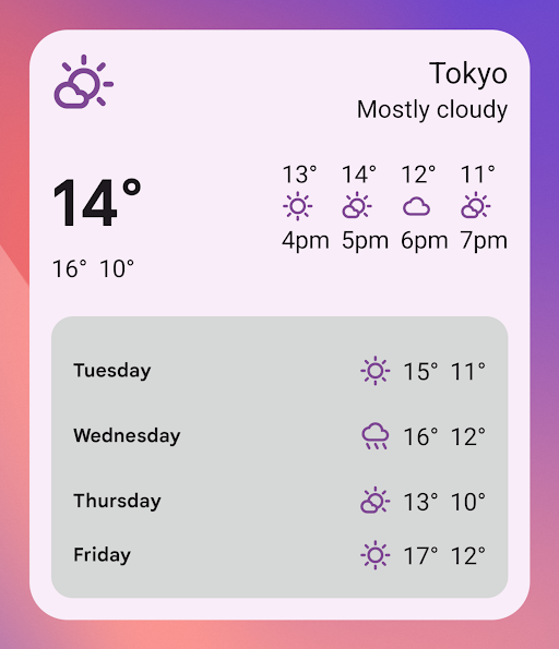
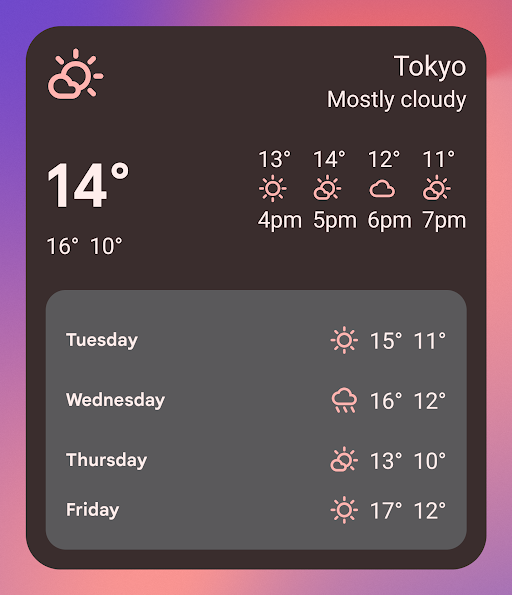
在下列使用 Material 3 主題的範例中,裝置的主題顏色為「紫紅色」。強調色和小工具背景會根據淺色和深色模式調整,如圖 1 和 2 所示。
<LinearLayout xmlns:android="http://schemas.android.com/apk/res/android"
  xmlns:app="http://schemas.android.com/apk/res-auto"
  android:layout_width="match_parent"
  android:layout_height="match_parent"
  android:background="?attr/colorPrimaryContainer"
  android:theme="@style/Theme.Material3.DynamicColors.DayNight">

  <ImageView
    ...
    app:tint="?attr/colorPrimaryContainer"
    android:src="@drawable/ic_partly_cloudy" />

    <!-- Other widget content. -->

</LinearLayout>
動態色彩的回溯相容性
動態色彩僅適用於搭載 Android 12 以上版本的裝置。如要為較舊版本提供自訂主題,請使用預設主題屬性,以自訂顏色和新的限定符 (values-v31) 建立預設主題。
以下是使用 Material 3 主題的範例:
/values/styles.xml
<resources>
  <style name="MyWidgetTheme" parent="Theme.Material3.DynamicColors.DayNight">
    <!-- Override default colorBackground attribute with custom color. -->
    <item name="android:colorBackground">@color/my_background_color</item>

    <!-- Add other colors/attributes. -->

  </style>
</resources>
/values-v31/styles.xml
<resources>
  <!-- Do not override any color attribute. -->
  <style name="MyWidgetTheme" parent="Theme.Material3.DynamicColors.DayNight" />
</resources>
/layout/my_widget_layout.xml
<resources>
  <LinearLayout xmlns:android="http://schemas.android.com/apk/res/android"
    ...
    android:background="?android:attr/colorBackground"
    android:theme="@style/MyWidgetTheme" />
</resources>
啟用語音支援
應用程式動作可讓 Google 助理在收到相關語音指令時顯示小工具。將小工具設為回應內建意圖 (BII),應用程式就能在 Android 和 Android Auto 等 Google 助理介面上主動顯示小工具。使用者可以釘選小工具,將 Google 助理顯示的小工具釘選到啟動器,鼓勵日後互動。
舉例來說,您可以為運動應用程式設定運動摘要小工具,以滿足觸發 GET_EXERCISE_OBSERVATION BII 的使用者語音指令。當使用者提出「Ok Google,根據範例應用程式的數據,我這個禮拜跑了幾英里?」等要求,觸發這個 BII 時,Google 助理就會主動顯示小工具。
有數十個 BII 涵蓋多種使用者互動類別,幾乎任何 Android 應用程式都能透過這些 BII 強化語音小工具。如要開始使用,請參閱「整合應用程式動作與 Android 小工具」。
為小工具命名
在小工具挑選器中顯示的小工具名稱不得重複。
系統會從 AndroidManifest.xml 檔案中,小工具 receiver 元素的 label 屬性載入小工具名稱。
<receiver
….
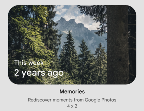
android:label="Memories">
….
</receiver>
新增小工具的說明
從 Android 12 開始,您可以為小工具挑選器提供說明,以便顯示小工具。
使用 <appwidget-provider> 元素的 description 屬性,提供小工具的說明:
<appwidget-provider
    android:description="@string/my_widget_description">
</appwidget-provider>
您可以在舊版 Android 上使用 descriptionRes 屬性,但小工具挑選器會忽略該屬性。
啟用更流暢的轉場效果
從 Android 12 開始,啟動器會在使用者透過小工具啟動應用程式時,提供更順暢的轉場效果。
如要啟用這項改良的轉場效果,請使用 @android:id/background 或 android.R.id.background 識別背景元素:
// Top-level layout of the widget.
<LinearLayout
    android:id="@android:id/background">
</LinearLayout>
您的應用程式可以在舊版 Android 上使用 @android:id/background,不會發生錯誤,但系統會忽略這項功能。
在執行階段修改 RemoteViews
從 Android 12 開始,您可以運用多種 RemoteViews 方法,在執行階段修改 RemoteViews 屬性。如需新增方法的完整清單,請參閱 RemoteViews API 參考資料。
以下程式碼範例說明如何使用其中幾種方法。
Kotlin
// Set the colors of a progress bar at runtime.
remoteView.setColorStateList(R.id.progress, "setProgressTintList", createProgressColorStateList())

// Specify exact sizes for margins.
remoteView.setViewLayoutMargin(R.id.text, RemoteViews.MARGIN_END, 8f, TypedValue.COMPLEX_UNIT_DP)
Java
// Set the colors of a progress bar at runtime.
remoteView.setColorStateList(R.id.progress, "setProgressTintList", createProgressColorStateList());

// Specify exact sizes for margins.
remoteView.setViewLayoutMargin(R.id.text, RemoteViews.MARGIN_END, 8f, TypedValue.COMPLEX_UNIT_DP);