با مجموعهها، منظم بمانید
ذخیره و طبقهبندی محتوا براساس اولویتهای شما.
یک نماد تطبیقی یا AdaptiveIconDrawable بسته به قابلیتهای دستگاه و موضوع کاربر میتواند متفاوت نمایش داده شود. نمادهای تطبیقی عمدتاً توسط راهانداز در صفحه اصلی استفاده میشوند، اما میتوانند در میانبرها، برنامه تنظیمات، گفتگوهای اشتراکگذاری و صفحه نمای کلی نیز استفاده شوند. آیکون های تطبیقی در تمام فرم فاکتورهای اندروید استفاده می شوند.
برخلاف تصاویر بیت مپ ، آیکون های تطبیقی می توانند با موارد استفاده مختلف سازگار شوند:
اشکال مختلف: یک نماد تطبیقی می تواند اشکال مختلفی را در مدل های مختلف دستگاه نمایش دهد. به عنوان مثال، می تواند یک شکل دایره ای را در یک دستگاه OEM نشان دهد و یک سنجاب (شکل بین مربع و دایره) را در دستگاه دیگر نمایش دهد. هر OEM دستگاه باید یک ماسک ارائه دهد که سیستم از آن برای ارائه تمام نمادهای تطبیقی با یک شکل استفاده می کند.
شکل 1. نمادهای تطبیقی از انواع ماسک ها پشتیبانی می کنند که از دستگاهی به دستگاه دیگر متفاوت است.
جلوههای بصری: یک نماد تطبیقی از انواع جلوههای بصری جذاب پشتیبانی میکند که وقتی کاربران نماد را در صفحه اصلی قرار میدهند یا حرکت میدهند، نمایش داده میشوند.
شکل 2. نمونه هایی از جلوه های بصری نمایش داده شده توسط یک نماد تطبیقی.
قالب بندی کاربر: با شروع اندروید 13 (سطح API 33)، کاربران می توانند نمادهای تطبیقی خود را قالب بندی کنند. اگر کاربر آیکونهای برنامههای مضمونی را در تنظیمات سیستم خود فعال کند و راهانداز از این ویژگی پشتیبانی کند، سیستم از رنگآمیزی تصویر زمینه و طرح زمینه انتخابی کاربر برای تعیین رنگ رنگ نمادهای برنامه برای برنامههایی که یک لایه monochrome در نماد تطبیقی خود دارند، استفاده میکند. با شروع Android 16 QPR 2، Android بهطور خودکار نمادهای برنامهها را برای برنامههایی که خود را ارائه نمیدهند تم میکند.
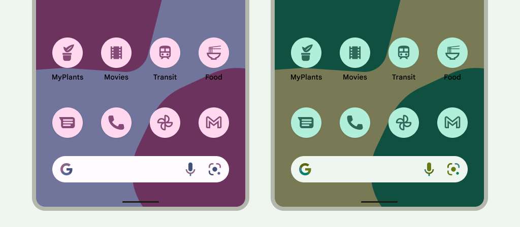
شکل 3. نمادهای تطبیقی که از تصویر زمینه و تم های کاربر به ارث می رسند.
در سناریوهای زیر، صفحه اصلی نماد برنامه موضوعی را نشان نمیدهد و در عوض نماد برنامه تطبیقی یا استاندارد را نشان میدهد:
اگر کاربر نمادهای برنامه مضمون را فعال نکند.
اگر برنامه شما یک نماد برنامه تک رنگ ارائه نمیکند و دستگاه کاربر روی نسخه قبلی اندروید نسبت به Android 16 QPR 2 اجرا میشود.
اگر راهانداز از نمادهای برنامه مضمون پشتیبانی نمیکند.
طراحی آیکون های تطبیقی
برای اطمینان از اینکه نماد تطبیقی شما از اشکال مختلف، جلوههای بصری و طرح زمینه کاربر پشتیبانی میکند، طرح باید شرایط زیر را برآورده کند:
شما باید دو لایه برای نسخه رنگی آیکون ارائه دهید: یکی برای پیش زمینه و دیگری برای پس زمینه. لایه ها می توانند بردار یا بیت مپ باشند، اگرچه بردارها ترجیح داده می شوند.
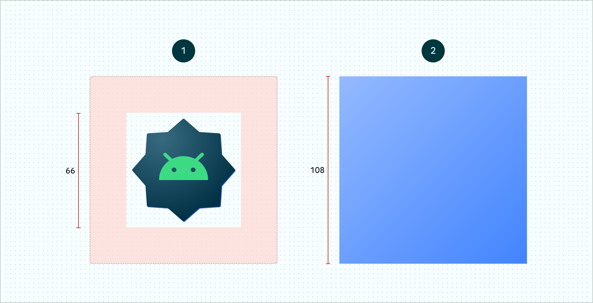
شکل 4. نمادهای تطبیقی با استفاده از لایه های پیش زمینه و پس زمینه تعریف شده اند. منطقه امن 66x66 به تصویر کشیده شده، ناحیه ای است که هرگز توسط یک ماسک شکلی که توسط یک OEM تعریف شده است، بریده نمی شود. شکل 5. نمونه ای از اینکه چگونه لایه های پیش زمینه و پس زمینه با هم به همراه یک ماسک دایره ای اعمال شده به نظر می رسند.
اگر میخواهید از قالببندی کاربر آیکونهای برنامه پشتیبانی کنید، یک لایه برای نسخه تک رنگ آیکون ارائه دهید.
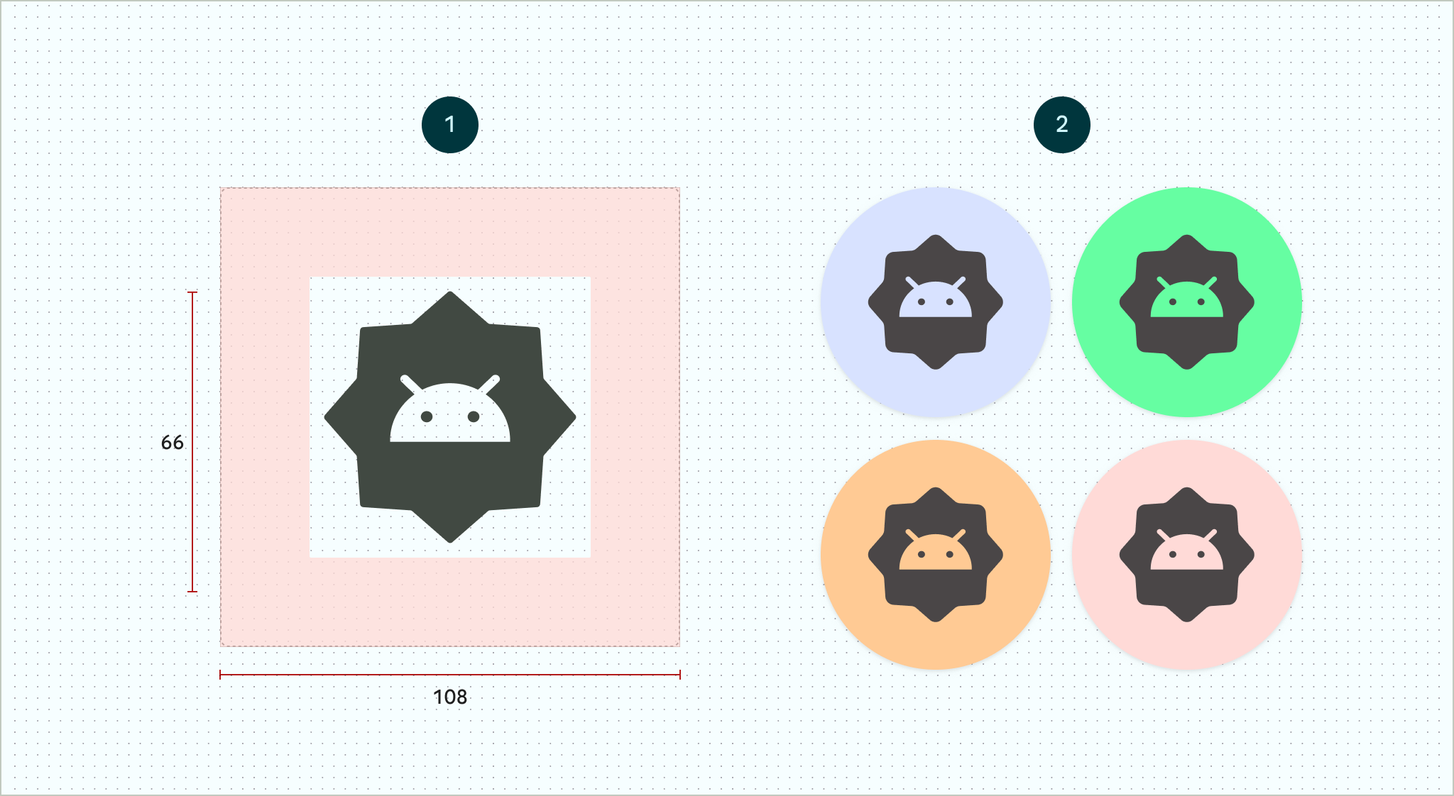
شکل 6. یک لایه آیکون تک رنگ (چپ) با نمونه هایی از پیش نمایش های رنگی (راست).
اندازه همه لایه ها 108x108 dp.
از آیکون هایی با لبه های تمیز استفاده کنید. لایه ها نباید دارای ماسک یا سایه های پس زمینه در اطراف طرح کلی نماد باشند.
از لوگویی استفاده کنید که حداقل 48x48 dp باشد. نباید از 66x66 dp تجاوز کند، زیرا 66x66 dp داخلی نماد در نمای ماسک شده ظاهر می شود.
18 dp بیرونی در هر یک از چهار طرف لایه ها برای ماسک کردن و ایجاد جلوه های بصری مانند اختلاف منظر یا ضربان در نظر گرفته شده است.
یک ویژگی اختیاری، android:roundIcon ، توسط راهاندازهایی استفاده میشود که برنامههای دارای نمادهای دایرهای را نشان میدهند، و اگر نماد برنامه شما دارای پسزمینه دایرهای به عنوان بخش اصلی طراحی باشد، ممکن است مفید باشد. چنین راهاندازهایی برای تولید نمادهای برنامه با اعمال یک ماسک دایرهای در android:roundIcon مورد نیاز هستند، و این ضمانت ممکن است به شما امکان دهد که ظاهر نماد برنامه خود را برای مثال با بزرگکردن کمی لوگو و اطمینان از اینکه هنگام برش، پسزمینه دایرهای کامل است، بهینه کنید.
قطعه کد زیر هر دوی این ویژگی ها را نشان می دهد، اما اکثر برنامه ها فقط android:icon را مشخص می کنند:
سپس، نماد تطبیقی خود را در res/mipmap-anydpi-v26/ic_launcher.xml ذخیره کنید. از عنصر <adaptive-icon> برای تعریف منابع لایه پیش زمینه، پس زمینه و تک رنگ برای آیکون های خود استفاده کنید. عناصر داخلی <foreground> ، <background> و <monochrome> از تصاویر برداری و بیت مپ پشتیبانی می کنند.
مثال زیر نحوه تعریف عناصر <foreground> ، <background> و <monochrome> را در <adaptive-icon> نشان میدهد:
لایههای پیشزمینه و تک رنگ از قابلیت ترسیم یکسانی استفاده میکنند. با این حال، در صورت نیاز میتوانید برای هر لایه نقشههای جداگانه ایجاد کنید.
همچنین میتوانید با قرار دادن آنها در عناصر <foreground> ، <background> و <monochrome> ، طرحها را به عنوان عناصر تعریف کنید. قطعه زیر نمونه ای از انجام این کار با ترسیم پیش زمینه را نشان می دهد.
محتوا و نمونه کدها در این صفحه مشمول پروانههای توصیفشده در پروانه محتوا هستند. جاوا و OpenJDK علامتهای تجاری یا علامتهای تجاری ثبتشده Oracle و/یا وابستههای آن هستند.
تاریخ آخرین بهروزرسانی 2025-08-22 بهوقت ساعت هماهنگ جهانی.
[[["درک آسان","easyToUnderstand","thumb-up"],["مشکلم را برطرف کرد","solvedMyProblem","thumb-up"],["غیره","otherUp","thumb-up"]],[["اطلاعاتی که نیاز دارم وجود ندارد","missingTheInformationINeed","thumb-down"],["بیشازحد پیچیده/ مراحل بسیار زیاد","tooComplicatedTooManySteps","thumb-down"],["قدیمی","outOfDate","thumb-down"],["مشکل ترجمه","translationIssue","thumb-down"],["مشکل کد / نمونهها","samplesCodeIssue","thumb-down"],["غیره","otherDown","thumb-down"]],["تاریخ آخرین بهروزرسانی 2025-08-22 بهوقت ساعت هماهنگ جهانی."],[],[],null,["# Adaptive icons\n\nAn adaptive icon, or\n[`AdaptiveIconDrawable`](/reference/android/graphics/drawable/AdaptiveIconDrawable),\ncan display differently depending on individual device capabilities and user\ntheming. Adaptive icons are primarily used by the launcher on the home screen,\nbut they can also be used in shortcuts, the Settings app, sharing dialogs, and\nthe overview screen. Adaptive icons are used across all Android form factors.\n\nIn contrast to [bitmap\nimages](/guide/topics/resources/drawable-resource#Bitmap), adaptive icons can\nadapt to different use cases:\n\n- **Different shapes:** an adaptive icon can display a variety of shapes\n across different device models. For example, it can display a circular shape\n on one OEM device, and display a squircle (a shape between a square and a\n circle) on another device. Each device OEM must provide a mask, which the\n system uses to render all adaptive icons with the same shape.\n\n **Figure 1.** Adaptive icons support a variety of masks, which vary from one device to another.\n- **Visual effects:** an adaptive icon supports a variety of engaging visual\n effects, which display when users place or move the icon around the home\n screen.\n\n **Figure 2.** Examples of visual effects displayed by an adaptive icon. **Note:** Animated visual effects are generated by supported launchers. Visual effects might vary from one launcher to another.\n- **User theming:** starting with Android 13 (API level 33), users can theme\n their adaptive icons. If a user enables themed app icons in their system\n settings, and the launcher supports this feature, the system uses the\n coloring of the user's chosen wallpaper and theme to determine the tint\n color of the app icons for apps that have a `monochrome` layer in their\n adaptive icon. Starting with Android 16 QPR 2, Android automatically themes\n app icons for apps that don't provide their own.\n\n **Figure 3.** Adaptive icons inheriting from the user's wallpaper and themes.\n\n In the following scenarios, the home screen doesn't display the themed\n app icon, and instead displays the adaptive or standard app icon:\n - If the user doesn't enable themed app icons.\n - If your app doesn't provide a monochromatic app icon and the users device runs on an earlier version of Android than Android 16 QPR 2.\n - If the launcher doesn't support themed app icons.\n\nDesign adaptive icons\n---------------------\n\nTo ensure that your adaptive icon supports different shapes, visual effects, and\nuser theming, the design must meet the following requirements:\n\n- You must provide two layers for the color version of the icon: one for the\n foreground, and one for the background. The layers can be either vectors or\n bitmaps, though vectors are preferred.\n\n **Figure 4.** Adaptive icons defined using foreground and background layers. The 66x66 *safe zone* depicted is the area that is never clipped by a shaped mask defined by an OEM. **Figure 5.** An example of how foreground and background layers look together with a circular mask applied.\n- If you want to support user theming of app icons, provide a single layer for\n the monochrome version of the icon.\n\n **Figure 6.** A monochromatic icon layer (left) with examples of color previews (right).\n- Size all layers to 108x108 dp.\n\n- Use icons with clean edges. The layers must not have masks or background\n shadows around the outline of the icon.\n\n- Use a logo that's at least 48x48 dp. It must not exceed 66x66 dp,\n because the inner 66x66 dp of the icon appears within the masked\n viewport.\n\nThe outer 18 dp on each of the four sides of the layers is reserved for\nmasking and to create visual effects such as parallax or pulsing.\n| **Caution:** If you don't update your launcher icon with the necessary layers, the icon neither looks consistent with other icons displayed by the system nor supports visual effects.\n\nTo learn how to create adaptive icons using Android Studio, see our [Android App\nicon Figma\ntemplate](https://www.figma.com/community/file/1131374111452281708)\nor [Android Studio documentation for creating launcher\nicons](/studio/write/image-asset-studio#create-adaptive). Also,\ncheck out the blog post [Designing Adaptive\nIcons](https://medium.com/google-design/designing-adaptive-icons-515af294c783)\n.\n\nAdd your adaptive icon to your app\n----------------------------------\n\nAdaptive icons, just like non-adaptive icons, are specified [using the\n`android:icon` attribute in the app\nmanifest](/guide/topics/manifest/manifest-intro#iconlabel).\n\nAn optional attribute, `android:roundIcon`, is used by launchers that represent\napps with circular icons, and may be useful if your app's icon includes a\ncircular background as a core part of its design. Such launchers are required to\ngenerate app icons by applying a circular mask to `android:roundIcon`, and this\nguarantee may enable you to optimize the appearance of your app icon by, for\nexample, slightly enlarging the logo and ensuring that when cropped, the\ncircular background is full bleed.\n\nThe following code snippet illustrates both of these attributes, but most apps\nonly specify `android:icon`: \n\n```xml\n\u003capplication\n ...\n android:icon=\"@mipmap/ic_launcher\"\n android:roundIcon=\"@mipmap/ic_launcher_round\"\n ...\u003e\n\u003c/application\u003e\n```\n\nNext, save your adaptive icon to `res/mipmap-anydpi-v26/ic_launcher.xml`. Use\nthe `\u003cadaptive-icon\u003e` element to define the foreground, background, and\nmonochromatic layer resources for your icons. The `\u003cforeground\u003e`,\n`\u003cbackground\u003e`, and `\u003cmonochrome\u003e` inner elements support both\nvector and bitmap images.\n\nThe following example shows how to define `\u003cforeground\u003e`, `\u003cbackground\u003e`, and\n`\u003cmonochrome\u003e` elements inside `\u003cadaptive-icon\u003e`: \n\n```xml\n\u003c?xml version=\"1.0\" encoding=\"utf-8\"?\u003e\n...\n\u003cadaptive-icon xmlns:android=\"http://schemas.android.com/apk/res/android\"\u003e\n \u003cbackground android:drawable=\"@drawable/ic_launcher_background\" /\u003e\n \u003cforeground android:drawable=\"@drawable/ic_launcher_foreground\" /\u003e\n \u003cmonochrome android:drawable=\"@drawable/ic_launcher_foreground\" /\u003e\n\u003c/adaptive-icon\u003e\n...\n```\n\nThe foreground and monochrome layers are using the same\ndrawable. However, you can create separate drawables for each layer if needed.\n\nYou can also define drawables as elements by *inlining* them into the\n`\u003cforeground\u003e`, `\u003cbackground\u003e`, and `\u003cmonochrome\u003e` elements. The following\nsnippet shows an example of doing this with the foreground drawable. \n\n```xml\n\u003c?xml version=\"1.0\" encoding=\"utf-8\"?\u003e\n...\n\u003cforeground\u003e\n \u003cinset\n android:insetBottom=\"18dp\"\n android:insetLeft=\"18dp\"\n android:insetRight=\"18dp\"\n android:insetTop=\"18dp\"\u003e\n \u003cshape android:shape=\"oval\"\u003e\n \u003csolid android:color=\"#0000FF\" /\u003e\n \u003c/shape\u003e\n \u003c/inset\u003e\n\u003c/foreground\u003e\n...\n```\n\nIf you want to apply the same mask and visual effect to your shortcuts as\nregular adaptive icons, use one of the following techniques:\n\n- For static shortcuts, use the `\u003cadaptive-icon\u003e` element.\n- For dynamic shortcuts, call the [`createWithAdaptiveBitmap()`](/reference/android/graphics/drawable/Icon#createWithAdaptiveBitmap(android.graphics.Bitmap)) method when you create them.\n\nFor more information about implementing adaptive icons, see [Implementing\nAdaptive\nIcons](https://medium.com/google-developers/implementing-adaptive-icons-1e4d1795470e).\nFor more information about shortcuts, see [App shortcuts\noverview](/guide/topics/ui/shortcuts).\n\nAdditional resources\n--------------------\n\nSee the following resources for additional information about designing and\nimplementing adaptive icons.\n\n- [Figma community page template](https://www.figma.com/community/file/1131374111452281708)\n- [Understanding Android Adaptive Icons](https://medium.com/google-design/understanding-android-adaptive-icons-cee8a9de93e2)\n- [Designing Adaptive Icons](https://medium.com/google-design/designing-adaptive-icons-515af294c783)\n- [Implementing Adaptive Icons](https://medium.com/google-developers/implementing-adaptive-icons-1e4d1795470e)\n- [Create app icons in Android Studio](/studio/write/create-app-icons#create-adaptive)\n- [Google Play icon design specifications](/google-play/resources/icon-design-specifications)"]]