
應用程式經常必須在類似樣式的容器中顯示資料,例如保存清單中項目資訊的容器。系統提供 CardView API,可讓您在平台內顯示樣式一致的資訊卡。舉例來說,資訊卡的預設高度會高於其包含的檢視區塊群組,因此系統會在下方繪製陰影。資訊卡可讓您包含一組檢視畫面,並同時為容器提供一致的樣式。
新增依附元件
CardView 小工具是 AndroidX 的一部分。若要在專案中使用,請將下列依附元件新增至應用程式模組的 build.gradle 檔案:
Groovy
dependencies {
    implementation "androidx.cardview:cardview:1.0.0"
}
Kotlin
dependencies {
    implementation("androidx.cardview:cardview:1.0.0")
}
建立資訊卡
如要使用 CardView,請將其新增至版面配置檔案。可用來做為檢視區塊群組,以包含其他檢視畫面。在以下範例中,CardView 含有 ImageView 和幾個 TextViews,以便為使用者顯示部分資訊:
<?xml version="1.0" encoding="utf-8"?>
<androidx.constraintlayout.widget.ConstraintLayout
    xmlns:android="http://schemas.android.com/apk/res/android"
    xmlns:app="http://schemas.android.com/apk/res-auto"
    android:padding="16dp"
    android:background="#E0F7FA"
    android:layout_width="match_parent"
    android:layout_height="match_parent">

    <androidx.cardview.widget.CardView
        android:layout_width="match_parent"
        android:layout_height="wrap_content"
        app:layout_constraintBottom_toBottomOf="parent"
        app:layout_constraintEnd_toEndOf="parent"
        app:layout_constraintStart_toStartOf="parent"
        app:layout_constraintTop_toTopOf="parent">

        <androidx.constraintlayout.widget.ConstraintLayout
            android:padding="4dp"
            android:layout_width="match_parent"
            android:layout_height="match_parent">

            <ImageView
                android:id="@+id/header_image"
                android:layout_width="match_parent"
                android:layout_height="200dp"
                android:src="@drawable/logo"
                app:layout_constraintEnd_toEndOf="parent"
                app:layout_constraintStart_toStartOf="parent"
                app:layout_constraintTop_toTopOf="parent" />

            <TextView
                android:id="@+id/title"
                style="@style/TextAppearance.MaterialComponents.Headline3"
                android:layout_width="match_parent"
                android:layout_height="wrap_content"
                android:layout_marginTop="4dp"
                android:text="I'm a title"
                app:layout_constraintEnd_toEndOf="parent"
                app:layout_constraintStart_toStartOf="parent"
                app:layout_constraintTop_toBottomOf="@id/header_image" />

            <TextView
                android:id="@+id/subhead"
                style="@style/TextAppearance.MaterialComponents.Subtitle2"
                android:layout_width="match_parent"
                android:layout_height="wrap_content"
                android:layout_marginTop="4dp"
                android:text="I'm a subhead"
                app:layout_constraintEnd_toEndOf="parent"
                app:layout_constraintStart_toStartOf="parent"
                app:layout_constraintTop_toBottomOf="@id/title" />

            <TextView
                android:id="@+id/body"
                style="@style/TextAppearance.MaterialComponents.Body1"
                android:layout_width="match_parent"
                android:layout_height="wrap_content"
                android:layout_marginTop="4dp"
                android:text="I'm a supporting text. Very Lorem ipsum dolor sit amet, consectetur adipiscing elit, sed do eiusmod tempor incididunt ut labore et dolore magna aliqua. Ut enim ad minim veniam, quis nostrud exercitation ullamco laboris nisi ut aliquip ex ea commodo consequat. Duis aute irure dolor in reprehenderit in voluptate velit esse cillum dolore eu fugiat nulla pariatur. Excepteur sint occaecat cupidatat non proident, sunt in culpa qui officia deserunt mollit anim id est laborum."
                app:layout_constraintEnd_toEndOf="parent"
                app:layout_constraintStart_toStartOf="parent"
                app:layout_constraintTop_toBottomOf="@id/subhead" />
        </androidx.constraintlayout.widget.ConstraintLayout>
    </androidx.cardview.widget.CardView>
</androidx.constraintlayout.widget.ConstraintLayout>
如果您使用相同的 Android 標誌圖片,上述程式碼片段會產生類似下列內容:
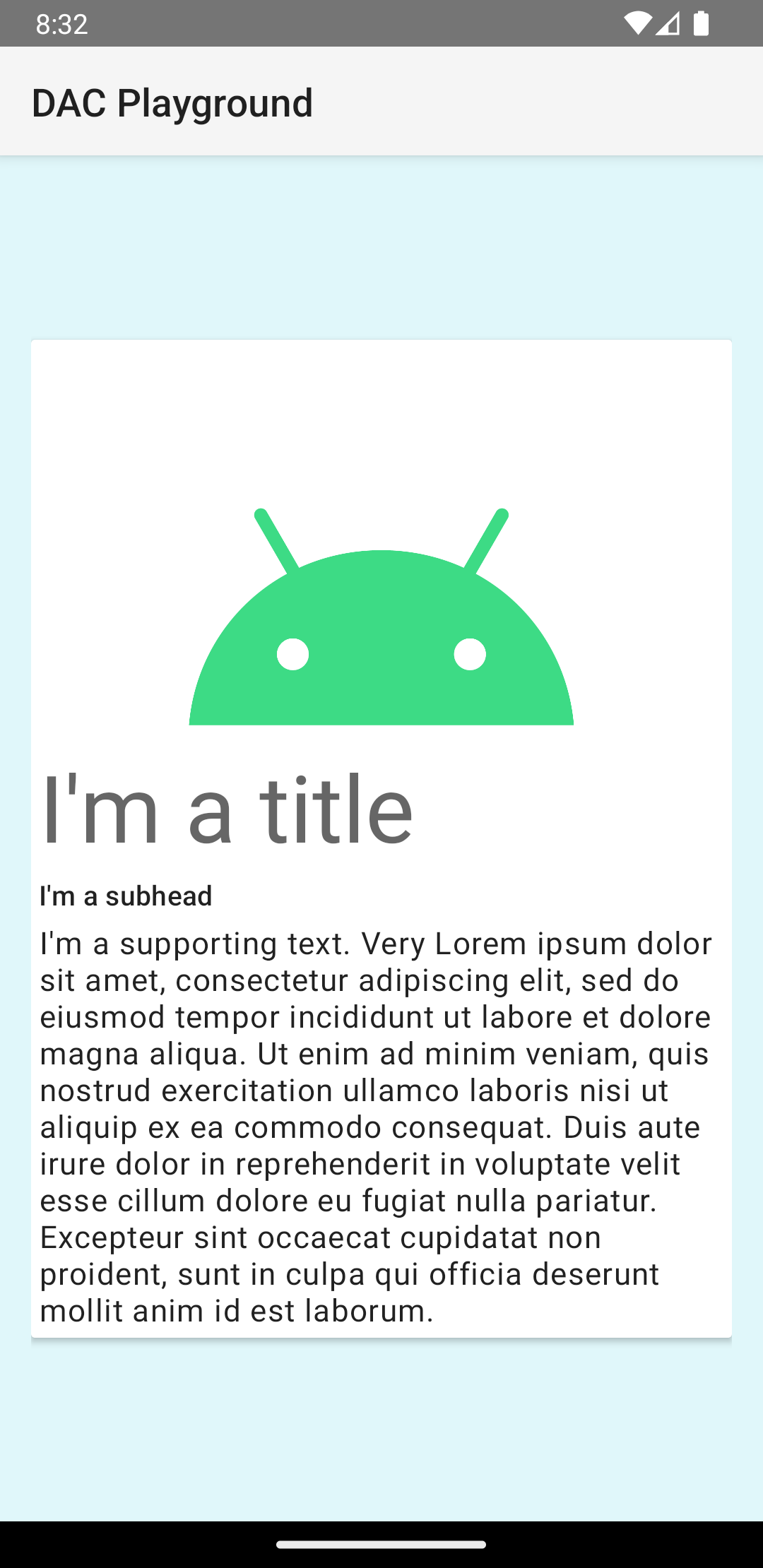
本例中的資訊卡會以預設高度繪製到畫面上,造成系統於其下方繪製陰影。您可透過 card_view:cardElevation 屬性為資訊卡提供自訂高度。高度較高的資訊卡陰影較深,高度較低的資訊卡陰影較淺。CardView 在 Android 5.0 (API 級別 21) 以上版本上採用實際高度和動態陰影。
請使用下列屬性自訂 CardView 小工具的外觀:
- 如要設定版面配置的圓角半徑,請使用
card_view:cardCornerRadius屬性。 - 若要設定程式碼中的圓角半徑,請使用
CardView.setRadius方法。 - 若要設定資訊卡的背景顏色,請使用
card_view:cardBackgroundColor屬性。