
تحتاج التطبيقات غالبًا إلى عرض البيانات في حاويات ذات أنماط متشابهة، مثل الحاويات التي تتضمّن معلومات حول العناصر في قائمة. يوفّر النظام واجهة برمجة التطبيقات CardView لتتمكّن من عرض المعلومات في بطاقات ذات مظهر متّسق على مستوى المنصة. على سبيل المثال، تحتوي البطاقات على مستوى ارتفاع تلقائي فوق مجموعة طرق العرض التي تحتويها، وبالتالي يرسم النظام ظلالاً أسفلها. توفّر البطاقات طريقة لاحتواء مجموعة من طرق العرض مع توفير نمط متسق للحاوية.
إضافة التبعيات
التطبيق المصغّر CardView هو جزء من AndroidX. لاستخدامها في مشروعك، أضِف الاعتمادية التالية إلى ملف build.gradle الخاص بوحدة تطبيقك:
Groovy
dependencies {
    implementation "androidx.cardview:cardview:1.0.0"
}
Kotlin
dependencies {
    implementation("androidx.cardview:cardview:1.0.0")
}
إنشاء بطاقات
لاستخدام CardView، أضِفها إلى ملف التصميم. استخدِمها كمجموعة طرق عرض لاحتواء طرق عرض أخرى. في المثال التالي، يحتوي CardView على
ImageView وبعض TextViews لعرض بعض المعلومات للمستخدم:
<?xml version="1.0" encoding="utf-8"?>
<androidx.constraintlayout.widget.ConstraintLayout
    xmlns:android="http://schemas.android.com/apk/res/android"
    xmlns:app="http://schemas.android.com/apk/res-auto"
    android:padding="16dp"
    android:background="#E0F7FA"
    android:layout_width="match_parent"
    android:layout_height="match_parent">

    <androidx.cardview.widget.CardView
        android:layout_width="match_parent"
        android:layout_height="wrap_content"
        app:layout_constraintBottom_toBottomOf="parent"
        app:layout_constraintEnd_toEndOf="parent"
        app:layout_constraintStart_toStartOf="parent"
        app:layout_constraintTop_toTopOf="parent">

        <androidx.constraintlayout.widget.ConstraintLayout
            android:padding="4dp"
            android:layout_width="match_parent"
            android:layout_height="match_parent">

            <ImageView
                android:id="@+id/header_image"
                android:layout_width="match_parent"
                android:layout_height="200dp"
                android:src="@drawable/logo"
                app:layout_constraintEnd_toEndOf="parent"
                app:layout_constraintStart_toStartOf="parent"
                app:layout_constraintTop_toTopOf="parent" />

            <TextView
                android:id="@+id/title"
                style="@style/TextAppearance.MaterialComponents.Headline3"
                android:layout_width="match_parent"
                android:layout_height="wrap_content"
                android:layout_marginTop="4dp"
                android:text="I'm a title"
                app:layout_constraintEnd_toEndOf="parent"
                app:layout_constraintStart_toStartOf="parent"
                app:layout_constraintTop_toBottomOf="@id/header_image" />

            <TextView
                android:id="@+id/subhead"
                style="@style/TextAppearance.MaterialComponents.Subtitle2"
                android:layout_width="match_parent"
                android:layout_height="wrap_content"
                android:layout_marginTop="4dp"
                android:text="I'm a subhead"
                app:layout_constraintEnd_toEndOf="parent"
                app:layout_constraintStart_toStartOf="parent"
                app:layout_constraintTop_toBottomOf="@id/title" />

            <TextView
                android:id="@+id/body"
                style="@style/TextAppearance.MaterialComponents.Body1"
                android:layout_width="match_parent"
                android:layout_height="wrap_content"
                android:layout_marginTop="4dp"
                android:text="I'm a supporting text. Very Lorem ipsum dolor sit amet, consectetur adipiscing elit, sed do eiusmod tempor incididunt ut labore et dolore magna aliqua. Ut enim ad minim veniam, quis nostrud exercitation ullamco laboris nisi ut aliquip ex ea commodo consequat. Duis aute irure dolor in reprehenderit in voluptate velit esse cillum dolore eu fugiat nulla pariatur. Excepteur sint occaecat cupidatat non proident, sunt in culpa qui officia deserunt mollit anim id est laborum."
                app:layout_constraintEnd_toEndOf="parent"
                app:layout_constraintStart_toStartOf="parent"
                app:layout_constraintTop_toBottomOf="@id/subhead" />
        </androidx.constraintlayout.widget.ConstraintLayout>
    </androidx.cardview.widget.CardView>
</androidx.constraintlayout.widget.ConstraintLayout>
ينتج مقتطف الرمز البرمجي السابق شيئًا مشابهًا لما يلي، بافتراض أنّك تستخدم صورة شعار Android نفسها:
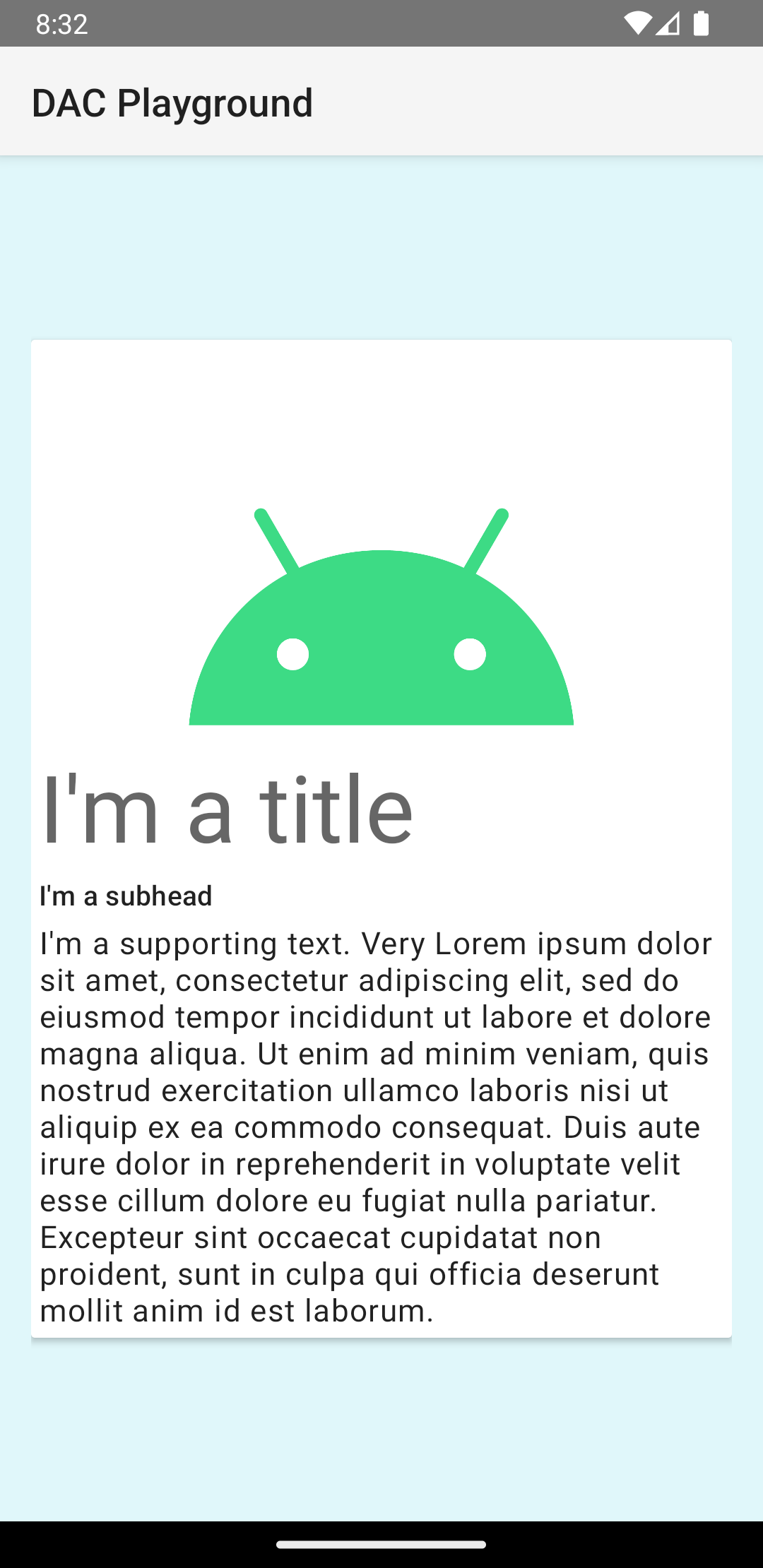
يتم عرض البطاقة في هذا المثال على الشاشة مع مستوى ارتفاع تلقائي، ما يؤدي إلى رسم النظام لظل أسفلها. يمكنك تقديم ارتفاع مخصّص لبطاقة باستخدام السمة card_view:cardElevation. تتضمّن البطاقة ذات الارتفاع الأكبر ظلًا أكثر وضوحًا، بينما تتضمّن البطاقة ذات الارتفاع الأقل ظلًا أخف. تستخدم CardView الارتفاع الحقيقي والظلال الديناميكية على الإصدار 5.0 من نظام التشغيل Android (المستوى 21 من واجهة برمجة التطبيقات) والإصدارات الأحدث.
استخدِم هذه الخصائص لتخصيص مظهر الأداة CardView:
- لضبط نصف قطر الزاوية في التصاميم، استخدِم السمة
card_view:cardCornerRadius. - لضبط نصف قطر الزاوية في الرمز، استخدِم طريقة
CardView.setRadius. - لضبط لون خلفية بطاقة، استخدِم السمة
card_view:cardBackgroundColor.