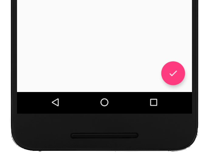
Um botão de ação flutuante (FAB, na sigla em inglês) é um botão circular que aciona a ação
principal na IU do seu app. Este documento mostra como adicionar um FAB ao seu layout,
personalizar parte da aparência dele e responder aos toques no botão.
Para saber mais sobre como criar um FAB para seu app de acordo com as Diretrizes do Material
Design, consulte FAB do Material Design
(link em inglês).
Figura 1. Um botão de ação flutuante (FAB).
Adicionar o botão de ação flutuante ao layout
O código a seguir mostra como o
FloatingActionButton
aparece no arquivo de layout:
Você pode configurar outras propriedades do FAB usando atributos XML ou métodos
correspondentes, como os seguintes:
O tamanho do FAB, usando o atributo app:fabSize ou o
método
setSize().
A cor de ondulação do FAB, usando o atributo app:rippleColor ou o
método
setRippleColor().
O ícone do FAB, usando o atributo android:src ou o
método
setImageDrawable()
Responder aos toques no botão
Em seguida, aplique um
View.OnClickListener para
gerenciar os toques no FAB. Por exemplo, o código a seguir mostra um
Snackbar quando
o usuário toca no FAB:
Kotlin
valfab:View=findViewById(R.id.fab)fab.setOnClickListener{view->Snackbar.make(view,"Here's a Snackbar",Snackbar.LENGTH_LONG).setAction("Action",null).show()}
Java
FloatingActionButtonfab=findViewById(R.id.fab);fab.setOnClickListener(newView.OnClickListener(){@OverridepublicvoidonClick(Viewview){Snackbar.make(view,"Here's a Snackbar",Snackbar.LENGTH_LONG).setAction("Action",null).show();}});
Para mais informações sobre os recursos do FAB, consulte a referência da API
para o
FloatingActionButton.
O conteúdo e os exemplos de código nesta página estão sujeitos às licenças descritas na Licença de conteúdo. Java e OpenJDK são marcas registradas da Oracle e/ou suas afiliadas.
Última atualização 2025-08-27 UTC.
[[["Fácil de entender","easyToUnderstand","thumb-up"],["Meu problema foi resolvido","solvedMyProblem","thumb-up"],["Outro","otherUp","thumb-up"]],[["Não contém as informações de que eu preciso","missingTheInformationINeed","thumb-down"],["Muito complicado / etapas demais","tooComplicatedTooManySteps","thumb-down"],["Desatualizado","outOfDate","thumb-down"],["Problema na tradução","translationIssue","thumb-down"],["Problema com as amostras / o código","samplesCodeIssue","thumb-down"],["Outro","otherDown","thumb-down"]],["Última atualização 2025-08-27 UTC."],[],[],null,["Try the Compose way \nJetpack Compose is the recommended UI toolkit for Android. Learn how to add components in Compose. \n[Floating Action Button →](/develop/ui/compose/components/fab) \n\n\u003cbr /\u003e\n\nA floating action button (FAB) is a circular button that triggers the primary\naction in your app's UI. This document shows how to add a FAB to your layout,\ncustomize some of its appearance, and respond to button taps.\n\nTo learn more about how to design a FAB for your app according to the Material\nDesign Guidelines, see [Material Design\nFAB](https://m3.material.io/components/floating-action-button/overview)\n.\n**Figure 1.** A floating action button (FAB).\n\nAdd the floating action button to your layout\n\nThe following code shows how the\n[`FloatingActionButton`](/reference/com/google/android/material/floatingactionbutton/FloatingActionButton)\nappears in your layout file: \n\n```xml\n\u003ccom.google.android.material.floatingactionbutton.FloatingActionButton\n android:id=\"@+id/fab\"\n android:layout_width=\"wrap_content\"\n android:layout_height=\"wrap_content\"\n android:layout_gravity=\"end|bottom\"\n android:src=\"@drawable/ic_my_icon\"\n android:contentDescription=\"@string/submit\"\n android:layout_margin=\"16dp\" /\u003e\n```\n\nBy default, a FAB is colored by the `colorAccent` attribute, which you can\n[customize with the theme's color\npalette](/guide/topics/ui/look-and-feel/themes#ColorPalette).\n\nYou can configure other FAB properties using XML attributes or corresponding\nmethods, such as the following:\n\n- The size of the FAB, using the `app:fabSize` attribute or the [`setSize()`](/reference/com/google/android/material/floatingactionbutton/FloatingActionButton#setSize(int)) method\n- The ripple color of the FAB, using the `app:rippleColor` attribute or the [`setRippleColor()`](/reference/com/google/android/material/floatingactionbutton/FloatingActionButton#setRippleColor(int)) method\n- The FAB icon, using the `android:src` attribute or the [`setImageDrawable()`](/reference/android/widget/ImageView#setImageDrawable(android.graphics.drawable.Drawable)) method\n\nRespond to button taps\n\nYou can then apply an\n[`View.OnClickListener`](/reference/android/view/View.OnClickListener) to\nhandle FAB taps. For example, the following code displays a\n[`Snackbar`](/reference/com/google/android/material/snackbar/Snackbar) when\nthe user taps the FAB: \n\nKotlin \n\n```kotlin\nval fab: View = findViewById(R.id.fab)\nfab.setOnClickListener { view -\u003e\n Snackbar.make(view, \"Here's a Snackbar\", Snackbar.LENGTH_LONG)\n .setAction(\"Action\", null)\n .show()\n}\n```\n\nJava \n\n```java\nFloatingActionButton fab = findViewById(R.id.fab);\nfab.setOnClickListener(new View.OnClickListener() {\n @Override\n public void onClick(View view) {\n Snackbar.make(view, \"Here's a Snackbar\", Snackbar.LENGTH_LONG)\n .setAction(\"Action\", null).show();\n }\n});\n```\n\nFor more information about the capabilities of the FAB, see the API reference\nfor the\n[`FloatingActionButton`](/reference/com/google/android/material/floatingactionbutton/FloatingActionButton)."]]