
फ़्लोट करने वाला कार्रवाई बटन (एफ़एबी) एक गोल बटन होता है. इससे आपके ऐप्लिकेशन के यूज़र इंटरफ़ेस (यूआई) में मुख्य कार्रवाई ट्रिगर होती है. इस दस्तावेज़ में, लेआउट में एफ़एबी जोड़ने, उसकी दिखावट को पसंद के मुताबिक बनाने, और बटन पर टैप करने पर होने वाली कार्रवाई के बारे में बताया गया है.
मटीरियल डिज़ाइन के दिशा-निर्देशों के मुताबिक, अपने ऐप्लिकेशन के लिए एफ़एबी डिज़ाइन करने के बारे में ज़्यादा जानने के लिए, मटीरियल डिज़ाइन एफ़एबी सेक्शन देखें.
अपने लेआउट में फ़्लोट करने वाला कार्रवाई बटन जोड़ना
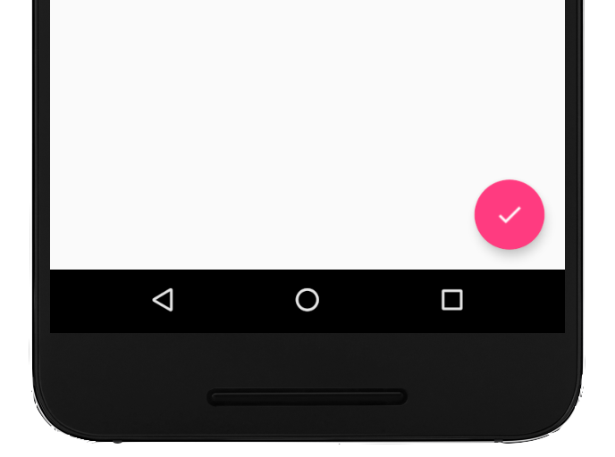
यहां दिए गए कोड से पता चलता है कि आपके लेआउट फ़ाइल में
FloatingActionButton
कैसा दिखता है:
<com.google.android.material.floatingactionbutton.FloatingActionButton
        android:id="@+id/fab"
        android:layout_width="wrap_content"
        android:layout_height="wrap_content"
        android:layout_gravity="end|bottom"
        android:src="@drawable/ic_my_icon"
        android:contentDescription="@string/submit"
        android:layout_margin="16dp" />
एक्सएमएल एट्रिब्यूट या उनसे जुड़े तरीकों का इस्तेमाल करके, एफ़एबी की अन्य प्रॉपर्टी कॉन्फ़िगर की जा सकती हैं. जैसे, ये प्रॉपर्टी:
- एफ़एबी का साइज़ सेट करना,
app:fabSizeएट्रिब्यूट याsetSize()तरीके का इस्तेमाल करके - `
app:rippleColor` एट्रिब्यूट या `setRippleColor()` तरीके का इस्तेमाल करके, एफ़एबी का रिपल कलर सेट करना - एफ़एबी का आइकॉन सेट करना,
android:srcएट्रिब्यूट याsetImageDrawable()तरीके का इस्तेमाल करके
बटन पर टैप करने पर होने वाली कार्रवाई को सेट करना
इसके बाद, एफ़एबी पर टैप करने की कार्रवाई को मैनेज करने के लिए,
View.OnClickListener लागू किया जा सकता है. उदाहरण के लिए, यहां दिए गए कोड से पता चलता है कि उपयोगकर्ता के एफ़एबी पर टैप करने पर,
Snackbar कैसे दिखता है:
Kotlin
val fab: View = findViewById(R.id.fab)
fab.setOnClickListener { view ->
    Snackbar.make(view, "Here's a Snackbar", Snackbar.LENGTH_LONG)
            .setAction("Action", null)
            .show()
}
Java
FloatingActionButton fab = findViewById(R.id.fab);
fab.setOnClickListener(new View.OnClickListener() {
    @Override
    public void onClick(View view) {
        Snackbar.make(view, "Here's a Snackbar", Snackbar.LENGTH_LONG)
                .setAction("Action", null).show();
    }
});
एफ़एबी की क्षमताओं के बारे में ज़्यादा जानने के लिए, एपीआई रेफ़रंस देखें
के लिए
FloatingActionButton.