แบบอักษร
จัดทุกอย่างให้เป็นระเบียบอยู่เสมอด้วยคอลเล็กชัน
บันทึกและจัดหมวดหมู่เนื้อหาตามค่ากำหนดของคุณ
แทนที่อินสแตนซ์ทั้งหมดของ Roboto ด้วย Roboto Flex ปรับขนาดแบบพื้นฐานที่เพิ่มประสิทธิภาพให้เหมาะกับนาฬิกาและภาษาการออกแบบที่สื่อความหมายของ Material 3
การใช้แกนตัวแปร ความกว้างและน้ำหนักแบบตัวแปรเพื่อดูแลจัดการวิธีที่เราจัดสไตล์ข้อความแสดงผลขนาดใหญ่และข้อความชื่อเพื่อยกระดับสไตล์ รวมถึงเพิ่มประโยชน์และความอ่านง่ายสำหรับขนาดที่เล็กลง
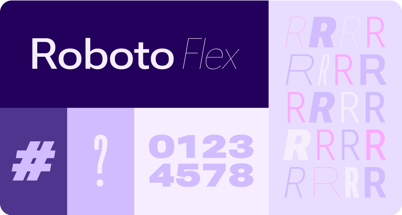
Roboto Flex
Roboto Flex มีชุดแกนตัวแปรที่รองรับกรณีการใช้งานของแอป
แกนปรับได้
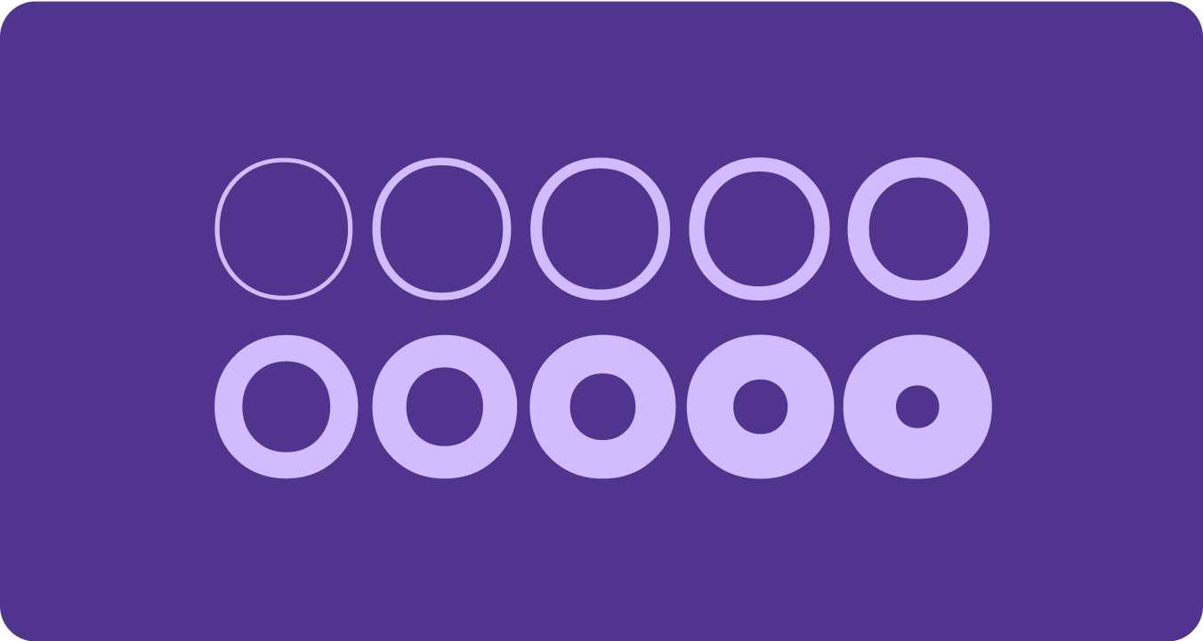
แม้ว่าแบบอักษรแบบแปรผันจะมีแอตทริบิวต์แบบอักษรแบบแปรผันมากมายสำหรับการแสดงออก แต่ก็มี 2 แอตทริบิวต์สไตล์ (หรือแกน) ที่ปรับแต่งได้ซึ่งเหมาะกับการออกแบบผลิตภัณฑ์มากที่สุด ได้แก่ ความหนาและขนาด
น้ำหนัก
น้ำหนักคือแอตทริบิวต์หลักที่กำหนดความหนาโดยรวมของเส้นในแบบอักษรในแบบอักษรหนึ่งๆ น้ำหนักที่พบบ่อยที่สุดคือแบบปกติและแบบหนา แต่น้ำหนักอาจครอบคลุมตั้งแต่เบามากไปจนถึงหนักมาก หากแบบอักษรเป็นแบบแปรผัน ก็จะมีความหนาของเส้นต่อเนื่องกันเต็มรูปแบบ ทำให้จำนวนน้ำหนักแบบอักษรไม่มีขีดจำกัด
สิ่งที่ต้องจดจำ
warning
ข้อควรระวัง
ระวังอย่าใช้แบบอักษรที่มีน้ำหนักเบาเกินไปสำหรับข้อความเนื้อหา
จอแสดงผลที่มีความละเอียดต่ำอาจแสดงแบบอักษรที่มีความละเอียดอ่อนได้ไม่ดี โดยเฉพาะแบบอักษรขนาดเล็ก ใช้แบบอักษรที่มีน้ำหนักเบากว่ากับแบบอักษรขนาดใหญ่ เช่น แบบอักษรแสดงผล
warning
ข้อควรระวัง
ในทางกลับกัน น้ำหนักที่มากเกินไปในขนาดที่เล็กกว่าอาจส่งผลต่อความชัดเจนในการอ่าน ตัวอักษรหนาเกินไปอาจอ่านได้ยาก
ความกว้าง
ความกว้างคือผลลัพธ์ของพื้นที่แนวนอนที่ตัวอักษรของแบบอักษรใช้ แถบแคบช่วยให้ใส่อักขระได้มากขึ้นต่อบรรทัด ในขณะที่แถบกว้างอาจแสดงถึงบุคลิกภาพได้มากกว่า
สิ่งที่ต้องจดจำ
check_circle
ควรทำ
การใช้ความกว้างที่แคบลงจะช่วยให้ใส่อักขระได้มากขึ้นเมื่อใช้ขนาดที่เล็ก เช่น ชื่อหรือตัวเลขยาว
cancel
ไม่ควรทำ
เนื่องจากแบบกว้างใช้พื้นที่มากกว่า จึงควรหลีกเลี่ยงการใช้แบบกว้างในพื้นที่ที่มีพื้นที่จำกัด เช่น ในส่วนหัวของหน้าแอป
ตัวอย่างเนื้อหาและโค้ดในหน้าเว็บนี้ขึ้นอยู่กับใบอนุญาตที่อธิบายไว้ในใบอนุญาตการใช้เนื้อหา Java และ OpenJDK เป็นเครื่องหมายการค้าหรือเครื่องหมายการค้าจดทะเบียนของ Oracle และ/หรือบริษัทในเครือ
อัปเดตล่าสุด 2025-07-27 UTC
[[["เข้าใจง่าย","easyToUnderstand","thumb-up"],["แก้ปัญหาของฉันได้","solvedMyProblem","thumb-up"],["อื่นๆ","otherUp","thumb-up"]],[["ไม่มีข้อมูลที่ฉันต้องการ","missingTheInformationINeed","thumb-down"],["ซับซ้อนเกินไป/มีหลายขั้นตอนมากเกินไป","tooComplicatedTooManySteps","thumb-down"],["ล้าสมัย","outOfDate","thumb-down"],["ปัญหาเกี่ยวกับการแปล","translationIssue","thumb-down"],["ตัวอย่าง/ปัญหาเกี่ยวกับโค้ด","samplesCodeIssue","thumb-down"],["อื่นๆ","otherDown","thumb-down"]],["อัปเดตล่าสุด 2025-07-27 UTC"],[],[],null,["# Fonts\n\nReplace all instances of Roboto with Roboto Flex. Tailor a baseline type scale\nthat is optimized for the watch and the Material 3 Expressive design language.\n\nUsing variable axis, variable width and weight to curate how we style big\ndisplay and title text to elevate style and bring more utility and legibility\nfor smaller sizes.\n\nRoboto Flex\n-----------\n\n\nRoboto Flex offers a set of variable axis that serves your app's use cases. \n\n\u003cbr /\u003e\n\nAdjustable axes\n---------------\n\nWhile variable fonts can have a multitude of variable font attributes for\nexpression, there are two customizable stylistic attributes (or axes) that are\nmost applicable for product design: weight and width.\n\n### Weight\n\n\n[Weight](https://fonts.google.com/knowledge/choosing_type/exploring_typefaces_with_multiple_weights_or_grades) is the primary attribute that defines the overall thickness of a\ntypeface's strokes in any given font. The most common weights are regular and\nbold, but weights can cover extremes from the very light to the very heavy. If\nthe typeface is variable, it provides a full, continuous range of stroke\nthicknesses, making the number of weights effectively unlimited. \n\n\u003cbr /\u003e\n\n#### Things to remember\n\nwarning\n\n### Caution\n\nBe careful of using too light a weight type for body text.\nLower resolution displays can struggle with delicate, especially small\ntypography. Use lighter weights at larger font sizes, such as display\ntype. \nwarning\n\n### Caution\n\nConversely, excessive weight at smaller sizes may affect\nlegibility. Too thick a type may be difficult to read.\n\n### Width\n\n\n[Width](https://fonts.google.com/knowledge/glossary/width) is the result of how much horizontal space is taken up by a\ntypeface's characters. A narrow width allows more characters to fit per line\nwhile a wider width may offer more personality. \n\n\u003cbr /\u003e\n\n#### Things to remember\n\ncheck_circle\n\n### Do\n\nA thinner width can allow for more characters to fit at\nsmall sizes, such as name or a long number. \ncancel\n\n### Don't\n\nSince wider styles take up more space, avoid using them for\nareas with limited space, such as in the app page header."]]