גופנים
קל לארגן דפים בעזרת אוספים
אפשר לשמור ולסווג תוכן על סמך ההעדפות שלך.
מחליפים את כל המופעים של Roboto ב-Roboto Flex. להתאים אישית סולם של סוגים בסיסיים שמותאם לשעון ולשפת העיצוב העשירה של Material 3.
שימוש בציר משתנה, ברוחב משתנה ובמשקל משתנה כדי לקבוע את הסגנון של טקסטים גדולים בתצוגה וטקסטים של כותרות, כדי לשפר את הסגנון ולהפוך אותם ליותר שימושיים וקלים לקריאה בגדלים קטנים יותר.
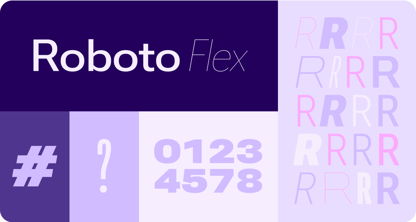
Roboto Flex
ב-Roboto Flex יש קבוצה של צירים משתנים שמתאימים לתרחישי השימוש של האפליקציה.
צירים מתכווננים
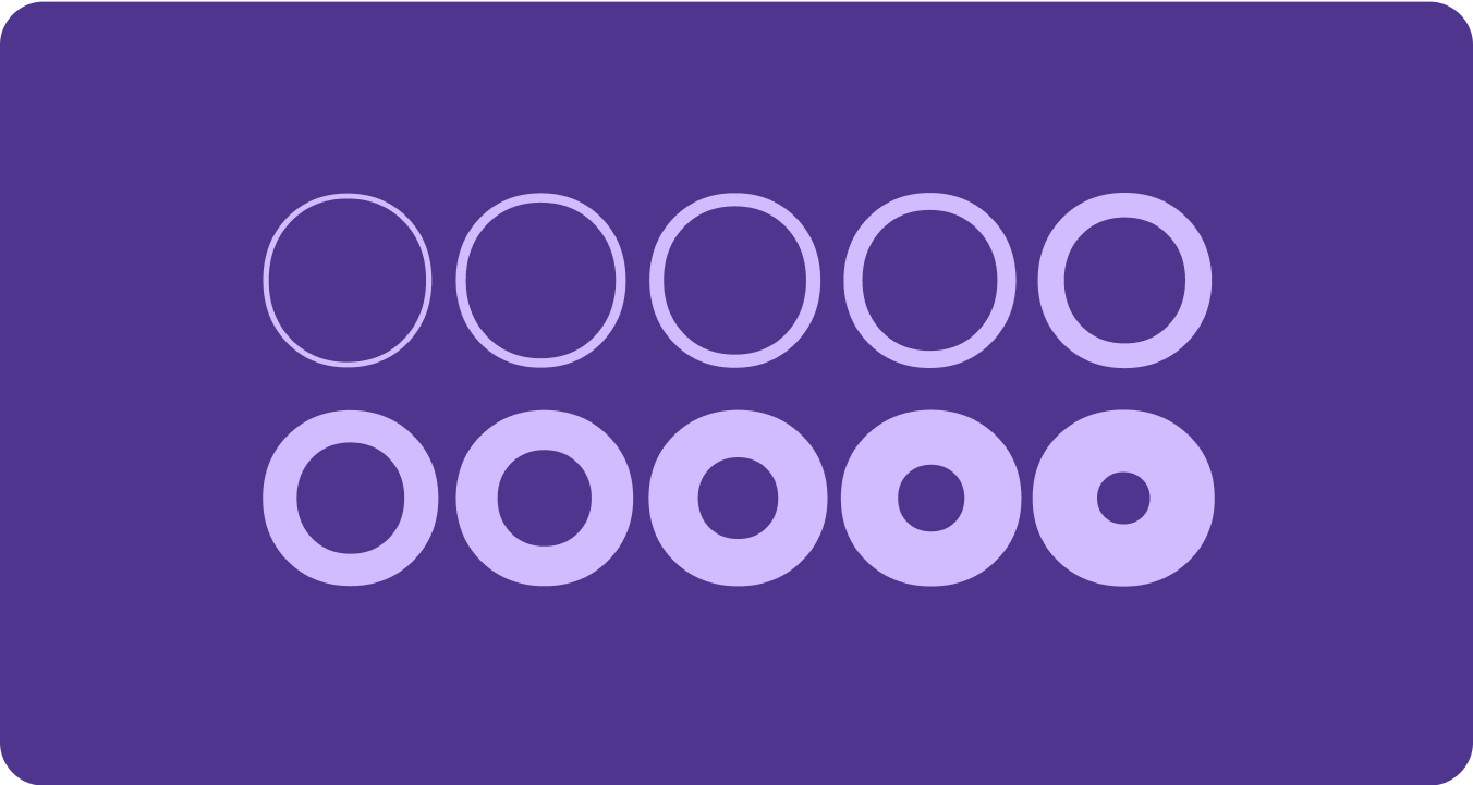
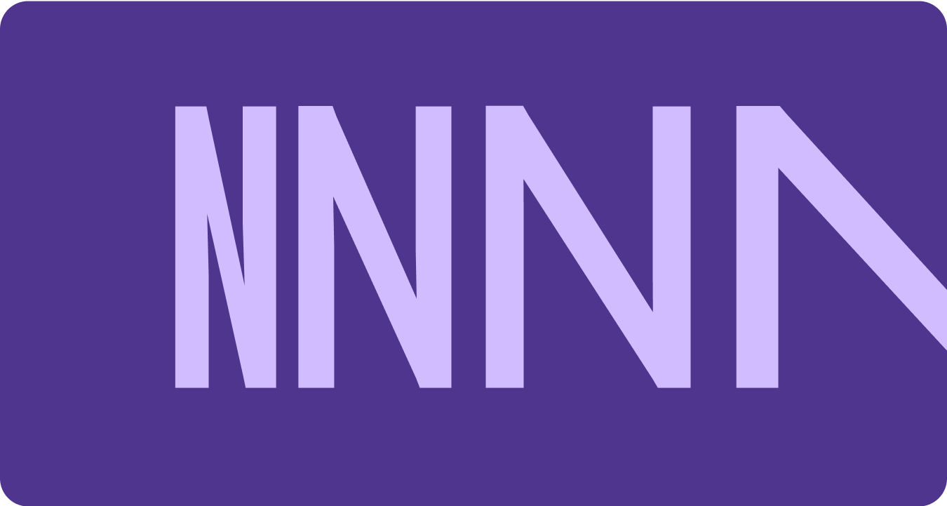
לגופנים משתנים יכולים להיות מגוון מאפיינים משתנים לביטוי, אבל יש שני מאפיינים סגנוניים (או צירים) שניתן להתאים אישית, והם המתאימים ביותר לעיצוב מוצרים: משקל ורוחב.
משקל
משקל הוא המאפיין הראשי שמגדיר את העובי הכולל של הקווים של גופן בכל גופן נתון. המשקלים הנפוצים ביותר הם רגיל ועבה, אבל המשקלים יכולים לנוע בין קיצוניות של קל מאוד לכבד מאוד. אם הגופן משתנה, הוא מספק טווח מלא ורציף של עובי קווים, כך שמספר עומסי הגופן הוא למעשה בלתי מוגבל.
כדאי לזכור
warning
זהירות
חשוב להיזהר משימוש בסוג גופן קל מדי לגוף הטקסט.
במסכים ברזולוציה נמוכה יותר, יכול להיות שיהיה קשה להציג גופנים עדינים, במיוחד גופנים קטנים. מומלץ להשתמש בעוביים דקים יותר בגודל גופן גדול יותר, כמו גופן תצוגה.
warning
זהירות
לעומת זאת, משקל יתר בגדלים קטנים יותר עלול להשפיע על הקריאוּת. אם הגופן עבה מדי, יכול להיות שיהיה קשה לקרוא אותו.
רוחב
רוחב הוא התוצאה של נפח המרחב האופקי שנכבש על ידי התווים של הגופן. רוחב צר מאפשר להציג יותר תווים בכל שורה, בעוד שרוחב רחב יותר יכול להעניק יותר אישיות.
כדאי לזכור
check_circle
מה צריך לעשות
רוחב צר יותר מאפשר להציג יותר תווים בגדלים קטנים, כמו שם או מספר ארוך.
cancel
מה אסור לעשות
סגנונות רחבים יותר תופסים יותר מקום, לכן כדאי להימנע משימוש בהם באזורים עם מקום מוגבל, כמו בכותרת של דף האפליקציה.
דוגמאות התוכן והקוד שבדף הזה כפופות לרישיונות המפורטים בקטע רישיון לתוכן. Java ו-OpenJDK הם סימנים מסחריים או סימנים מסחריים רשומים של חברת Oracle ו/או של השותפים העצמאיים שלה.
עדכון אחרון: 2025-07-27 (שעון UTC).
[[["התוכן קל להבנה","easyToUnderstand","thumb-up"],["התוכן עזר לי לפתור בעיה","solvedMyProblem","thumb-up"],["סיבה אחרת","otherUp","thumb-up"]],[["חסרים לי מידע או פרטים","missingTheInformationINeed","thumb-down"],["התוכן מורכב מדי או עם יותר מדי שלבים","tooComplicatedTooManySteps","thumb-down"],["התוכן לא עדכני","outOfDate","thumb-down"],["בעיה בתרגום","translationIssue","thumb-down"],["בעיה בדוגמאות/בקוד","samplesCodeIssue","thumb-down"],["סיבה אחרת","otherDown","thumb-down"]],["עדכון אחרון: 2025-07-27 (שעון UTC)."],[],[],null,["# Fonts\n\nReplace all instances of Roboto with Roboto Flex. Tailor a baseline type scale\nthat is optimized for the watch and the Material 3 Expressive design language.\n\nUsing variable axis, variable width and weight to curate how we style big\ndisplay and title text to elevate style and bring more utility and legibility\nfor smaller sizes.\n\nRoboto Flex\n-----------\n\n\nRoboto Flex offers a set of variable axis that serves your app's use cases. \n\n\u003cbr /\u003e\n\nAdjustable axes\n---------------\n\nWhile variable fonts can have a multitude of variable font attributes for\nexpression, there are two customizable stylistic attributes (or axes) that are\nmost applicable for product design: weight and width.\n\n### Weight\n\n\n[Weight](https://fonts.google.com/knowledge/choosing_type/exploring_typefaces_with_multiple_weights_or_grades) is the primary attribute that defines the overall thickness of a\ntypeface's strokes in any given font. The most common weights are regular and\nbold, but weights can cover extremes from the very light to the very heavy. If\nthe typeface is variable, it provides a full, continuous range of stroke\nthicknesses, making the number of weights effectively unlimited. \n\n\u003cbr /\u003e\n\n#### Things to remember\n\nwarning\n\n### Caution\n\nBe careful of using too light a weight type for body text.\nLower resolution displays can struggle with delicate, especially small\ntypography. Use lighter weights at larger font sizes, such as display\ntype. \nwarning\n\n### Caution\n\nConversely, excessive weight at smaller sizes may affect\nlegibility. Too thick a type may be difficult to read.\n\n### Width\n\n\n[Width](https://fonts.google.com/knowledge/glossary/width) is the result of how much horizontal space is taken up by a\ntypeface's characters. A narrow width allows more characters to fit per line\nwhile a wider width may offer more personality. \n\n\u003cbr /\u003e\n\n#### Things to remember\n\ncheck_circle\n\n### Do\n\nA thinner width can allow for more characters to fit at\nsmall sizes, such as name or a long number. \ncancel\n\n### Don't\n\nSince wider styles take up more space, avoid using them for\nareas with limited space, such as in the app page header."]]