
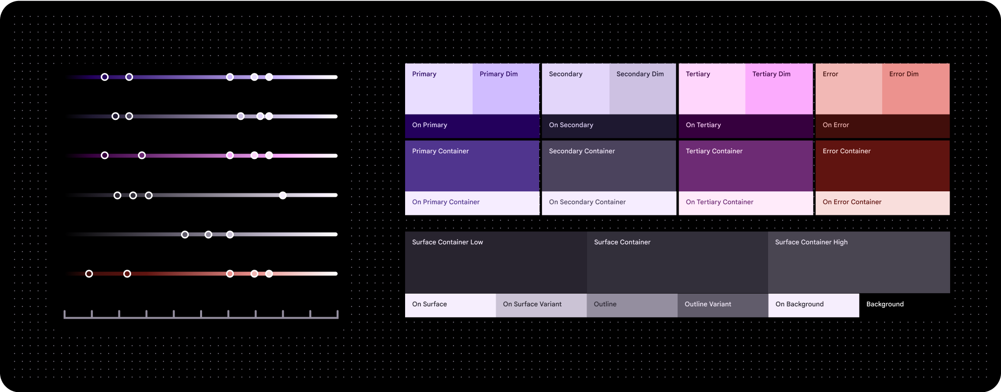
במסגרת הצבעים של Material 3 Expressive נעשה שימוש בנושאי צבעים דינמיים, שמבוססים על שני צבעים מקוריים שממופים למערכת הצבעים HCT (גוון, צבע וטון).
מונחים חיוניים
- תפקיד צבע
- כמו 'המספרים' על קנבס לצביעה לפי מספרים, תפקידים של צבעים מוקצים לרכיבים ספציפיים בממשק המשתמש. השמות שלהם יכולים להיות primary, on primary ו-primary container. אותו תפקיד צבע משמש גם בעיצוב בהיר וגם בעיצוב כהה. הצגת כל התפקידים לפי צבע
- HCT
- האותיות HCT מייצגות את המילים hue (גוון), chroma (עוצמת צבע) ו-tone (טון).
הגדרת צבעים באמצעות גוון, רוויה וטון (HCT)
גנרטור צבעים מסוג HCT שיוצר קבוצה של לוחות צבעים מצבע זרע אחד, כדי ליצור מודל צבע תלת-ממדי שמגדיר צבעים על סמך הגוון (הצבע), הצפיפות (הרוויה) והגוון (הבהירות) שלהם
יש שלושה צבעים משניים עיקריים: צבע ראשי, צבע משני וצבע שלישי. גוונים ניטרליים, כמו גוונים שונים של אפור עם נגיעת צבע ראשי, הם אידיאליים לשימוש כצבעים של קונטיינרים לתוכן עשיר בגלל האופי המונוכרומטי שלהם.
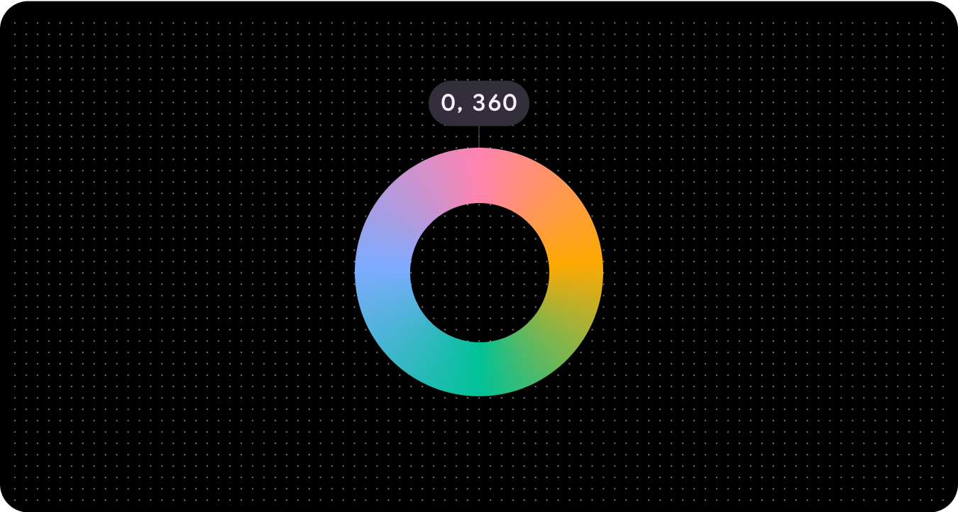
גוון
גוון הוא תפיסת הצבע, כמו אדום, כתום, צהוב, ירוק, כחול וסגול. הצבע מוגדר במספר שנע בין 0 ל-360, והוא ספקטרום עגול (הערכים 0 ו-360 הם אותו צבע).
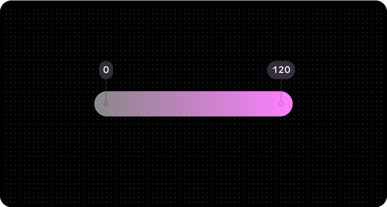
כרומה
הצבעה היא מידת הצבעוניות או הנייטרליות (אפור, שחור או לבן) של צבע. הצבע מוגדר במספר שנע בין 0 (אפור, שחור או לבן לחלוטין) לבין אינסוף (הצבע הכי עז), אבל ערכי הצבע ב-HCT מגיעים ל-120 בערך.
בגלל מגבלות ביולוגיות והגבלות על עיבוד המסך, לגוונים ולצבעים שונים יהיו ערכי צפיפות צבע מקסימליים שונים.
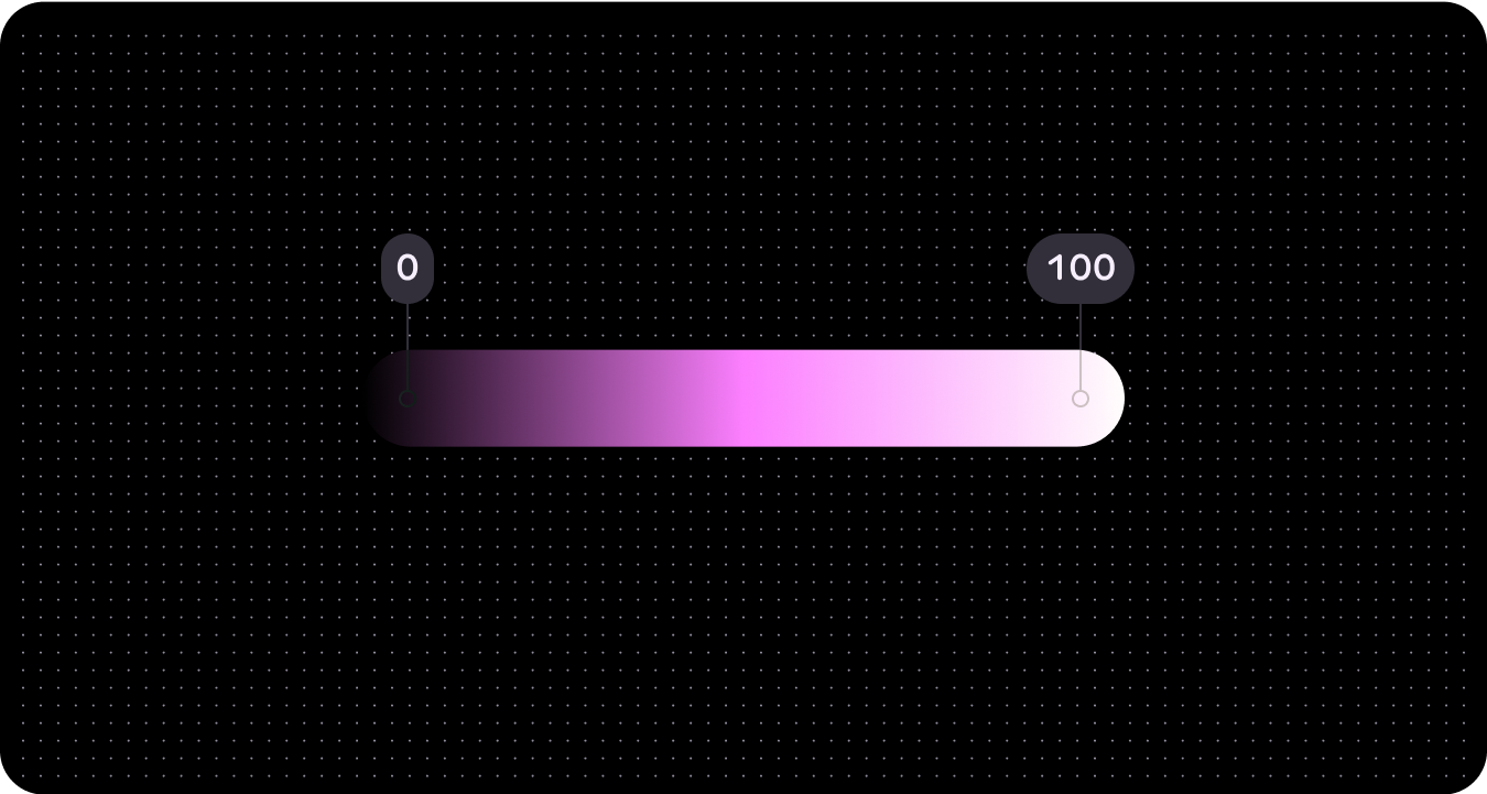
טון
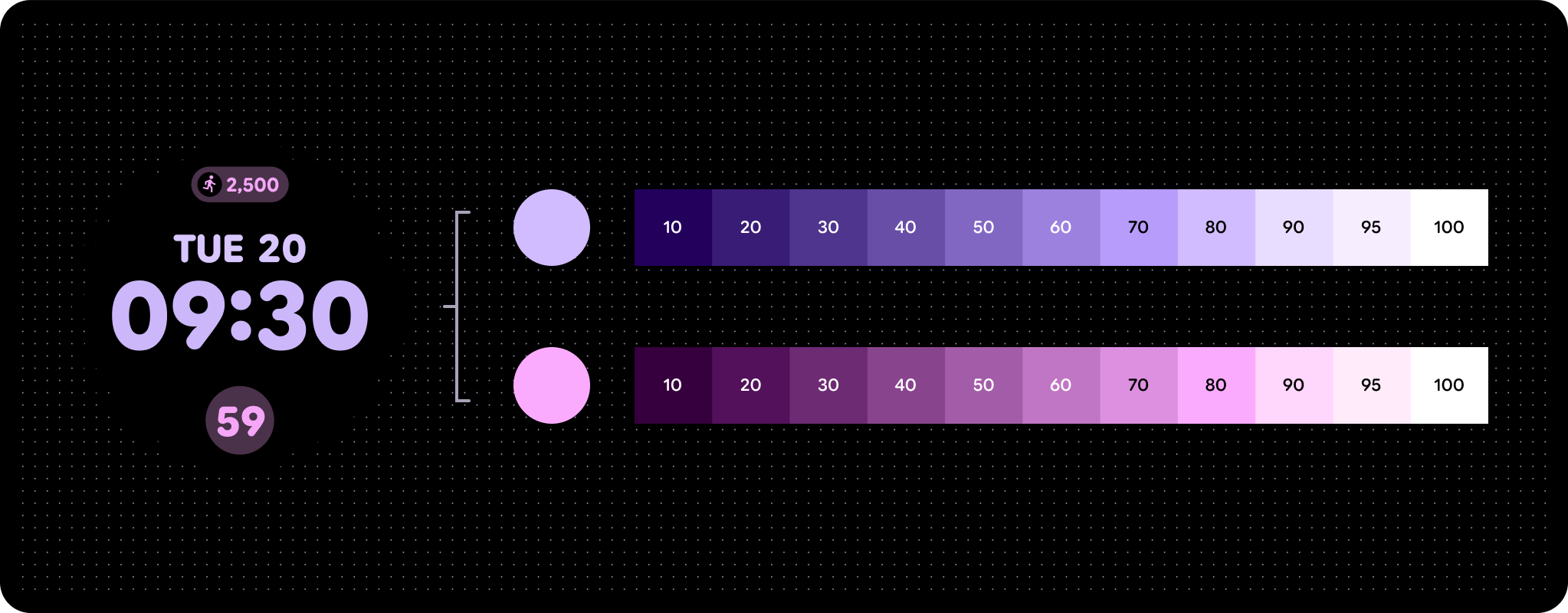
הטון הוא מידת הבהירות או החושך של הצבע. לפעמים קוראים לגוון גם עוצמת הארה. הטון מוגדר במספר שנע בין 0 (שחור טהור, ללא בהירות) ל-100 (לבן טהור, בהירות מלאה).
הטון הוא קריטי לנגישות חזותית כי הוא קובע את הניגודיות. צבעים עם הבדל גדול יותר בגוון יוצרים ניגודיות גבוהה יותר, ואילו צבעים עם הבדל קטן יותר יוצרים ניגודיות נמוכה יותר.
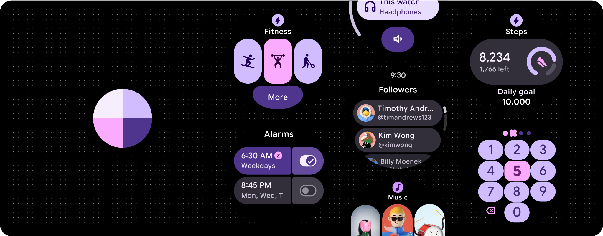
צבע דינמי (עיצוב לפי צבע)
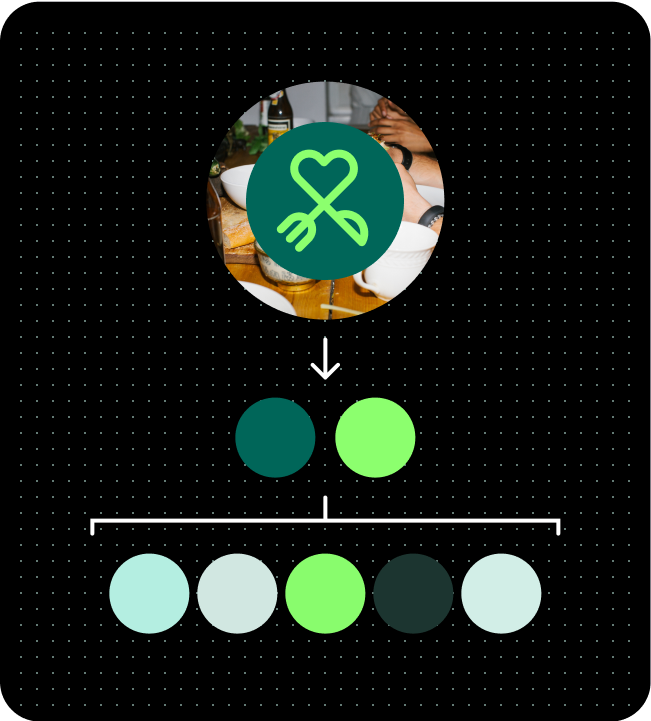
ב-Wear OS מופעלת מערכת עיצוב שתואמת להנחיות של Web Content Accessibility Guidelines (WCAG)-AAA, שמבוססת על שני צבעים מוגדרים. באופן ספציפי, צבעים אלה משמשים כבסיס ללוחות צבעים ראשיים ושלישיים. על סמך שני הצבעים הראשוניים האלה, המערכת יוצרת לוח צבעים מקיף שכולל לוחות צבעים ראשיים, משניים, שלישיים ולוחות צבעים לרקע. לאחר מכן, העיצוב שנוצר חל על רכיבי Wear OS, על רכיבי ממשק המשתמש של המערכת, על כרטיסי מידע ועל אפליקציות.
בהתאם להעדפה שלכם, תוכלו להשתמש בצבע זרעים ספציפי או בצבע המותג כדי להפיק את הצבע הדינמי.
מצבע זרעי ה-HTML
התכונה 'צבע דינמי' תיצור באופן אוטומטי ערכת צבעים נגישה על סמך צבע התחלה ספציפי.
מכיוון שמערכת ממשק המשתמש עשויה לכלול מספר כלשהו של צבעי מקור שונים, מומלץ לבצע את העיצוב הראשוני באמצעות ערכת הצבעים הבסיסית כדי לוודא שתפקידים הצבעים הנכונים ממופים לרכיבים הנכונים במוצר. תוכלו להשתמש ב-Material Theme Builder כדי לראות איך נראים מודלי UI במגוון צבעים של מקור, ולשנות את ההגדרות לפי הצורך.
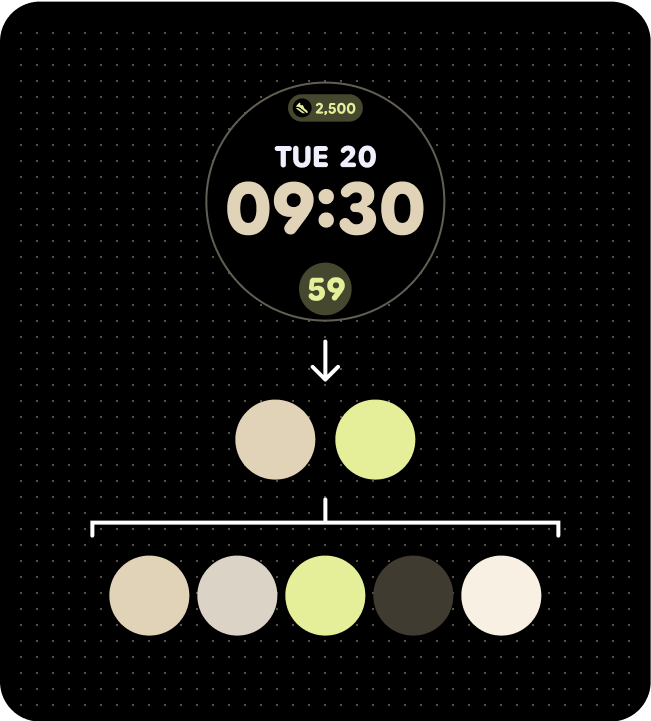
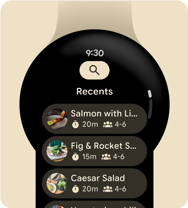
לוח צבעים (מצבעים בסיסיים של תצוגת השעון)
ערכת צבעים שחלה על משבצת
ערכת צבעים שחלה על מסך של אפליקציה
מהצבע של המותג
בדומה לאופן שבו נעשה שימוש בתפקידי צבעים ב-Material 3 Expressive, ב-Wear OS נעשה שימוש בצבע כדי להתאים אישית חוויות באמצעות ביטוי דינמי ונגיש של צבעים. ב-Wear OS נעשה שימוש רק בעיצוב כהה, כי הממשק של השעון החכם מבוסס על רקע שחור. Wear OS היא פלטפורמה שפועלת במכשירי מגע, ולכן גם לצבעים שלה יש מגוון מוגבל יותר, כי היא לא דורשת כל כך הרבה מצבי מעבר מעל או התמקדות. אתם יכולים להשתמש בכלים הספציפיים ל-Wear OS ליצירת עיצוב בצבעים שמותאם למותג שלכם, וליצור לוחות צבעים מלאים ותפקידי צבעים שהוקצתה להם תמיכה באסימונים של Material Design, ועומדים בדרישות לעבודה חלקה עם רכיבי ממשק המשתמש של המערכת.
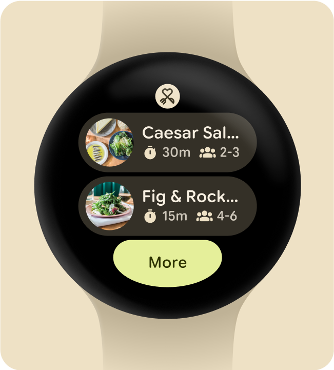
לוח צבעים (מצבעים ראשוניים של גרפיקה)
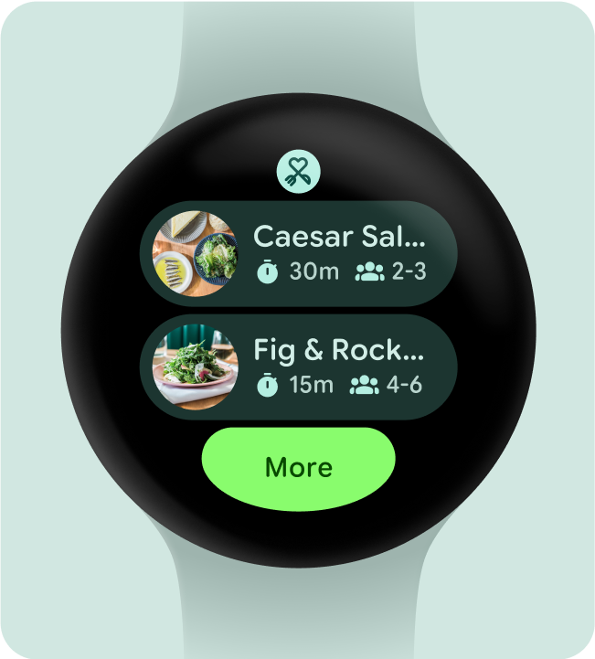
ערכת צבעים שחלה על משבצת
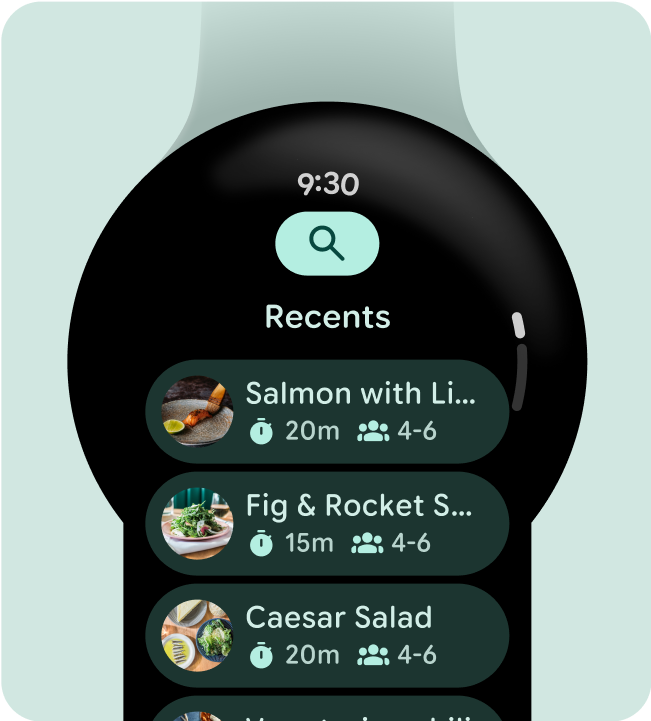
ערכת צבעים שחלה על מסך של אפליקציה