
מערכת הצבעים Wear Material 3 Expressive משתמשת בשלוש שכבות של צבעים משניים (ראשי, משני ושלישוני) לרכיבי מפתח, ובשתי שכבות ניטרליות של צבעי רקע. כל תפקיד מציע טווח של ערכים עם ניגודיות עקבית, שמאפשרת שילובי צבעים מגוונים ונגישים לחוויה אחידה בכל נושא.
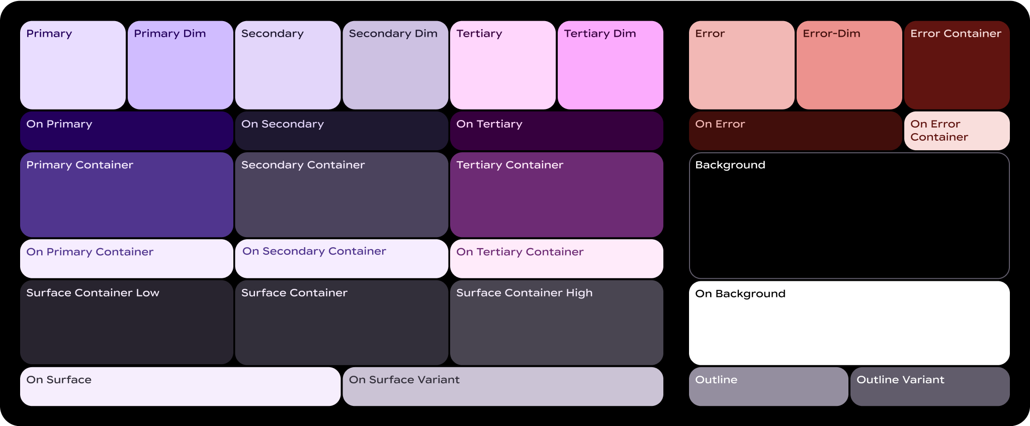
מהם תפקידים של צבעים?
תפקידי הצבעים הם כמו ה "מספרים" בציור לפי מספרים. הם מהווים את הרקמה המחברת בין רכיבי ממשק המשתמש ובין הצבעים שמוצגים בכל מקום.
- תפקידי הצבעים ממופים לרכיבי Material: תשתמשו בתפקידי הצבעים האלה בין אם אתם משתמשים בסכימת הבסיס הסטטית או בצבע דינמי. אם המוצר שלכם מכיל רכיבים בהתאמה אישית, צריך למפות אותם בצורה נכונה לקבוצת תפקידי הצבע הזו.
- תפקידי הצבע תומכים בנגישות: מערכת הצבעים מבוססת על שילובי צבעים נגישים יותר. לזוגות הצבעים האלה יש יחס ניגודיות של לפחות 3:1.
- תפקידי הצבעים מומרים לטוקנים: התפקידים מוטמעים בעיצוב ובקוד באמצעות טוקנים. טוקן עיצוב מייצג החלטת עיצוב קטנה וניתנת לשימוש חוזר, שהיא חלק מהסגנון החזותי של מערכת עיצוב.
תנאים חיוניים
אלה מונחים חשובים שמופיעים בשמות של תפקידים שקשורים לצבע:
- משטח: תפקיד שמשמש לרקעים ולאזורים גדולים במסך שאין בהם דגש.
- ראשי, משני, שלישוני: תפקידי צבע משני שמשמשים להדגשה או להפחתת ההדגשה של אלמנטים בחזית.
- מאגר: תפקידים שמשמשים כצבע מילוי לרכיבים בחזית כמו כפתורים. אין להשתמש בהם לטקסט או לסמלים.
- מופעל: תפקידים שמתחילים במונח הזה מציינים צבע לטקסט או לסמלים מעל צבע ההורה התואם. לדוגמה, הצבע הראשי משמש לטקסט ולסמלים על רקע הצבע הראשי למילוי.
- וריאציה: תפקידים שמסתיימים במונח הזה הם חלופה עם דגש נמוך יותר לתפקיד המקביל שאינו וריאציה. לדוגמה, וריאציה של קו מתאר היא גרסה עם פחות הדגשה של צבע קו המתאר.
תפקידים ראשיים
תפקידים ראשיים משמשים לרכיבי מפתח בממשק המשתמש, כמו כפתורים שצמודים לקצה, כפתורים בולטים, מצבים פעילים וסמלים בסגנונות של כפתורים עם גוונים.

ראשי
- ראשי
- במסגרת העיסוק העיקרי
משתמשים בתפקיד Primary לפעולות הכי חשובות בממשק המשתמש, כמו לחצנים ראשיים או קריאות לפעולה. הצבע הזה צריך להיות בולט וקל לזיהוי כדי להנחות את המשתמשים לאינטראקציות מרכזיות.
Primary-Dim
- ראשי – עמום
- במסגרת העיסוק העיקרי
תפקידים מוחלשים משמשים בדרך כלל לרכיבים שצריכים להיות שונים מבחינה חזותית מהפעולה הראשית, אבל לא דורשים תשומת לב או אינטראקציה מיידית מצד המשתמש.
Primary-Container
- Primary-Container
- On-Primary-Container
אפשר להשתמש ב-Primary Container לרכיבי רקע כמו כרטיסים או חלונות קופצים כדי להדגיש קטעים או מצבים נבחרים. היא עוזרת למשוך את תשומת הלב לתוכן חשוב או לפעילויות שמתבצעות בממשק המשתמש.
תפקידים משניים
תפקידים משניים משמשים לרכיבים מרכזיים בממשק המשתמש, שהחשיבות שלהם פחותה מהתפקיד הראשי, אבל עדיין צריך להבליט אותם. אפשר להשתמש בפריסות גם בפריסה הראשית וגם בפריסה המשנית כדי ליצור הבחנה ומיקוד.

משני
- משני
- On-Secondary
משתמשים בתפקיד המשני כדי לתמוך בפעולות באזורים עם ממשק משתמש צפוף, כמו לחצנים משניים או פעולות משלימות. הוא שומר על הנראות בלי להסתיר רכיבים עיקריים בפריסות מורכבות.
Secondary-Dim
- מאפיין משני
- משני
התפקיד Secondary-Dim מציע ניגודיות מושתקת לאלמנטים פסיביים באזורים צפופים. הוא משלים את הצבע המשני ומוסיף עומק עדין, שומר על הממשק נקי ועוזר למשתמשים להתמצא בו.
Secondary-Container
- Secondary-Container
- On-Secondary-Container
כדאי להשתמש ב-Secondary-Container כדי לארגן רכיבים משניים בפריסות צפופות. הוא יוצר מבנה והפרדה, כדי להבטיח שיהיה אפשר להבחין בתוכן המשני אבל שהוא לא יהיה דומיננטי.
תפקידים ברמה שלישונית
תפקידים שלישוניים משמשים להדגשות מנוגדות כדי לאזן בין צבעים ראשיים ומשניים, או כדי להפנות תשומת לב מוגברת לרכיב כמו שדה קלט. תפקידים משניים יכולים גם לעזור לציין מתי התוכן משתנה או צריך להיות בולט, למשל כשמגיעים ליעד.

שלישוני
- שלישי
- On-Tertiary
התפקיד המשני משמש להדגשת רכיבים חשובים. תפקידים משניים יעילים במיוחד לרכיבים שצריכים לבלוט, כמו תגים, סטיקרים או אלמנטים מיוחדים של פעולות.
Tertiary-Dim
- Tertiary-Dim
- שלישי
משתמשים בתפקיד Tertiary Dim (משני מוחלש) עבור לחצנים או פעולות שקשורים לפעולות משניות, אבל לא דורשים מיקוד מיידי.
Tertiary-Container
- Tertiary-Container
- On-Tertiary-Container
משתמשים ב-Tertiary-Container לרקעים שמקבצים תוכן שקשור ל-Tertiary, כמו אוספים של תגים או סטיקרים. הוא מדגיש אלמנטים משניים תוך שמירה על איזון ומבנה בממשק המשתמש.
תפקידים סמנטיים
הצבע האדום משמש לציון בעיות קריטיות כשגיאה, מחיקה וכל מה שקשור למצב חירום. הוא נועד למשוך תשומת לב מיידית לבעיות או לאזהרות, כדי שהמשתמשים יוכלו לזהות במהירות את התחומים שבהם צריך לבצע פעולות לתיקון. הגוון של Error-Red צריך להיות בעל ניגודיות מספקת לעומת הרקעים כדי לעמוד בתקני הנגישות, כך שהוא יהיה גלוי בבירור וניתן להבחין בינו לבין צבעים אחרים של סטטוסים, כמו אזהרות או הודעות הצלחה.
שגיאה
- שגיאה
- On-Error
אדום סמנטי, אבל עם גוון קל של נושא, שמציין פעולות של הסרה, מחיקה, סגירה או ביטול, כמו החלקה לחשיפה. נוספה כחלופה למאגר, עם רמת דחיפות ודאגה נמוכה יותר מאשר צבע השגיאה המעומעם.
Error-Dim
- Error-Dim
- On-Error
אדום סמנטי, אבל עם גוון קל של הנושא, שמציין שגיאות בעדיפות גבוהה או פעולות חירום, כמו התרעות בטיחות, שכבות-על של דיאלוג שנכשלו או לחצני עצירה.
Error-Container
- Error-Container
- On-Error-Container
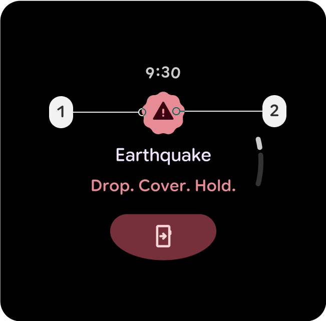
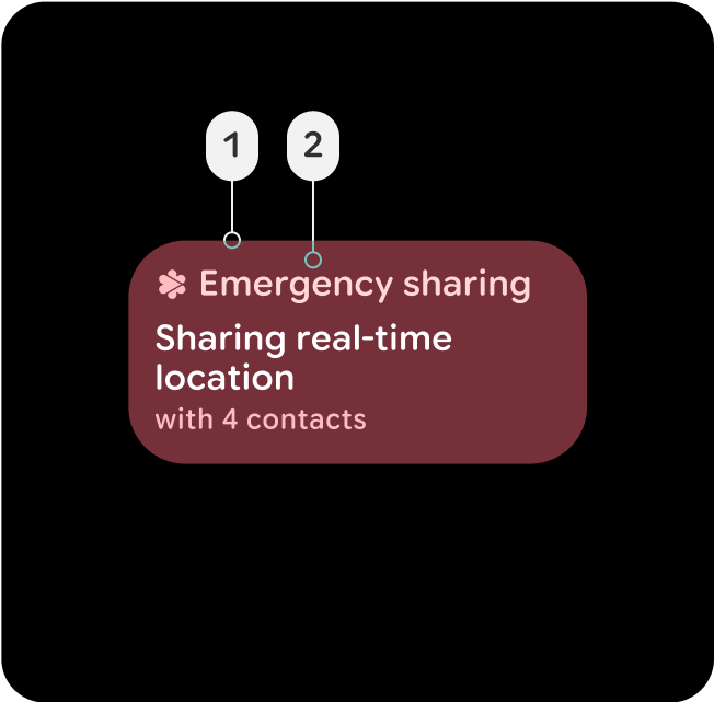
צבע פחות בולט של מאגר, לרכיבים שמשתמשים במצב השגיאה. יכול להיות גם מצב שגיאה פעיל שמרגיש פחות אינטראקטיבי ממצב מלא, כמו לחצן או כרטיס פעילים לשיתוף מידע במקרה חירום, או תיבת דו-שיח של שכבת-על שנכשלה.
מאגרי קישורים וגובה בפלטפורמה
השימוש במאגרי מידע של משטחים הוא חיוני להגדרת העומק והגובה בממשק המשתמש, והם מספקים מבנה והיררכיה באמצעות צבעים, ועוזרים להבחין בין רכיבים על סמך החשיבות והאינטראקציה שלהם.
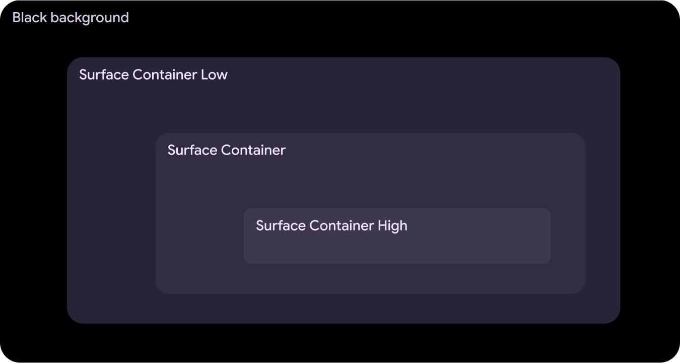
Surface-Container-Low
- Surface-Container-Low
- בפלטפורמה
- On-Surface-Variant
מתאים מאוד למאגר מורחב שצריך להיות מתחת ל-Surface-Container, כמו כרטיס מורחב בהתראה. אפשר להשתמש בה גם בכרטיסים לא אינטראקטיביים, שבהם התוכן עדיין נהנה מהכללה.
Surface-Container
- Surface-Container
- בפלטפורמה
- On-Surface-Variant
צבע ברירת המחדל של הקונטיינר עבור רוב האלמנטים. הוא מספק גובה ניטרלי ומתון, ולכן מתאים לרכיבי ממשק משתמש כלליים.
Surface-Container-High
- Surface-Container-High
- בפלטפורמה
- On-Surface-Variant
מתאים במיוחד לרכיבים שצריך להדגיש ושצריכים להיות מעל Surface-Container או בשילוב איתו. הצבע הזה עוזר למקד את תשומת הלב בהיררכיה של אזורים חשובים בממשק המשתמש.