
אפליקציה היא אחת מהממשקים הראשיים ב-Wear OS. אפליקציות שונות מסמלי 'הוספה למסך הבית' או משבצות, שהן ייצוגים של תוכן האפליקציה שאפשר לראות במבט מהיר. באפליקציות מוצג מידע נוסף והן תומכות באינטראקציה עשירה יותר. המשתמשים נכנסים לאפליקציות לעיתים קרובות ממסך אחר, כמו התראה, ווידג'ט, משבצת או פעולה קולית.
עקרונות
כשאתם מתכננים אפליקציות, חשוב לזכור את העקרונות הבאים:
ממוקדת: התמקדות במשימות קריטיות כדי לעזור לאנשים להשלים משימות תוך שניות.
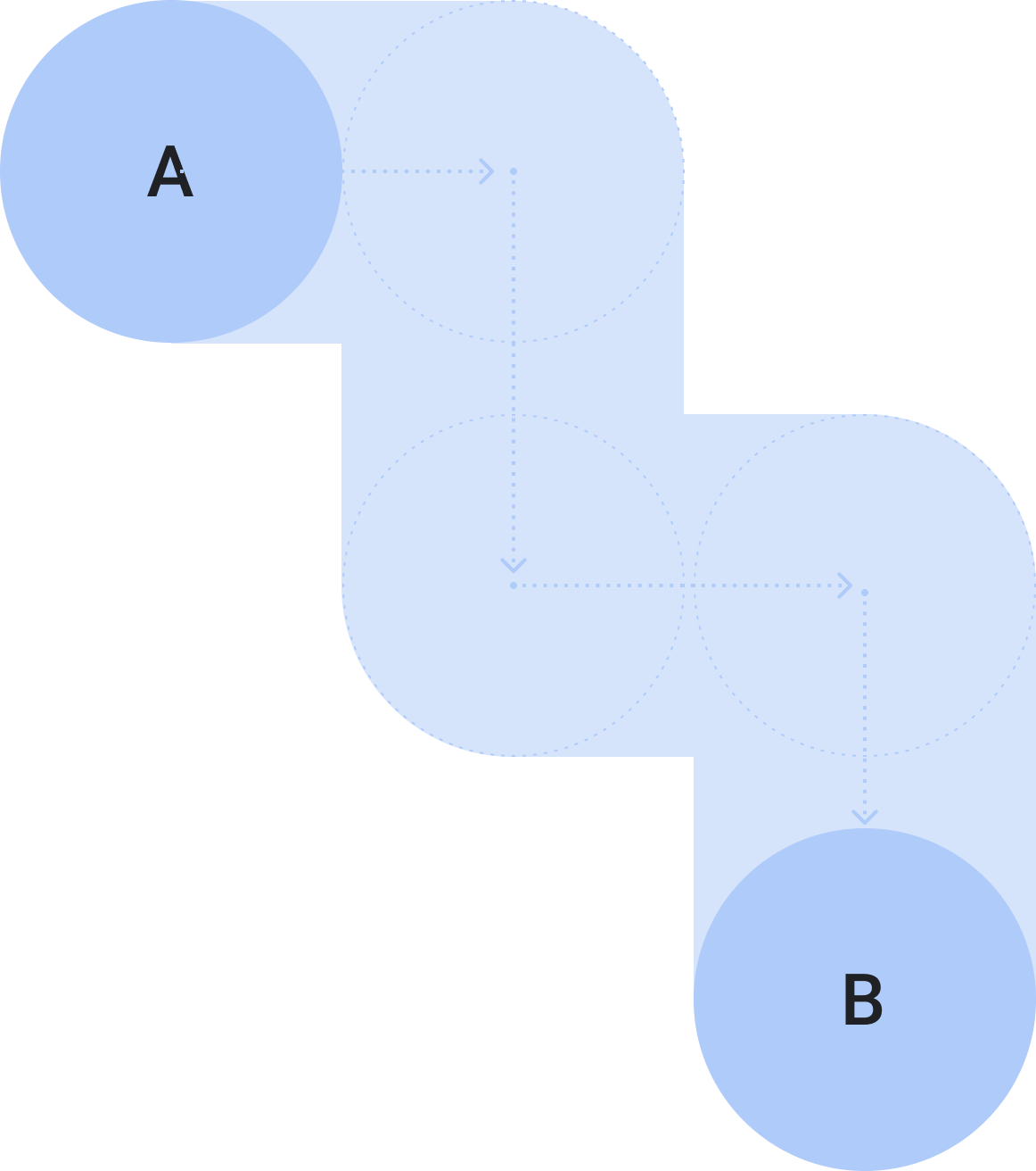
שטחית וליניארית: מומלץ להימנע מיצירת היררכיות עמוקות יותר משתי רמות. כשהדבר אפשרי, כדאי להציג את התוכן ואת הניווט בתוך הדף.
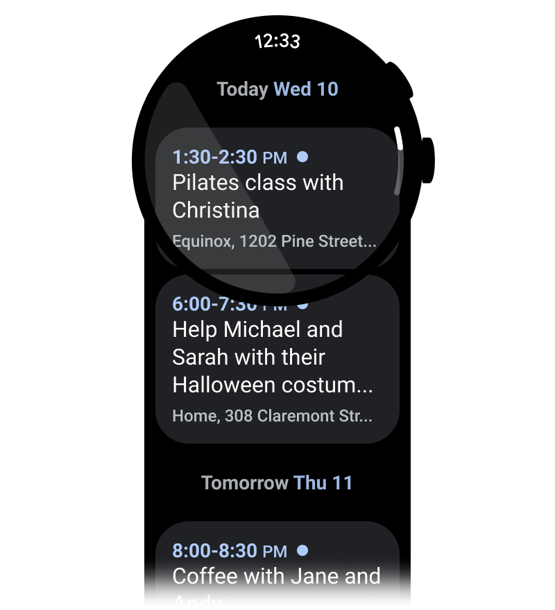
גלילה: אפשר לגלול באפליקציות. זוהי תנועה טבעית שמשתמשים מבצעים כדי לראות תוכן נוסף בשעון.
הנחיות
מומלץ לפעול לפי ההנחיות הבאות כשאתם מעצבים אפליקציות.
אופטימיזציה לפריסות אנכיות
כדי לפשט את העיצוב של האפליקציה, כדאי להשתמש בפריסות אנכיות שמאפשרות למשתמשים לגלול בכיוון אחד כדי לעבור בין התוכן.
מה צריך לעשות
מה אסור לעשות
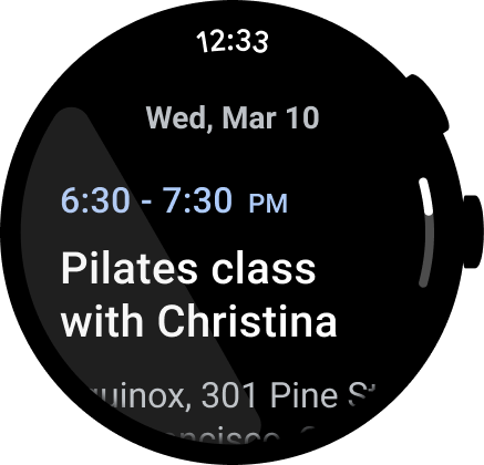
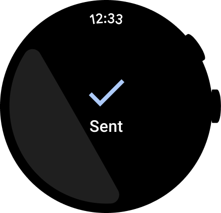
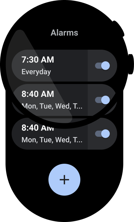
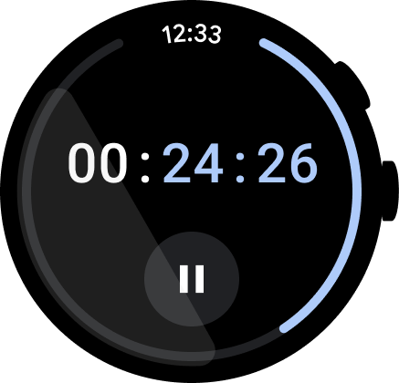
הצגת השעה
משתמשים נוטים להקדיש יותר זמן באפליקציות, ולכן חשוב לספק גישה מהירה לשעון.
מה צריך לעשות
מה אסור לעשות
מידע נוסף על עיצוב ושימוש זמין במאמר טקסט של שעה.
נקודות כניסה נגישה בקוד
חשוב לוודא שכל הפעולות מוצגות בשורה, ולהשתמש בסמלים ובתוויות ברורים לשיפור הנגישות. נקודות הכניסה האלה כוללות נקודות כניסה להגדרות ולהעדפות.
מה צריך לעשות
מה אסור לעשות
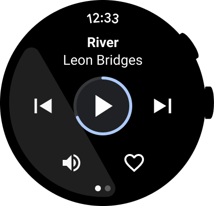
העברת פעולות ראשיות לחזית
כדי לעזור למשתמשים לבצע פעולות באפליקציה, כדאי להציב את הפעולות הראשיות בחלק העליון של האפליקציה. כדאי להציב בחלק העליון של האפליקציה פעולות ראשיות ברורות.
שימוש בתוויות כדי לנווט את המשתמשים
באפליקציות ארוכות, כדאי להוסיף תוויות כדי לעזור למשתמש לנווט בתוכן בזמן שהוא גולל.
מה צריך לעשות
מה אסור לעשות
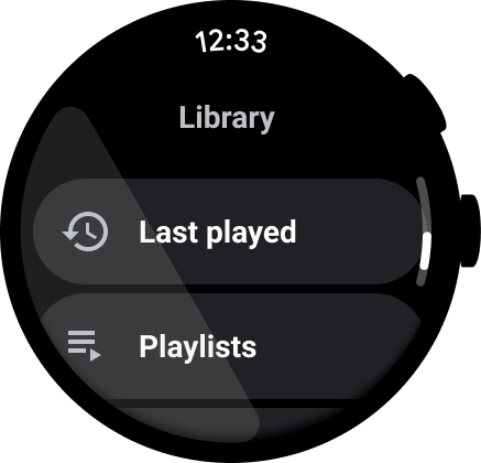
הצגת סרגל הגלילה
הצגת פס ההזזה אם כל התצוגה גולשת, כפי שמוצג בתמונה הבאה. מידע נוסף זמין במאמר חיווי המיקום.

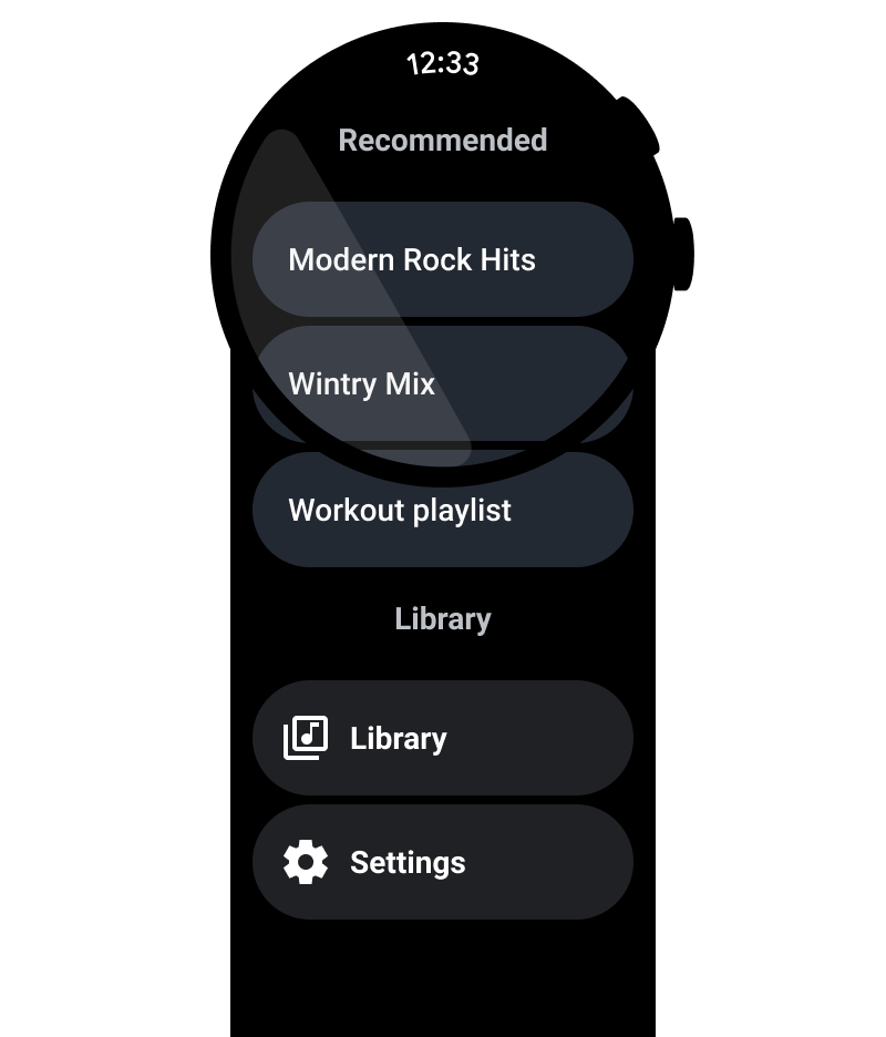
קונטיינרים של תוכן
ריכזנו כאן כמה דוגמאות לקונטיינרים של תוכן.
איור 1. מאגר בגובה קבוע.
איור 2. מאגר בעל גובה משתנה.
איור 3. מאגר ברוחב ובגובה גדולים מאזור התצוגה.
איור 4. מאגר עם דפים.
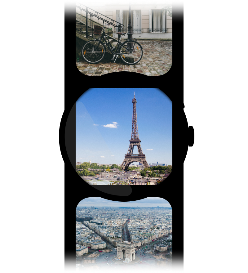
איור 5a. דפי תוכן שמשתמשים במלוא המימדים של המסך ומחולקים לדפים אנכיים.