
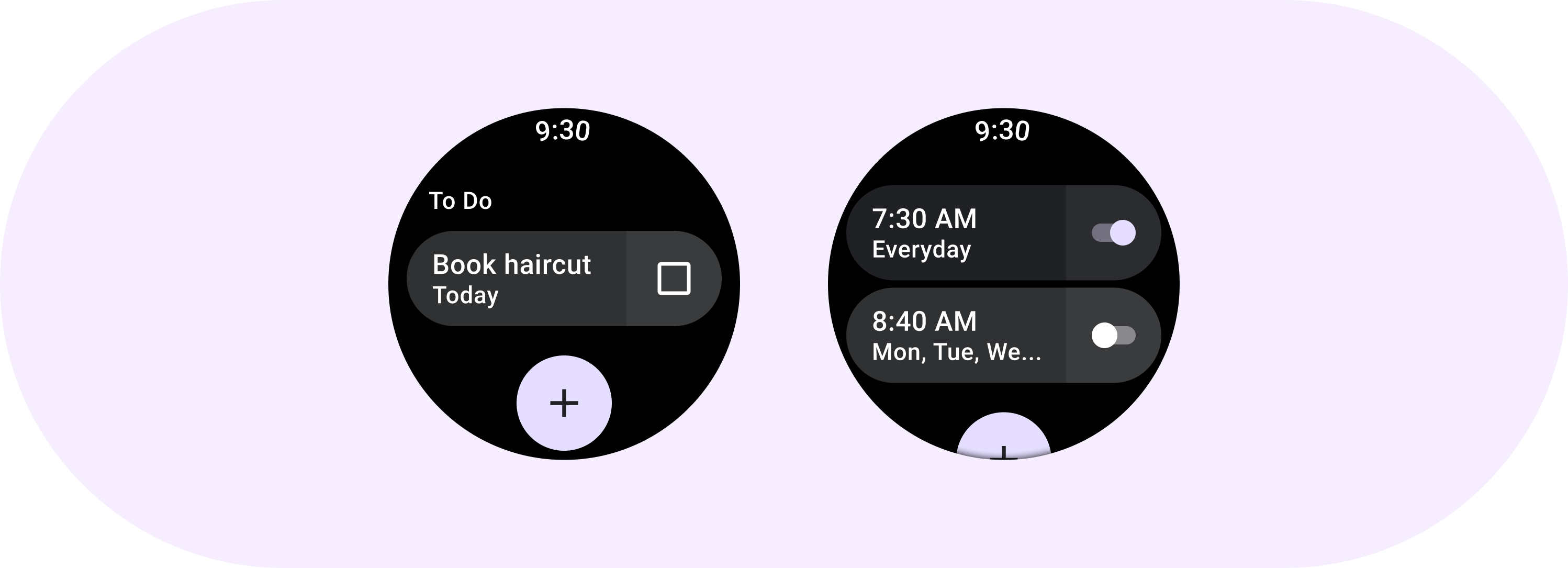
ToggleChip เป็นชิปเฉพาะที่อนุญาตให้ผู้ใช้เลือกตัวเลือกต่างๆ
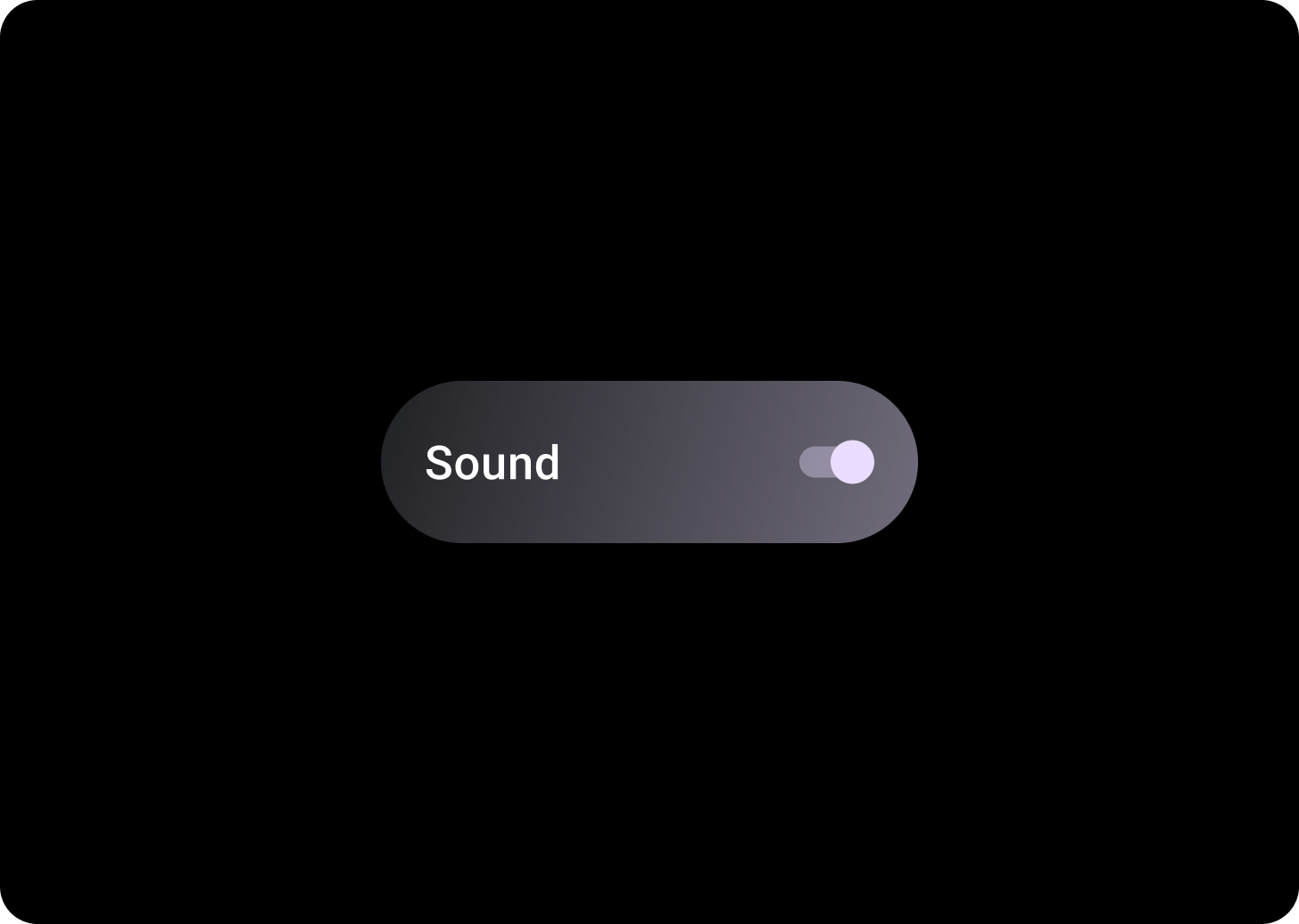
ชิปสลับมีตัวควบคุมแบบ 2 สถานะ ตัวอย่างการควบคุมแบบเปิด/ปิด 2 สถานะ ได้แก่ สวิตช์ ปุ่มตัวเลือก หรือช่องทำเครื่องหมาย ใช้ชิปเปิด/ปิดสำหรับกรณีที่อาจต้องตั้งค่าตัวเลือกหลายรายการอย่างรวดเร็วและง่ายดาย เช่น ในการตั้งค่า
กายวิภาคศาสตร์
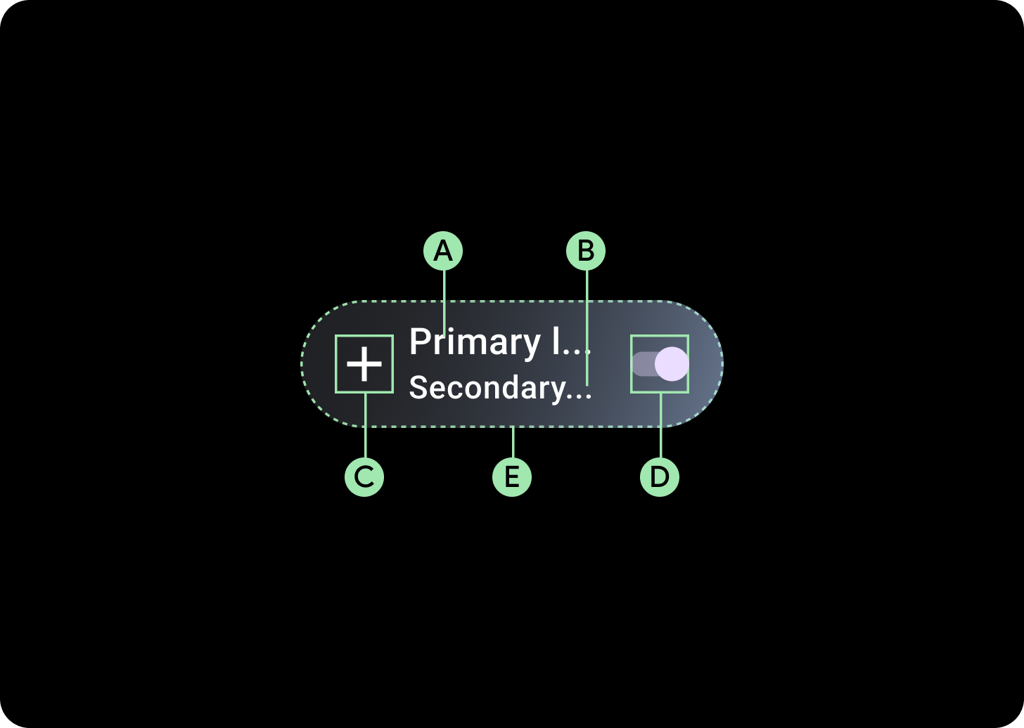
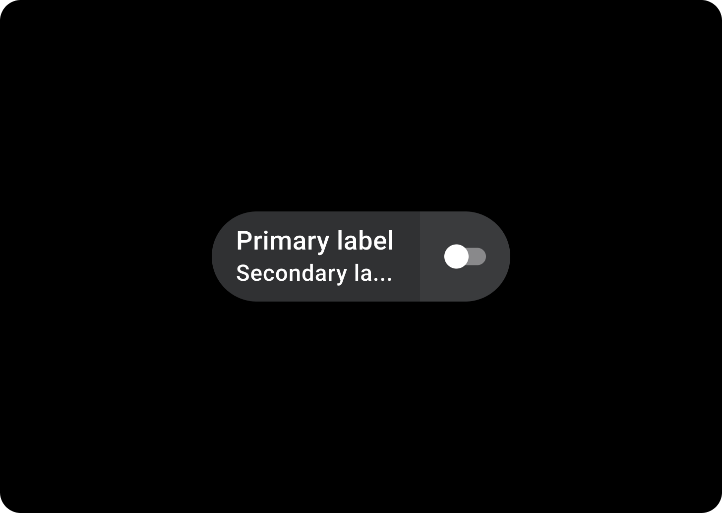
ชิปเปิด/ปิดมี 4 ช่องที่รองรับป้ายกำกับข้อความ 2 รายการ การควบคุมการเลือก 1 รายการ และไอคอนแอปพลิเคชัน 1 รายการ คุณจะใส่ไอคอนและป้ายกำกับรองหรือไม่ก็ได้
ก. ป้ายกํากับ
ข. ป้ายกำกับรอง
ค. ไอคอน
ง. การควบคุมการเลือก
จ. คอนเทนเนอร์
สลับการไล่สีชิป
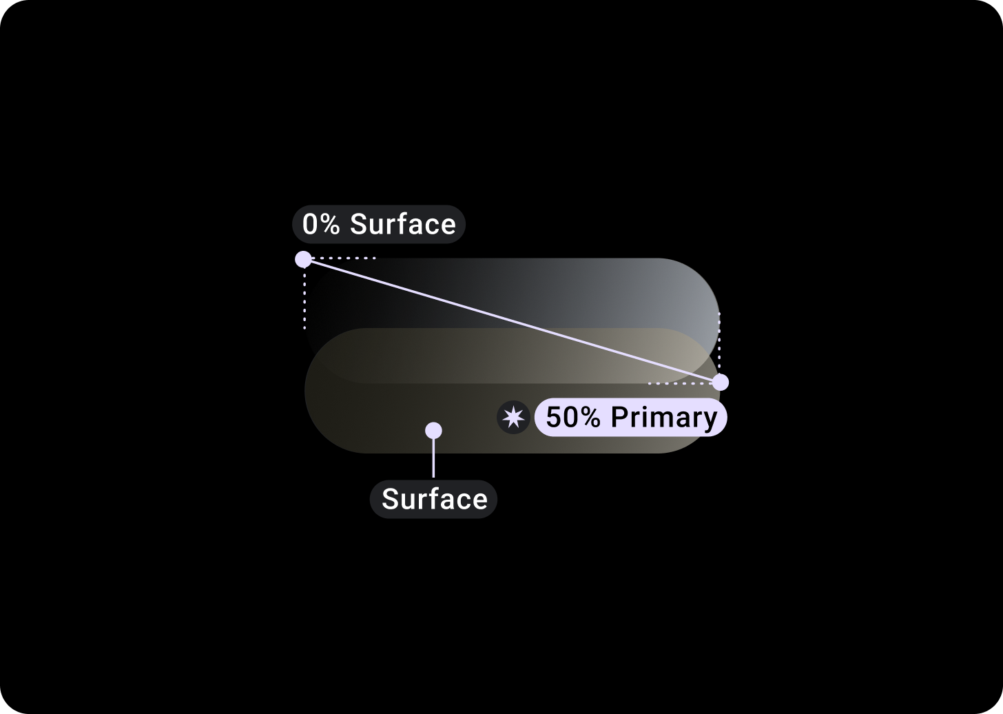
ด้านบน/ซ้าย = พื้นผิว 0%
ด้านล่าง/ขวา = หลัก 50%
(การไล่ระดับสีวางซ้อนบนพื้นหลังสีพื้นผิว)
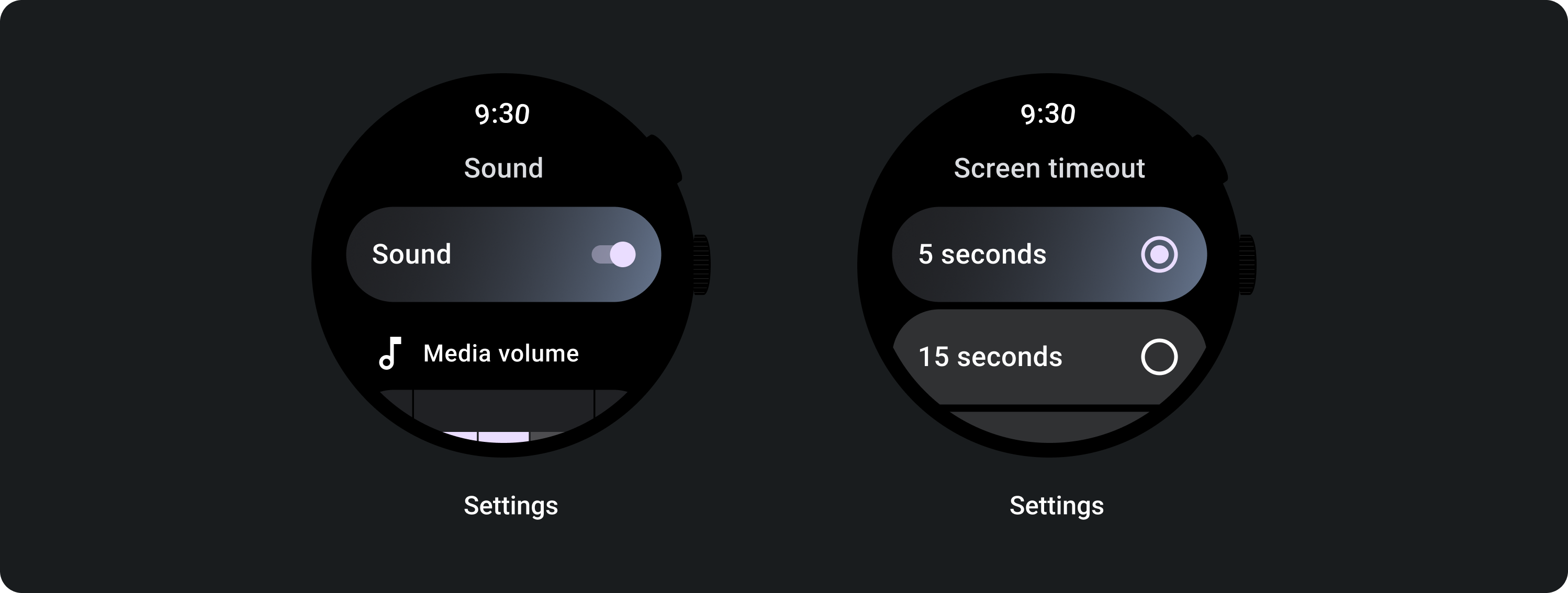
การควบคุมการเลือก
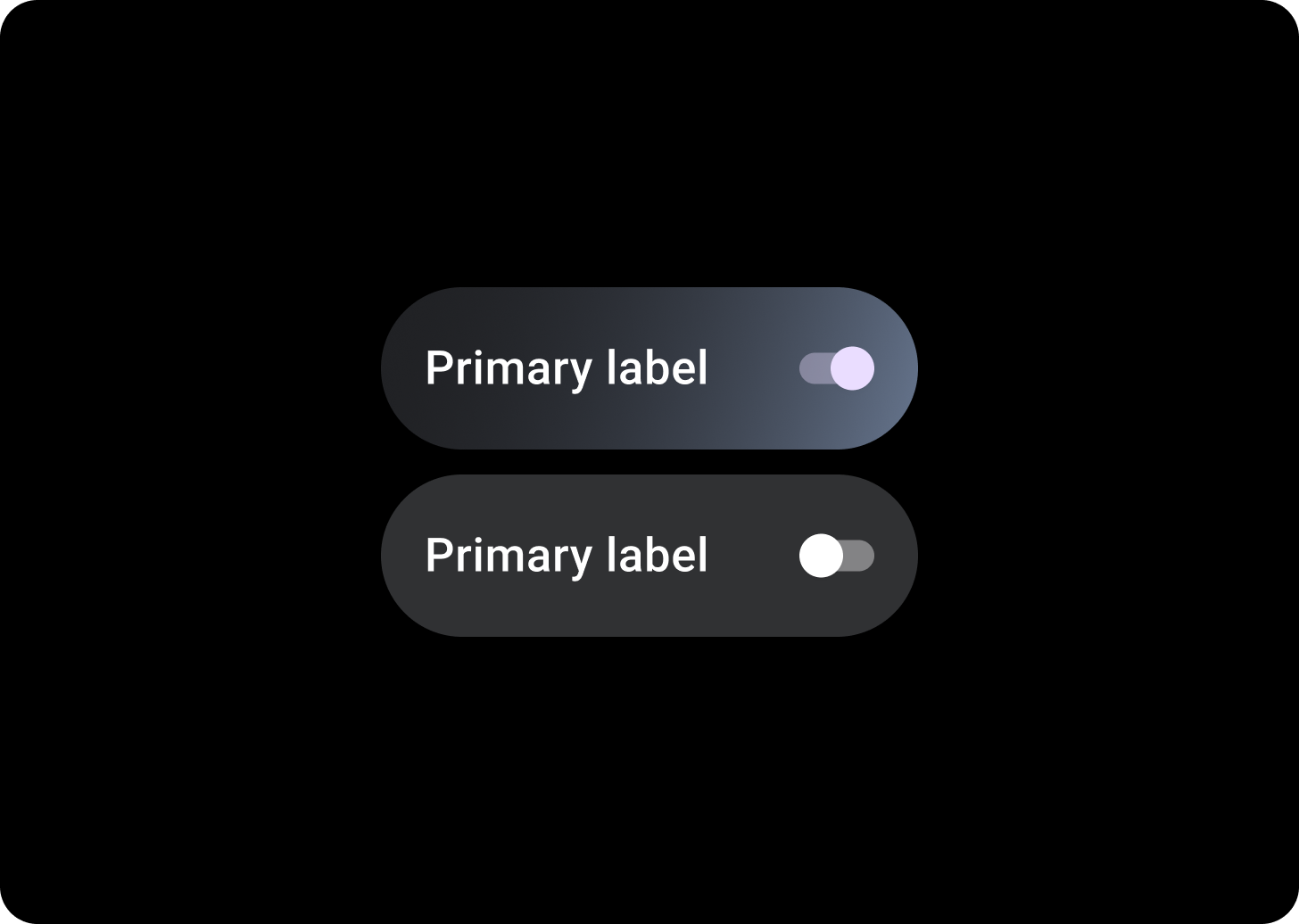
เปลี่ยน
ใช้สวิตช์เพื่อเปิดหรือปิดรายการที่เลือก

ปุ่มตัวเลือก
ใช้ปุ่มตัวเลือกในรายการที่ผู้ใช้เลือกได้เพียงตัวเลือกเดียว
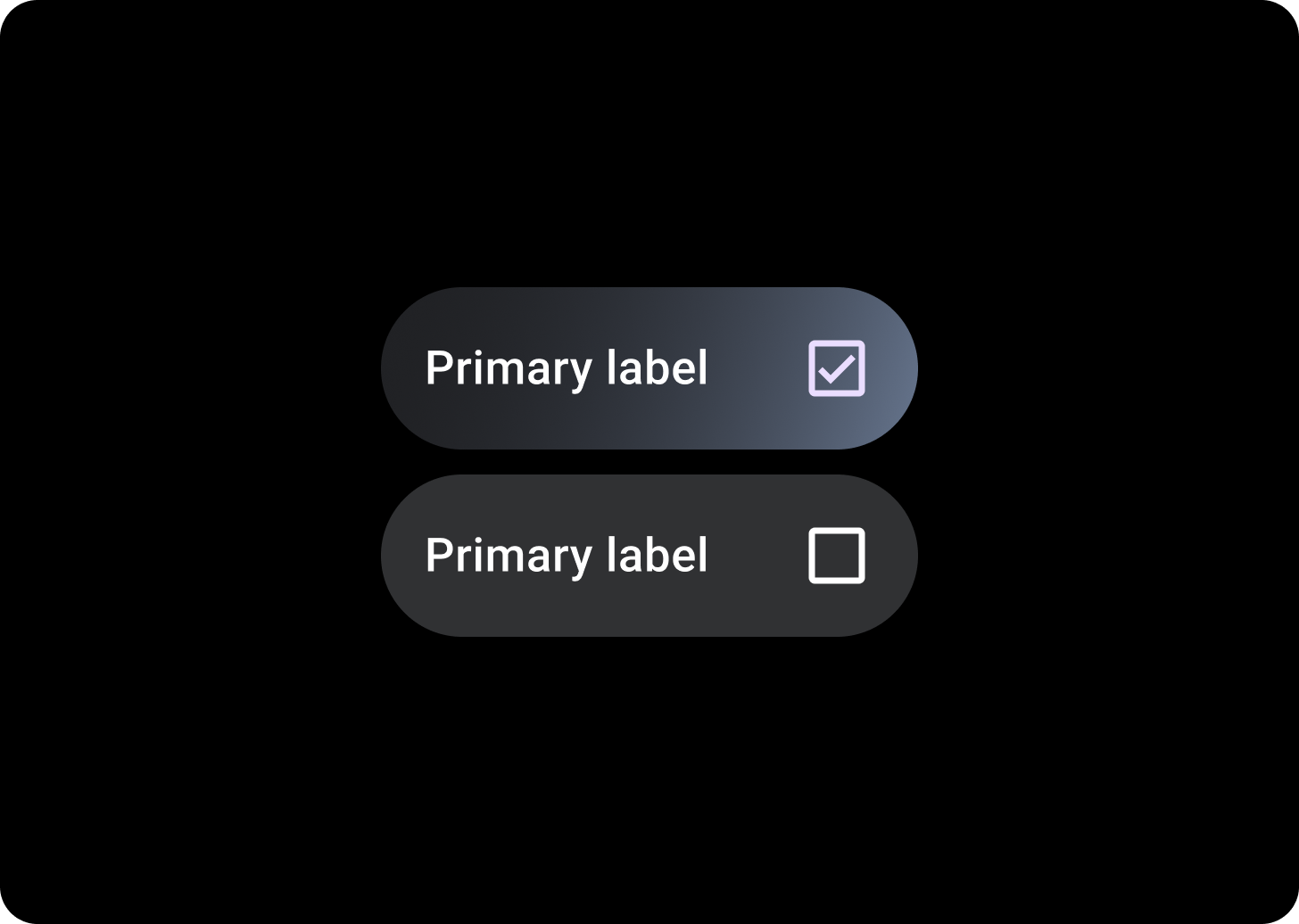
ช่องทำเครื่องหมาย
ใช้ช่องทำเครื่องหมายในรายการที่ผู้ใช้เลือกตัวเลือกได้หลายรายการ
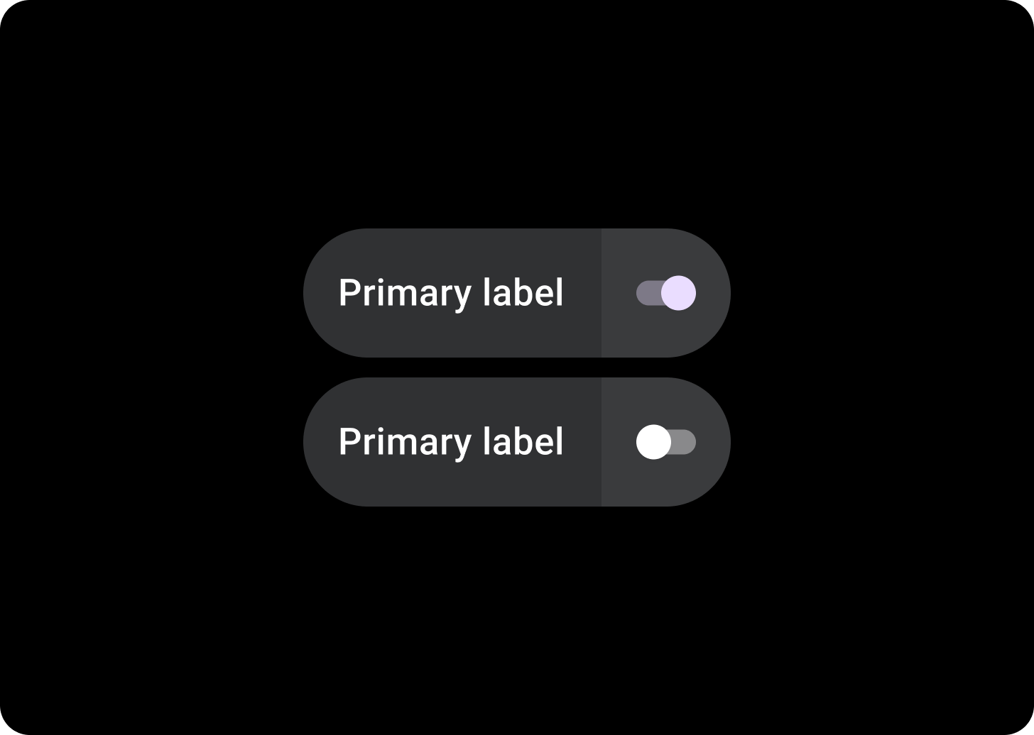
ชิปสวิตช์แบบแยก
ใช้ชิปสวิตช์แบบแยกเมื่อคุณต้องการพื้นที่ที่แตะได้ 2 พื้นที่
คอมโพเนนต์ที่เกี่ยวข้อง
แยก ToggleChips
SplitToggleChip แตกต่างจาก ToggleChip ตรงที่มีพื้นที่ที่แตะได้ 2 พื้นที่ โดยพื้นที่หนึ่งคลิกได้และอีกพื้นที่หนึ่งมีปุ่มเปิด/ปิด
ในชิปสวิตช์แบบแยก ให้แยกความแตกต่างระหว่างพื้นที่พื้นหลังที่แตะได้กับตัวควบคุมสวิตช์โดยทำให้แต่ละส่วนมีสีต่างกัน
การใช้งาน
ใช้ ToggleChips ดังที่แสดงในตัวอย่างต่อไปนี้
เลย์เอาต์ที่ปรับเปลี่ยนได้
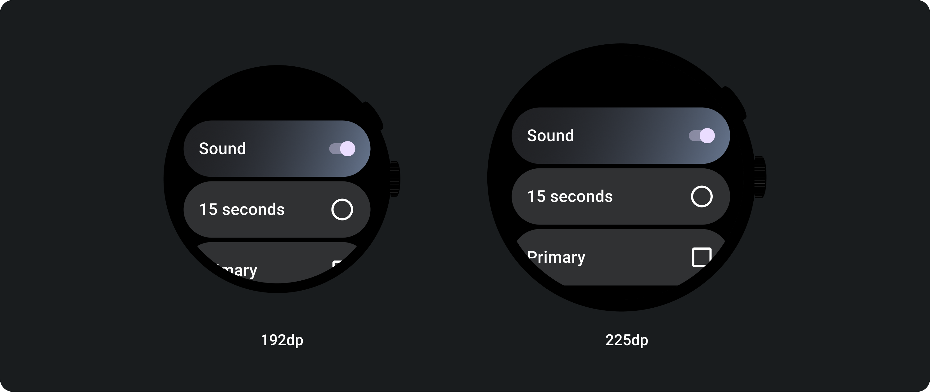
ลักษณะการทํางานแบบตอบสนอง
ToggleChip จะยืดให้เต็มความกว้างที่มีในจอแสดงผลขนาดใหญ่
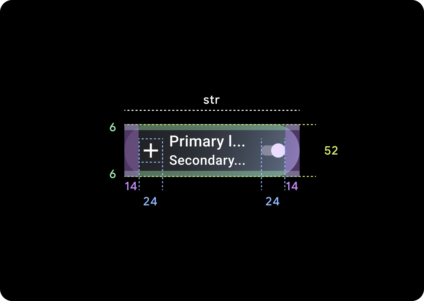
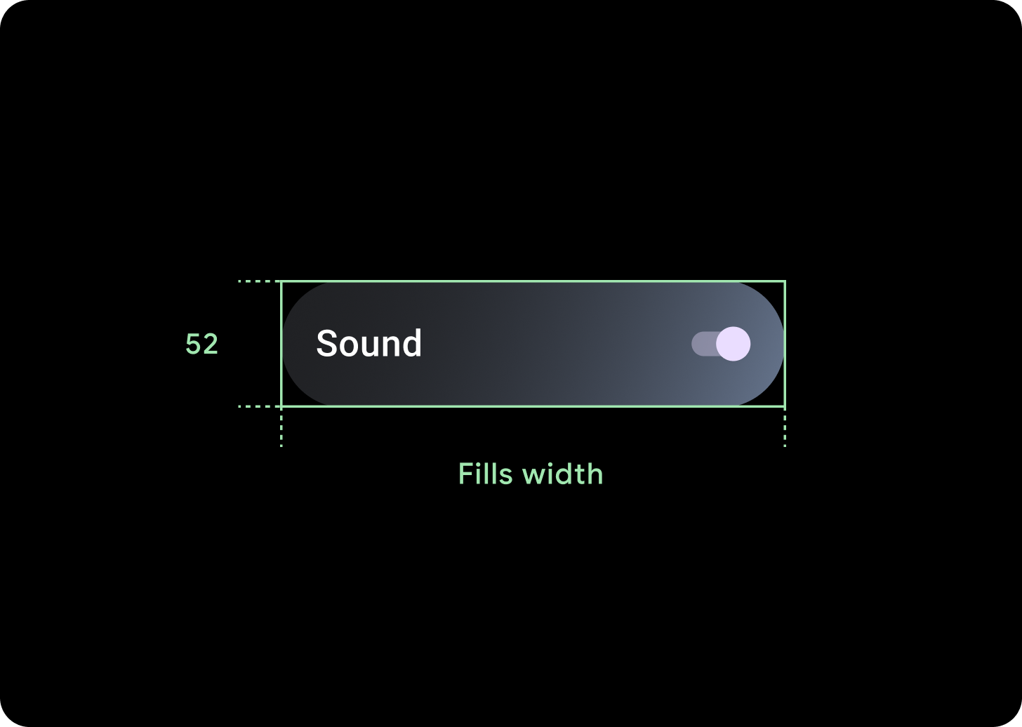
ไอคอน (24 x 24 dp)
คอนเทนเนอร์ (52 x XX dp)