
เครื่องมือเลือกช่วยให้ผู้ใช้เลือกและตั้งค่าข้อมูลที่ต้องการได้
เครื่องมือเลือก
ควรใช้เครื่องมือเลือกเพื่อให้ผู้ใช้เลือกจากรายการที่มีจำนวนจำกัด
โดยค่าเริ่มต้น ระบบจะวนรายการไปมาอย่างไม่มีที่สิ้นสุดในทั้ง 2 ทิศทาง ลองปิดใช้ลักษณะการทำงานนี้หากลําดับในรายการมีความสําคัญ หรือเพื่ออนุญาตให้ผู้ใช้ไปยังองค์ประกอบแรกและองค์ประกอบสุดท้ายด้วยการปัดอย่างรวดเร็ว
กายวิภาคศาสตร์
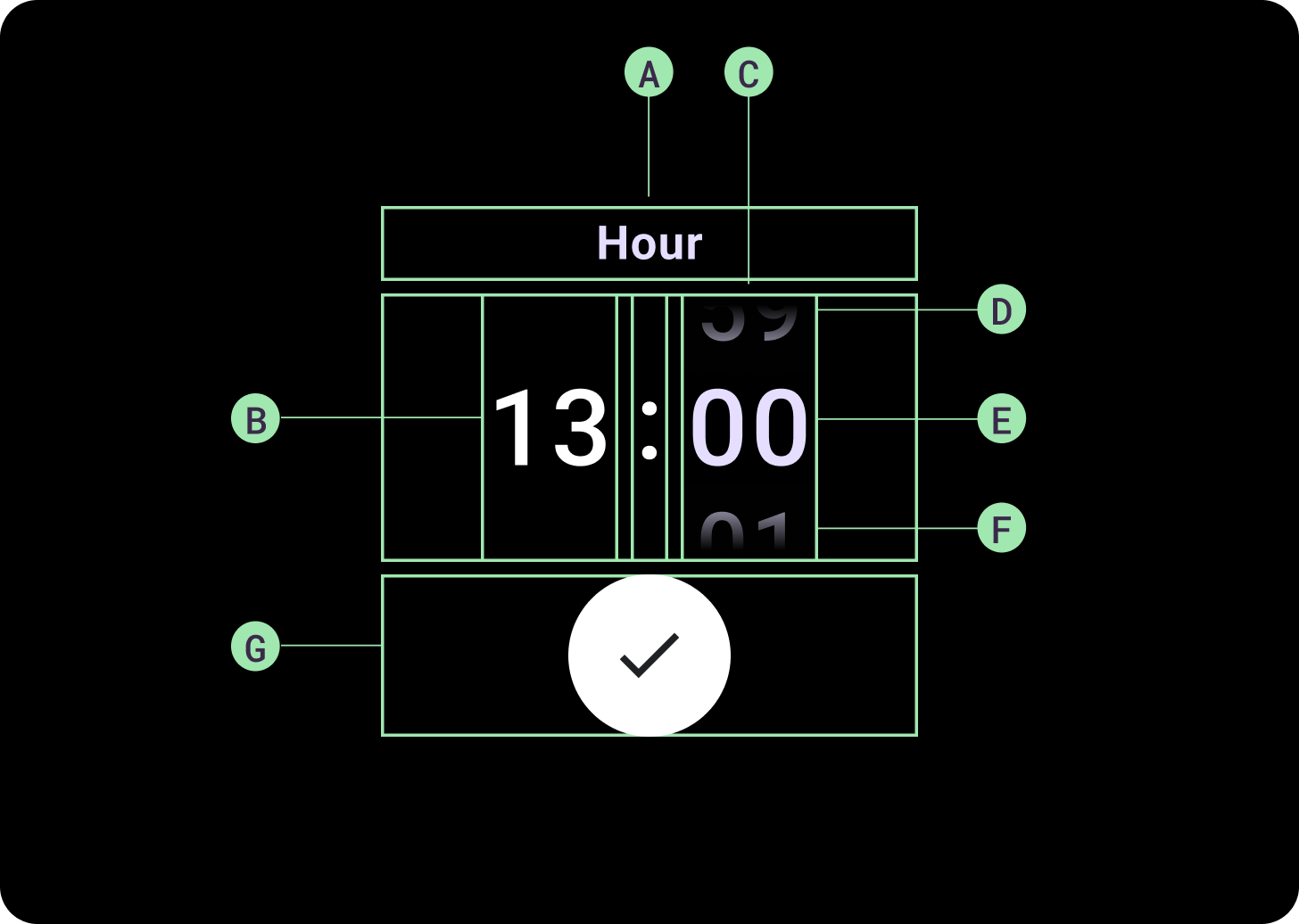
องค์ประกอบ
A. คอลัมน์ที่ไม่ได้ใช้งาน
ข. เครื่องหมายแบ่ง
ค. คอลัมน์เครื่องมือเลือก
ง. เนื้อหายอดนิยม
จ. เนื้อหากลาง
ฉ. เนื้อหาด้านล่าง
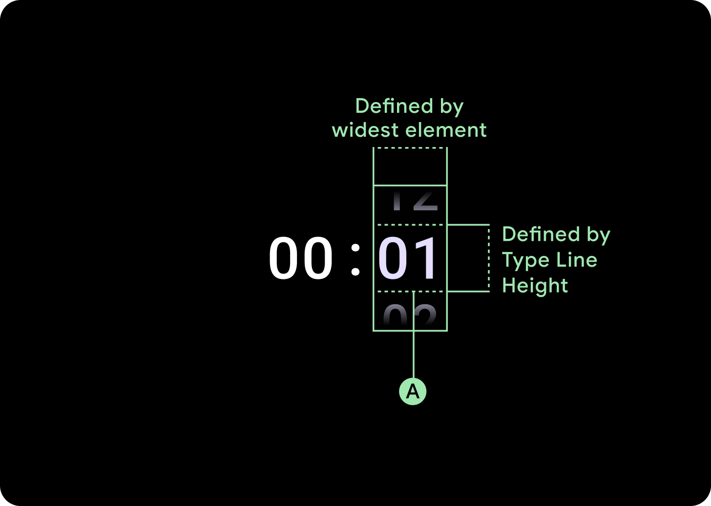
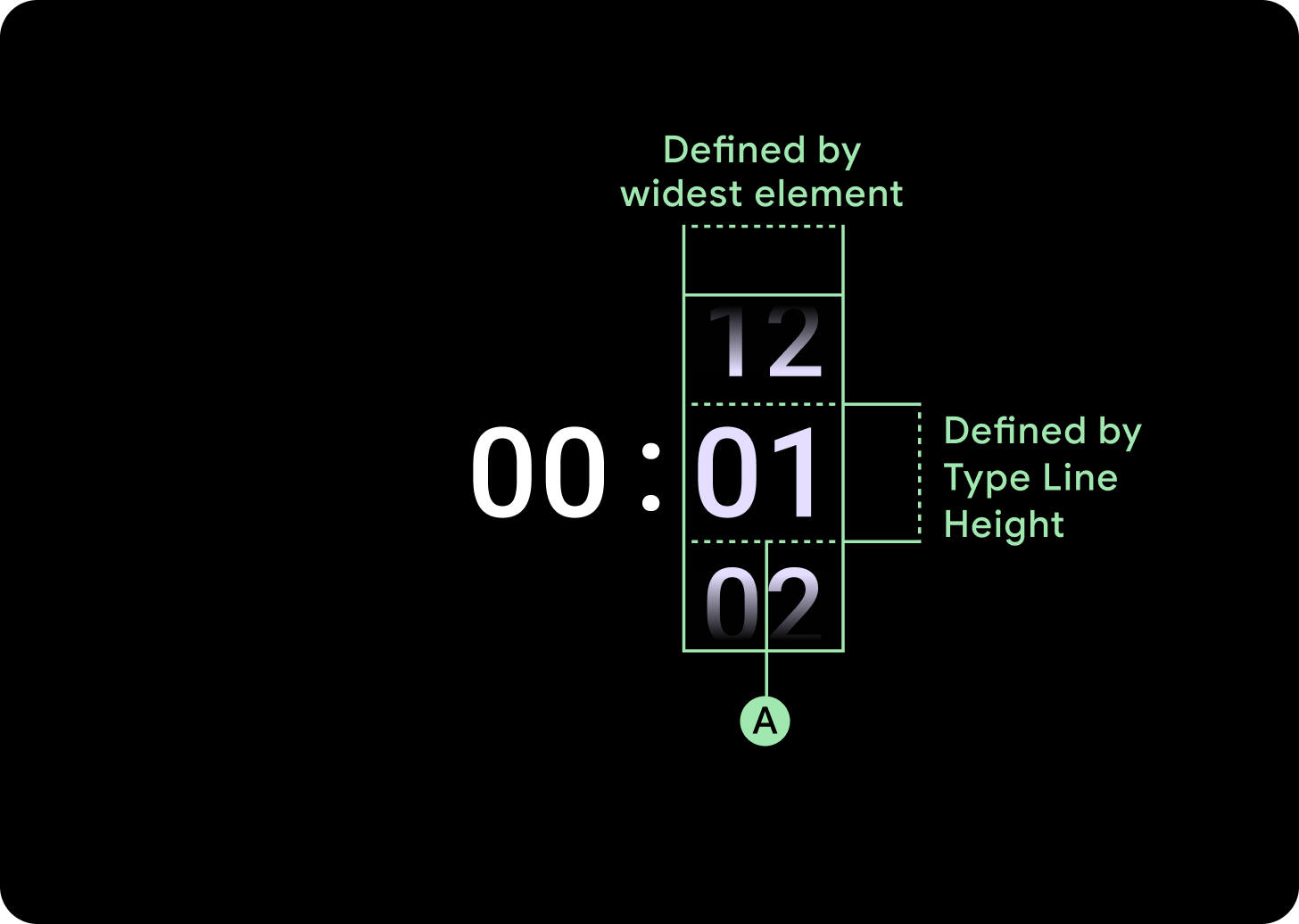
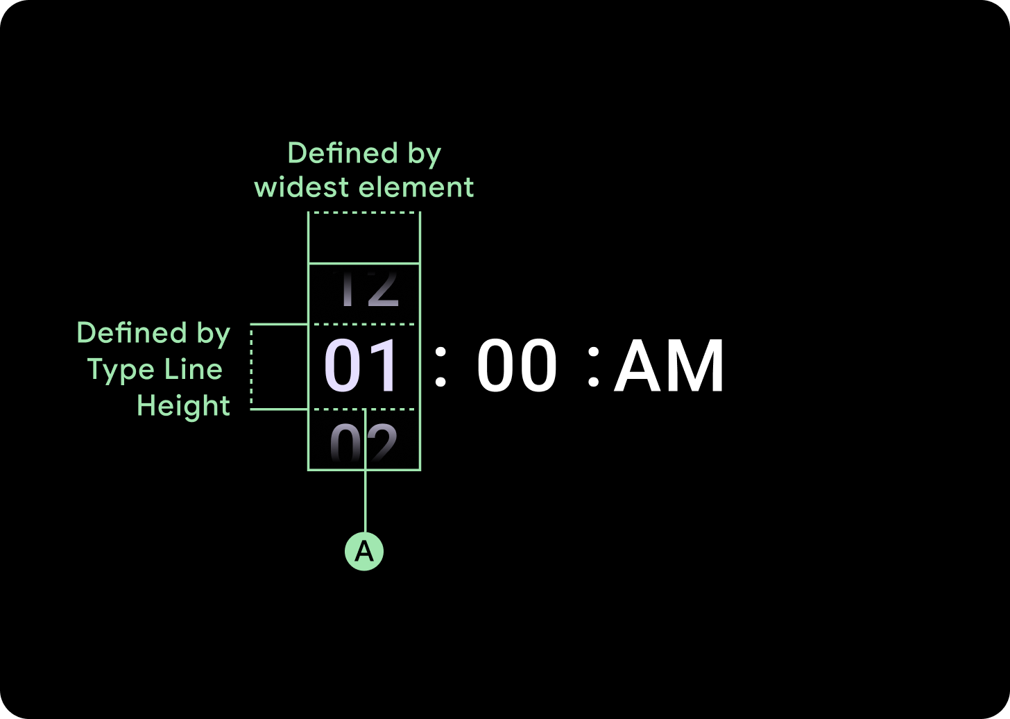
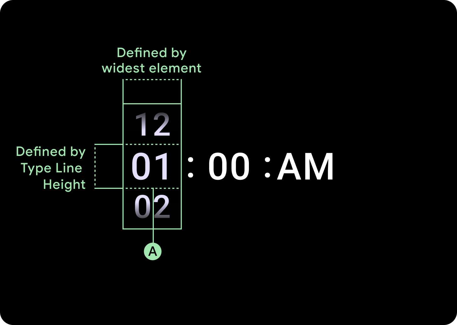
ความกว้างและความสูง
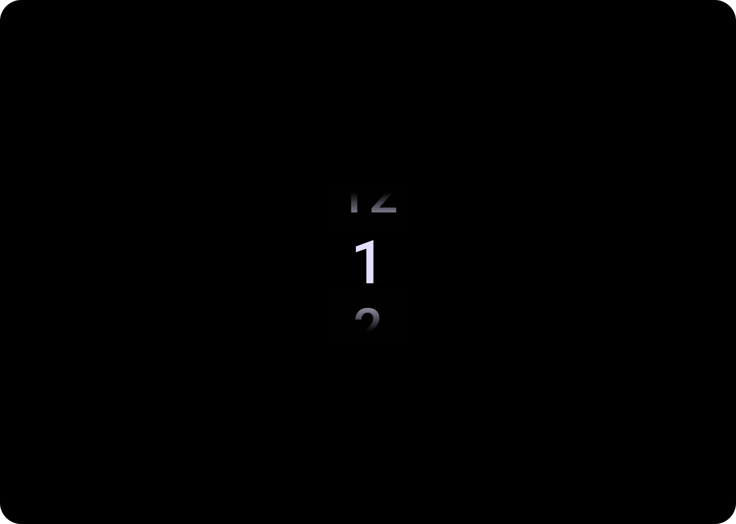
กลุ่มเครื่องมือเลือกจะเติมความสูงและความกว้างที่มีอยู่ ตัวเลือกเลย์เอาต์ของคอลัมน์เครื่องมือเลือกมี 4 ตัวเลือก เลย์เอาต์แต่ละรายการจะจัดกึ่งกลางและเติมความสูงที่มีอยู่ ความกว้างของคอลัมน์จะกำหนดตามความกว้างที่จำเป็นในการรองรับจำนวนตัวเลขที่ต้องการในแบบอักษร แต่จะมีข้อยกเว้นสำหรับเครื่องมือเลือกวันที่ ซึ่งจะแสดงเต็มหน้าจอในแนวนอนและตัดขอบ
เช่น ตัวเลขจะคํานวณความกว้างของ "00" แล้วตั้งค่าความกว้าง สำหรับช่องข้อความ เช่น ช่องเดือน ระบบจะคำนวณความกว้างเป็น "MMM" (ซึ่งเป็นตัวอักษรที่กว้างที่สุดในตัวอักษรละติน) ความกว้างและความสูง (ซึ่งเป็นความสูงบรรทัดของแบบอักษรที่ใช้) จึงจะได้รับผลกระทบจากแบบอักษรที่ใช้
รายการเครื่องมือเลือกมีขนาดแตกต่างกันไปตามจุดพัก
การใช้งาน
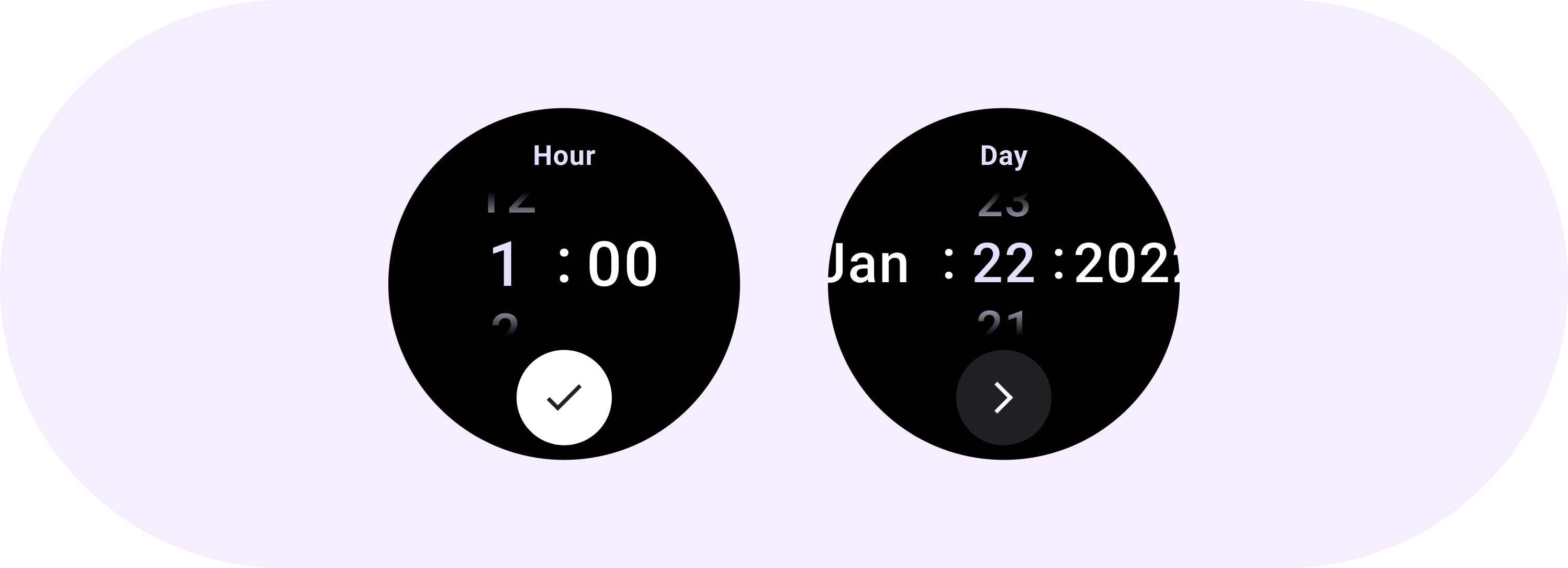
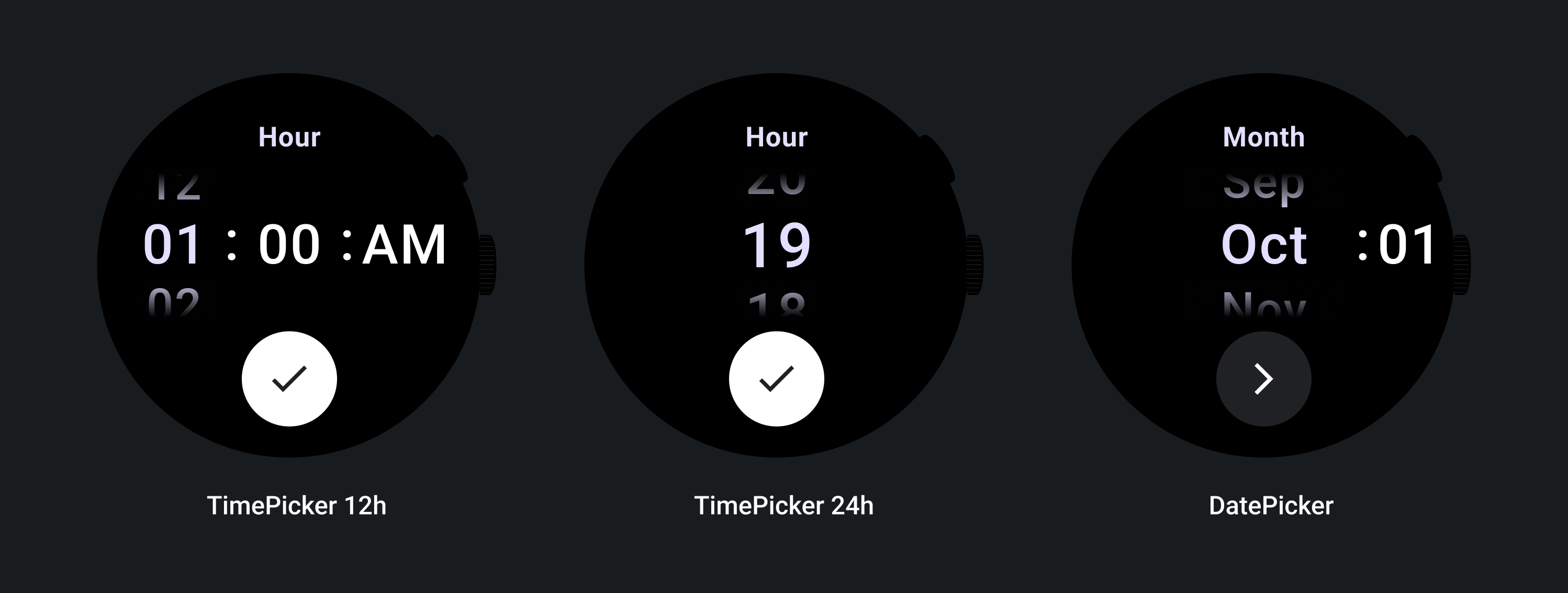
ดูตัวอย่างเครื่องมือเลือกวันที่และเวลาต่อไปนี้
หากต้องการใช้เครื่องมือเลือกวันที่และเวลาที่สร้างไว้ล่วงหน้า โปรดดูไลบรารี Horologist ใน GitHub
หากต้องการสร้างประสบการณ์ที่คล้ายกันซึ่งผู้ใช้เลือกค่าหลายส่วนในเครื่องมือเลือกหลายรายการ ให้ใช้คอมโพเนนต์ PickerGroup ในตัว ออบเจ็กต์นี้ใช้ออบเจ็กต์ผู้ประสานงานโฟกัสเพื่อกำหนดโฟกัสให้กับองค์ประกอบ Picker ที่ถูกต้อง
เลย์เอาต์ที่ปรับเปลี่ยนได้
TimePicker 24H
TimePicker 12H
เครื่องมือเลือกวันที่
ลักษณะการทํางานแบบตอบสนอง
เพิ่มขนาดข้อความ
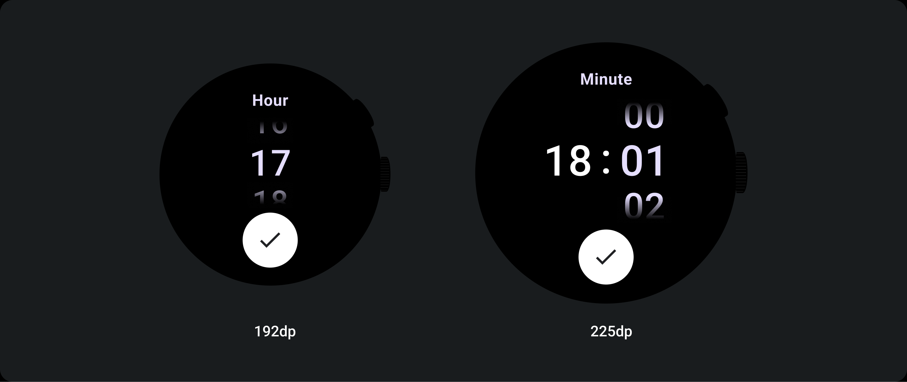
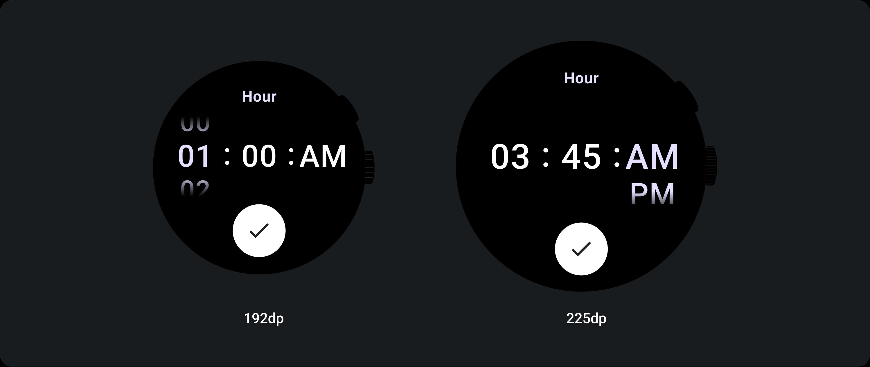
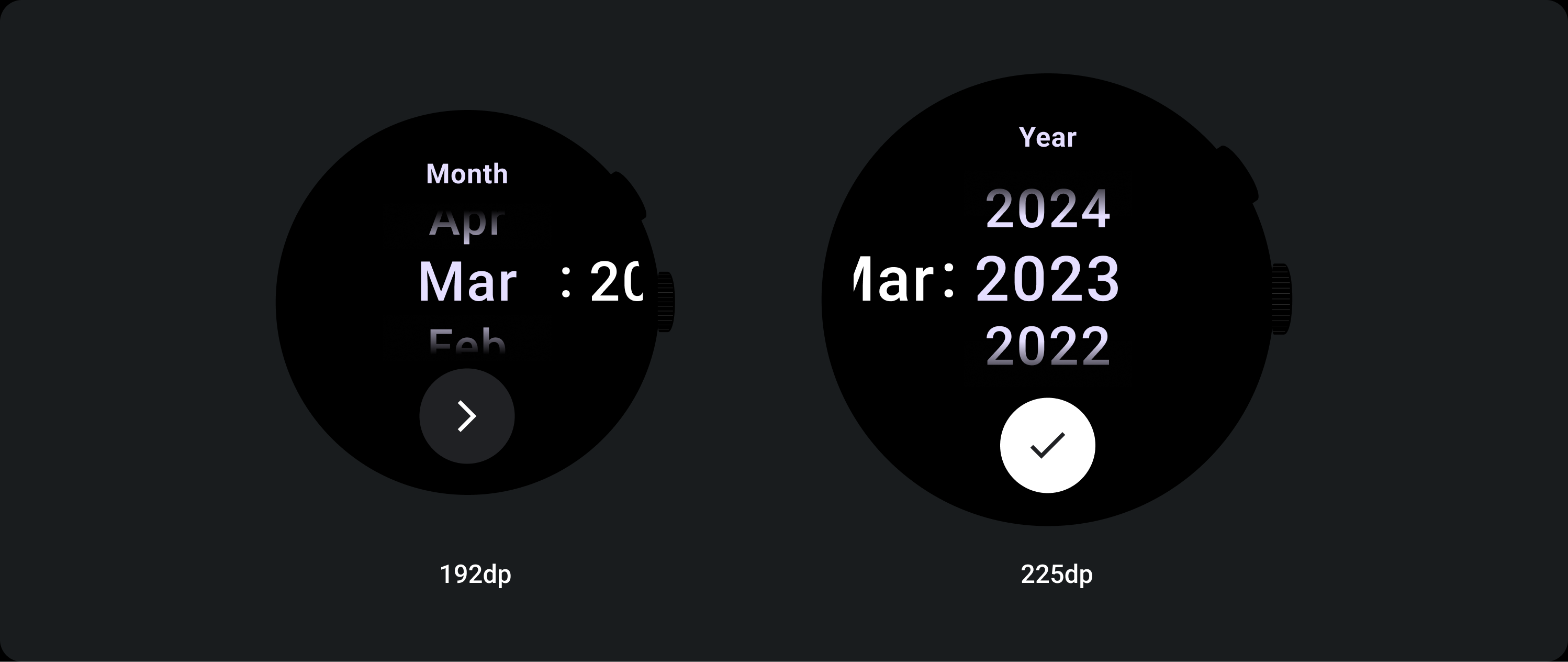
เมื่อผ่านจุดหยุดที่ 225 ขึ้นไป ขนาดแบบอักษรขององค์ประกอบเครื่องมือเลือกจะเปลี่ยนไป ข้อความด้านบนและด้านล่างในคอลัมน์การเลื่อนแบบเลื่อนลงช้าจะปรับ (ก) เช่นเดียวกับข้อความกลาง ตัวอย่างบางส่วนมีดังนี้
เลย์เอาต์แบบ 2 คอลัมน์
ต่ำกว่าเบรกพอยต์ 225 dp
แบบอักษร: Display 2
เบรกพอยต์ที่ 225 dp ขึ้นไป
แบบอักษร: Display 1
เลย์เอาต์แบบ 3 คอลัมน์
ต่ำกว่าเบรกพอยต์ 225 dp
แบบอักษร: Display 3
สูงกว่าจุดพัก 225 dp
แบบอักษร: Display 2
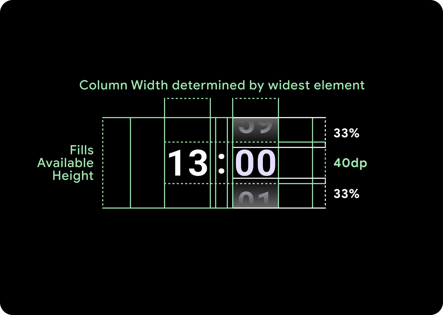
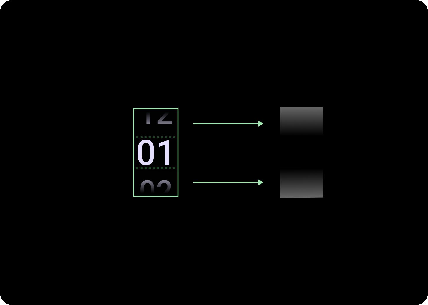
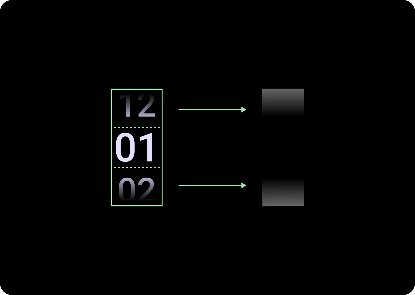
เพิ่มขนาดการไล่ระดับสี
ความสูงของไล่ระดับสีในคอลัมน์เครื่องมือเลือกจะกำหนดตามพื้นที่ว่างที่มีอยู่ ทั้งไล่ระดับสีด้านบนและด้านล่างจะตั้งค่าไว้ที่ 1 ใน 3 (33%) ของความสูงที่ใช้ได้ ซึ่งหมายความว่าไล่ระดับสีจะปรับขนาดตามสัดส่วนสำหรับหน้าจอแต่ละขนาดที่มี อยู่นอกเหนือเลย์เอาต์คอลัมน์
ต่ำกว่าเบรกพอยต์ 225 dp
ขนาด: 33% ของความสูงของคอลัมน์
สูงกว่าจุดพัก 225 dp
ขนาด: 33% ของความสูงของคอลัมน์
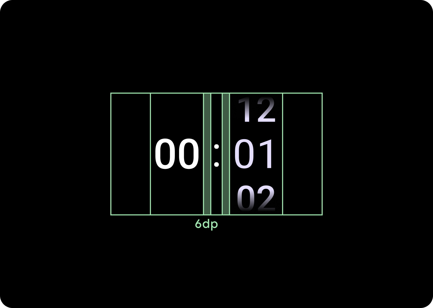
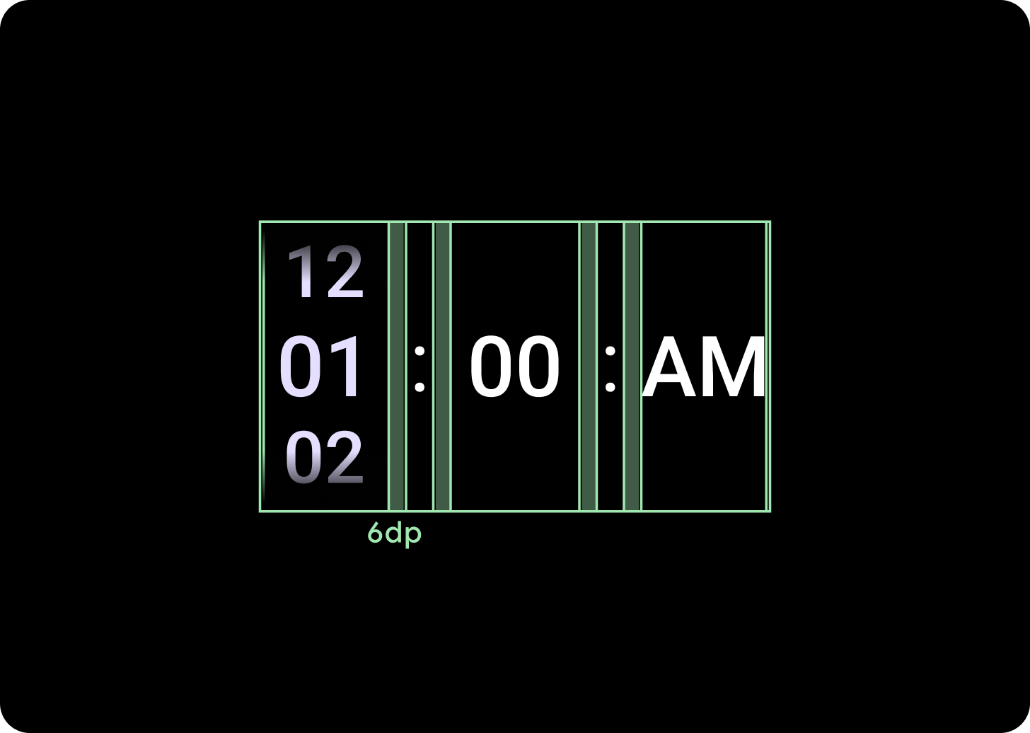
เพิ่มระยะห่างของคอลัมน์
ระยะห่างระหว่างคอลัมน์จะปรับขนาดเกินเบรกพอยต์ 225+ โดยเริ่มจาก 2 dp หรือ 4 dp และเพิ่มขึ้นเป็น 6 dp การดำเนินการนี้ขึ้นอยู่กับเลย์เอาต์ที่คุณเลือก ซึ่งอาจเป็นเลย์เอาต์ 2 หรือ 3 คอลัมน์
เลย์เอาต์แบบ 2 คอลัมน์
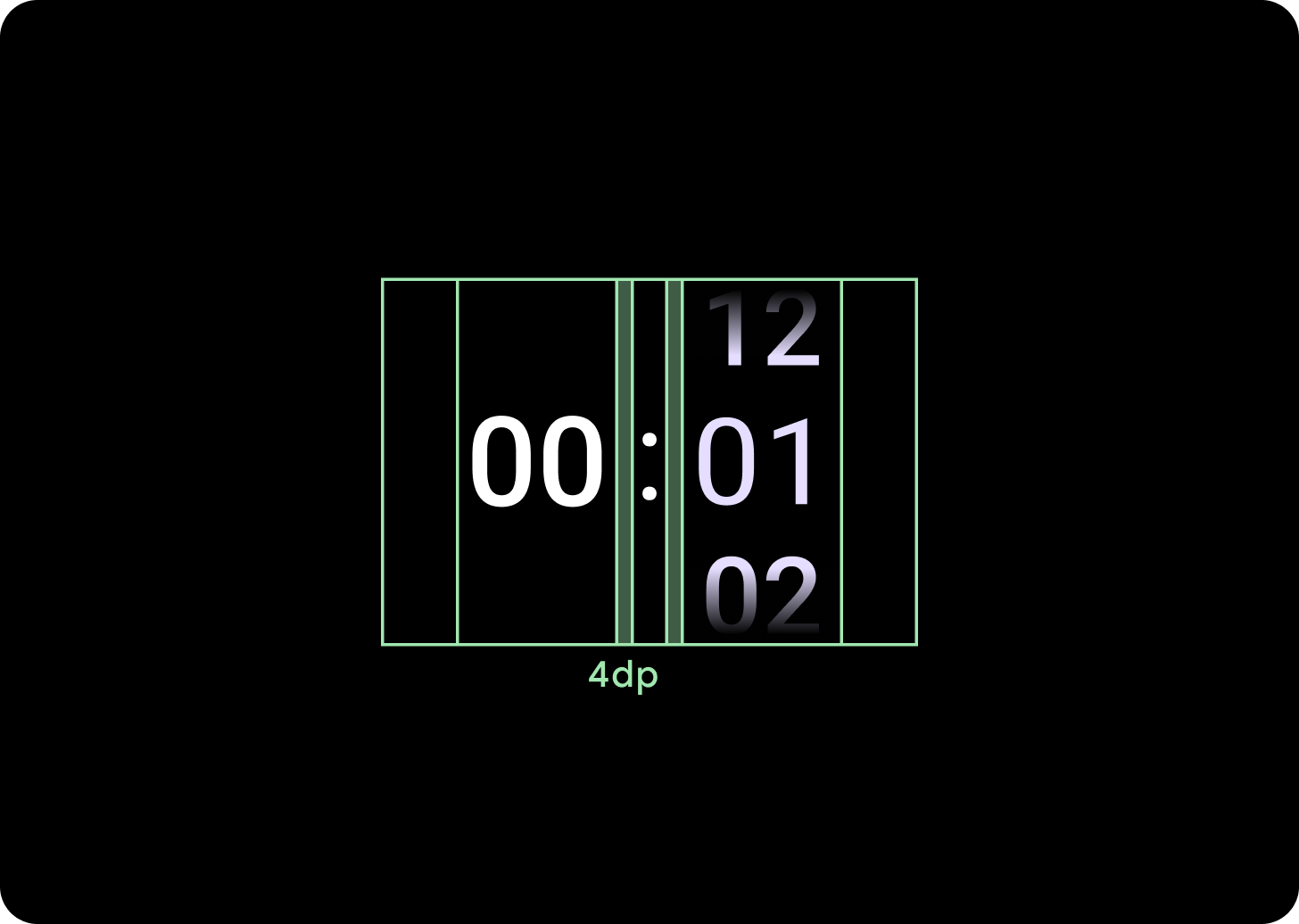
ต่ำกว่าเบรกพอยต์ 225 dp
ระยะห่างของคอลัมน์ 4 dp
สูงกว่าจุดพัก 225 dp
ระยะห่างระหว่างคอลัมน์ 6 dp
เลย์เอาต์แบบ 3 คอลัมน์
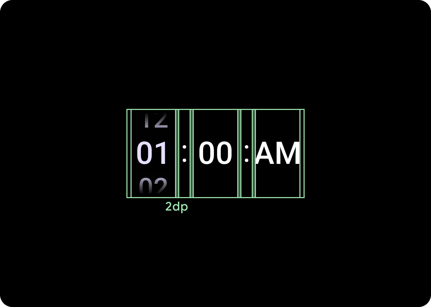
ต่ำกว่าเบรกพอยต์ 225 dp
ระยะห่างระหว่างคอลัมน์ 2 dp
สูงกว่าจุดพัก 225 dp
ระยะห่างระหว่างคอลัมน์ 6 dp