
בורר עוזר למשתמשים לבחור ולהגדיר נתונים ספציפיים.
Picker
צריך להשתמש בבוררי בחירה כדי לאפשר למשתמשים לבחור מתוך מספר סופי של פריטים.
ברירת המחדל היא שהפריטים יחזרו שוב ושוב בלי סוף בשני הכיוונים. מומלץ להשבית את ההתנהגות הזו אם הסדר ברשימה חשוב, או כדי לאפשר למשתמשים להגיע לאלמנט הראשון והאחרון בתנועה מהירה.
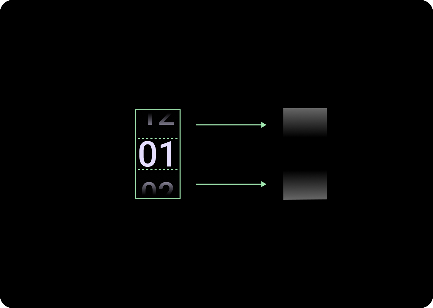
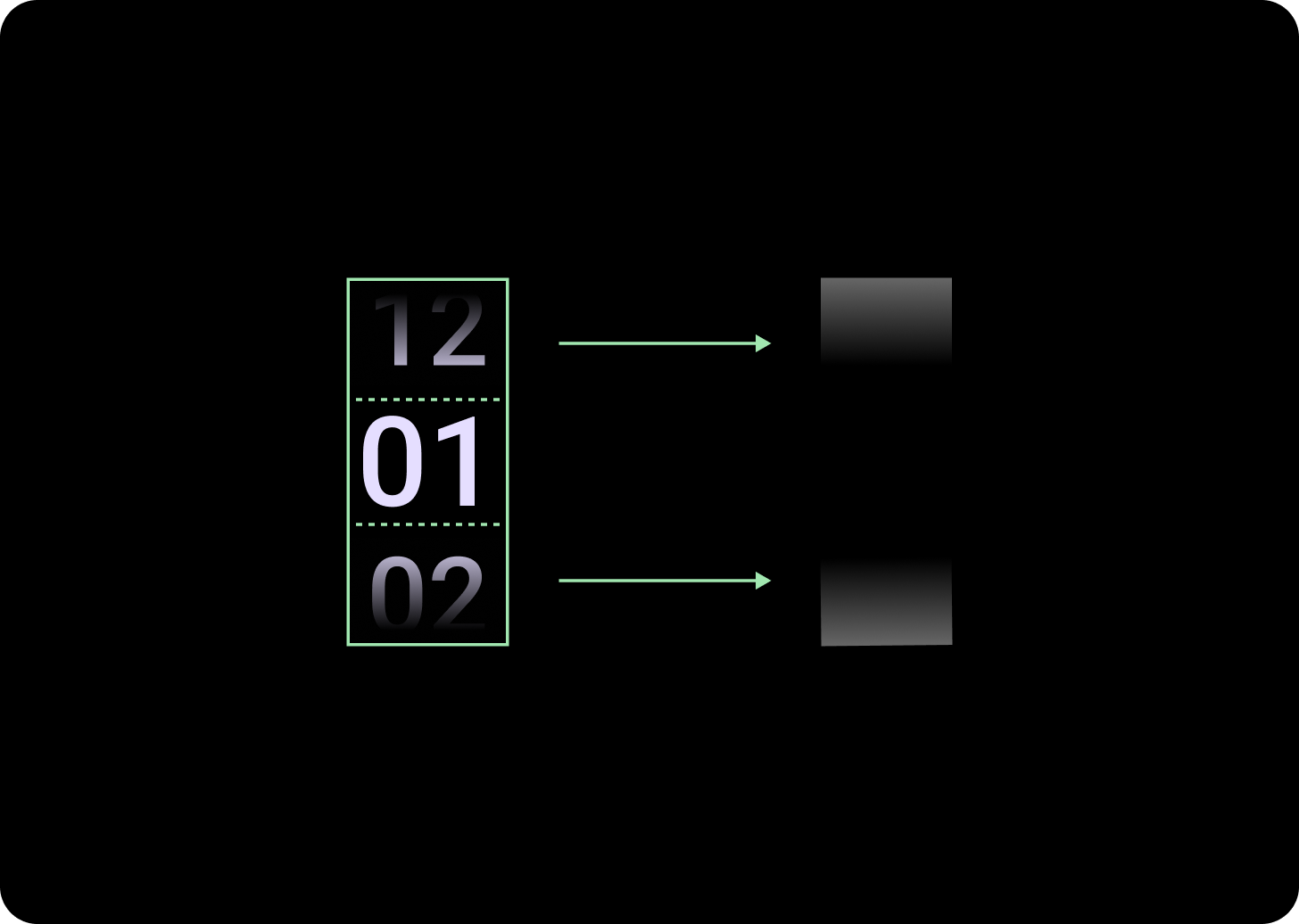
אנטומיה
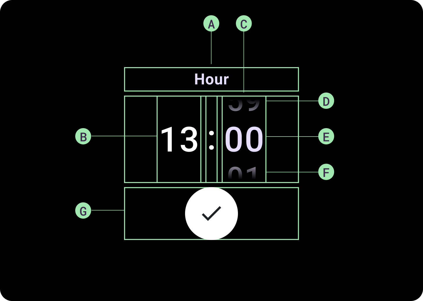
מבנה
א. עמודה לא פעילה
ב'. Colon Breaker
ג. עמודת הבורר
ד. תוכן מוביל
ה. תוכן באמצע
ו. תוכן תחתון
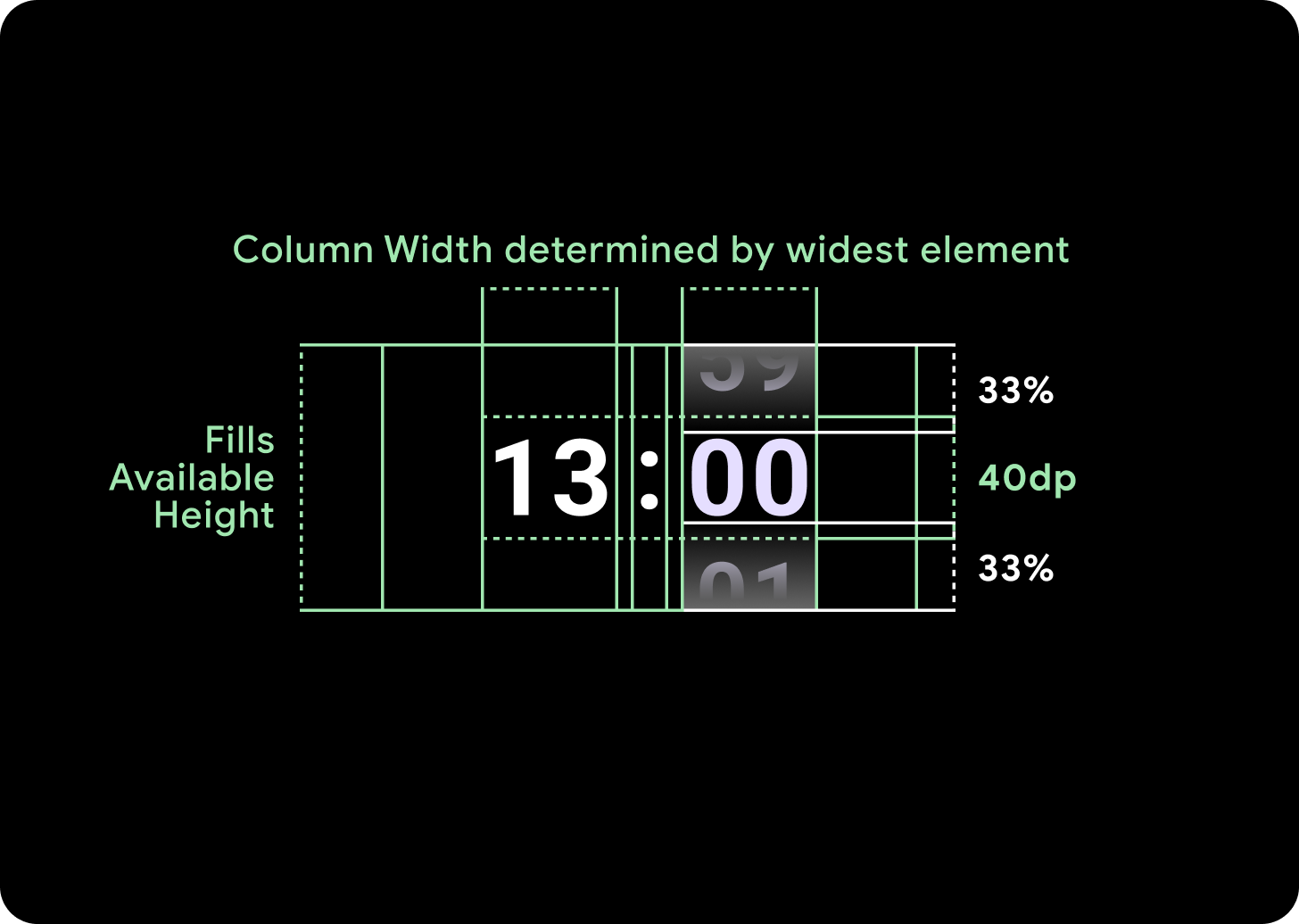
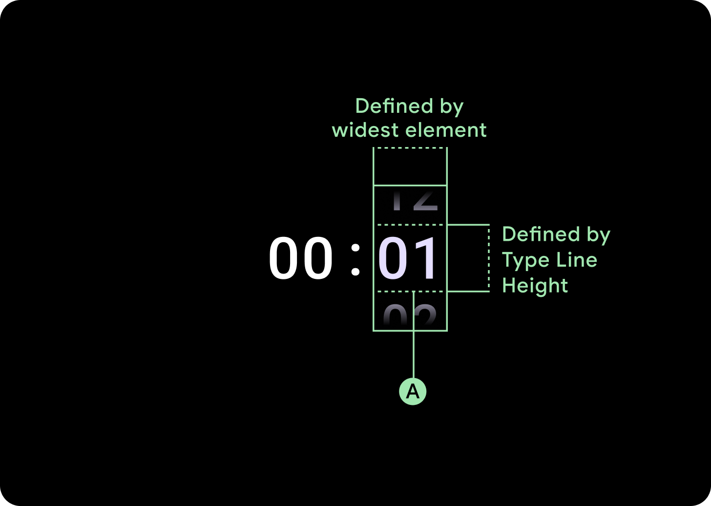
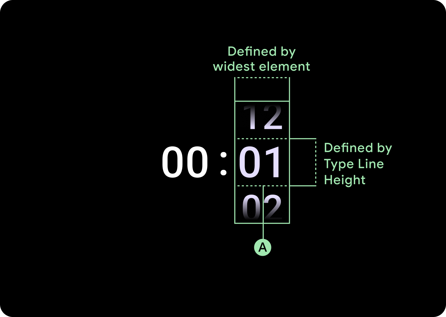
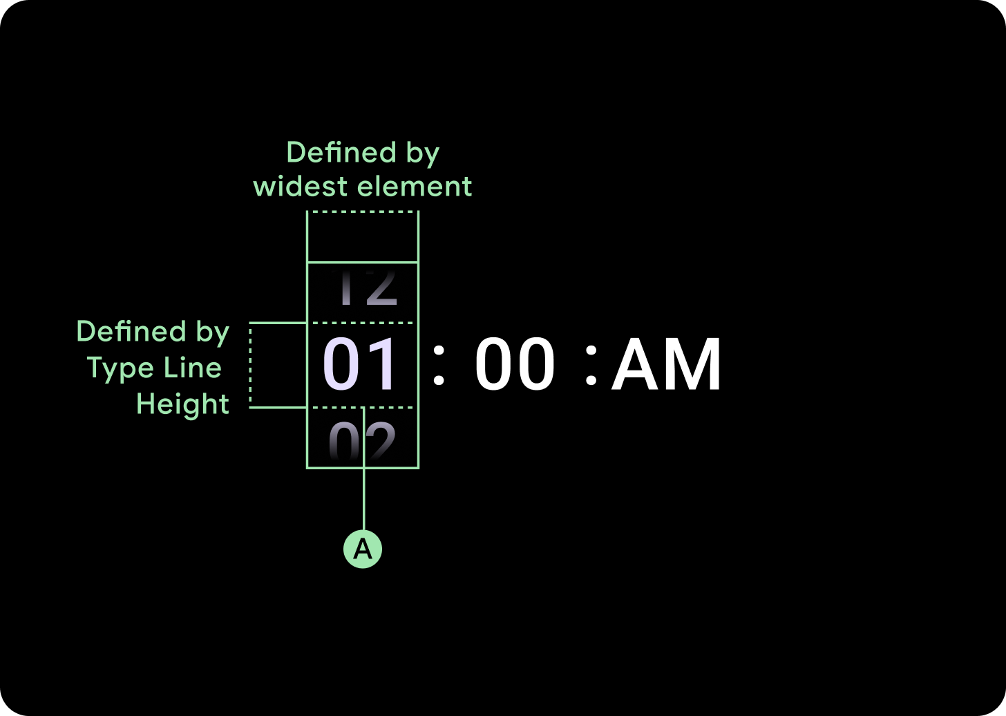
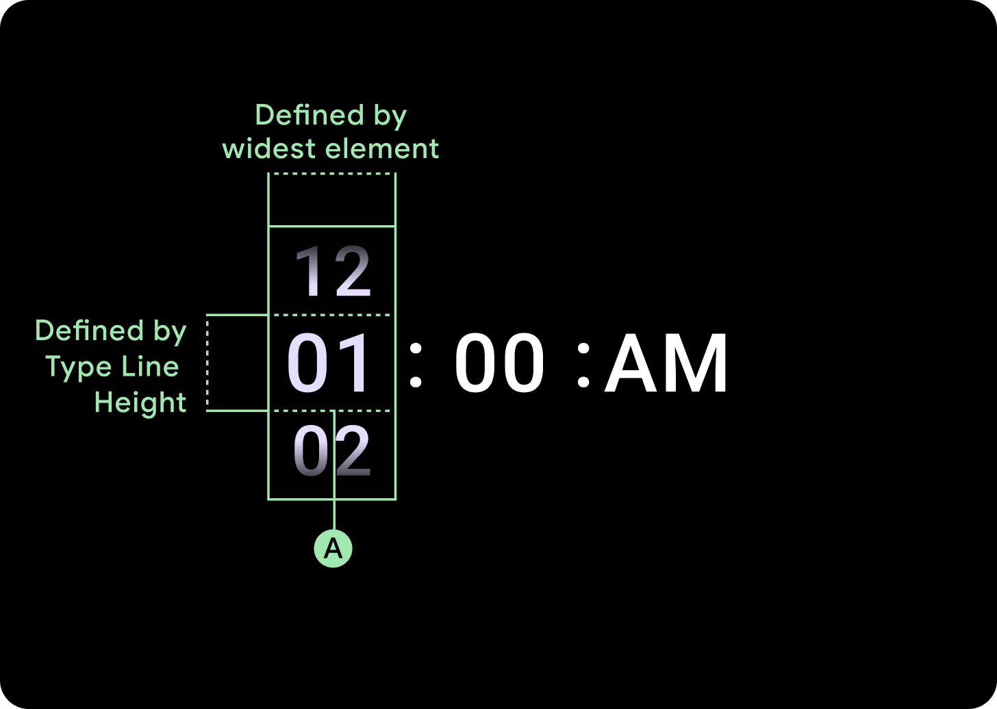
רוחבים וגבהים
קבוצת הבורר ממלאת את הגובה והרוחב הזמינים. יש ארבע אפשרויות פריסה לעמודות הבורר. כל פריסה ממוקמת במרכז וממלאת את הגובה הזמין. רוחב העמודות מוגדר לפי רוחב הנדרש כדי להכיל את מספר הספרות הנדרשות בגופן. חלונית הבחירה של תאריך היא היוצאת מן הכלל, והיא ממלאת את המסך אופקית ומגיעה עד לקצה.
לדוגמה, המספרים יחשבו את הרוחב של '00' ולאחר מכן יגדירו את הרוחב. בשדות טקסט, לדוגמה, שדה החודש, הרוחב ייקבע לפי הרוחב של 'MMM' (האות הרחבה ביותר באלפבית הלטיני). לכן, הרוחב והגובה (כלומר גובה השורה של סגנון הטקסט שבו נעשה שימוש) יושפעו מהגופן שבו נעשה שימוש.
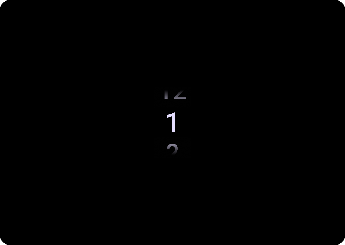
הפריטים בבורר משתנים בגודל בהתאם לנקודת הציון.
שימוש
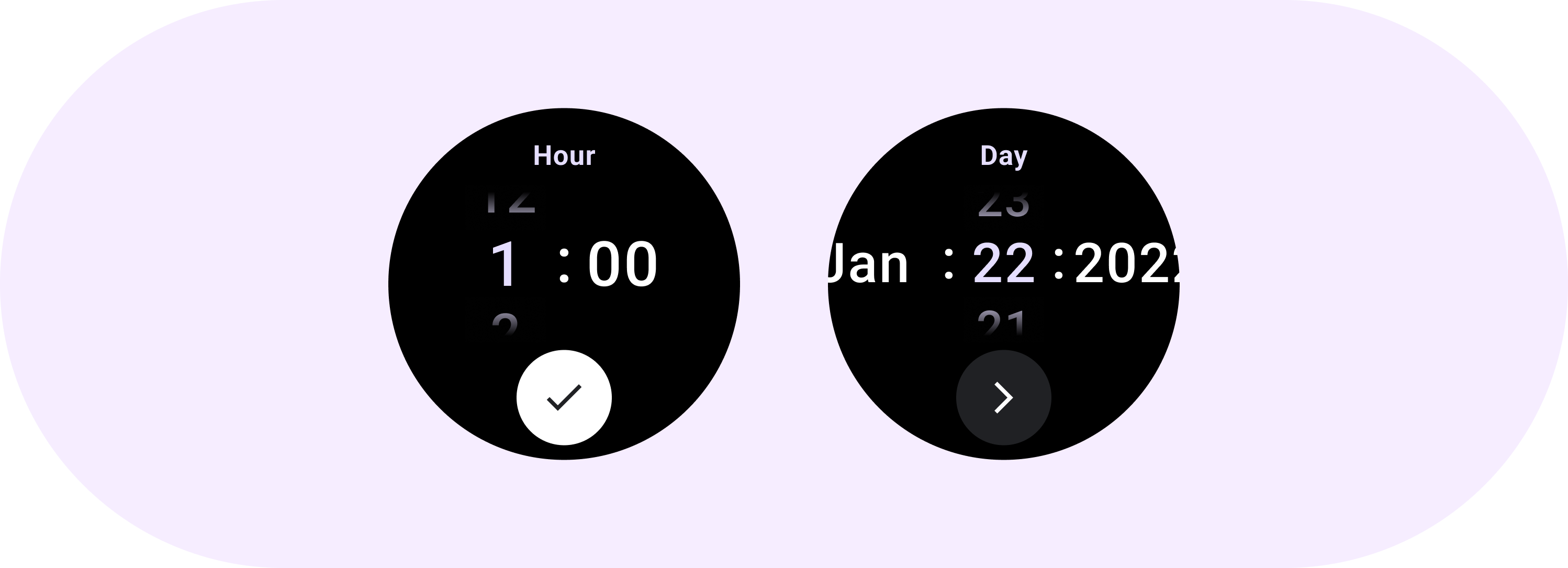
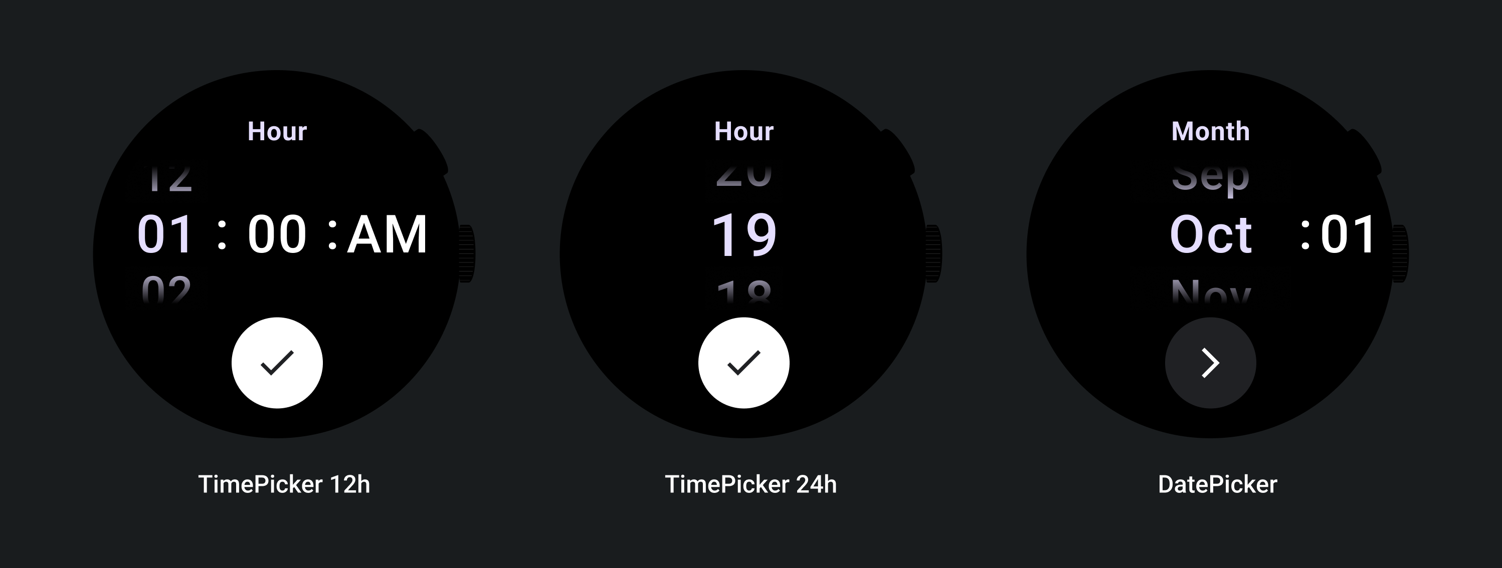
דוגמאות הבאות של בוררים לבחירת תאריך ושעה
כדי להטמיע בורר תאריך ושעה מובנה, אפשר להיעזר בספריית Horologist ב-GitHub.
אם רוצים ליצור חוויה דומה שבה המשתמשים בוחרים ערך שמורכב מכמה חלקים במספר בוררי בחירת ערכים, צריך להשתמש ברכיב המובנה PickerGroup. האובייקט הזה משתמש באובייקט של רכז המיקוד כדי להקצות את המיקוד לרכיב ה-Picker הנכון.
פריסות דינמיות
TimePicker 24H
TimePicker 12H
חלונית לבחירת תאריך
התנהגות תגובה
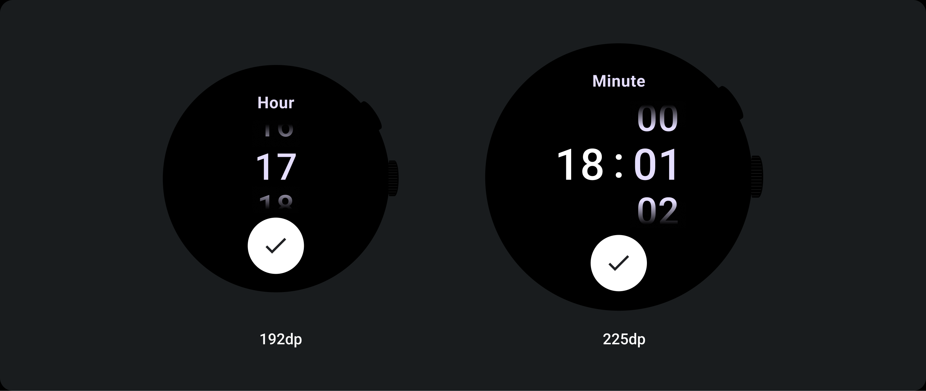
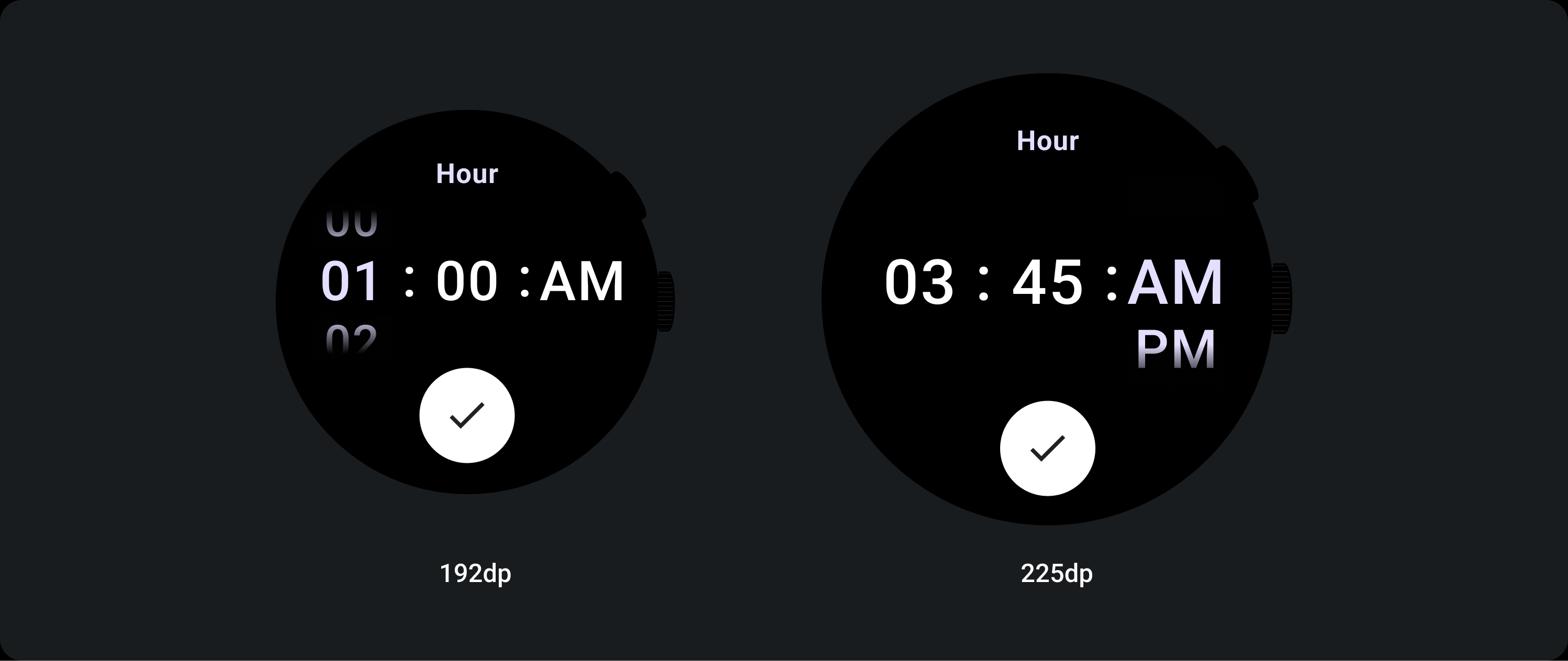
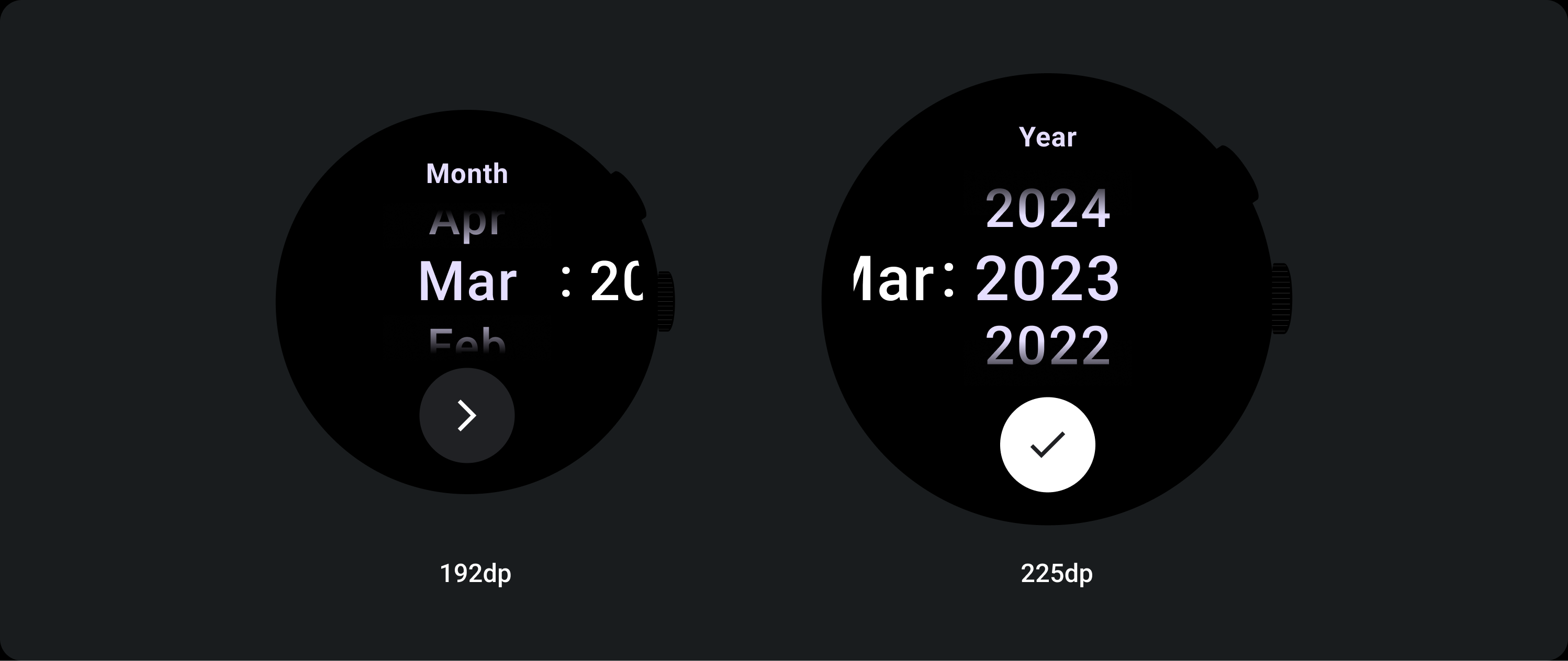
הגדלת גודל הטקסט
אחרי נקודת העצירה 225+, גודל הגופן של רכיב הבורר משתנה. העותק העליון והתחתון בעמודה של גלילה איטית משתנה (A), וכך גם העותק האמצעי. ריכזנו כאן כמה דוגמאות:
פריסת שתי עמודות
מתחת לנקודת העצירה (breakpoint) של 225dp
גופן: Display 2
מעל נקודת העצירה (breakpoint) של 225dp
גופן: Display 1
פריסת שלוש עמודות
מתחת לנקודת העצירה (breakpoint) של 225dp
גופן: Display 3
מעל לנקודת העצירה (breakpoint) של 225dp
גופן: Display 2
הגדלת גודל הגרדיאנט
הגובה של העמודה Picker נקבע לפי השטח הזמין. גם ההדרגתיות העליונה וגם ההדרגתיות התחתונה מוגדרות לשליש (33%) מהגובה הזמין. המשמעות היא שבכל גודל מסך זמין, שיפוע הצבעים משתנה באופן יחסי. מוצגים בנפרד מפריסת העמודות.
מתחת לנקודת העצירה (breakpoint) של 225dp
גודל: 33% מגובה העמודה
מעל לנקודת העצירה (breakpoint) של 225dp
גודל: 33% מגובה העמודה
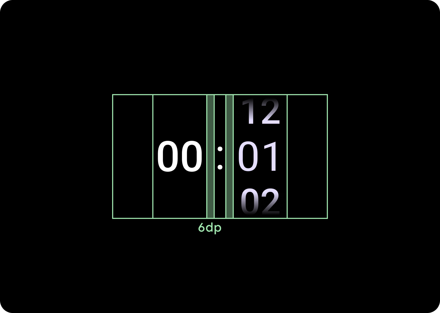
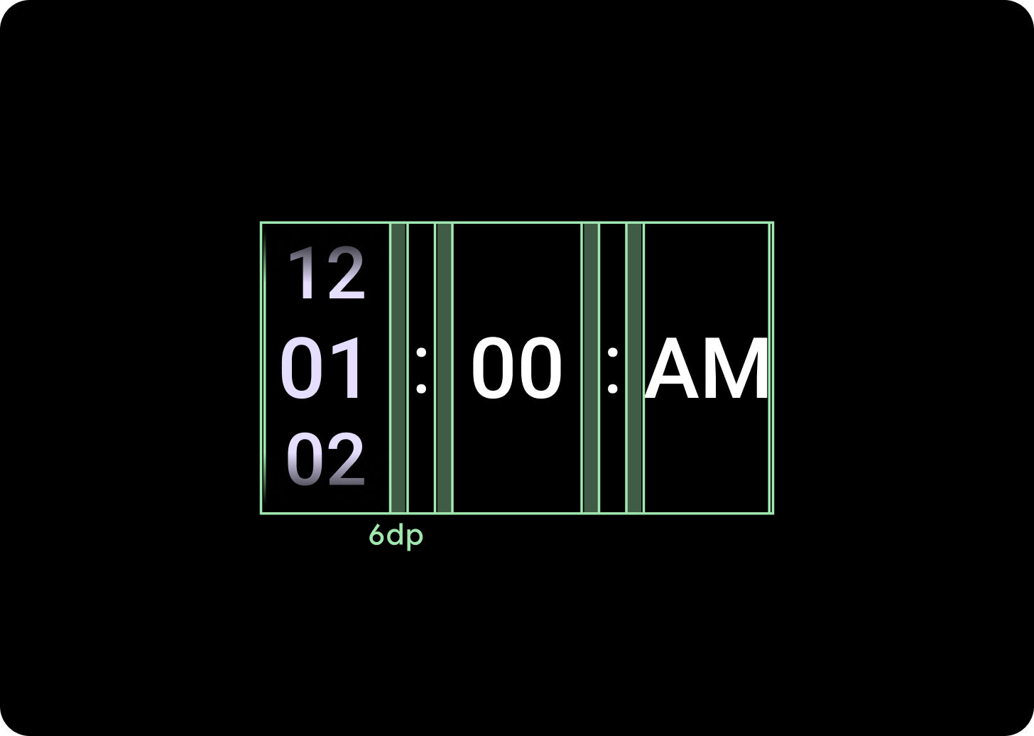
הגדלת המרווח בין העמודות
המרווח בין העמודות משתנה אחרי נקודת העצירה (breakpoint) של 225px ואילך, ומתחיל ב-2dp או ב-4dp וגדל ל-6dp. זה תלוי בפריסה שבחרתם: פריסה עם 2 עמודות או פריסה עם 3 עמודות.
פריסת שתי עמודות
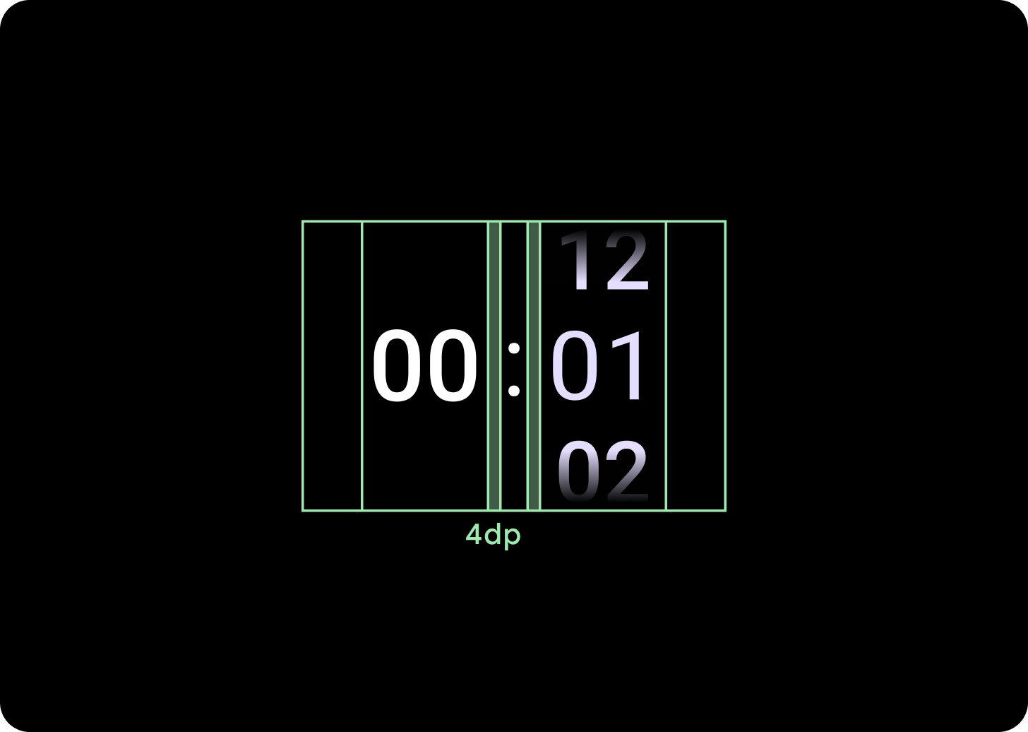
מתחת לנקודת העצירה (breakpoint) של 225dp
מרווח בין עמודות של 4dp
מעל לנקודת העצירה (breakpoint) של 225dp
מרווח בין עמודות של 6dp
פריסת שלוש עמודות
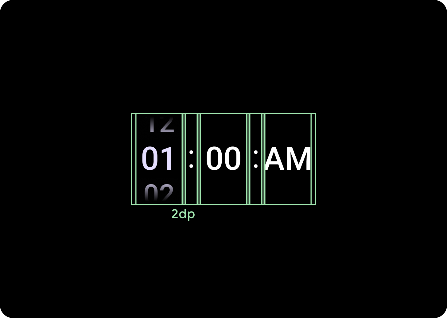
מתחת לנקודת העצירה (breakpoint) של 225dp
מרווח של 2dp בין עמודות
מעל לנקודת העצירה (breakpoint) של 225dp
מרווח בין עמודות של 6dp