
ใช้คอมโพเนนต์ปุ่มสําหรับการดําเนินการที่ผู้ใช้เข้าใจดีและไม่จำเป็นต้องมีป้ายกำกับข้อความ ปุ่มจะแตกต่างจากชิปตรงที่เป็นทรงกลม
กายวิภาคศาสตร์
ก. เนื้อหา
ปุ่มมีช่องเดียวที่สงวนไว้สำหรับไอคอนหรือข้อความ เลือกไอคอนที่เกี่ยวข้องกับการดำเนินการของปุ่ม คุณใช้ข้อความได้สูงสุด 3 อักขระหากไอคอนไม่สามารถอธิบายการดำเนินการที่เกี่ยวข้อง ลองใช้คอมโพเนนต์ชิปหากไอคอนอธิบายการดำเนินการได้ไม่ดี
ข. คอนเทนเนอร์
คอนเทนเนอร์ปุ่มจํากัดไว้ที่การเติมสีพื้นสีเดียว
ประเภทปุ่ม
ปุ่มแบบกะทัดรัด
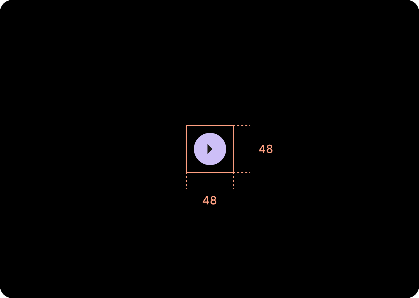
ปุ่มแบบกะทัดรัดจะปรากฏเล็กกว่า แต่มีพื้นที่ที่แตะได้ใหญ่กว่า พื้นที่ที่แตะได้เริ่มต้นคือ 48x48 dp
ลำดับชั้น
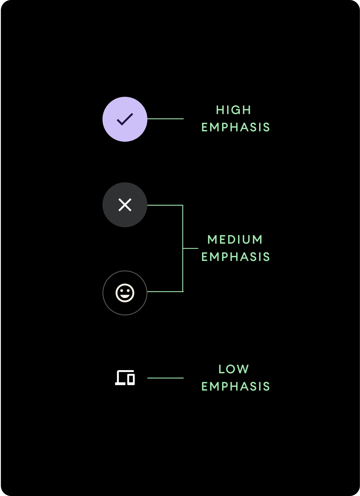
ใช้การเติมสีที่แตกต่างกันเพื่อระบุลําดับชั้นของปุ่ม
เน้นสูง
ปุ่มเน้นสูงมีการดำเนินการหลักของแอป สำหรับปุ่มเน้นสูง ให้ใช้สีหลักหรือสีรองสำหรับคอนเทนเนอร์ และใช้สีในโหมดหลักและโหมดรองสำหรับเนื้อหา ดูข้อมูลเพิ่มเติมได้ที่ธีม Material ของ Wear
การเน้นปานกลาง
ปุ่มเน้นระดับกลางจะโดดเด่นด้วยสีที่เติมซึ่งคอนทราสต์น้อยกว่า เหตุการณ์เหล่านี้มีการกระทําที่มีความสําคัญน้อยกว่าการกระทําหลัก ใช้สีพื้นผิวสำหรับคอนเทนเนอร์และสีบนพื้นผิวสำหรับเนื้อหา
หรือจะใช้คอมโพเนนต์ OutlinedButton ที่กําหนดเองสําหรับปุ่มเน้นระดับกลางก็ได้ รูปภาพนี้มีพื้นหลังโปร่งใส เส้นสีของตัวแปรหลักที่มีความทึบแสง 60% และเนื้อหาสีหลัก
เน้นต่ำ (ไอคอนเท่านั้น)ปุ่มที่มีความสำคัญต่ำจะสังเกตได้จากการไม่มีเส้นขอบ หน้าปัดประเภทนี้เหมาะสําหรับพื้นที่ขนาดเล็กบนหน้าปัดซึ่งจําเป็นต้องมีการจัดเรียงแบบกะทัดรัด ใช้สีบนพื้นผิวสำหรับเนื้อหา
ขนาด
ใช้ปุ่มขนาดต่างๆ เพื่อเน้นหรือลดการเน้นการดำเนินการ
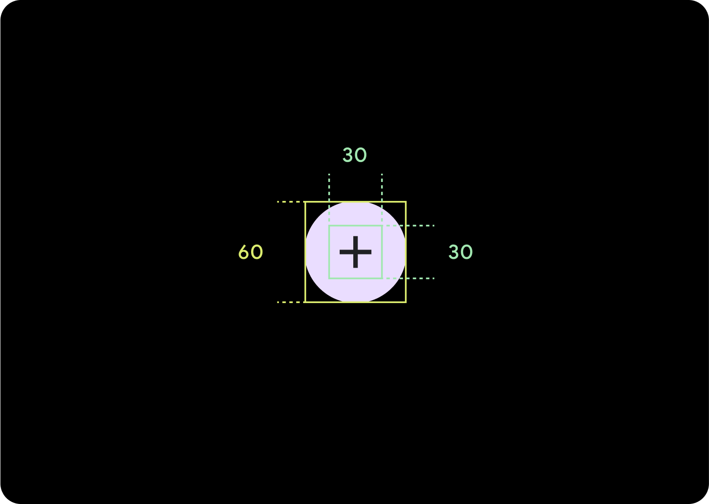
ใหญ่
ไอคอน (30 x 30 dp)
คอนเทนเนอร์ (60 x 60 dp)
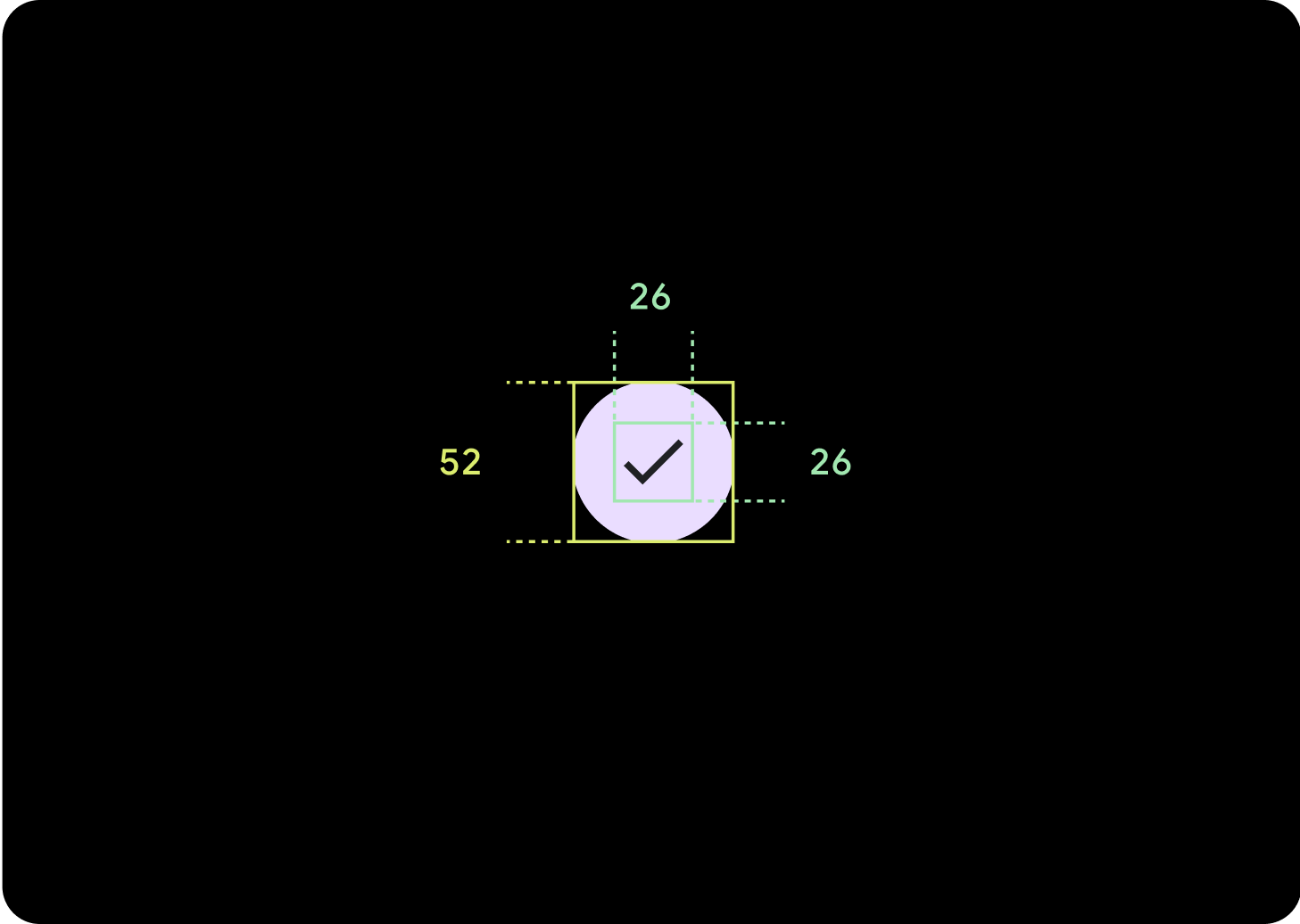
ค่าเริ่มต้น
ไอคอน (26 x 26 dp)
คอนเทนเนอร์ (52 x 52 dp)
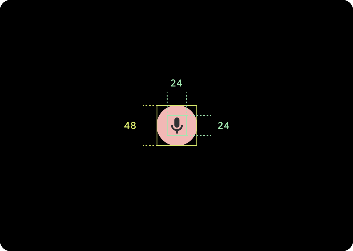
เล็ก
ไอคอน (24 x 24 dp)
คอนเทนเนอร์ (48 x 48 dp)
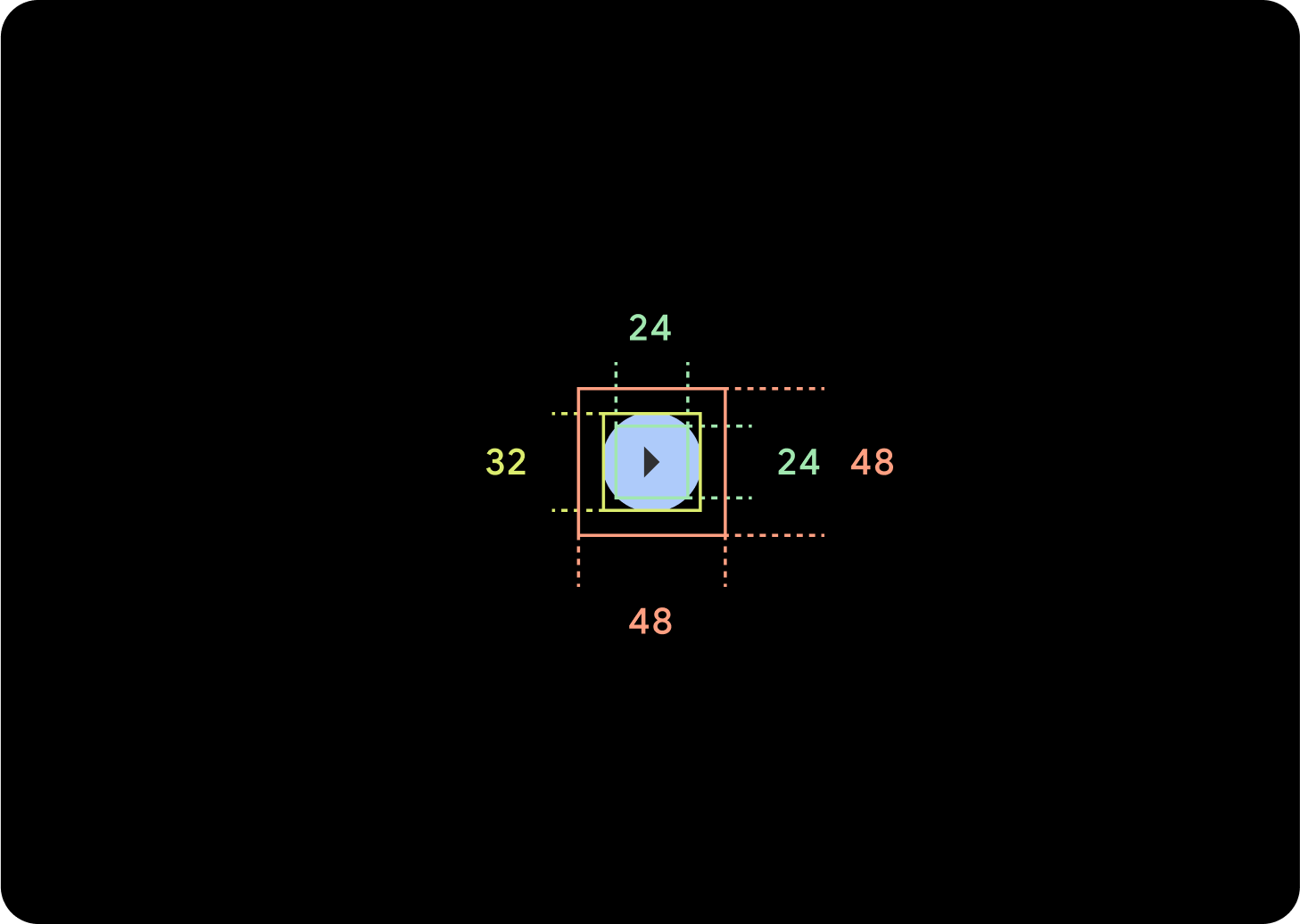
เล็กพิเศษ
ไอคอน (24 x 24 dp)
คอนเทนเนอร์ (32 x 32 dp)
ขอแนะนําให้เพิ่มระยะห่างจากขอบรอบปุ่มนี้เพื่อสร้างเป้าหมายการแตะที่มีขนาดอย่างน้อย 48 dp นี่คือขนาดเป้าหมายการแตะขั้นต่ำสำหรับการช่วยเหลือพิเศษ
การใช้งาน
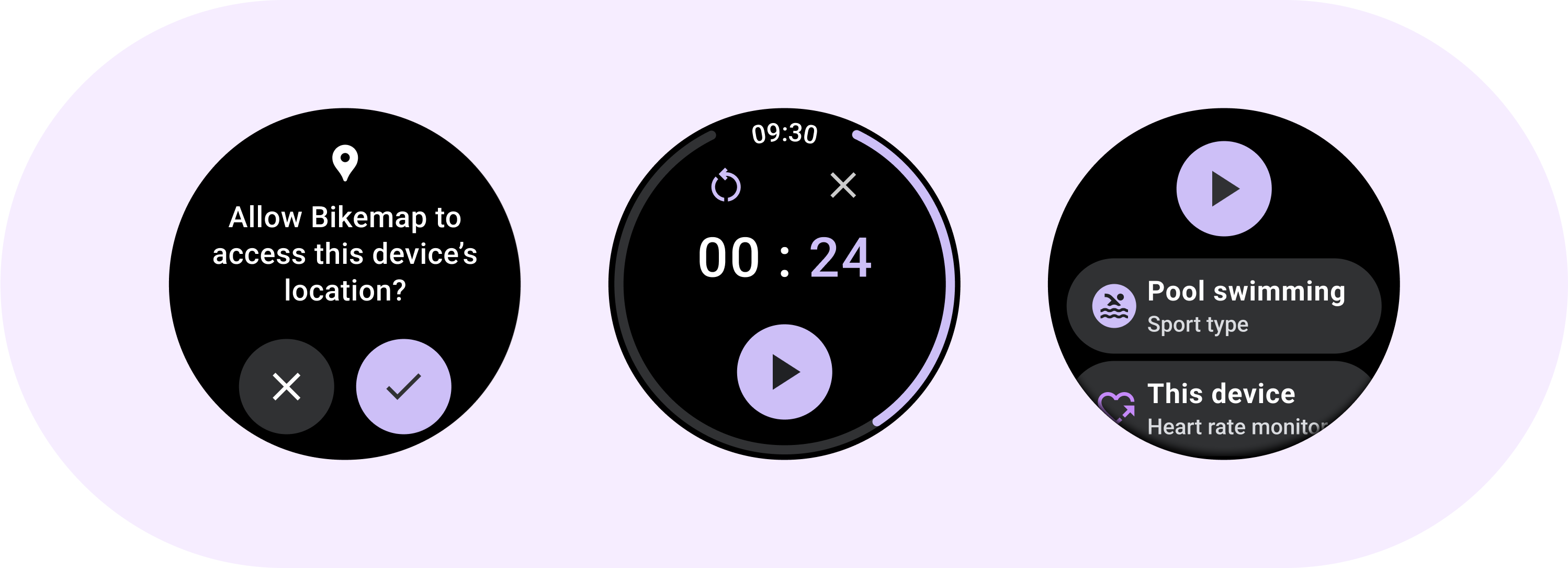
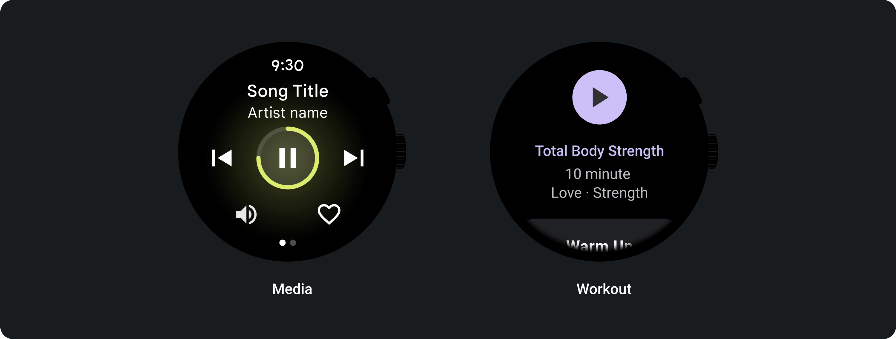
ใช้ปุ่มมาตรฐานเพื่อให้ผู้ใช้ดำเนินการอย่างใดอย่างหนึ่งได้ เช่น ยอมรับหรือปฏิเสธสายเรียกเข้า หรือเริ่มตัวจับเวลา
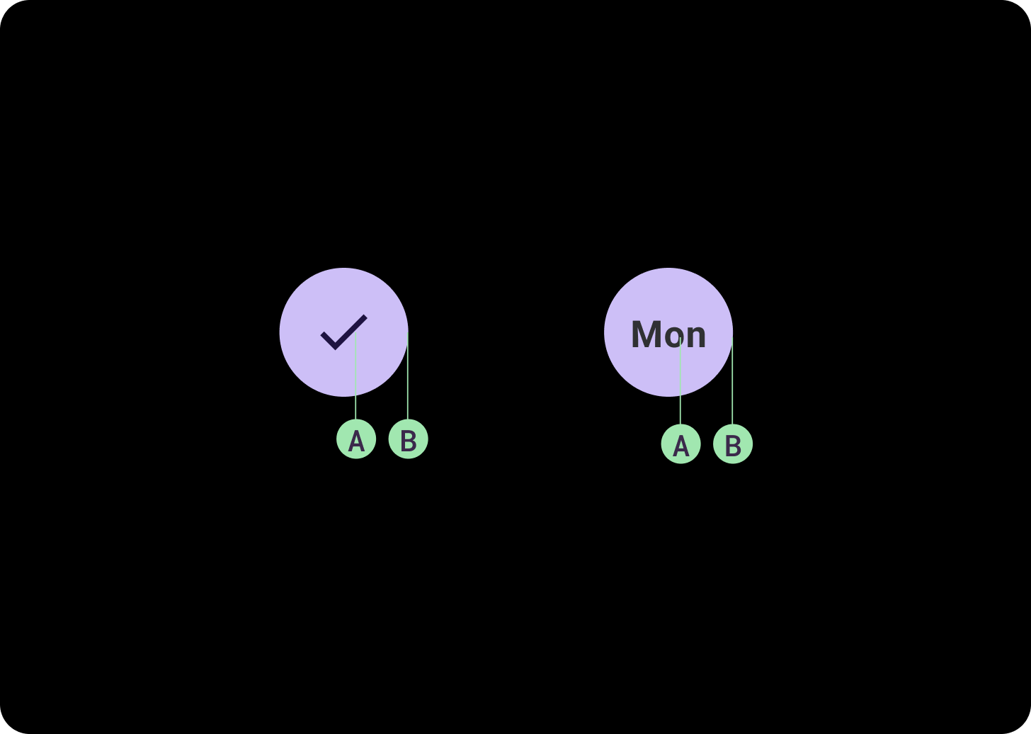
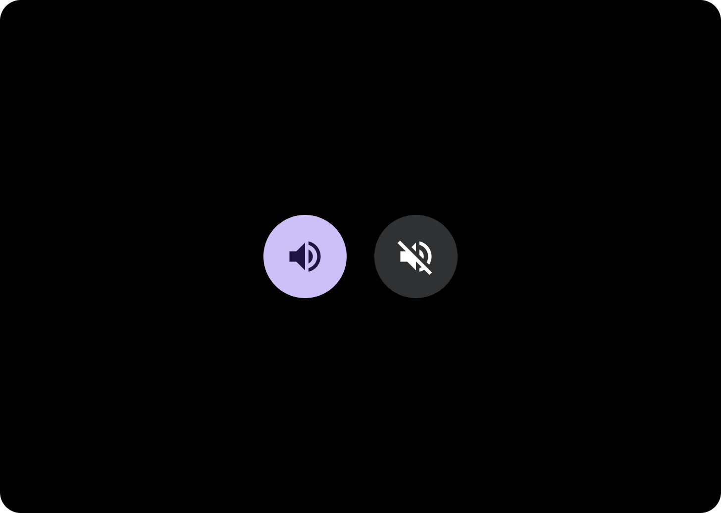
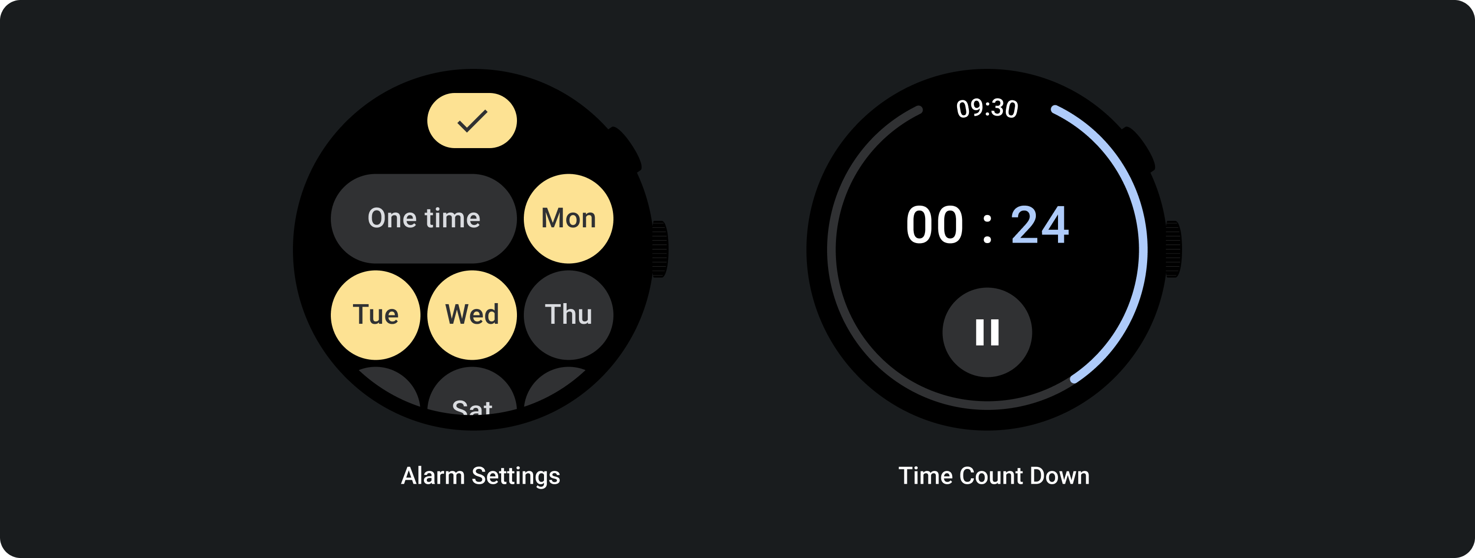
ใช้ปุ่มเปิด/ปิดเพื่อให้ผู้ใช้เปิดหรือปิดตัวเลือก เช่น การเลือกและยกเลิกการเลือกวันของสัปดาห์ หรือหยุดตัวจับเวลาชั่วคราวและเริ่มอีกครั้ง
เลย์เอาต์ที่ปรับเปลี่ยนได้
ลักษณะการทํางานแบบตอบสนอง
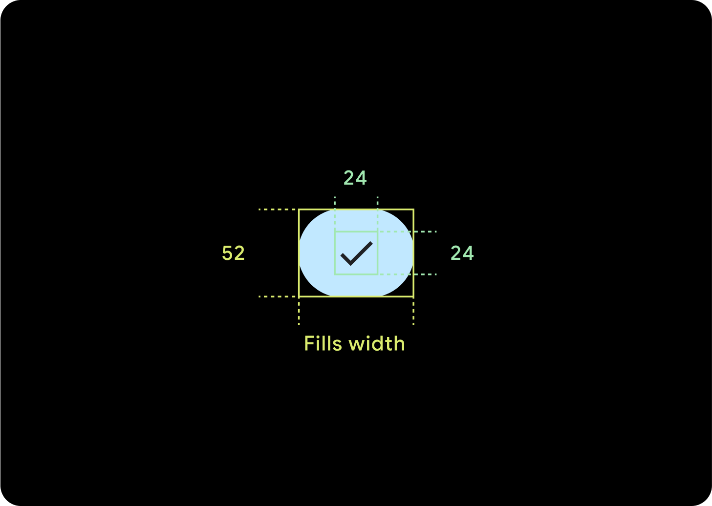
ปุ่ม 1 ปุ่ม
ระยะห่างจากขอบภายในจะยังคงเหมือนเดิม และระยะขอบควรเป็นเปอร์เซ็นต์เพื่อไม่ให้ปุ่มยืดออกมากเกินไปและคงขนาดแบบสัมพัทธ์ไว้
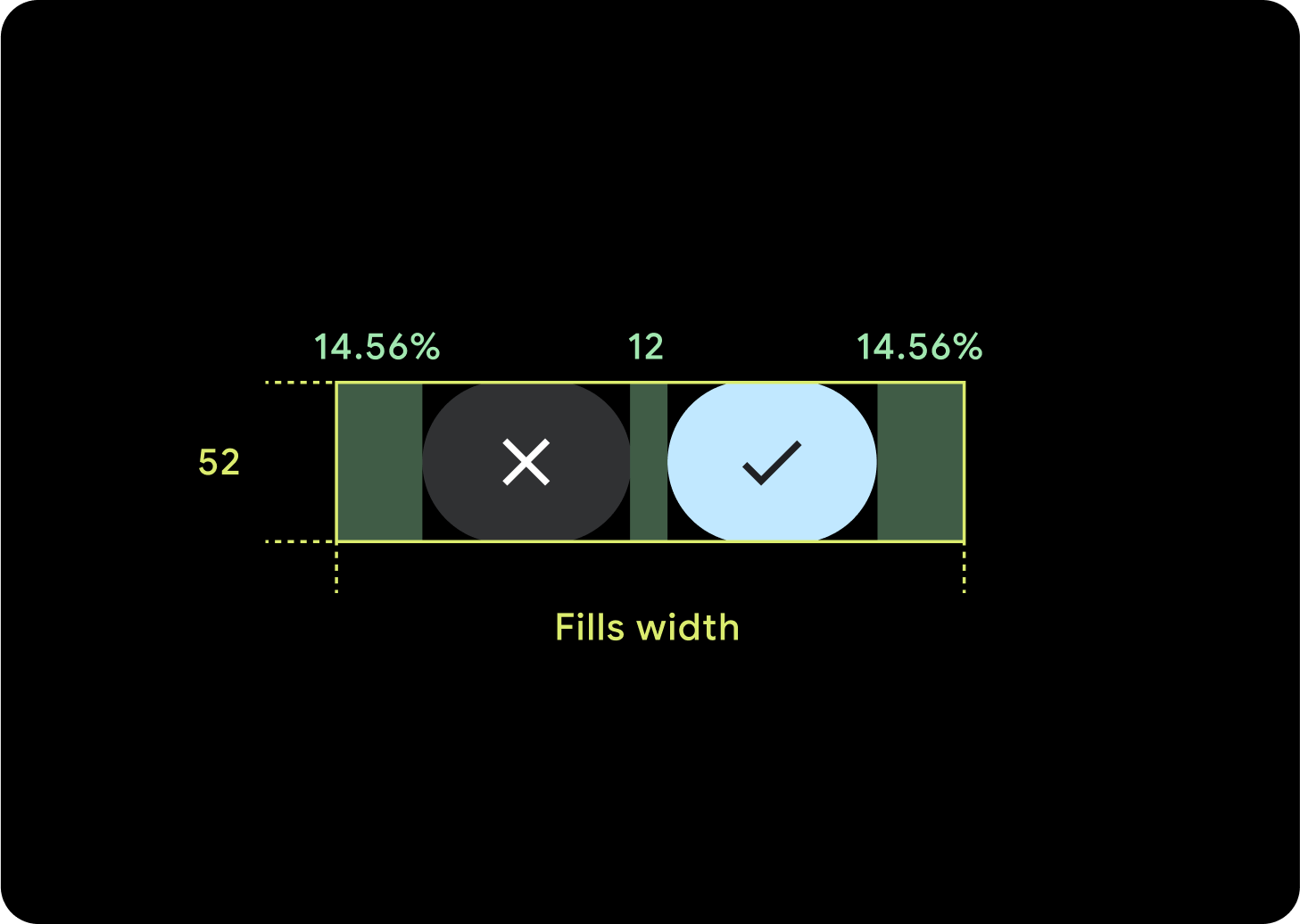
ปุ่ม 2 ปุ่ม
เมื่อมีปุ่ม 2 ปุ่ม ระบบจะเพิ่มระยะขอบภายในเป็นเปอร์เซ็นต์เพื่อไม่ให้ปุ่มยืดออกมากเกินไปและคงขนาดแบบสัมพัทธ์ไว้
IME
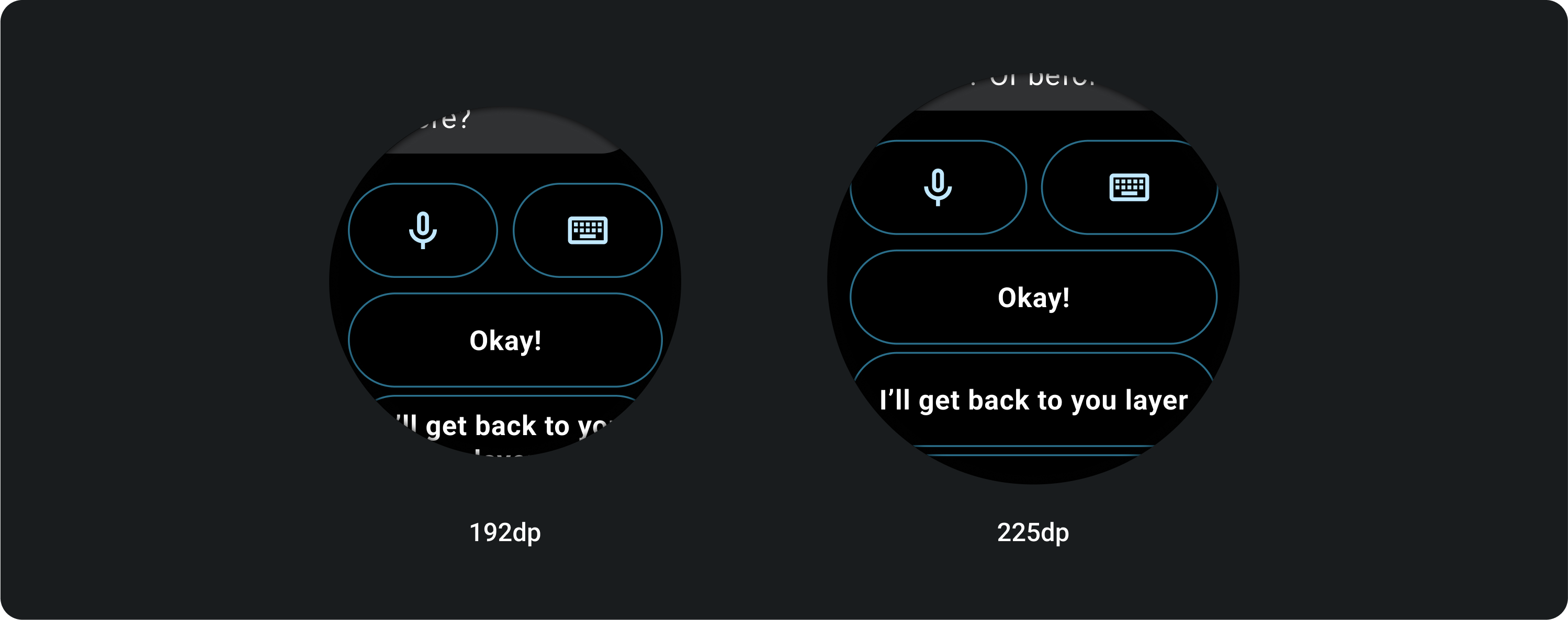
ปุ่ม 1 หรือ 2 ปุ่ม
IME ที่มีปุ่มล็อก 2 ปุ่มหรือปุ่มเดียวจะขยายไปจนถึงขอบด้านข้างเสมอ ไม่ว่าจะมีขนาดหน้าจอเท่าใดก็ตาม
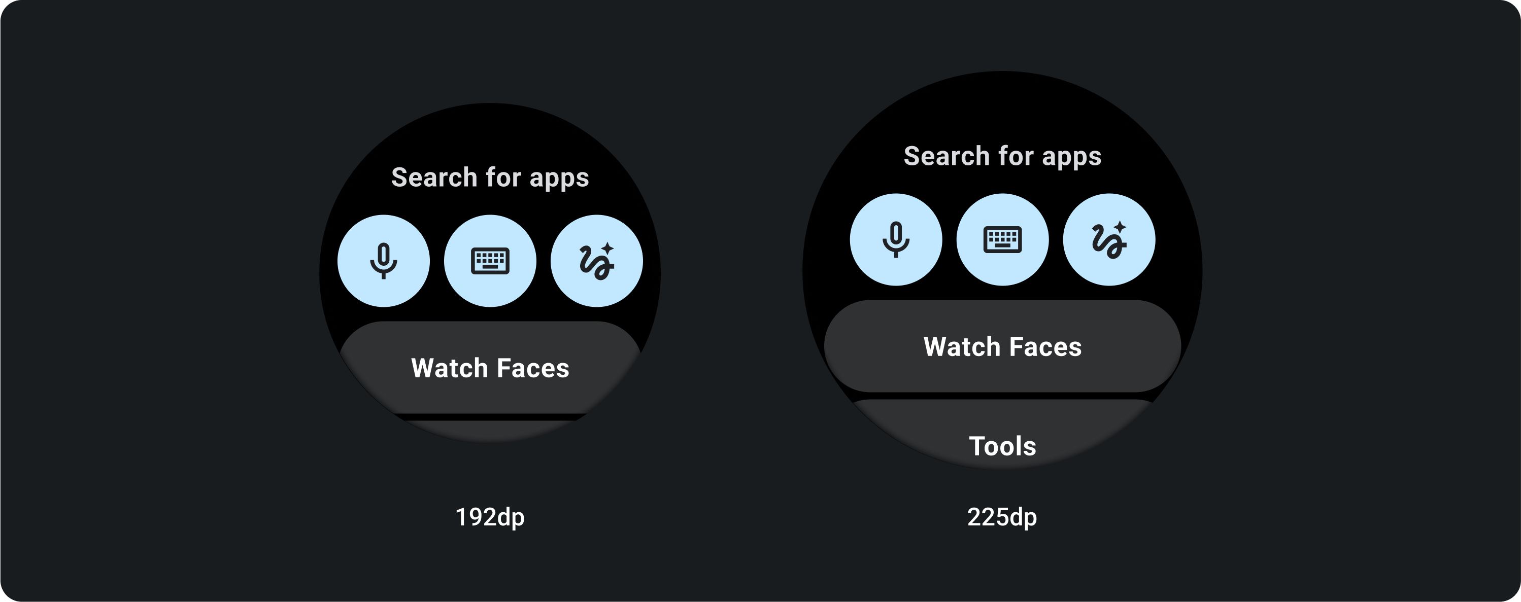
ปุ่ม 3 ปุ่ม
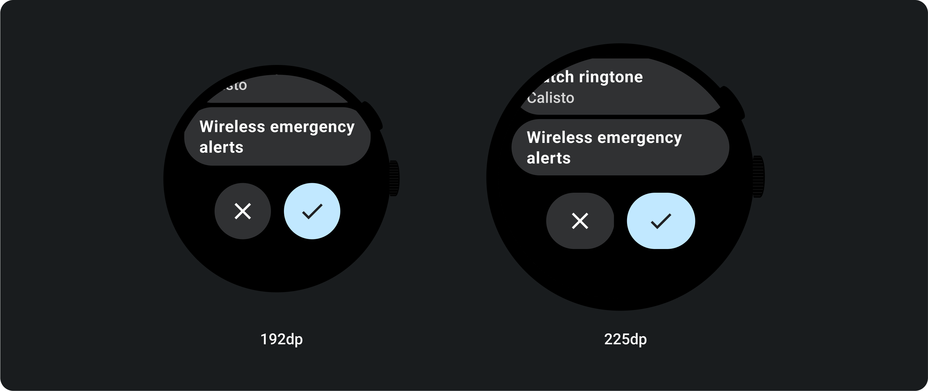
ในหน้าจอที่เล็กกว่า 225 dp ปุ่มจะยังคงเป็นวงกลมและไม่ยืด ในหน้าจอขนาดใหญ่กว่า 225 dp ปุ่มจะขยายไปจนถึงขอบด้านข้าง