ป้องกันการตัดข้อความและการตัดเนื้อหา
จัดทุกอย่างให้เป็นระเบียบอยู่เสมอด้วยคอลเล็กชัน
บันทึกและจัดหมวดหมู่เนื้อหาตามค่ากำหนดของคุณ
สมาร์ทวอทช์มีหน้าจอขนาดเล็กกว่าอุปกรณ์มือถือ จึงจำเป็นต้องจัดเรียงและแสดงองค์ประกอบในลักษณะที่ผู้ใช้เข้าถึงได้และใช้พื้นที่หน้าจอที่มีอยู่อย่างมีประสิทธิภาพ ใช้ระยะห่างจากขอบและระยะขอบที่เหมาะสมตามที่ระบุไว้ในหลักเกณฑ์ของ Material เพื่อช่วยในการปรับขนาดรายการให้พอดีกับหน้าจอ
แม้ว่าการออกแบบจะพอดีกับหน้าจอ แต่องค์ประกอบของอินเทอร์เฟซอาจถูกตัดหรือถูกครอบตัดเมื่อผู้ใช้ดำเนินการอย่างใดอย่างหนึ่งต่อไปนี้
- เปลี่ยนภาษาที่แสดง
- เปลี่ยนขนาดข้อความ
- เปิดใช้การตั้งค่าระบบข้อความเป็นตัวหนา
คุณจึงต้องทดสอบการออกแบบโดยคำนึงถึงข้อควรพิจารณาเหล่านี้เพื่อให้แน่ใจว่าการออกแบบจะปรับให้เข้ากับสภาพแวดล้อมของผู้ใช้แต่ละรายได้อย่างราบรื่น
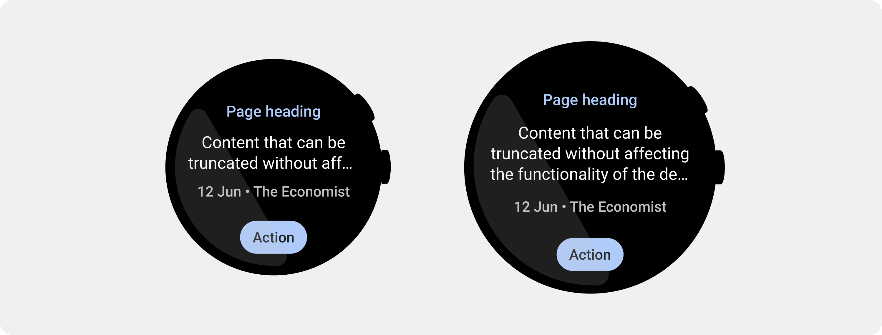
แสดงองค์ประกอบแบบอินเทอร์แอกทีฟให้มองเห็นได้ทั้งหมด
หากอินเทอร์เฟซมีองค์ประกอบแบบอินเทอร์แอกทีฟ ให้ตรวจสอบว่าผู้ใช้สามารถเลื่อนองค์ประกอบเหล่านี้ให้แสดงอย่างเต็มหน้าจอได้ โดยเฉพาะอย่างยิ่งหากวางองค์ประกอบเหล่านี้ไว้ที่ขอบของหน้า หากแอปใช้ไลบรารี Horologist ให้ใช้responsive()
Layout Factory หรือจะใช้ตัวเว้นวรรคและเพิ่มระยะขอบที่ด้านบนและด้านล่างของออบเจ็กต์ ScalingLazyColumn
ก็ได้เพื่อป้องกันไม่ให้ระบบตัดรายการแรกและรายการสุดท้ายของรายการถูกตัดออกเสมอ
ใช้ชิปแทนการ์ดสำหรับเลย์เอาต์ที่หนาแน่น
หากต้องการเลย์เอาต์ที่หนาแน่นขึ้น ให้ใช้ CompactChip
แทนการ์ด พื้นที่ผิวของการ์ดที่ใหญ่ขึ้นทำให้การป้องกันการตัดข้อความและการตัดเนื้อหาทำได้ยากขึ้นมาก
พิจารณาผลกระทบของขนาดหน้าจอต่อการตัดข้อความและการตัดคลิป
คุณมีพื้นที่สำหรับแสดงข้อความและปุ่มเพิ่มเติมได้น้อยหรือมากขึ้นอยู่กับขนาดหน้าจอของอุปกรณ์ Wear OS
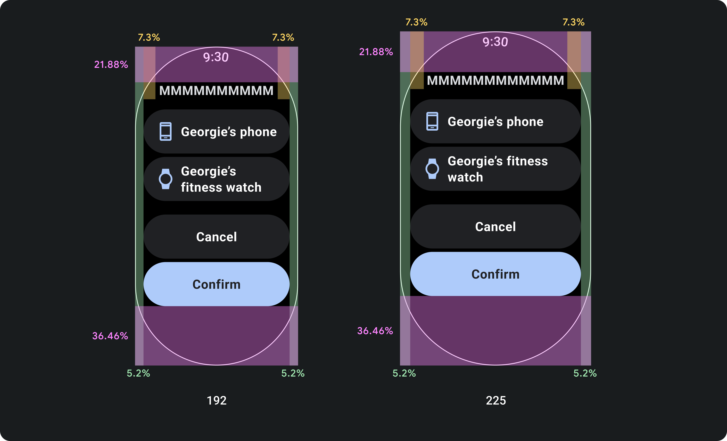
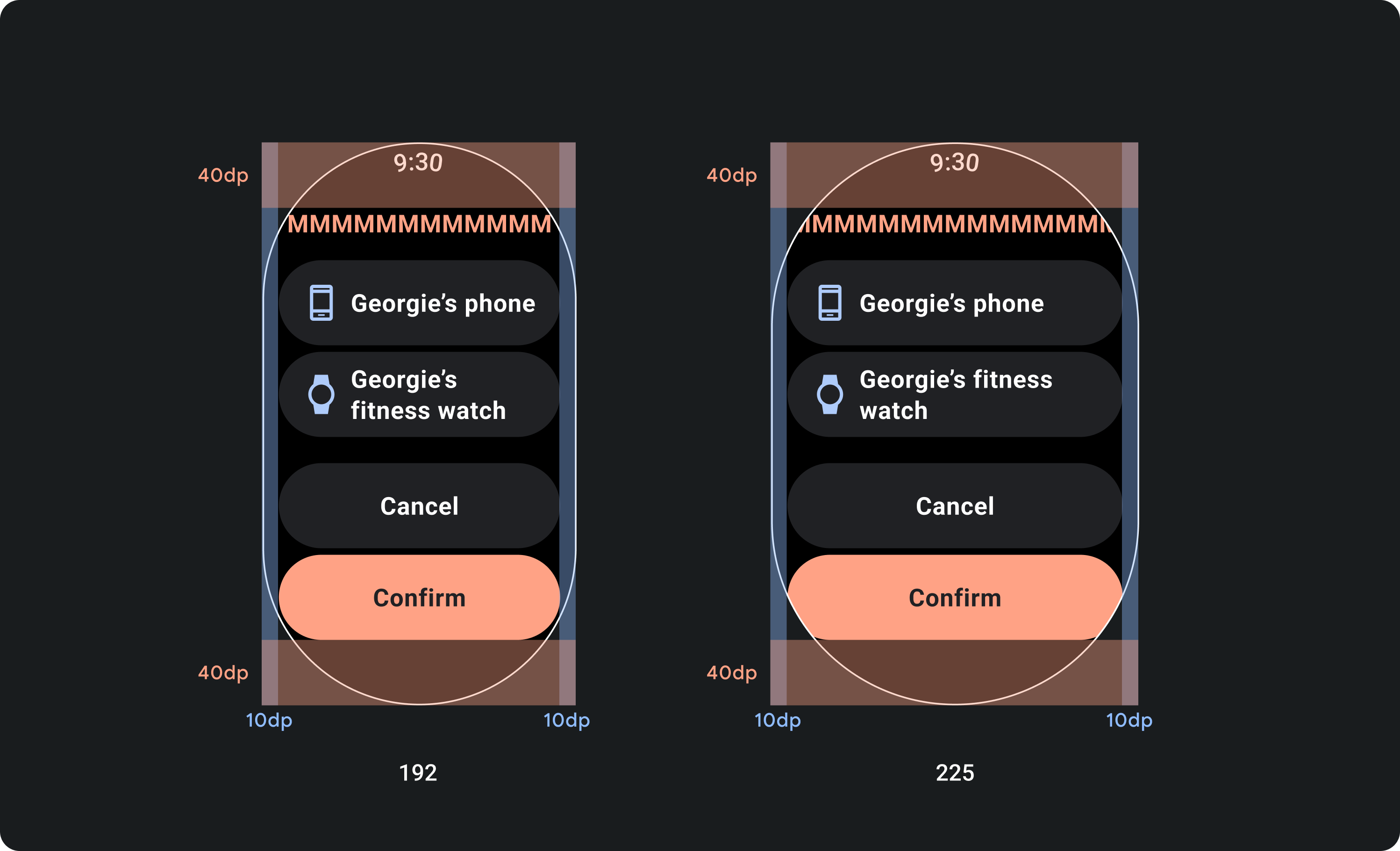
ออกแบบให้เหมาะกับระยะขอบแบบเปอร์เซ็นต์ ไม่ใช่ระยะขอบแบบคงที่
หากต้องการสร้างเนื้อหาที่ปรับให้เหมาะกับขนาดหน้าจอของอุปกรณ์ Wear OS ให้ใช้ระยะขอบแบบเปอร์เซ็นต์ โดยขนาดของระยะขอบแต่ละส่วนจะสัมพันธ์กับขนาดหน้าจอ ในกรณีที่รายการอยู่ด้านบนหรือด้านล่างของหน้าจอ ให้ใช้ระยะห่างจากขอบด้านในเพิ่มเติมเพื่อลดการครอบตัดเนื้อหาจากขอบที่โค้งของหน้าจอ ในทางตรงกันข้าม พื้นที่ด้านบนและด้านล่างจะเพิ่มขึ้นเมื่อกลุ่มเนื้อหามีขนาดเล็กพอที่จะแสดงในหน้าจอเดียว

check_circle
ควรทำ
คอมโพเนนต์ต้องเป็นไปตามระยะขอบแบบเปอร์เซ็นต์เพื่อให้ขนาดของคอมโพเนนต์ปรับตามขนาดของหน้าจอ วิธีนี้จะทำให้เนื้อหาบนหน้าจอเต็มพื้นที่ที่มีเสมอและไม่ถูกครอบตัดโดยขอบของหน้าจอ

cancel
ไม่ควรทำ
อย่าใช้พื้นที่สูงสุดที่มีให้สำหรับข้อความโดยไม่คำนึงถึงวิธีที่ข้อความอาจถูกตัดให้สั้นลงบนหน้าจอขนาดเล็กและส่งผลต่อฟังก์ชันการทำงานของการออกแบบ
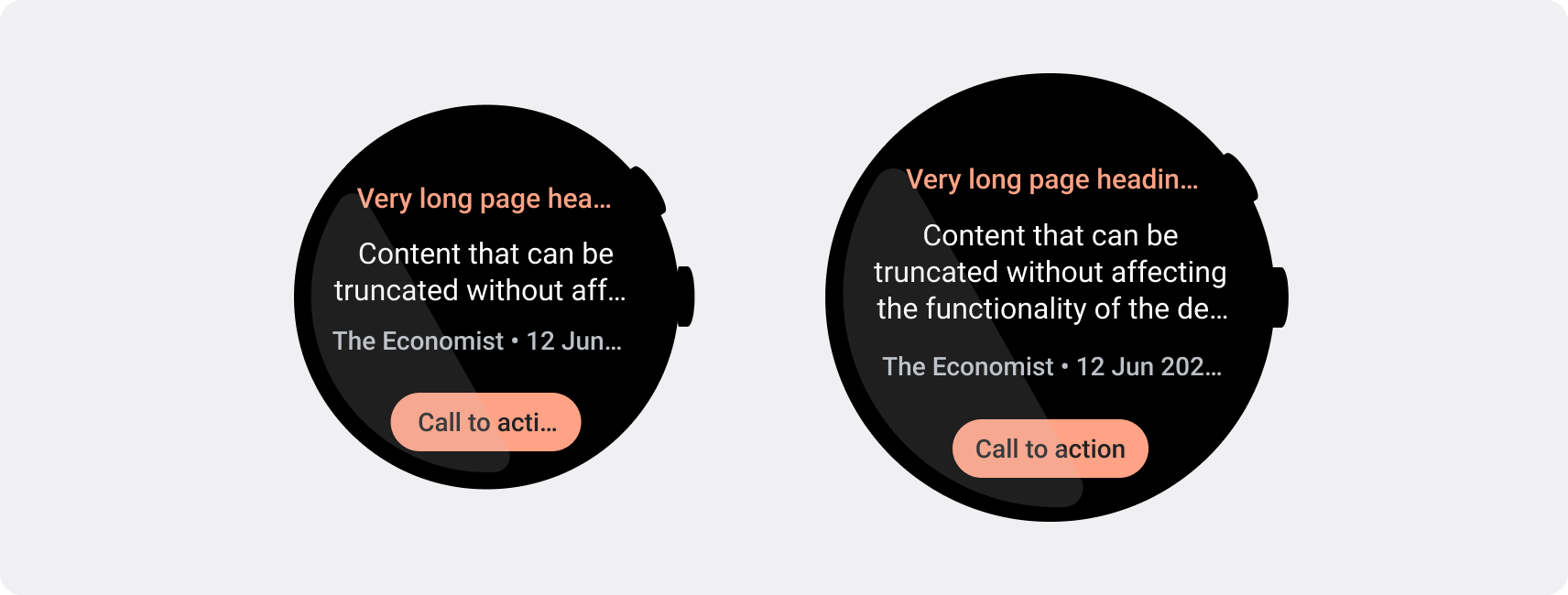
ใช้ขีดจํากัดอักขระที่หน้าจอขนาดเล็กจําเป็น
ในกรณีส่วนใหญ่ หน้าจอขนาดใหญ่จะแสดงข้อความและเนื้อหาได้มากกว่าก่อนที่จะตัดให้สั้นลง
แม้ว่าอาจมีพื้นที่แนวนอนมากกว่า แต่ให้ออกแบบสำหรับหน้าจอขนาดเล็กที่สุดเสมอเพื่อสร้างประสบการณ์การใช้งานที่สอดคล้องกันในอุปกรณ์ต่างๆ
ตัวอย่างเช่น ปุ่มอาจมีพื้นที่สำหรับอักขระเพิ่มเติมบนหน้าจอขนาดใหญ่ก่อนที่จะตัด แต่หากเป็นคำกระตุ้นให้ดำเนินการ (Call-To-Action) ที่สําคัญต่อประสบการณ์ของผู้ใช้ ให้ใช้ข้อความที่สั้นพอที่จะปรากฏทั้งหมดบนหน้าจอของอุปกรณ์ขนาดเล็กโดยไม่ต้องตัด
หรือหากการ์ดแสดงเนื้อหาแบบผันแปร เช่น ข้อความที่ดึงมาจากเซิร์ฟเวอร์ ให้เตรียมรับมือกับกรณีที่ข้อความนี้ถูกตัดให้สั้นลงบนหน้าจอขนาดเล็ก

check_circle
ควรทำ
ข้อความที่ส่งผลต่อฟังก์ชันการทํางานของการออกแบบ เช่น ปุ่มคำกระตุ้นให้ดำเนินการ ได้รับการออกแบบโดยคำนึงถึงหน้าจอขนาดเล็กที่สุด พื้นที่เพิ่มเติมบนหน้าจอขนาดใหญ่จะแสดงบรรทัดข้อความเพิ่มเติมหลังจุดตัด จำนวนบรรทัดของข้อความจะขึ้นอยู่กับคอมโพเนนต์และบริบท

cancel
ไม่ควรทำ
อย่าเขียนข้อความที่กินพื้นที่สูงสุดบนหน้าจอขนาดใหญ่โดยไม่คำนึงถึงลักษณะที่ข้อความอาจถูกตัดให้สั้นลงบนหน้าจอขนาดเล็กและส่งผลต่อฟังก์ชันการทำงานของการออกแบบ
ตัวอย่างเนื้อหาและโค้ดในหน้าเว็บนี้ขึ้นอยู่กับใบอนุญาตที่อธิบายไว้ในใบอนุญาตการใช้เนื้อหา Java และ OpenJDK เป็นเครื่องหมายการค้าหรือเครื่องหมายการค้าจดทะเบียนของ Oracle และ/หรือบริษัทในเครือ
อัปเดตล่าสุด 2025-07-27 UTC
[[["เข้าใจง่าย","easyToUnderstand","thumb-up"],["แก้ปัญหาของฉันได้","solvedMyProblem","thumb-up"],["อื่นๆ","otherUp","thumb-up"]],[["ไม่มีข้อมูลที่ฉันต้องการ","missingTheInformationINeed","thumb-down"],["ซับซ้อนเกินไป/มีหลายขั้นตอนมากเกินไป","tooComplicatedTooManySteps","thumb-down"],["ล้าสมัย","outOfDate","thumb-down"],["ปัญหาเกี่ยวกับการแปล","translationIssue","thumb-down"],["ตัวอย่าง/ปัญหาเกี่ยวกับโค้ด","samplesCodeIssue","thumb-down"],["อื่นๆ","otherDown","thumb-down"]],["อัปเดตล่าสุด 2025-07-27 UTC"],[],[],null,["# Prevent text truncation and content clipping\n\nSmartwatches have smaller screen sizes than handheld devices, so it's critical\nto arrange and display elements in a manner that users can access and that\nefficiently uses the available screen space. To help your items fit the screen,\nuse the correct amount of padding and margins as specified by the\n[Material guidelines](https://m3.material.io/foundations/layout/understanding-layout/spacing).\n\nEven when your design fits the screen, elements of your interface may be\ntruncated or clipped when the user does one of the following:\n\n- Changes the display language.\n- Changes the text size.\n- Enables the **Bold text** system setting.\n\nIt's crucial to test your designs with these considerations in mind to ensure\nthey adapt seamlessly to different user environments.\n\nKeep interactive elements fully visible\n---------------------------------------\n\nIf your interface includes interactive elements, check that users can scroll\nthese elements fully into view, especially if these elements are placed at the\nedges of a page. If your app uses the [Horologist](https://github.com/google/horologist) library, use the\n[`responsive()` layout factory](https://github.com/google/horologist/blob/main/docs/compose-layout.md). Otherwise, use spacers and add margins to\nthe top and bottom of a [`ScalingLazyColumn`](/reference/kotlin/androidx/wear/compose/foundation/lazy/package-summary#ScalingLazyColumn%28androidx.compose.ui.Modifier,androidx.wear.compose.foundation.lazy.ScalingLazyListState,androidx.compose.foundation.layout.PaddingValues,kotlin.Boolean,androidx.compose.foundation.layout.Arrangement.Vertical,androidx.compose.ui.Alignment.Horizontal,androidx.compose.foundation.gestures.FlingBehavior,kotlin.Boolean,androidx.wear.compose.foundation.lazy.ScalingParams,androidx.wear.compose.foundation.lazy.ScalingLazyListAnchorType,androidx.wear.compose.foundation.lazy.AutoCenteringParams,kotlin.Function1%29) object to prevent the first and\nlast list items from always being clipped.\n\nUse chips instead of cards for dense layouts\n--------------------------------------------\n\nIf you need a denser layout, use [`CompactChip`](/reference/kotlin/androidx/wear/compose/material/package-summary#CompactChip(kotlin.Function0,androidx.compose.ui.Modifier,kotlin.Function1,kotlin.Function1,androidx.wear.compose.material.ChipColors,kotlin.Boolean,androidx.compose.foundation.interaction.MutableInteractionSource,androidx.compose.foundation.layout.PaddingValues,androidx.compose.ui.graphics.Shape,androidx.wear.compose.material.ChipBorder)) instead of cards. The larger\nsurface area of cards makes it much more difficult to prevent text truncation\nand content clipping.\n\nConsider screen size effects on truncation and clipping\n-------------------------------------------------------\n\nDepending on the Wear OS device's screen size, you have a smaller or larger\nspace for additional text and buttons to be visible:\n\n### Design for percentage margins, not fixed margins\n\nTo create content that adapts responsively to the Wear OS device's screen size,\napply percentage margins, where the size of each margin is relative to the\nscreen size. In cases where items sit on the top or bottom of the screen, apply\nadditional inner padding to minimize content clipping from the screen's curved\nedge. In contrast, the space at the top and bottom increases when a group of\ncontent is small enough to fit on one screen.\n\ncheck_circle\n\n### Do\n\nComponents must adhere to the percentage margins so that their size scales with the screen's size. This way, the content of your screen always fills the space available and isn't cropped by the screen's edges.\n\ncancel\n\n### Don't\n\nDon't use the maximum space available for text without considering how it may truncate on smaller screens and affect the functionality of your design.\n\n### Use the character limits required by smaller screens\n\nIn most cases, larger screens can show more text and content before truncation.\nEven though more horizontal space might be available, however, always design for\nthe smallest screen size to create a consistent experience across devices.\n\nFor example, a button may have space for more characters on a larger screen\nbefore truncation, but if it's an important call to action that is vital to the\nuser experience, then use text that's short enough to appear entirely, without\ntruncating, on a small device's screen.\n\nAlternatively, if the tile shows variable content, such as text fetched from a\nserver, plan for the possibility that this text is truncated on smaller screens.\n\ncheck_circle\n\n### Do\n\nText which affects the functionality of your design, like call-to-action buttons, is designed with the smallest screen in mind. The additional space on larger screens can show additional lines of text after the breakpoint. The number of lines of text depends on the component and context.\n\ncancel\n\n### Don't\n\nDon't write text that consumes the maximum space available on a larger screen without considering how it may appear truncated on smaller screens and affect the functionality of your design."]]