Material 3 एक्सप्रेशनिव डिज़ाइन लैंग्वेज
संग्रह की मदद से व्यवस्थित रहें
अपनी प्राथमिकताओं के आधार पर, कॉन्टेंट को सेव करें और कैटगरी में बांटें.
Material 3 Expressive (M3) को उपयोगकर्ताओं की मांग को पूरा करने के लिए बनाया गया था. इसमें उपयोगकर्ताओं को मॉडर्न, काम के, और अलग-अलग अनुभव मिलते हैं. Expressive की मदद से, डिज़ाइनर इंटरफ़ेस के लेआउट और प्रज़ेंटेशन में खास भावनाओं और एहसासों को भी दिखा सकते हैं.
कलर और टाइपोग्राफ़ी
कलर सिस्टम को बेहतर बनाया जा रहा है. इसमें M3 के डीपर टोनल पैलेट और ज़्यादा टोकन सेट शामिल किए जा रहे हैं. साथ ही, टाइपोग्राफ़ी के आसान स्केल में, ज़्यादा एक्सप्रेशन के लिए वैरिएबल फ़ॉन्ट ऐक्सिस का इस्तेमाल किया जा रहा है. इससे इंटरैक्शन ज़्यादा एक्सप्रेसिव और मज़ेदार हो रहे हैं.
कलर थीम
नए टोकन की मदद से, अलग-अलग थीम और पूरे डिज़ाइन सिस्टम के संदर्भ में ज़्यादा रंगों का इस्तेमाल किया जा सकता है.
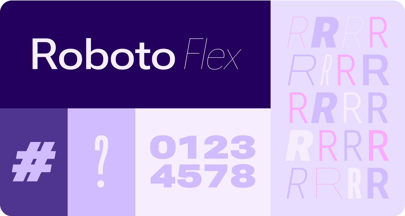
वैरिएबल फ़ॉन्ट
वेरिएबल फ़ॉन्ट और उनके पसंद के मुताबिक बनाए जा सकने वाले ऐक्सिस के लिए, अपडेट की गई बातों का ध्यान रखना ज़रूरी है. ये बातें, 1P के साथ-साथ 3P के इस्तेमाल के उदाहरणों पर भी लागू होती हैं. जैसे, Roboto Flex, जिसमें वेरिएबल ऐक्सिस का एक जैसा सेट होता है.
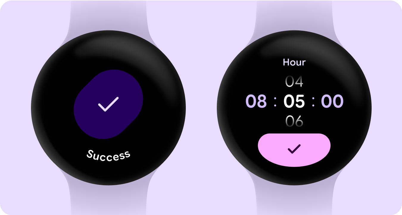
वैरिएबल फ़ॉन्ट ऐक्सिस इन मोशन
इसमें वैरिएबल फ़ॉन्ट ऐक्सिस का इस्तेमाल किया गया है, ताकि मोशन फ़ीडबैक को बेहतर तरीके से दिखाया जा सके. साथ ही, इंटरैक्शन को ज़्यादा बेहतर और इस्तेमाल करने में मज़ेदार बनाया जा सके.
इस्तेमाल के उदाहरण:
- डाइनैमिक फ़ॉन्ट की मोटाई
- डाइनैमिक फ़ॉन्ट की चौड़ाई
- फ़ॉन्ट की मोटाई और चौड़ाई को डाइनैमिक तरीके से बदलना
भूमिकाएं टाइप करना
हम अपडेट की गई और ऑप्टिमाइज़ की गई टाइप स्केल के साथ-साथ, नई टाइप भूमिकाएं भी पेश कर रहे हैं. ये खास तौर पर Wear पर दिखने वाले अहम पैटर्न के लिए काम करती हैं.
टाइप की ये नई भूमिकाएं, कई तरह के इस्तेमाल के उदाहरणों के साथ काम करती हैं. जैसे, सर्फ़ेस के टाइटल के लिए आर्क टेक्स्ट, लाइव स्पेस के साथ सक्रिय कॉन्टेंट, और खास तौर पर अंकों के लिए टाइप की भूमिका. इससे उन स्ट्रिंग के लिए बड़े और ज़्यादा स्टाइल वाले टेक्स्ट साइज़ का इस्तेमाल किया जा सकता है जिन्हें स्थानीय भाषा में बदलने की ज़रूरत नहीं होती.
शेप और मोशन
हम शेप लैंग्वेज का इस्तेमाल ज़्यादा बड़े और बेहतर तरीके से कर रहे हैं. इसके लिए, हम कंटेनर की अलग-अलग शेप का इस्तेमाल कर रहे हैं. इससे, कॉर्नर रेडियस को गोल और शार्प किया जा सकता है. साथ ही, शेप बदलने वाली सूचियों और बटन की स्थितियों को बेहतर बनाया जा सकता है. हम Wear पर गोल डिवाइसों के लिए, किनारे से चिपके हुए बटन को एक नए और खास डिज़ाइन पैटर्न के तौर पर पेश कर रहे हैं.
किनारे से चिपके हुए कंटेनर
हम ऐसे शेप कंटेनर पेश कर रहे हैं जो गोल हैं और गोलाकार डिवाइस के नाप या आकार में ज़्यादा से ज़्यादा जगह का इस्तेमाल करते हैं.
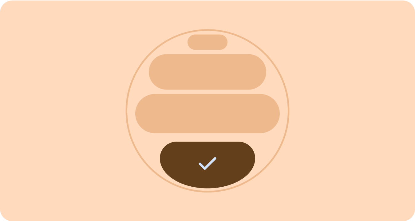
आकार लागू किया गया
कोने के रेडियस और यूनीक शेप का इस्तेमाल करके, डिज़ाइन को बेहतर बनाया गया है. इसमें लोड होने के दौरान दिखने वाले दिलचस्प ऐनिमेशन, दिलचस्प लेआउट, शेप बदलने वाले बटन, और अडैप्टिव बटन ग्रुप शामिल हैं.
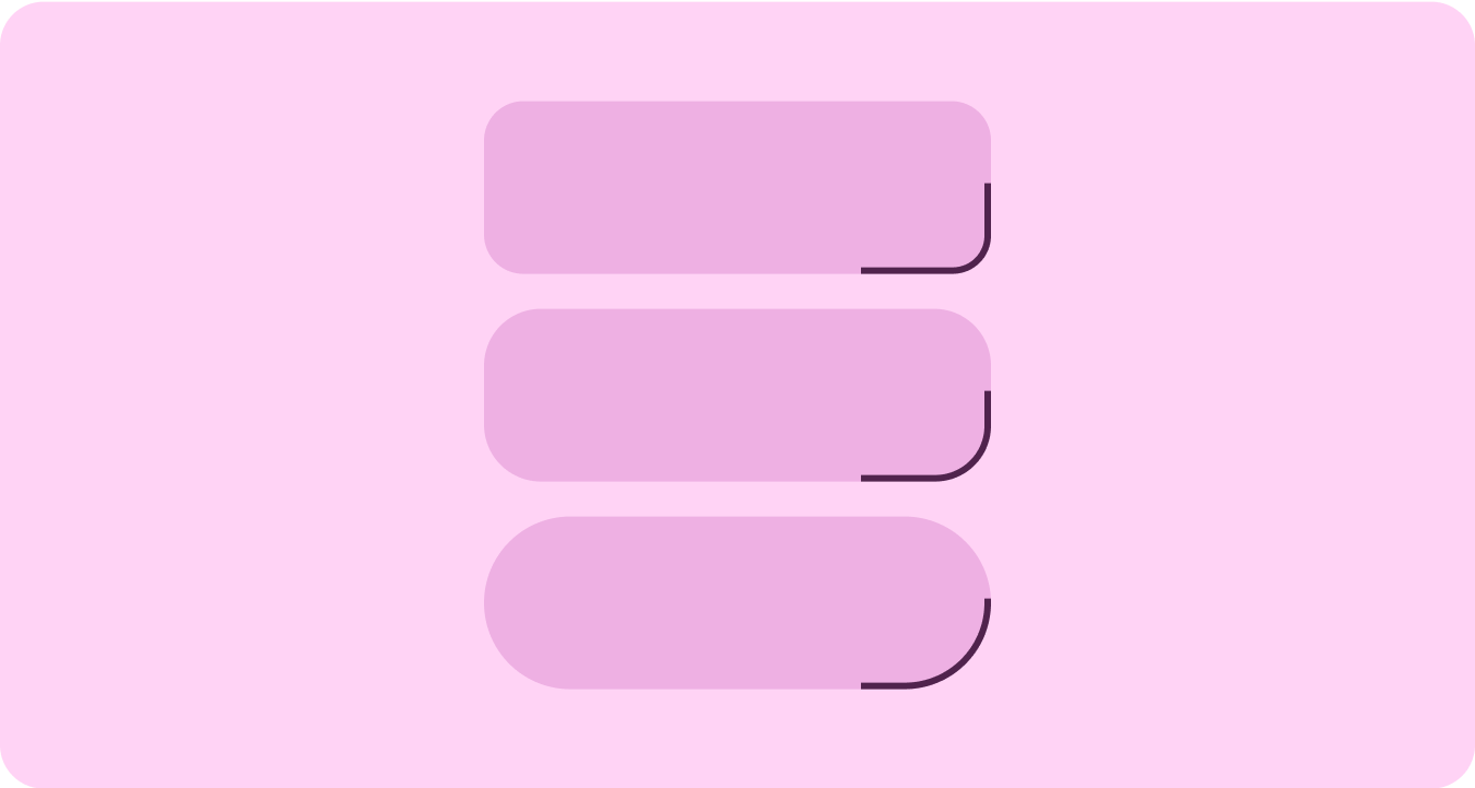
कॉर्नर रेडियस
कंटेनर के कॉर्नर के अलग-अलग शेप इस्तेमाल करके, उन्हें अलग-अलग बनाना और उनके बीच संबंध दिखाना.
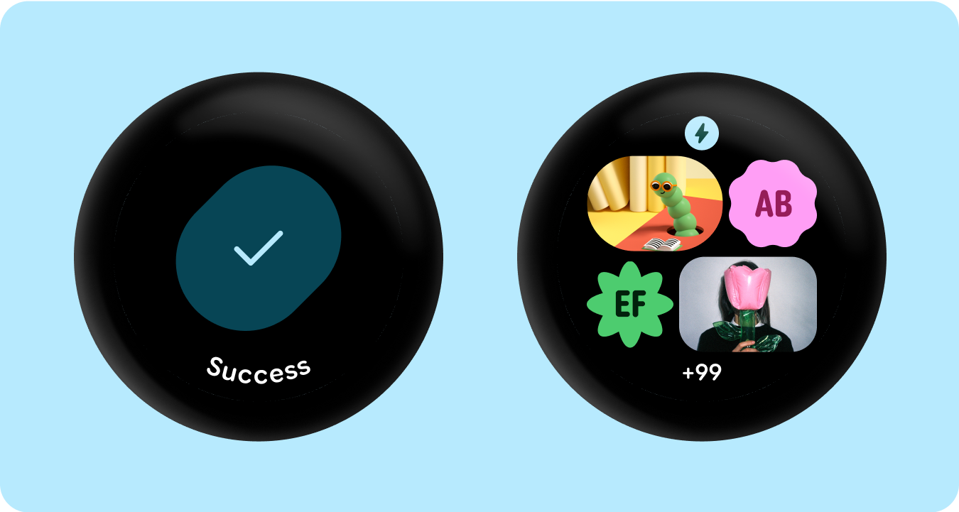
ग्रुप किए गए कंटेनर
कॉम्पोनेंट कंटेनर, लेआउट की अलग-अलग तकनीकों का इस्तेमाल करते हैं, ताकि वे उपलब्ध जगह के हिसाब से अपने-आप अडजस्ट हो सकें. वे इस स्पेस को सिमिट्री के लिए बराबर बांट सकते हैं या विज़ुअल हैरारकी बनाने, अहम कॉन्टेंट पर ज़ोर देने, और एक्सप्रेसिव और मोशन-लीड वाले विज़ुअल क्यू के ज़रिए उपयोगकर्ता के इंटरैक्शन को गाइड करने के लिए, एलिमेंट को रणनीतिक तरीके से व्यवस्थित कर सकते हैं.
इस पेज पर मौजूद कॉन्टेंट और कोड सैंपल कॉन्टेंट के लाइसेंस में बताए गए लाइसेंस के हिसाब से हैं. Java और OpenJDK, Oracle और/या इससे जुड़ी हुई कंपनियों के ट्रेडमार्क या रजिस्टर किए हुए ट्रेडमार्क हैं.
आखिरी बार 2025-07-27 (UTC) को अपडेट किया गया.
[[["समझने में आसान है","easyToUnderstand","thumb-up"],["मेरी समस्या हल हो गई","solvedMyProblem","thumb-up"],["अन्य","otherUp","thumb-up"]],[["वह जानकारी मौजूद नहीं है जो मुझे चाहिए","missingTheInformationINeed","thumb-down"],["बहुत मुश्किल है / बहुत सारे चरण हैं","tooComplicatedTooManySteps","thumb-down"],["पुराना","outOfDate","thumb-down"],["अनुवाद से जुड़ी समस्या","translationIssue","thumb-down"],["सैंपल / कोड से जुड़ी समस्या","samplesCodeIssue","thumb-down"],["अन्य","otherDown","thumb-down"]],["आखिरी बार 2025-07-27 (UTC) को अपडेट किया गया."],[],[],null,["# Material 3 Expressive design language\n\nMaterial 3 Expressive (M3) was built to meet user demand for experiences that\nare modern, relevant, and distinct. Expressive also allows designers to mirror\nspecific emotions and feelings in the layout and presentation of the interface.\n\nColor and typography\n--------------------\n\nThe [color system](/design/ui/wear/guides/styles/color/system) is expanding to adopt M3's deeper tonal palettes and a\nwider token set and the simpler typography scale is utilizing variable font axes\nfor more expression, making interactions more expressive and delightful.\n\n### Color theming\n\n\nThe [new tokens](/design/ui/wear/guides/styles/color/roles-tokens) allow for more color to be applied across different themes\nand in context of the design system as a whole. \n\n\u003cbr /\u003e\n\n### Variable fonts\n\n\nThe updated considerations for variable fonts and their customizable axis,\nextend beyond 1P to also serve 3P use cases such as Roboto Flex, which has a\nsimilar set of variable axis. \n\n\u003cbr /\u003e\n\n### Variable font axis in motion\n\n\nUtilizing variable font axis to signal expressive motion feedback and making\ninteractions more expressive and delightful to use.\n\nExample use-cases:\n\n- Dynamic font weight\n- Dynamic font width\n- Dynamic font weight and width \n\n\u003cbr /\u003e\n\n### Type roles\n\n\nAlong with an updated and optimized type scale, we are also introducing new type\nroles that specifically serve notable patterns on Wear.\n\nThese new type roles support several use cases---including Arc Text for surface\ntitles, proactive content with live space, and a type role specifically for\nNumerals---that allow for bigger and more styled text sizes for strings that don't\nneed to be localized. \n\n\u003cbr /\u003e\n\nShape and motion\n----------------\n\nWe are also leaning into shape language in a much more expansive and meaningful\nway by utilizing flexible container shapes to apply rounding and sharpening of\ncorner radius to support shape morphing lists and button states. We're\nintroducing edge-hugging buttons as a new ownable and iconic design pattern for\nround devices on Wear.\n\n### Edge-hugging containers\n\n\nIntroducing shape containers that embrace round and maximize the space within\nthe circular form factor. \n\n\u003cbr /\u003e\n\n### Shape applied\n\n\nUsing corner radius and unique shapes as containers to embrace expressive design\n---extending to delightful loading animations, interesting layouts, shape-morphing\nbuttons and adaptive button groups. \n\n\u003cbr /\u003e\n\n### Corner radius\n\n\nUtilizing Material 3 corner shapes to enable variety, distinction, and\nrelationship between container shapes. \n\n\u003cbr /\u003e\n\n### Grouped containers\n\n\nComponent containers use flexible layout techniques to dynamically adapt to\navailable space. They can distribute this space evenly for symmetry, or\nstrategically arrange elements to establish visual hierarchy, emphasize\nimportant content, and guide user interaction through expressive and motion-lead\nvisual cues. \n\n\u003cbr /\u003e"]]