
Wear Material 3 के एक्सप्रेसिव कलर सिस्टम में, मुख्य कॉम्पोनेंट के लिए तीन ऐक्सेंट लेयर (प्राइमरी, सेकंडरी, टर्शरी) और दो न्यूट्रल सर्फ़ेस लेयर का इस्तेमाल किया जाता है. हर भूमिका के लिए, कंट्रास्ट वाली वैल्यू की एक रेंज उपलब्ध होती है. इससे, किसी भी थीम पर एक जैसा अनुभव मिलता है. साथ ही, रंग के ऐसे कॉम्बिनेशन इस्तेमाल किए जा सकते हैं जो देखने में अच्छे लगें और आसानी से समझ में आएं.
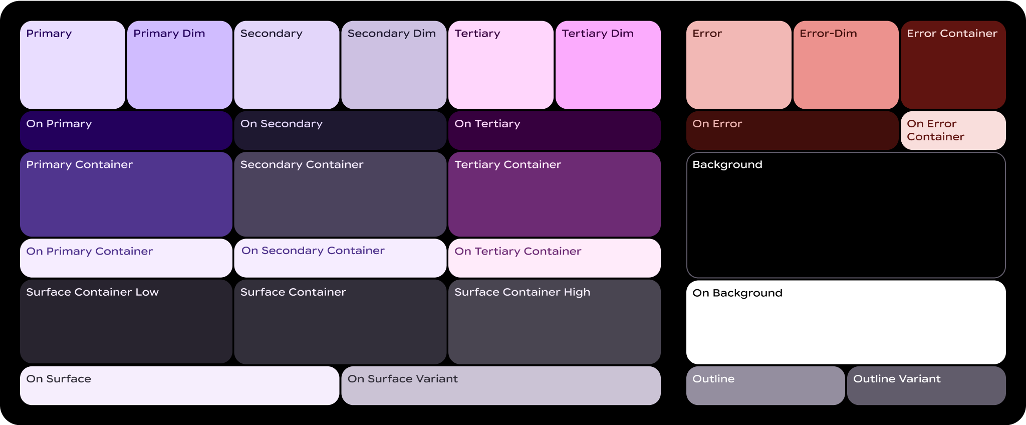
कलर रोल क्या होते हैं?
कलर रोल, पेंट-बाय-नंबर कैनवस में मौजूद "नंबर" की तरह होते हैं. ये यूज़र इंटरफ़ेस (यूआई) के एलिमेंट और उनके रंग के बीच संबंध बनाते हैं.
- कलर रोल, Material कॉम्पोनेंट के साथ मैप किए जाते हैं: आपको इन कलर रोल का इस्तेमाल करना होगा. भले ही, स्टैटिक बेसलाइन स्कीम या डाइनैमिक कलर का इस्तेमाल किया जा रहा हो. अगर आपके प्रॉडक्ट में कस्टम कॉम्पोनेंट शामिल हैं, तो उन्हें रंग की भूमिकाओं के इस सेट से सही तरीके से मैप करना होगा.
- रंगों की भूमिकाओं से सुलभता को बढ़ावा मिलता है: कलर सिस्टम को, रंगों के ऐसे कॉम्बिनेशन के आधार पर बनाया गया है जिन्हें आसानी से समझा जा सकता है. इन रंग के जोड़ों में, रंग का कंट्रास्ट कम से कम 3:1 होता है.
- कलर रोल को टोकन के तौर पर इस्तेमाल किया जाता है: रोल को डिज़ाइन और कोड में टोकन के ज़रिए लागू किया जाता है. डिज़ाइन टोकन, डिज़ाइन से जुड़ा एक छोटा और दोबारा इस्तेमाल किया जा सकने वाला फ़ैसला होता है. यह डिज़ाइन सिस्टम की विज़ुअल स्टाइल का हिस्सा होता है.
ज़रूरी शर्तें
यहां कुछ ऐसे मुख्य शब्द दिए गए हैं जो आपको कलर रोल के नामों में दिखेंगे:
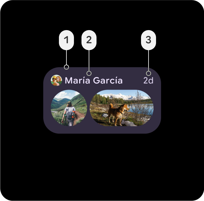
- सरफ़ेस: इस भूमिका का इस्तेमाल बैकग्राउंड के लिए किया जाता है. साथ ही, स्क्रीन के उन बड़े हिस्सों के लिए भी किया जाता है जिन पर कम ज़ोर दिया जाता है.
- प्राइमरी, सेकंडरी, टर्शरी: एक्सेंट कलर की भूमिकाएं, फ़ोरग्राउंड एलिमेंट पर ज़ोर देने या उन्हें कम अहमियत देने के लिए इस्तेमाल की जाती हैं.
- कंटेनर: इन भूमिकाओं का इस्तेमाल, फ़ोरग्राउंड एलिमेंट के लिए रंग भरने के तौर पर किया जाता है. जैसे, बटन. इनका इस्तेमाल टेक्स्ट या आइकॉन के लिए नहीं किया जाना चाहिए.
- ऑन: इस शब्द से शुरू होने वाली भूमिकाएं, टेक्स्ट या आइकॉन के लिए रंग दिखाती हैं. ये रंग, पैरंट कलर के ऊपर दिखते हैं. उदाहरण के लिए, प्राइमरी रंग का इस्तेमाल टेक्स्ट और आइकॉन के लिए किया जाता है. ये आइकॉन, प्राइमरी फ़िल कलर के बैकग्राउंड में दिखते हैं.
- वैरिएंट: इस शब्द से खत्म होने वाली भूमिकाएं, बिना वैरिएंट वाली भूमिकाओं के मुकाबले कम अहमियत वाली होती हैं. उदाहरण के लिए, आउटलाइन वैरिएंट, आउटलाइन कलर का कम हाइलाइट किया गया वर्शन होता है.
प्राइमरी रोल
प्राइमरी रोल का इस्तेमाल, यूज़र इंटरफ़ेस (यूआई) के मुख्य कॉम्पोनेंट के लिए किया जाता है. जैसे, एज हगिंग बटन, खास बटन, ऐक्टिव स्टेट, और टोनल बटन स्टाइल पर मौजूद आइकॉन.

मुख्य
- प्राइमरी
- On-Primary
यूज़र इंटरफ़ेस (यूआई) में सबसे ज़रूरी कार्रवाइयों के लिए, प्राइमरी भूमिका का इस्तेमाल करें. जैसे, प्राइमरी बटन या कॉल-टू-ऐक्शन. यह रंग अलग दिखना चाहिए, ताकि उपयोगकर्ता को मुख्य इंटरैक्शन के बारे में तुरंत पता चल सके.
Primary-Dim
- Primary-Dim
- On-Primary
डिम रोल का इस्तेमाल आम तौर पर उन एलिमेंट के लिए किया जाता है जिन्हें मुख्य कार्रवाई से अलग दिखाना होता है. हालांकि, इन पर उपयोगकर्ता का तुरंत ध्यान जाना या उनसे इंटरैक्ट करना ज़रूरी नहीं होता.
Primary-Container
- Primary-Container
- On-Primary-Container
कार्ड या मॉडल जैसे बैकग्राउंड एलिमेंट के लिए प्राइमरी कंटेनर लागू करें, ताकि सेक्शन या चुनी गई स्थितियों को हाइलाइट किया जा सके. इससे यूज़र इंटरफ़ेस (यूआई) में मौजूद अहम कॉन्टेंट या मौजूदा गतिविधियों पर ध्यान खींचने में मदद मिलती है.
सेकंडरी भूमिकाएं
सेकेंडरी भूमिकाओं का इस्तेमाल, यूज़र इंटरफ़ेस (यूआई) के मुख्य कॉम्पोनेंट के लिए किया जाता है. ये कॉम्पोनेंट, प्राइमरी भूमिका जितने ज़रूरी नहीं होते, लेकिन फिर भी इन्हें अलग से दिखाना होता है. लेआउट में प्राइमरी और सेकंडरी का एक साथ इस्तेमाल किया जा सकता है. इससे फ़ोकस करने और अंतर करने में मदद मिलती है.

सेकंडरी
- सेकंडरी
- ऑन-सेकंडरी
डेंस यूज़र इंटरफ़ेस (यूआई) वाले इलाकों में कार्रवाइयों को सपोर्ट करने के लिए, सेकंडरी भूमिका का इस्तेमाल करें. जैसे, सेकंडरी बटन या पूरक कार्रवाइयां. यह जटिल लेआउट में मुख्य एलिमेंट को छिपाए बिना, उन्हें दिखाता है.
Secondary-Dim
- Secondary-Dim
- सेकंडरी
सेकंडरी-डिम भूमिका, ज़्यादा घनत्व वाले क्षेत्रों में पैसिव एलिमेंट के लिए म्यूट किया गया कंट्रास्ट उपलब्ध कराती है. यह सेकंडरी कलर के साथ मिलकर काम करता है. साथ ही, इसमें हल्का सा डेप्थ जोड़ता है. इससे यूज़र इंटरफ़ेस (यूआई) साफ़ रहता है और लोगों को नेविगेट करने में मदद मिलती है.
Secondary-Container
- Secondary-Container
- On-Secondary-Container
डेंस लेआउट में सेकंडरी एलिमेंट को व्यवस्थित करने के लिए, Secondary-Container का इस्तेमाल करें. इससे स्ट्रक्चर और सेपरेशन बनता है. इससे यह पक्का होता है कि सेकंडरी कॉन्टेंट को अलग से पहचाना जा सके, लेकिन वह मुख्य कॉन्टेंट से ज़्यादा अहम न हो.
टर्शरी भूमिकाएं
टर्शियरी रोल का इस्तेमाल, प्राइमरी और सेकंडरी कलर को बैलेंस करने के लिए किया जाता है. इसके अलावा, इसका इस्तेमाल इनपुट फ़ील्ड जैसे किसी एलिमेंट पर ज़्यादा ध्यान खींचने के लिए भी किया जाता है. टेरशरी रोल से यह भी पता चल सकता है कि कॉन्टेंट में कब बदलाव हुआ है या उसे कब हाइलाइट किया जाना चाहिए. जैसे, किसी लक्ष्य के पूरा होने पर.

तीसरा
- टर्शरी
- On-Tertiary
टर्शरी भूमिका का इस्तेमाल, मुख्य एलिमेंट पर ध्यान खींचने के लिए किया जाता है. टर्शरी रोल, उन कॉम्पोनेंट के लिए खास तौर पर असरदार होते हैं जिन्हें अलग से दिखाना होता है. जैसे, बैज, स्टिकर या खास ऐक्शन वाले एलिमेंट.
Tertiary-Dim
- Tertiary-Dim
- टर्शरी
बटन या कार्रवाइयों के लिए, टर्शरी डिम रोल का इस्तेमाल करें. ये कार्रवाइयां टर्शरी कार्रवाइयों से जुड़ी होती हैं, लेकिन इन पर तुरंत फ़ोकस करने की ज़रूरत नहीं होती.
Tertiary-Container
- Tertiary-Container
- On-Tertiary-Container
ऐसे बैकग्राउंड के लिए Tertiary-Container का इस्तेमाल करें जो तीसरे पक्ष से जुड़े कॉन्टेंट को ग्रुप करते हैं. जैसे, बैज या स्टिकर के कलेक्शन. यह यूज़र इंटरफ़ेस (यूआई) में संतुलन और स्ट्रक्चर बनाए रखते हुए, तीसरे लेवल के एलिमेंट पर ज़ोर देता है.
सिमैंटिक रोल
Error-Red का इस्तेमाल, गंभीर समस्याओं को गड़बड़ी, मिटाने, और आपातकालीन स्थिति से जुड़ी किसी भी चीज़ के तौर पर दिखाने के लिए किया जाता है. इसे समस्याओं या चेतावनियों पर तुरंत ध्यान देने के लिए डिज़ाइन किया गया है. इससे यह पक्का होता है कि उपयोगकर्ता उन क्षेत्रों की तुरंत पहचान कर सकें जिनमें सुधार करने की ज़रूरत है. सुलभता के मानकों को पूरा करने के लिए, Error-Red टोन में बैकग्राउंड के मुकाबले इतना कंट्रास्ट होना चाहिए कि वह साफ़ तौर पर दिखे. साथ ही, वह चेतावनी या सफलता के मैसेज जैसे अन्य स्टेटस कलर से अलग दिखे.
गड़बड़ी
- कोई गड़बड़ी हुई
- On-Error
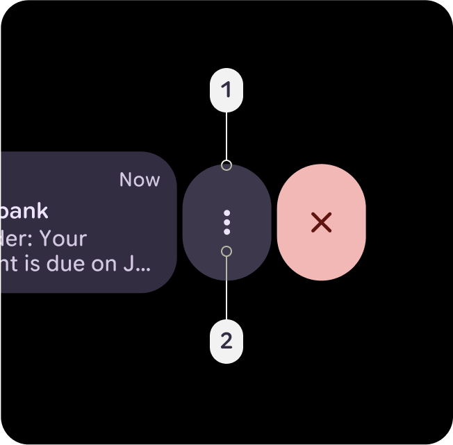
यह लाल रंग का ऐसा शेड है जो थीम के हिसाब से थोड़ा अलग है. इसका इस्तेमाल, हटाने, मिटाने, बंद करने या खारिज करने जैसी कार्रवाइयों के लिए किया जाता है. जैसे, स्वाइप करके दिखाना. इसे कंटेनर के विकल्प के तौर पर जोड़ा गया है. यह, गड़बड़ी वाले डाइमेंशन के रंग की तुलना में थोड़ा कम गंभीर और ज़रूरी है.
Error-Dim
- Error-Dim
- On-Error
यह सिमैंटिक है, लेकिन इसमें थीम के हिसाब से लाल रंग का हल्का शेड है. इससे ज़्यादा प्राथमिकता वाली गड़बड़ियों या आपातकालीन कार्रवाइयों के बारे में पता चलता है. जैसे, सुरक्षा से जुड़ी सूचनाएं, डायलॉग ओवरले काम नहीं कर रहे हैं या स्टॉप बटन काम नहीं कर रहे हैं.
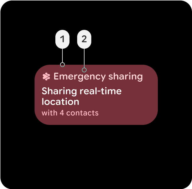
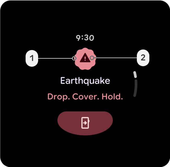
Error-Container
- Error-Container
- On-Error-Container
कंटेनर का रंग कम प्रमुखता वाला होता है. यह उन कॉम्पोनेंट के लिए होता है जिनमें गड़बड़ी की स्थिति दिखती है. यह चालू गड़बड़ी की स्थिति को भी दिखा सकता है. यह भरी हुई स्थिति की तुलना में कम इंटरैक्टिव होती है. जैसे, चालू आपातकालीन शेयरिंग बटन या कार्ड या गड़बड़ी वाले ओवरले डायलॉग पर.
सरफ़ेस कंटेनर और एलिवेशन
यूज़र इंटरफ़ेस (यूआई) में डेप्थ और एलिवेशन तय करने में, सर्फ़ेस कंटेनर अहम भूमिका निभाते हैं. ये रंग के ज़रिए स्ट्रक्चर और हैरारकी उपलब्ध कराते हैं. साथ ही, कॉम्पोनेंट को उनकी अहमियत और इंटरैक्शन के आधार पर अलग-अलग करने में मदद करते हैं.
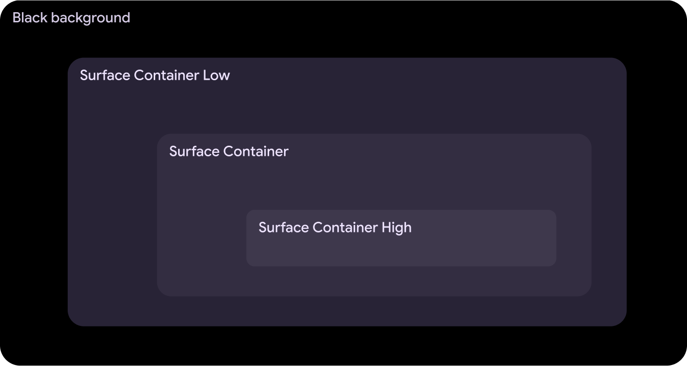
Surface-Container-Low
- Surface-Container-Low
- ऑन-सरफ़ेस
- On-Surface-Variant
यह ऐसे बड़े कंटेनर के लिए सबसे सही है जिसे Surface-Container के नीचे रखना है. जैसे, सूचना में बड़ा किया गया कार्ड. इसका इस्तेमाल ऐसे नॉन-इंटरैक्टिव कार्ड के लिए भी किया जा सकता है जिनमें कॉन्टेंट को कंटेनमेंट से फ़ायदा मिलता है.
Surface-Container
- Surface-Container
- ऑन-सरफ़ेस
- On-Surface-Variant
ज़्यादातर एलिमेंट के लिए, कंटेनर का डिफ़ॉल्ट रंग. यह सामान्य यूज़र इंटरफ़ेस (यूआई) कॉम्पोनेंट के लिए सही है. इसमें न तो ज़्यादा और न ही कम एलिवेशन होता है.
Surface-Container-High
- Surface-Container-High
- ऑन-सरफ़ेस
- On-Surface-Variant
यह ऐसे कॉम्पोनेंट के लिए सबसे सही है जिन पर ज़्यादा ज़ोर देना है और जिन्हें Surface-Container के ऊपर या उसके साथ इस्तेमाल करना है. इस रंग से, यूज़र इंटरफ़ेस (यूआई) के मुख्य हिस्सों पर फ़ोकस करने और उन्हें क्रम से लगाने में मदद मिलती है.