
Material 3 Expressive leans into shape language in a much more expansive and meaningful way by utilizing flexible container shapes to apply rounding and sharpening of corner radii to support shape morphing lists and button states. The design system also introduces edge-hugging buttons as an ownable and iconic design pattern for round devices on Wear OS.
Maintain UI element scaling
When designing layouts on a round screen, scrolling and non-scrolling views each have unique requirements to maintain UI element scaling and preserve a balanced layout and composition.
Scrolling views
For scrolling views, use percentages to define all top, bottom, and side margins to avoid clipping and provide proportional scaling of elements.
All top, bottom, and side margins should be defined in percentages to avoid clipping and provide proportional scaling of elements.
Non-scrolling views
For non-scrolling views, use percentages and vertical constraints for all margins. That way, the main content in the middle can stretch to fill the available area.
All margins should be defined in percentages and vertical constraints should be defined such that the main content in the middle can stretch to fill the available area.
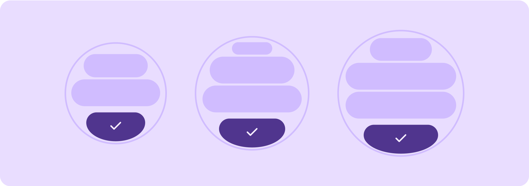
Tiers of quality guidelines
Our quality guidelines are organized into three tiers. Enable the best possible experience for your users by meeting guidelines in all three tiers.

Ready for all screen sizes
Ensure your app is delivering a quality experience across all screen sizes. Create layouts that fully use the available app space.

Responsive and optimized
Deliver more content to users on devices which allow for it, and utilize responsive layouts that automatically adapt to different screen sizes.

Adaptive and differentiated
Make the most of additional real estate by utilizing breakpoints to offer powerful new experiences on larger screens which are not possible on devices with smaller screens.