เลย์เอาต์ทั่วไปสําหรับแอปที่เลื่อนได้
จัดทุกอย่างให้เป็นระเบียบอยู่เสมอด้วยคอลเล็กชัน
บันทึกและจัดหมวดหมู่เนื้อหาตามค่ากำหนดของคุณ
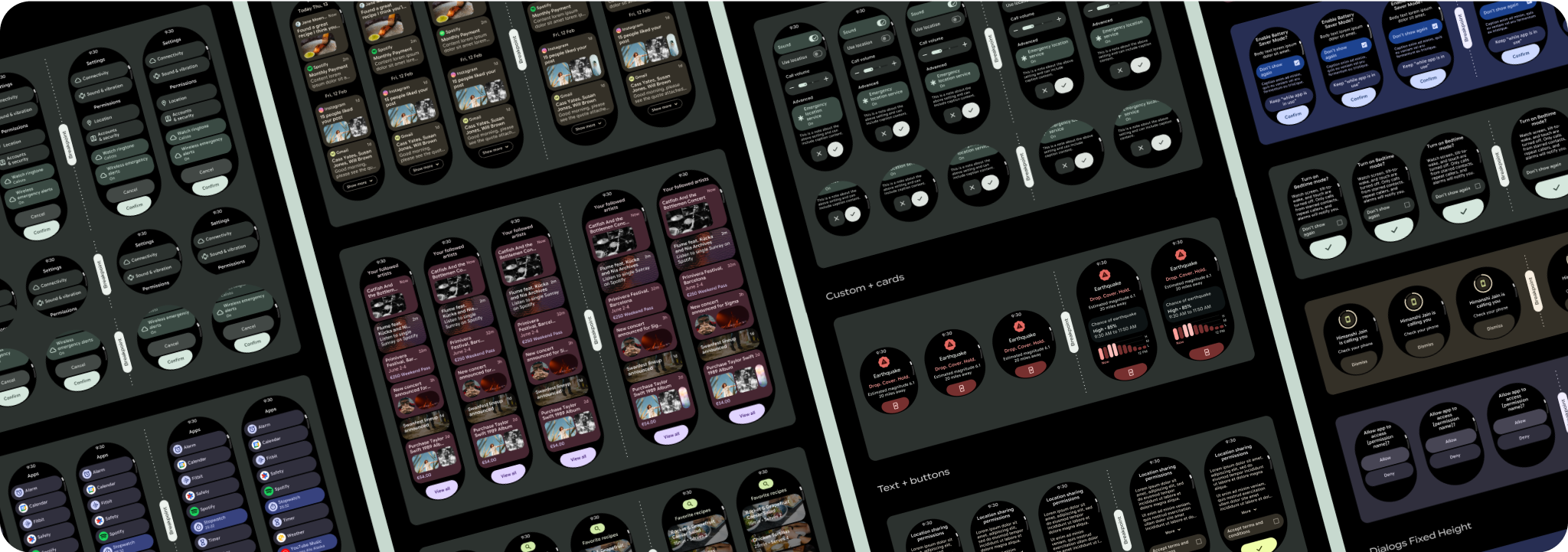
เลย์เอาต์มุมมองแอปแบบเลื่อนประกอบด้วยรายการ (TransformingLazyColumn
) และกล่องโต้ตอบ
เลย์เอาต์เหล่านี้ประกอบกันเป็นหน้าจอแอปส่วนใหญ่ และแสดงถึงคอลเล็กชันคอมโพเนนต์ที่ต้องปรับให้เข้ากับหน้าจอขนาดใหญ่ขึ้น ตรวจสอบว่าคอมโพเนนต์ปรับเปลี่ยนตามพื้นที่โฆษณา กล่าวคือ คอมโพเนนต์มีขนาดเท่ากับความกว้างที่มีและใช้TransformingLazyColumn
การปรับเมื่อความสูงของหน้าจอมีมากขึ้น เลย์เอาต์เหล่านี้สร้างขึ้นให้ปรับเปลี่ยนขนาดได้อยู่แล้ว และเรามีคำแนะนำเพิ่มเติมเพื่อใช้ประโยชน์จากพื้นที่โฆษณาที่ขยายใหญ่ขึ้น

สร้างการออกแบบที่ปรับเปลี่ยนตามอุปกรณ์และเพิ่มประสิทธิภาพ
เราได้อัปเดตลักษณะการทํางานของเลย์เอาต์และคอมโพเนนต์เพื่อให้มีลักษณะการทํางานที่ปรับเปลี่ยนตามอุปกรณ์โดยค่าเริ่มต้น รวมถึงระยะขอบและระยะห่างจากขอบแบบเปอร์เซ็นต์ เพื่อช่วยให้คุณปรับเลย์เอาต์การออกแบบให้เหมาะกับหน้าจอขนาดใหญ่ได้ ในการแก้ไขปัญหานี้ เราได้อัปเดตเลย์เอาต์และคอมโพเนนต์ของไลบรารี UI ของ Android ให้มีลักษณะการทํางานแบบปรับเปลี่ยนตามอุปกรณ์โดยค่าเริ่มต้น รวมถึงระยะขอบและการเว้นวรรคตามเปอร์เซ็นต์ หากใช้คอมโพเนนต์ Compose คุณจะรับการตอบสนองนี้โดยอัตโนมัติ
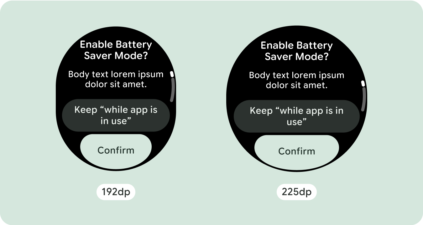
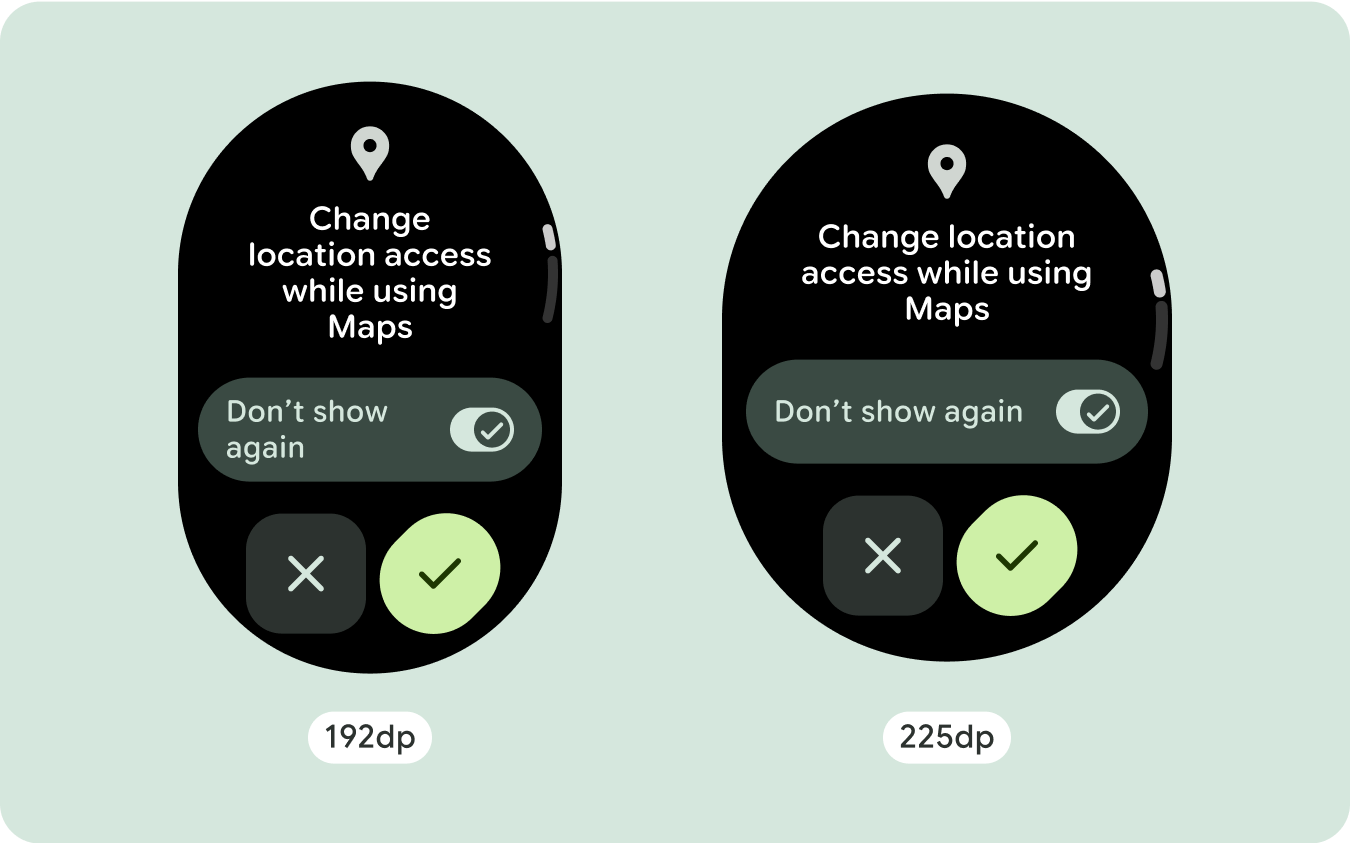
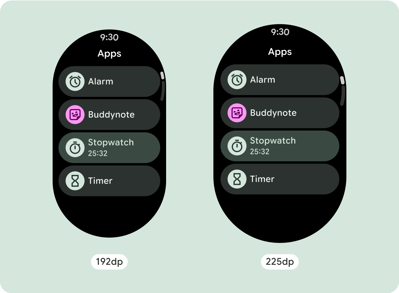
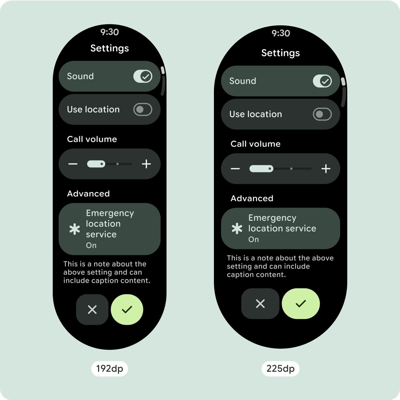
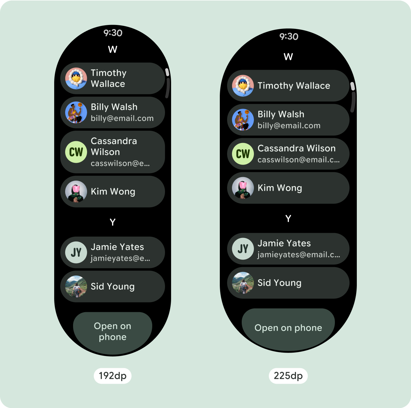
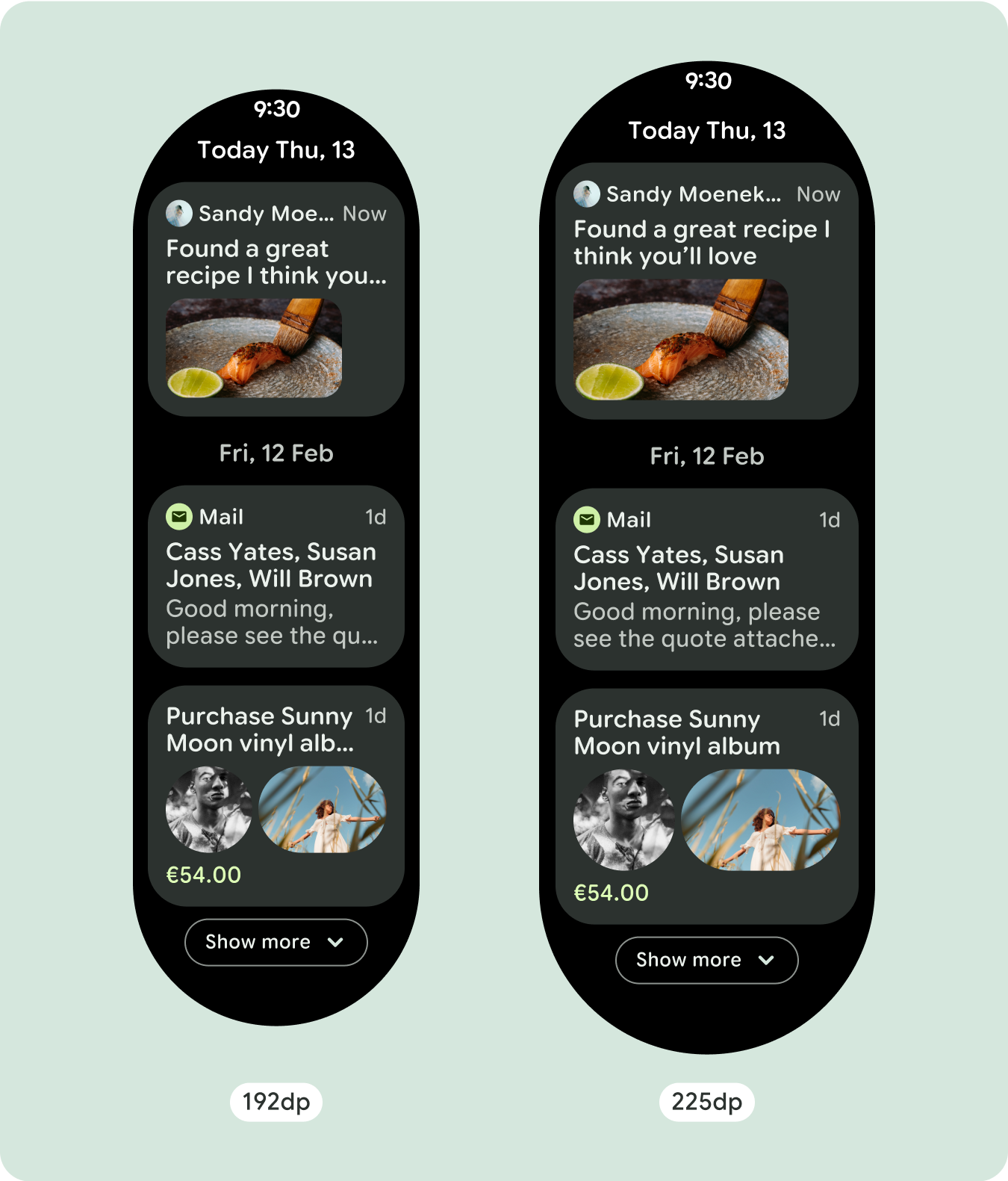
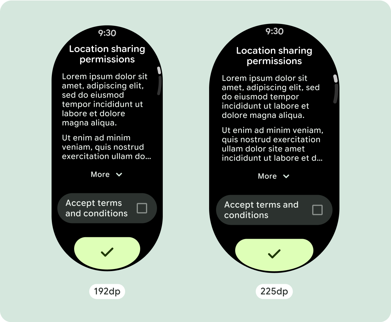
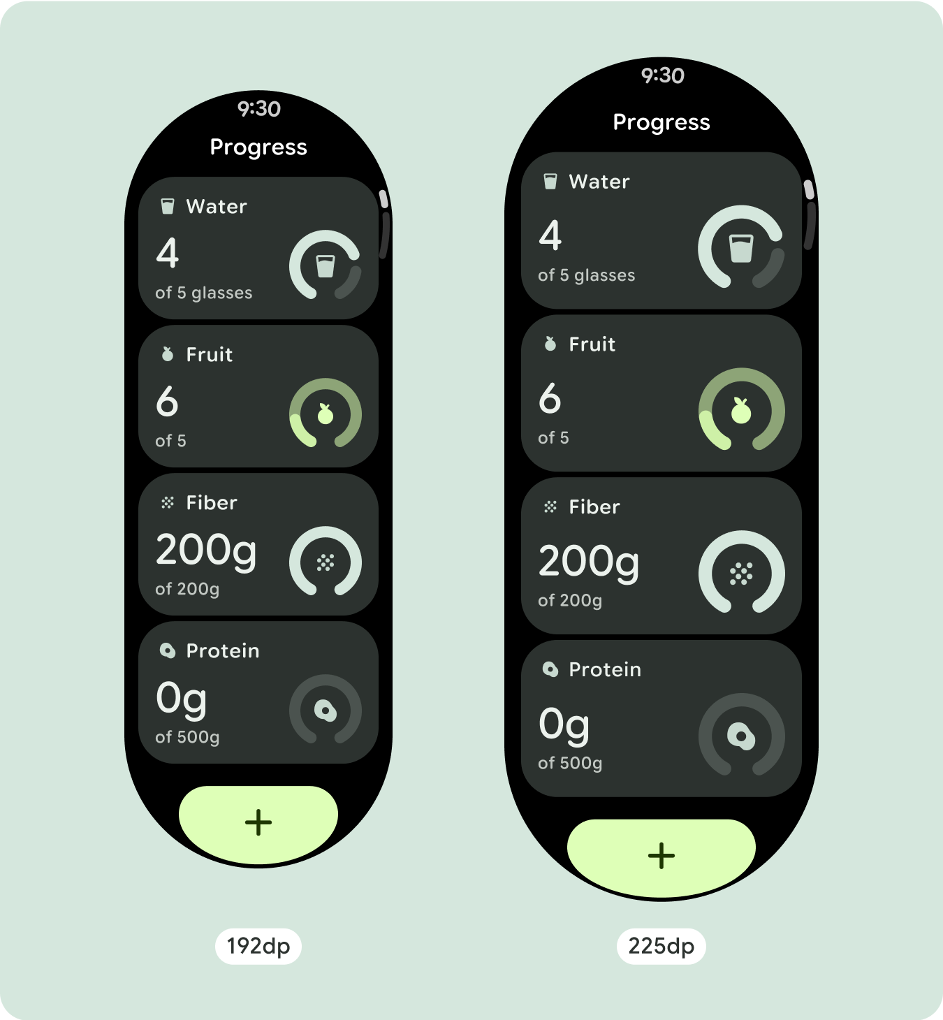
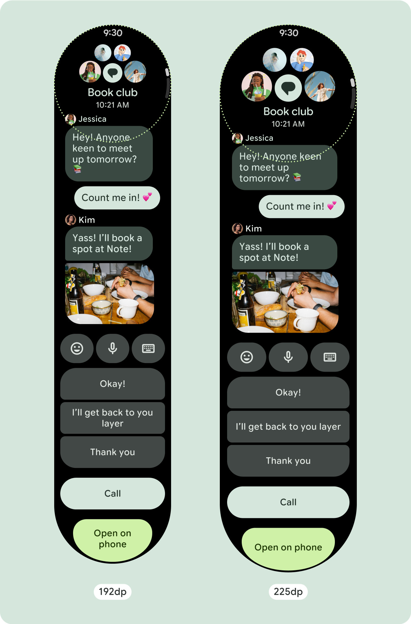
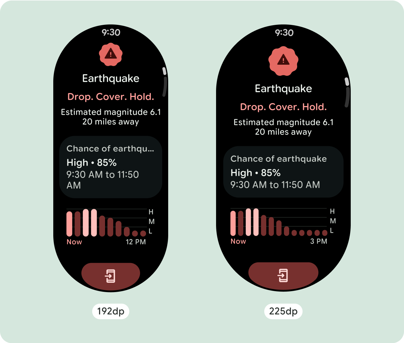
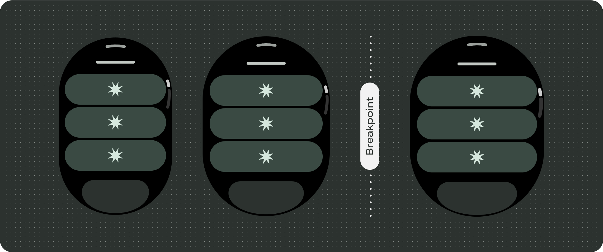
สำหรับการออกแบบหน้าจอที่ไม่ซ้ำกัน ให้ทดสอบอย่างละเอียดในหน้าจอขนาดต่างๆ เพื่อให้แน่ใจว่าคอมโพเนนต์และองค์ประกอบต่างๆ จะปรับขนาดได้อย่างราบรื่นและหลีกเลี่ยงการครอบตัดเนื้อหา ส่วนต่างของเปอร์เซ็นต์ช่วยให้ตัวเว้นวรรคปรับขนาดได้อย่างมีประสิทธิภาพ และเราขอแนะนำให้ใช้จุดแบ่งที่ 225dp เพื่อแสดงข้อมูลเพิ่มเติมและฟังก์ชันการทำงานที่มีประสิทธิภาพมากขึ้นบนหน้าจอนาฬิกาขนาดใหญ่
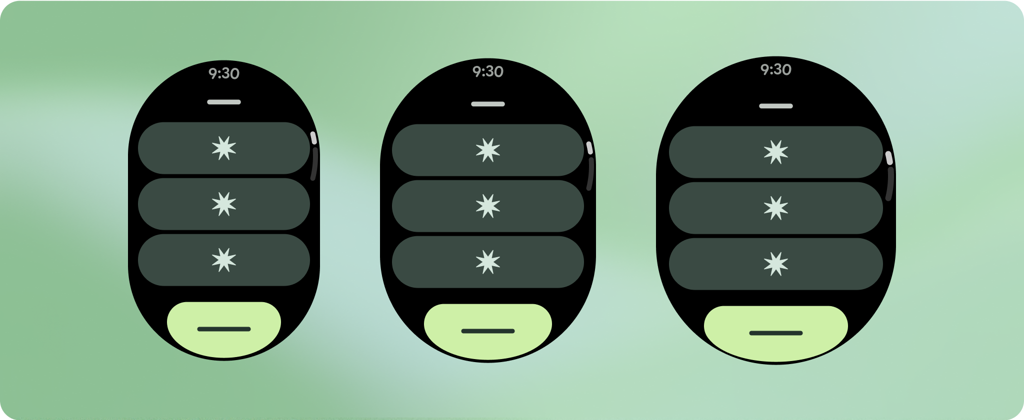
ตรวจสอบว่าคอมโพเนนต์เต็มความกว้างที่มีอยู่
ส่วนประกอบทั้งหมดสร้างขึ้นแบบตอบสนอง ซึ่งหมายความว่าจะเติมเต็มความกว้างและความสูงที่มีอยู่ ตรวจสอบว่าคุณมีระยะขอบที่จำเป็นเพื่อให้เนื้อหาไม่ถูกตัดออกโดยหน้าจอที่ปัดมุม
แสดงอักขระข้อความเพิ่มเติม
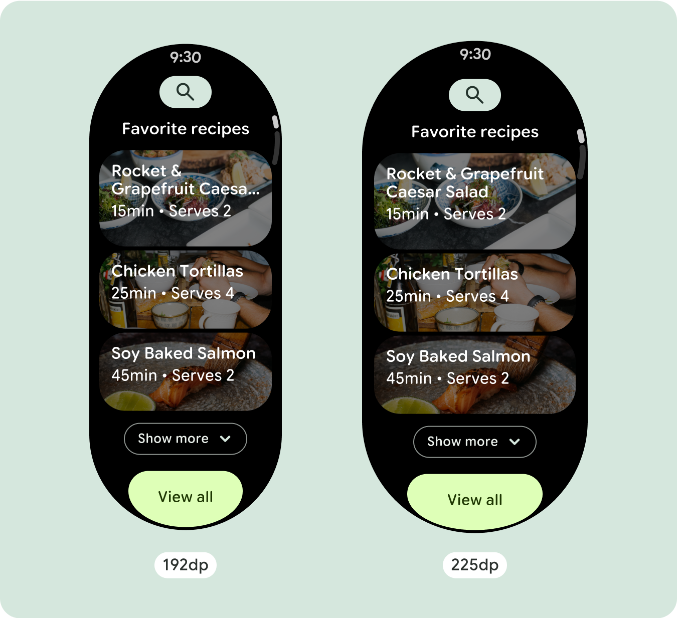
ส่วนประกอบส่วนใหญ่จะมีกล่องข้อความที่เติมเต็มความกว้างที่มีอยู่ ซึ่งหมายความว่าข้อความจะมีจำนวนอักขระเพิ่มขึ้นโดยอัตโนมัติเมื่อความกว้างของหน้าจอเพิ่มขึ้น
สร้างการออกแบบที่ปรับเปลี่ยนได้และมีความแตกต่างกัน
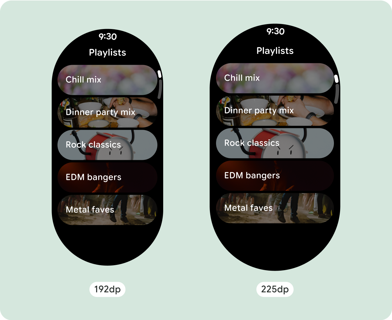
เนื่องจากเลย์เอาต์แบบเลื่อนจะแสดงเนื้อหาที่ซ่อนอยู่ก่อนหน้านี้ใต้รอยพับของหน้าจอโดยอัตโนมัติ คุณจึงไม่ต้องทำอะไรมากนักเพื่อเพิ่มมูลค่า คอมโพเนนต์แต่ละรายการจะเติมเต็มความกว้างที่มีอยู่ และในบางกรณี คอมโพเนนต์อาจมีแถวข้อความเพิ่มเติม (เช่น การ์ด) หรือคอมโพเนนต์อาจยืดออกเพื่อเติมเต็มความกว้างที่มีอยู่ (เช่น ปุ่มไอคอน)
หากต้องการใช้พื้นที่เพิ่มเติมในหน้าจอขนาดใหญ่ให้คุ้มค่าที่สุด ให้เพิ่มจุดหยุดแสดงขนาดที่ 225dp จุดพักนี้ช่วยให้คุณแสดงเนื้อหาเพิ่มเติม ใส่ปุ่มหรือข้อมูลอื่นๆ หรือเปลี่ยนเลย์เอาต์ให้เหมาะกับหน้าจอขนาดใหญ่ได้ ซึ่งต้องใช้การออกแบบที่แตกต่างกันสำหรับจุดพักแต่ละจุด การออกแบบหน้าจอขนาดใหญ่ (225+) อาจรวมองค์ประกอบเพิ่มเติมต่อไปนี้
เพิ่มขนาดหรือเปลี่ยนสถานะของคอมโพเนนต์ที่มีอยู่
ซึ่งอาจทำเพื่อแสดงรายละเอียดเพิ่มเติมหรือทำให้เนื้อหาดูง่ายขึ้น
เลย์เอาต์ที่เพิ่มประสิทธิภาพและมีความแตกต่างกัน
เลย์เอาต์อาจเปลี่ยนแปลงเล็กน้อยหลังจากจุดพัก 225dp เพื่อให้เนื้อหาด้านบนของหน้าจอในมุมมองเริ่มต้นได้รับการเพิ่มประสิทธิภาพ แต่เนื้อหาเดียวกันทั้งหมดที่อยู่ด้านล่างของหน้าจอควรยังคงใช้งานได้ไม่ว่าจะมีขนาดหน้าจอเท่าใดก็ตาม
ลักษณะการทํางานที่ปรับเปลี่ยนได้
คอมโพเนนต์ทั้งหมดในไลบรารี Compose จะปรับให้เข้ากับขนาดหน้าจอที่กว้างขึ้นโดยอัตโนมัติ รวมถึงเพิ่มความกว้างและความสูง มุมมองการเลื่อนที่ใช้แนวทางการออกแบบที่ปรับเปลี่ยนตามอุปกรณ์มักจะปรับให้เหมาะกับขนาดหน้าจอที่หลากหลาย อย่างไรก็ตาม ในบางกรณีพิเศษ คุณสามารถใช้จุดหยุดพักเพื่อลบล้างมิติข้อมูลและเพิ่มเลย์เอาต์ ซึ่งจะขยายฟังก์ชันการทำงาน ปรับปรุงการมองเห็นได้อย่างรวดเร็ว หรือทำให้เนื้อหาพอดีกับหน้าจอมากขึ้น
ควรกำหนดระยะขอบด้านบน ด้านล่าง และด้านข้างทั้งหมดเป็นเปอร์เซ็นต์เพื่อหลีกเลี่ยงการตัดออกและปรับขนาดองค์ประกอบตามสัดส่วน โปรดทราบว่า PositionIndicator
จะปรากฏขึ้นเมื่อผู้ใช้เลื่อน และจะแนบไปกับขอบของหน้าจอโดยอัตโนมัติไม่ว่าจะมีขนาดเท่าใดก็ตาม
เช็กลิสต์
- ใช้ระยะขอบด้านบน ด้านล่าง และด้านข้างที่แนะนํา
- กําหนดระยะขอบด้านนอกเป็นค่าเปอร์เซ็นต์เพื่อป้องกันการตัดออกที่จุดเริ่มต้นและจุดสิ้นสุดของคอนเทนเนอร์ที่เลื่อนได้
- ใช้ระยะขอบในค่า DP แบบคงที่ระหว่างองค์ประกอบ UI
- ลองใช้จุดหยุดพักที่ 225dp เพื่อแสดงเนื้อหาเพิ่มเติมหรือทำให้เนื้อหาที่มีอยู่ดูได้ง่ายขึ้นเมื่อใช้หน้าจอขนาดใหญ่

สร้างประสบการณ์ที่แตกต่าง
มุมมองการเลื่อนปรับแต่งได้เป็นอย่างมาก โดยสามารถเพิ่มคอมโพเนนต์ใดก็ได้ตามลำดับที่ต้องการ ระยะขอบด้านบนและด้านล่างอาจเปลี่ยนแปลงได้ ทั้งนี้ขึ้นอยู่กับคอมโพเนนต์ที่วางไว้ที่ด้านบนและด้านล่าง เพื่อป้องกันไม่ให้เนื้อหาถูกตัดออกโดยส่วนโค้งที่เพิ่มขึ้นของหน้าจอ

ตัวอย่างเนื้อหาและโค้ดในหน้าเว็บนี้ขึ้นอยู่กับใบอนุญาตที่อธิบายไว้ในใบอนุญาตการใช้เนื้อหา Java และ OpenJDK เป็นเครื่องหมายการค้าหรือเครื่องหมายการค้าจดทะเบียนของ Oracle และ/หรือบริษัทในเครือ
อัปเดตล่าสุด 2025-07-27 UTC
[[["เข้าใจง่าย","easyToUnderstand","thumb-up"],["แก้ปัญหาของฉันได้","solvedMyProblem","thumb-up"],["อื่นๆ","otherUp","thumb-up"]],[["ไม่มีข้อมูลที่ฉันต้องการ","missingTheInformationINeed","thumb-down"],["ซับซ้อนเกินไป/มีหลายขั้นตอนมากเกินไป","tooComplicatedTooManySteps","thumb-down"],["ล้าสมัย","outOfDate","thumb-down"],["ปัญหาเกี่ยวกับการแปล","translationIssue","thumb-down"],["ตัวอย่าง/ปัญหาเกี่ยวกับโค้ด","samplesCodeIssue","thumb-down"],["อื่นๆ","otherDown","thumb-down"]],["อัปเดตล่าสุด 2025-07-27 UTC"],[],[],null,["# Common layouts for scrolling apps\n\nScrolling app view layouts include lists (`TransformingLazyColumn`) and dialogs.\nThese layouts make up the majority of app screens, and they represent a\ncollection of components which need to adapt to larger screen sizes. Check that\nthe components are responsive---that is, that they fill the available width and\nadopt the `TransformingLazyColumn` adjustments when more of the screen's height\nis available. These layouts are built responsively already, and we have some\nadditional recommendations to take further advantage of the expanded real\nestate.\n\nBuild responsive and optimized designs\n--------------------------------------\n\nTo help your design layouts adapt to larger screen sizes, we have updated the\nbehavior of our layouts and components to have built-in responsive behavior,\nincluding percentage-based margins and padding. To address this, we have updated\nour Android UI library layouts and components with built-in responsive behavior,\nincluding percentage-based margins and padding. If you're utilizing our Compose\ncomponents, you can automatically inherit this responsiveness.\n\nFor unique screen designs, thoroughly test across a variety of screen sizes,\nensuring components and elements adapt smoothly and avoid content clipping. Our\npercentage margins help spacers scale effectively, and we recommend using a\nbreakpoint at 225dp to introduce additional information and enhanced\nfunctionality on larger watch screens.\n\n### Check that components fill the available width\n\n\nAll components are built responsively, meaning they fill the available width and\nheight. Make sure you have the necessary margins to ensure content doesn't get\nclipped by the rounding screen. \n\n\n\u003cbr /\u003e\n\n### Show additional text characters\n\n\nMost components have text boxes which fill the available width. This means that\nthey automatically gain character counts as the screen width increases. \n\n\n\u003cbr /\u003e\n\nBuild adaptive and differentiated designs\n-----------------------------------------\n\nAs scrolling layouts will automatically show more of what was previously hidden\nbelow the screen fold, there isn't much you need to do to add value. Each\ncomponent fills the available width, and in some cases, a component might gain\nadditional rows of text (such as cards), or components stretch to fill the\navailable width (such as icon buttons).\n\nTo best use the additional space on larger screen sizes, add a size breakpoint\nat 225dp. This breakpoint makes it possible to reveal additional content,\ninclude more buttons or data, or change the layout to better suit the larger\nscreen. This requires a different design for each breakpoint. The larger screen\ndesign (225+) could include the following additional elements:\n\n### Increase the size or change the state of the existing components\n\n\nThis could be done in order to show more detail or make the content more\nglanceable. \n\n\u003cbr /\u003e\n\n### Optimized and differentiated layouts\n\n\nThe layout can alter slightly after the 225dp breakpoint, so that the content\nabove the fold in the default view is optimized, however all of the same content\nbelow the fold should still be available regardless of screen size. \n\n\u003cbr /\u003e\n\nResponsive and adaptive behavior\n--------------------------------\n\nAll components in the Compose library will automatically adapt to the wider\nscreen size, and gain width and height. Scroll views that use responsive design\npractices usually adapt to a range of screen sizes. However, in some special\ncases, you can use a breakpoint to override dimensions and augment layouts which\nexpand functionality, improve glanceability, or make content fit better on\nscreen.\n\nAll top, bottom, and side margins should be defined in percentages to avoid\nclipping and provide proportional scaling of elements. Consider that the\n`PositionIndicator` appears when the user scrolls, and it automatically hugs the\nscreen's bezel no matter its size.\n\n### Checklist\n\n- Apply the recommended top, bottom, and side margins.\n- Define outer margins in percentage values to prevent clipping at the beginning and end of the scrollable container.\n- Apply margins in fixed DP values between UI elements.\n- Consider applying a breakpoint at 225dp to introduce additional content or make existing content more glanceable when on bigger screen sizes.\n\nCreate differentiated experiences\n---------------------------------\n\nScrolling views are highly customizable, with the ability to add any combination\nof components in any order. The top and bottom margins can change depending on\nwhich components sit at the top and bottom. This is to prevent content from\nbeing clipped by the growing curve of the screen."]]