เลย์เอาต์ทั่วไปสําหรับแอปที่เลื่อนไม่ได้
จัดทุกอย่างให้เป็นระเบียบอยู่เสมอด้วยคอลเล็กชัน
บันทึกและจัดหมวดหมู่เนื้อหาตามค่ากำหนดของคุณ
เลย์เอาต์มุมมองแอปที่เลื่อนไม่ได้ ได้แก่ โปรแกรมเล่นสื่อ กล่องโต้ตอบการยืนยัน เครื่องมือเลือก ตัวสลับ และหน้าจอฟิตเนสหรือการติดตามพิเศษที่ใช้ตัวบ่งชี้ความคืบหน้า คุณสามารถจำกัดความสูงของหน้าจอใดก็ได้ ซึ่งจะช่วยให้ผู้ใช้มุ่งเน้นที่งานหรือชุดการควบคุมหนึ่งๆ แทนที่จะต้องเรียกดูรายการตัวเลือก ออกแบบโดยคำนึงถึงขนาดที่จำกัดเพื่อรองรับอุปกรณ์ที่มีหน้าจอขนาดเล็ก ตรวจสอบว่าข้อมูลอ่านได้อย่างรวดเร็ว และยอมรับหน้าจอกลมตามความเกี่ยวข้อง

สร้างการออกแบบที่ปรับเปลี่ยนตามอุปกรณ์และเพิ่มประสิทธิภาพ
มุมมองแบบไม่เลื่อนจะเน้นที่ข้อมูลที่สามารถดูได้อย่างรวดเร็วและมอบคุณค่าแก่ผู้ใช้ด้วยการโต้ตอบเพียงเล็กน้อย อย่างไรก็ตาม การสร้างลักษณะการปรับเปลี่ยนตามอุปกรณ์ในเลย์เอาต์เหล่านี้อาจเป็นเรื่องยาก ด้วยเหตุนี้ เราจึงได้อัปเดตไลบรารี UI ของ Android เลย์เอาต์ และคอมโพเนนต์ให้มีลักษณะการทํางานแบบปรับเปลี่ยนตามพื้นที่โฆษณาในตัว รวมถึงระยะขอบและระยะห่างจากขอบตามเปอร์เซ็นต์ หากใช้คอมโพเนนต์ Compose คุณจะรับการตอบสนองนี้โดยอัตโนมัติ
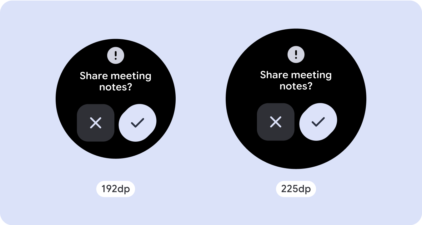
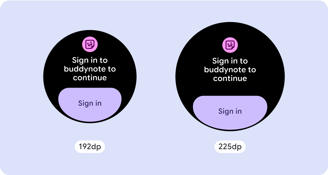
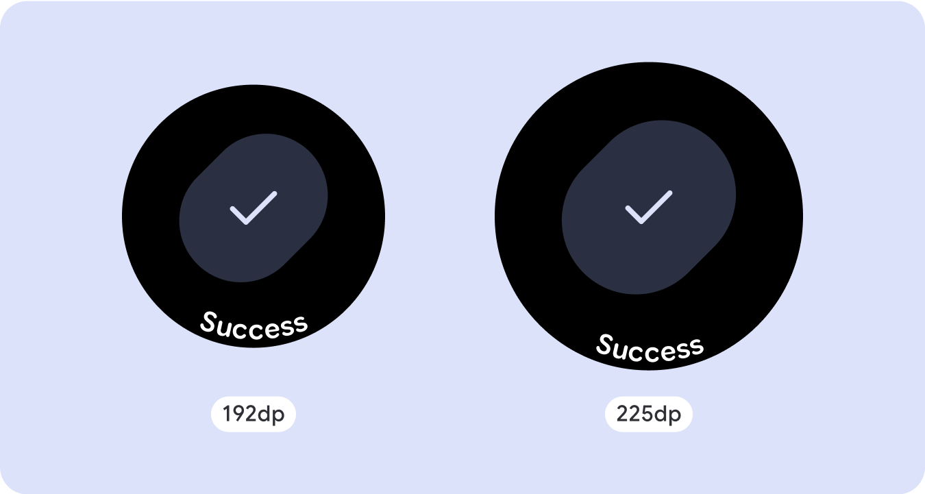
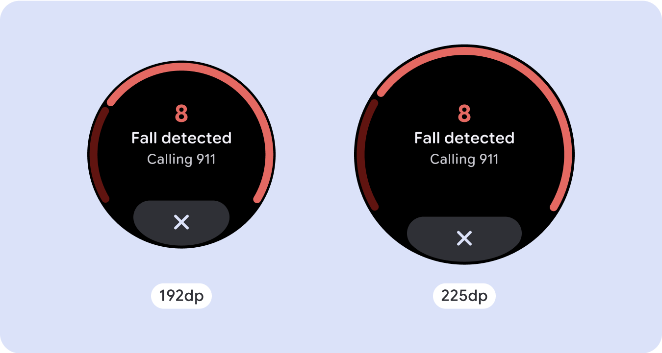
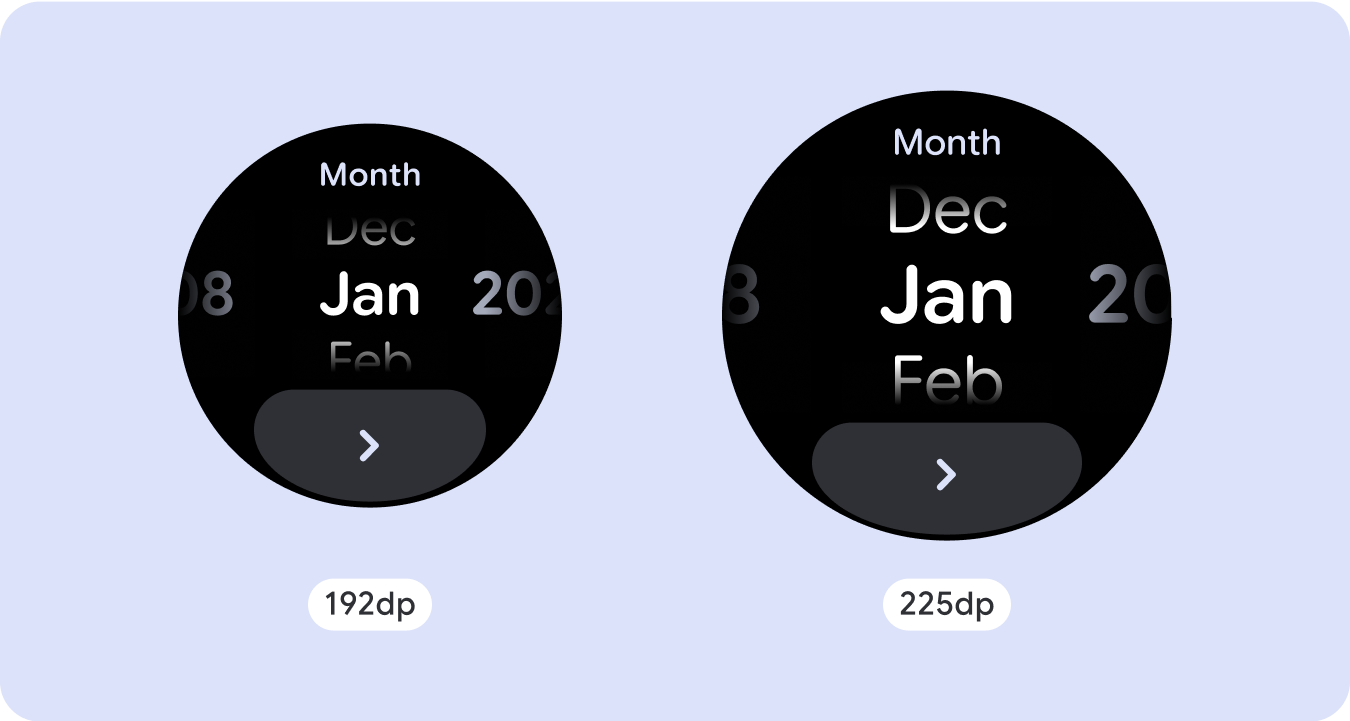
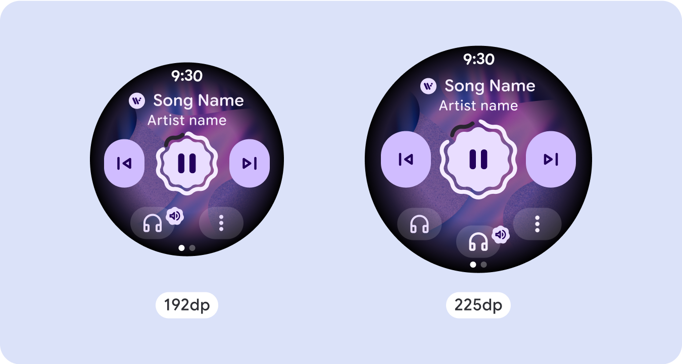
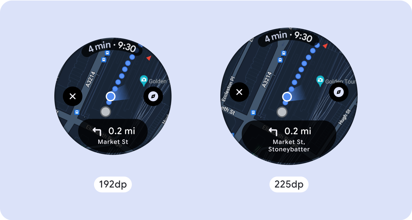
สำหรับการออกแบบหน้าจอที่ไม่ซ้ำกัน ให้ทดสอบอย่างละเอียดในหน้าจอขนาดต่างๆ เพื่อให้แน่ใจว่าคอมโพเนนต์และองค์ประกอบต่างๆ จะปรับขนาดได้อย่างราบรื่นและหลีกเลี่ยงการครอบตัดเนื้อหา ส่วนต่างของเปอร์เซ็นต์ช่วยให้ตัวเว้นวรรคปรับขนาดได้อย่างมีประสิทธิภาพ และเราขอแนะนำให้ใช้จุดแบ่งที่ 225dp เพื่อแสดงข้อมูลเพิ่มเติมและฟังก์ชันการทำงานที่มีประสิทธิภาพมากขึ้นบนหน้าจอนาฬิกาขนาดใหญ่
ตรวจสอบว่าคอมโพเนนต์ปรับขนาดให้เข้ากับความกว้างและความสูงที่มีอยู่
คอมโพเนนต์ทั้งหมดสร้างขึ้นแบบปรับเปลี่ยนตามอุปกรณ์ ซึ่งหมายความว่าจะปรับให้เข้ากับความกว้าง (และความสูงเมื่อแสดงแบบเต็มหน้าจอ) ที่พร้อมใช้งาน ตรวจสอบว่าคุณมีระยะขอบที่จำเป็นเพื่อให้เนื้อหาไม่ถูกตัดออกโดยเส้นโค้งมนของหน้าจอ
นอกจากนี้ โปรดตรวจสอบลักษณะการทํางานของเลย์เอาต์ที่จําเป็นเพื่อให้เนื้อหาบนหน้าจอแบบไม่เลื่อนไม่ทําให้เลย์เอาต์เลื่อนหรือถูกตัดออก
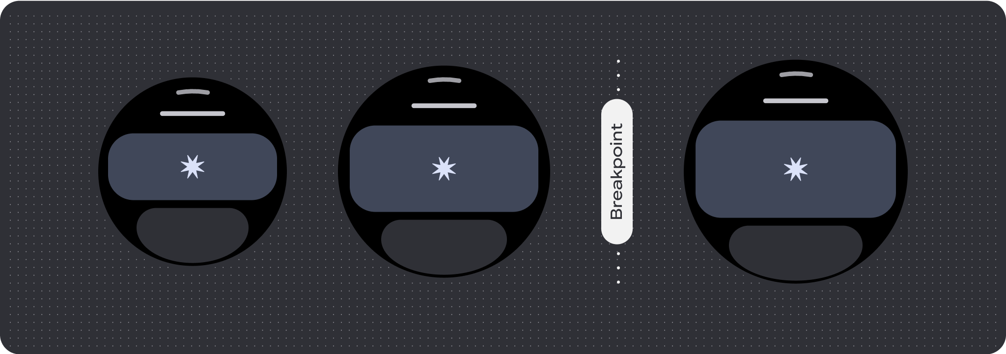
สร้างการออกแบบที่ปรับเปลี่ยนได้และมีความแตกต่างกัน
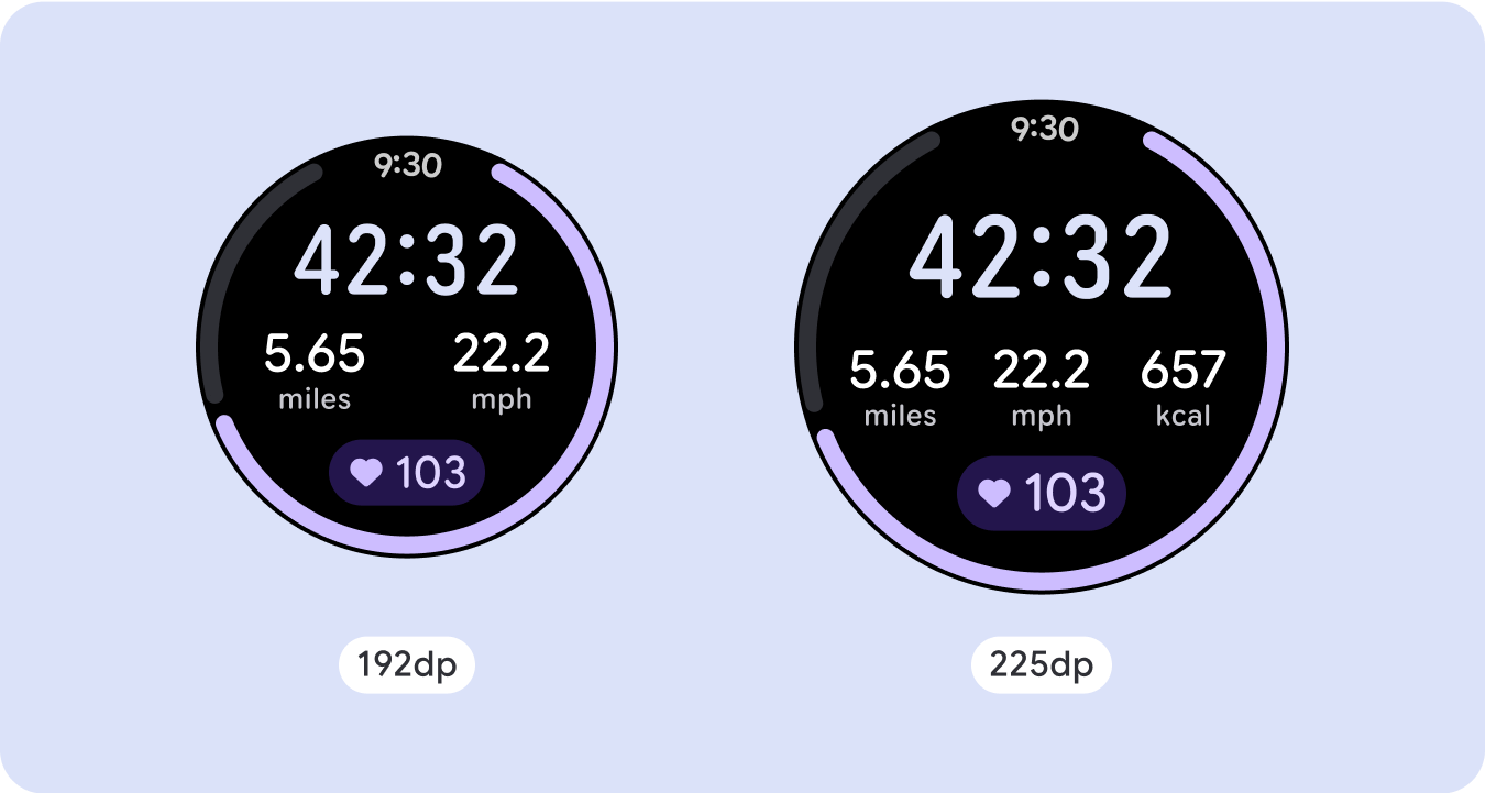
เพิ่มจุดตัดขนาดที่ 225dp เพื่อใช้พื้นที่เพิ่มเติมในหน้าจอขนาดใหญ่ให้คุ้มค่าที่สุด จุดหยุดพักนี้ช่วยให้คุณแสดงเนื้อหาเพิ่มเติม ใส่ข้อมูลเพิ่มเติม ตัวเลือก ข้อมูล หรือเปลี่ยนเลย์เอาต์ให้เหมาะกับหน้าจอขนาดใหญ่ได้ดีขึ้น
ซึ่งต้องใช้การออกแบบที่แตกต่างกันสำหรับจุดพักแต่ละจุด การออกแบบหน้าจอขนาดใหญ่ขึ้น (225+) อาจรวมองค์ประกอบเพิ่มเติมต่อไปนี้
เพิ่มขนาดหรือเปลี่ยนสถานะของคอมโพเนนต์ที่มีอยู่
ใช้จุดหยุดแสดงเพื่อแสดงรายละเอียดเพิ่มเติมหรือทำให้เนื้อหาดูได้ง่ายขึ้น เพียงตรวจสอบว่าประสบการณ์การใช้งานหรือฟังก์ชันการทำงานไม่ขัดข้องในหน้าจอขนาดเล็ก และการเปลี่ยนแปลงในหน้าจอขนาดใหญ่เป็นเพียงส่วนเสริมเท่านั้น
เพิ่มเนื้อหาภายในเลย์เอาต์ปัจจุบัน
การเพิ่มคอมโพเนนต์หรือเนื้อหาจะทำให้เลย์เอาต์มีตัวเลือก รายละเอียด และคุณค่าเพิ่มเติม
แต่ไม่ควรทำให้ผู้ใช้ต้องใช้เวลานานในการดูข้อมูล
ในกรณีที่ประสบการณ์การใช้งานต้องใช้เนื้อหามากขึ้นแต่ต้องการคงเลย์เอาต์แบบไม่เลื่อน ให้พิจารณาเลย์เอาต์แบบหลายหน้าที่มีการแบ่งหน้าแนวตั้งหรือแนวนอน

ลักษณะการทํางานที่ปรับเปลี่ยนได้
คอมโพเนนต์ทั้งหมดในไลบรารี Compose จะปรับให้เข้ากับขนาดหน้าจอที่กว้างขึ้นโดยอัตโนมัติ รวมถึงเพิ่มความกว้างและความสูง สำหรับการแสดงผลเหล่านี้โดยเฉพาะ การใช้จุดแบ่งหน้าจอจะช่วยให้ผู้ใช้ทุกคนได้รับประสบการณ์การใช้งานที่สมบูรณ์และมีประโยชน์ กําหนดระยะขอบทั้งหมดเป็นเปอร์เซ็นต์ และกำหนดข้อจำกัดแนวตั้งเพื่อให้เนื้อหาหลักตรงกลางยืดออกเพื่อเติมเต็มพื้นที่แสดงผลที่มีอยู่
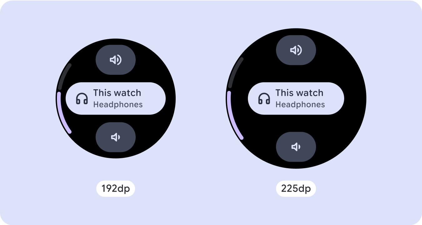
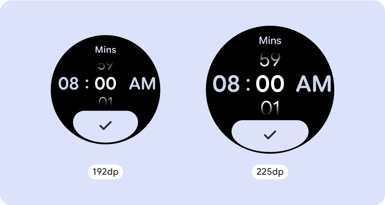
การออกแบบหน้าจอแบบเลื่อนไม่ได้ควรแบ่งออกเป็นส่วนบน กลาง และล่าง วิธีนี้ช่วยให้คุณเพิ่มระยะขอบด้านในลงในส่วนบนและล่างเพื่อหลีกเลี่ยงการถูกตัดออกได้ แต่ช่วยให้ส่วนกลางใช้ประโยชน์จากหน้าจอได้เต็มความกว้าง ลองใช้ปุ่มเลื่อนแบบหมุนเพื่อควบคุมองค์ประกอบของหน้าจอเมื่อหน้าจอมีขนาดเล็ก เนื่องจากการโต้ตอบด้วยการแตะเพียงอย่างเดียวอาจให้ประสบการณ์การใช้งานที่ไม่ดีที่สุด
เช็กลิสต์
- สร้างเลย์เอาต์ที่ยืดหยุ่นซึ่งดูเหมาะสมกับหน้าจอทุกขนาด
- ใช้ระยะขอบด้านบน ด้านล่าง และด้านข้างที่แนะนํา
- กำหนดระยะขอบเป็นค่าเปอร์เซ็นต์ในตำแหน่งที่เนื้อหาอาจถูกตัด
- ใช้ข้อจำกัดของเลย์เอาต์เพื่อให้องค์ประกอบใช้พื้นที่ในหน้าจอได้อย่างคุ้มค่าที่สุดและรักษาสมดุลในอุปกรณ์ขนาดต่างๆ
- รองรับข้อความเวลา (หากมี) โดยไม่ทับซ้อนกับส่วนบนของหน้า (ดูข้อมูลเพิ่มเติมที่ตัวบ่งชี้ความคืบหน้าที่มีช่องว่างด้านบน)
- ลองใช้ปุ่มที่แนบไปกับขอบเพื่อใช้ประโยชน์จากพื้นที่ที่จำกัดมากขึ้น
- ลองใช้จุดหยุดพักที่ 225dp เพื่อแสดงเนื้อหาเพิ่มเติมหรือทำให้เนื้อหาที่มีอยู่ดูได้ง่ายขึ้นเมื่อใช้หน้าจอขนาดใหญ่

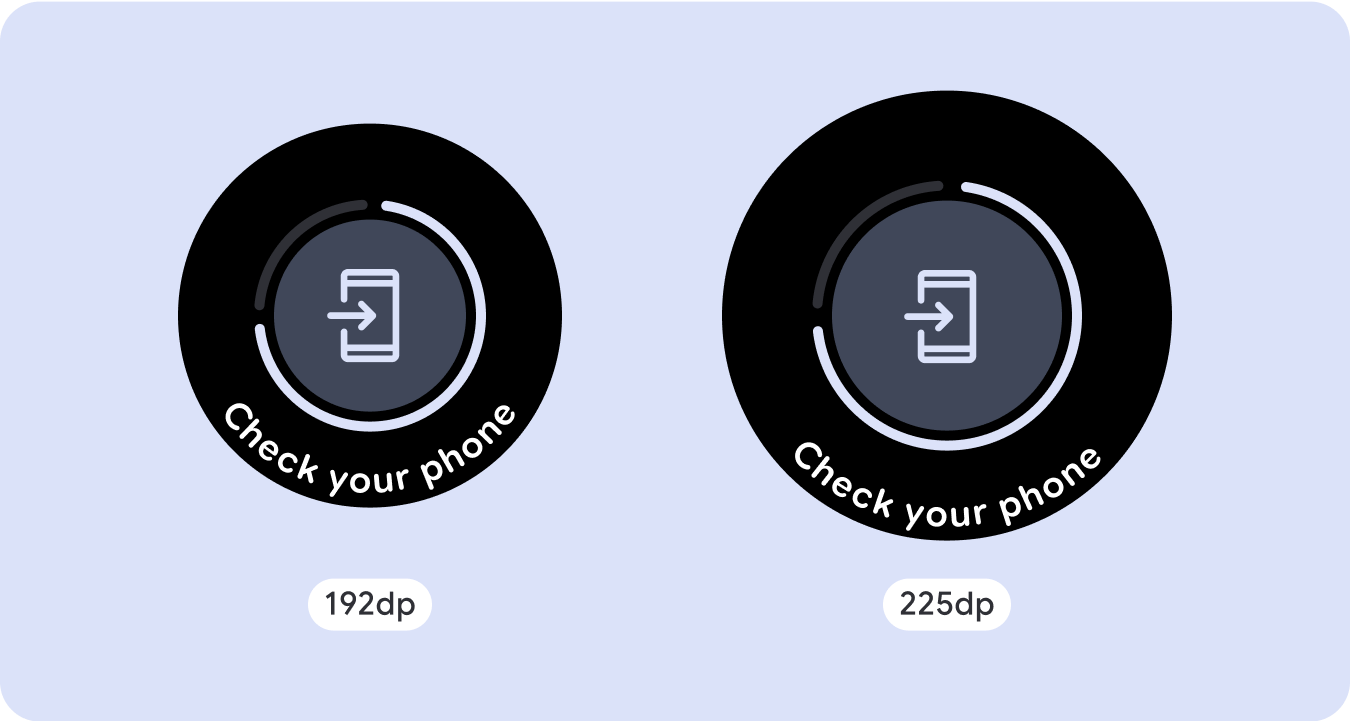
สัญญาณบอกสถานะความคืบหน้าแบบเต็มหน้าจอ
ตัวบ่งชี้ความคืบหน้าจะไม่มีการเปลี่ยนแปลงลักษณะการทำงานเนื่องจากจะปรับตามขนาดหน้าจอโดยอัตโนมัติ อย่างไรก็ตาม ให้พิจารณาใช้ระยะขอบ (เปอร์เซ็นต์) และระยะห่างจากขอบตามสัดส่วนในพื้นที่ตรงกลางเพื่อใช้พื้นที่อย่างคุ้มค่าที่สุด นอกจากนี้ ให้พิจารณาใช้จุดตัดเพื่อเพิ่มขนาดหรือจํานวนคอมโพเนนต์ในหน้าจอขนาดใหญ่

สร้างประสบการณ์ที่แตกต่าง
เลย์เอาต์แบบไม่เลื่อนปรับแต่งได้ แต่มีข้อจำกัดมากกว่าในด้านปริมาณเนื้อหาที่เพิ่มลงในหน้าจอและประเภทคอมโพเนนต์ที่ได้ผลดีที่สุด การใช้ปุ่มไอคอนแทนปุ่มทรงยาเม็ดที่กว้างกว่าจะช่วยให้ใช้พื้นที่ที่จำกัดได้ดียิ่งขึ้น และกราฟิกภาพ เช่น ตัวบ่งชี้ความคืบหน้าและจุดข้อมูลขนาดใหญ่จะช่วยสื่อสารข้อมูลสำคัญด้วยวิธีที่เป็นภาพ องค์ประกอบทั้งหมดที่แนบกับขอบหน้าจอจะขยายตามขนาดหน้าจอโดยอัตโนมัติ เพื่อให้ดูโดดเด่นยิ่งขึ้น

ตัวอย่างเนื้อหาและโค้ดในหน้าเว็บนี้ขึ้นอยู่กับใบอนุญาตที่อธิบายไว้ในใบอนุญาตการใช้เนื้อหา Java และ OpenJDK เป็นเครื่องหมายการค้าหรือเครื่องหมายการค้าจดทะเบียนของ Oracle และ/หรือบริษัทในเครือ
อัปเดตล่าสุด 2025-07-27 UTC
[[["เข้าใจง่าย","easyToUnderstand","thumb-up"],["แก้ปัญหาของฉันได้","solvedMyProblem","thumb-up"],["อื่นๆ","otherUp","thumb-up"]],[["ไม่มีข้อมูลที่ฉันต้องการ","missingTheInformationINeed","thumb-down"],["ซับซ้อนเกินไป/มีหลายขั้นตอนมากเกินไป","tooComplicatedTooManySteps","thumb-down"],["ล้าสมัย","outOfDate","thumb-down"],["ปัญหาเกี่ยวกับการแปล","translationIssue","thumb-down"],["ตัวอย่าง/ปัญหาเกี่ยวกับโค้ด","samplesCodeIssue","thumb-down"],["อื่นๆ","otherDown","thumb-down"]],["อัปเดตล่าสุด 2025-07-27 UTC"],[],[],null,["# Common layouts for non-scrolling apps\n\nNon-scrolling app view layouts include media players, confirmation dialogs,\npickers, switchers, and special fitness or tracking screens using progress\nindicators. You can restrict the height of any screen, which ensures the user is\nfocused on one task or set of controls, rather than needing to browse through a\nlist of options. To accommodate devices with smaller screen sizes, design with\nthe limited size in mind, ensuring glanceability and embracing the circular\nscreen where relevant.\n\nBuild responsive and optimized designs\n--------------------------------------\n\nNon-scrolling views focus on glanceable information and offer users value with\nminimal interaction. However, building responsive behavior into these layouts\ncan be challenging. To address this, we have updated our Android UI library\nlayouts and components with built-in responsive behavior, including\npercentage-based margins and padding. If you're utilizing our Compose\ncomponents, you can automatically inherit this responsiveness.\n\nFor unique screen designs, thoroughly test across a variety of screen sizes,\nensuring components and elements adapt smoothly and avoid content clipping. Our\npercentage margins help spacers scale effectively, and we recommend using a\nbreakpoint at 225dp to introduce additional information and enhanced\nfunctionality on larger watch screens.\n\nCheck that components adapt to the available width and height\n-------------------------------------------------------------\n\n\nAll components are built responsively, meaning they adapting to the available\nwidth (and height when full screen). Make sure you have the necessary margins to\nensure content doesn't get clipped by the rounding curve of the screen.\nAdditionally, ensure the necessary layout behavior to ensure your non-scrolling\nscreen content doesn't push the layout to scroll or get cut off. \n\n\n\u003cbr /\u003e\n\nBuild adaptive and differentiated designs\n-----------------------------------------\n\nIn order to best use the additional space on larger screen sizes, add a size\nbreakpoint at 225dp. This breakpoint makes it possible to reveal additional\ncontent, include more information, options, data, or change the layout to better\nsuit the larger screen size.\n\nThis requires a different design for each breakpoint. The larger screen design\n(225+) could include the following additional elements:\n\n### Increase the size or change the state of the existing components\n\n\nUse the breakpoint to show more detail or make the content more glanceable. Just\nmake sure the experience or functionality isn't broken on small screen and the\nlarge screen changes are only additional. \n\n\n\u003cbr /\u003e\n\n### Add content within the current layout\n\n\nBy adding components or content, the layout provides additional options, detail\nand ultimately, value.\n\nThis should never come at the cost of the glanceability. \n\n\u003cbr /\u003e\n\nUse pagination\n--------------\n\nIn scenarios where an experience requires more content but wants to retain a\nnon-scrolling layout, consider a multi-page layout with either vertical or\nhorizontal pagination.\n\nResponsive and adaptive behavior\n--------------------------------\n\nAll components in the Compose library will automatically adapt to the wider\nscreen size, and gain width and height. For these views in particular, utilizing\nbreakpoints can deliver a particularly rich and valuable experience for all\nusers. Define all margins in percentages, and define vertical constraints such\nthat the main content in the middle can stretch to fill the available display\narea.\n\nIt's best to break a non-scrolling screen into a top, middle, and bottom section\nwhen designing. This way, you can add inner margins to the top and bottom\nsection to avoid clipping, but allow your middle section to take advantage of\nthe full width of the screen. Consider the use of the rotary scroll button to\ncontrol elements of the screen when its size is limited, as tapping interactions\nalone may not provide the best experience.\n\n### Checklist\n\n- Create flexible layouts that look reasonable on all screen sizes.\n- Apply the recommended top, bottom, and side margins.\n- Define margins in percentage values in places where content might otherwise be clipped.\n- Utilize layout constraints so that elements make the best possible use of the space within the screen and maintain balance across different device sizes.\n- Accommodate Time Text if used, but not overlapping the top section of the page (see progress indicators with a top gap for more)\n- Consider using edge-hugging buttons to utilize more of the limited space.\n- Consider applying a breakpoint at 225dp to introduce additional content or make existing content more glanceable when on bigger screen sizes.\n\n**Full screen progress indicators**\n\nThere is no behavior change on the progress indicator as it automatically adapts\nto the screen size, however, consider applying proportional (percentage) margins\nand padding on the central area to best utilize space. Also consider a\nbreakpoint to increase the size or number of components on larger screen.\n\nCreate differentiated experiences\n---------------------------------\n\nNon-scrolling layouts are customizable, but are more limited in how much content\ncan be added to the screen and what kind of components work best. Using Icon\nButtons instead of wider pill shaped Buttons makes better use of the limited\nspace, and visual graphics like Progress Indicators and large data points help\ncommunicate key information in a graphical way. All elements that hug the screen\nbezel automatically grow with the screen size, so they become even more\nimpactful."]]