

Android 支援多種板型規格,不限於傳統直向智慧型手機,包括摺疊式裝置、平板電腦、電腦分割視窗環境和外接螢幕。如果假設螢幕幾何圖形是靜態的,媒體內容可能會被拉伸、裁剪或意外加上黑邊。應用程式必須動態調整,以因應不斷演進的顯示模式,支援各種來源媒體顯示比例 (從傳統 4:3 到超寬螢幕)。
Jetpack Compose 中大多數媒體版面配置失敗的原因,都源自三個常見的架構問題:
- 視窗插邊處理不一致,且與無邊框設計衝突。
- 視窗大小計算錯誤,導致版面配置更新不一致。
- 內容縮放選項設定錯誤。
本指南將說明使用 Media3 和 Jetpack Compose 處理各個領域的策略和最佳做法。
處理視窗插邊和無邊框衝突
在搭載 Android 15 (API 級別 35) 以上版本的裝置上,指定 API 級別 35 以上版本的應用程式預設會無邊框顯示。狀態列、導覽列和桌面標題列等系統資訊列會繪製在應用程式內容上方,而螢幕凹口可能會遮住部分內容。
如果沒有妥善管理視窗插邊,會發生兩種主要的版面配置衝突:
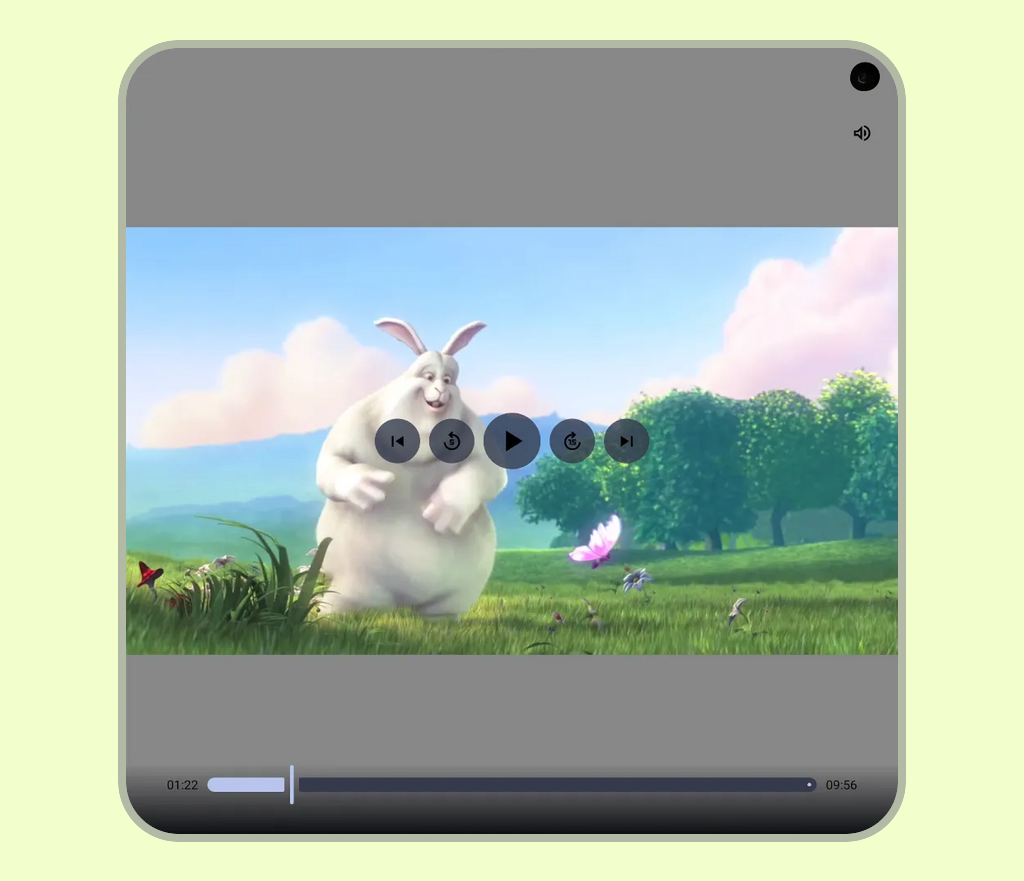
- 系統資訊列重疊:影片影格、字幕和播放控制項部分遭到狀態列 (時鐘、電池圖示)、手勢或導覽列,或螢幕凹口 (相機凹口) 遮擋。如需一般設定指南,請參閱「設定無邊框」。
- 電腦模式說明文字列干擾:在電腦分割視窗模式中,系統會導入頂端說明文字列,用於管理視窗。如果標準版面配置在算繪自訂標頭或無邊框媒體畫布時,未考量到這個字幕列,就會導致影片影格和頂端播放控制項遭到遮蓋,無法點選。如要進一步瞭解視窗狀態,請參閱「支援電腦分割視窗」。
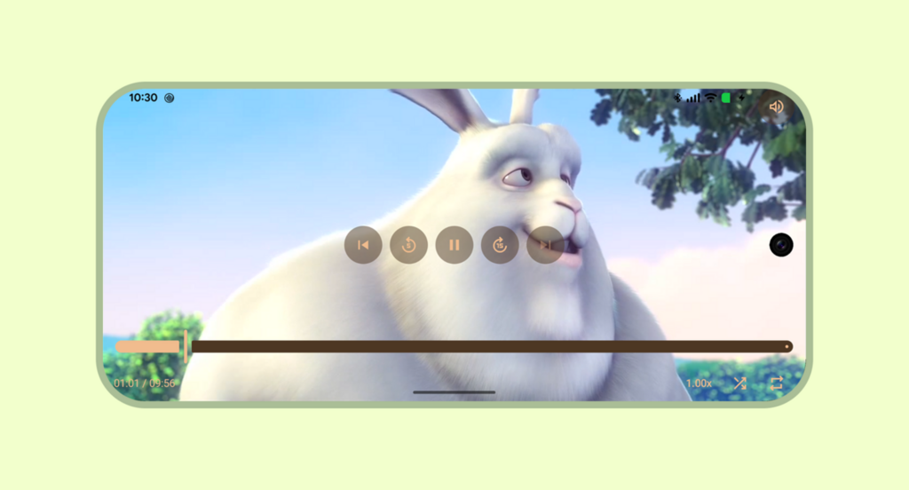
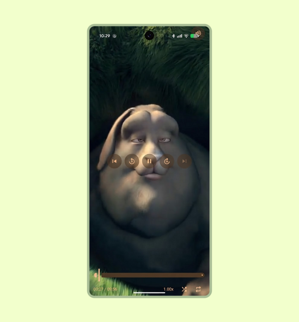
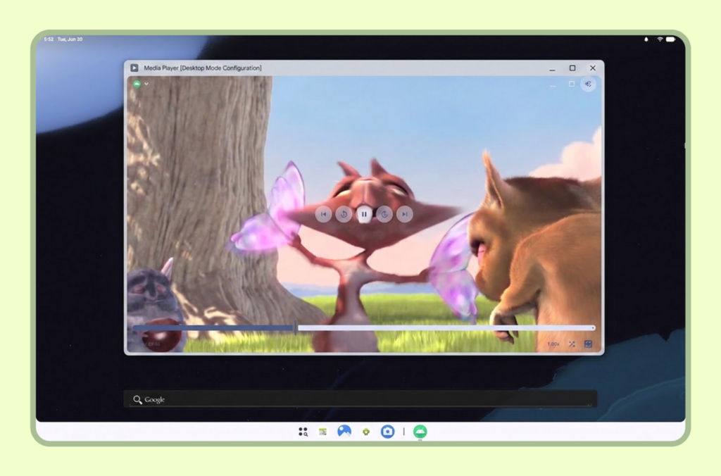
插頁管理策略
應用程式應根據玩家是否處於非沉浸模式或沉浸模式,動態調整系統插邊。
非沉浸式設定
在非沉浸式播放模式中,系統資訊列會保持顯示,以保留裝置背景資訊。
當播放器延伸至視窗邊緣時,請在與系統資訊列或螢幕凹口相接的邊緣,對每個 PlayerDefaults 控制列套用 windowInsetsPadding,並搭配 WindowInsets.safeDrawing 和 only (例如 TopControls 上的 Top + Horizontal 和 BottomControls 上的 Bottom + Horizontal)。這樣一來,當影片介面延伸至整個容器時,控制項就不會與系統資訊列重疊。
@Composable fun NonImmersiveVideoPlayer( player: Player, showControls: Boolean, modifier: Modifier = Modifier, ) { Player( player = player, modifier = modifier, showControls = showControls, // Keep top controls clear of the status bar, caption bar, and display cutout topControls = { PlayerDefaults.TopControls( player = player, modifier = Modifier.fillMaxWidth() .windowInsetsPadding( WindowInsets.safeDrawing.only(WindowInsetsSides.Top + WindowInsetsSides.Horizontal) ), ) { MuteButton(player = player, modifier = Modifier.align(Alignment.TopEnd).padding(16.dp)) } }, // Keep bottom controls clear of the navigation bar and display cutout bottomControls = { PlayerDefaults.BottomControls( player = player, modifier = Modifier.fillMaxWidth() .windowInsetsPadding( WindowInsets.safeDrawing.only( WindowInsetsSides.Bottom + WindowInsetsSides.Horizontal ) ), ) }, ) }
沉浸式設定 (直向和橫向)
在全螢幕沉浸模式下,目標是盡可能擴大畫布,提供電影般的體驗,同時讓使用者能存取播放控制項:
- 將
windowInsetsPadding套用至媒體遙控器疊加層 (例如頂端和底部控制項),避免與螢幕凹口或系統手勢區域重疊 (例如在底部控制項上結合WindowInsets.displayCutout和WindowInsets.systemGestures,避免跳轉滑桿與邊緣滑動手勢衝突)。 - 在
DisposableEffect中使用WindowInsetsControllerCompat隱藏系統資訊列,確保離開可組合函式時,系統 UI 會恢復顯示。
@Composable fun ImmersiveVideoPlayer(player: Player, showControls: Boolean, modifier: Modifier = Modifier) { val view = LocalView.current // Manages the system UI lifecycle to create an edge-to-edge cinematic experience DisposableEffect(view) { // Finds the hosting Activity, unwrapping any ContextWrapper around the view's context val activity = generateSequence(view.context) { (it as? ContextWrapper)?.baseContext } .filterIsInstance<Activity>() .firstOrNull() val window = activity?.window ?: return@DisposableEffect onDispose {} val controller = WindowCompat.getInsetsController(window, view) // Records the current system bar state so it can be restored on dispose val insets = ViewCompat.getRootWindowInsets(view) val wereSystemBarsVisible = insets == null || insets.isVisible(WindowInsetsCompat.Type.statusBars()) || insets.isVisible(WindowInsetsCompat.Type.navigationBars()) val previousBehavior = controller.systemBarsBehavior // Hides status bars, navigation bars, and caption bars to maximize the video canvas controller.hide(WindowInsetsCompat.Type.systemBars()) // Allows hidden system bars to temporarily reappear with a swipe gesture from the edge controller.systemBarsBehavior = WindowInsetsControllerCompat.BEHAVIOR_SHOW_TRANSIENT_BARS_BY_SWIPE onDispose { // Restores the previous system bar state when leaving the composable controller.systemBarsBehavior = previousBehavior if (wereSystemBarsVisible) { controller.show(WindowInsetsCompat.Type.systemBars()) } } } Player( player = player, modifier = modifier, showControls = showControls, // Keep top controls clear of the display cutout while the system bars are hidden topControls = { PlayerDefaults.TopControls( player = player, modifier = Modifier.fillMaxWidth() .windowInsetsPadding( WindowInsets.displayCutout.only( WindowInsetsSides.Top + WindowInsetsSides.Horizontal ) ), ) { MuteButton(player = player, modifier = Modifier.align(Alignment.TopEnd).padding(16.dp)) } }, // Keep bottom controls clear of the display cutout and system gesture areas bottomControls = { PlayerDefaults.BottomControls( player = player, modifier = Modifier.fillMaxWidth() .windowInsetsPadding( WindowInsets.displayCutout .union(WindowInsets.systemGestures) .only(WindowInsetsSides.Bottom + WindowInsetsSides.Horizontal) ), ) }, ) }
計算動態視窗大小和版面配置更新
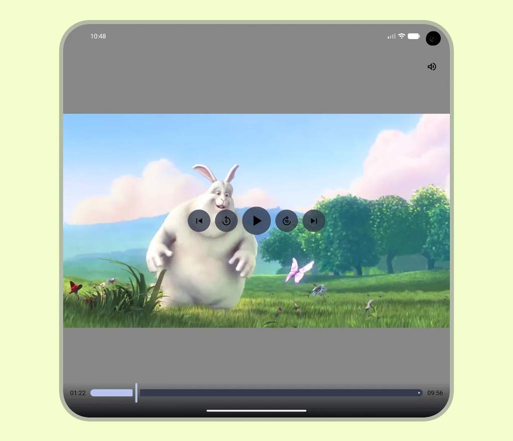
如果只在應用程式啟動時計算螢幕寬度或高度,當裝置設定變更時 (例如摺疊式裝置展開、多視窗模式工作階段大小調整,或螢幕旋轉),版面配置就會依賴過時的值。
在這種情況下,即使子項元件正確使用 Modifier.fillMaxWidth(),如果父項容器受限於過時的尺寸,子項元件也無法調整,導致版面配置拉伸、裁剪或沒有回應。
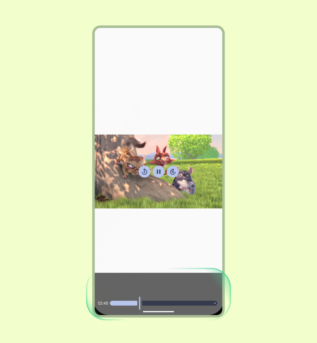
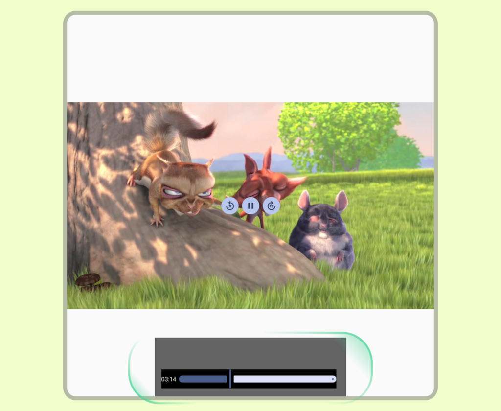
在以下範例中,左側畫面顯示標準可視區域的正確算繪,右側畫面則顯示裝置展開時,過時的視窗尺寸無法調整,導致內容版面配置不具回應性。
為避免版面配置限制過時,請使用 Jetpack 媒體查詢 API。由於這個 API 屬於實驗性質,且預設為停用,因此請先設定 ComposeUiFlags.isMediaQueryIntegrationEnabled = true (例如在呼叫 setContent 之前),啟用 mediaQuery 函式,並使用 @OptIn(ExperimentalMediaQueryApi::class) 選擇加入。
使用 derivedMediaQuery 評估目前視窗大小的條件 (例如 windowWidth),這樣一來,版面配置就會在視窗變更時更新,而不會進行不必要的重組。您可以將 derivedMediaQuery 與 WindowSizeClass 中斷點結合,在視窗展開時切換單窗格和多窗格播放器版面配置:
@OptIn(ExperimentalMediaQueryApi::class) @Composable fun AdaptiveVideoPlayerScreen( player: Player, modifier: Modifier = Modifier, relatedContent: @Composable () -> Unit, ) { val isWideWindow by derivedMediaQuery { windowWidth >= WindowSizeClass.WIDTH_DP_MEDIUM_LOWER_BOUND.dp } if (isWideWindow) { // Medium or expanded width: place the player alongside a details or playlist pane Row(modifier = modifier.fillMaxSize()) { Player(player = player, modifier = Modifier.weight(0.65f).fillMaxHeight()) Box(modifier = Modifier.weight(0.35f).fillMaxHeight()) { relatedContent() } } } else { // Compact width: stack a 16:9 player above the details pane Column(modifier = modifier.fillMaxSize()) { Player(player = player, modifier = Modifier.fillMaxWidth().aspectRatio(16f / 9f)) Box(modifier = Modifier.weight(1f).fillMaxWidth()) { relatedContent() } } } }
設定內容縮放和顯示比例
請區分管理可用容器區域和縮放媒體內容本身。使用插邊管理 (例如安全區域邊框間距),設定容器相對於系統資訊列和螢幕凹口的邊界。然後在這些界限內套用資源調度策略。如需有關建構容器和跨顯示比例縮放視覺內容的設計指南,請參閱「內容組成和結構」。
在以下範例中,左圖顯示裁剪策略如何在需要完整顯示時切除內容,右圖則顯示調整策略如何保留原生顯示比例,以全螢幕顯示。
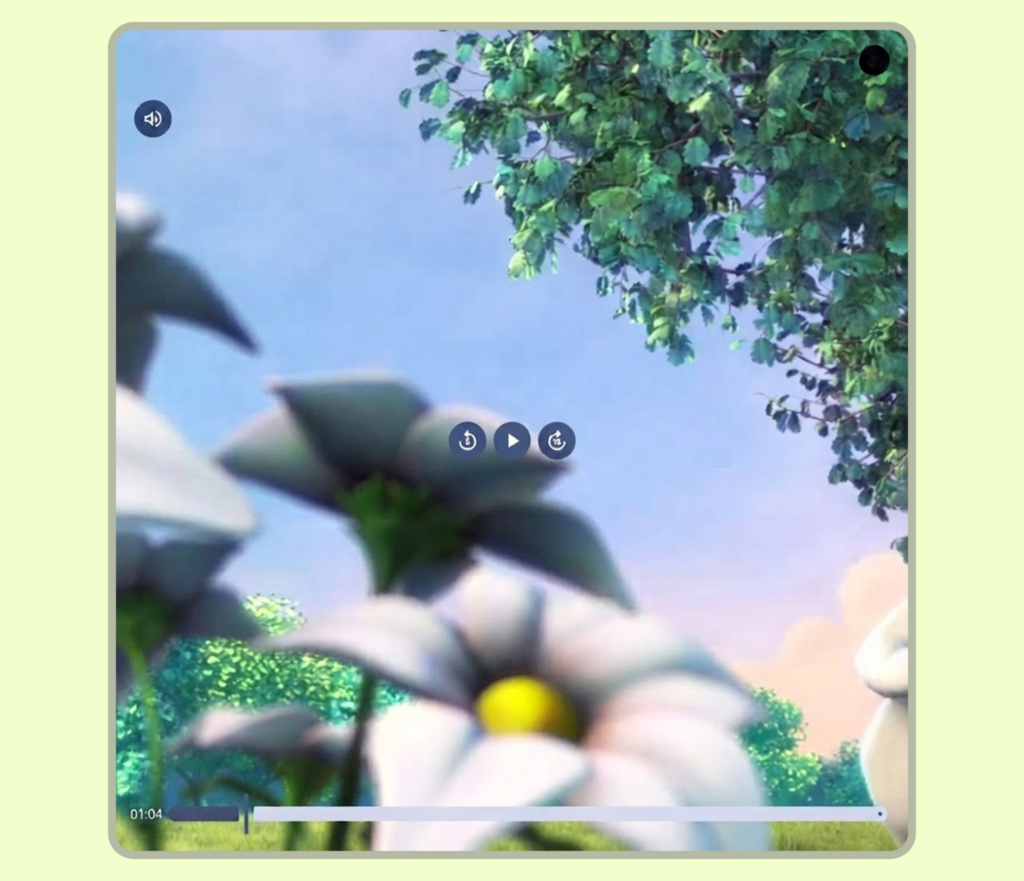
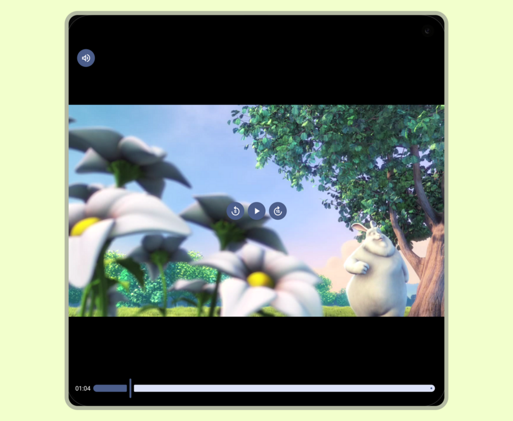
Media3 元件會自動處理標準影片顯示比例,但使用自訂 Compose 版面配置或受限容器 (例如可捲動的社群動態) 時,明確的 ContentScale 設定就變得至關重要。如果選取不當的內容縮放比例,可能會導致版面配置問題,例如影片失真 (拉伸) 或非預期的上下黑邊,導致可視區域留空。如果沒有這些選項,手動管理影片介面也可能導致螢幕旋轉或摺疊式裝置狀態變更時,版面配置損毀。
無論是在 4:3 螢幕上顯示 16:9 影片,還是在 16:9 螢幕上顯示 4:3 影片,Player 可組合項預設都會採用 ContentScale.Fit。這樣一來,系統就會套用上下黑邊或左右黑邊,完整顯示影片,不會裁剪。
後續的顯示模式變更 (例如縮放或裁剪) 應由使用者驅動。例如,切換至 ContentScale.Crop 即可完全填滿容器。互動式縮放切換鈕可平衡版面配置需求和使用者選擇。
導入範例
您可以使用標準 Compose ContentScale 屬性,強制顯示完整影格並處理顯示比例。
使用 Player 可組合函式
最簡單直接的方法是使用 Player 可組合函式。這個高階包裝函式會自動處理縮放邊界,並將用於影片算繪的 ContentFrame 與可自訂的控制項疊加層 (topControls、centerControls、bottomControls) 和快門層配對:
@Composable fun FitVideoPlayer(player: Player, modifier: Modifier = Modifier) { Player( player = player, modifier = modifier.fillMaxSize(), // Fill the available space contentScale = ContentScale.Fit, // Default; shown for clarity ) }
建構自訂影片播放器版面配置,或直接在影片串流上放置自訂 UI 圖層時,可以直接使用 ContentFrame,進行精確的低階版面配置控制。
動態使用者控制資源配置切換鈕
如要提升應用程式的觀看體驗,可以新增選用切換鈕,在不同的內容縮放選項之間切換。偵測到輕觸兩下的手勢時,即可立即在 ContentScale.Fit 和 ContentScale.Crop 之間切換播放器狀態。您也可以擴充這項功能,支援使用雙指撥動縮放或其他多點觸控手勢動態調整 ContentScale,類似於現代影片串流應用程式。
@Composable fun ZoomableVideoPlayer(player: Player, modifier: Modifier = Modifier) { var isCropped by rememberSaveable { mutableStateOf(false) } Player( player = player, modifier = modifier .fillMaxSize() // Handle double-tap to toggle between Fit and Crop scaling .pointerInput(Unit) { detectTapGestures(onDoubleTap = { isCropped = !isCropped }) }, contentScale = if (isCropped) ContentScale.Crop else ContentScale.Fit, ) }
雖然有多種內容縮放選項,但請根據用途選擇縮放選項:如果是短篇影片或可捲動的動態消息,且主要目標是填滿螢幕,請使用 ContentScale.Crop;如果是含有重要邊界資訊的媒體 (例如運動賽事比分或字幕),請預設使用 ContentScale.Fit,以保護重要的視覺背景資訊。