
Compose comes with built-in composables and modifiers for handling common animation use cases.
Built-in animated composables
Compose provides several composables that animate content appearance, disappearance, and layout changes.
Animate appearance and disappearance
The
AnimatedVisibility
composable animates the appearance and disappearance of its content.
var visible by remember { mutableStateOf(true) } // Animated visibility will eventually remove the item from the composition once the animation has finished. AnimatedVisibility(visible) { // your composable here // ... }
By default, the content appears by fading in and expanding, and it disappears by
fading out and shrinking. Customize this transition by specifying
EnterTransition and ExitTransition objects.
var visible by remember { mutableStateOf(true) } val density = LocalDensity.current AnimatedVisibility( visible = visible, enter = slideInVertically { // Slide in from 40 dp from the top. with(density) { -40.dp.roundToPx() } } + expandVertically( // Expand from the top. expandFrom = Alignment.Top ) + fadeIn( // Fade in with the initial alpha of 0.3f. initialAlpha = 0.3f ), exit = slideOutVertically() + shrinkVertically() + fadeOut() ) { Text( "Hello", Modifier .fillMaxWidth() .height(200.dp) ) }
As shown in the preceding example, you can combine multiple EnterTransition
or ExitTransition objects with a + operator, and each accepts optional
parameters to customize its behavior. See the reference pages for more
information.
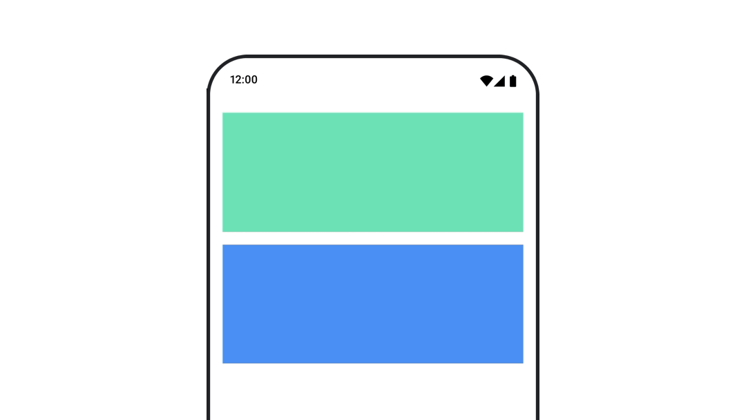
Enter and exit transition examples


AnimatedVisibility also offers a variant that takes a
MutableTransitionState argument. This lets you trigger an animation as soon as
the AnimatedVisibility composable is added to the composition tree. It is also
useful for observing the animation state.
// Create a MutableTransitionState<Boolean> for the AnimatedVisibility. val state = remember { MutableTransitionState(false).apply { // Start the animation immediately. targetState = true } } Column { AnimatedVisibility(visibleState = state) { Text(text = "Hello, world!") } // Use the MutableTransitionState to know the current animation state // of the AnimatedVisibility. Text( text = when { state.isIdle && state.currentState -> "Visible" !state.isIdle && state.currentState -> "Disappearing" state.isIdle && !state.currentState -> "Invisible" else -> "Appearing" } ) }
Animate enter and exit for children
Content within AnimatedVisibility (direct or indirect children) can use the
animateEnterExit
modifier to specify different animation behavior for each of them. The visual
effect for each of these children is a combination of the animations specified
at the AnimatedVisibility composable and the child's own enter and
exit animations.
var visible by remember { mutableStateOf(true) } AnimatedVisibility( visible = visible, enter = fadeIn(), exit = fadeOut() ) { // Fade in/out the background and the foreground. Box( Modifier .fillMaxSize() .background(Color.DarkGray) ) { Box( Modifier .align(Alignment.Center) .animateEnterExit( // Slide in/out the inner box. enter = slideInVertically(), exit = slideOutVertically() ) .sizeIn(minWidth = 256.dp, minHeight = 64.dp) .background(Color.Red) ) { // Content of the notification… } } }
In some cases, you may want to have AnimatedVisibility apply no animations at
all so that children can each have their own distinct animations by
animateEnterExit. To achieve this, specify EnterTransition.None and
ExitTransition.None at the AnimatedVisibility composable.
Add custom animation
If you want to add custom animation effects beyond the built-in enter and exit
animations, access the underlying Transition instance using the transition
property inside the content lambda for AnimatedVisibility. Any animation
states added to the Transition instance will run simultaneously with the enter
and exit animations of AnimatedVisibility. AnimatedVisibility waits until
all animations in the Transition have finished before removing its content.
For exit animations created independently of Transition (such as using
animate*AsState), AnimatedVisibility wouldn't be able to account for them,
and therefore might remove the content composable before they finish.
var visible by remember { mutableStateOf(true) } AnimatedVisibility( visible = visible, enter = fadeIn(), exit = fadeOut() ) { // this: AnimatedVisibilityScope // Use AnimatedVisibilityScope#transition to add a custom animation // to the AnimatedVisibility. val background by transition.animateColor(label = "color") { state -> if (state == EnterExitState.Visible) Color.Blue else Color.Gray } Box( modifier = Modifier .size(128.dp) .background(background) ) }
To learn more about using Transition to manage animations, see Animate
multiple properties simultaneously with a transition.
Animate based on target state
The AnimatedContent
composable animates its content as it changes based on a
target state.
Row { var count by remember { mutableIntStateOf(0) } Button(onClick = { count++ }) { Text("Add") } AnimatedContent( targetState = count, label = "animated content" ) { targetCount -> // Make sure to use `targetCount`, not `count`. Text(text = "Count: $targetCount") } }
By default, the initial content fades out and then the target content fades in
(this behavior is called
fade through).
You can customize this animation behavior by specifying a
ContentTransform
object to the transitionSpec parameter. You can create an
instance of ContentTransform by combining an
EnterTransition object
with an ExitTransition object
using the with infix function. You can apply SizeTransform
to the ContentTransform object by attaching it with the
using infix function.
AnimatedContent( targetState = count, transitionSpec = { // Compare the incoming number with the previous number. if (targetState > initialState) { // If the target number is larger, it slides up and fades in // while the initial (smaller) number slides up and fades out. slideInVertically { height -> height } + fadeIn() togetherWith slideOutVertically { height -> -height } + fadeOut() } else { // If the target number is smaller, it slides down and fades in // while the initial number slides down and fades out. slideInVertically { height -> -height } + fadeIn() togetherWith slideOutVertically { height -> height } + fadeOut() }.using( // Disable clipping since the faded slide-in/out should // be displayed out of bounds. SizeTransform(clip = false) ) }, label = "animated content" ) { targetCount -> Text(text = "$targetCount") }
EnterTransition defines how the target content should appear, and
ExitTransition defines how the initial content should disappear. In addition
to all of the EnterTransition and ExitTransition functions available for
AnimatedVisibility, AnimatedContent offers slideIntoContainer
and slideOutOfContainer.
These are convenient alternatives to slideInHorizontally/Vertically and
slideOutHorizontally/Vertically that calculate the slide distance based on
the sizes of the initial content and the target content of the
AnimatedContent content.
SizeTransform defines how the
size should animate between the initial and the target contents. You have
access to both the initial size and the target size when you are creating the
animation. SizeTransform also controls whether the content should be clipped
to the component size during animations.
var expanded by remember { mutableStateOf(false) } Surface( color = MaterialTheme.colorScheme.primary, onClick = { expanded = !expanded } ) { AnimatedContent( targetState = expanded, transitionSpec = { fadeIn(animationSpec = tween(150, 150)) togetherWith fadeOut(animationSpec = tween(150)) using SizeTransform { initialSize, targetSize -> if (targetState) { keyframes { // Expand horizontally first. IntSize(targetSize.width, initialSize.height) at 150 durationMillis = 300 } } else { keyframes { // Shrink vertically first. IntSize(initialSize.width, targetSize.height) at 150 durationMillis = 300 } } } }, label = "size transform" ) { targetExpanded -> if (targetExpanded) { Expanded() } else { ContentIcon() } } }
Animate child enter and exit transitions
Just like AnimatedVisibility, the animateEnterExit
modifier is available inside the content lambda of AnimatedContent. Use this
to apply EnterAnimation and ExitAnimation to each of the direct or indirect
children separately.
Add custom animation
Just like AnimatedVisibility, the transition field is available inside the
content lambda of AnimatedContent. Use this to create a custom animation
effect that runs simultaneously with the AnimatedContent transition. See
updateTransition for the details.
Animate between two layouts
Crossfade animates between two layouts with a crossfade animation. By toggling
the value passed to the current parameter, the content is switched with a
crossfade animation.
var currentPage by remember { mutableStateOf("A") } Crossfade(targetState = currentPage, label = "cross fade") { screen -> when (screen) { "A" -> Text("Page A") "B" -> Text("Page B") } }
Built-in animation modifiers
Compose provides modifiers for animating specific changes directly on composables.
Animate composable size changes
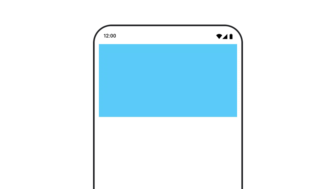
The animateContentSize modifier animates a size change.
var expanded by remember { mutableStateOf(false) } Box( modifier = Modifier .background(colorBlue) .animateContentSize() .height(if (expanded) 400.dp else 200.dp) .fillMaxWidth() .clickable( interactionSource = remember { MutableInteractionSource() }, indication = null ) { expanded = !expanded } ) { }
List item animations
If you are looking to animate item reorderings inside a Lazy list or grid, take a look at the Lazy layout item animation documentation.
Recommended for you
- Note: link text is displayed when JavaScript is off
- Value-based animations
- Animations in Compose
- Animation tooling support {:#tooling}