
Understand the ProtoLayout Material layout templates and sample design layouts to design and build unique tiles for your apps.
ProtoLayout Material layout templates
To help you create the recommended adaptive layout experience, use the provided layout templates. These templates cover common design use cases.
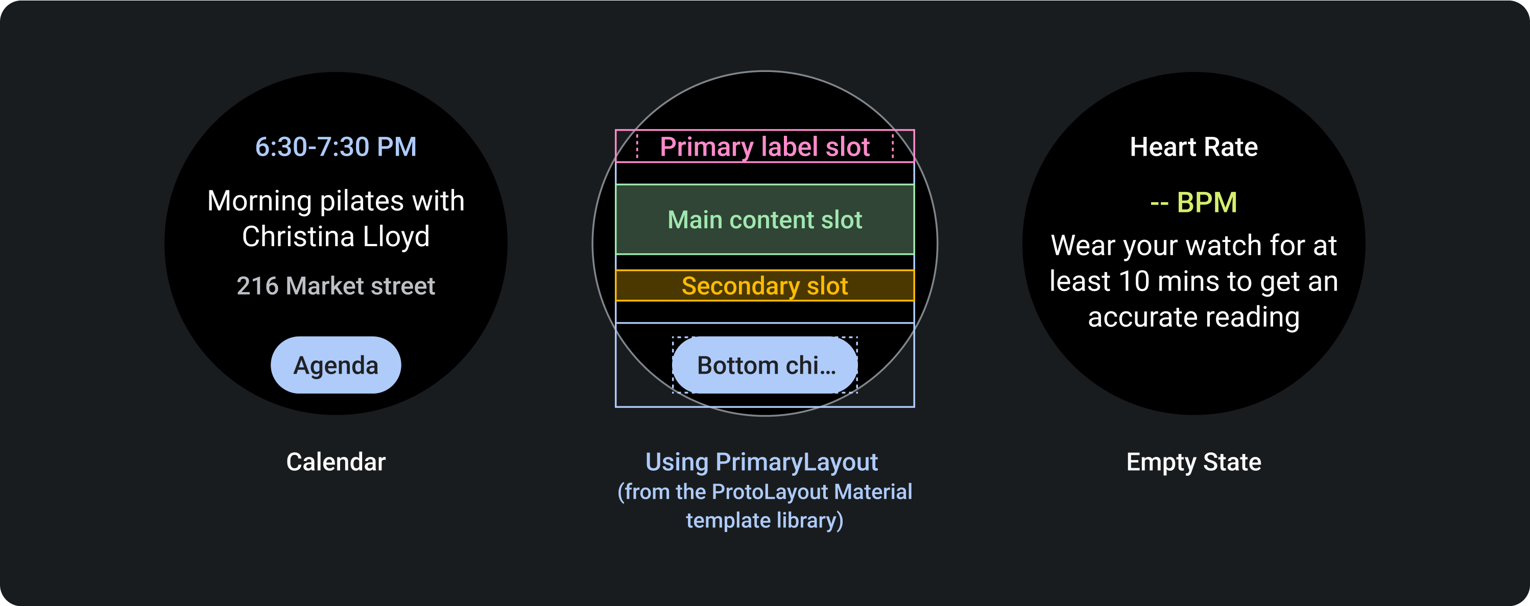
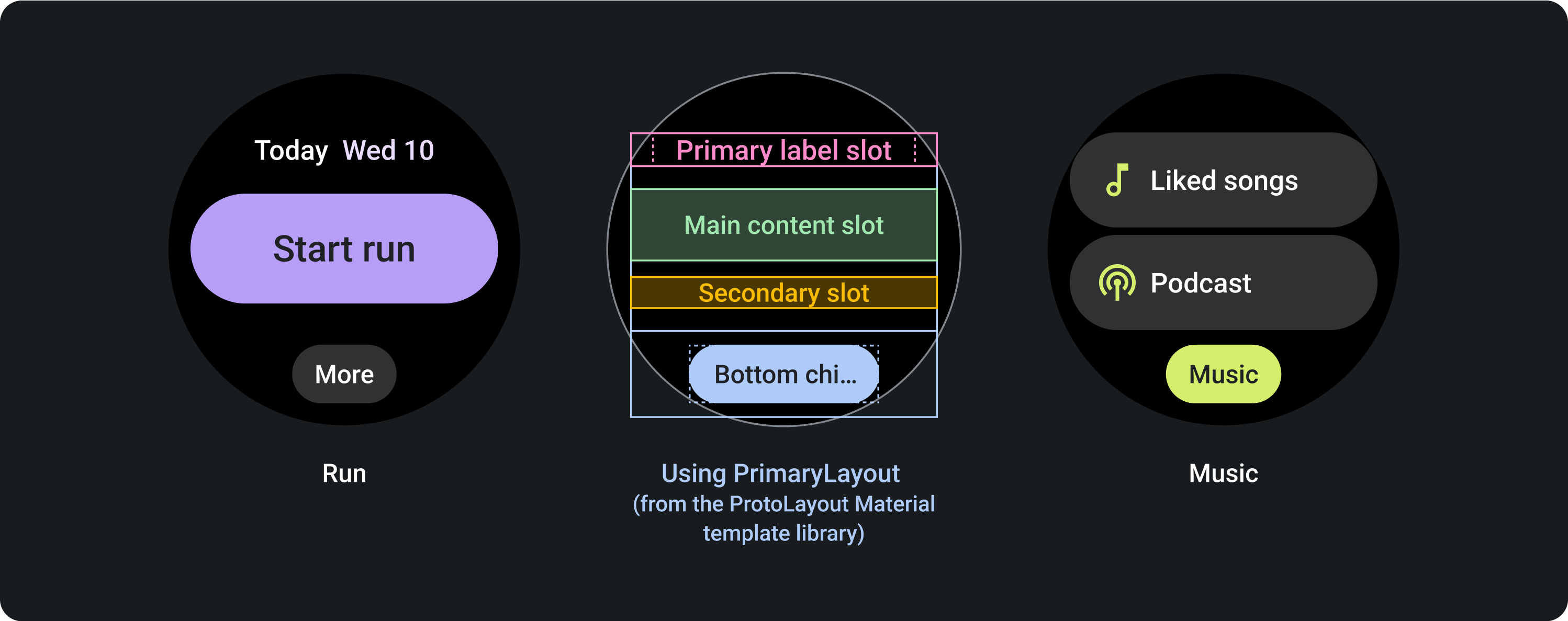
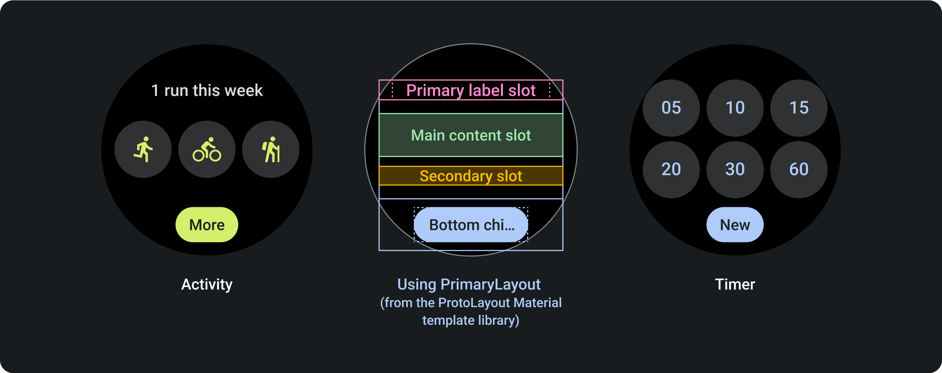
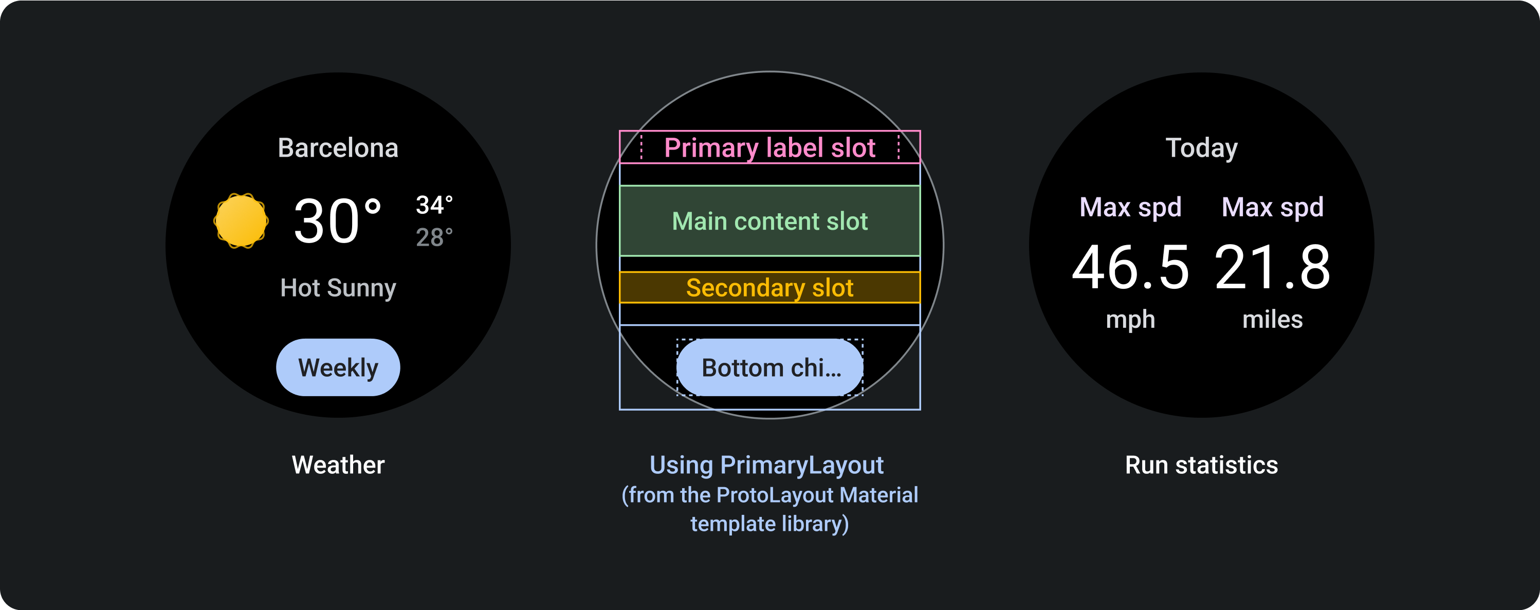
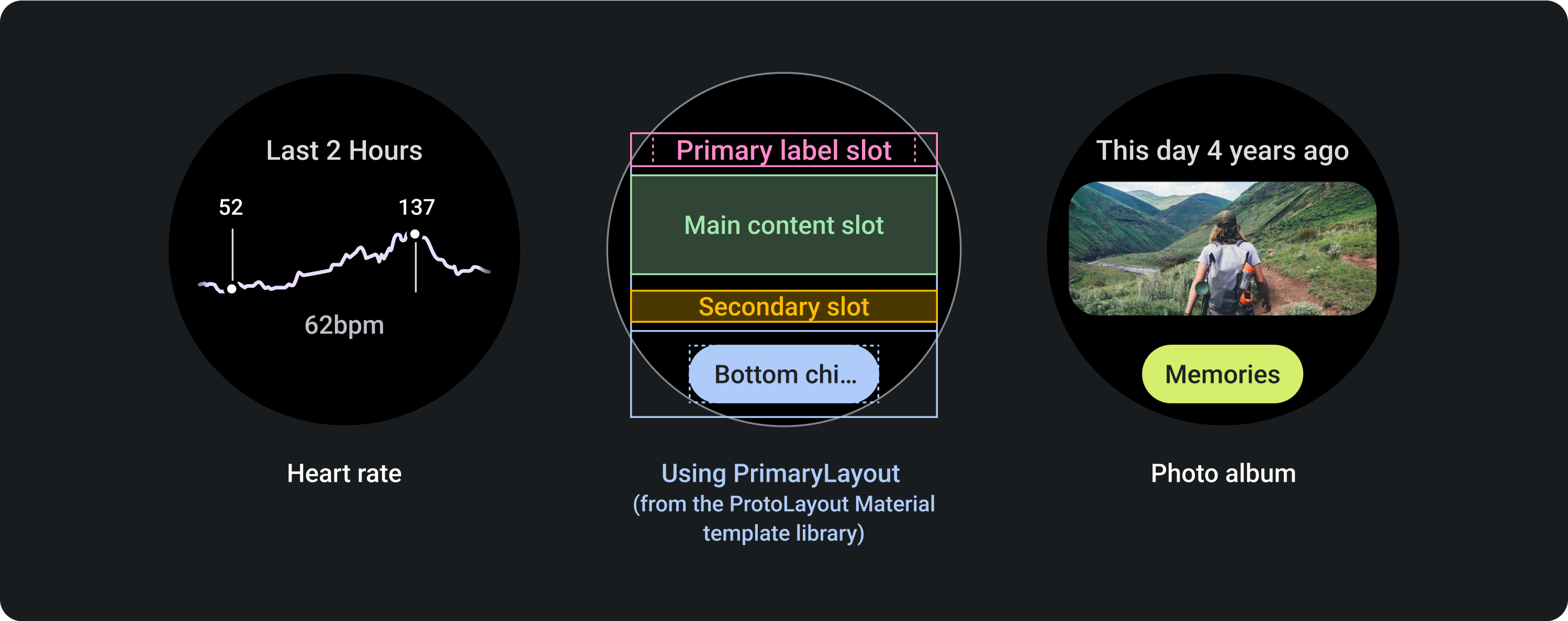
PrimaryLayout template
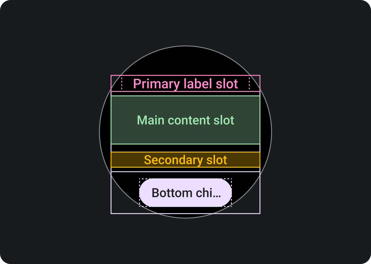
Top section:
Primary label slot (optional)
Middle section:
Main content slot
Secondary label slot
(optional)
Bottom section:
Primary chip slot (optional)
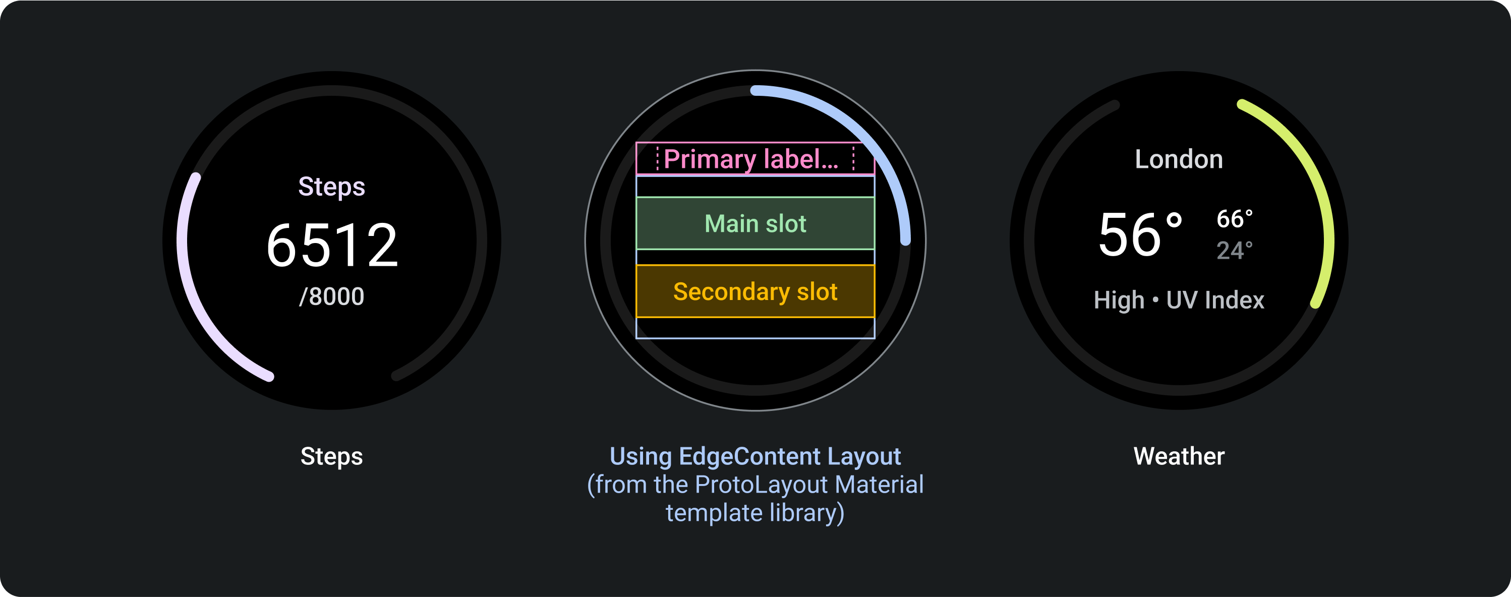
EdgeContentLayout template
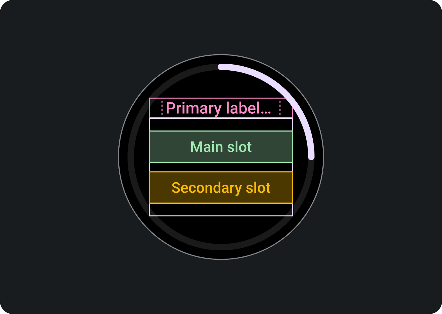
Top section:
Primary label slot (optional)
Middle section:
Main content slot
Secondary label slot
(optional)
Bottom section:
Edge content slot, as a progress
indicator
Each template has optional slots in order to achieve a specific density and layout:
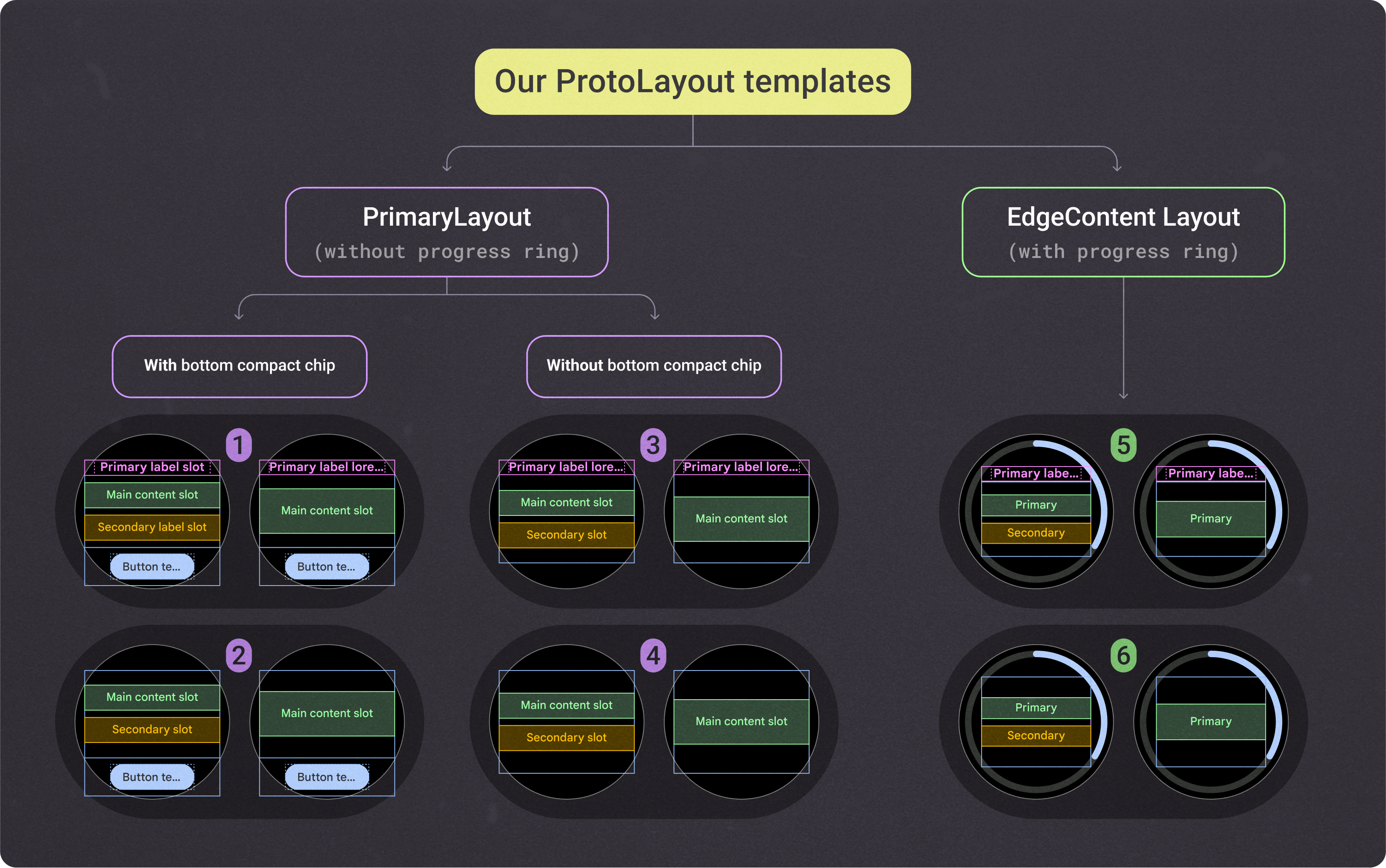
These fixed-height ProtoLayout Material layout templates provide the foundation and scaffolding that all tiles are built on. The only differences between them are the built-in margins and internal padding. To encourage consistency with other apps' tile designs, use the recommended slots shown in the previous image.
To customize these layouts and have various combinations of components within the main content slot, use these additional layout components:
- Multi-button slot: Creates a grid of round buttons
- Multi-slot: Creates up to three columns of content, usually data points.
- Custom slots: All slots are customizable and can contain any component. In some cases, the slot contains an image or graph instead of a system-provided component.
Canonical design sample layouts
To design your app's tiles, use the layout templates described here and provided in the Figma design template.
To provide consistency across tile designs, use these canonical design layouts. They're based on common UX use cases, and the Figma designs and samples provide a prebuilt layout you can start with, helping you create a tile more quickly. The layouts shown in these templates are flexible and let you populate the slots with any content you need.
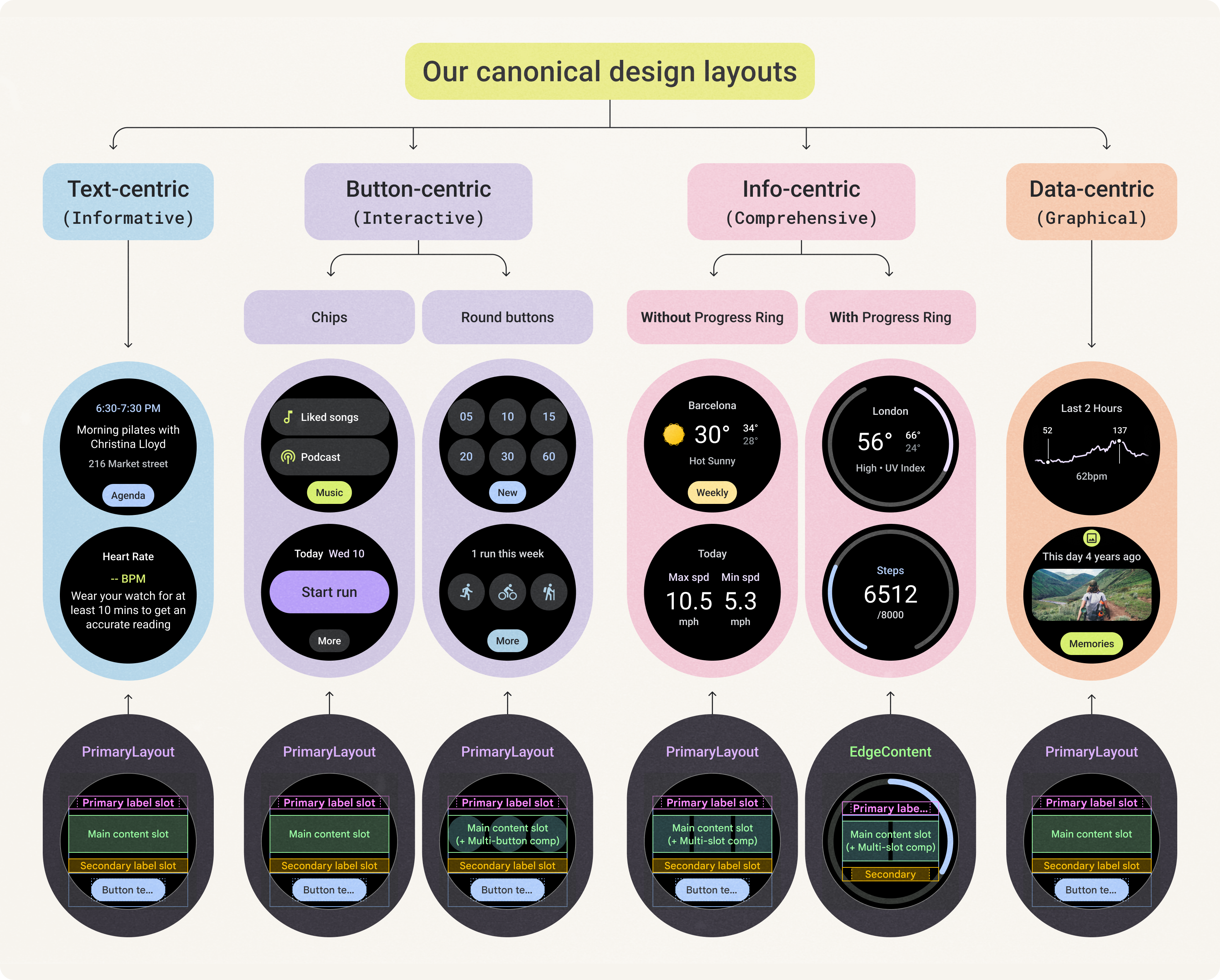
The design kit lets you explore the full flexibility of these layouts. You can customize your layout while maintaining consistency with all ProtoLayout Material layout templates.
The elements that we don't recommend customizing include the following:
- Primary label style and position
- Progress indicator style and position
- Bottom compact chip style and position
There are several types of tile layouts to choose from based on the following top-level criteria. Consider what the primary goal is for your tile, as well as the type of content that you want to display.
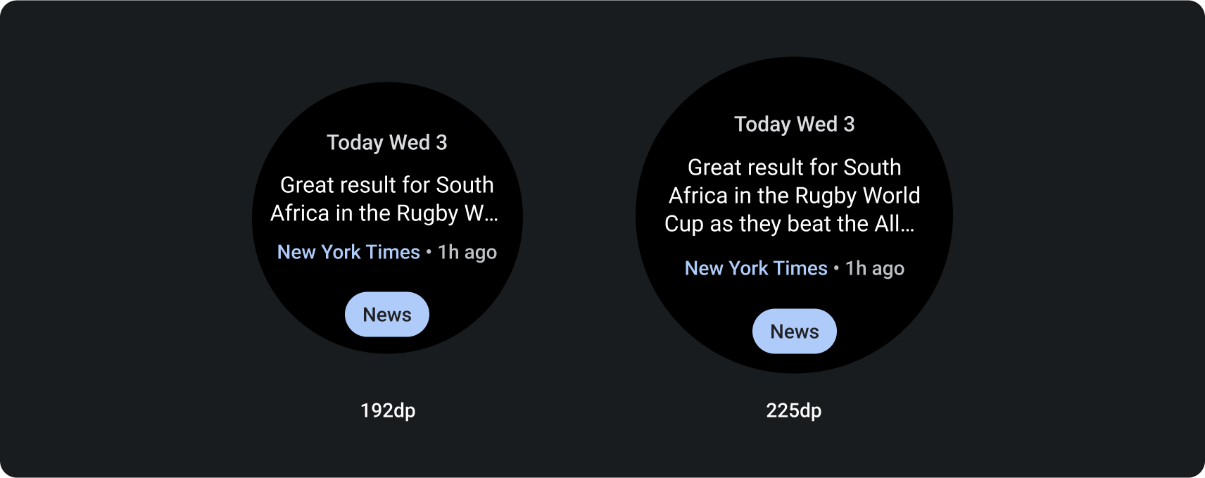
Text-centric layouts
This layout uses the PrimaryLayout template.
This layout works best both for tiles that contain a significant amount of text and a clear call to action, and for tiles that represent empty and signed-out states.
To maximize the available height on devices with smaller screen sizes, remove the secondary label slot and primary chip slot.
Button-centric layouts
Button-centric layouts include those with chips and those with buttons.
Button-centric (chips)
This layout uses the PrimaryLayout template.
The Chip component appears in the main content slot. On the layout with two standard chips, don't use the secondary label in layouts for smaller screen sizes.
Button-centric (buttons)
This layout uses the PrimaryLayout template.
To show multiple buttons in a grid layout, use the MultiButtonLayout in the main content slot. This component accommodates up to six buttons on devices with smaller screen sizes, and more buttons on devices with larger screen sizes.
On the layout that contains two rows of buttons, don't use the secondary label slot on devices with smaller screen sizes.
Info-centric layouts
Info-centric layouts include those with and without progress indicators.
Info-centric without progress indicator
This layout uses the PrimaryLayout template.
To show multiple columns of data, use the MultiSlotLayout in the main content slot. This component accommodates up to three columns on devices with smaller screen sizes, and additional content or columns on devices with larger screen sizes. To achieve the layout shown in the final example, Run statistics, use a primary and secondary label in each column, and don't use the typical secondary label slot underneath.
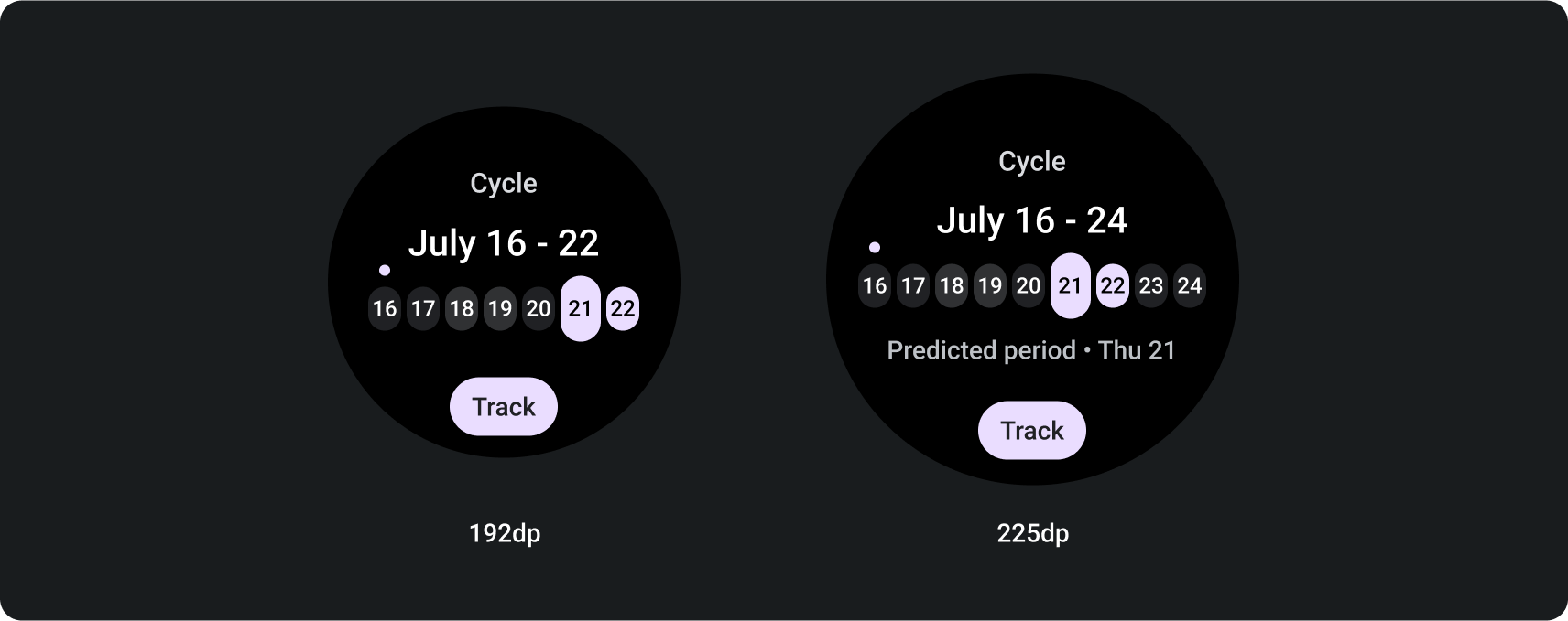
Info-centric with progress indicator
This layout uses the EdgeContentLayout template.
Use this layout to display progress and one key metric. The progress indicator reduces the space available in the center of the layout.
This layout retains the same slots as the one without a progress indicator, except for the primary chip slot.
To create the layout shown in the final example, Weather, use the MultiSlotLayout component within the main content slot.
Data-centric layouts
This layout uses the PrimaryLayout template.
Use this layout to show graphics and graphs, or when the tile requires the most visual flexibility on devices with larger screen sizes.
To maximize the available height, turn off the secondary label slot and primary chip slot off. This configuration lets you show a larger graphic, as well as additional information on devices with larger screen sizes.
Responsive design
The following templates show how tile layouts adapt responsively to Wear OS devices with larger screen sizes. These examples illustrate built-in behavior, which helps maximize the additional screen real-estate provided by a larger display size. As an app developer, you can also define multiple possible layouts, along with a breakpoint that informs the system of which layout to show (a "smaller screen" one or a "larger screen" one).
Learn more about how to design for adaptive layouts.
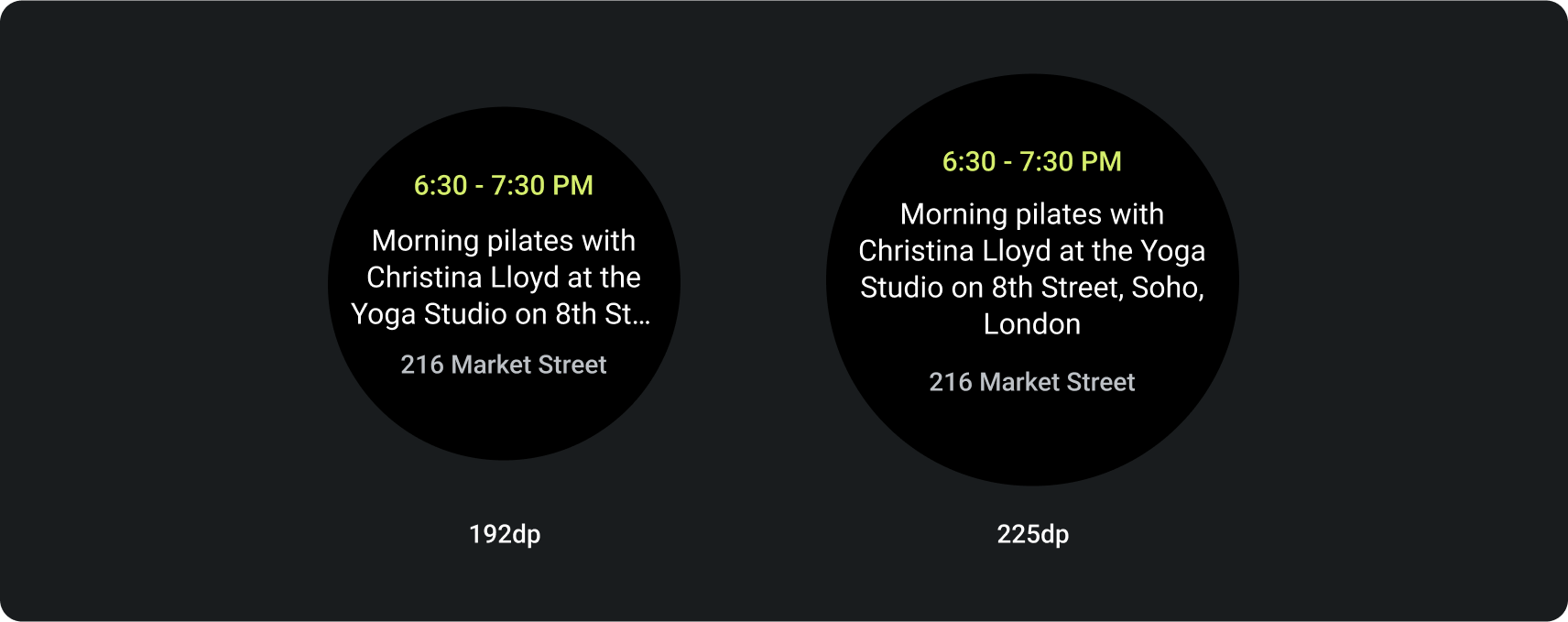
Text-centric design layout
This template helps display textual content—such as the latest news, upcoming events, and reminders. It's also commonly used for sign-in, error, and setup states, providing space to inform users of what's happening and offer a clear call to action.
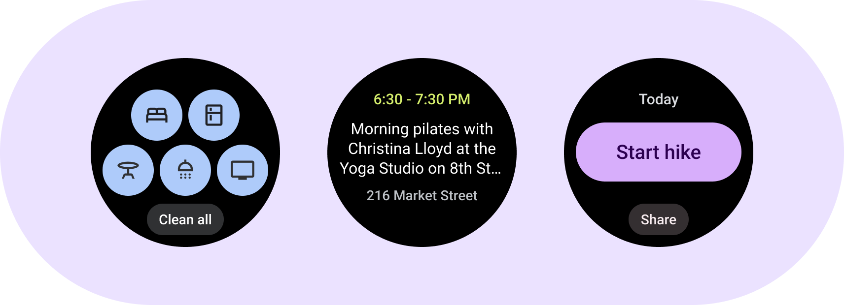
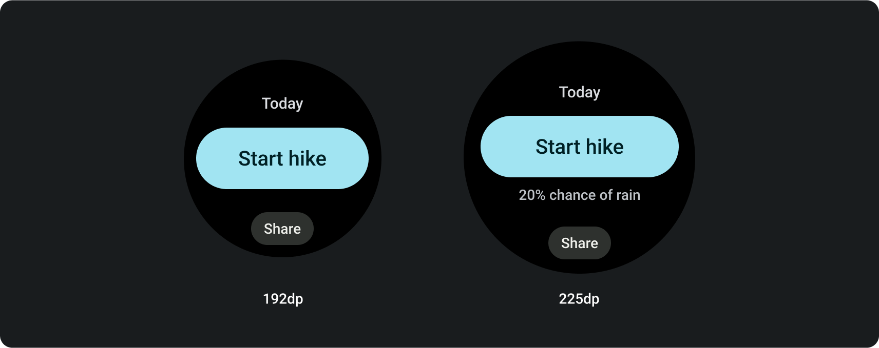
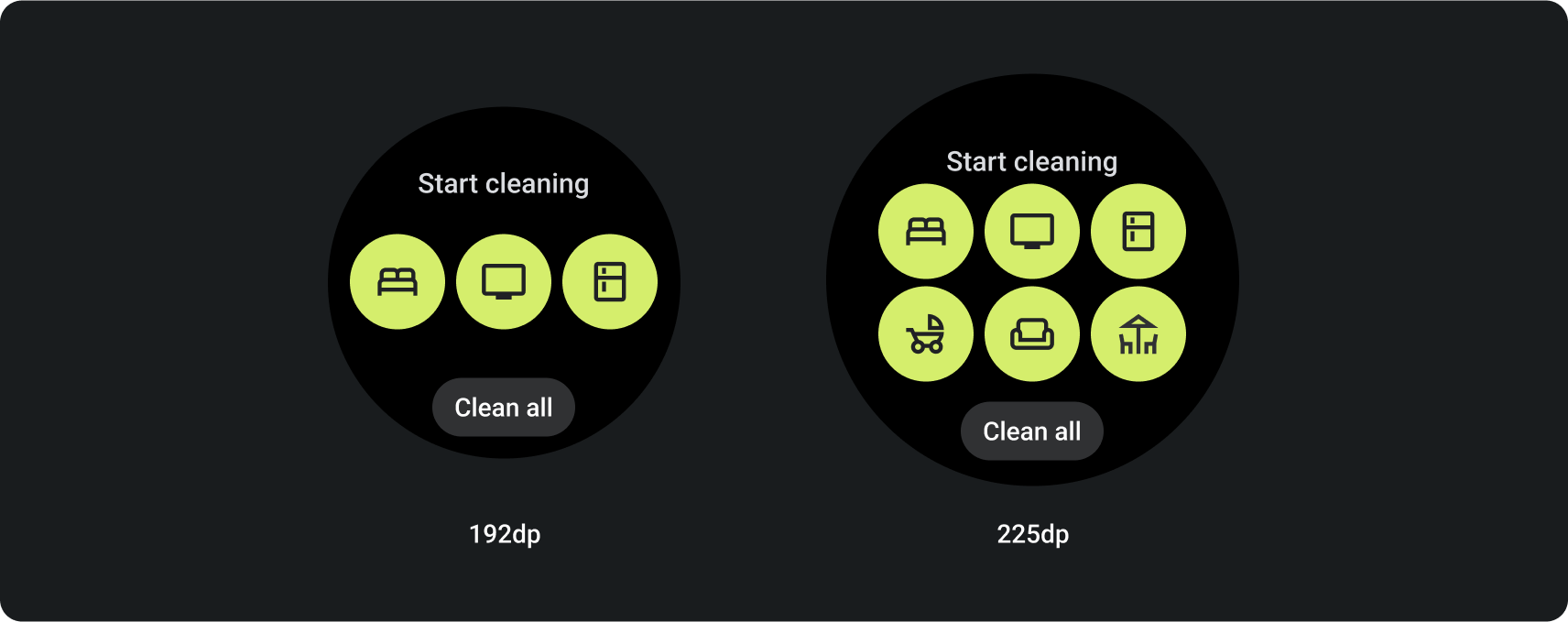
Button-centric design layouts
These templates helps show up to 5 related primary actions, such as jump-starting specific tasks. It creates a clear, concise, and highly glanceable tile for users, helping streamline your app's interactions.
Button-centric layout with chips
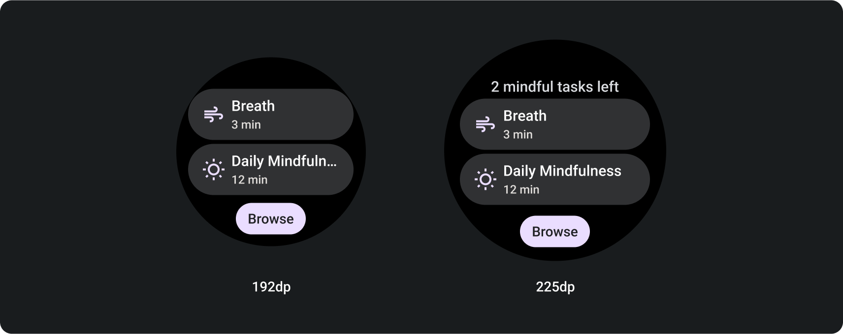
Button-centric layout with round buttons
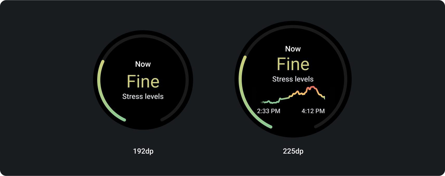
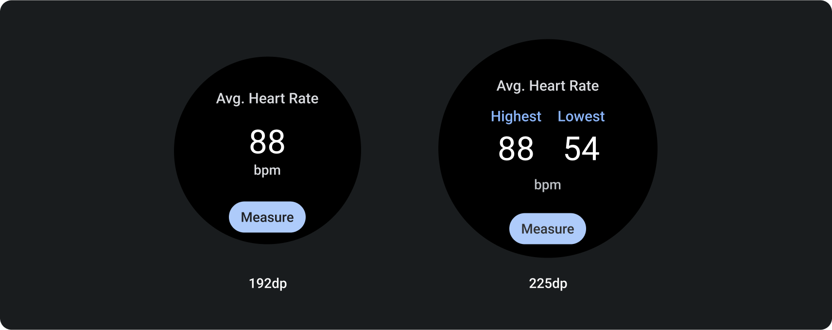
Info-centric design layouts
These templates—shown both with and without a progress indicator—display high-level metrics and progress towards goals. They're particularly useful for tiles related to health and fitness use case. It also provides flexible options for content display and a primary call to action.
To maintain glanceability, prioritize important data and avoid overcrowding the tile.
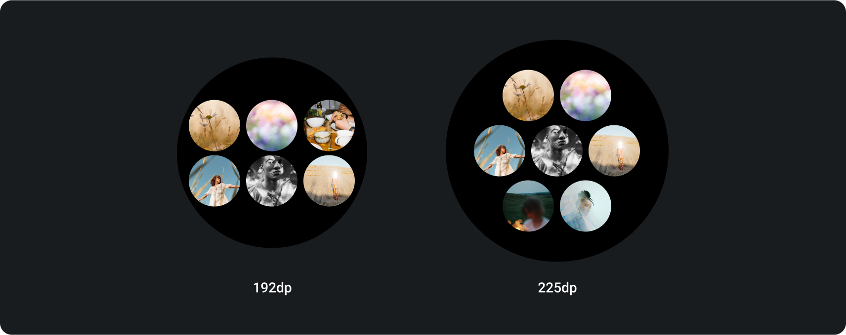
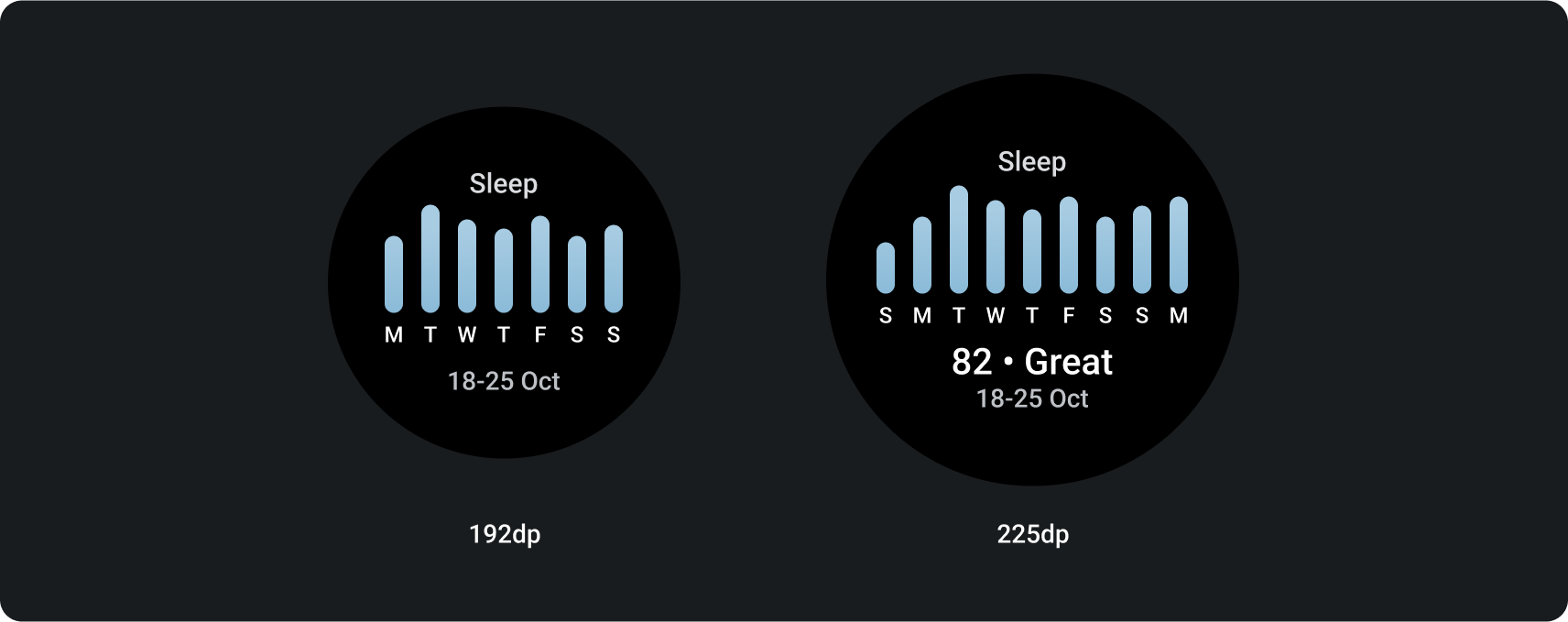
Data-centric design layout
This template presents information in a graph or similar picture.
Download the Tiles on Wear OS design kit
Download the design kit to start using the tile design layouts. The kit contains built-in components, options, and recommendations to achieve up to 80 different layouts to suit your needs, while maintaining a connection to the ProtoLayout coded templates.
Download the Figma design kit (64 MB)
SHA-256 hash: db443d4ba5cc10716719bed84b859f9d66cbd3a0a41694666a3752415434b362